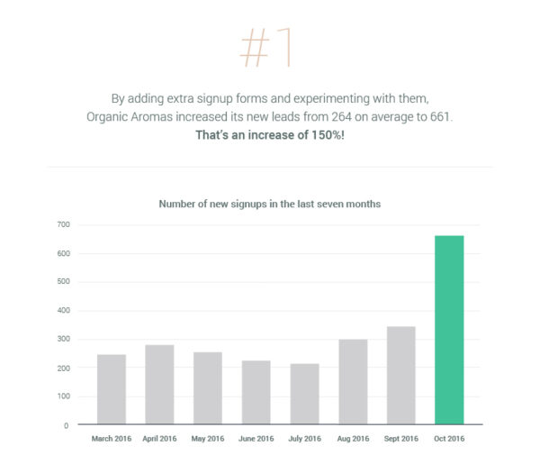
Omnisend worked with Organic Aromas to complete a four-week experiment in building their contact list. With only one hour invested (and zero financial input), this online store captured 661 new leads and ended up with 40 extra orders.
Before Omnisend, Organic Aromas had two types of sign-up forms: a native Shopify sign-up form in the footer of the store and a Sumo.me bar at the top of the page.
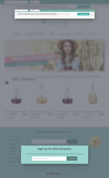
The subscription rate over the seven months previous to the experiment varied between 1.75% and 4.47%, with an average of 3.24%. The store was generating about 264 new leads every month.
I would say that this is not bad for a small online store. However, this number could be much better. And this is how we did it.
Week 1: Exit-intent pop-up
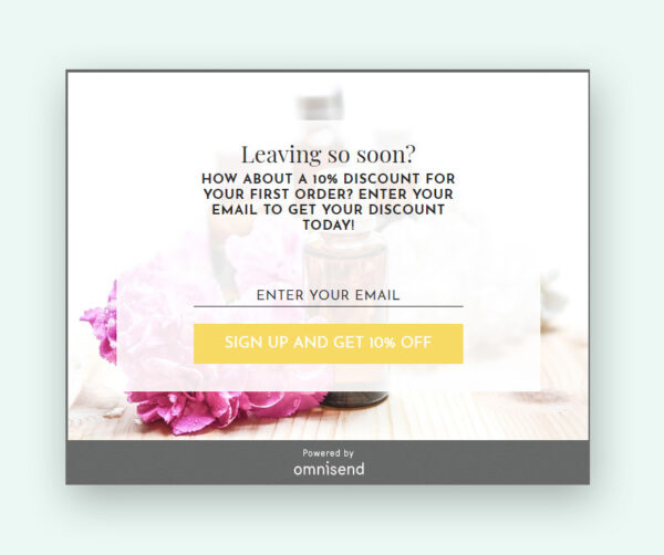
Without looking any further, we set up an Omnisend exit-intent pop-up. This appears to the visitor when he/she tends to leave the site.
Exit-intent technology is one of the most effective ways to retain customers once they have decided to abandon your website.
Week 2: Immediate popup
For the second week we chose to experiment with an immediate pop up. This shows up immediately after the visitor begins browsing in your store.
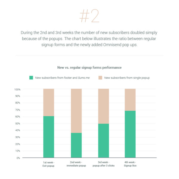
This is a controversial pop up. Most people do not like it when something pops up on the screen before they’ve had a chance to see anything. However, this pop up showed stunning results! In one week it captured 135 new subscribers, and 10 of them ended up following through on purchases.
A 6.8% conversion from just one pop up! What do you think about it now?
Week 3: Pop up after a number of clicks
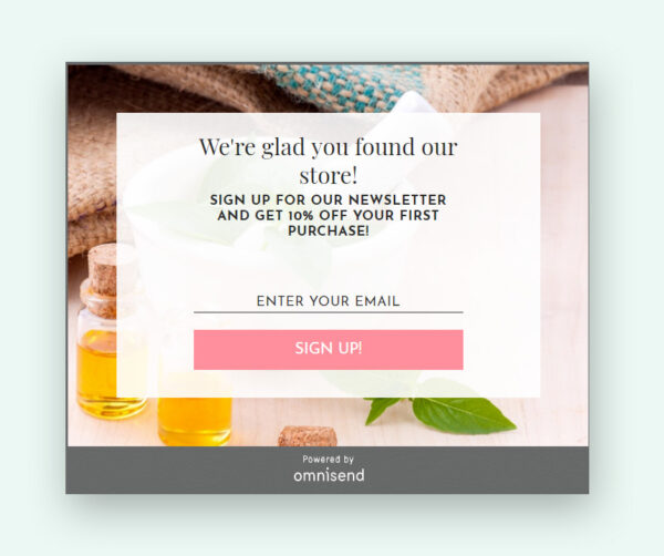
For the third week of the Omnisend Email Lab, we chose a pop-up that appears after a particular number of clicks. According to our experience, three clicks indicate that the visitor is engaged already and might be interested in subscribing to the newsletter.
We used the same pop-up design and copywriting as before, the only difference was the settings when the pop-up has to appear.
This pop-up did not capture so many new signups as the immediate pop-up, but it generated the biggest number of purchases – 17 extra orders in seven days.
Week 4: Signup Box
The last week was dedicated to the Signup Box. This is the least aggressive signup form and appears as a widget at the bottom of the page, inviting the visitor to sign up.
No discount code was offered for the signup.
This signup page achieved only a 0.81% subscription rate in comparison to the 3.8% of the immediate pop up.
Overall results of the experiment
Now that we know what the forms looked like, let’s dig deeper into the overall results.
Which popup is the best for your store?
It seems that you should use different ones depending on what you want to achieve: an aggressive immediate pop-up for faster list building, or exit-intent and after-few-clicks pop-ups to convince engaged visitors to purchase your products.
The last week of the experiment showed that the Signup Box can be used along with the popups but shouldn’t totally replace them. The small widget can be kept all year long and be left alone to quietly do its work. However, a significant boost can be achieved using pop-ups with discounts.
The time invested in this experiment – only 15 minutes for each form. This means that only 60 minutes was needed for the entire month to obtain such great results.
Last but not least, as a result of this experiment, you can have a deeper understanding of your own store and your visitors’ behavior.

 OFFER
OFFER


