Drive sales on autopilot with ecommerce-focused features
See FeaturesIn their “Milliseconds make millions” study, Deloitte found out that:
83% of customers say the experience a company provides is as important as its products and services.
In other words, the “I’ll compensate for my store’s bad user experience by offering discounted products” strategy doesn’t work anymore.
More than anything else, users value their time. When they are on a hunt for a particular product or service, they want everything to happen fast.
Otherwise, you guessed it, they will bounce.
That’s why providing a seamless user experience (UX) is not only a great option but also a mandatory pillar of your online strategy. And in the following lines you will learn how to improve that.
Understanding website UX in 2024
In 2024, website user experience has reached new heights of sophistication, driven by technological advancements and an increased focus on user-centric design. Today’s UX prioritizes personalization, accessibility, and seamless interactions to cater to users’ diverse needs and preferences.
Key UX elements in 2024 are:
1. Personalization
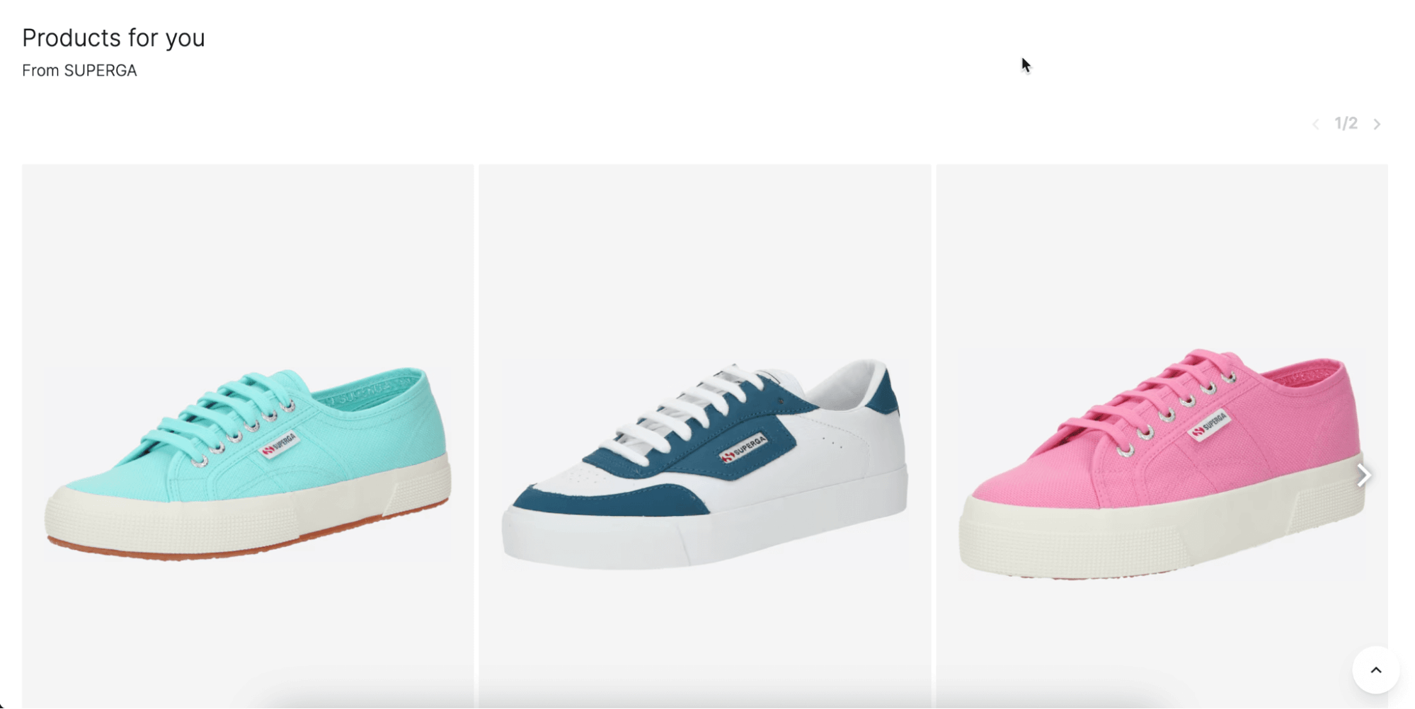
Modern websites leverage AI and machine learning to deliver personalized content and experiences. This means tailored recommendations, dynamic content adjustments, and user-specific interfaces that adapt to individual behaviors and preferences.
2. Accessibility
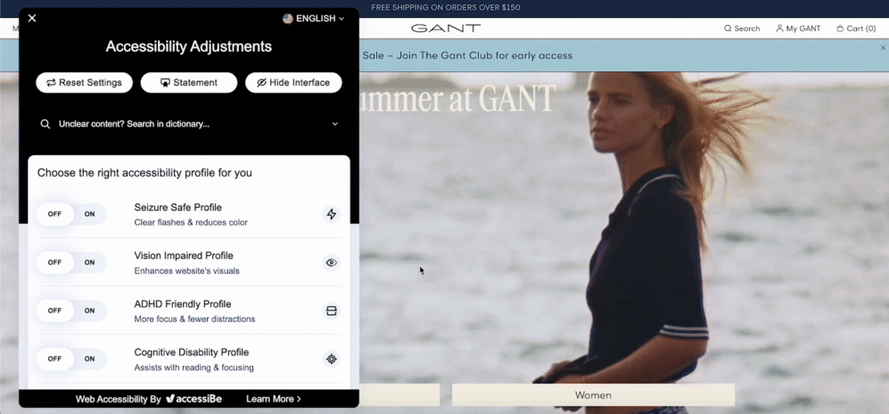
Inclusivity is a central tenet of UX design. Websites are now built to be accessible to all users, including those with disabilities. This involves implementing features such as screen reader compatibility, keyboard navigability, and high-contrast design options.
3. Responsive design
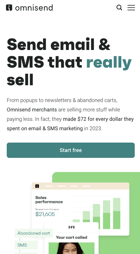
With the proliferation of devices and screen sizes, responsive design ensures that websites function flawlessly across desktops, tablets, and smartphones. Fluid grids, flexible images, and media queries are standard practices to maintain usability and aesthetics on any device.
4. Engaging content
Interactive elements such as animations, micro-interactions, and multimedia content keep users engaged. Storytelling through compelling visuals and interactive features enhances the overall user experience.

What is a good user experience, and how can it be measured?
A good UX is characterized by ease of use, efficiency, accessibility, and satisfaction.
It ensures that users can effortlessly navigate a website, find the information they need, and complete their desired tasks without frustration.
The latter is the biggest indicator of a good or bad user experience. Generally, websites and apps that provide poor UX inevitably see higher bounce rates and rage clicks.
Term: Rage clicks
Rage clicks occur when users repeatedly click or tap on an element in a website or app out of frustration. This behavior can result from various issues, such as confusion over whether an element is clickable, malfunctioning buttons, broken elements, misleading content, or invisible overlays.
But despite looking for an increase in bounce rate, what else can you do to measure UX?
Here are a couple of ideas:
1. Usability testing: Conduct tests with real users to observe how easily they can navigate and use your website. Look for pain points and areas of confusion.
Tool: UserTesting
2. Surveys and feedback: Collect direct feedback from users to gauge their satisfaction and gather suggestions for improvement.
Tool: SurveyMonkey
3. Analytics tools: Use analytics tools to track user behavior, such as bounce rates, session duration, and conversion rates. These metrics provide insights into how effectively your website meets user needs.
Tool: Google Analytics
4. Heatmaps: Implement heatmap tools to visualize where users click, scroll, and hover on your site. This data helps identify which areas attract attention and which are ignored.
Tool: Hotjar
5. Performance metrics: Monitor website performance metrics like Core Web Vitals (CWV). Faster, smoother websites generally offer better UX.
Tool: PageSpeed Insights
6. Net Promoter Score (NPS): Measure users’ willingness to recommend your website to others. A high NPS indicates a positive user experience.
Tool: Delighted
7. Task completion rate: Track the percentage of users who successfully complete specific tasks on your website, such as filling out a form or making a purchase.
Tool: Crazy Egg
Half of your job is done by regularly measuring these aspects. The other 50% requires you to knuckle down and apply different optimization techniques to improve your website’s user experience.
And here’s a list of techniques you can start with:
8 ways to improve your online store’s user experience
Optimize page speed and Core Web Vitals
Two things you must achieve in terms of web performance:
- Ensure your website loads in less than 3 seconds
- Pass Core Web Vitals
Here’s why — according to recent research by NitroPack, a page load time of under 3s yields great business results like:
- More page views per session: Users who experience a load time of 3 seconds or less visit 60% more pages
- Lower bounce rates: 50% more visitors drop off when a page loads in 3 seconds compared to a 2-second page load time.
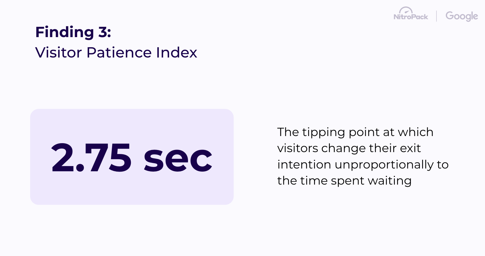
- Fewer unsatisfied users: Visitors lose patience and disproportionately start to abandon a web page at 2.75s of the page load
Core Web Vitals is a set of three metrics that measure real-world user experience for loading performance, responsiveness, and visual stability of a page:
- Loading: Largest Contentful Paint (LCP)
- Responsiveness: Interaction to Next Paint (INP)
- Visual stability: Cumulative Layout Shift (CLS)
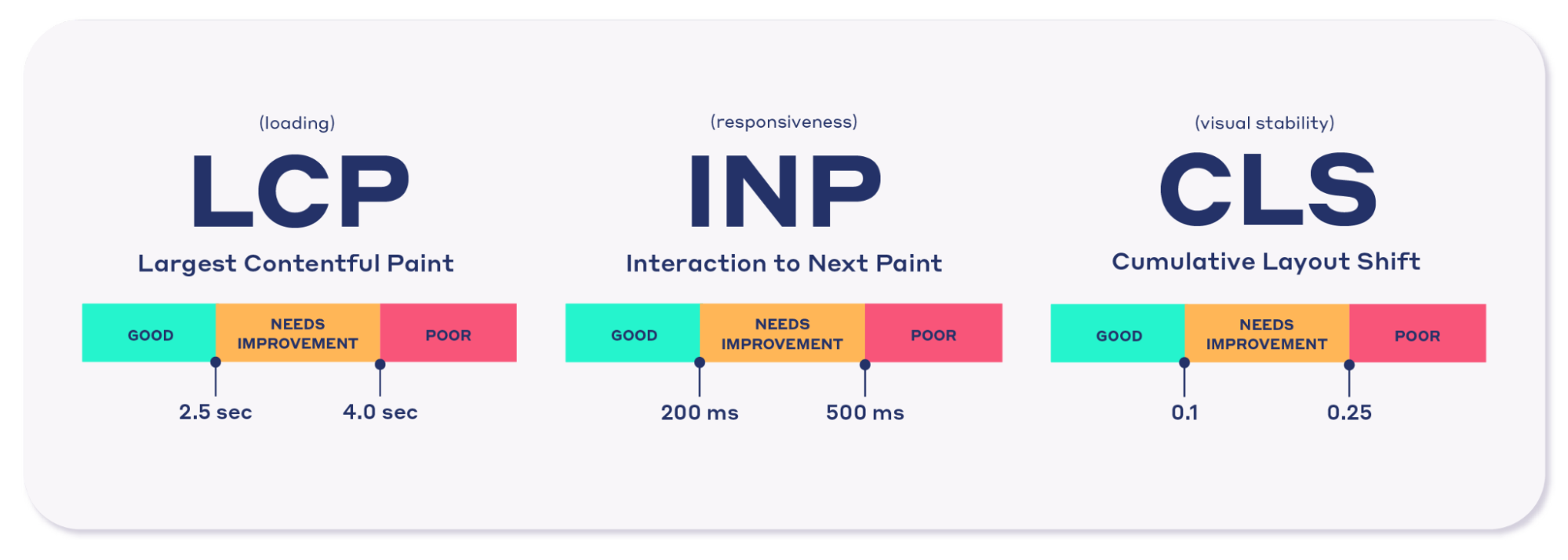
Furthermore, CWVs are one of the four page experience search signals that Google takes into consideration when building every search engine results page (SERP).
But beyond their SEO importance, it’s proven that passing Core Web Vitals leads to better user experience, less bounce rate, and more conversions.
How to speed up your website
- Apply caching on your website
- Convert images into next-gen formats
- Generate Critical CSS
- Lazy load unnecessary resources
- Use Content Delivery Network (CDN)
- Compress and minify your HTML, CSS, and JavaScript files
- Subset your fonts
- Rely on high-quality hosting provider
Improve navigation on money pages
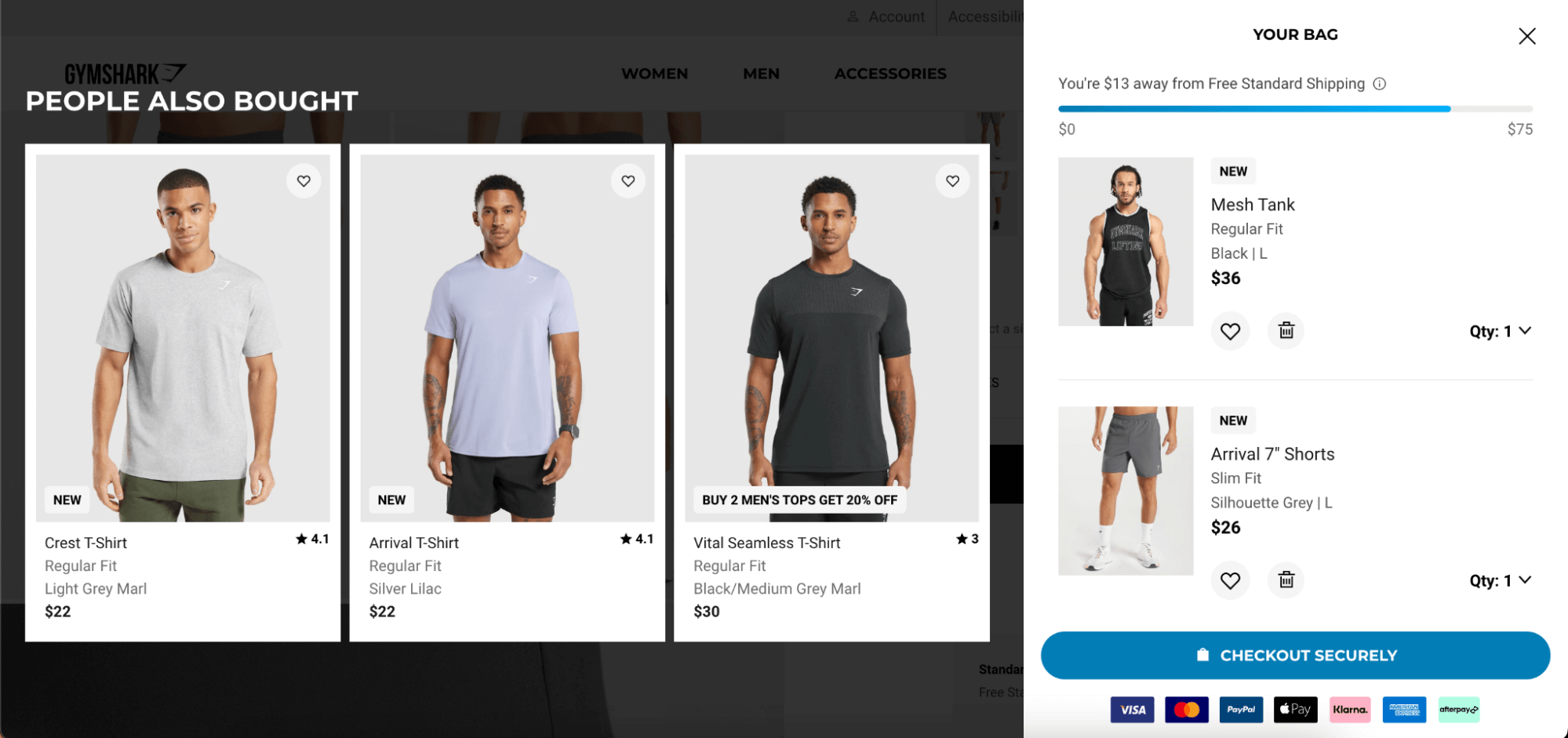
Streamlined navigation on money pages — such as product pages, checkout pages, and lead generation forms — is crucial for maximizing conversions and revenue. These key pages are where users make critical decisions, and any friction can lead to frustration and abandonment.
Ensuring that navigation is intuitive and straightforward on these pages is essential for keeping users engaged and guiding them smoothly toward completing a purchase or filling out a form.
How to improve navigation on money pages
- Highlight primary actions: Ensure that buttons and links leading to purchase or sign-up actions are prominent and easy to find
- Minimize distractions: Keep navigation elements focused on the conversion goal by reducing unnecessary links and clutter
- Use clear CTAs: Employ clear and descriptive call-to-action buttons to guide users through the conversion process seamlessly
- Provide quick access: Implement quick links or shortcuts to important sections such as product details, reviews, and checkout to facilitate a smoother user journey
Think mobile and responsive
As of June 2024, people using mobile devices contribute to 61.35% of all website traffic, making it essential to ensure your website is mobile-friendly and responsive. A mobile-optimized site enhances user satisfaction and boosts engagement and conversions by allowing users to navigate and interact with your content effortlessly on smaller screens.
How to ensure your website is mobile-friendly
- Implement responsive design: Use responsive web design techniques to ensure your website automatically adjusts and looks great on all devices, from desktops to smartphones
- Simplify navigation: Design a mobile-friendly navigation menu that is easy to use on smaller screens, with clear and tappable links and buttons
- Prioritize content: Ensure the most important content is easily accessible and readable on mobile devices, avoid long paragraphs, and use headings, bullet points, and concise text
- Test across devices: Regularly test your website on various mobile devices and screen sizes to ensure a consistent and functional user experience
Rethink your CTAs and microcopy
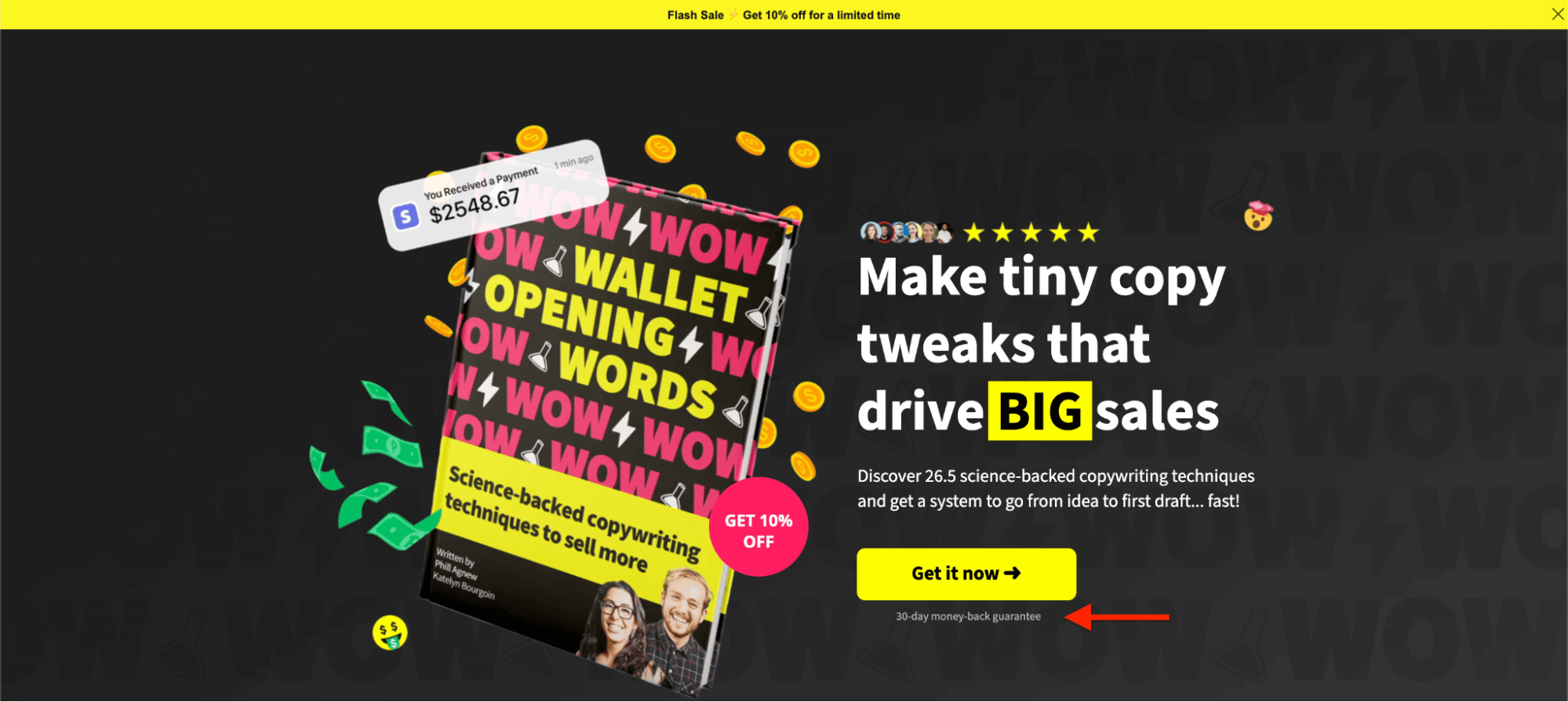
Effective calls to action (CTAs) and microcopy are essential for directing users through your website and encouraging them to take desired actions. By making your CTAs and microcopy clear, concise, and compelling, you can significantly enhance user engagement and conversion rates by providing direction and reducing friction.
Term: Microcopy
Microcopy refers to the tiny bits of text on your website that guide users and provide clarity, such as button labels, form instructions, and error messages.
How to improve your CTAs and microcopy
- Make CTAs clear and actionable: Use strong, action-oriented language that tells users exactly what to do, such as “Buy Now,” “Sign Up,” or “Learn More”
- Use contrasting colors: Ensure your CTAs stand out by using colors that contrast with the rest of your website’s design, making them easy to spot
- Keep microcopy concise: Provide helpful instructions or contextual information with concise and friendly microcopy that guides users without overwhelming them
- Test different variations: A/B test different CTA texts, placements, and designs to determine what resonates best with your audience and drives the most conversions
- Align CTAs with user intent: Ensure your CTAs match the user’s journey and intent, providing relevant actions based on the content they are engaging with
Focus on above-the-fold experiences
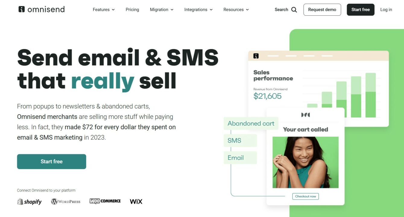
Above-the-fold content refers to the portion of your website that is visible without scrolling. This area is critical because it forms the first impression for visitors and plays a significant role in engaging users and reducing bounce rates. Ensuring that above-the-fold content loads immediately is crucial for capturing user attention and providing a seamless experience right from the start.
How to improve the above-the-fold experience
- Prioritize load speed: Optimize the loading time of above-the-fold elements by reducing file sizes, leveraging browser caching, and using asynchronous loading for scripts
- Showcase key information: Display essential information and compelling visuals above the fold to engage users immediately. This might include a strong headline, primary call to action, and high-quality images
- Use clear CTAs: Place clear and prominent calls to action in the above-the-fold area to guide users towards desired actions without requiring them to scroll
- Optimize images and videos: Ensure that images and videos in the above-the-fold section are optimized for quick loading without compromising quality
Keep your web design frictionless
A frictionless web design ensures users can navigate your website effortlessly, enhancing their overall experience and increasing engagement. By eliminating obstacles and simplifying interactions, you can make your website more intuitive and user-friendly, leading to higher satisfaction and conversion rates.
How to keep your design frictionless
- Optimize user flows: Design clear and straightforward user flows for key actions, such as signing up, purchasing, or finding information, ensure that each step is logical and easy to follow
- Simplify forms: Streamline your forms by reducing the number of required fields and using smart defaults, implement auto-fill options and provide clear, concise instructions to help users complete forms quickly and easily
- Maintain visual consistency: Use a consistent design language throughout your website, including fonts, colors, and layouts, as this helps users feel comfortable and confident as they navigate
- Reduce intrusive elements: Limit pop-ups, auto-play videos, and other intrusive elements that can disrupt the user experience, ensure any necessary interruptions are easy to dismiss and don’t obstruct essential content
Make text and hyperlinks scannable
Scannable text and hyperlinks are essential for enhancing readability and helping users quickly find the necessary information. By structuring your content to be easily digestible, you can improve user engagement and ensure that essential details are not overlooked.
How to improve your content scannability
- Use clear headings and subheadings: Break up your content with descriptive headings and subheadings to guide users through your page and highlight key sections
- Employ bullet points and lists: Use bullet points and numbered lists to present information in a concise and easily digestible format, making it simple for users to scan
- Highlight keywords: Bold or italicize important keywords and phrases to draw attention to essential information and make it stand out
- Keep paragraphs short: Write short, focused paragraphs to maintain readability and prevent users from feeling overwhelmed by large blocks of text
- Use descriptive hyperlinks: Ensure that hyperlinks are descriptive and provide context about the link’s destination, avoid generic text like “click here” and instead use meaningful phrases that tell users what to expect
Check internal linking and 404s
Effective internal linking and promptly addressing 404 errors are crucial for maintaining a seamless user experience and enhancing your website’s SEO. Proper internal linking not only aids users in navigating your site more easily but also distributes link equity, improving the ranking potential of your pages.
Fixing 404 errors, on the other hand, prevents user frustration and keeps your site’s credibility intact, ensuring that both users and search engines can access your content without interruption.
How to improve your link structure
- Audit internal links: Regularly review your internal links to ensure they are functioning correctly and guiding users to relevant content
- Monitor for 404 errors: Use tools like Google Search Console to identify and monitor 404 errors on your website, regularly check for broken links and pages that no longer exist
- Implement 301 redirects: When a page is removed or its URL changes, set up 301 redirects to guide users to the correct page, as this helps maintain a smooth user experience and retains link equity
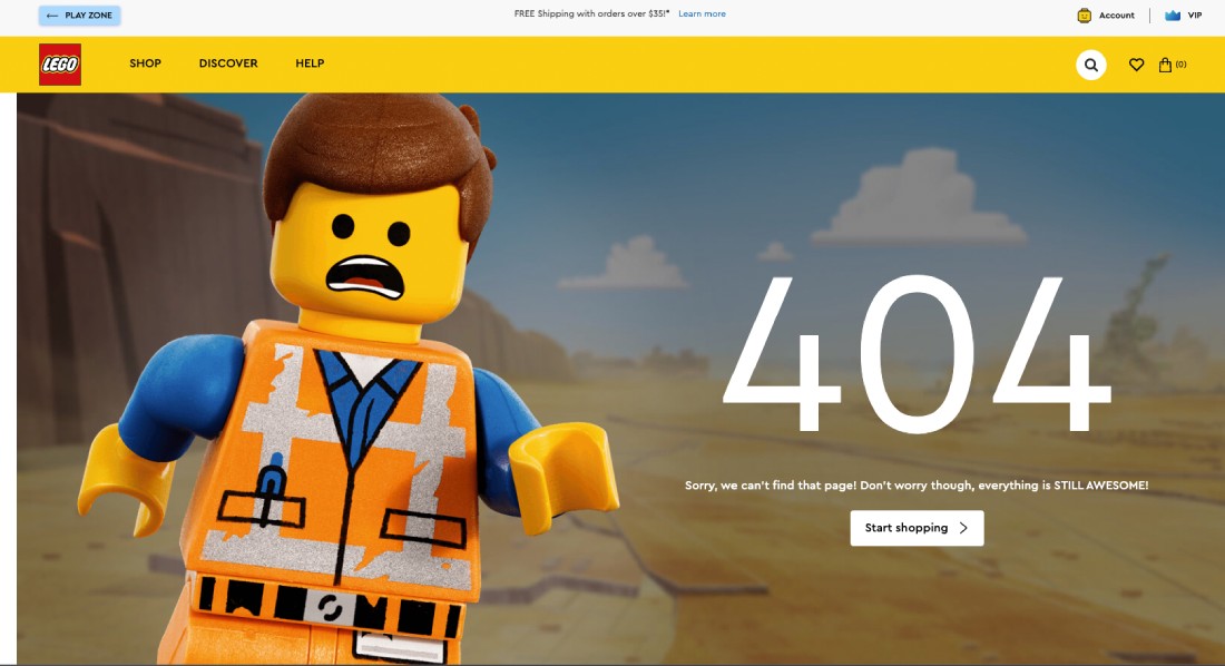
- Custom 404 page: Design a custom 404 error page that offers helpful options to users, such as a search bar or links to popular content, to keep them engaged even when they encounter an error
Bonus improvement ideas for more online sales in 2024
Optimize lead generation forms
Lead generation forms are a great way to capture your prospects’ emails, which you can later use for remarketing campaigns. Well-designed forms can significantly increase conversion rates by reducing friction and encouraging users to complete the process.
Ensuring that your lead generation forms are user-friendly and efficient is crucial for maximizing the number of leads you collect and improving overall engagement.
How to optimize your forms
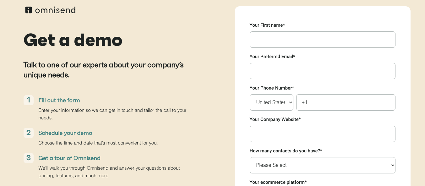
- Keep forms short and simple: Limit the number of fields to only those necessary — long forms can overwhelm users and lead to higher abandonment rates
- Use clear and concise labels: Ensure that form fields have clear, concise labels and placeholder text that guide users to the required information
- Implement smart defaults: Use smart defaults and auto-fill options to make it easier for users to complete the form quickly
- Provide real-time validation: Implement real-time validation to give users immediate feedback on errors and help them correct them as they go
- Optimize for mobile: Ensure that your forms are fully responsive and easy to complete on mobile devices, as many users will access your site from their phones
- Use a strong call to action: Make your submit button stand out with a strong, action-oriented call to action that encourages users to complete the form
- A/B test your forms: Regularly test different form designs, field placements, and calls to action to see what works best for your audience and improve conversion rates
Follow up with personalized emails
Personalized email campaigns are incredibly valuable for engaging customers, driving conversions, and building long-term relationships. However, creating effective personalized follow-up campaigns can be challenging, and choosing the right email platform is crucial for success.
Omnisend simplifies this process with its comprehensive features, making it easier to create impactful personalized follow-up emails:
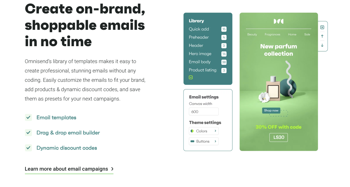
- Customizable templates: Use Omnisend’s professional, on-brand email templates to create engaging follow-up emails
- Dynamic content blocks: Easily insert personalized content, such as product recommendations and special offers, using the drag-and-drop builder
- Advanced segmentation: Target specific audience segments based on purchase history, browsing behavior, and other criteria to make your follow-up emails more relevant
- Automated workflows: Set up automated email sequences to send timely follow-ups triggered by user actions, such as abandoned cart reminders or post-purchase thank you emails
- A/B testing: Optimize your follow-up emails with A/B testing to determine the most effective subject lines, content, and calls to action
And the best part is – you can start for free.
FAQ
What’s the difference between UX and UI?
UX (User Experience) focuses on the overall feel and functionality of a product, ensuring it meets user needs and provides a positive experience. UI (User Interface) deals with the visual elements and interactive aspects of a product, such as buttons, icons, and layout.
How do you test for user experience?
User experience can be tested through usability testing, surveys, and feedback forms, as well as by analyzing metrics like task completion rates, time on task, and user satisfaction scores.
What are the 7 principles of good user experience?
The 7 principles of good user experience are:
- User-centricity
- Consistency
- Hierarchy
- Context
- User control
- Accessibility
- Usability
Author bio

Niko Kaleev is a Senior Content Writer at NitroPack, the leading all-in-one web performance optimization platform. With over 7 years of tech industry experience, he excels at transforming complex topics into engaging and accessible content. Explore his latest work on the NitroPack blog.
TABLE OF CONTENTS
TABLE OF CONTENTS


No fluff, no spam, no corporate filler. Just a friendly letter, twice a month.

 OFFER
OFFER


