
 OFFER
OFFER


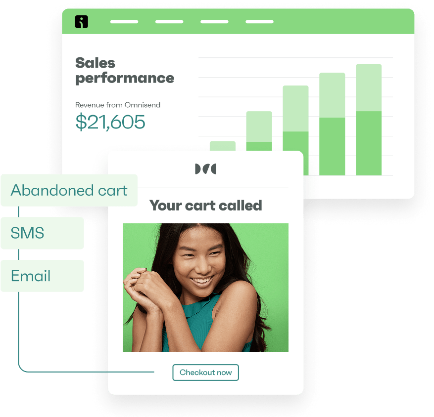
Drive sales on autopilot with ecommerce-focused features
See FeaturesA squeeze page is a tool for bringing visitors to your website and capturing their email addresses to grow your subscriber list.
The most effective squeeze pages offer a compelling lead magnet, use persuasive copy, and have a simple form to obtain email addresses quickly and without distractions.
For instance, your squeeze page might offer a free shopping guide or use limited-time offers and scarcity tactics to encourage the visitor to act.
Omnisend helps you build squeeze pages that convert with easily customizable page templates, popups, and single and multi-step forms.
Join us below to learn more about squeeze pages and how to use them effectively in your ecommerce marketing strategy.
Use Omnisend to build high-converting squeeze pages with ease
Quick sign up | No credit card required
What is a squeeze page?
Squeeze pages are lead-generation tools on your website that encourage visitors to submit their email addresses in exchange for value, such as 20% off their next order.
The difference between a squeeze page vs landing page is that squeeze pages focus on contact information capture, usually for email marketing campaigns. Landing pages pursue multiple goals, such as increasing sales or demo signups.
A well-designed squeeze page will help you build permission-based lists more effectively than signup boxes and popups can achieve alone.
Squeeze pages are typically concise and focused, containing compelling headlines, brief benefit-oriented copy, and a prominent opt-in form to keep visitors’ attention on the primary CTA.
Some also use a minimalist design philosophy and strip away standard website elements like menus, footers, and sidebars to guide visitors to take action.
How to create a squeeze page
To ensure you get the most out of your squeeze page, follow these seven steps:
1. Define your goal
Your squeeze page’s primary goal is to collect your visitors’ email addresses and grow your subscriber list.
To make this goal clear and actionable, here’s how to define it:
- Specify the desired outcome (e.g., grow email list, generate leads)
- Quantify your target (e.g., obtain 500 new subscribers)
- Set a timeframe (e.g., within 30 days)
- Define the type of leads you want (e.g., first-time shoppers interested in eco-friendly products)
When setting your goal, be specific and realistic. For example, aim to “increase email subscribers by 20% in the next quarter” rather than “get more emails.”
2. Write a compelling headline
Your squeeze page’s headline is the first (and sometimes last) opportunity to grab your visitors’ attention and encourage them to take action.
Effective headlines use clear, compelling language to communicate your value proposition and address pain points or desires.
Rocket Money uses the headline “Take full control of your subscriptions with Rocket Money” to explain precisely the value the visitor will receive by signing up:
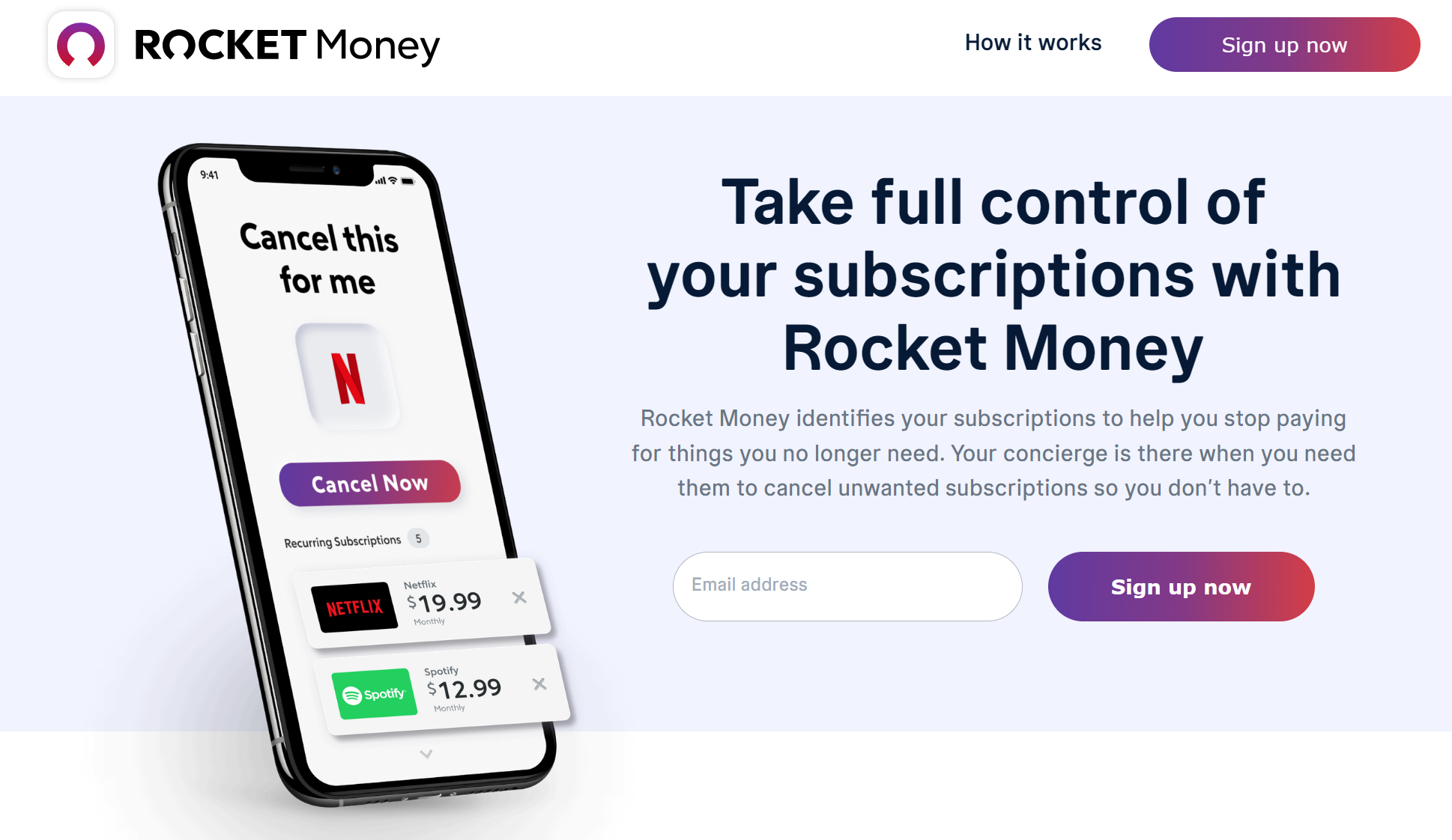
The headline is effective as it directly addresses a common pain point (managing subscriptions) while promising a solution.
You can follow this idea by identifying your audience’s key challenge and crafting a headline that offers a clear, actionable benefit for solving it.
3. Offer an irresistible incentive
Offering incentives can significantly boost signup rates for your squeeze page, as visitors are likely to provide their email addresses if they perceive immediate value.
Effective incentives should be easy to deliver digitally and provide instant gratification to the user. Here are some examples:
- Discount codes for first purchases
- Refer a friend offers
- Free shipping on the next order
- Exclusive access to new product launches
- Entry into a prize draw or contest
- Free downloadable buying guides or lookbooks
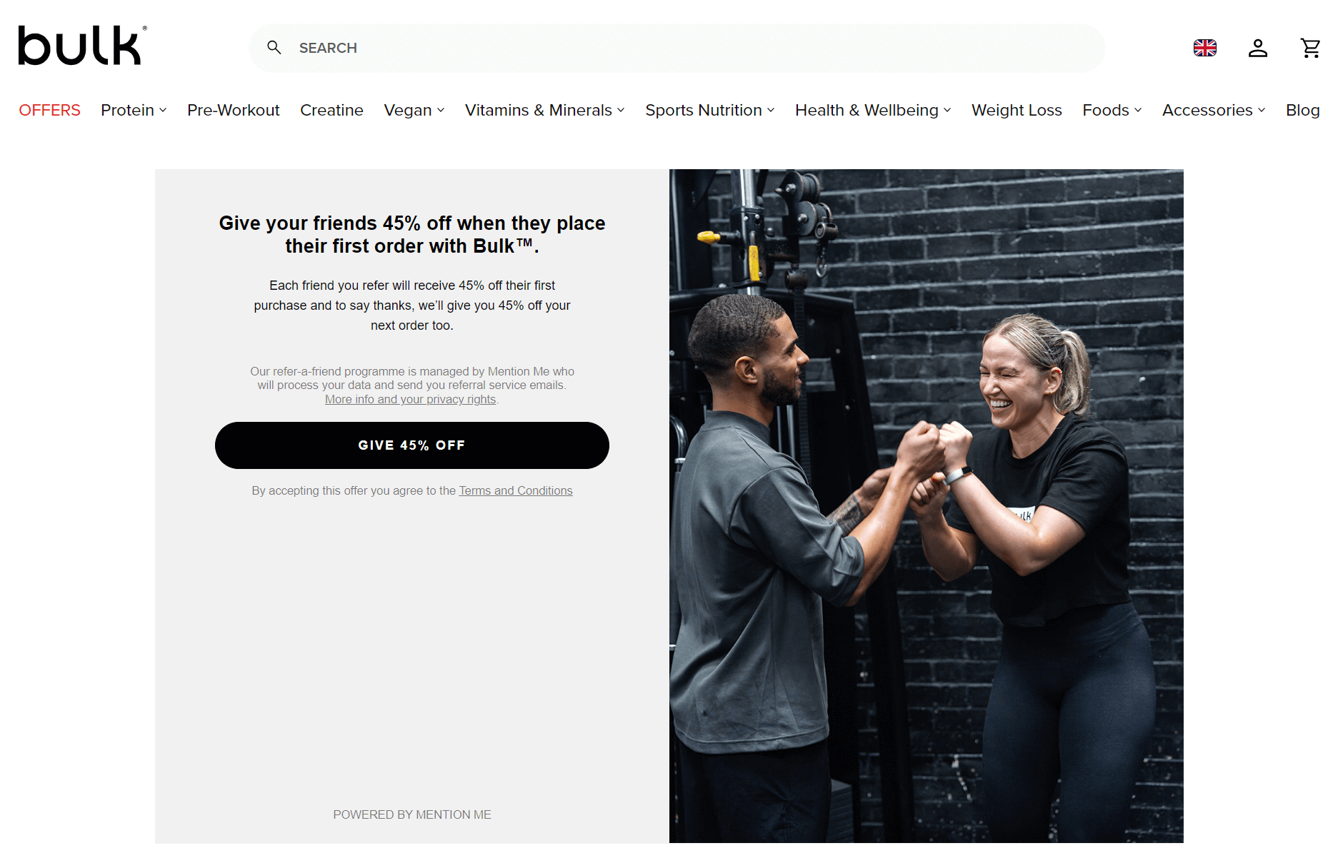
Health supplements brand Bulk Powders has a friend referral page with a compelling incentive of 45% off for both parties on their next order:
4. Keep the form simple
Visitors may abandon complex forms because they perceive them as time-consuming and intrusive. Simplicity reduces cognitive load and respects your audience’s time, increasing the likelihood they will provide information and engage with your offer.
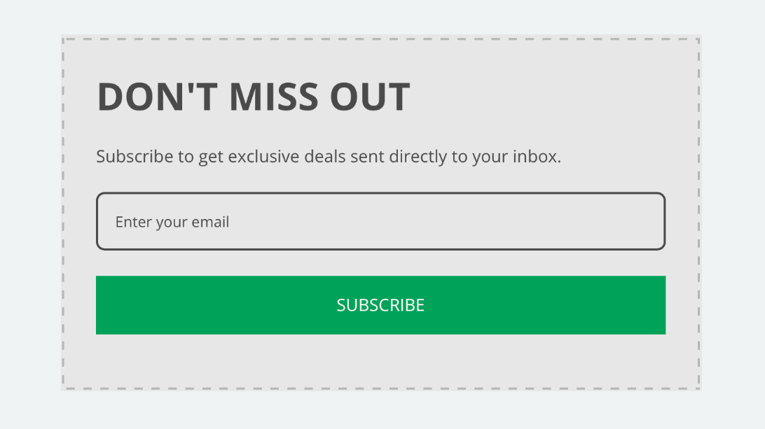
Many of the highest-converting forms use just a single email address field, making it quick and easy for visitors to subscribe. Here’s an example:
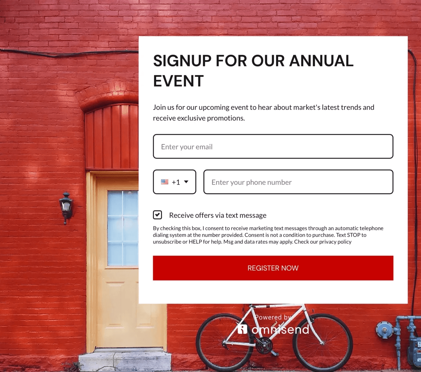
If you need to use two fields to capture an email and phone number, your form should be as compact as possible. Here’s a good example:
5. Use eye-catching visuals and clear CTA
Your squeeze page needs striking visuals and a clear CTA to convert visitors quickly. For ecommerce, this means:
- Product-focused images that showcase benefits
- Large, contrasting CTA buttons that are easy to tap or click
- A CTA that promises immediate value (e.g., “Get 20% Off Now”)
- Minimal distractions — strip away everything but the offer
- Mobile optimization for on-the-go shoppers
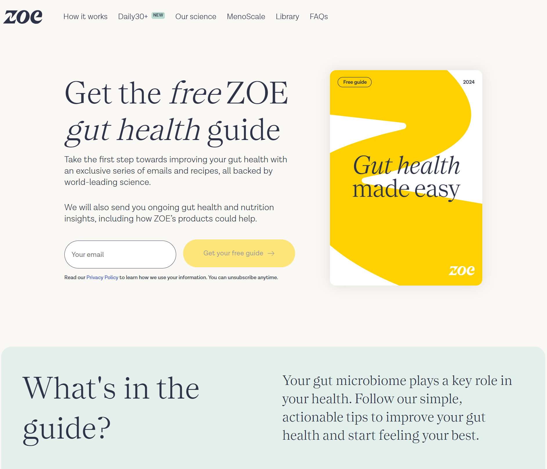
For instance, personalized nutrition brand ZOE uses a contrasting yellow CTA button that stands out, with the text “Get your free guide” to draw attention to its email field:
6. Optimize for mobile devices
Mobile optimization for squeeze pages demands a focus on simplicity and speed.
Strip away everything but the core offer and opt-in form. Use large, bold typography that’s readable without zooming. Ensure your form fits comfortably on the smallest screens and all your input fields are touch-friendly.
Compress images aggressively and lazy-load content below the fold to minimize load times. Above all, rigorously test your page’s performance on actual mobile devices, not just emulators, to catch usability issues that desktop testing might miss.
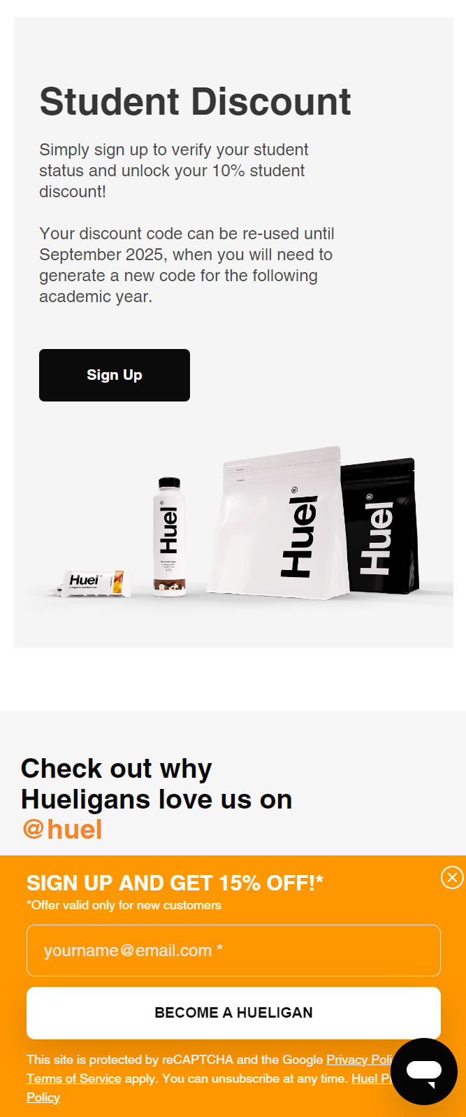
Food supplement brand Huel has a mobile-optimized squeeze page promoting its student discount. It uses a black signup button for the student discount and an orange sticky popup offering 15% off to capture email addresses:
7. Track and test performance with Omnisend
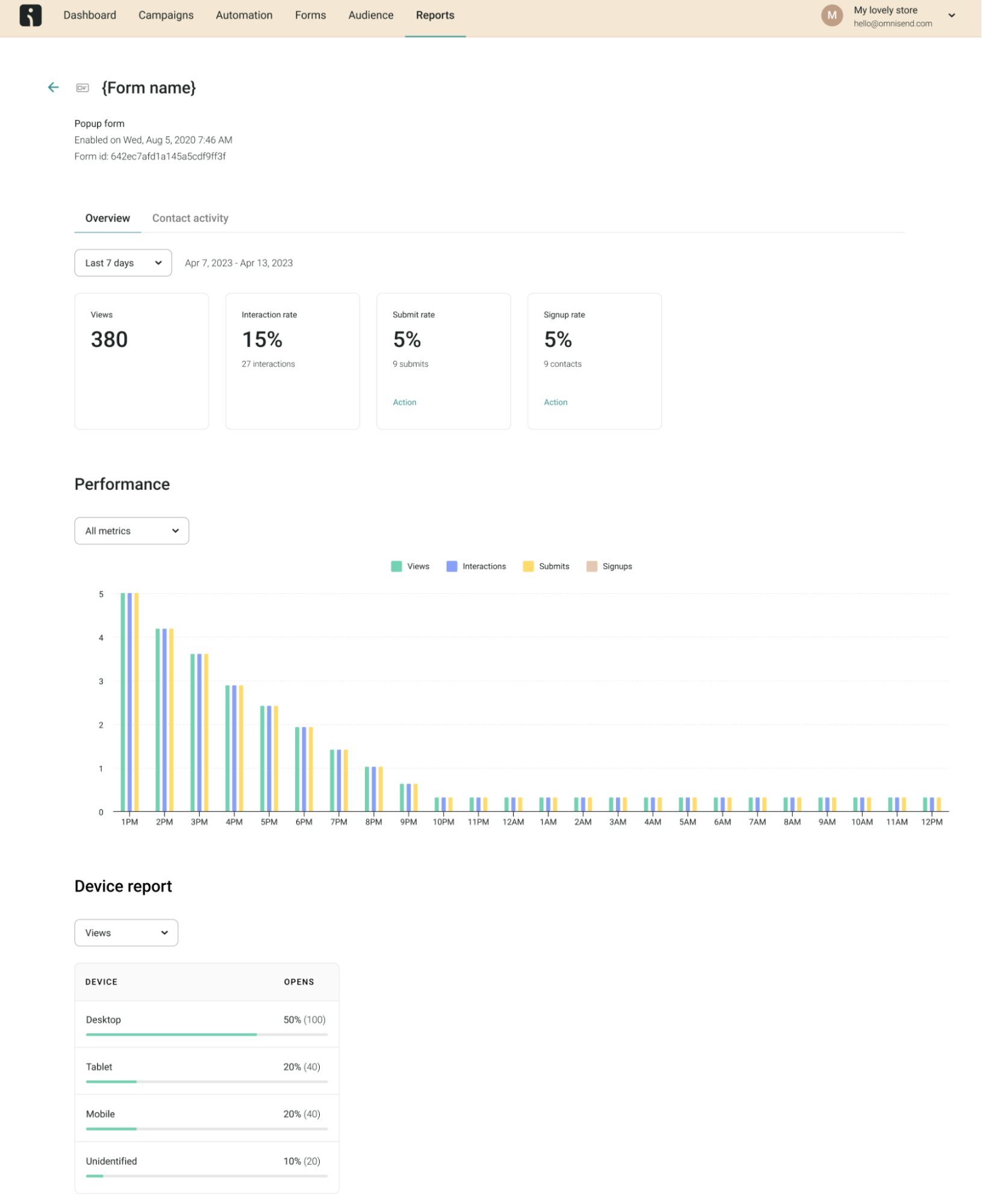
Omnisend offers granular visibility into the performance of your signup forms through its dedicated signup form reports.
Signup form reports lets you monitor key metrics such as form views, interactions, submissions, and signups.
The reports break down these metrics by individual form, giving you a clear understanding of which signup experiences resonate most with your audience.
You can analyze form performance over custom date ranges, assess device-level engagement, and export contact details of new subscribers.
Omnisend also lets you A/B test your signup forms. You can create two form variations, whether experimenting with different copywriting, visuals, display settings, or form structure.
The A/B test then tracks the metrics for each version, letting you identify the highest-converting forms to boost signups on your squeeze pages.
Build, test, and optimize your squeeze pages with Omnisend
Quick sign up | No credit card required
Examples of high-converting squeeze pages
Squeeze pages look slightly different across ecommerce, SaaS, webinars, and other industries to cater to different audiences and goals.
Check out these squeeze page examples with high conversion rates:
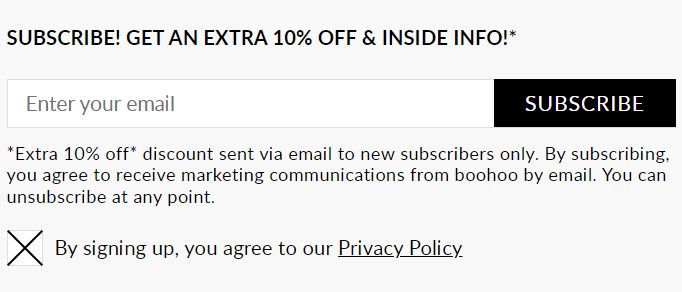
Example 1: Ecommerce store
Fashion retailer boohoo uses a minimalist squeeze page with a 10% off offer to obtain newsletter subscribers.
The heading “EXTRA 10% OFF” makes the offer explicit and hard to miss, while a simple email form with a black “SUBSCRIBE” CTA button makes it easy to subscribe:
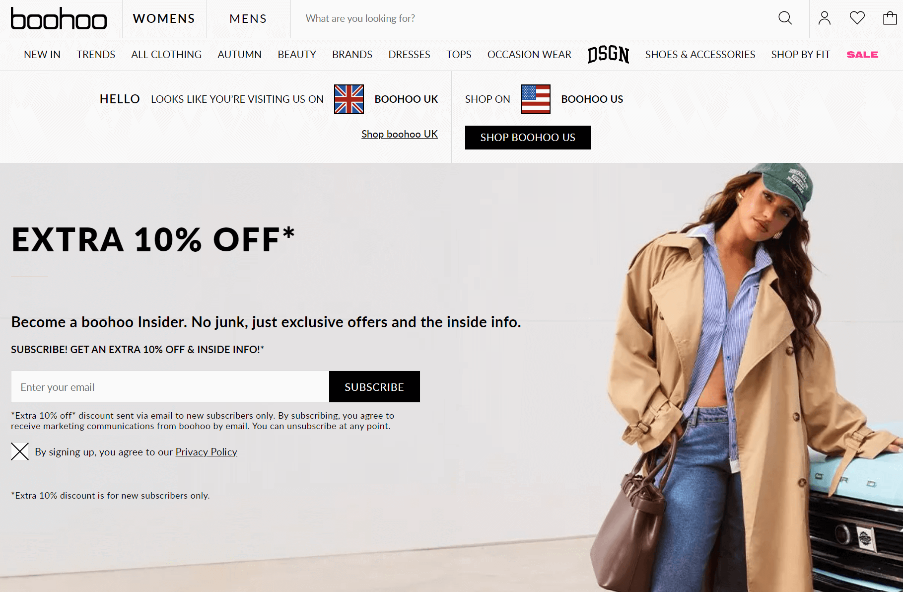
Scrolling down boohoo’s page also reveals a subscribe box in the footer to ensure the offer doesn’t go unnoticed:
Example 2: SaaS business
Shopify makes excellent use of squeeze pages to capture email addresses and initiate free trials. Here’s an example:
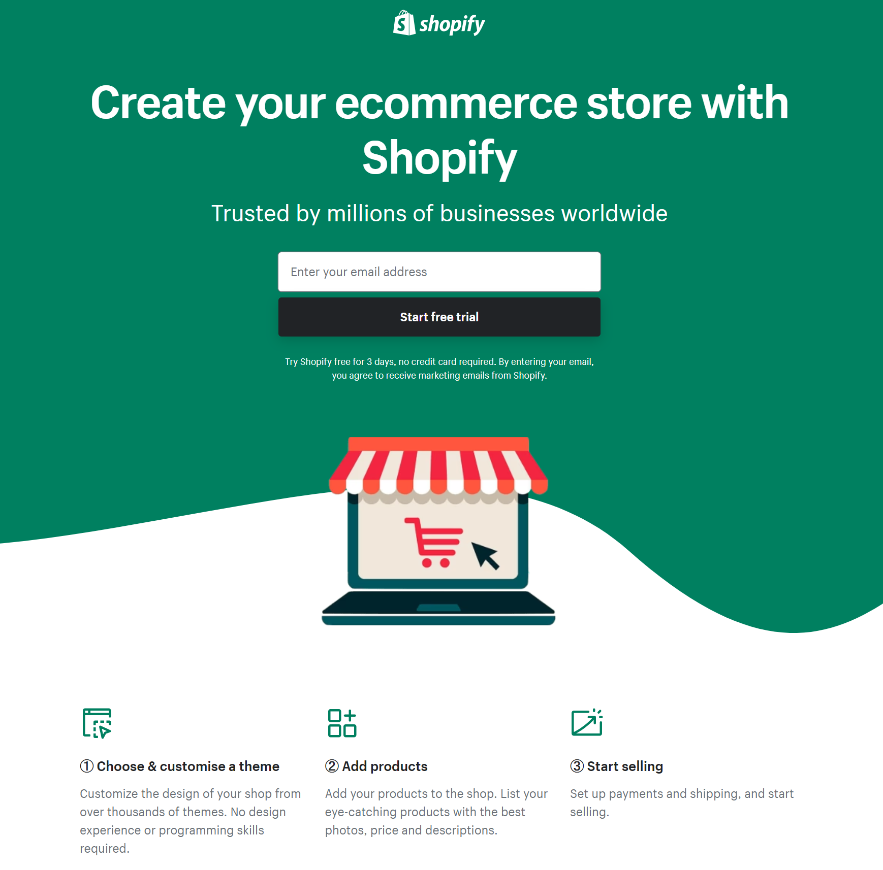
This squeeze page’s key strength is its prominent and eye-catching call to action, “Start free trial.” It encourages the user to take the next step in the conversion process, making it easy for them to start with Shopify.
The page also communicates the benefits of using Shopify to create an ecommerce store. It highlights the trust factor (“Trusted by millions of businesses worldwide”) and the ease of use (“No design experience or programming skills required”).
Example 3: Webinar signup page
Squeeze pages for webinars need to include more detailed information, such as the webinar topic, speaker credentials, and key takeaways, to compel visitors to sign up.
A fantastic example of a squeeze page that matches these criteria comes from Intel for its AI Developer Webinar Series:

Intel’s webinar squeeze page encourages signups with the prominent value proposition “Sharpen your AI skills on the latest in frameworks, optimization tools, and products with webinars by AI experts from Intel.”
There’s a clear call to action, a five-field form (with two dropdowns), detailed webinar descriptions, and credible presenters to encourage visitors to sign up.
Best practices for optimizing your squeeze page
Follow this six-step formula to optimize your squeeze page for signups:
1. Personalize the experience
Analyze your target audience’s demographics and interests to craft a message that resonates with their needs and desires.
Use relatable language, address common pain points, and highlight tailored benefits to create a compelling, audience-focused value proposition.
2. Create a sense of urgency
FOMO tactics, like limited-time offers and scarcity messaging, can dramatically increase signup rates by creating urgency and motivating your visitors to act quickly.
Use scarcity messaging such as “ONLY 10 LEFT!,” add countdown timers for limited-time offers, display real-time stock counters, and use ticking clocks for flash sales. Spotlight rapidly filling event slots with progress bars to create genuine scarcity and immediacy.
3. A/B test your page and forms
Continuously test different elements of your squeeze page, such as the headline, images, and form design. Identify the most effective combination to drive optimal conversions.
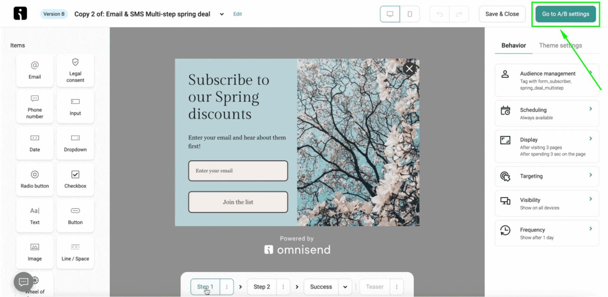
Omnisend’s A/B testing feature lets you test different form variations to identify the best-performing version and boost your conversion rates.
For instance, you could A/B test forms for copywriting, visuals, structure, timing, information collection, promotions, and gamification.
Here’s an example of the Omnisend form builder with A/B test settings:
4. Craft compelling copy
Create content that showcases your unique value proposition. Use emotive language to effectively address your audience’s pain points and emphasize your offer’s benefits, demonstrating how they directly solve your customers’ problems.
For example, if your customers want to save money, explicitly mention how subscribing will give them a 10% discount on their next order.
5. Optimize your CTA
Make your CTA button eye-catching and prominently placed. Use actionable, benefit-driven language that instills a sense of urgency in your visitors.
Experiment with different CTA variations to identify the most compelling phrasing and placement that drives visitors to convert.
6. Streamline your form
Keep your lead capture form simple and easy to complete. Limit the number of required fields to the bare minimum to minimize friction and increase conversion rates.
If your forms need more detailed contact information, consider using a multi-step form to improve user experience.
Join Omnisend to grow your email list with high-converting squeeze pages and forms
Quick sign up | No credit card required
TABLE OF CONTENTS
TABLE OF CONTENTS

Subscribe and don’t miss any updates!
No fluff, no spam, no corporate filler. Just a friendly letter, twice a month.