OFFER
OFFER


Email capture: Best tools, forms, and tactics for ecommerce
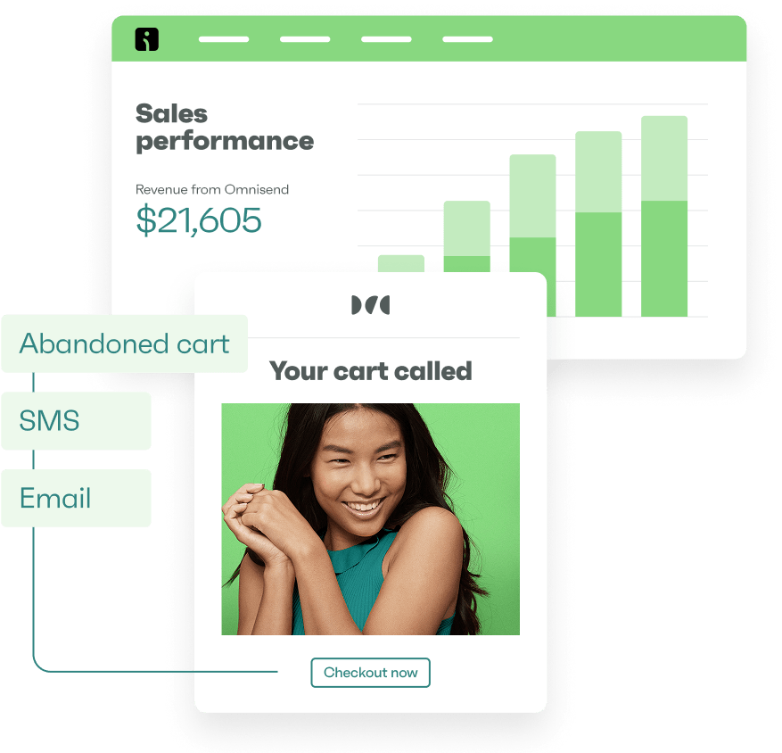
With over 130+ pre-built integrations and flexible APIs, you can easily centralize data from across your tech stack
Make the most out of your data and unlock powerful growth marketing possibilities with these other top marketing tools.
Build any custom integration with our open, flexible APIs that are simple to use and implement.
Check out apps that have been stealing all the spotlight.
Email and SMS marketing insights, ecommerce resources, and the latest Omnisend news
Expert-led sessions covering email, SMS, and ecommerce marketing strategies.
Educational video and live training to help you make the most out of Omnisend.
Drive sales on autopilot with ecommerce-focused features
See FeaturesThe best email signup form examples share one critical trait: they turn curious visitors into valuable leads within seconds.
Imagine landing on a sleek website, intrigued by what it offers, only to be stopped by a clunky, confusing signup form. It’s one of the fastest ways to lose a prospect and the revenue they could bring.
High-converting signup forms create seamless entry points, making the decision to subscribe feel intentional and worthwhile. That’s what makes them such a valuable part of your marketing stack.
Unlike social media followers who exist on borrowed platforms, email subscribers become part of your owned audience. They’re an asset that can directly impact your bottom line. Companies with optimized signup forms typically see higher conversion rates, which can translate into thousands in additional monthly revenue.
In this guide, you’ll get a curated breakdown of real-world signup form examples, what works, what doesn’t, and why. I’ll cover modern design practices, persuasive microcopy tips, and data-backed UX patterns that drive conversions.
Quick sign up | No credit card required
A signup form appears — often inline, sticky, or as a popup — on an ecommerce store or website to collect contact details from visitors who want to opt in. These forms typically request key information like a user’s email address, name, phone number, and sometimes additional details like preferences or demographics.
Businesses use signup forms to turn casual website visitors into leads they can engage with over time. These forms can appear in different formats, such as:
You’ll often see email signup forms on homepages, blog sidebars, in email capture overlays, or even during checkout. Visitors may provide their email in exchange for a welcome discount, account access, event registration, or entry into a giveaway. The goal is to grow your email list for email or SMS marketing.
Signup forms often trigger a confirmation email, especially when using double opt-in systems. This extra step validates the subscriber’s intent and helps reduce spam entries, ultimately improving email delivery rates. With a strong list, you can continue the conversation, build trust, and eventually convert subscribers into paying customers.
Not all email signup forms perform equally. High-converting forms share a set of proven characteristics that grab attention and deliver clear value. Here are the key elements to include:
Not sure how to get started? This video breaks down the essential elements every high-converting form should include:
Omnisend partnered with Organic Aromas to run a four-week list-building experiment. With just 60 minutes invested (15 minutes per week per form), the store captured 661 leads and 40 additional orders. The campaign required zero financial input, proving how minimal effort with smart execution can drive powerful results.
Organic Aromas achieved a 150% increase in newsletter signups using a single Omnisend popup with a 6.8% conversion rate.
Read the full case study here.
One of the best ways to improve your own signup forms is by analyzing real-world examples that are working right now. In this section, I’ll look at some of the most successful and thoughtfully designed signup forms of 2026 and break down what makes them successful.
I’ve curated a diverse mix across industries and form types, including popups, embedded fields, and gamified forms, to give you a wide range of inspiration. Each of these email signup form examples includes a quick teardown so you can see how it converts visitors into subscribers.

Tiny Rituals, a wellness and spiritual jewelry brand, uses a beautifully branded, multistep signup popup that appears 10–15 seconds into browsing. The signup form is visually engaging and on-brand, with a soft pink palette that reflects its brand color.
It includes a teaser message for visitors, saying they’ve earned a mystery discount, but asks them to first choose their intention among three options before revealing it. Once a visitor selects one, the form advances to the next step, presenting the discount and prompting them to enter their email address to claim it. They’re then guided through an additional step to confirm their phone number, streamlining both email and SMS engagement.
I love how this form turns a passive moment (a popup) into a fun, interactive experience. By adding mystery and a reward element, Tiny Rituals removes friction and brings in engagement without feeling salesy.
Want to create something similar? Here’s a detailed explanation of how to create a two-step signup form for WooCommerce:
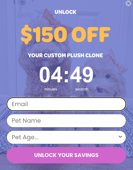
Email signup form examples that combine high-value incentives with urgency are often top performers, and Cuddle Clones nails this approach. The popup form appears with a bold message offering $150 off and includes a live countdown timer, urging visitors to act fast.
The form includes three fields: email, pet name, and your pet’s age, which helps to personalize the experience. This extra input feels relevant and intentional, given that Cuddle Clones creates custom plush replicas of people’s pets.
I love that the form asks boldly for a bit more information but balances it out with a massive discount while emphasizing urgency. It speaks directly to pet lovers and uses urgency the right way without overstepping.
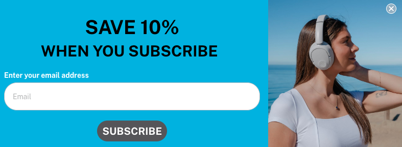
Email signup form examples don’t always have to be bold or in-your-face, and JLab proves that with a clean, subtle slide-out form. As users scroll down the page, a signup form rolls out gently from the bottom right corner, grabbing attention without interrupting the browsing experience.
The form is fully branded with JLab’s signature blue and includes a crisp product image for visual appeal. The message is short and effective: “Save 10% when you subscribe.” It asks only for the visitor’s email, which makes it a low-friction entry point for first-time customers.
Compared to most signup examples, I love how this flyout form feels helpful rather than intrusive. The inclusion of a product photo adds a bit of contextual relevance, showing what’s in store for new subscribers.
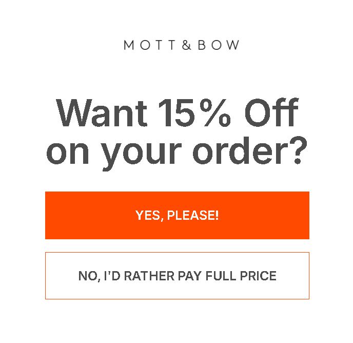
Mott & Bow, a premium apparel brand, uses a clever yes/no offer gate popup to segment user intent and gently introduce an offer. As visitors scroll through the site, the popup appears and asks: “Want 15% off on your order?” Two buttons are presented — yes or no.
If the user clicks yes, they’re shown a simple follow-up form asking only for their email to gain the discount. If they click no, the email popup disappears, and they continue browsing uninterrupted.
I love the psychological approach here, asking a direct question that prompts a micro-decision. The yes/no format adds a layer of interactivity that feels intuitive and user-driven.
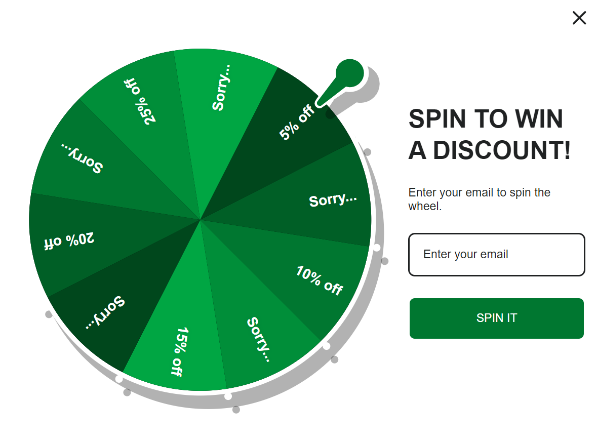
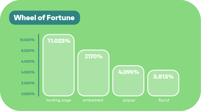
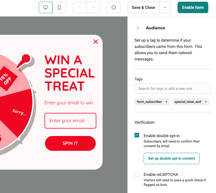
If you’re looking for email signup form examples that use gamification well, this is a textbook example signup form to model. Rosebud’s, an organic food brand, uses a vibrant Wheel of Fortune popup style that appears as visitors scroll through the site, inviting users to spin to win a discount.
You need to first enter your email address to play. Once submitted, users can spin for a chance to win between 5% and 25% off their order. The wheel design gives the form a game-show feel while keeping the process simple and engaging.
I was impressed by the form’s ability to turn a simple signup process into a fun experience. That fun little moment turns visitors into active participants, which is a smart way to make the signup feel less transactional.
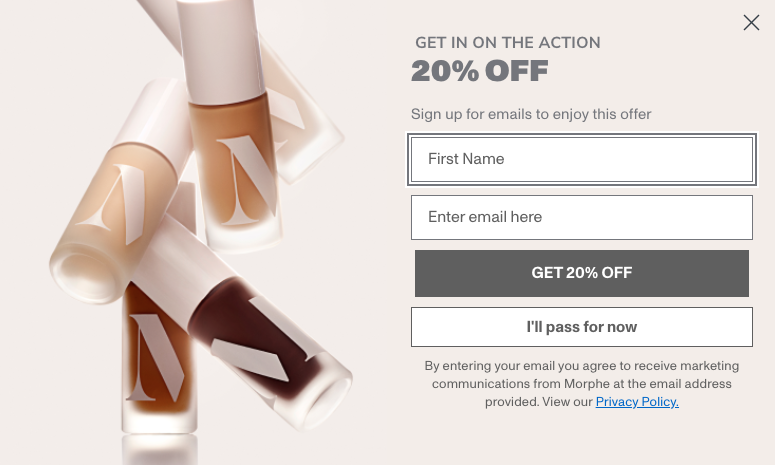
This is an email signup form example that uses timing and tone to full advantage. Morphe, a cosmetics brand, triggers a delayed popup that appears after a visitor has been on the site for a short while, without requiring any scrolling or clicks.
The popup headline is bold: “Get in the action,” followed by a tempting 20% off offer when users sign up with their name and email. Visitors can also choose to pass — a subtle, branded way to close the form without pressure.
I like how Morphe lets its personality shine through the copy while offering a solid incentive. The passive trigger respects the user’s space, but the energy of the message pulls them in.
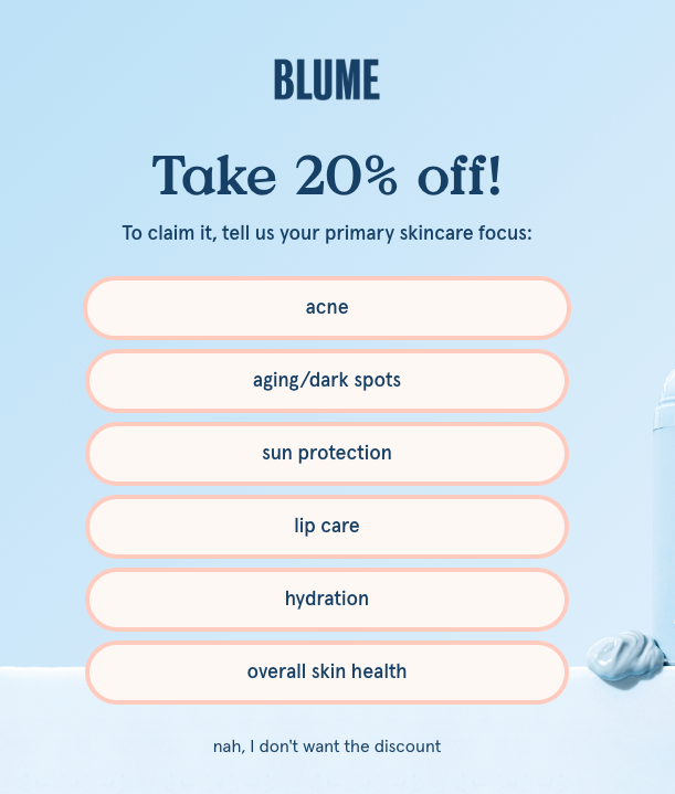
This is an excellent multistep signup form example that smartly blends instant engagement with personalization. Blume, a skincare and wellness brand, launches an instant popup when users land on the site. It grabs attention with the headline “Take 20% off.”
But before requesting their emails, the form asks users to choose their primary skin focus, with options such as hydration, acne, and others. Only after a selection is made does the second step appear, requesting an email address to reveal the discount.
Blume uses a multistep popup to collect emails and preferences, inviting users to personalize their experience from the start. It’s a subtle but smart move, tailoring recommendations while signaling that relevance matters more than speed.
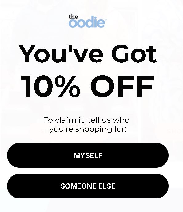
Signup form examples can show how segmentation can start right at the first interaction. The Oodie, known for its wearable blankets, greets visitors with a short, interactive quiz-style popup.
The form begins by asking a simple question: “Who are you shopping for?” with simple answers like “Myself,” or “Someone else.” After responding, they’re taken to the second step, where they’re invited to enter their email to get a 10% discount.
What stood out to me was how The Oodie turns a basic form into a micro-quiz. It’s a light lift for the visitor but gives the brand powerful segmentation data. Plus, it makes the user feel like they’re part of a journey, not just a marketing funnel.
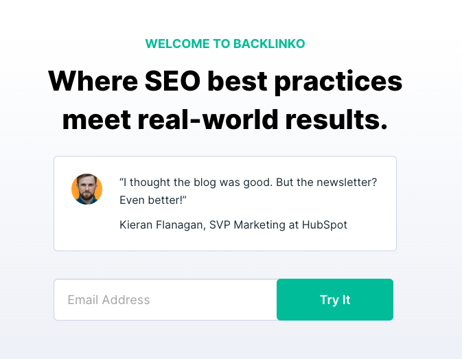
This is one of the signup form examples that shows how powerful social proof and placement can be when done right. Backlinko, a well-known SEO brand founded by Brian Dean, places an embedded email signup form right at the top of its homepage, where it’s immediately visible.
The form starts by offering a warm welcome, followed by a short, glowing review that highlights how valuable the newsletter is. Beneath that is a single email field and a straightforward CTA button that invites visitors to “Try it.”
What makes this form so effective is how Backlinko leads with credibility. By combining a testimonial with prime placement and a frictionless form, it builds trust instantly. You feel like you’re signing up for something people already love, not taking a gamble.
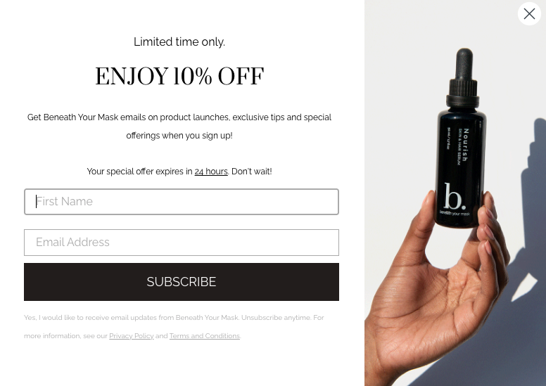
Among the more visually polished email signup form examples, Beneath Your Mask stands out with its form that features an animated GIF. As the form appears, it cycles through subtle animations of the product line, drawing attention while keeping the experience relaxed.
The messaging invites visitors to subscribe and offers 10% off as a thank-you for signing up. To claim it, visitors have to enter their name and email, a modest ask in exchange for joining the community.
I appreciated how the product visuals elevate the brand experience. The soft motion draws the eye without distracting from the message.
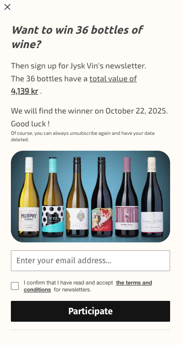
This is a classic yet effective email signup form example that uses a compelling incentive to drive conversions. When visitors land on the Jysk Vin website, a Danish wine retailer, they’re greeted with a left-side popup that grabs attention by asking visitors if they “Want to win 36 bottles of wine.” That’s a powerful hook.
The form invites users to join the newsletter to enter the giveaway. It keeps things simple by requesting just an email address, lowering friction and maximizing opt-ins.
A standout feature here is how direct and attractive the offer is. A chance to win 36 bottles is eye-catching, and placing the popup on the side feels less intrusive than a center-screen modal.
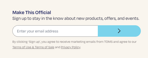
Another fine option on this list of signup form examples is this clean and unobtrusive form in the footer of the TOMS landing page. The form invites visitors to sign up to stay updated about upcoming products, offers, and events, which keeps the value proposition broad and brand-relevant.
Despite being a Shopify store, it uses a minimalist signup form design with only an email address required. Plus, it includes a clear link to the terms of use to support transparency.
I appreciate how subtle yet effective this form is. It doesn’t rely on flashy graphics or popups, it’s just included in the footer, always available to users who are ready to engage. It respects user intent, especially for visitors who scroll all the way down looking for ways to stay connected.
If you’re ready to create a Shopify signup form for your store, you can follow these comprehensive steps:

This is one of the signup form examples that offer information in exchange for an email. Positioned near the bottom of the page, the popup promotes a free educational guide, a resource designed to educate visitors who are likely curious about their health.
Rather than pushing discounts or offers, Mira leads with information. That helps to build credibility and aligns with the brand’s mission to help people better understand their fertility. The design is clean, inviting, and consistent with Mira’s brand tone. There’s a single field asking for your email, keeping the form extremely simple to complete.
I love the fact that you’re not being sold to, you’re being offered something helpful without needing to make a purchase or commitment. It feels like a brand that wants to support your learning, not just grow its list.
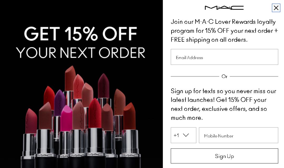
This signup form example pops up prominently at the top of the MAC Cosmetics website, offering a clear and compelling incentive — 15% off the next order. But it doesn’t stop there. It cleverly ties the offer into MAC’s Lover Rewards loyalty program to encourage longer-term engagement.
The form is flexible, giving users the option to sign up with either their email or mobile number. It also clearly outlines the perks of joining: special offers, early access to product launches, exclusive offers, and ongoing rewards.
It’s refreshing to see how MAC makes the loyalty program the centerpiece of the offer. It’s not just about a one-time 15% discount, but forming a lasting relationship with the brand.
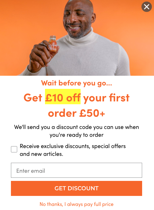
The Turmeric Co., known for its functional turmeric shots, uses a sharp, brand-colored exit-intent popup to catch departing visitors just in time. The form triggers when the user moves their cursor toward the browser bar, an indication they’re about to leave the site.
The offer is simple and direct: £10 off your first order over £50. The signup form design uses the brand’s signature yellow and deep orange palette to visually pop. Only one form field is requested (email), and there’s a small checkbox inviting users to opt in for additional perks like new article alerts and special offers.
I like how The Turmeric Co. captures attention the moment a visitor is about to leave. The timely offer feels like a last-minute gift, and the optional checkbox lets users control their preferences.
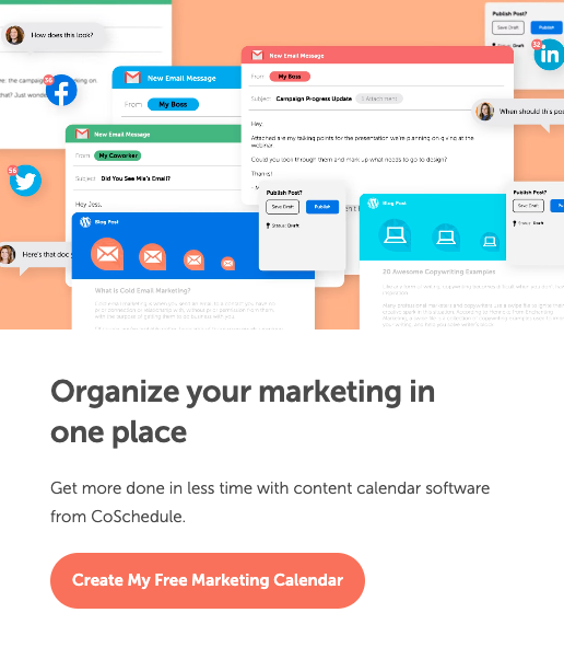
Signup form examples don’t always need flashy discounts or spin-to-win wheels to convert. CoSchedule proves that a strong value proposition and purpose-driven CTA can be just as compelling. Its embedded signup form appears right on the homepage and focuses on solving a clear pain point — marketing.
Instead of a traditional “Join now” or “Subscribe” button, the form features a highly specific CTA — “Create My Free Marketing Calendar.” It’s clean, minimal, and aligned with the brand’s straightforward tone.
The form doesn’t distract, it informs. As a visitor, I instantly understand what I’m getting and why it’s valuable. It’s a form built around a benefit-first design, which makes it a powerful example of how to convert interest into action without needing incentives.
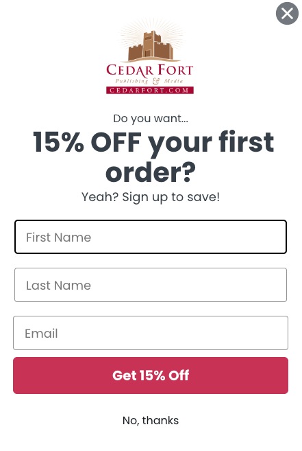
If you’re looking for signup form examples that are both brand-consistent and persuasive, Cedar Fort offers a great one to model. As a publishing company, Cedar Fort uses a popup that blends clean design with clear messaging.
The form appears shortly after a visitor lands on the site and features the company’s logo at the top. It requests three fields: first name, last name, and email. There’s also a polite opt-out option with a clear “No, thanks” link, for visitors who are not interested in the offer.
One detail I appreciated was how this form uses casual, friendly language while still delivering a strong value proposition. Plus, the 15% off offer is a solid incentive, strong enough to motivate action.
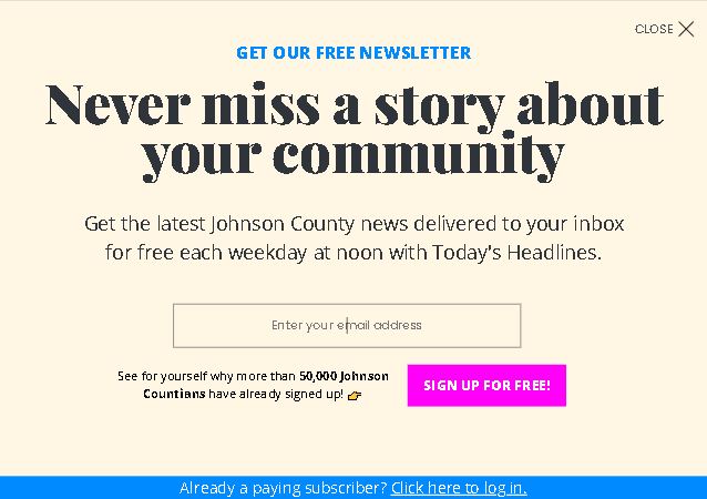
that prioritize relevance tend to stand out, and this one from Johnson County does just that. The design is simple and straightforward, without flashy graphics or distracting elements. What makes it stand out is its tone and intent.
The message is focused on keeping locals informed with weekday headlines. There’s a single field asking only for your email address, so subscribing is quick and friction-free.
There’s something clever about how this form doesn’t try too hard. It knows its audience and speaks to them with clarity. The mention of tens of thousands already subscribed makes visitors feel part of a larger community, not just a name on an email list.
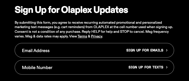
This is one of those signup form examples that’s straightforward and transparent. Olaplex uses a clean, minimal on-page form that gives users the option to subscribe to both email and text updates.
What makes it stand out is how clearly it communicates what you’re signing up for, including how often messages are sent. The form also describes what kind of content you’ll receive, and even how to opt out. Visually, the layout is simple and easy to scan. Nothing flashy, but very user-focused.
You feel respected as a user since the form doesn’t bury details or hide behind incentives to collect data. Instead, it gives you space to decide how (or if) you want to hear from the brand, which makes the entire experience feel less like a marketing grab.
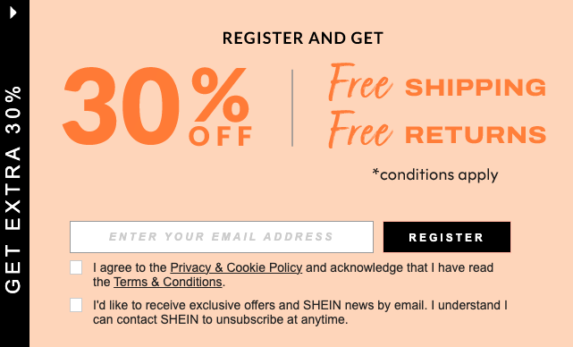
If you’re looking for signup form examples that can convert with irresistible incentives, Shein’s welcome popup form is a classic example. As soon as a first-time visitor lands on the site, a bold side popup appears offering 30% off, free shipping, and free returns, all clearly listed to create instant interest.
The form is straightforward: enter your email, check a couple of boxes to agree to terms and consent to receive marketing emails, and you’re in.
This form makes a strong first impression in that it feels like you’re getting a deal just for showing up. It rewards your interest without demanding too much in return, just an email address. Plus, it gives you the power to choose your preferences.
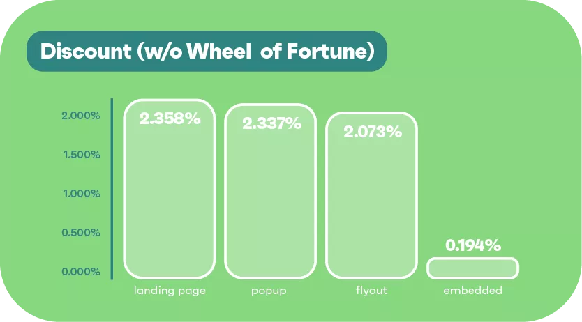
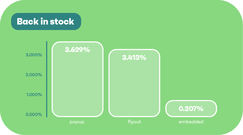
Based on Omnisend’s signup form statistics, certain form types consistently convert better than others, especially when paired with the right features. As such, you need to choose the right type of email signup form for your business, as this can impact your list growth.
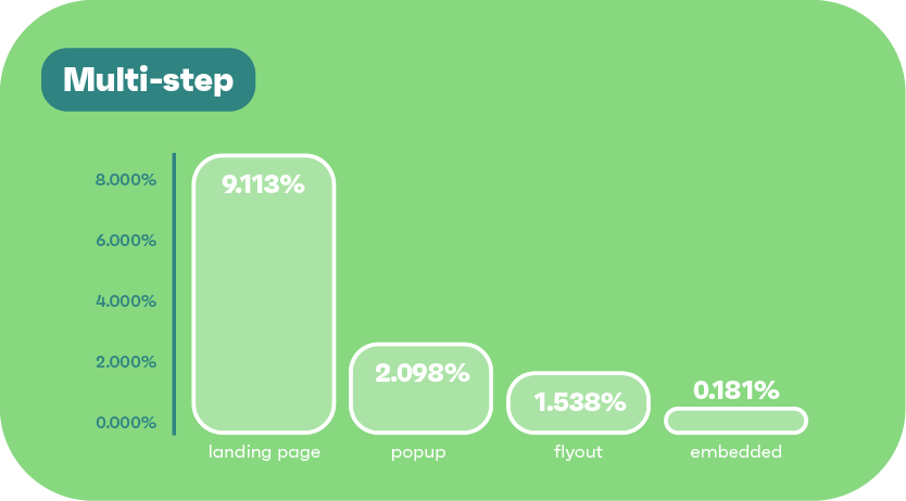
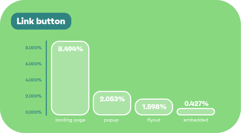
According to Omnisend’s data, landing pages maintain consistently strong form conversion rates across devices:
In contrast, popups and flyouts perform moderately but trail behind, while embedded forms are the lowest performers across all devices.
| Display type | Desktop signup rate | Mobile signup rate | Tablet signup rate |
|---|---|---|---|
| Landing page | 7.47% | 8.24% | 9.04% |
| Popup | 1.18% | 2.53% | 2.54% |
| Flyout | 1.18% | 2.21% | 2.31% |
| Embedded | 0.12% | 0.17% | 0.17% |
Let’s explore the step-by-step process you need to follow to create a signup form using Omnisend. Even if you use a different tool, these steps will give you a general idea of the process and important settings to focus on:
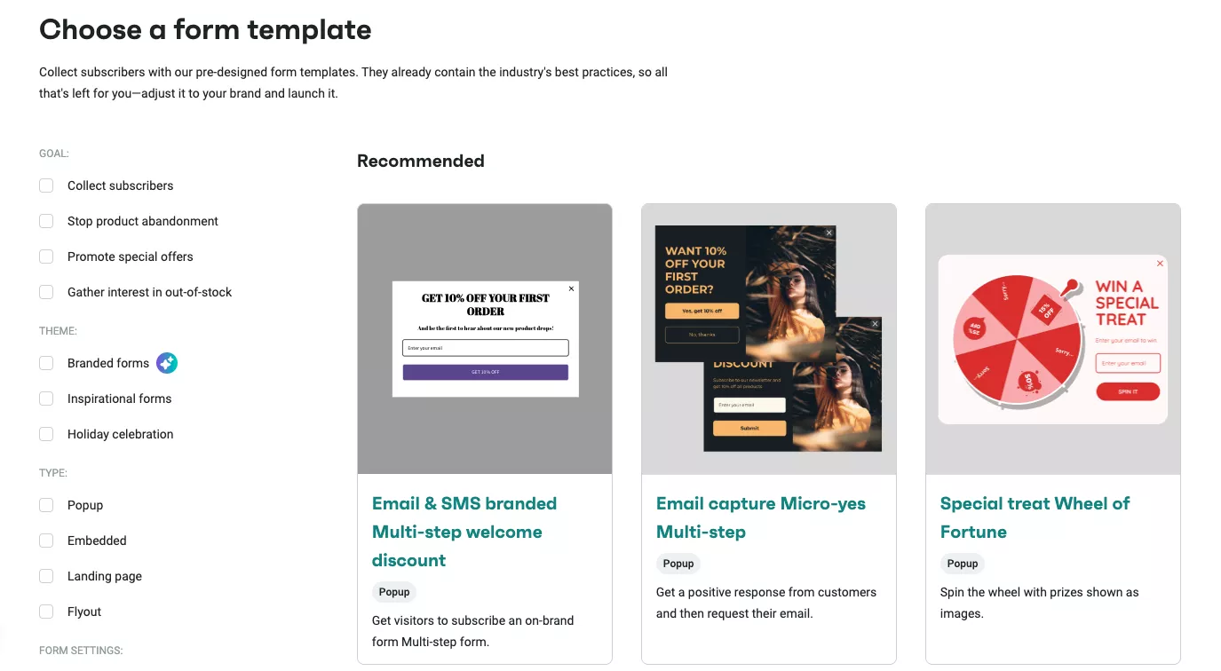
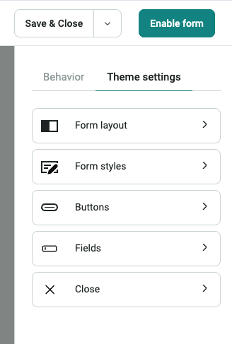
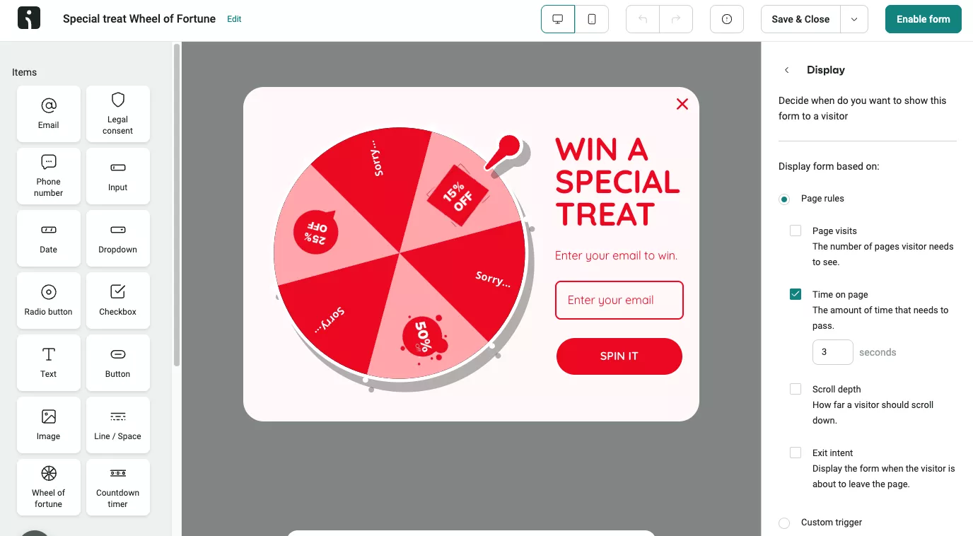
You can control:
Omnisend even lets you create mobile vs. desktop versions or preview how the design adjusts responsively.
Want to grow your email list fast? In this step-by-step video for beginners, you’ll learn exactly how to create high-converting signup forms using best practices and real examples:
A high-converting signup form is, of course, a nice-to-have feature, but don’t underestimate how powerful it is in turning visitors into loyal customers. From clear value propositions to smart design, every detail matters in getting more people to sign up.
Now that you’ve seen what works from top email signup form examples, it’s time to put these insights into action. It doesn’t matter if you’re building your first signup form or optimizing an existing one, as small professional changes can lead to big results.
Focus on delivering real value and keeping the experience seamless. With the right strategy, your signup form will help you build a real connection with your audience.
Quick sign up | No credit card required
A signup form can have as many fields as possible, but it’s advisable to stick to just one or two, such as name and email. Many high-performing signup form examples use only a single email field and introduce additional fields later through email or user profile updates. The goal is to reduce friction and make it quick for users to complete.
A strong conversion rate for email signup forms typically ranges from 1.95% to over 5%, depending on the industry, offer, and placement. Using best practices like a clear CTA, mobile-friendly design, and trust signals can push your form performance well above average.
Placement can impact the performance of your signup form. High-converting signup form examples are often placed in the header, as exit-intent popups, or within high-traffic blog content. Strategic timing and visibility ensure the form captures attention without interrupting the user journey.
Absolutely. Reviewing proven signup form examples from successful brands is a smart way to learn what works. These examples can guide your layout, messaging, and user flow to improve results.
TABLE OF CONTENTS
TABLE OF CONTENTS
What’s next


No fluff, no spam, no corporate filler. Just a friendly letter, twice a month.