OFFER
OFFER


How to optimize WooCommerce product image size
With over 130+ pre-built integrations and flexible APIs, you can easily centralize data from across your tech stack
Make the most out of your data and unlock powerful growth marketing possibilities with these other top marketing tools.
Build any custom integration with our open, flexible APIs that are simple to use and implement.
Check out apps that have been stealing all the spotlight.
Email and SMS marketing insights, ecommerce resources, and the latest Omnisend news
Expert-led sessions covering email, SMS, and ecommerce marketing strategies.
Educational video and live training to help you make the most out of Omnisend.
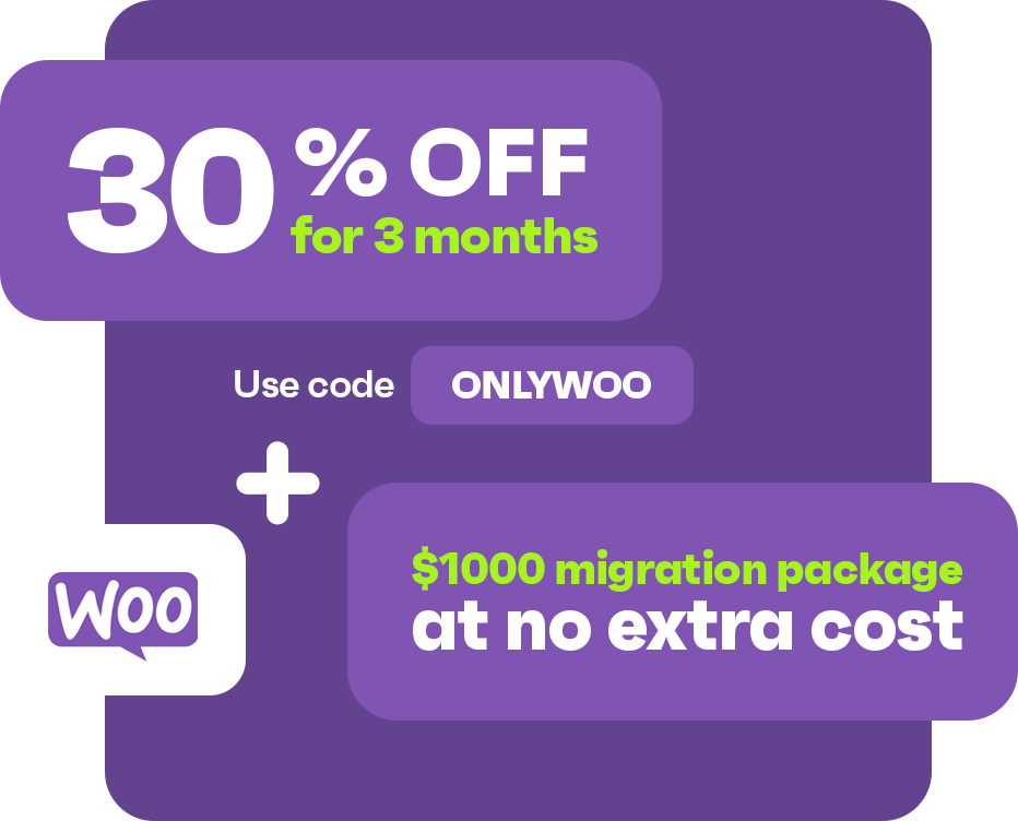
Get better email & SMS marketing made for WooCommerce for 30% off PLUS a bonus migration package valued at $1,000
Use code to get 30% discount COPIED ONLYWOO
Drive sales on autopilot with ecommerce-focused features
See FeaturesGreat WooCommerce stores prioritize intuitive design, ensuring customers can easily navigate and find products without clutter.
A mobile-optimized experience is crucial, as a significant portion of online shopping now occurs on smartphones, demanding fast loading times and responsive layouts.
High-quality visuals, including sharp product images and engaging videos, enhance customer trust and encourage purchases by making products feel more tangible.
Effective marketing integrations, such as automated emails and personalized messaging, are essential for converting one-time visitors into loyal customers.
WooCommerce stores are getting more creative, from bold layouts to product pages that capture your attention with storytelling. With so many brands using WooCommerce to build beautiful, high-performing stores, it’s easier than ever to find inspiration for yours.
Whether you’re interested in design, functionality, or conversion-focused features, we’ve got the best WooCommerce store examples. You can get really creative with this platform.
In this roundup, you’ll see 30 visually appealing examples of WooCommerce sites. Then, you can apply these features to your WooCommerce store.
Quick sign up | No credit card required
Besides offering the best WooCommerce themes, a great store creates a hassle-free and enjoyable shopping experience for customers. In fact, the best stores have the following important features that steadily drive conversions:
Now you know what makes certain stores stand out among others. Let’s discuss the 30 best WooCommerce websites examples you can draw inspiration from in 2026, no matter if you’re building your store or upgrading it.
Let’s look at some of the best WooCommerce website examples in the beauty industry.
Sodashi’s homepage is clearly built around a single hero image, focusing on giving visitors a sense of its unique style rather than trying to communicate any specific information about the brand or products.
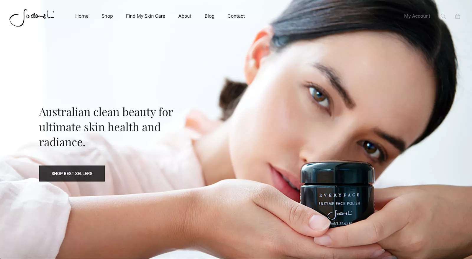
The main challenge that comes with this type of design is determining how to balance the image itself against other elements. Sodashi does a good job of highlighting the main image without distracting visitors from the rest of the site. The logo and menu items at the top-left and center of the page contrast well against the light background while maintaining the brand’s minimalist color palette.
On the other hand, it’s much easier to miss the “My Account,” search, and cart buttons in the upper-right corner. Its team went with a gray color for those elements instead of the black it used for the rest of the text — most likely due to the contrast with the model’s dark hair.
Kane NY sells luxury skincare products. Its homepage showcases its flagship product, Serum Savant, using an aqua color box that contrasts with the store’s orange tones. This way, the product is more visible.
It quickly builds trust with its About page that tells the story of its founder, Dr. Michael Kane, a renowned plastic surgeon.
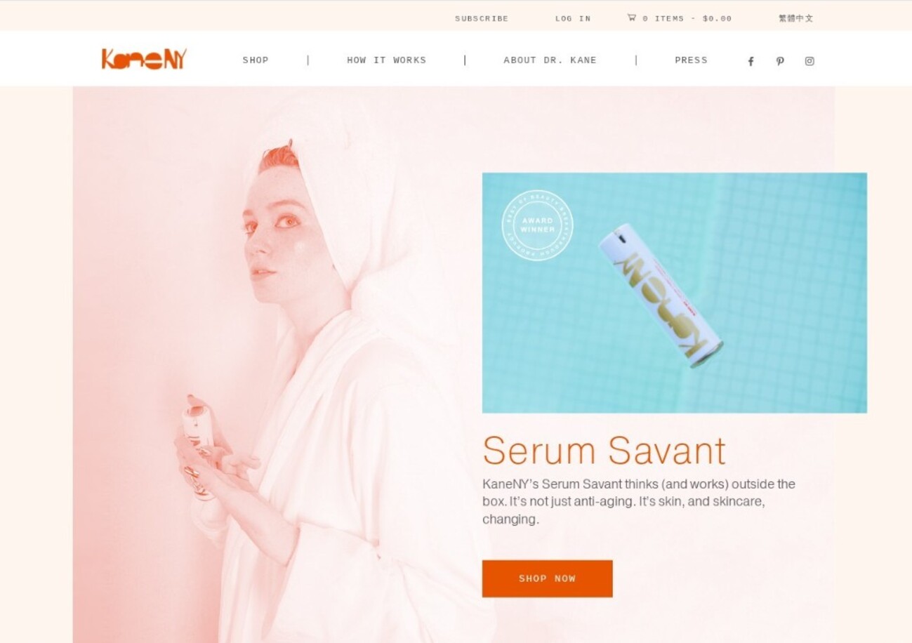
The product page takes an educational approach by explaining the science behind the product. This ensures potential customers know exactly what they’ll apply to their skin and what results to expect.
The overall store layout is simple and easy to scroll through. Also, the CTA buttons contrast with the store’s color palette.
MAHALO Skincare sells facial beauty products, targeting skin inflammation, premature aging, and environmental damage.
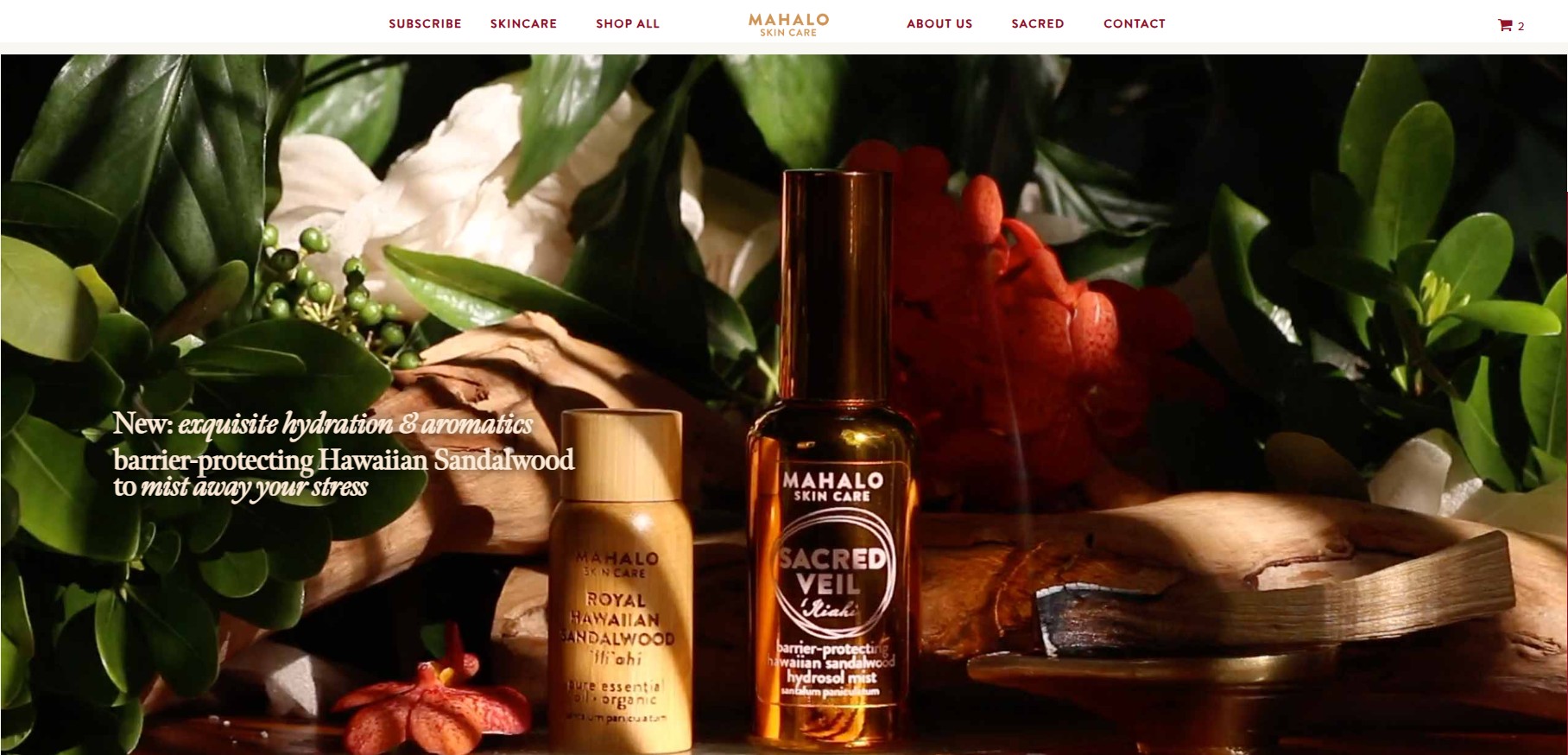
Its online store uses rich photography and earth tones, mirroring its bamboo product packaging. Also, it shows several videos of the production process, helping build consumer trust.
MAHALO Skincare stands out among the best WooCommerce store examples as it features customer reviews on product pages. It also includes a CTA, “Add to cart,” below each product, allowing customers to quickly pick items.
If you’re sending products as a gift, it offers gift wrapping at an extra cost. The brand ensures a great unboxing experience for the receiver.
Karmin Professional is a beauty brand that offers a variety of hair products, including straighteners, dryers, clippers, and curling irons.
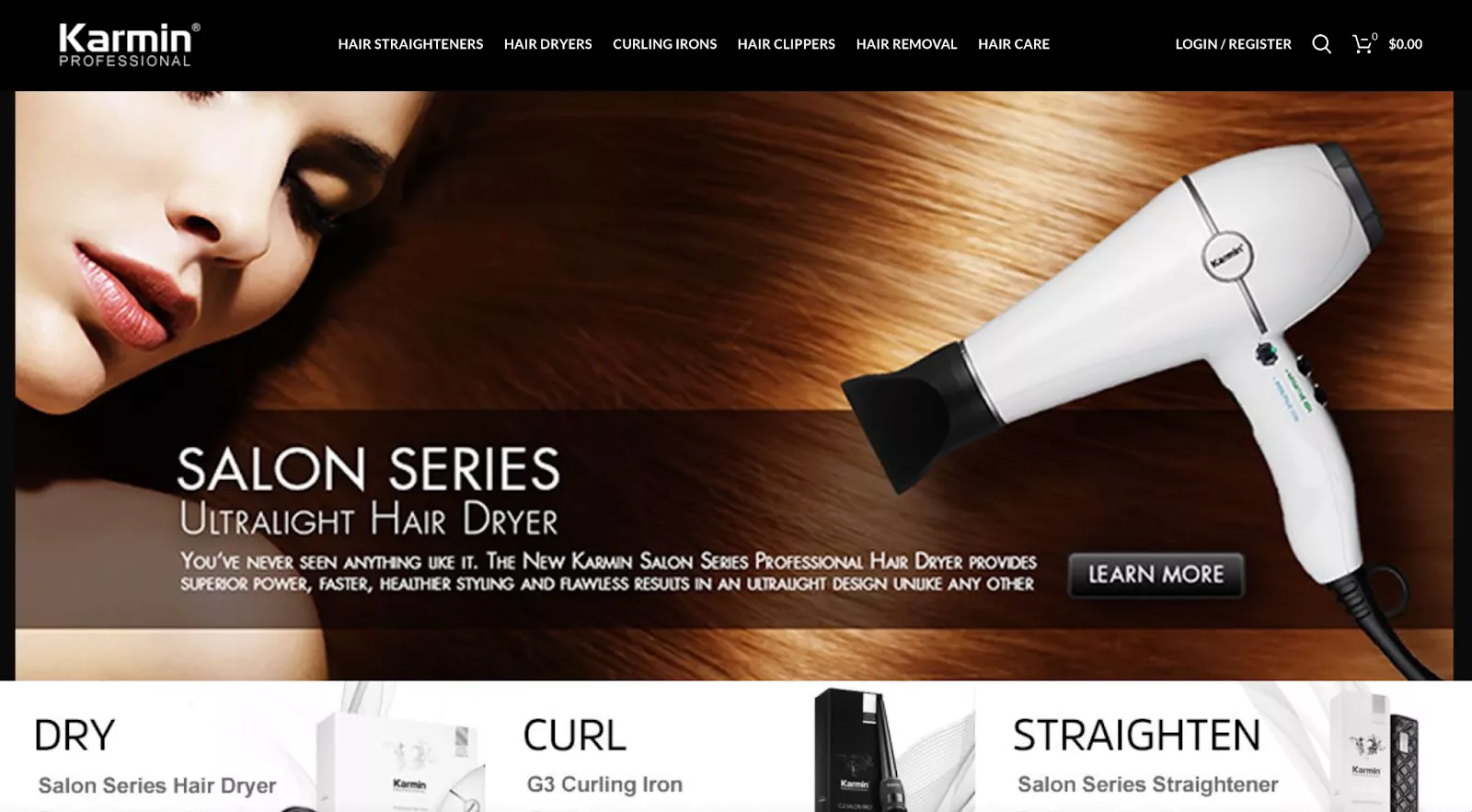
This WooCommerce store is clearly divided into categories for each sort of product, with a centerfold image highlighting one of their most popular items.
This layout makes it easy for visitors to find exactly what they’re looking for without wasting time. However, we noticed some issues with image quality, as certain product photos have lower resolution than others.
This WooCommerce store offers high-quality wet shaving essentials for both men and women. This includes creams, razors, brushes, oils, and soaps.
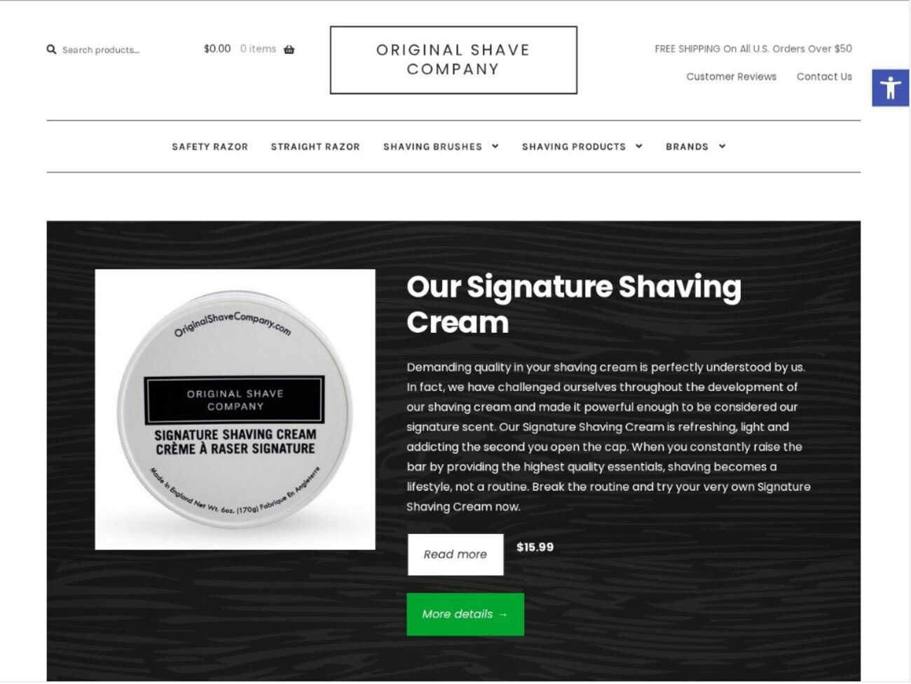
The Original Shaving Company’s website features a monochrome design that’s easy on the eyes. The store is also gender neutral, attracting both male and female shoppers.
Its products are neatly arranged in categories on the hero page. It also showcases its signature shaving cream to immediately show value. However, the brand uses two CTAs that both take you to the same page.
Clothing is certainly one of the most popular ecommerce industries, and here you’ll find some of the best WooCommerce site examples in that category.
Gentlewench is a fashion boutique known for its curated collections of clothes, accessories, and homeware from brands like Zanini, Adam Ross, and Peter Do.
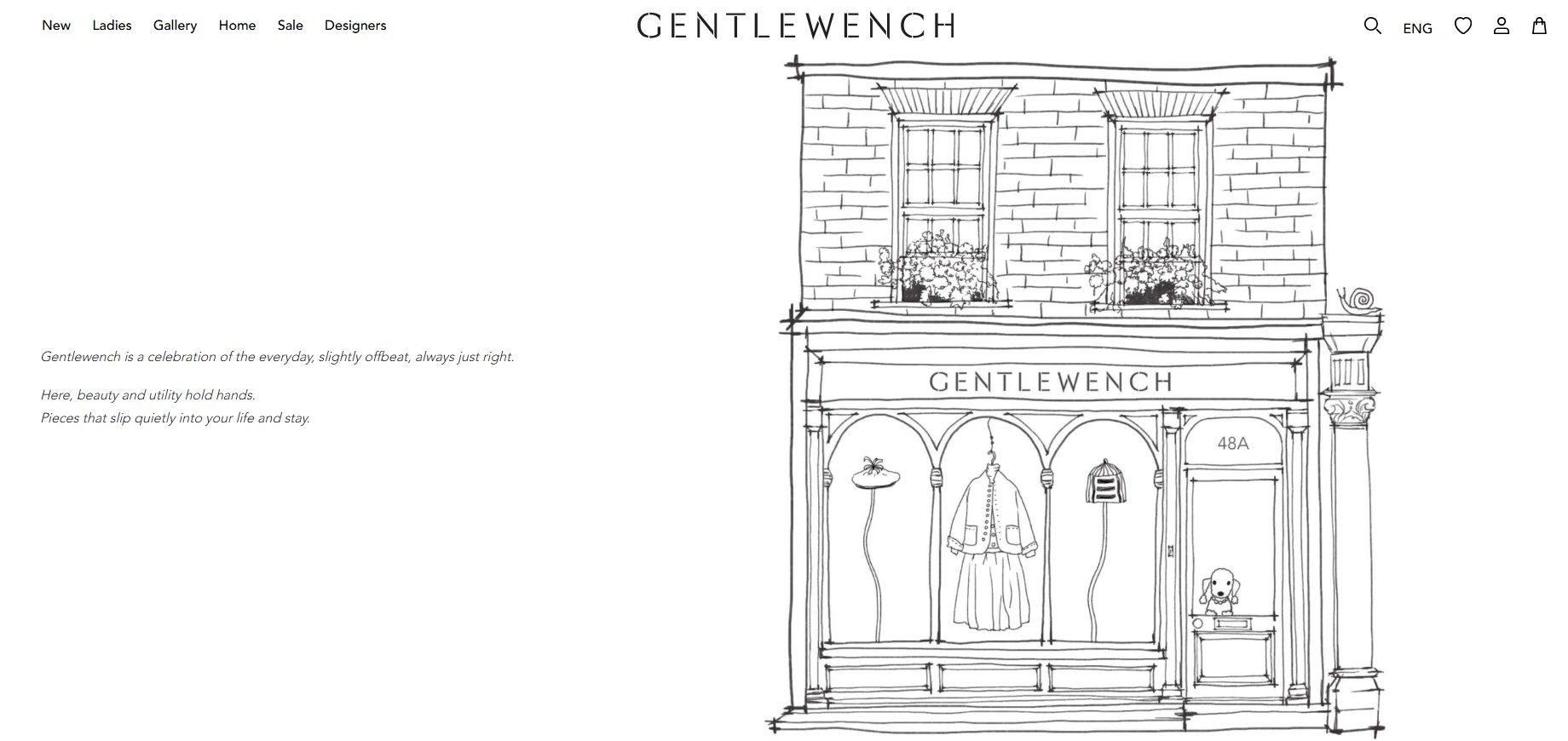
It’s among the top WooCommerce store examples with a monochrome design. This makes the store simple but polished. The varying colors of the products in the store add a hint of color to the black and white scale.
What stands out is the heavy use of white space on its product pages, which showcases minimalism and makes every aspect of product design clearly visible.
Nord Republic is a footwear brand that specializes in minimalist sandals. Its hero page includes a slideshow that positions it as a store for adventurers and travelers who value freedom over convention.
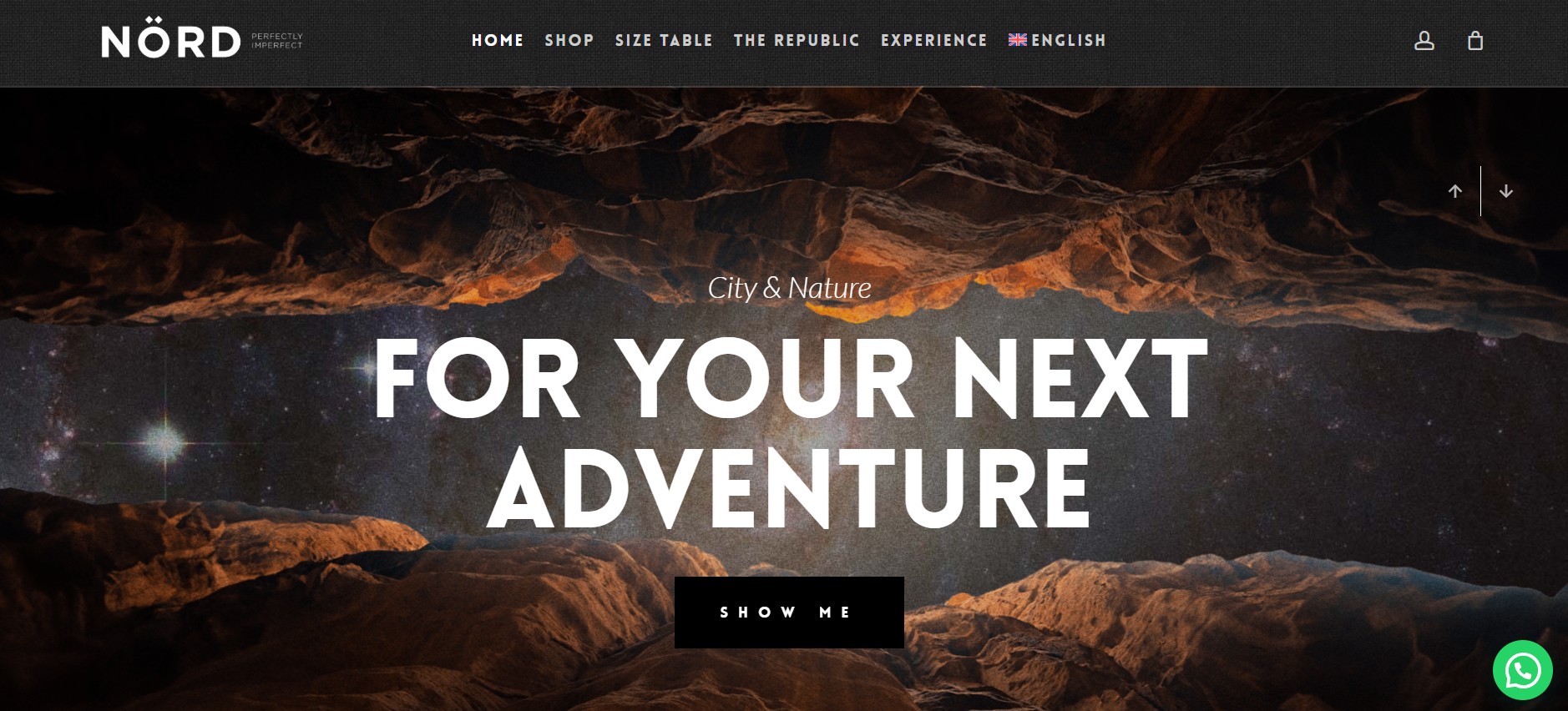
This WooCommerce store nails a clean, minimal aesthetic with elegant typography. With a compelling CTA that says, “Show me,” customers won’t think twice before clicking.
Also, the store strategically positions its WhatsApp button, showing customers that the brand is accessible.
Another important feature of this store is the size table. It serves as an essential guide for buying footwear, for which many shoppers have doubts about purchasing online.
Nighthawks is a multi-brand retailer carrying labels like Sunsea, Salomon, Euer, and Omar Afridi.
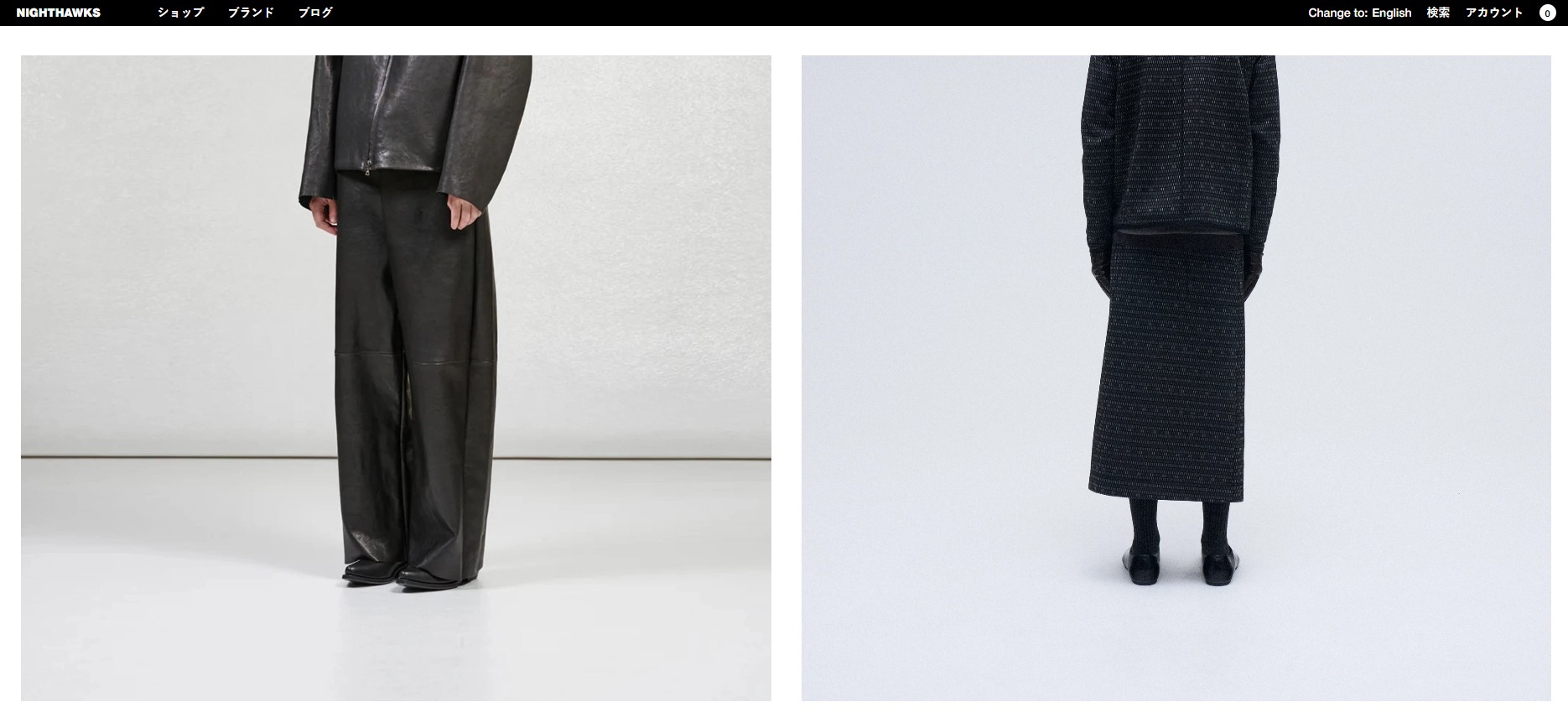
This WooCommerce store allows you to filter your product search by color, categories (jackets, bottoms, shoes), brands, and price. It helps you navigate a wide range of high-end clothing.
It uses a minimal design with rich photography. The product images are crisp with no distractions. However, the store’s language doesn’t automatically change to English.
It also has a mobile-friendly user interface, so customers don’t have to scroll too much when viewing the page.
This knitwear brand blends innovation with sustainability and high-performance yarns. The “New Collection” section leads to the product page, sampling key pieces.
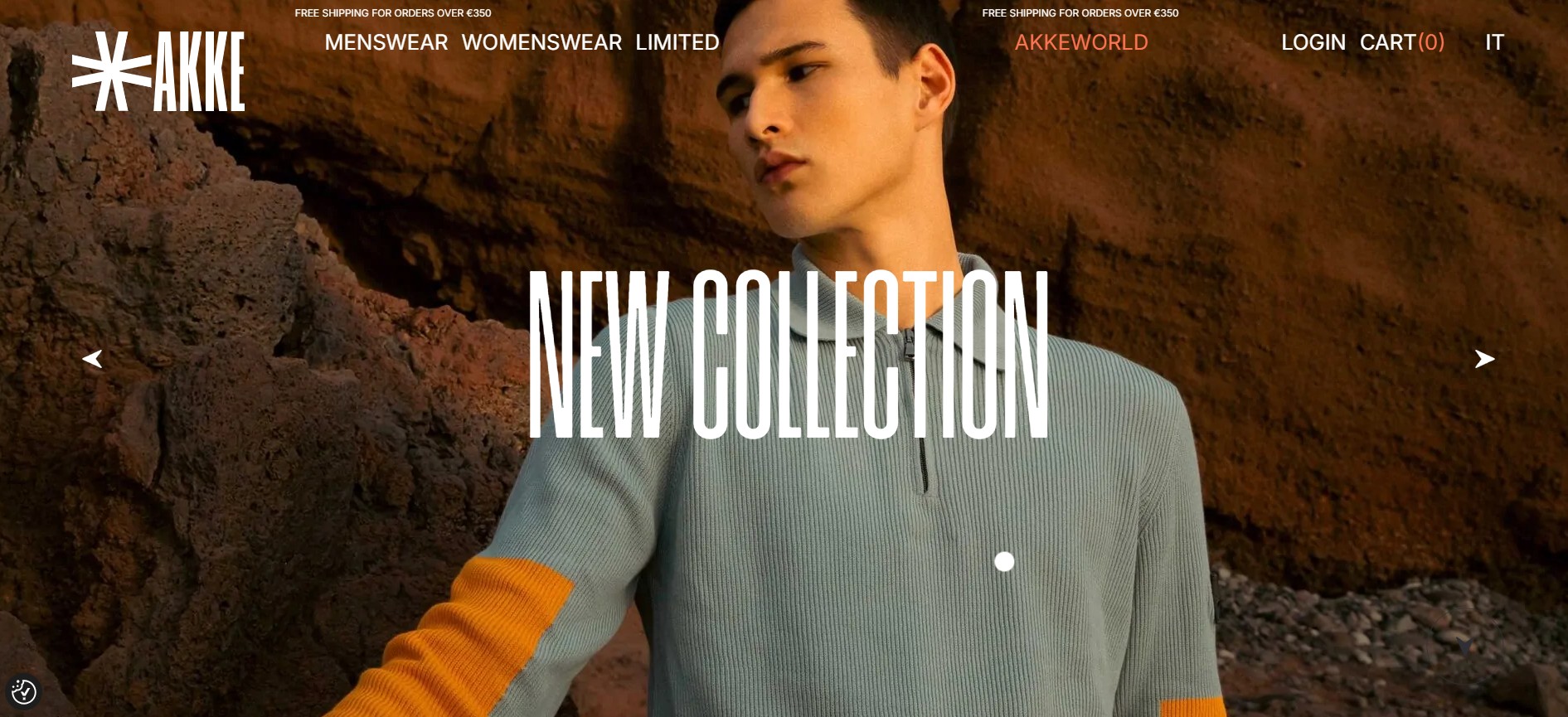
The shop page shows a wide variety of sweaters, tees, and knits with pricing and CTAs saying, “Discover me.” It’s worth mentioning that this store has a pointer, which makes each click or movement on the screen interactive.
Additionally, the navigation between men’s and women’s collections is intuitive. Its “Akke World” page highlights its innovation and sustainable production methods.
Goshopia is an online clothing store selling fashion and accessories for women. It’s focused on what it describes as its “three Ss”:
Those key points are reflected in the hero image, which is actually the preview for a video. Clicking play reveals a short clip of founder Araceli Gallego, explaining what the store offers and reiterating those important core values.
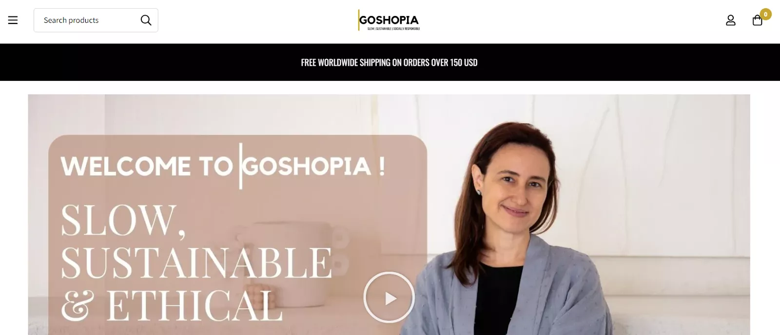
While some sites have a background video, an embedded clip with sound is certainly an unconventional choice. However, it gives the brand a personal edge, highlighting the real person behind the products and the story that sets them apart.
These WooCommerce examples of accessories sites can help inspire your own — just take note of their hits, duplicate them, and avoid their misses.
NEWTWIST is a designer jewelry store that sells handcrafted pieces from artisans like Jamie Joseph, Melissa Joy Manning, and Rene Escobar.
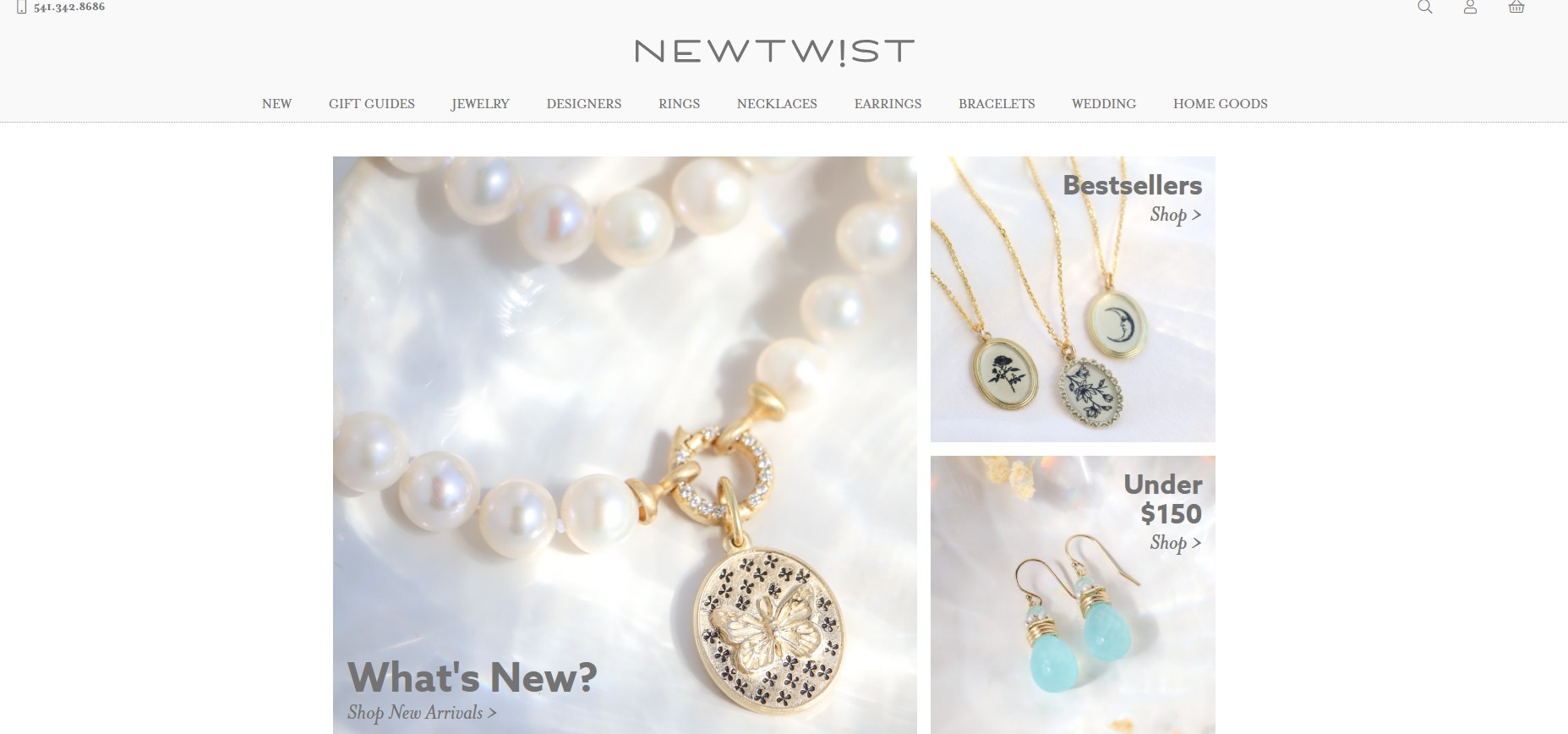
Its WooCommerce store design is elegant, artsy, and uses plenty of whitespace, helping each product stand out. This structured store places products in categories like wedding, jewelry, home goods, and earrings.
When browsing products, the store reminds you of products you recently viewed. It also recommends related products so you can make an informed choice or even buy more.
Unlike other WooCommerce store examples, NEWTWIST doesn’t use CTAs until you click on a product. It only has the “Add to cart” CTA on individual product pages.
Hyo Silver is a jewelry brand with a cowboy aesthetic that aligns with the brand. It’s bold, but not too busy. Its engraved jewellery and turquoise collections still shine.
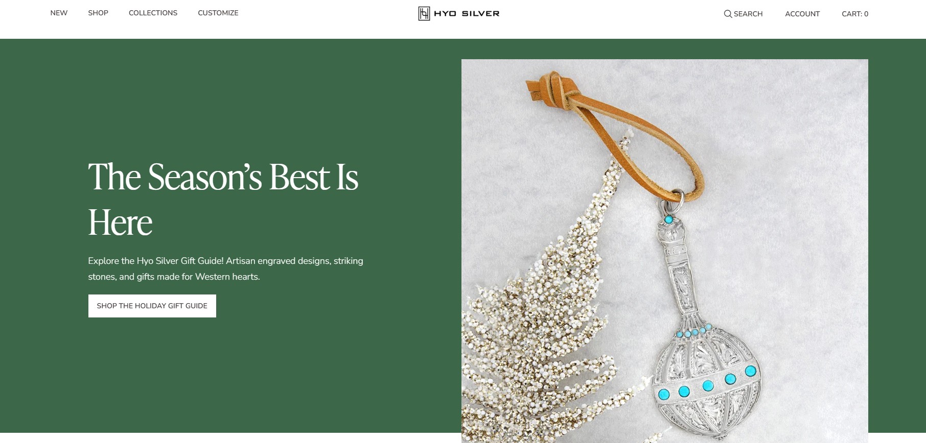
The homepage CTA “Shop the holiday gift guide” takes you to a collection of items you can gift a friend or family member. The products are categorized into rings, pendants, gifts for him, gifts for her, and more.
Hyo Silver could do more with storytelling on its product pages. Some pieces look like they deserve more heritage content to drive emotional purchases.
April Soderstrom sells bracelets, necklaces, earrings, and other accessories, focusing on a style that’s fun and casual while also conveying a sense of luxury. Its homepage fits that tone and gives visitors details about a holiday gift set promotion.
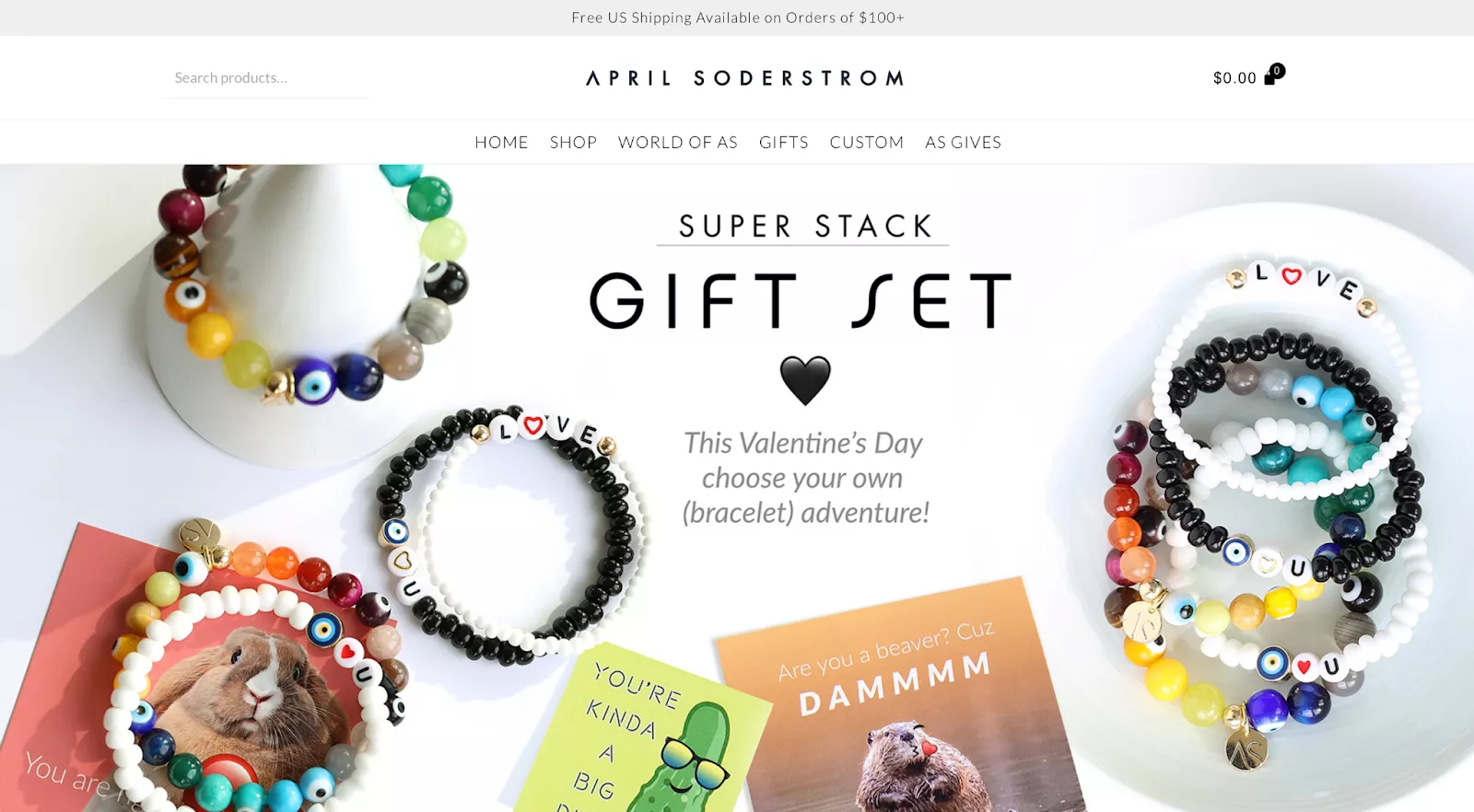
The April Soderstrom website also clearly displays its free shipping policy in a small banner at the top of the page. This gives customers important information about their order without distracting them from the rest of the site.
One potential issue with its site design is that visitors can’t see any product categories without first hovering over the “Shop” button. The hero image itself only mentions bracelets, so users who aren’t familiar with April Soderstrom may not even realize that it also offers other types of accessories.
JOCO Cups is a direct-to-consumer brand that sells glasses, reusable cups, bottles, straws, and other drinking products. Its site design is somewhat similar to other DTC brands, with a minimal aesthetic based on a relatively monochrome color palette.
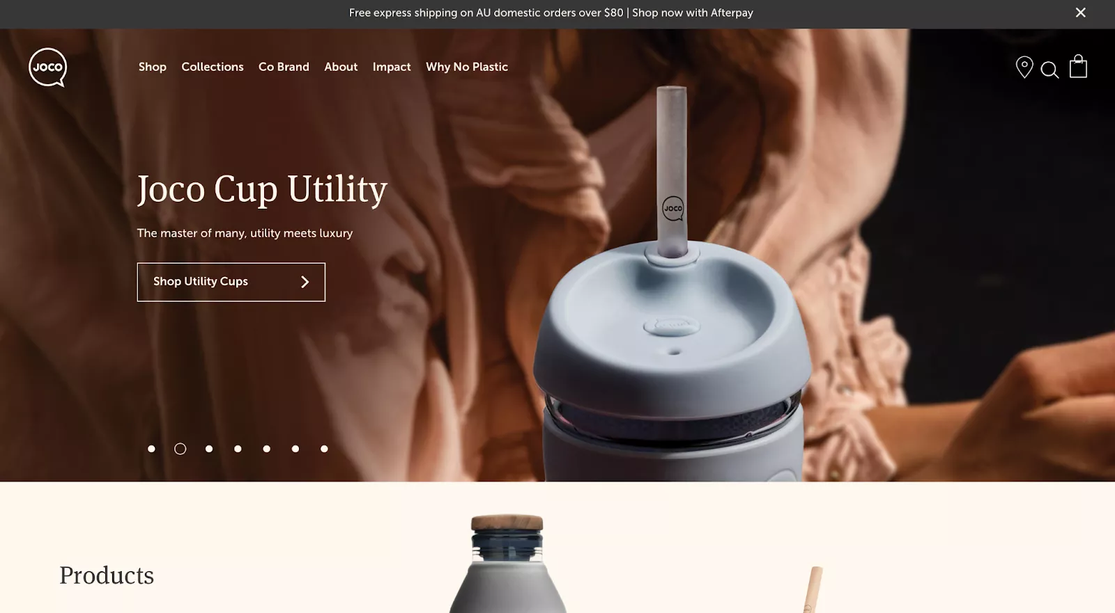
The JOCO Cups homepage slowly scrolls through hero images of some of its most popular products. Each item is displayed in a high-resolution image that fits the brand aesthetic, with a matching call to action that takes visitors to the corresponding category page.
On the other hand, we also noticed that its site has some issues with localization. Even though we were visiting its site from the US, we were shown a banner highlighting “free express shipping on AU domestic orders over $80.”
Kemo Sabe is another WooCommerce site example of a brand designing its homepage around a single hero image. It sells a variety of luxury Western fashion items, including jackets, hats, boots, and even belt buckles.
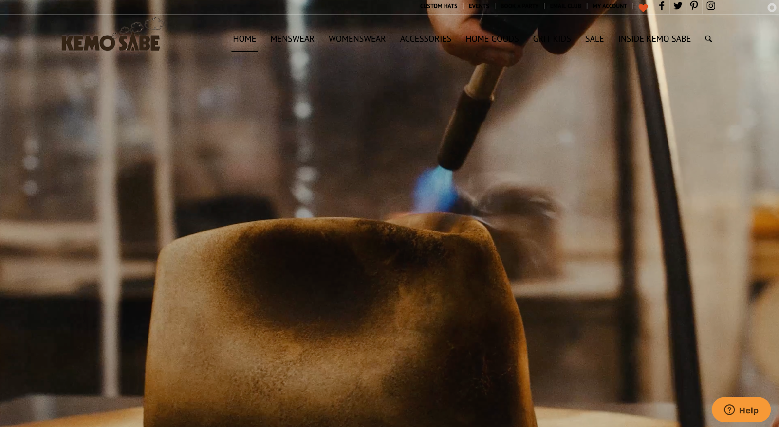
In fact, Kemo Sabe goes above and beyond the conventional hero image by using a background video that illustrates the process of producing one of its flagship hats. This is a great way to showcase unique brand style, particularly if the company uses traditional or bespoke production methods.
Because of the delectable nature of this particular category, it’s a good idea to see some WooCommerce food store examples.
Forest Whole Foods is a UK-based online whole foods retailer, offering ingredients like seeds, nuts, dried fruits, and organic staples. Its mission is obvious from your first store visit: emphasizing high-quality organic produce.
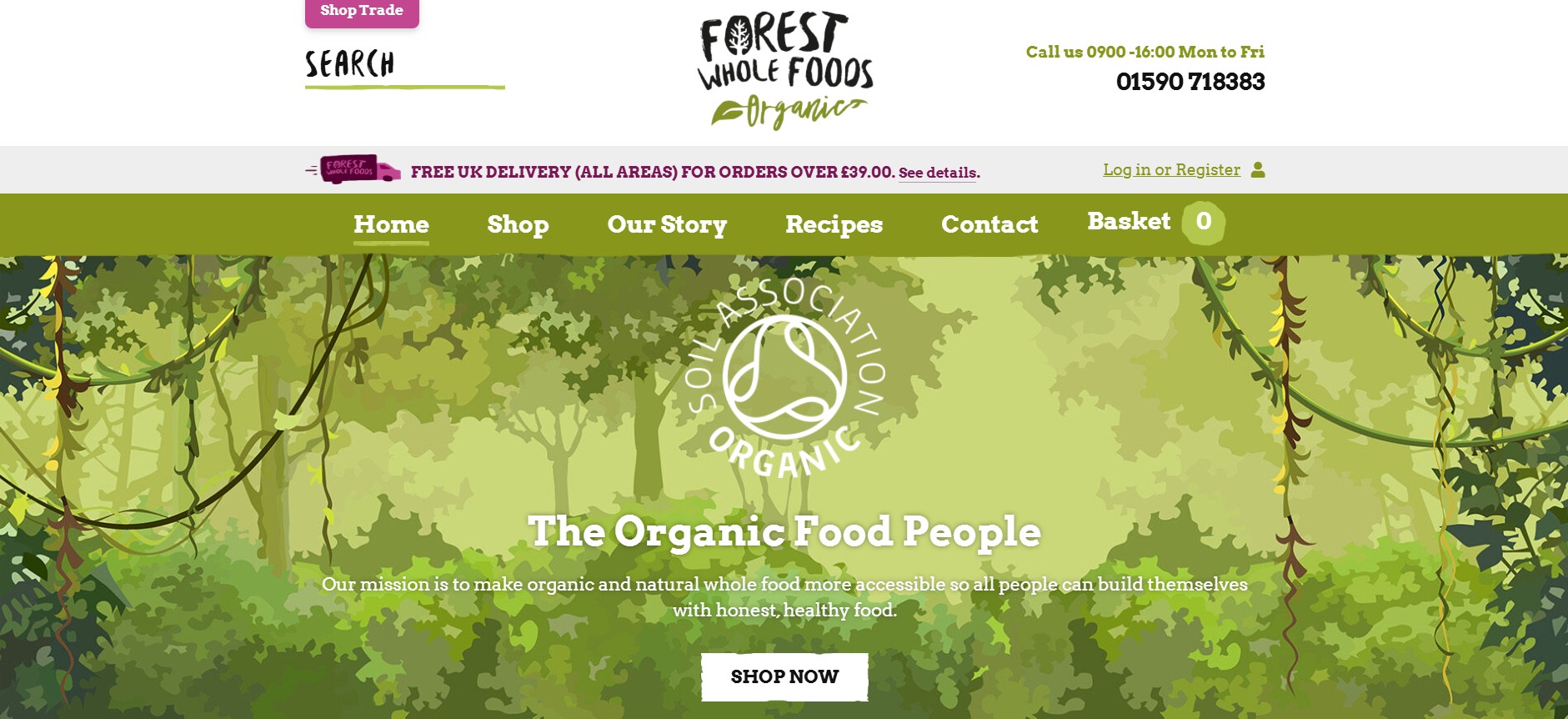
Because customers may be skeptical about where the products are sourced, the brand places its reviews first. It also showcases the Soil Association organic certification on its homepage, adding credibility.
Another catch in the store is the recipe section. It teaches customers what they can do with the product. So, if there’s an ingredient you haven’t added to your cart, it’s easy to slide back into the store and add it.
Cape Brewing Company (CBC) sells beers, ciders, spritzers, wines, seltzers, and sodas.
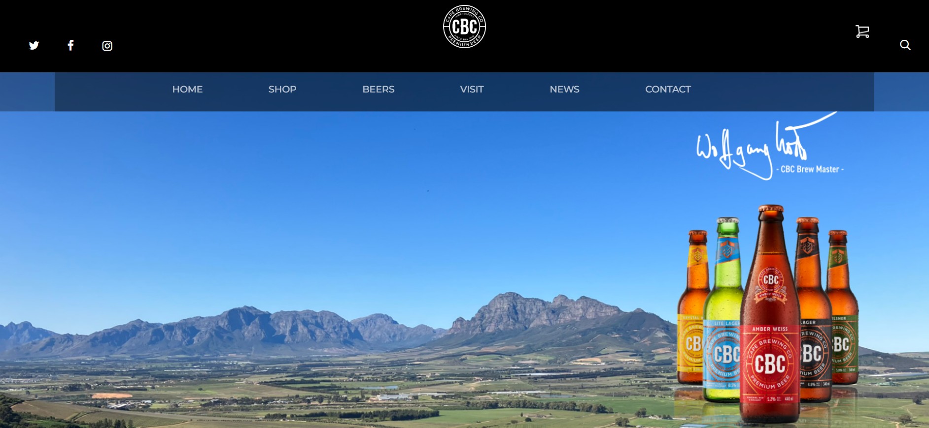
The store quickly introduces customers to the best beers in stock, providing details like alcohol percentage and the international bitterness units scale. Below each product is a “Shop now” CTA.
However, there are no visible CTAs in the “Shop” section. They only appear when you hover over each product, making each page more interactive.
Additionally, the individual product pages tell a mini-story of the product, including the perfect way to serve it.
SakéOne is a premium saké producer, known for introducing Japanese-made saké to the American market.
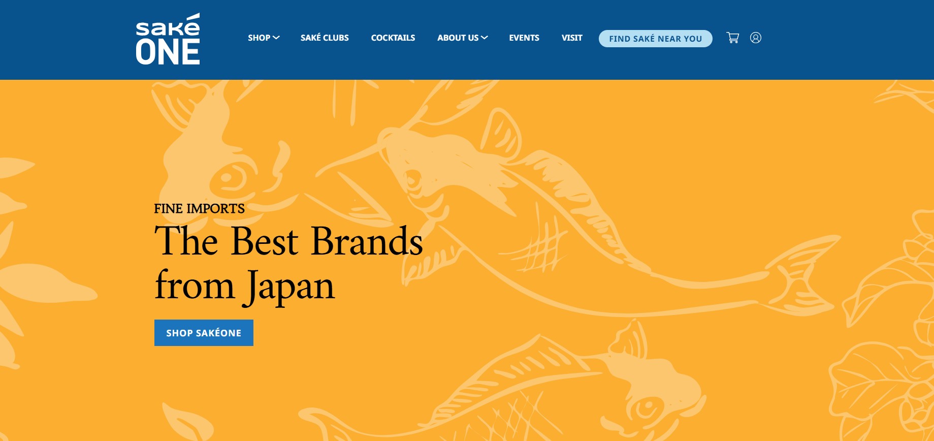
This WooCommerce store welcomes you with its bestseller collection. Each featured saké has a story and a “Buy now” CTA. Its cocktail page contains various recipes you can prepare with sakés, immediately adding value to customers.
Because saké can be technical, the store added more educational content (tasting notes and food pairing) on its product pages. This will help newer buyers feel confident in their purchase.
The Cleanse Kitchen sells cold-pressed juice cleanses, delivered fresh. Its minimal overall design puts its products front and center. It also offers a mini-quiz to help customers find the right cleanse blend for them.
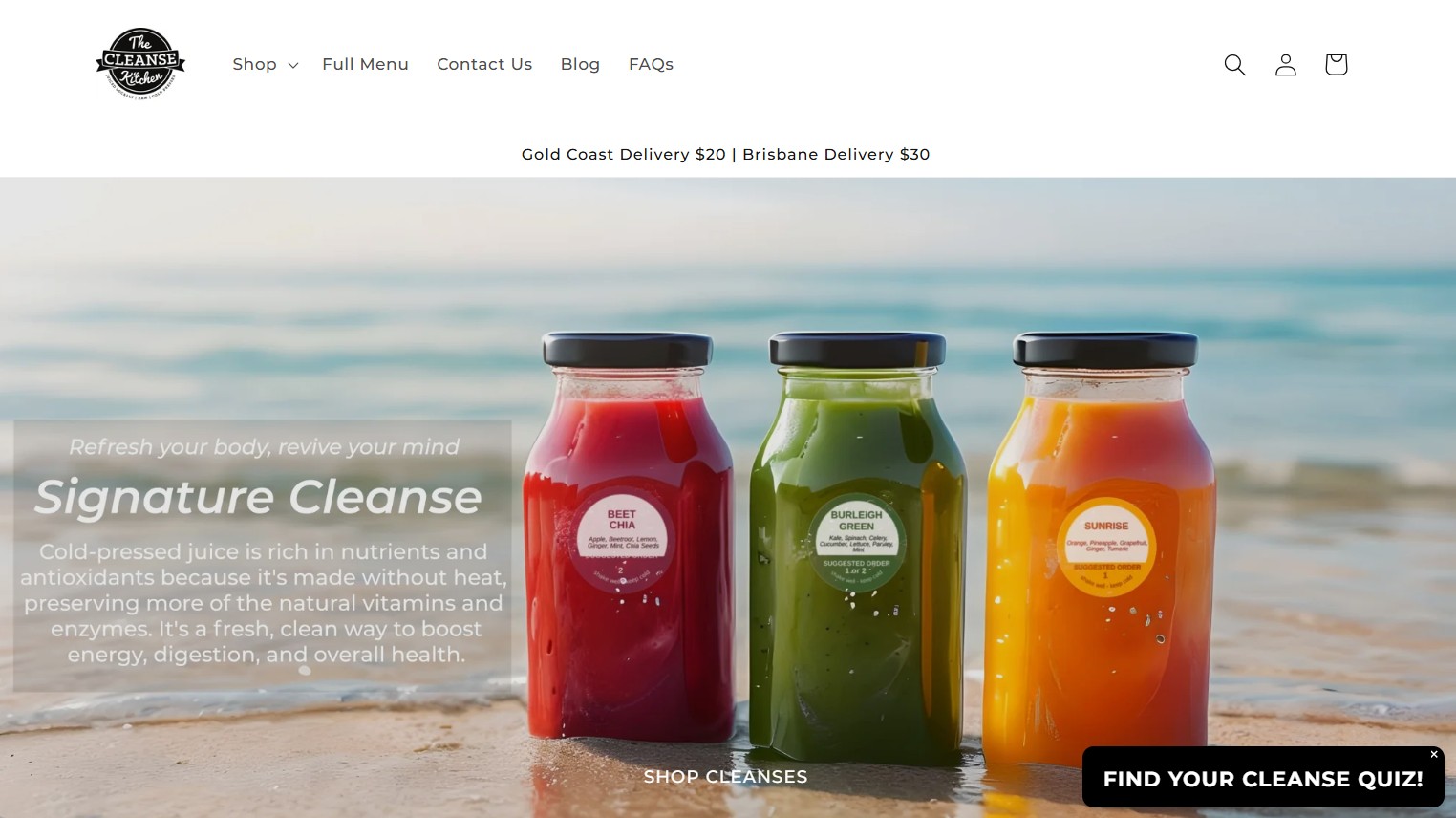
Each product description is educational, detailing what the product does. The shipping information is also clear, properly setting customer expectations.
Considering that this is a food and drinks WooCommerce store example, we expected customer reviews to be splashed around the store, but it wasn’t. This would’ve easily convinced customers to try the product.
The Daelmans Stroopwafels website has a relatively straightforward design, but their team did an excellent job of integrating the brand’s color, style, and product into a single page.
This is one of the best WooCommerce examples of how a homepage can also give visitors clear access to various areas of the site without distracting from the visual design.
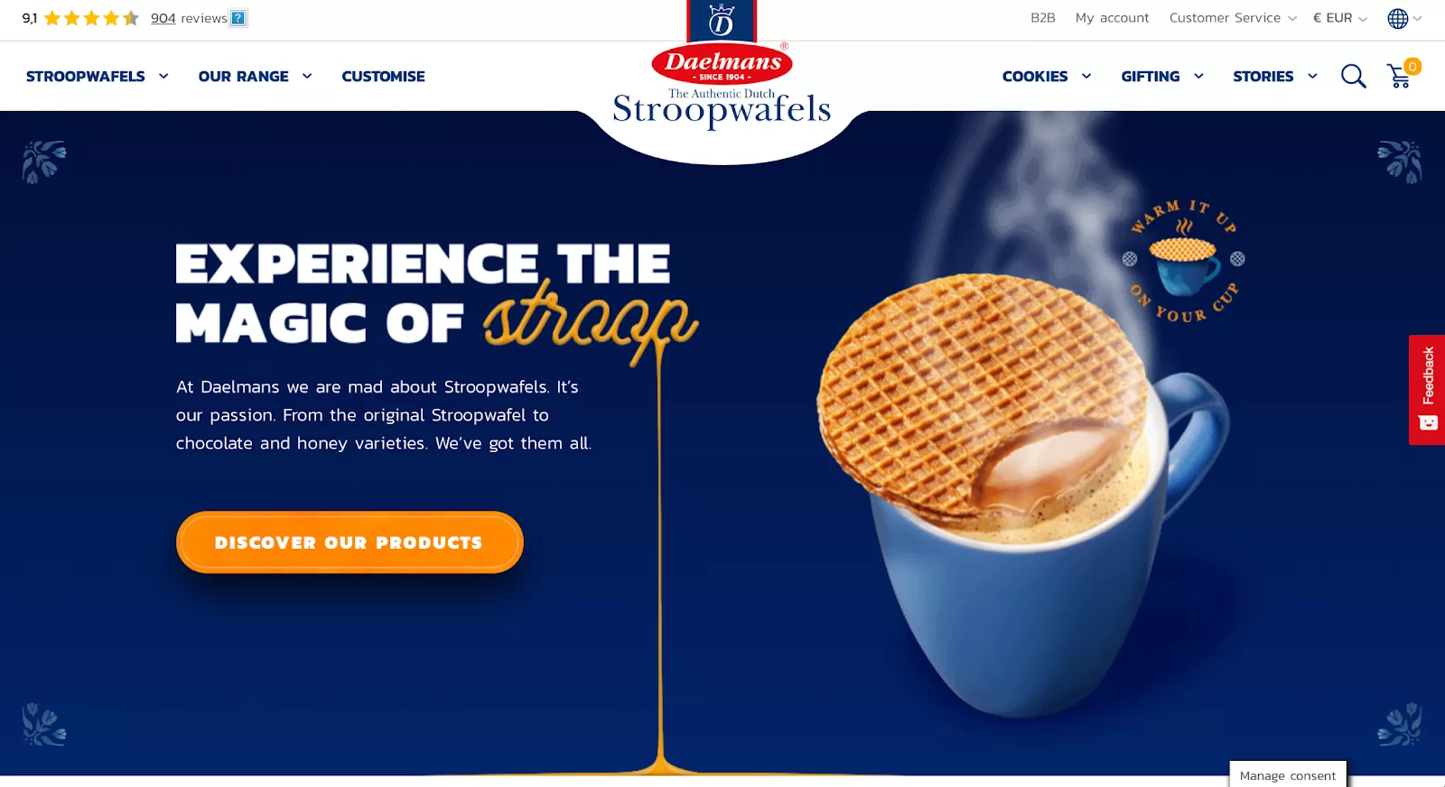
While the Daelmans website is extremely well-designed, we noticed that its prices are listed in euros — even for users accessing the store from North America. There’s a small dropdown menu in the upper-right corner for visitors who want to see prices in their local currency, but that’s an inelegant solution compared to simply showing localized prices by default.
Get some inspiring ideas from these WooCommerce examples focused on the home decor category.
Martin’s Home & Garden is a family-run establishment offering a wide range of indoor plants and landscaping materials.
Its website effectively communicates its business’s essence through the color scheme. Green is a common choice for companies in the gardening industry, and Martin’s Home & Garden is no exception.
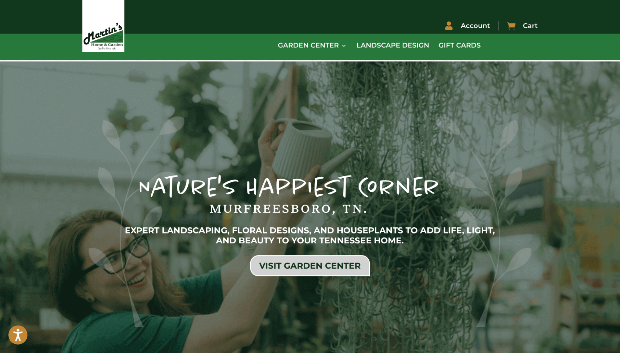
Additionally, there’s a small accessibility icon at the lower-left corner of the screen. Upon clicking it, a larger window appears, presenting a variety of accessibility options. Impressively, the company extends support to users with ADHD, which is a rare feature. You can even customize fonts, alignment, colors, and orientation.
It’s a good idea to ensure your website is accessible. This way, you can improve the user experience and potentially give your search rankings an increase.
Quick sign up | No credit card required
Taps Empire is a British brand that delivers taps/faucets along with a variety of home products such as shower parts, toilets, basins/sinks, radiators, and more.
When someone goes to an online store to look at bathroom products, they usually have a product and a design according to the space. The Taps Empire website is perfectly built around that fact, focusing directly on its best deals and the types of products it offers, with clear categories for each kind of item.
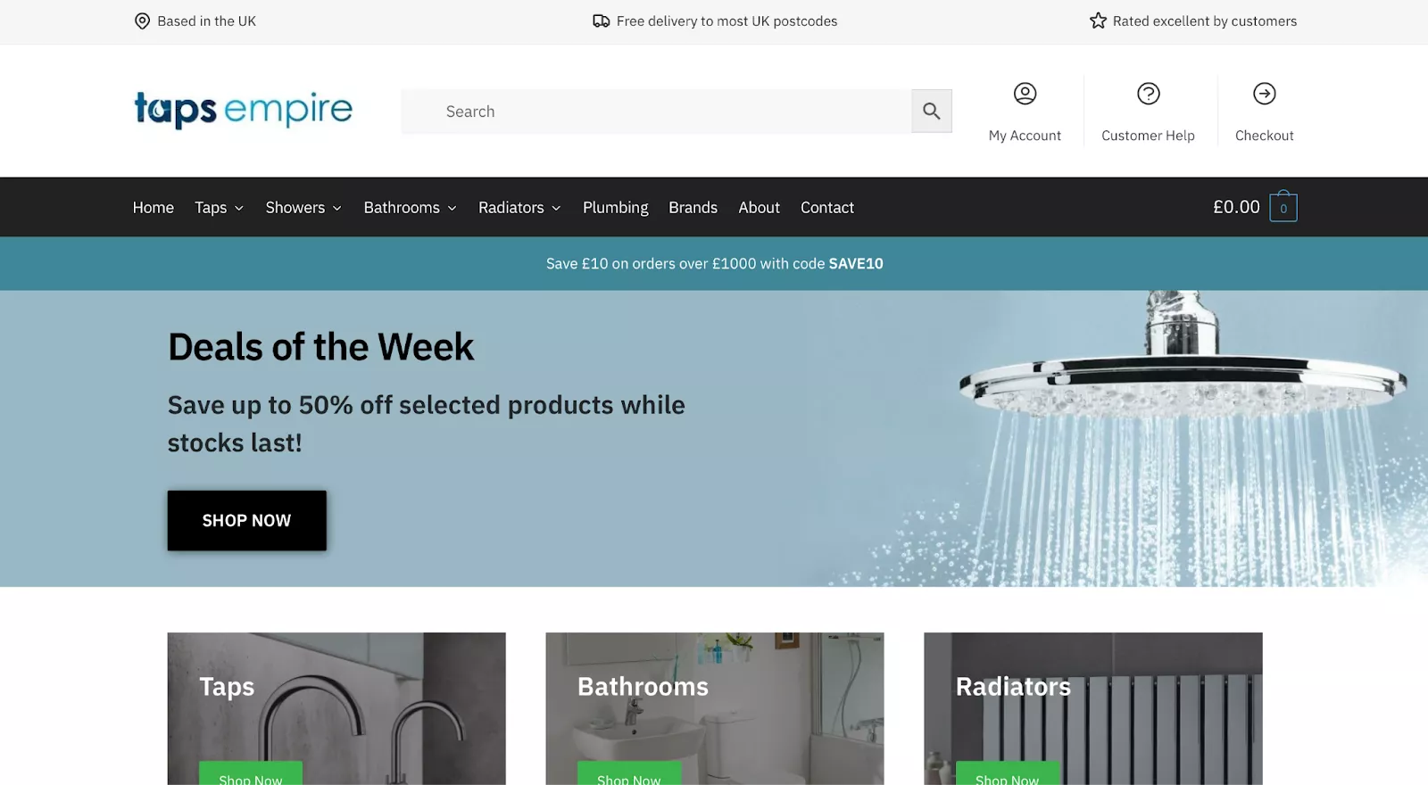
If you’re selling commodities or necessities, you should consider making your WooCommerce website less flashy and instead focusing on getting visitors to your products as quickly as possible.
Like Sodashi, Heymat goes for a single hero image instead of a more broken-up design. While that isn’t necessarily the right decision for every ecommerce merchant, it often works well for brands in beauty, interior design, and other fields with a heavy emphasis on aesthetics.
Rather than a specific product or offer, Heymat starts with a more general tagline that invites customers to find out what makes it different from other brands. Visitors can scroll down to view some of its designs or click the “Read More” button to learn more about its history and philosophy.
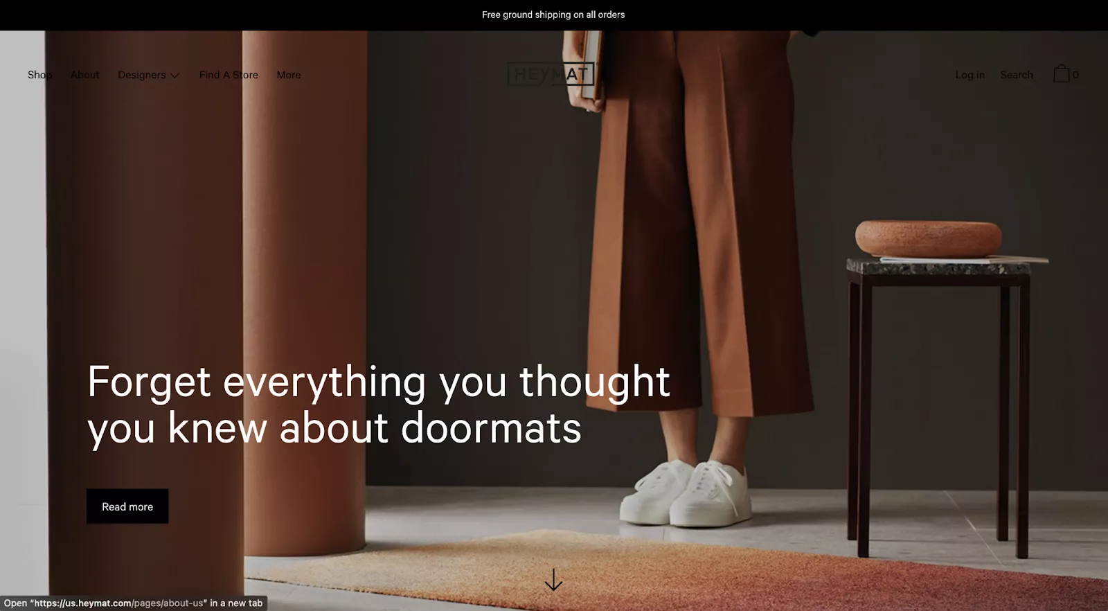
However, Heymat’s design still isn’t perfect. The positioning and color of the menu items at the top of the screen could be better. The “Log in,” “Search,” and “Cart” options in the upper-right corner, for example, are barely visible against the dark background. Even the logo is mostly hidden except for the “AT” that shows up over the model’s hand.
Badeloft is a luxury retailer for bathroom fixtures, such as freestanding bathtubs, sinks, and modern tubs. Its WooCommerce site is polished and invites customers to request a free material sample. This allows you to have a feel of the product before purchasing.
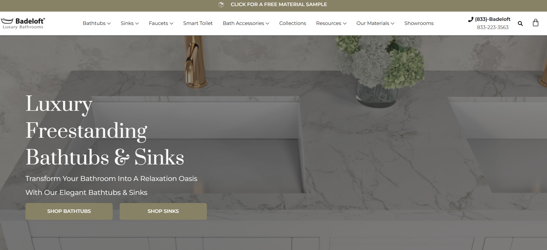
Although it uses two CTAs on the homepage, it’s not confusing as they lead to different product sections. The brand prioritizes transparency, giving detailed product information, including dimensions, capacity, color, and finish.
For more credibility, Badeloft mentions editorial recognition from platforms like Bob Vila and USA Today. It also features customer reviews and star ratings.
Carpet Runners specializes in stair rods, carpet binding, door thresholds, and accessories. The products are clearly categorized, allowing customers to easily find what they’re looking for.
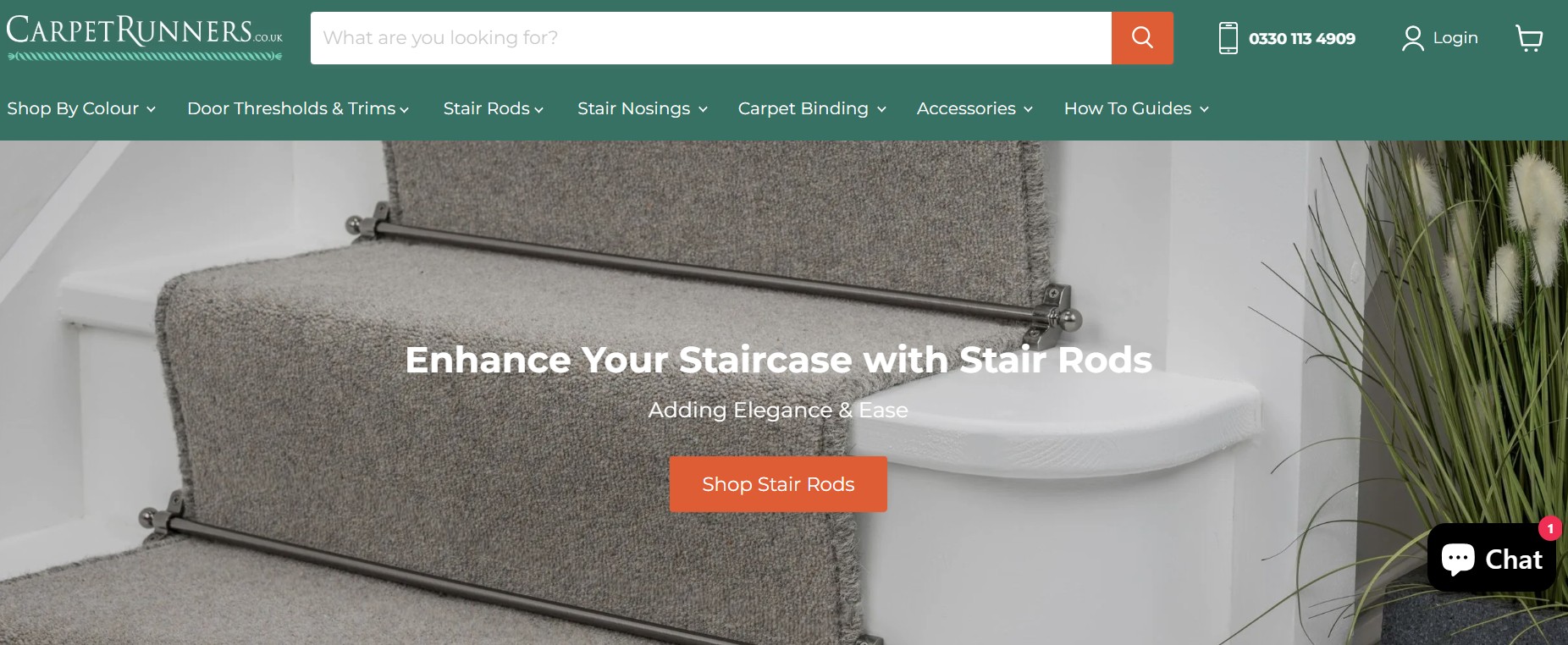
The WooCommerce site features a contrasting color CTA, which makes it stand out. There’s also a chat button, so customers can ask about its products and get instant answers.
Similar to Badeloft, customers can request up to three product samples. You can get expert advice and an easy installation guide, adding more value to the buyer’s journey.
Pet owners are often emotional buyers, and these top WooCommerce webshop examples can teach you how to design yours.
2 Hounds Design makes high-quality, designer dog collars, leashes, and harnesses. The store showcases craftsmanship with its awards and features on platforms like CNN and NBC.
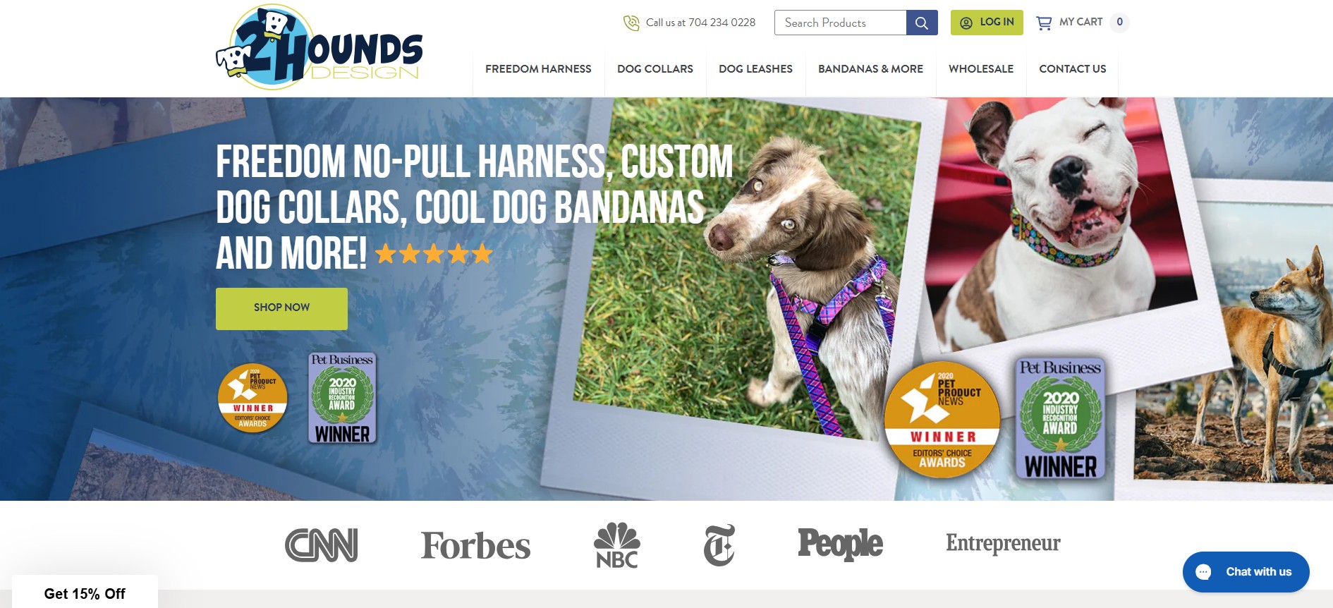
The brand immediately provides a 15% discount on products, enticing customers to check out the items in stock. It also has a chat button for instant messaging, tracking orders, and requesting shipping information.
Aside from the images of pets using the products, the brand takes it a step further by featuring videos of the product in use.
ZippyPaws sells fun, durable dog toys with unique designs. It displays a wistful cliché used humorously by dog owners: “It’s a dog’s world, we’re only living in it.” This can make the brand settle in the hearts of first-time store visitors.
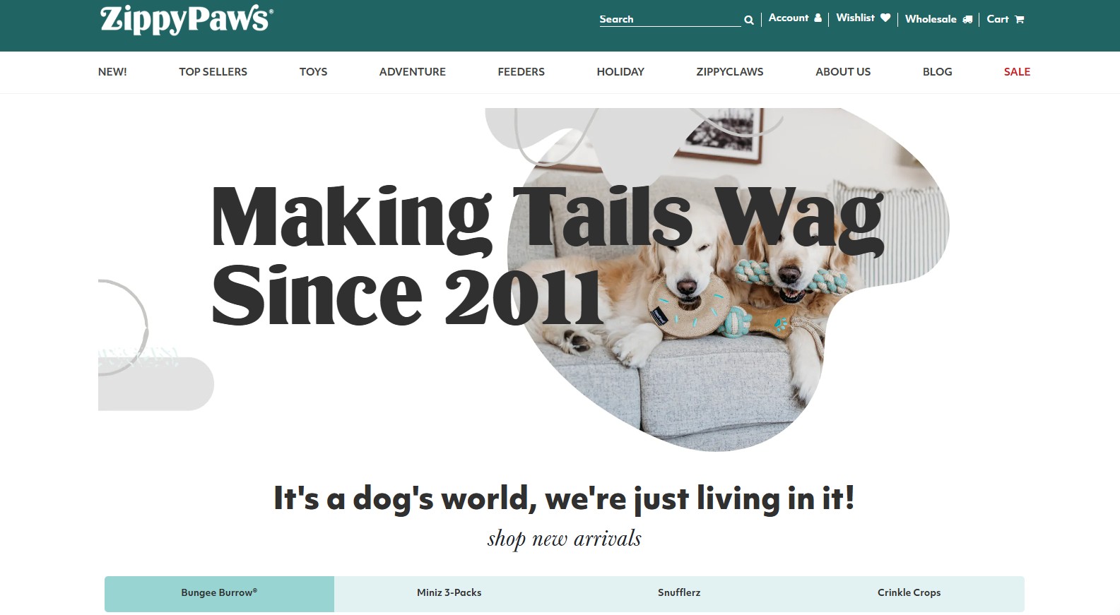
Its catalog shows personality and fun using images of pets playing with the toys. This WooCommerce store also includes a video of real pets using the products.
Each product page displays a “You may also like” section. This can make customers buy more than planned because you can’t have too many pet toys, right?
Scratch is an Australian pet food brand focused on gut health. The brand mentions that 75,000 dogs love it. This strategic use of social proof shows trustworthiness. It also features two CTAs with varying colors, one for puppies and another for adult dogs.
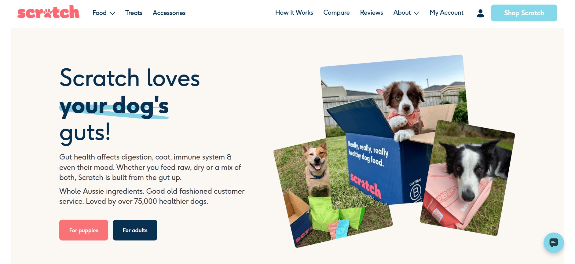
The WooCommerce store lists the products’ ingredients and their purpose. This educates customers on what their pets are consuming. Behind its customer service is a veterinarian, assuring customers of expert advice.
Multipet is a large pet supply brand, offering a wide variety of pet products like toys, waste bags, wipes, and leash wraps. It’s a well-known store, and the recognition helps build trust among pet parents.
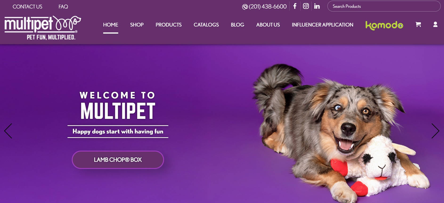
Unlike other WooCommerce store examples, it displays its contact information and links to its social media pages. This encourages customers to share product reviews and see how other customers are using the product.
Its homepage is well-structured, with direct links to the shop and different product categories. Despite its large catalog, customers can shop smoothly, thanks to its search functionality.
Crocx sells hemp-based pet products like balm, shampoo, paste, cookies, and leashes. Similar to Multipet, it front-loads its social media channels, making it easy to contact the brand.
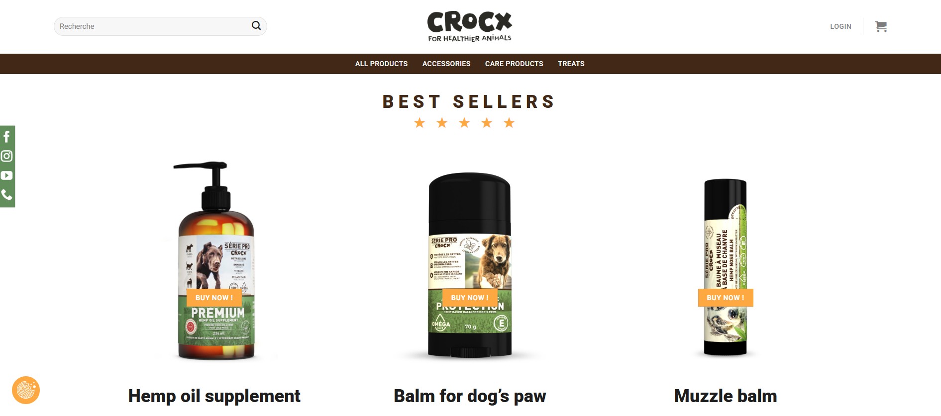
The store features its best sellers with a “Buy now” CTA that isn’t immediately noticeable. The design would have been best placed underneath the product.
That said, you can filter products based on category, reducing the number of steps you take before purchasing. Each product page is detailed, including benefits, dosage, route of administration, and storage information for supplements.
There you have it — 30 amazing WooCommerce store examples, from beauty, apparel, and accessories to food and drinks, home decor, and pet niches.
As you kickstart 2026, don’t sleep on these examples. Let them inspire your own customer journey. The competition in the ecommerce industry will continue to grow, but with an optimized store and great marketing, you’ll stand out.
Take the next step today by signing up for Omnisend, an email and SMS marketing automation platform for ecommerce businesses. Start free today and turn your WooCommerce store into a high-performing site with automated, omnichannel workflows.
Quick sign up | No credit card required
TABLE OF CONTENTS
TABLE OF CONTENTS
What’s next


No fluff, no spam, no corporate filler. Just a friendly letter, twice a month.