
 OFFER
OFFER


Drive sales on autopilot with ecommerce-focused features
See FeaturesA mobile popup can work wonders for increasing conversions. When done right, it can grab attention and increase signups. However, poor execution can only frustrate users and increase bounce rates.
If you want to grow your email list, reduce cart abandonment, or promote special offers, you need attention-grabbing popups that aren’t intrusive.
The big question is — how do you create effective mobile popups that engage visitors without disrupting the user experience?
Google’s guidelines on mobile interstitials play a key role in answering this. To maintain a good user experience, Google discourages intrusive popups that block content immediately after a visitor lands on a page.
In this guide, you’ll learn best practices for designing high-converting mobile popups, along with seven inspiring examples that showcase what works.
Let’s get into it and see how to use a mobile popup effectively.
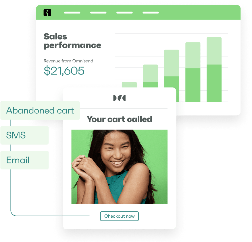
Drive conversions and grow your email list with a high-converting mobile popup
Quick sign up | No credit card required
What is a mobile popup?
A mobile popup is a small window that appears while a user is browsing a website on a mobile device. It’s designed to capture attention and encourage specific actions, such as subscribing to a newsletter or claiming a discount.
Popups can be triggered by user behavior, such as scrolling, inactivity, or intent to exit a page, or they can be shown after a specific amount of time.
Here are some ways a popup message on a phone can engage visitors and drive conversions:
- Lead capture: Collect email addresses or phone numbers for marketing
- Special offers: Promote discounts, flash sales, or exclusive deals to encourage purchases
- Exit-intent: Reduce cart or browse abandonment by offering last-minute incentives before visitors leave
- User engagement: Highlight important announcements, new product launches, or interactive surveys
There are different types of mobile popups that serve unique purposes. Common types of popups on mobiles include:
- Discount popups: Offer percentage-based or dollar-value discounts to incentivize purchases
- Newsletter signup popups: Encourage visitors to join an email list by offering perks like exclusive content or deals
- Cart recovery popups: Remind users of abandoned carts and provide incentives to complete their purchase
When used correctly, popups on mobile devices can enhance user experience and improve conversion rates without disrupting the browsing journey.
Best practices for high-converting mobile popups
A mobile popup can be a powerful tool for capturing leads and maximizing conversions — but only when used correctly. Creating an effective popup on the phone or any other mobile device requires balancing engagement and user experience.
Choosing the right tool plays an important role, as it determines how easily you can design responsive popups, control triggers, and personalize messaging. Platforms like Claspo help marketers build mobile-friendly popups with flexible targeting options, making it easier to capture attention while maintaining a smooth user experience.
Here are six best practices to ensure your popups convert without disrupting the browsing experience:
1. Use fullscreen popups sparingly
Fullscreen popups are great for grabbing attention, but they must be used carefully. Since they cover the entire screen, they’re impossible to miss. However, when they appear too soon, it can annoy users.
Use them for high-value offers, such as exclusive discounts, and always include a clear, easy-to-find button to close them.
2. Trigger popups based on scroll depth, not time
Instead of using time-based triggers, which may interrupt users too early, trigger mobile popups based on scroll depth. This ensures visitors see the popup only after engaging with your content.
A common approach is to display popups after users scroll 50–70% down the page, indicating genuine interest.
3. Prioritize thumb-friendly CTA placement
Most mobile users navigate with their thumbs, so place your call to action (CTA) buttons where they’re easy to tap.
Keep CTAs in the lower half of the screen, and ensure they’re large, clear, and accessible without excessive scrolling. This small change can positively affect conversions and improve usability.
4. Limit popup frequency to avoid Google penalties
Google penalizes websites for intrusive popups that disrupt the user experience, which can hurt search rankings. To avoid this, limit popups so they don’t block key content.
Show a mobile popup only once per session or after a reasonable delay, allowing users to engage with the page first.
5. Use sticky popups instead of disruptive overlays
Sticky popups stay visible as visitors scroll without obstructing content. They’re less intrusive than full-screen overlays, improving the user experience.
Common placements include sticky banners at the top or bottom of the screen to ensure visibility without disrupting navigation.
6. Enable swipe-to-close for a better user experience
Give your users more control by enabling swipe-to-close popups instead of relying on a small “X” button in the top corner, which makes dismissing mobile popups easier.
This improves the browsing experience and reduces frustration, especially for mobile users who expect intuitive, gesture-based navigation.
7 mobile popup examples
A well-designed mobile popup or a well-timed exit-intent popup can turn a visitor into a customer. The examples below illustrate how diverse strategies in mobile popup design and intent can effectively engage users, capture leads, and drive conversions:
1. Blume

This mobile popup by Blume starts with an offer saying “Take 20% off!” and asks a simple question to spark curiosity. This non-intrusive approach encourages users to act, leading them to click an option given above and provide their email to redeem the discount code.
Instead of a standard email signup form, Blume makes the mobile popup more interactive by asking users about their primary skincare focus, offering a 20% discount as an incentive. This approach personalizes the experience while encouraging engagement and boosting data collection.
2. Victoria’s Secret
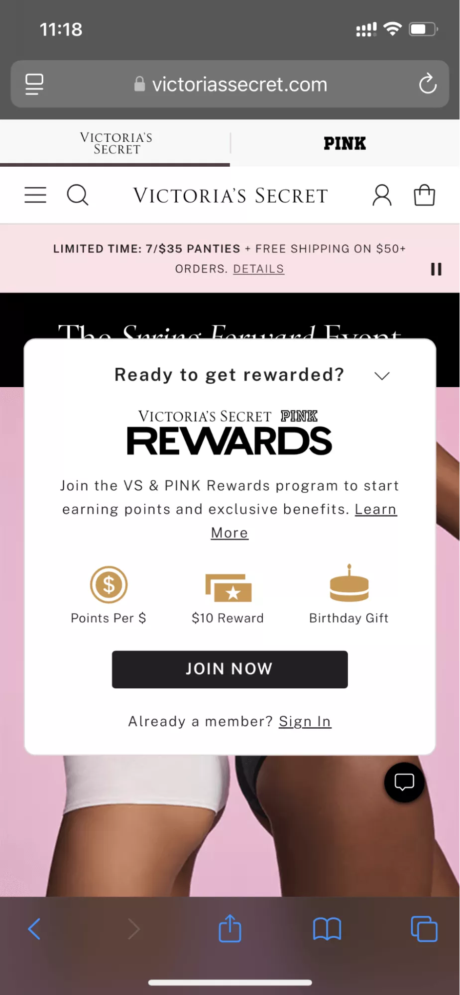
This sticky popup effectively promotes Victoria’s Secret’s Rewards program by clearly displaying the benefits the customer will get — points per dollar spent, a $10 reward, and a birthday gift.
The bold text and contrasting black “JOIN NOW” draw immediate attention, while the “Learn More” and “Sign In” CTAs cater to both new and existing members. The popup’s placement provides visibility without being intrusive and so is more likely to drive engagement. Plus, the use of icons and concise copy makes it easy for the visitor to understand and take action.
3. Ulta Beauty

The Ulta Beauty Rewards mobile popup stands out due to its subtle and non-intrusive placement. Instead of taking over the screen, it appears as a small tooltip-style box from the top, ensuring users stay engaged with the website content.
The popup effectively highlights exclusive perks like a $5 signup bonus, free birthday gift, and reward points, making the loyalty program feel rewarding and easy to join. By keeping it concise and benefit-driven, Ulta Beauty encourages signups.
4. MVMT Watches
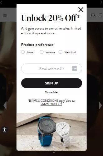
MVMT Watches’ popup effectively uses a “Product preference” selection to personalize the user experience and improve its marketing. By allowing users to choose between “Mens,” “Womens,” or “Want It All,” the brand can tailor future promotions, emails, and recommendations to match individual shopping interests.
The popup is simple, with minimal input required, making it easy to engage. The 20% discount acts as a strong incentive, while the “Maybe later” option gives an easy exit to prevent any frustration and maintain a positive experience.
5. Crocs

This popup by Crocs is full screen and is highly effective in driving conversions, as it’s impossible to miss. The bold “15% OFF” immediately grabs attention, and the concise copy clearly communicates the benefits — comfort and savings.
The clean design, high-contrast text, and clear exit option enhance user experience, making it easy to engage or opt out.
The CTA, “CLAIM 15% OFF,” is an effective call to action example as it clearly guides visitors to the reward without any distractions.
6. Gap
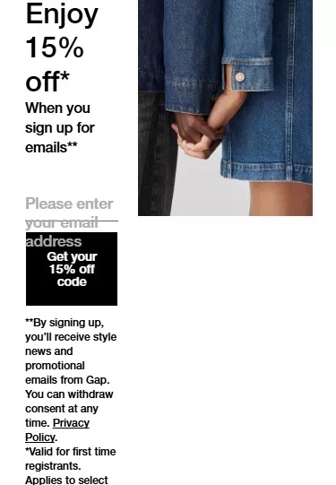
This popup on Gap’s site offers an attractive 15% off in exchange for an email signup. It stands out due to its minimalist design for easy readability on a small screen. Plus, the concise privacy disclaimer reassures the users about consent withdrawal, reducing hesitation.
7. Rare Beauty

This popup by Rare Beauty does a great job of aligning with the brand’s aesthetics while providing clear value. The “10% OFF” incentive is prominently displayed, making the offer enticing.
The design is elegant and on-brand, creating a seamless experience. The required birthday and email fields personalize engagement, while the CTAs like “CONTINUE” and “NO THANKS” leave the choice to customers, putting them in control.
How to create mobile popups with Omnisend
Creating effective mobile popups is essential for engaging visitors and maximizing conversions. Omnisend, a leading email and SMS marketing platform, offers a popup feature that makes it effortless to design and implement high-converting popups without coding.
With a 4.7 rating on the Shopify App Store and a 4.9 rating on WooCommerce, Omnisend is a trusted marketing platform for ecommerce brands of all sizes.
Follow these five steps to create a mobile popup with Omnisend:
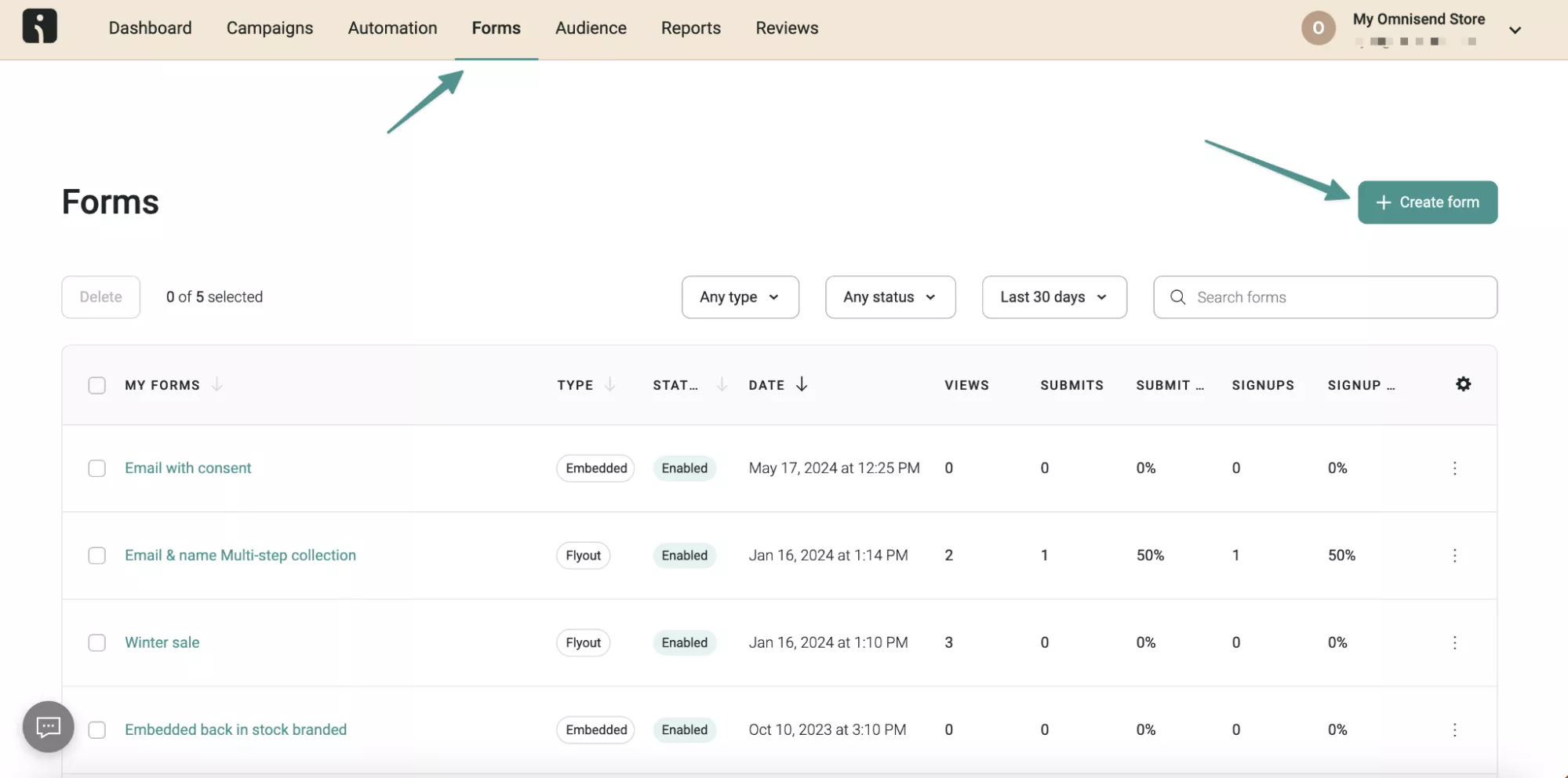
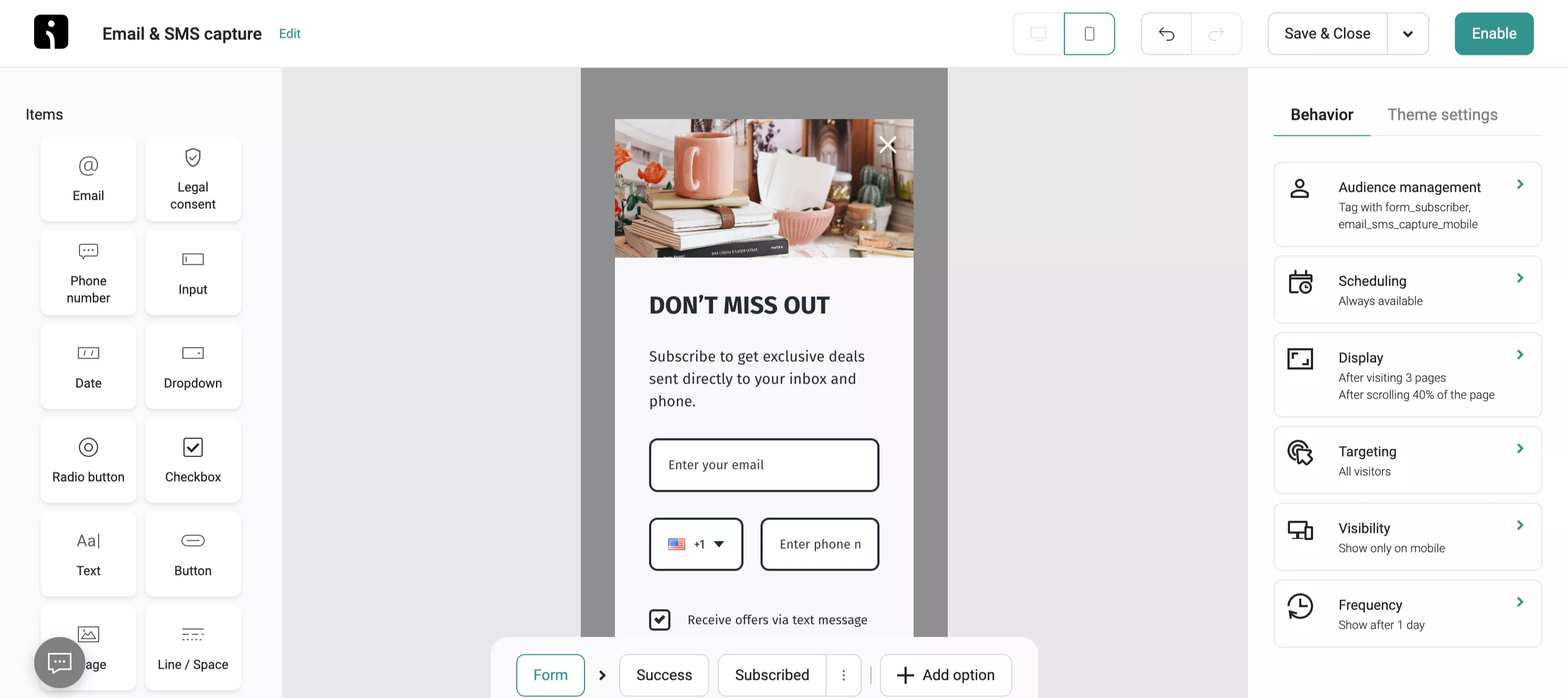
Step 1: Access Omnisend’s popup builder
First, log into your Omnisend account (or sign up if you haven’t already). Navigate to the Forms section and click on Create Form to access the form builder interface. This is where you’ll design and customize your mobile popup:
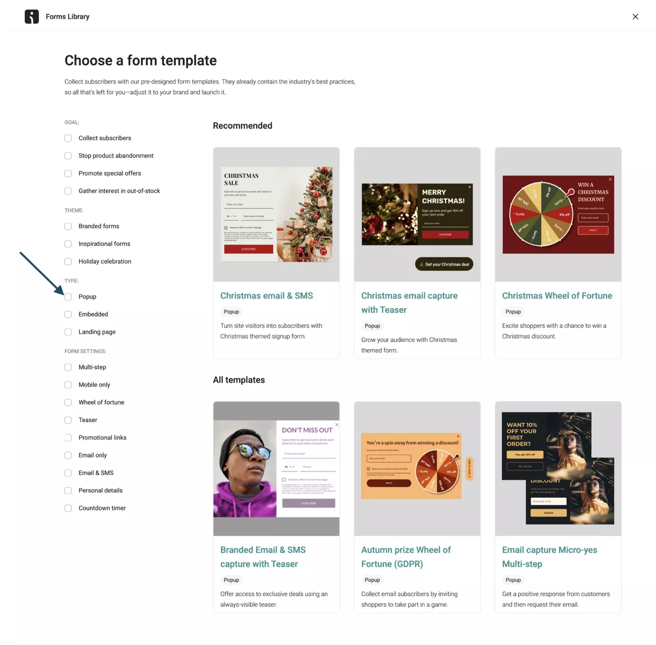
Step 2: Choose a popup template
Omnisend offers a variety of pre-designed templates tailored for mobile devices. Select a template that aligns with your brand’s aesthetics and campaign goals.
You can access the Forms Library, where you can choose a form template with different form types, including popups, embedded forms, and landing pages. Select Popup to start creating your mobile-friendly popup:
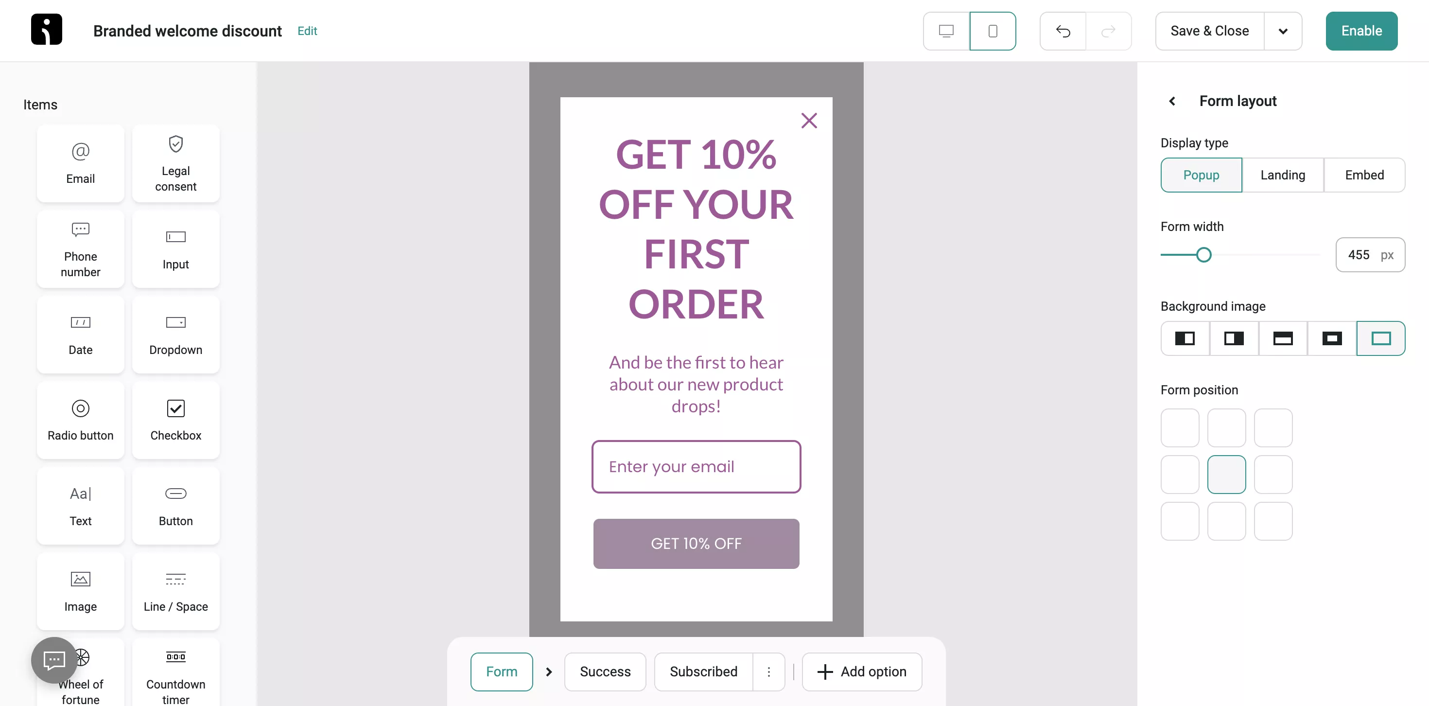
Step 3: Customize the popup design
After selecting a template, use Omnisend’s drag-and-drop editor to modify the popup to match your brand. You can:
- Edit the text to create a compelling message
- Change fonts, colors, and images to align with your branding
- Adjust the form fields to collect emails, phone numbers, or other details
- Add a countdown timer for urgency or a discount code to encourage action
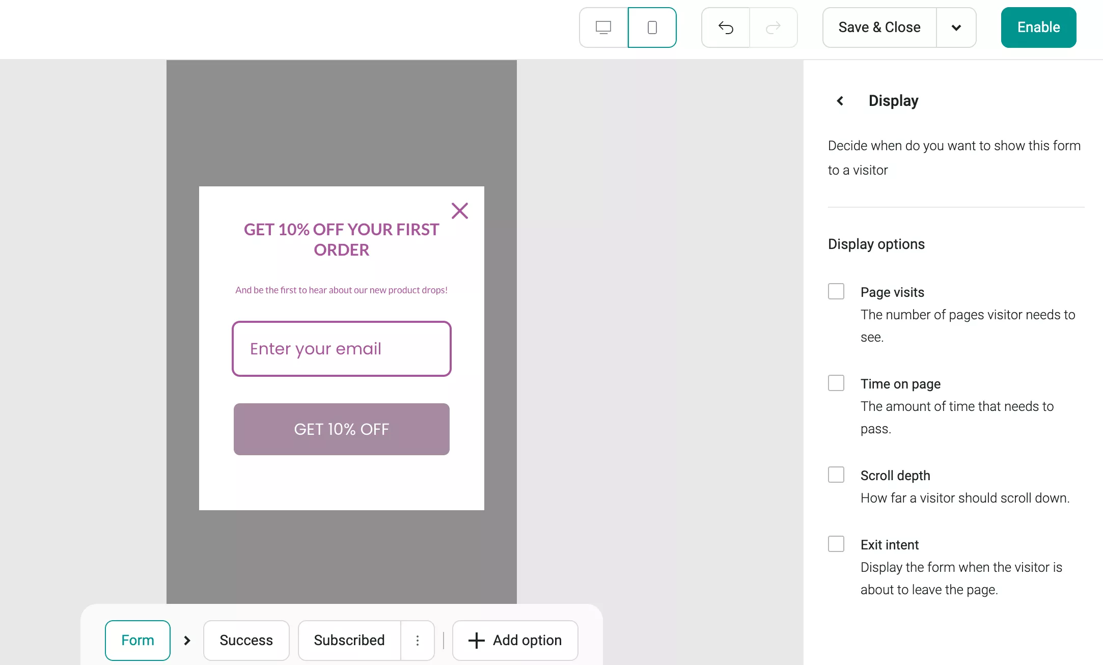
Step 4: Set display triggers and targeting
Define when and where your popup will appear. You can set popup timing and triggers to ensure you engage visitors at the perfect moment.
Omnisend allows you to set triggers based on user behavior, such as time spent on the page, scroll depth, or exit intent. Additionally, you can target specific audiences based on their location, device, or browsing history:
Step 5: Publish and track performance
Omnisend offers real-time analytics to monitor key performance metrics like conversion rates, impressions, and lead generation. Use these insights to optimize your strategy and improve results.
By following these steps, you can create high-converting mobile popups that help you engage visitors, build your email list, and increase sales.
After designing and configuring your mobile popup, save and activate it:
Wrap up
A well-optimized popup should feel natural, offering value without frustrating visitors. The key to creating a mobile popup that attracts attention without overwhelming users is using the right triggers, compelling offers, and non-intrusive designs.
By applying these best practices and drawing inspiration from these examples, you can design popups that increase signups, reduce cart abandonment, and increase conversions while maintaining a positive user experience and protecting SEO rankings.
Omnisend is a powerful tool without a steep learning curve, with its intuitive popup builder, advanced targeting options, and seamless integrations. With top ratings on Shopify and WooCommerce, it’s a trusted choice for ecommerce brands looking to upgrade their mobile marketing efforts.
Create and optimize your mobile popups for better conversion with Omnisend today
Quick sign up | No credit card required
Mobile popup: FAQs
1. What’s the difference between mobile popups and desktop popups?
Mobile popups are optimized for smaller screens, ensuring a seamless user experience without disrupting navigation. They often use thumb-friendly CTAs, swipe-to-close options, and non-intrusive designs.
On the other hand, desktop popups have more space for visuals and text. They also typically appear in different positions on the screen.
2. How can I make sure my mobile popups don’t hurt SEO?
To prevent SEO issues when creating mobile popups, the following practices will help:
— Avoid blocking essential content to keep your site accessible
— Use Google-friendly triggers like exit intent or scroll depth
— Opt for sticky popups instead of intrusive overlays
— Follow Google’s mobile-friendly guidelines to maintain search rankings
3. What’s the best timing for showing a mobile popup?
The best timing for a mobile popup depends on user behavior. Common triggers include exit intent, a 50% scroll depth, or a five to 10 second delay. Also, avoid immediate popups, as they can frustrate visitors. Instead, time them based on engagement levels to ensure a positive user experience.
4. How can I A/B test my mobile popups?
A/B testing mobile popups involves comparing two versions with different elements, such as call to action placement, copy, or timing. With Omnisend, you can test various elements, including:
— Headline and copy
— Call to action buttons
— Popup timing
— Design and layout
— Form fields
— Exit-intent vs. standard popups
TABLE OF CONTENTS
TABLE OF CONTENTS

Subscribe and don’t miss any updates!
No fluff, no spam, no corporate filler. Just a friendly letter, twice a month.