Drive sales on autopilot with ecommerce-focused features
See FeaturesKnowing some of the most powerful call to action examples is essential if you want to drive sales and leads, as it usually requires more than a basic prompt.
Your audience most likely craves a strong emotional connection, a sense of urgency, or the excitement of solving a problem to take the desired action. With the right call to action (CTA), you can nudge them to purchase, engage with your content, or even enroll in a course.
In this article, we’ll explore 30+ compelling, unique, and creative call to action examples you can implement right away. We’ll also discuss what constitutes a call to action, its various forms, and why these examples work so well.
Hopefully, they will inspire and give you ideas to craft CTAs that align with your brand’s goals and resonate with your audience.
Quick sign up | No credit card required
Problem: My brand story isn’t driving action, and my email CTAs aren’t generating leads
Solution: Craft a compelling brand story and combine it with a clear, action-oriented call to actions
Read: Brand storytelling: how to build a story [with examples] and How to create powerful email CTAs [30+ examples]
What is a call to action (CTA)?
A call to action is a marketing prompt designed to encourage users to take a specific action, whether that’s clicking on a link, subscribing to a channel, or making a purchase. Call to actions can appear in different formats, including interactive buttons, text hyperlinks, or just written texts.
“Subscribe now” or “shop now” are typical examples of a call to action. However, not all CTAs are short and precise. “Sign up today and be the first to know about our special offers” are examples of long CTAs.
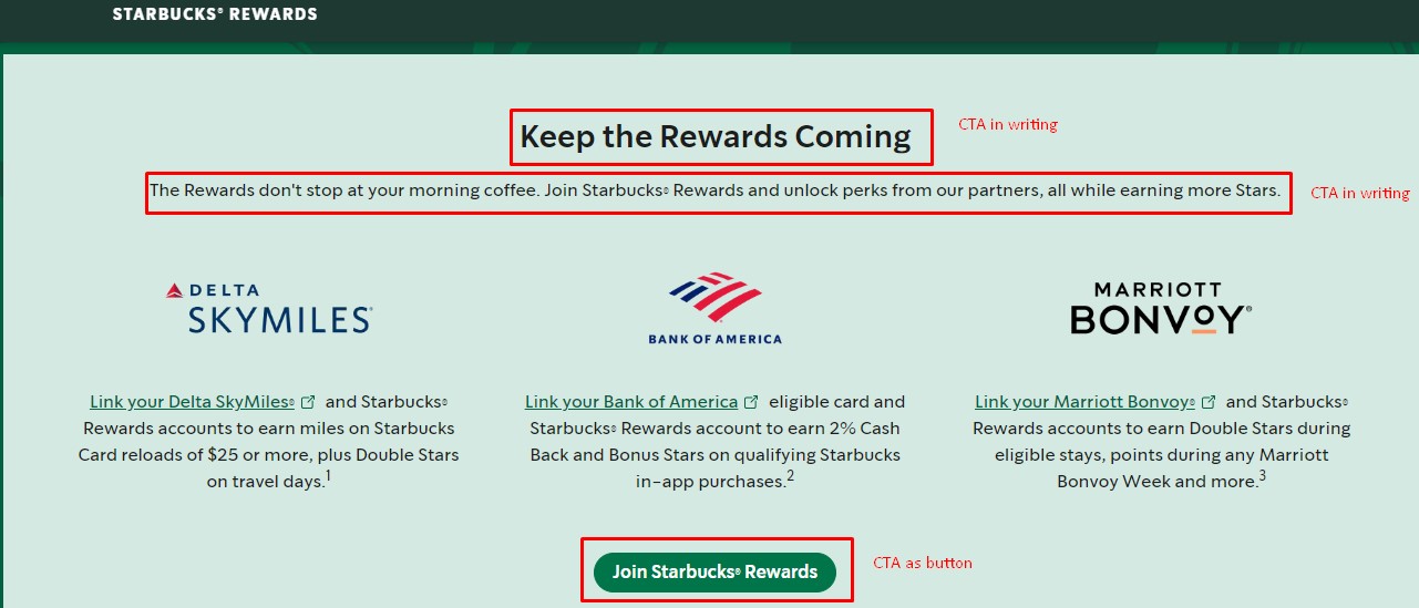
The call to action example from Starbucks Rewards illustrates how to effectively implement CTAs in both writing and button formats to improve user engagement:
What forms can call to actions take?
CTAs can be presented in multiple ways, each tailored to different platforms and user behaviors. The table below shows the common types and where they can be added:
| CTA forms | Description |
| Button CTAs | Web buttons, mobile app buttons |
| Text links | Inline text, anchor text |
| Popups and forms | Exit-intent popups, scroll-triggered popups |
| Push notifications | Mobile push notifications, web push notifications |
| Social media CTAs | Profile links, post CTAs |
| Email CTAs | Button CTAs, text links |
The type of call to action you choose plays a critical role in guiding your users’ interaction. These various CTA forms allow you to influence user decisions at every touchpoint, ensuring that the right action is taken at the right time.
For instance, a CTA on a website might take the form of a bold button urging visitors to make a purchase. For social media, it could be a simple text link encouraging followers to learn more.
The video here can be your playbook on how to create email CTAs that actually work and will get you the clicks that you need:
Call to action examples
Now, let’s discuss various CTA examples, including those in writing, buttons, text links, and profile links.
Each example is tailored to a specific audience and purpose. They’re also designed to drive engagement and boost your marketing efforts.
- Email CTA examples
- Ecommerce website CTA examples
- Popup form CTA examples
- Social media CTA examples
- Online ad CTA examples
- Creative CTA examples
Email CTA examples
Email marketing is a powerful tool for driving engagement and conversions. The following call to action button examples showcase how brands can add persuasive CTAs within their email campaigns to achieve particular goals:
Allbirds
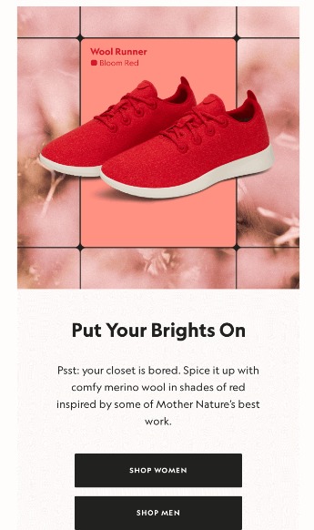
CTA: SHOP WOMEN, SHOP MEN
Format: Buttons
For this call to action example, Allbirds uses two prominent CTAs within the email. Both are presented as two distinct buttons with bold text and a vibrant background color.
The CTA buttons leverage a clean design and contrasting colors. Adding the black buttons against the white background makes this CTA pop and draws the reader’s eye to it.
We love how the brand uses gender-specific CTAs. They make it clear where the reader will be taken: the product pages that best match their needs, increasing the likelihood of a purchase.
Why this CTA example is great:
- Its effective placement captures readers who have fully engaged with the content
- The CTA directs users to their specific sections, personalizing their shopping experience
- The use of contrasting colors makes it visually appealing and easy to read
Allbirds is one of the successful stores, see more: The 25 top Shopify Plus stores to learn from in 2024
To’ak Chocolate
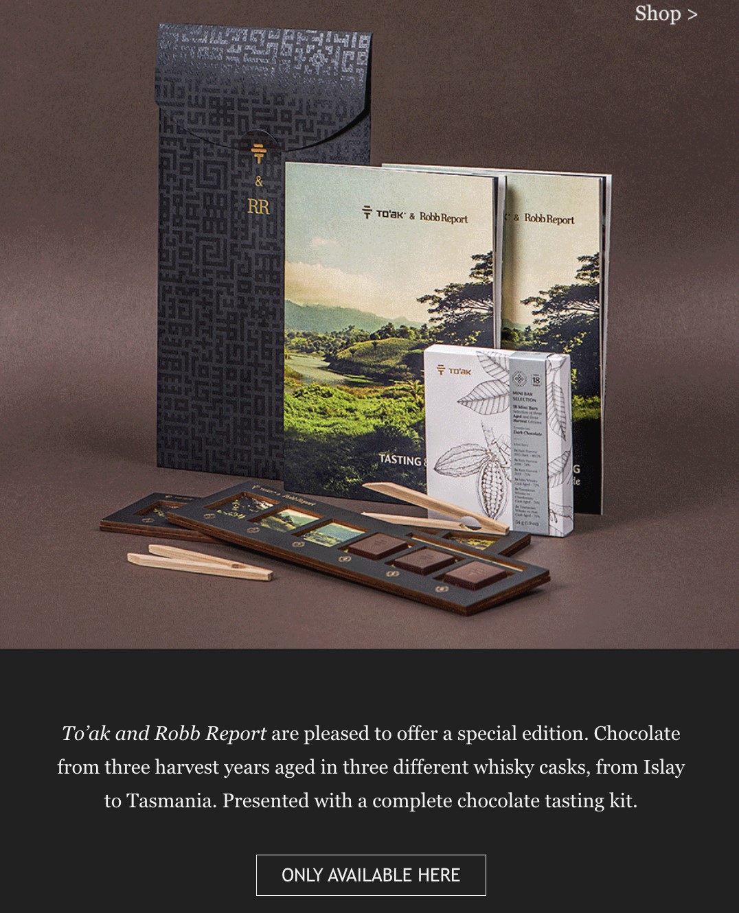
CTA: ONLY AVAILABLE HERE
Format: Button
This call to action example is effective as it highlights the product’s scarcity and exclusivity, encouraging customers to act fast. By using the words “ONLY AVAILABLE HERE,” To’ak Chocolate emphasizes that its luxury chocolate is a rare find and can only be found on its platform.
The exclusivity tactic enhances To’ak Chocolate’s allure and positions the brand as something the reader won’t want to miss out on. You can apply this technique in your email campaigns, especially if your audience values luxury and prefers specialty products.
Why this CTA example is great:
- Creates urgency by emphasizing the limited availability of the chocolates
- Reinforces the exclusivity of the brand, appealing to luxury consumers
- Positioned at the end for maximum impact after engaging content
| Case study To’ak Chocolate increased email-generated revenue by 460% with a clever strategy. Learn more |
Asphalte
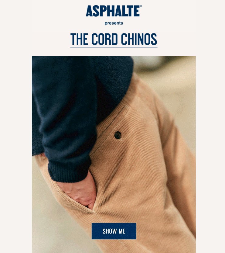
CTA: SHOW ME
Format: Button
The primary goal of this call to action is to prompt users to explore more details about the featured product — Asphalte’s Cord Chinos. The product is integrated directly into the image, making it a focal point of the email.
This CTA attracts attention with its contrasting color against the image background, making it hard to miss. By clicking “SHOW ME,” subscribers are directed to a page where they can view additional details and make a purchase. As a result, the CTA is effective in driving engagement and conversions.
Why this CTA example is great:
- Its minimalist design ensures that the CTA stands out without overwhelming the content
- The action-oriented text prompts users to interact and discover more, increasing engagement
- The CTA is strategically placed on top of the product image, making it highly visible and relevant to the email’s content
Asphalte is one of the best-looking fashion stores. See more: 15 best Shopify clothing stores in 2024
Kerrits
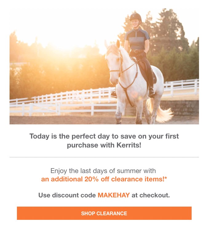
CTA: SHOP CLEARANCE
Format: Button
In this call to action example, Kerrits aims to promote a limited-time offer — 20% off of its clearance sale. The CTA is a striking, eye-catching orange color that contrasts well against the email’s white background. This visual distinction draws in the reader’s eyes.
Kerrits’ CTA is an example of a call to action that aligns perfectly with the promotional content. It builds momentum throughout the email before prompting action.
The prominent and well-positioned CTA further captures the readers’ attention at the most crucial moment when they’re most likely to convert.
Why this CTA example is great:
- The use of the words “SHOP CLEARANCE” tempts users to act quickly and take advantage of the offers
- It also directly guides customers to the clearance section, simplifying the shopping process
- Its positioning after a discount makes it more likely for prospects to click on it
| Case study Kerrits standard promotional emails generate a 26% open rate, a 19% click-to-open rate, and a 5.6% conversion rate — way above the industry average. Get insights |
DOD Outdoors
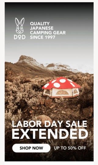
CTA: SHOP NOW
Format: Button
The main goal of this call to action is to drive immediate action by capitalizing on the urgency of the extended Labor Day sale. The bold “SHOP NOW” button is designed captures attention with its clear and concise copy.
The strategic CTA placement is difficult to miss against the surrounding text and imagery. This makes it easier for the reader to notice and act quickly to benefit from the sale.
To apply this technique, create a call to action that’s visually distinct with contrasting colors. Also, make sure your message is direct and emphasizes urgency or exclusivity to drive clicks and conversions.
Why this CTA example is great:
- It motivates customers to make purchases fast to avoid missing the sale
- The prominently placed CTA captures attention and drives immediate action
- The button is easy to spot even from afar because of its contrasting color
Ecommerce website CTA examples
Great CTAs on ecommerce websites guide users through their shopping journey. Here are some successful call to action examples used by ecommerce brands to improve their customer experience and boost sales:
DryRobe
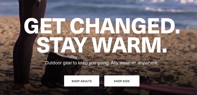
CTA: SHOP ADULTS, SHOP KIDS
Format: Buttons
In this example of call to action, DryRobe uses two CTAs, both positioned at the end of its email content.
It immediately segments the audience by directing them to either adult or kids’ products. If customers take action, they’re led directly to relevant product pages, streamlining their path to purchase.
This technique is a prime example of using minimal design to guide users efficiently. It offers a straightforward path to the products and can encourage faster decision-making.
Why this CTA example is great:
- Positioning the CTAs right after the introductory text encourages immediate action
- The clear segmentation of the adults and kids simplifies the shopper’s journey
- The contrasting colors make the CTAs easy to see, attracting the reader’s attention
Flaus
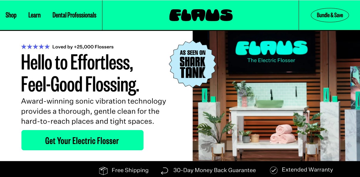
CTA: Get Your Electric Flosser
Format: Button
Flaus’ call to action appears as a bright green button against a clean white background. Using a contrasting color makes it highly visible and immediately draws the reader in.
The button is placed directly below a compelling product copy that highlights the product’s benefits. If the reader is influenced after reading this, the CTA’s placement makes it quick and easy for the reader to go through with their purchase.
By clicking the button and being guided directly to the product page, the CTA removes extra steps to checkout that may increase the risk of cart abandonment.
Why this CTA example is great:
- It’s direct and specific, clearly informing the readers on what action to take
- Its placement follows a natural flow from the product description to the action step, creating a seamless user experience
- The overall design is clean and uncluttered, ensuring that the CTA becomes the focal point of the page
Simple Self
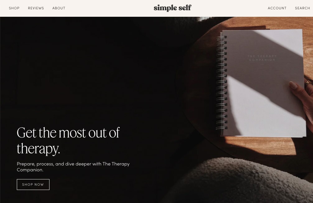
CTA: SHOP NOW
Format: Button
In this call to action example, Simple Self uses the CTA “SHOP NOW” on its landing page. Strategically placing the CTA immediately after a brief introduction of the planners allows users to transition smoothly from reading about the product’s benefits to taking action.
We love this call to action example because it leverages the momentum created by the introductory text. When customers click on it, they’re taken directly to a page where they can explore products and make purchases. This streamlines the shopping process.
Why this CTA example is great:
- It uses a direct, action-oriented language, making it easy for users to understand the next step
- The minimalist and straightforward design reduces distractions, allowing users to focus on what’s important
- The words “SHOP NOW” create a sense of immediacy, encouraging users to act without hesitation
Olipop
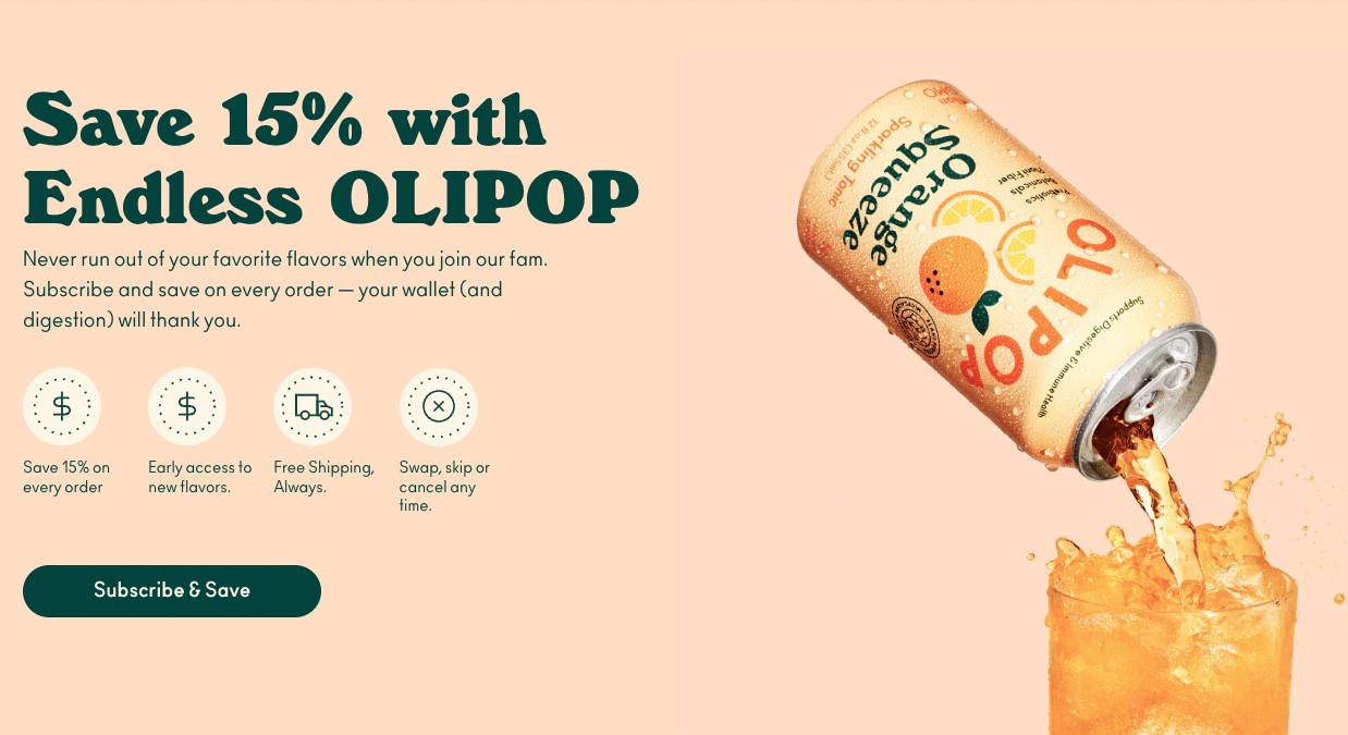
CTA: Subscribe & Save
Format: Button
Here, Olipop uses its call to action to encourage site visitors to commit to regular purchases. This CTA is positioned after a persuasive message highlighting the benefits of subscribing, and it targets customers looking for convenience and savings.
The CTA’s green button also contrasts sharply with the text’s background, making it visually prominent and easy to locate. By providing a discount, this call to action example appeals to cost-conscious shoppers while reinforcing the value of joining the subscription service.
Why this CTA example is great:
- The overall aesthetic and minimalistic design makes the CTA easy to spot and engage with
- It’s placed strategically during the purchase decision-making process, increasing the likelihood of action
- The copy’s simplicity ensures readers immediately know what they gain by subscribing
Alo Moves
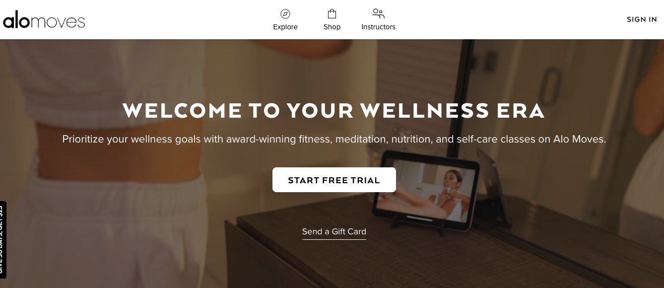
CTA: START FREE TRIAL, Send a Gift Card
Format: A button and an anchor text
Alo Moves includes two call to actions on its website. The prominent button contrasts well with the background, making it highly visible and inviting users to begin their fitness journey with Alo Moves. The other CTA is less visible and serves as a secondary option for users who may want to share the experience with others.
The dual CTA allows the customers to choose whether they want to try out the service themselves or gift it to someone else. The strong contrast of the “START FREE TRIAL” ensures it draws immediate attention. The second hyperlink offers an alternative action without overwhelming the user.
Why this CTA example is great:
- “START FREE TRIAL” button is front and center, encouraging immediate engagement
- Dual CTAs cater to different user needs, enhancing user experience
- The contrasting button color ensures that the primary action is clear and easy to undertake
EZCater
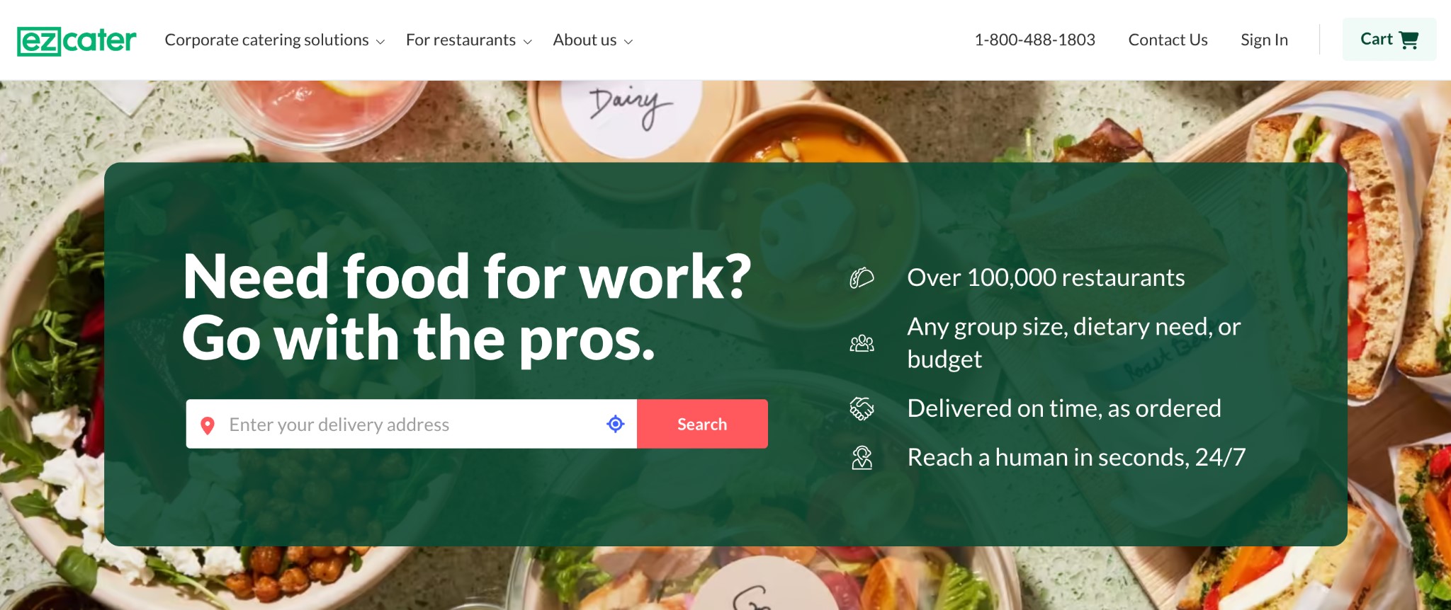
CTA: Search
Format: Button
EZCater has strategically integrated its CTA within the search button on its website, enabling users to input their delivery address to discover catering options. This CTA is designed to guide users through the initial step of ordering food, making it simple and straightforward.
Using a red search section against the text’s green background creates a strong visual contrast. It’s also obvious what action the user needs to take. The CTA mandates users to provide their delivery address, ensuring they’re actively engaged in the ordering process from the start.
Why this CTA example is great:
- Its placement at the top of the homepage makes it one of the first things the reader sees
- The search button is functional and directly engages users
- The surrounding text reinforces the value proposition, motivating users to take action
Popup form CTA examples
Popup forms are a clever way to capture user information and drive engagement through irresistible offers. Here are call to action examples used in popup forms to engage visitors and prompt action:
Aura
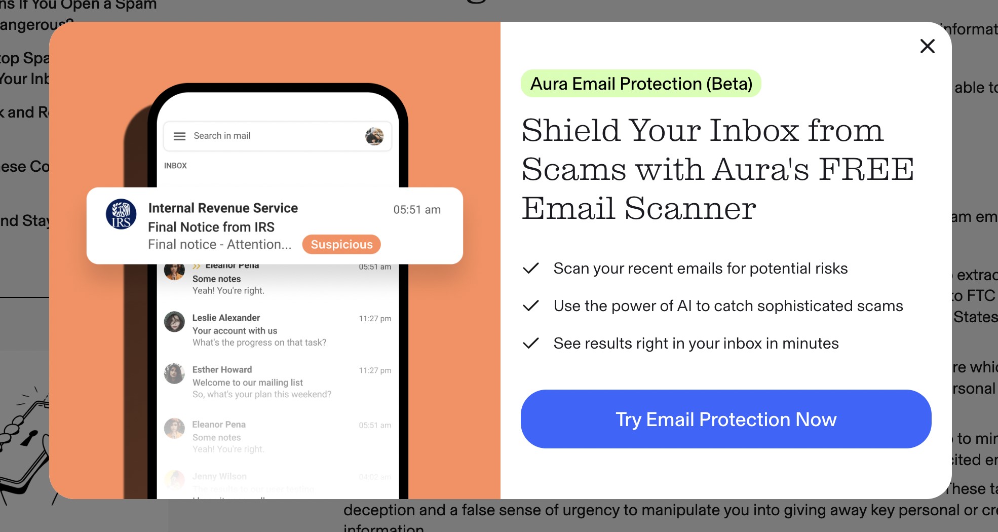
CTA: Try Email Protection Now
Format: Button
Aura’s call to action appears within a popup form on its website, offering users a clear action to start protecting their email accounts. By using the words “Try Email Protection Now,” Aura has managed to convey the urgency of protecting their emails, making them want to act quickly.
The CTA’s blue button stands out against the white background. This draws in the readers’ attention and makes it easy for them to see and click on it.
We love how the brand has effectively tied the CTA to the service’s value proposition, offering users a free and easy way to protect their inboxes from scams.
Why this CTA example is great:
- Its central positioning on the popup makes it hard to miss
- It provides a direct action with immediate benefits for the user
- The language emphasizes both protection and the ease of trying it out, which appeals to users’ needs
Convert more visitors with popups: 3 ways to use smart popups for better conversions
Illy
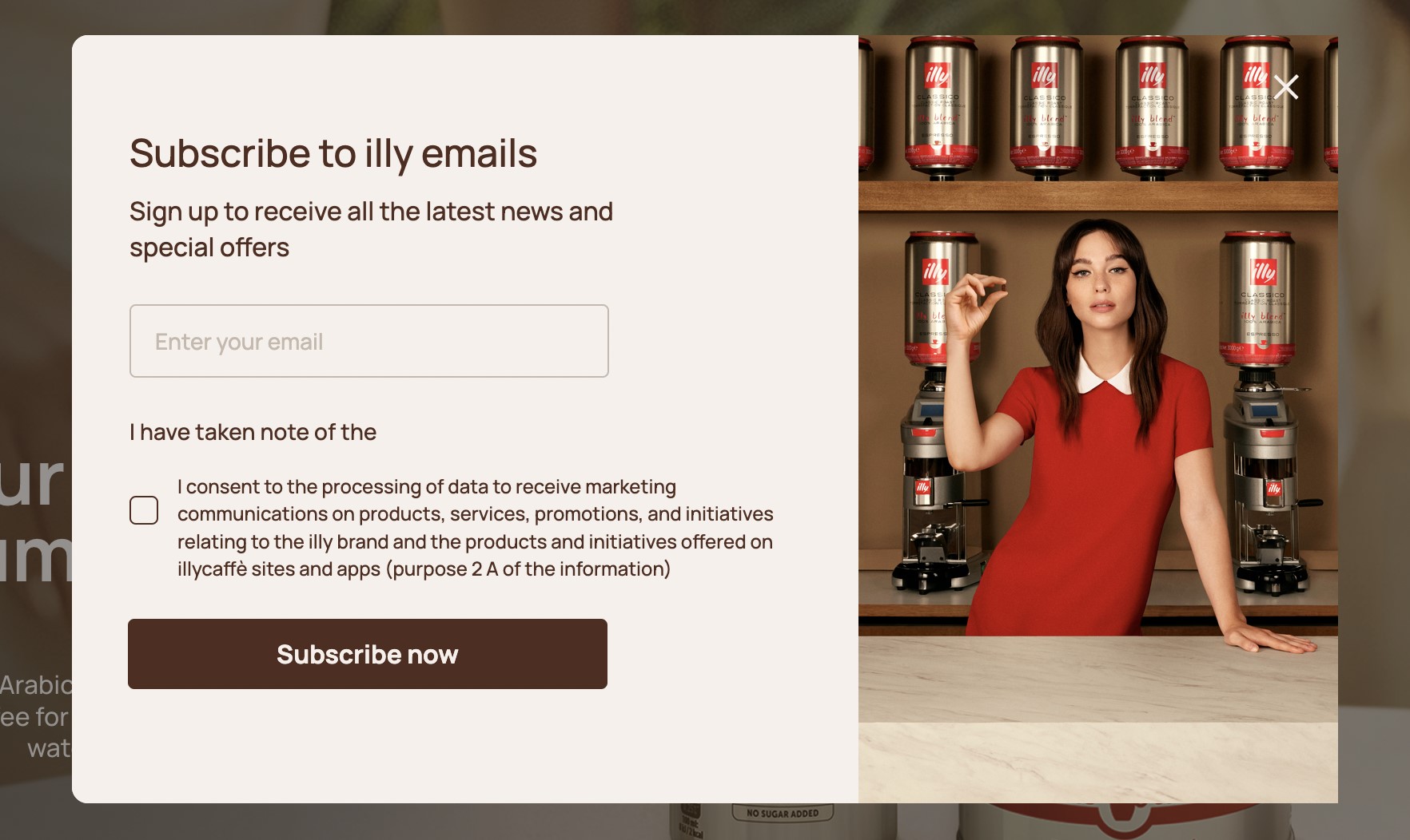
CTA: Subscribe now
Format: Button
This call to action is designed to capture email signups. Once users add their email addresses and agree to the terms, they’re prompted to click on the CTA to complete the process.
Illy’s CTA is clear and straightforward, guiding users through the final step of subscribing to its email list. By placing it directly after the email entry and agreement box, Illy ensures that the users are fully engaged and ready to take action.
Why this CTA example is great:
- It’s simple and takes minimal effort, making it easy for users to complete the subscription process
- The popup form format effectively captures user attention without being overly intrusive
- The contrasting color of the button makes it visually striking and very noticeable
OE Wines
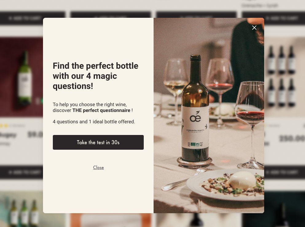
CTA: Take the test in 30s, “Close”
Format: A button and anchor text
OE Wines uses two CTAs in its popup form. The primary CTA is a black button on a white background. This color combination makes the CTA very visible and invites users to engage with the wine questionnaire.
The secondary CTA is presented as anchor text in a popup that closely aligns with the color of the background. This design choice is subtle, encouraging the primary CTA to be clicked on instead. Although, “Close” does provide a less obtrusive option for users who may not be interested.
Why this CTA example is great:
- The clean design and contrasting elements make it visually striking and effective
- Its copy, “Take the test in 30s” clearly communicates the short amount of time the action requires
- Dual CTA approach caters to different user intents, balancing engagement with exit options
Grub Club
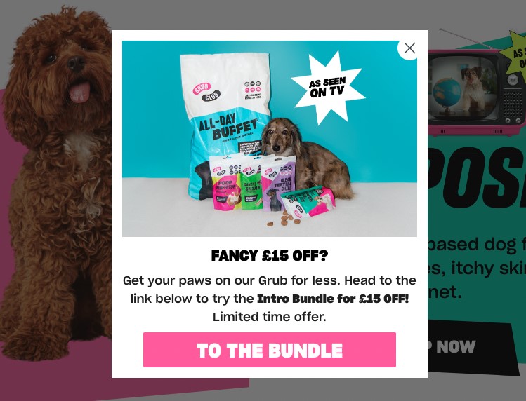
CTA: TO THE BUNDLE
Format: Button
Grub Club uses this call to action to encourage visitors to take advantage of a limited-time offer. The CTA design features a pink button that contrasts sharply with the white background, making it highly visible and easy to click.
The CTA, positioned after a persuasive offer of £15 off an introductory bundle, aims to drive immediate action by creating a sense of urgency. This approach effectively guides users towards a specific product, making the purchasing process straightforward and enticing.
Why this CTA example is great:
- Its color and design aligns with the site’s branding, maintaining a cohesive visual identity
- The direct, action-oriented copy makes it clear what users should do next
- Directing users to a special bundle page provides immediate value and enhances user engagement
Maguire Shoes
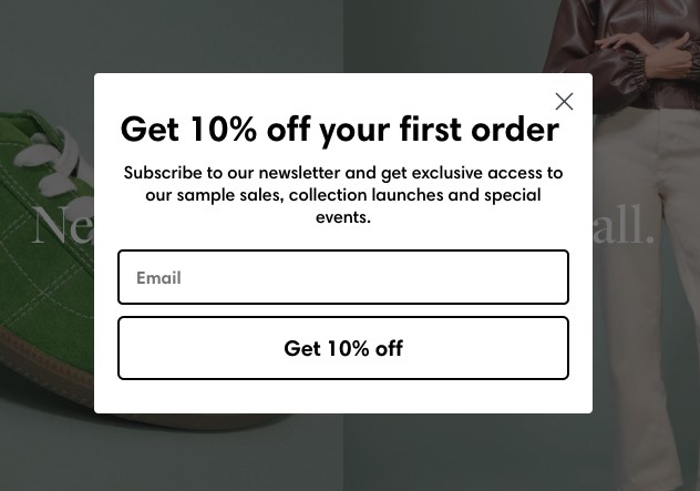
CTA: Get 10% off
Format: Button
The goal of this call to action is to incentivize visitors to subscribe to the Maguire Shoes newsletter. Its strategic placement in a popup that appears after a brief period of site interaction makes the consumer more likely to make a purchase knowing they’ll receive a discount.
We love this CTA because it motivates users to provide their email addresses. By offering a 10% discount and ongoing perks, the CTA drives user engagement and delivers immediate value.
The straightforward messaging makes it easy for users to understand and act upon.
Why this CTA example is great:
- It offers a direct and appealing benefit, encouraging users to subscribe
- The black text against the white background makes the CTA button visually striking and easy to find
- The clean and simple design ensures that the message is clear and the action easy to take
Social media CTA examples
Social media platforms provide unique opportunities to engage audiences with compelling CTAs that drive action. Here are five social media call to action examples and how they’ve been used to capture attention and encourage user interaction:
Salesforce
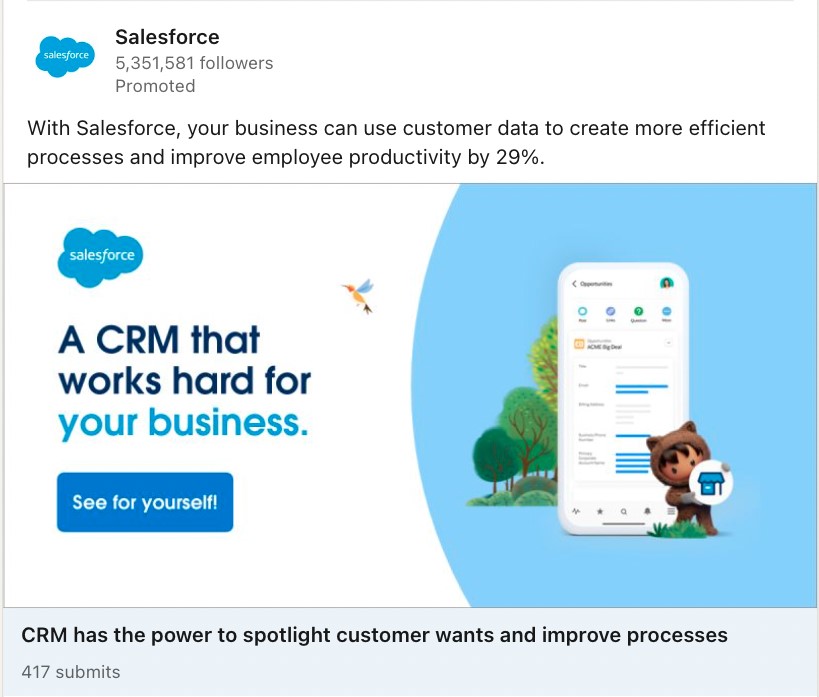
CTA: See for yourself!
Format: Button
Salesforce employs this call to action to engage potential customers in a sponsored post on LinkedIn. It invites readers to explore the brand’s CRM platform. The CTA follows a concise message emphasizing the value of a CRM that “works hard for your business.”
We love how this call to action example plays on curiosity and the promise of discovering something beneficial.
This can be particularly effective in a fast-paced social media environment where users are always scrolling. The simple and minimalist design also reduces distraction and makes it minimal effort to take action.
Why this CTA example is great:
- It’s clear and inviting, encouraging users to explore the product for themselves
- The blue button stands out against the white background, making the CTA easy to spot and click
- The message above the CTA effectively highlights the product’s value, motivating users to click
Giulia School
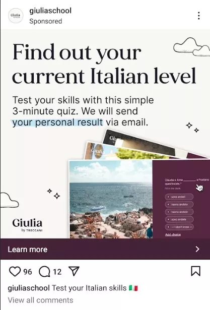
CTA: Learn more
Format: Link in a promotional post
Giulia School uses this call to action in its Instagram post to encourage users to engage with its content and test their Italian language skills. The CTA includes a link to a free, quick quiz to determine their Italian proficiency.
The call to action is designed to pique users’ curiosity. It offers personalized results via email to motivate them to click the link and explore further.
By directing users to its profile, the brand increases the likelihood of deeper engagement with its content and services.
Why this CTA example is great:
- It’s subtle yet effective, guiding users to learn more about the brand and its offerings
- The soft background tones paired with a striking button color enhance its visual appeal
- The copy “Learn more” is non-intrusive and inviting, offering an invitation without commitment
California Institute of Technology

CTA: Learn more
Format: Link in a sponsored post
Here’s another call to action example that targets social media users by offering just enough information to spark their interest. The link directs users to the institute’s profile, providing them with comprehensive details about the program.
The post highlights the key benefits of enrolling in the program, including the duration of the program, collaboration with IBM, and the tools covered. This makes the call to action an actionable next step for those interested.
Why this CTA example is great:
- It’s clear and action-oriented, encouraging users to learn more about the program
- The sponsored post format ensures the CTA reaches a targeted audience
- The term ‘Learn More” can help build trust by focusing on educating users rather than immediately converting them
Headway
CTA: Learn more
Format: Hyperlinked text
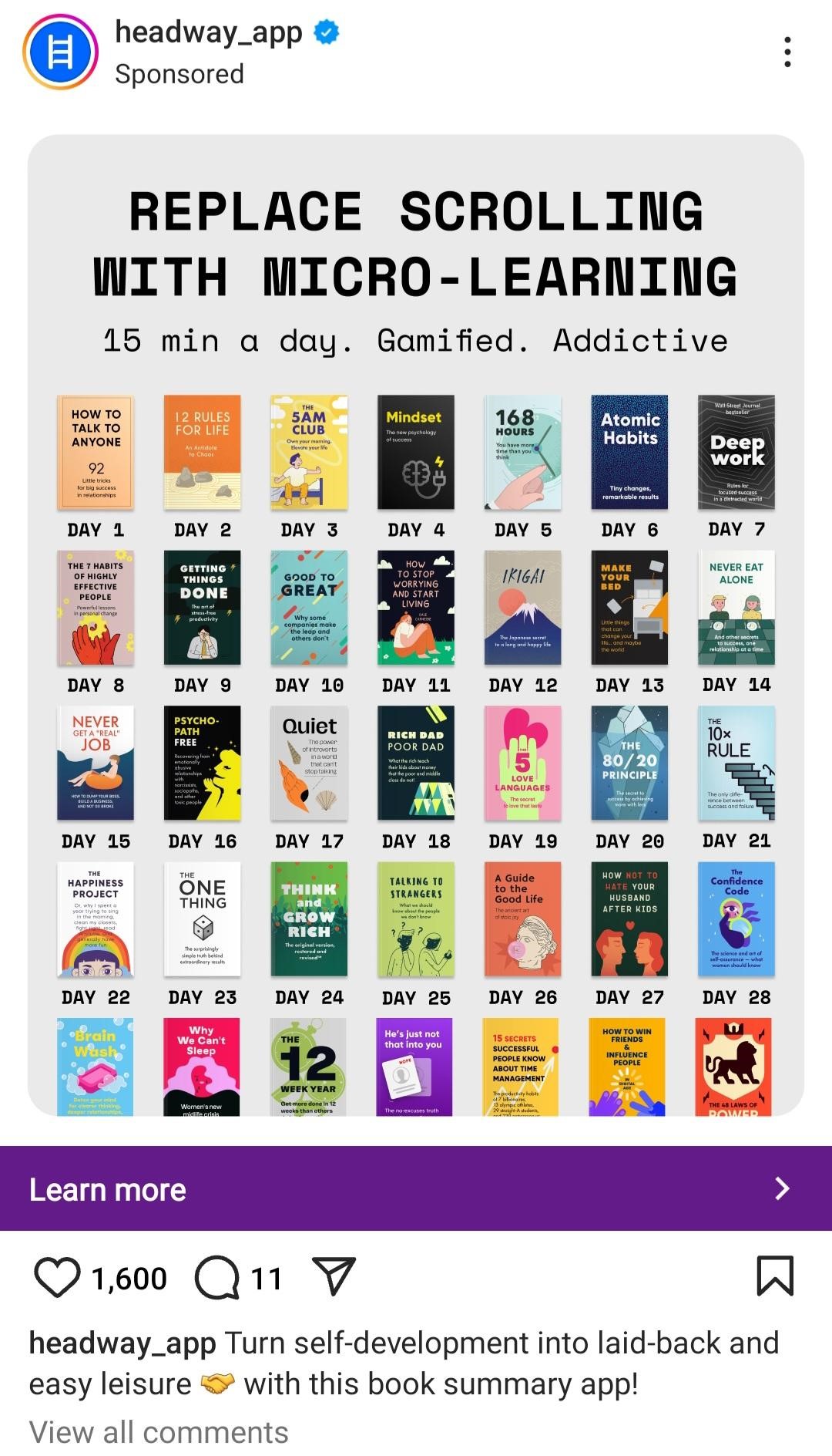
Headway uses this call to action in its sponsored post to attract users interested in personal development through micro-learning. The CTA, which is strategically positioned after a brief, engaging description, invites users to click the link for more information.
The post’s visual layout, combined with a clear and concise message, draws users in. It makes the CTA a logical next step for those intrigued by the concept of bite-sized learning.
Headways has also added the link directly within the text to make it easy for interested users to click through to the landing page without interactions.
Why this CTA example is great:
- It capitalizes on curiosity and interest, encouraging users to explore what the app offers in detail
- The hyperlinked text is clear to see because of its bright purple color against a clear background
- The sponsored post format ensures the CTA reaches a wide, targeted audience
Clutch

CTA: GET FOUND ON CLUTCH, Learn more
Format: Button
Clutch uses these call to action buttons to encourage companies to improve their visibility on social media. The bright orange button stands out and effectively grabs the user’s attention. The smaller, more subtle “Learn more” is also useful to encourage people who are unsure to read their reviews.
The brand positions the main CTA right after a compelling question that highlights the value of being discovered by potential clients. This is an attractive proposition for businesses and incentivizes them to take action.
Why this CTA example is great:
- It’s visually striking with its orange color, ensuring high visibility
- The direct and simple wording makes it easy for users to know what to expect when clicking
- It targets a specific need — visibility — making it highly relevant to the audience Headway is addressing
Online ad CTA examples
Online advertisements can be powerful tools for driving traffic and conversions when paired with compelling call to actions. Here are some examples from online ads:
CarGurus

CTA: New Cars For Sale, Used Cars, and Selling Your Car
Format: Anchor text links
CarGurus uses three call to actions in this Google ad. Each anchor text link directs users to a relevant section of the site based on their needs, whether they’re buying new, buying used, or selling their vehicle.
The CTAs are easy to spot, being highlighted in blue against the text’s white background. The ad’s surrounding copy builds trust by mentioning unbiased reviews and opinions. This helps users feel confident as they take the next step with one of the CTA links.
Why this CTA example is great:
- The buttons’ sizes and prominence create an easy navigation experience
- The CTAs clearly stand out without overwhelming the user
- The simplicity and directness of the options encourage users to click based on their intent
Helpshift

CTA: Contact Us, Pricing, Self Service Experience, Customers
Format: Anchor texts
Helpshift uses four distinct CTAs to engage different types of audiences in this sponsored ad. Each call to action serves a specific purpose, allowing users to navigate directly to the information they most find relevant.
These anchor texts are highly useful in a search ad format because they offer various entry points depending on the user’s intent. Whether a prospect is looking for information on pricing, case studies, or self-service options, Helpshift provides multiple paths for engagement.
Why this CTA example is great:
- Multiple CTAs offer tailored options for users, increasing relevance and engagement
- The anchor text format is clean and direct, making it easy to navigate
- The direct and simple copy helps reduce confusion and makes the CTAs intuitive
Jennifer Dawn Coaching

CTA: Book Your Free Call – Small Business Consultant
Format: Anchor text with a link
Here, Jennifer Dawn Coaching uses this call to action to prompt potential clients to schedule a consultation. The CTA is well-suited to the ad’s overall goal of attracting small business owners interested in coaching and consulting services — it offers a no-obligation entry point.
By focusing on free consultation, the CTA encourages visitors to take the first step without feeling pressured to commit to anything long-term. It’s clear, actionable language also makes it easy for users to understand what to do next.
Why this CTA example is great:
- Offers an appealing, no-cost benefit that reduces hesitation
- Its placement at the forefront of the ad ensures it grabs attention right away
- Creates urgency and immediate engagement by offering a free, time-sensitive opportunity
Pelican Hill

CTA: Our Villas, Explore our Bungalows, Resort, Spa Treatment Menu, Exclusive Offers, Golf
Format: Multiple anchor text CTAs
Pelican Hill’s online ad uses six distinct CTAs to guide potential customers to different areas of interest within the resort. These CTAs, presented as anchor texts, follow an enticing description of the resort’s luxurious offerings.
Each CTA caters to a specific interest, including accommodation options, spa services, golf, or exclusive offers. This approach allows the brand to target a broader audience with varying preferences and needs, providing multiple paths for engagement.
Why this CTA example is great:
- The CTAs are highly targeted, each catering to a specific aspect of the Pelican Hill experience
- They’re visually distinct from the ad background, making them easy to notice and act on
- The anchor text format blends seamlessly with the ad, creating a streamlined experience
AMPM

CTA: Meet Toomgis, ampm Near You, New ampm Deals & Offers, Download ampm App
Format: Anchor text links
This CTA example by AMPM features four calls to action, each with a specific purpose. They’re presented in anchor text links, allowing users to choose their path based on their interests. The ad introduces a coffee deal and positions the CTAs to cater to different needs.
The needs could be learning about AMPM’s mascot, finding a location, exploring deals, or downloading the AMPM app. These options give users control over their experience while encouraging deeper engagement with the brand.
Why this CTA example is great:
- Each call to action is clear and specific, helping to target both new customers and returning visitors
- The anchor text format makes it easy for users to navigate directly to what interests them
- The CTAs cater to different user needs, increasing the ad’s overall effectiveness
Creative CTA examples
Creative calls to action go beyond the typical “Shop Now” prompts, providing unique and engaging ways to inspire user action.
Here are some great creative call to action examples:
East Fork
CTA: THAT’S A LOT OF POTS
Format: Button
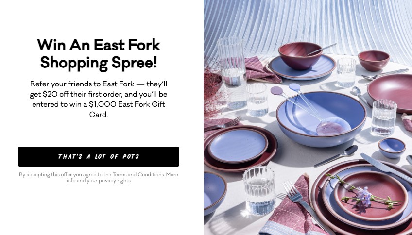
East Fork uses a playful and eye-catching CTA to encourage users to participate in its referral program. This creative CTA, styled in slanted font, breaks away from conventional CTA phrases, using humor and casual language to capture attention.
The black button contrasts against the white background, making it visually striking and easy to spot. We love how the relaxed tone and eye-catching design make the text more inviting for users to engage with.
Why this CTA example is great:
- Its central placement ensures it draws attention without being intrusive
- CTA creates curiosity, prompting users to click through without feeling pressured
- The referral-based offer adds value, encouraging users to take action without pressure to buy immediately
Reternity
CTA: GET YOUR SNEAKERS HERE ON SUNDAY, 10AM
Format: Link text and button
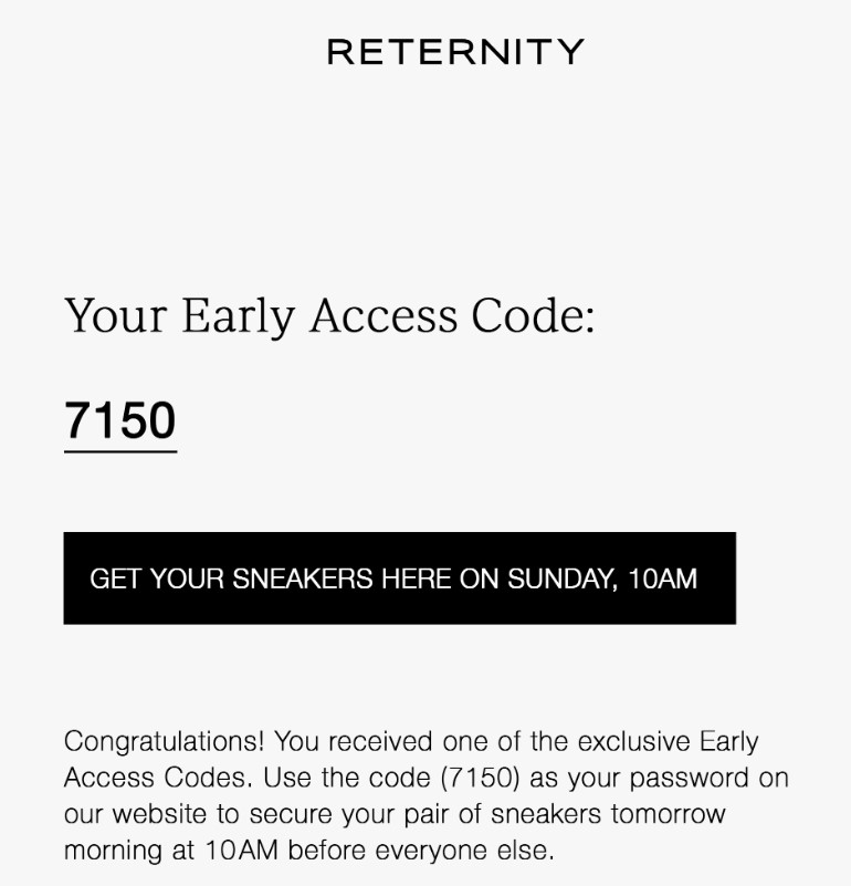
In this example, Reternity features two call to action examples. The first one is an access code subtly placed within the email copy. The second is a bold black button that stands out against the white background, creating urgency for the users to take action.
The combination of these two CTAs makes the user feel like part of a select group, thus driving engagement through exclusivity and scarcity. While the access code helps promote a feeling of privilege, the button directs users to take immediate action.
Why this CTA example is great:
- The first call to action creates a sense of exclusivity, increasing customer loyalty
- Its clean and modern design ensures that the CTAs are easily noticeable
- Adding the time in the call to action builds anticipation, motivating users to act quickly
Cabaia
CTA: I’ll give it a try
Format: Button
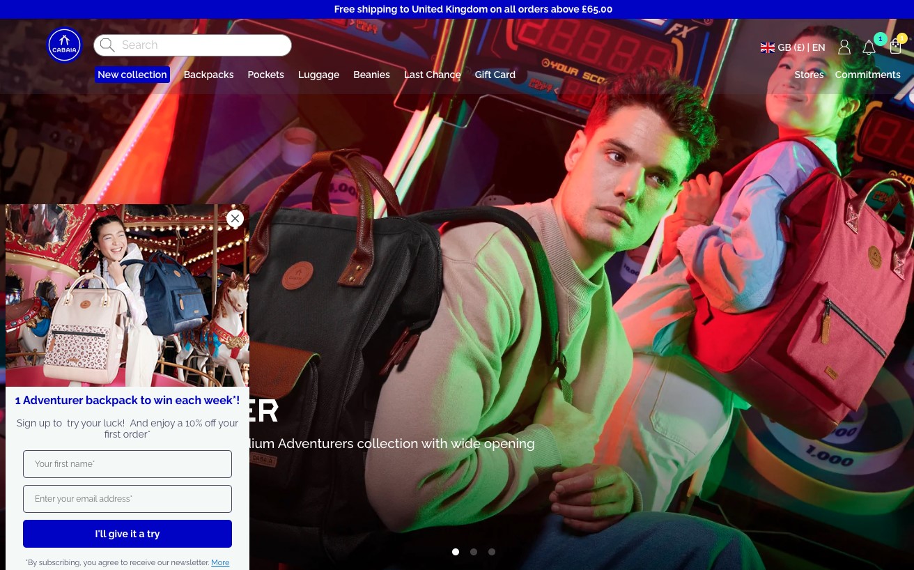
This CTA by Cabaia is a creative and casual approach that entices users to take action. It appears in a popup window, asking users to sign up for a chance to win a backpack and receive 10% off their first order.
The conversational tone of this call to action stands out. It feels less like a pushy sales tactic and more like a friendly invitation. The blue button also contrasts with the white background. This makes the call to action easy to spot and click.
Why this CTA example is great:
- The casual, friendly tone makes it feel approachable and less pushy
- Has a combination of rewards (contest and discount) that increases the appeal of taking action
- By focusing on a trial, the CTA reduces perceived risk, making it more appealing to new users
Harley Davidson
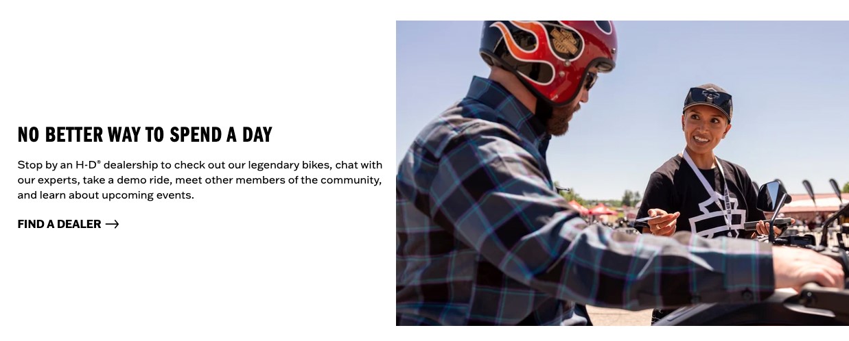
CTA: FIND A DEALER
Format: Anchor text
Harley Davidson’s call to action offers a practical yet compelling invitation for users to connect with the brand in person. It leverages the brand’s lifestyle, promoting a purchase and an entire experience.
Clicking the CTA takes users directly to a search tool, allowing them to find nearby dealers for immediate purchase. This effectively streamlines the buying process.
The placement of the CTA just above the persuasive message also encourages users to take the next step and find a dealer near them. The CTA is straightforward, functional, and aligns with the user’s interest.
Why this CTA example is great:
- It invites users to explore the brand’s products in a real-world setting
- The embedded link feels natural and less pushy, encouraging engagement without pressure
- It promotes the brand’s community-oriented lifestyle. This can help strengthen user loyalty and interest
Holo Taco
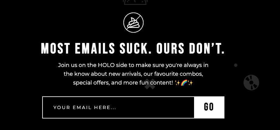
CTA: GO
Format: Button
Holo Taco uses this minimalistic yet bold call to action to encourage prospects to subscribe to its newsletter. The white CTA button, which contrasts with the black background, is visible and easy to locate.
Using “GO” instead of conventional terms like subscribe keeps the signup process fun and on-brand. Paired with the enticing copy about the benefits of joining, the CTA encourages users to act quickly and feel excited about signing up.
Why this CTA example is great:
- The playful language adds personality and aligns with the Holo Taco’s voice
- The straightforward message minimizes decision fatigue — this can lead to higher click-through rates
- It keeps the process simple while emphasizing the benefits of signing up, making it easy to engage
Summary
Effective call to action examples show us how a simple prompt can drive exceptional results across various platforms. Whether you’re focusing on email marketing, social media, or website content, the right CTA can make all the difference.
As seen in these examples, a call to action can take many forms. However, the key to success is creating a message that resonates with your audience.
A well-designed CTA should prompt immediate action and align with your audience’s needs and interests.
Omnisend offers tools to help you create compelling CTAs that speak to your audience and increase engagement. Start free today and watch how stronger CTAs can make a difference in your results.
Quick sign up | No credit card required
TABLE OF CONTENTS
TABLE OF CONTENTS


No fluff, no spam, no corporate filler. Just a friendly letter, twice a month.

 OFFER
OFFER


