Drive sales on autopilot with ecommerce-focused features
See FeaturesYou’re building your email list using popups, and the conversion rate is low. So you start building a new version, because that’s the only way to test different variables, isn’t it?
Actually, no.
Omnisend customers now have the ability to do forms A/B testing, which is a powerful feature to optimize the performance of your popup forms. By experimenting with different versions of a form, you’re able to quickly identify what your audience best responds to.
This also improves user experience, because you’re providing more of what your visitors want to see and less of what they don’t want to see. And you’ll be armed with information that helps you make data-backed decisions for your marketing strategies.
Let’s take a look at how you can make the most of your forms testing.
4 things to consider A/B testing in forms:
The key to successful forms A/B testing is to be methodical. The intention is to make incremental changes so you can easily observe what works and what doesn’t. On the other hand, if you compare two versions that have different wording, colors, and CTAs, you won’t know which factors led to success or failure.
So, while it is recommended to test lots of different elements, it’s important that you don’t do it all at once. Instead, choose one thing to test—for example, keep everything the same in both versions of a form, except for the headline. Then, keep everything the same except for the positioning, and so on.
Here are the four main areas you can test to optimize conversions, and how to do it:
1. Design and layout
There’s more to design than many people think. It’s not just the obvious, like size and color, but also considers how else a visitor is presented your popups—including what those popups require of them.
Size and positioning: do your popups grab attention by occupying the entire screen, or are they barely noticeable in the bottom corner?
Number of fields: are you asking your visitors to take 10 seconds to enter their name and email address, or are you overwhelming them with a long list of requirements? If you do want to collect more information, such as phone numbers and birthdays, you may want to use multi-step forms so it’s less intimidating.
Use of images and icons: Find out if your audience prefers text-only popups or if they want images. You can also experiment with types of image, such as those that show people, animals, or products.
2. Content
The words you choose to put on your popup forms are important. Too long, and you risk boring people. Too short, and they may not have enough information to want to sign up. You’re looking for the balance between the two, while making the popups compelling.
Call to action (CTA) text: many businesses opt for the usual “Subscribe” or “Sign up” but if they’re not working for you, try alternatives, such as “Join the club” or “Become part of the family.” Check these 30 killer exit intent popup examples for inspiration.
Field labels and placeholder text: Experiment with what you ask and how you present it. For example, instead of “Name” you could be more specific with “First Name.”
Incentive offers: Give people a reason to join your list, and make sure that reason is relevant and compelling. It could be free shipping, pre-sale access, or a discount code for signing up—by A/B testing the incentive, you’ll quickly find out what your audience appreciates the most.
3. Colors and typography
Your popups probably have your brand colors and fonts, and that’s great. But part of your experimentation can include checking that your audience responds well to that branding, and that there aren’t any readability problems caused by the font color blending into the background too much.
Colors: There are multiple places to use color in popups—there’s the background, your buttons, text, and images. You can choose to have a lot of contrast, or a lot of similarity, and experiment with entirely different colors.
Font size and style: Your font can say a lot about you. You can appear formal, informal, playful, alternative, luxury, and a lot more. Then there’s the size of your font—too small and people won’t be able to read it, but they might dislike it too big. Experiment with these options to discover the sweet spot.
4. Technical Aspects
There’s more to a form than just how it looks. To perform as well as it can, it also needs to not cause any friction for your visitors. There are two very important considerations for this:
Form load time: if your form doesn’t load instantly, it isn’t going to be effective. And it doesn’t matter if you’ve crafted the most beautiful design with the most compelling text ever created, if nobody gets to see it—so don’t sacrifice speed for design.
Mobile responsiveness: With almost half of global web traffic coming from mobile devices, it’s essential that your forms load accurately on all screen sizes. Make sure that it looks appropriate on every device, text is always clear and legible, and buttons are clickable.
Benefits of using A/B testing for popup forms
Now that we’ve covered the four main areas you could test, let’s look at some of the popular uses to ensure you’re making data-driven decisions:
- Test different copy: Try different text and messaging angles on your forms
- Experiment with visuals: See how different colors, icons, and images impact your conversion rates
- Adjust the look and feel: Change your font, copy, and visual elements to give a comprehensive makeover to your forms
- Test display settings: Change how quickly the form appears once a visitor lands on your site
- Compare single-step vs. multi-step forms: Is it more effective to put all the fields on one form, or to split them up with a multi-step form?
- Experiment with contact information collection: Try asking for a name and email, and name and email plus SMS, or custom information such as birthday, gender, favorite time of year—or anything that would be relevant to your brand
- Compare different promotions: Easily find out what matters the most to your audience
- Test form with a teaser vs. different teaser styles: Learn if your conversion rates are affected by the style or wording of your teasers
- Evaluate the impact of gamification: Try our Wheel of Fortune and see if it boosts your signup rate
Mastering A/B testing: from setup to success
At this point, you might be thinking that there must be a catch—to get all this insight and grow your email list more efficiently, there must be a complicated setup process, right? Wrong! Setting up forms A/B testing in Omnisend is incredibly easy. Let’s walk through it:
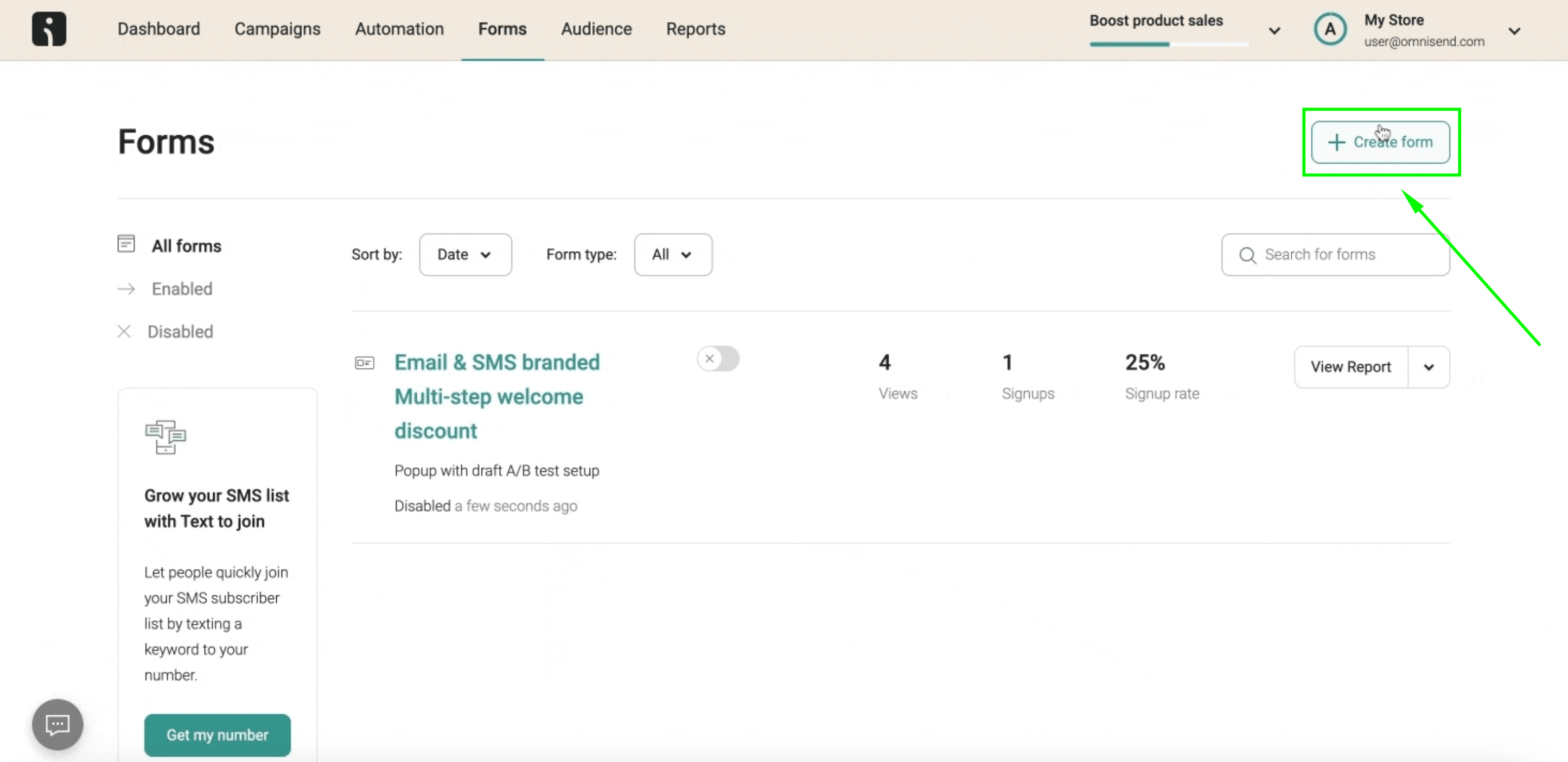
Step 1: Choose the form
Choose your preferred form in our library, or create your own from scratch using our Form Builder.
Step 2: Create two versions (Control and Experimental)
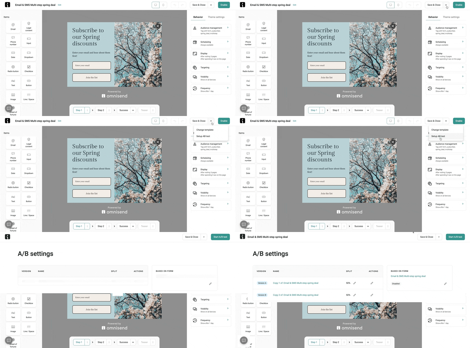
Forms testing requires that you have two versions: the control, and the experimental.
In the Form Builder, click on the arrow beside the “Save & Close” button, and then select the option to “Setup A/B test” in the dropdown. You’ll now be able to see two copies of your original form.
Keep the first one as it is, this is your control version. The second version is where you can make your changes to compare against the original form. In this example, we moved the “First name” field to the second step of the form, to see if this performs better than having it on the first step:
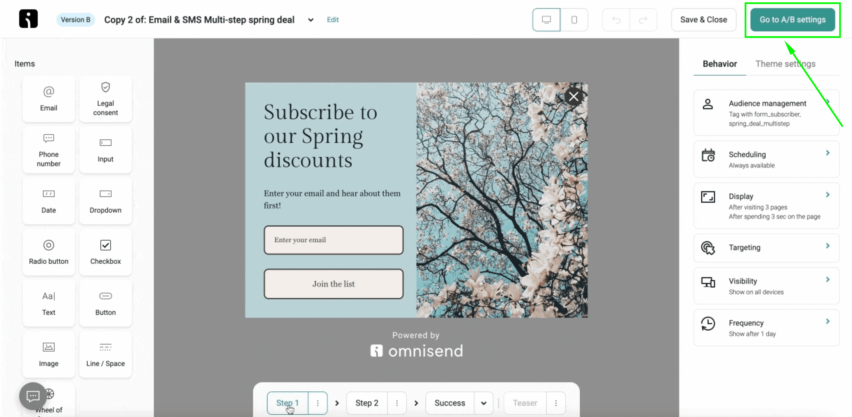
When you’re done, click “Go to A/B settings” in the top right corner.
Step 3: Decide on traffic split
Here, you get to choose what percentage of your website traffic sees each version. You can opt for 50/50 so both versions are seen equally, or you can opt to show either version to more people. Then it’s time to click the “Start A/B test” button in the top right of your screen:
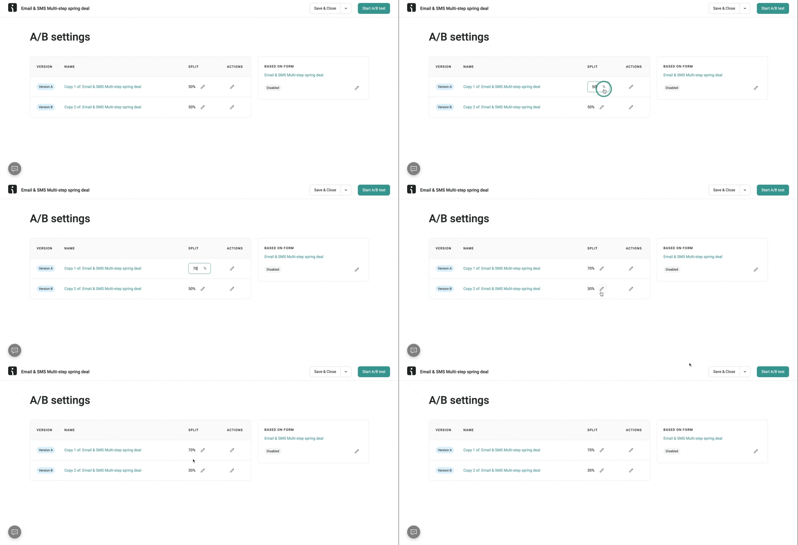
Step 4: Start the test
Now you can sit back in your chair, take long sips from your coffee, and wait patiently. Or you can nervously pace up and down the room—it’s your choice. Your visitors will now see either version, but never both at the same time.

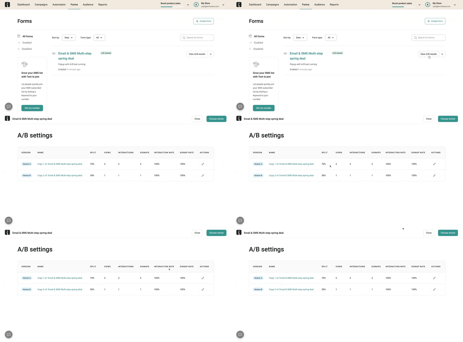
Step 5: Monitor results
Here’s where things get interesting. You can see not only the signup rate for each version, but also how many views and interactions they each had. By diving into the data, you can see what’s working and what’s not—and decide what changes to make for your next A/B test.
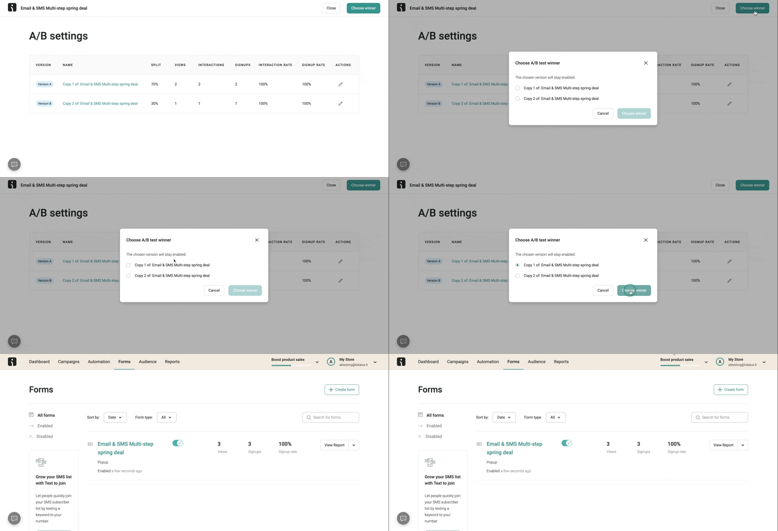
Step 6: Choose the winner
Once you’ve collected enough data to be happy that the results are conclusive, you can end the test. The version that won the experiment should now be your main form, and the control version of future A/B tests.
Conclusion
A/B testing forms is a powerful way of optimizing your popups. The experimentation allows you to adjust different elements of each form until you identify what your audience best responds to—which translates to higher conversion rates, and accelerated list growth.
Quick sign up | No credit card required
TABLE OF CONTENTS
TABLE OF CONTENTS

What’s next


No fluff, no spam, no corporate filler. Just a friendly letter, twice a month.

 OFFER
OFFER


