
 OFFER
OFFER


Drive sales on autopilot with ecommerce-focused features
See FeaturesWelcome popups engage first-time website visitors at a crucial moment in their customer journey — when they’re actively discovering your brand and forming their first impressions of your products or services.
A well-timed welcome popup can create a good first impression and improve customer experience. For instance, you could offer a 10% welcome discount on the product they’re viewing or free next-day delivery on time-sensitive Mother’s Day gifts.
That convenience makes welcome popups a powerful list-building tool. Once you have a contact list, you can send personalized emails, exclusive offers, and targeted content that drives repeat purchases.
Join us below to discover 10 welcome popup examples and tips to create high-converting popups for your store.
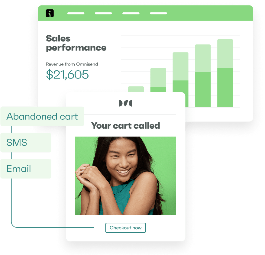
Create welcome popups that encourage signups with Omnisend
Quick sign up | No credit card required
What is a welcome popup?
A welcome popup is a marketing overlay that appears to new website visitors. It enhances the shopping experience with relevant value, such as a discount code, free shipping, or exclusive content.
Some welcome popups load instantly, some trigger based on user behavior like scroll depth, while others stay hidden until visitors tap a floating button or icon.
The quality of the offer and its relevance to the visitor determine whether it’s worthwhile for them to give their email address. Omnisend lets you A/B test different popup forms to find what resonates most with your audience.
Why welcome popups work
Welcome popups can help you build your list and drive sales in multiple ways:
- Power of urgency: Limited-time offers and seasonal promotions tap into FOMO (fear of missing out), encouraging immediate action rather than “maybe later” thinking
- Exclusivity: Welcome popups can create a sense of special access if you mention members-only discounts and VIP content
- Strategic interruption: Well-timed popups catch attention at key moments in the browsing experience, presenting value right when visitors are evaluating your brand
- Law of reciprocity: Offering something valuable first creates a natural desire for visitors to reciprocate by signing up
- Bounce prevention: Engaging popups can decrease bounce rates by giving hesitant visitors a compelling reason to stay and explore your site further
- Memory impact: Creating a positive first interaction influences how visitors remember their entire experience with your brand, making them more likely to return and purchase
Welcome popup examples
The best welcome popups match your brand style, display at the right moment, offer genuine value, and make it easy to subscribe or decline.
Check out these email popup ideas to inspire your efforts:
Join our list welcome popup
1. Example from To’ak Chocolate
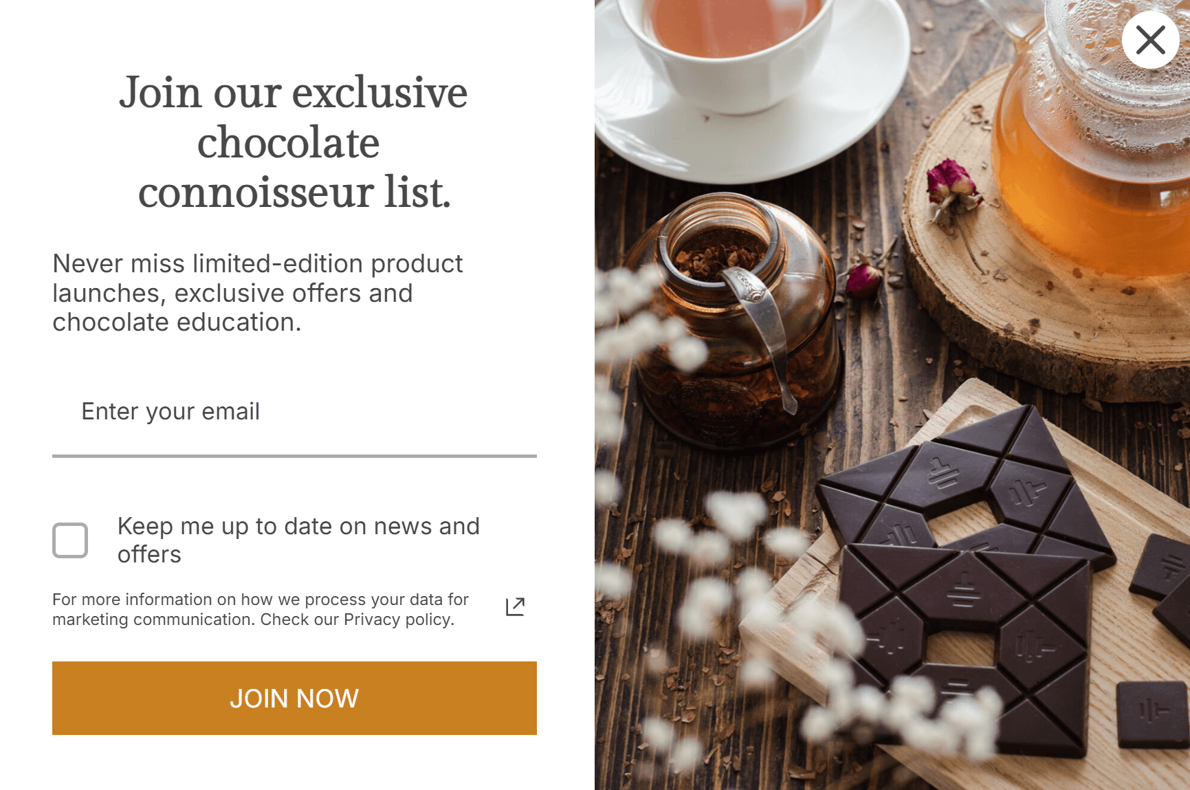
To’ak Chocolate’s welcome popup triggers after around five seconds of browsing activity and perfectly matches the site’s branding. It features a high-quality product image, a combination of serif and sans-serif fonts, and an orange CTA button.
Its heading, “Join our exclusive chocolate connoisseur list,” connects directly to the CTA button text “JOIN NOW” to clarify the offer.
“We tell the story from the founder’s perspective, the farmer’s perspective, and from other voices. Today, customers get a personalized introduction to our brand. Email automation makes it possible, for a small team like ours, to show customers that we care about building a connection.”
James Le Compte
CEO at To’ak Chocolate
Read the full story here.
2. Example from Omnisend
Another good example is this welcome popup from the Omnisend template library, designed for a clothing store offering membership:
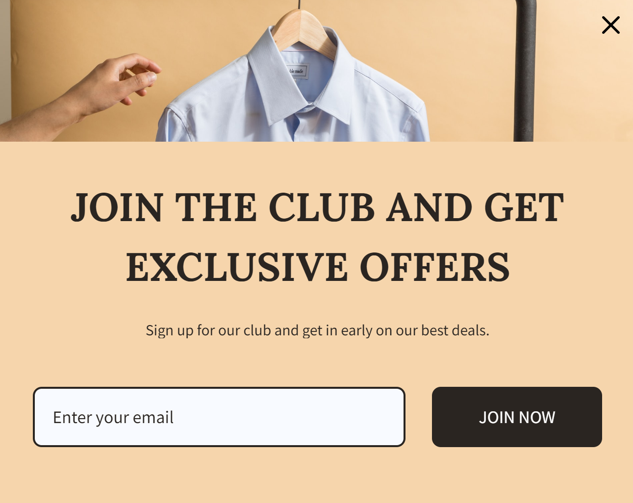
Notice how it also uses a combination of font styles and similar headline and CTA text to make the offer and next steps easy to follow.
Welcome popup with a discount
3. Example from Island Olive Oil
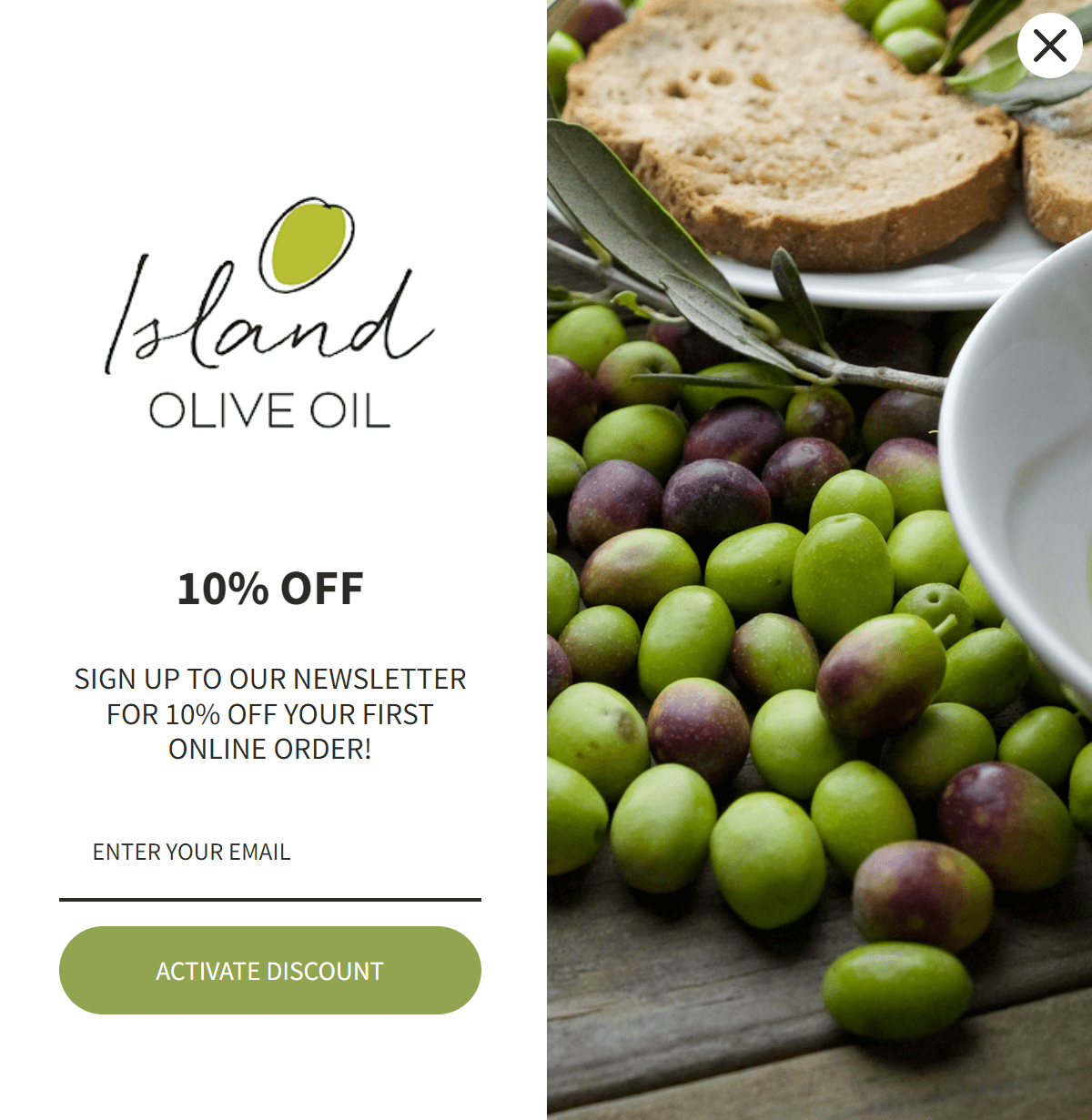
Island Olive Oil’s welcome popup loads during the initial page load with an olive green CTA button to match its logo. The CTA text “ACTIVATE DISCOUNT” is actionable, and the “10% OFF” offer is repeated twice in a heading and description.
The popup’s design is split 50-50 with an image and form, making it less transactional and more relevant to the visitor’s shopping session.
“Omnisend brings our business to another level. With challenging and changing times of the brick and mortar experience, it’s allowing us to set ourselves up for the future of ecommerce.”
Angèl Foster
Co-Owner of Island Olive Oil Company
Read the full story here.
4. Example from Omnisend
You can also take a more minimalistic approach to your welcome discount popup. Check out this example from the Omnisend template library:
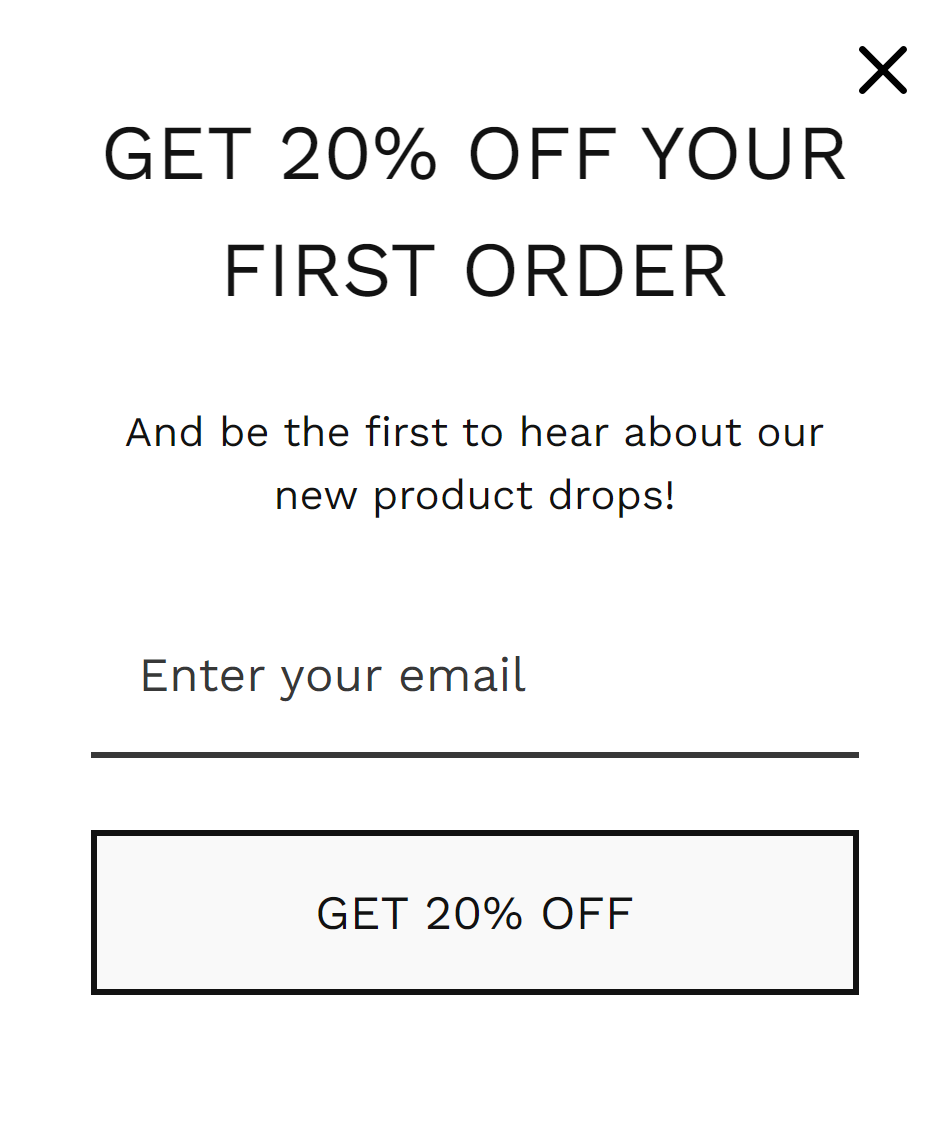
It uses a white background and black text with modern fonts to create a simple but effective form. The CTA button and headline both say “GET 20% OFF,” and there’s a single email field to make it as easy as possible to subscribe.
Welcome popup with a coupon code
5. Example from Frag Out Flavor
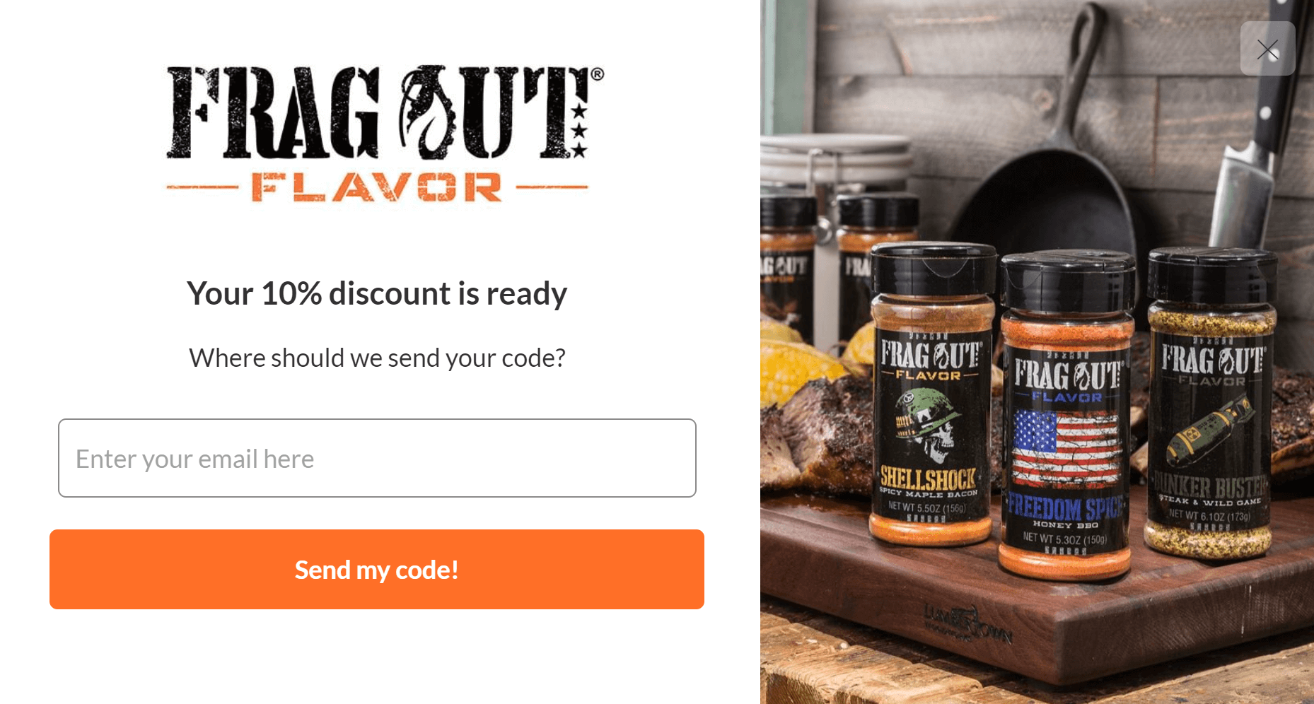
Frag Out Flavor’s welcome popup with a coupon code loads after scrolling around 20% of the page, allowing customers to browse before presenting the offer.
The form section takes up 60% of the viewing space, while a product image takes up the rest. Its orange CTA button says “Send my code!” to make it feel like a personalized code.
6. Example from Omnisend
While Frag Out Flavor’s welcome popup leads with a logo, this example from Omnisend leads with the heading “Grab a 10% off coupon” to deliver immediate value:
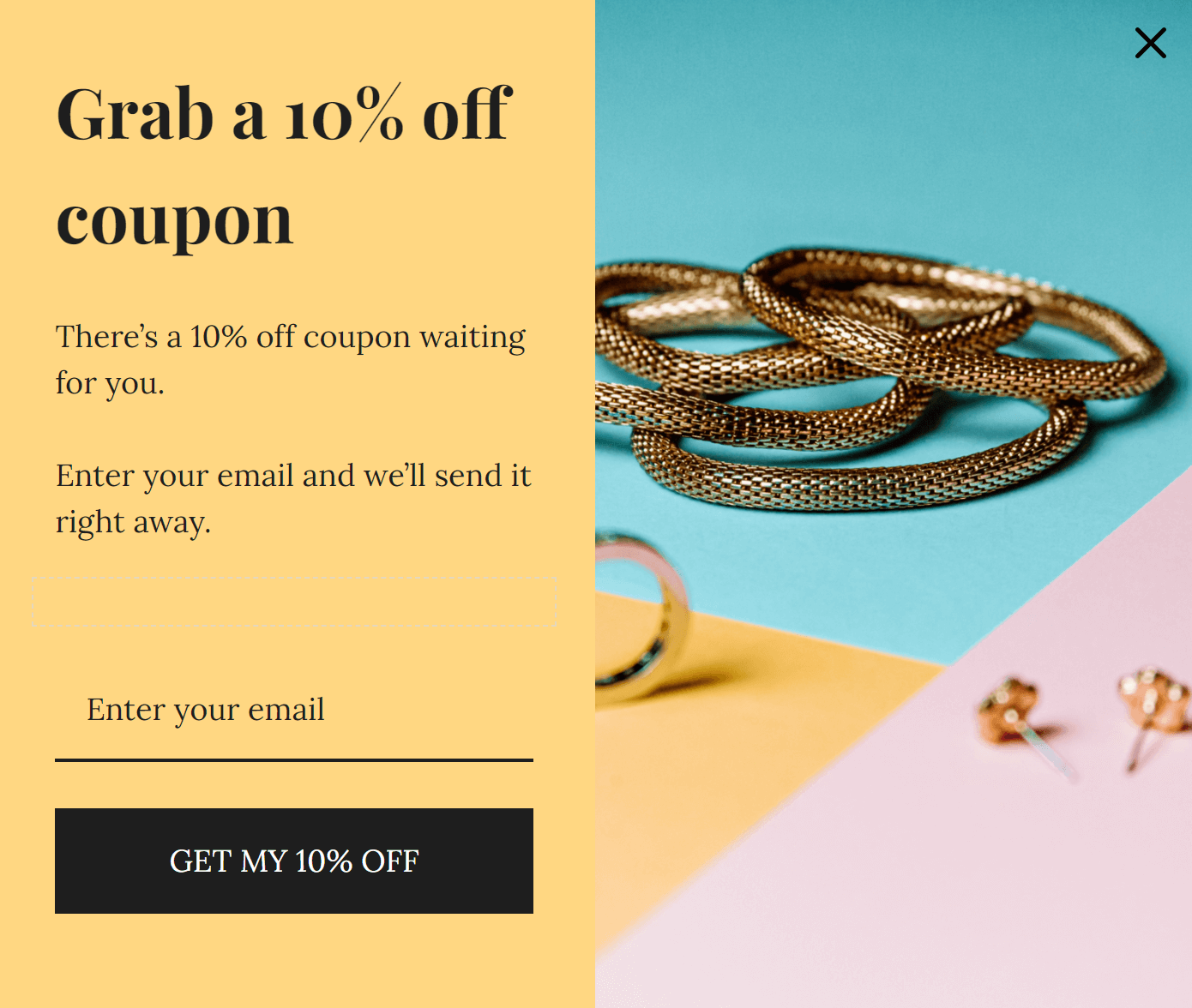
Direct language that reveals what your customers will receive is the best way to encourage engagement in your welcome popups.
Welcome popup with a gift offer
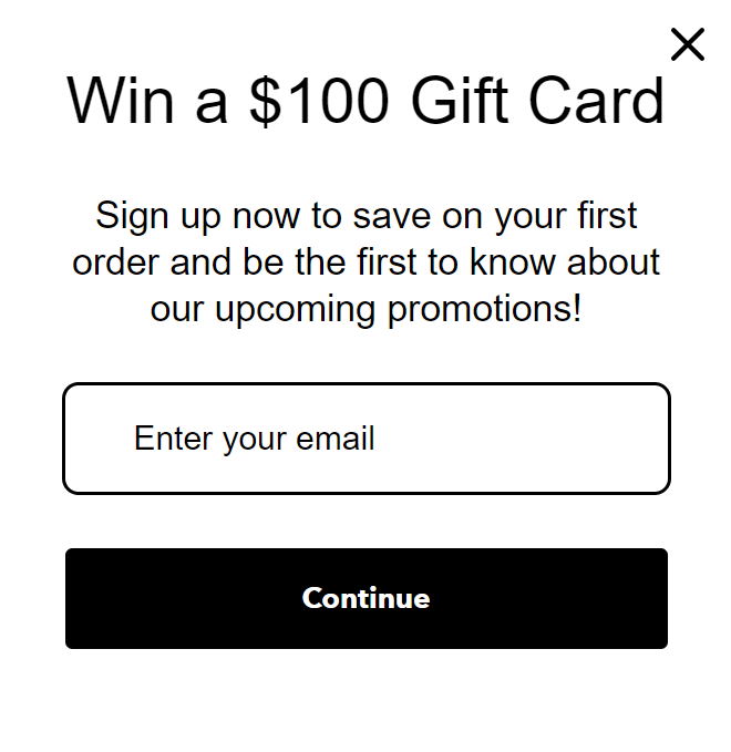
7. Example from Charmed Aroma
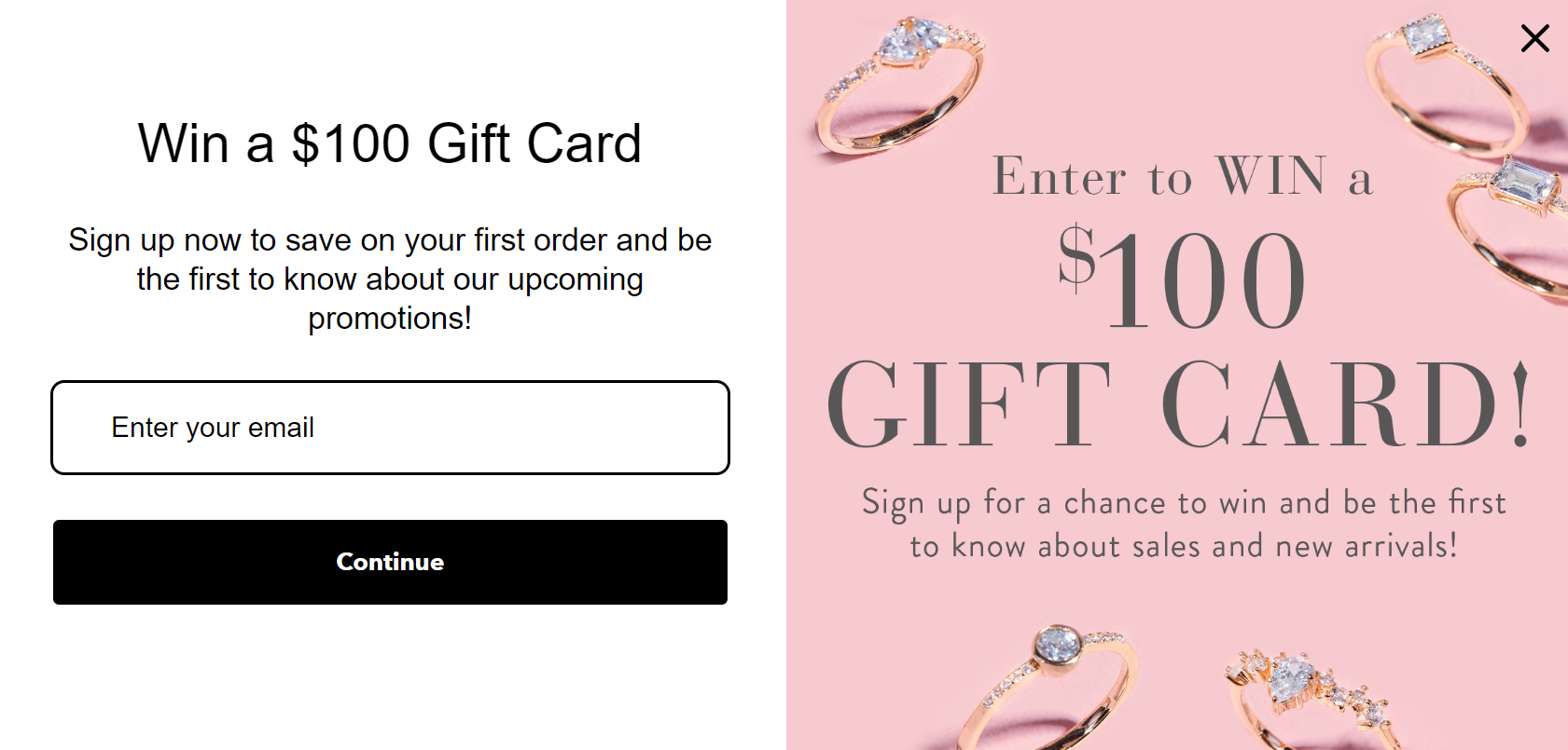
Charmed Aroma’s welcome popup matches its website colors and uses two content sections to reveal the chance to win a $100 gift card.
The purpose of the two sections is to make the popup more visually appealing on desktop — it converts to the simpler text version on mobile:
8. Example from Omnisend
The example below from Omnisend shows how you can use cohesive colors to transform two separate content sections (an image and form) into a cohesive design:
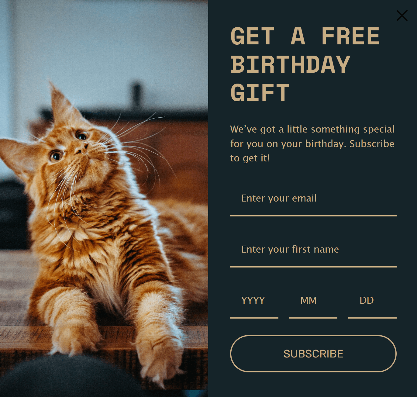
The cat image appeals to an audience of feline lovers, and using a date step on the form helps you capture more detailed customer information.
Welcome popup with a free shipping offer
9. Example from DonaJo
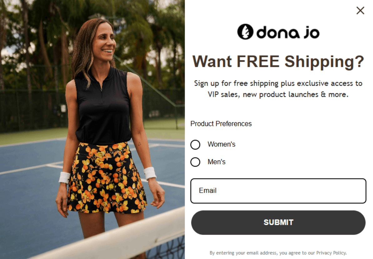
DonaJo’s free shipping popup captures its audience with an image of a lady happily wearing its tennis wear. The heading “Want FREE Shipping?” piques interest before the description, “Sign up for free shipping plus exclusive access to VIP sales, new product launches & more.”
Notice also how this form has product preference options for “Women’s” and “Men’s” — these give the customer a sense of control and help DonaJo create better-targeted email campaigns.
10. Example from Omnisend
The free shipping popup below uses the prominent heading “GET FREE SHIPPING” and a contrasting CTA button (bright pink against a black background) to make the offer crystal clear:
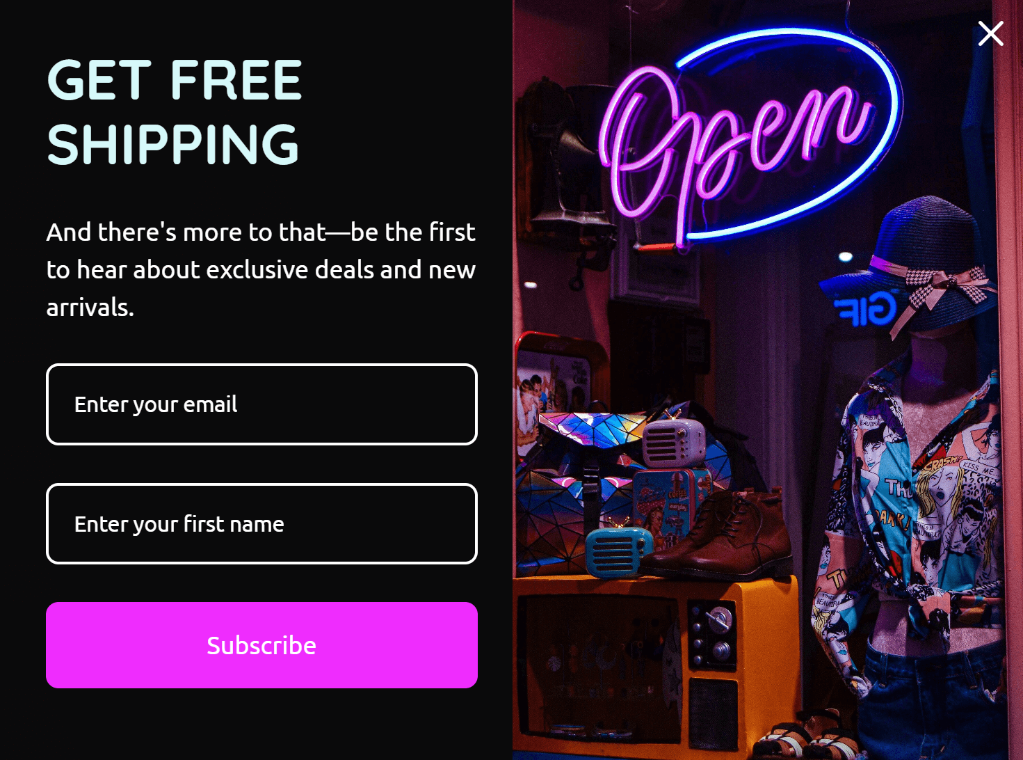
That particular popup is a pre-built template in Omnisend. You can edit all its elements to match your branding.
Welcome popup best practices
Follow these best practices to create welcome popups with high conversion rates:
Design to match your site
Welcome popups that clash with your site’s design can appear untrustworthy and spammy, driving visitors away instead of improving their experience.
Design your popups as extensions of your website, using your brand’s colors, fonts, and image styles to create a consistent visual experience.
Personalize the content
Tailor your offers to match visitor interests and browsing behavior — someone looking at kitchenware is more likely to convert with “20% off kitchen appliances” than a generic discount.
During peak shopping seasons like holidays, create urgency and relevance by highlighting time-sensitive benefits such as “Free next-day delivery for Thanksgiving.”
Use clear CTAs
Make your offer the first thing people see (“Get 20% off your first order”) and match it with an action-focused button text that says “Claim my 20% discount” instead of “Submit now.”
Give your CTA button a contrasting color (e.g., red against white) and use your form builder to maintain whitespace around it on all devices.
Time it right
Your welcome popup can appear instantly on page load, after a specific trigger, or via a floating button. While instant popups work for some sites and floating buttons offer subtlety, trigger-based timing typically converts best.
Waiting until visitors scroll halfway or show exit intent means they’re already engaged with your content and more likely to respond.
Optimize for mobile users
Mobile optimization is crucial for popup success. Your form must adapt seamlessly to smaller screens, ensuring all content and buttons are easily accessible without scrolling or zooming.
Keep mobile messaging concise, adjust image layouts for vertical viewing, and check that the close button is visible and easy to tap.
A/B test different versions
Testing different popup versions helps identify what resonates with your audience. Compare design, timing, offers, or messaging variations to find the highest-converting combination.
Once you identify a winning version, use it as your baseline and create new variations to test until the conversion rate hits your targets.
How to create a welcome popup
Omnisend lets you create welcome popups in just a few steps. You can also save and reuse your templates. This video tutorial shows how:
Can’t watch the video? Here are the steps:
Step 1: Select your template
Navigate to Forms > Create form > Style > Popup:
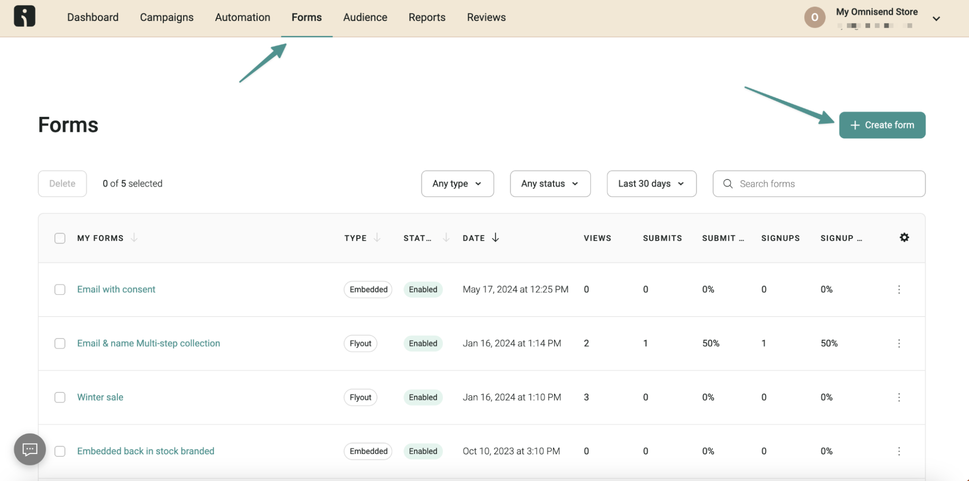
You can then choose from the templates in the Forms library to start editing.
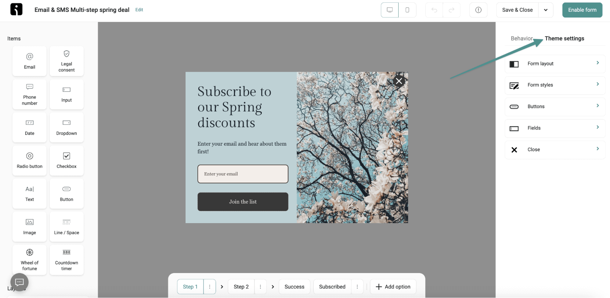
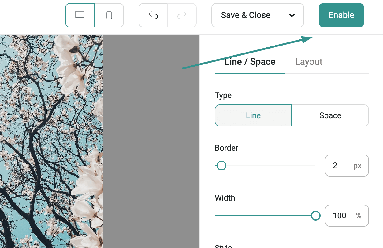
Step 2: Customize the design
Use Theme Settings to match your website’s look. Adjust colors, fonts, button styles, and fields to align with your brand identity.
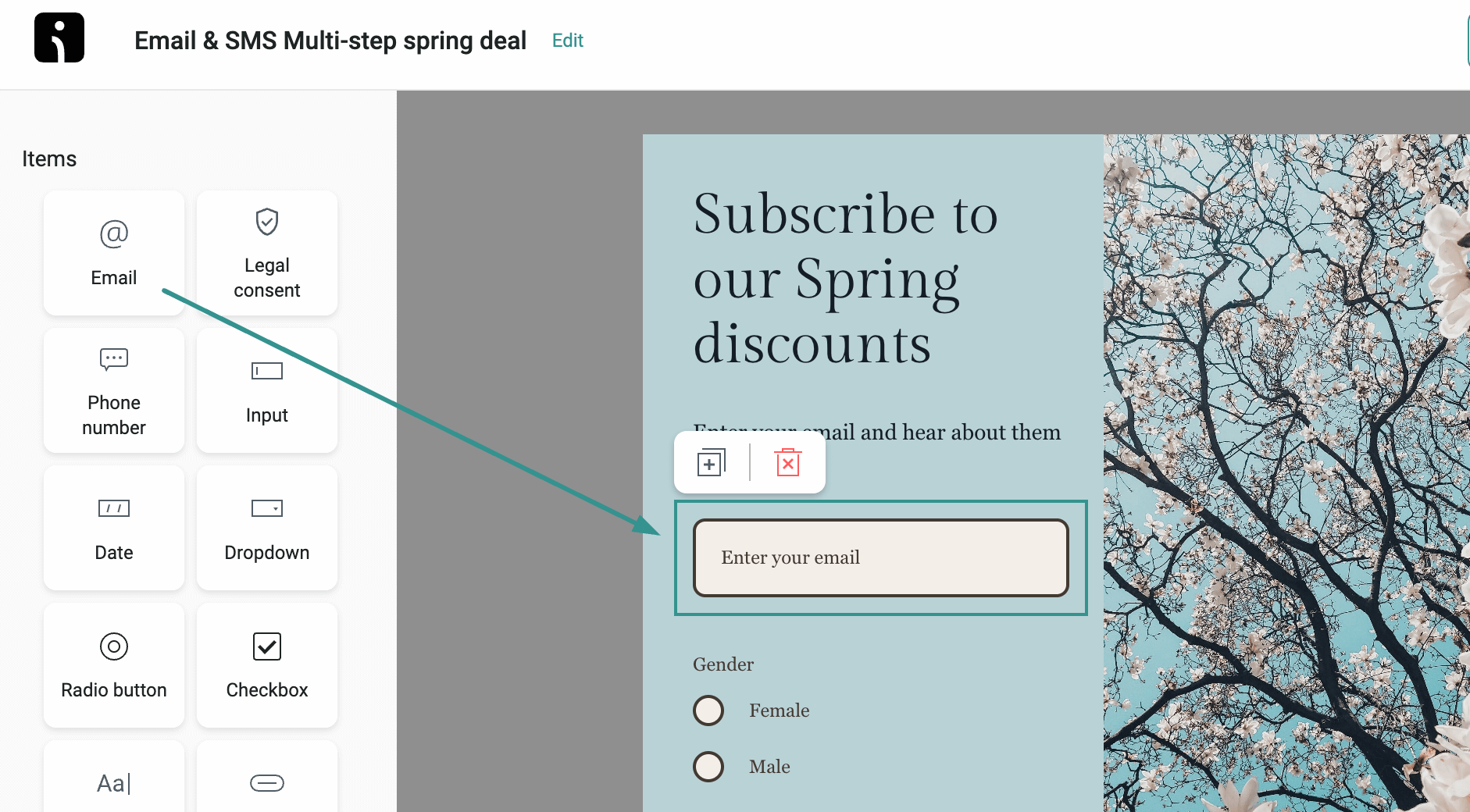
Step 3: Add your content
Add drag-and-drop Items into your form, such as:
- Email or phone number fields
- Text blocks for your offer
- Buttons with clear CTAs
- Images (JPG, PNG, or GIF under 2000px)
- Legal text for compliance
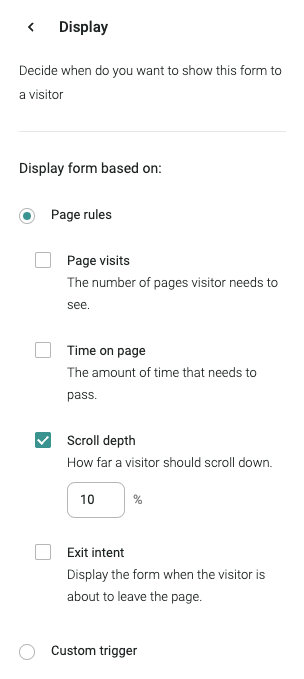
Step 4: Set display settings
In Display settings, choose when your popup appears:
- After viewing specific pages
- Time spent on page
- Scroll depth
- Exit intent (when visitors are about to leave)
You can select all the rules or pick and choose the most suitable ones.
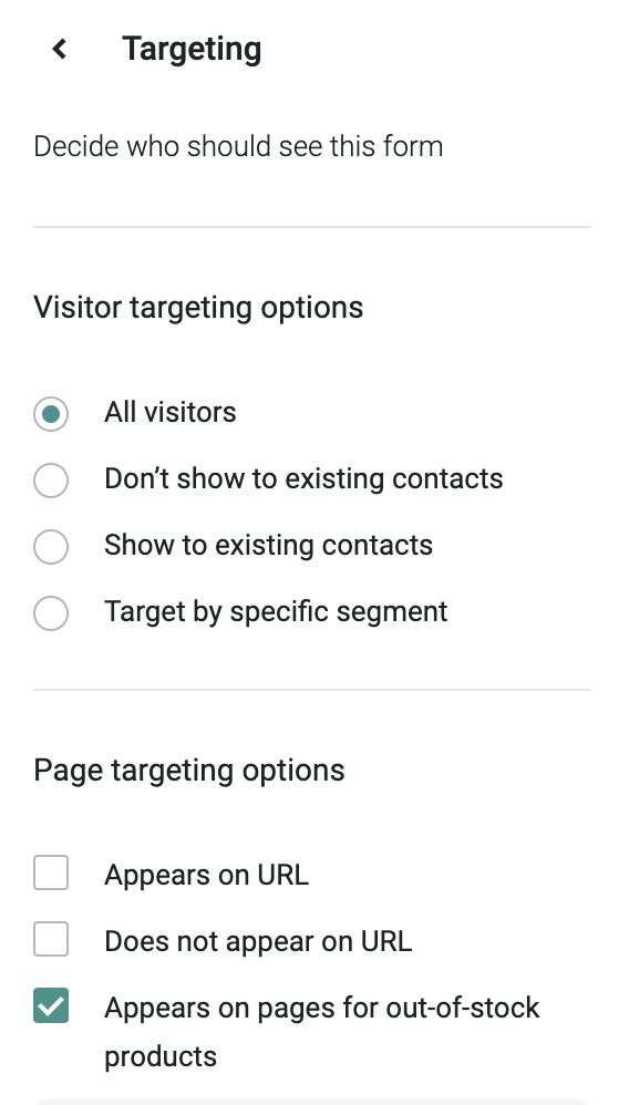
Step 5: Configure targeting
Use the Targeting settings to choose who sees your form:
- All visitors
- New visitors only
- Existing contacts
- Specific segments
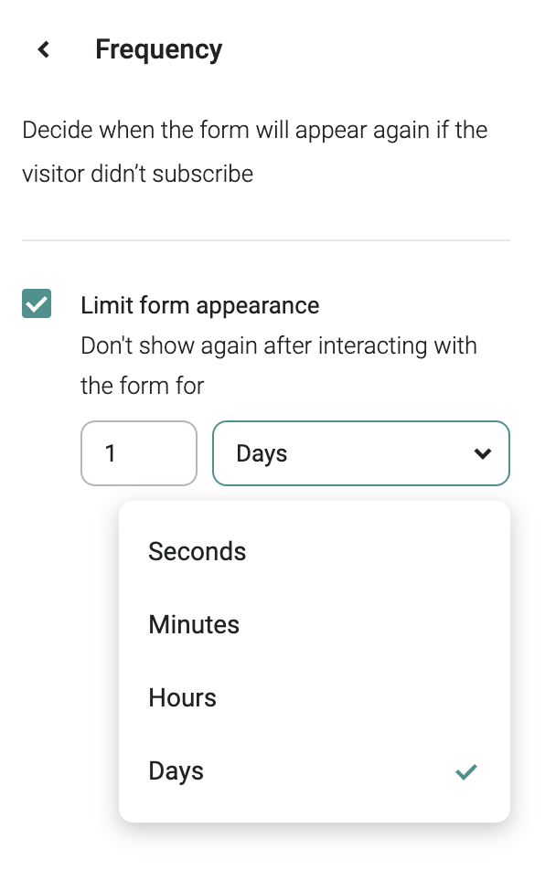
Step 6: Set frequency rules
Determine how often your popup reappears to visitors who don’t subscribe. Set intervals in seconds, minutes, hours, or days to avoid overwhelming visitors.
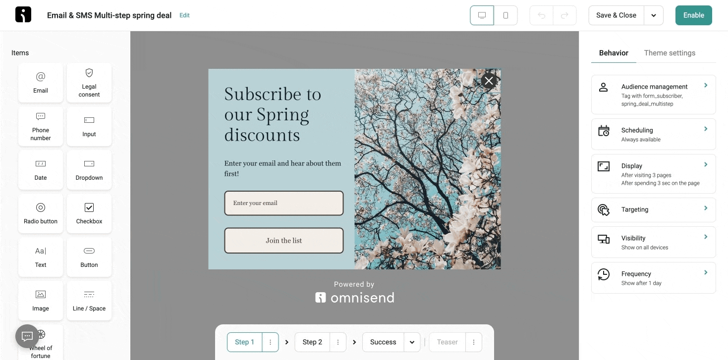
Step 7: Enable and test
Click Enable to make your popup live or Save & Close to save as a draft:
You can also A/B test two welcome popup versions. To start A/B testing, select Setup A/B test from the Save & Close dropdown menu in Form Builder. This creates two identical versions of your popup for testing:
Welcome popups FAQ
Are welcome popups effective?
Welcome popups are a proven way to build email lists by converting first-time visitors into subscribers, especially when offering targeted value to match their interests.
What’s the best time for a welcome popup to appear?
Trigger your welcome popup when visitors are most engaged, such as after viewing products, reading content, or scrolling. Exit-intent popups can also catch visitors before they leave.
Do welcome popups hurt user experience?
Immediate or repeated popups can frustrate visitors. However, those that match user interests and appear at natural browsing moments add value to their journey.
How do I make my welcome popup less intrusive?
Show your popup after visitors have explored your site, keep the design simple, make it easy to close, and use frequency caps to avoid repeated displays.
TABLE OF CONTENTS
TABLE OF CONTENTS

Subscribe and don’t miss any updates!
No fluff, no spam, no corporate filler. Just a friendly letter, twice a month.