Drive sales on autopilot with ecommerce-focused features
See FeaturesWebsite popups are great for communicating offers, capturing leads, and engaging site visitors who are about to leave your website.
If executed well, website popups can significantly increase engagement and boost conversions. In fact, research by Sumo shows that the average conversion rate for website popups is 3.09%.
The key to high-converting popups is to create an attention-grabbing design and be mindful of the user experience.
In this post, we’ll discuss the different types of website popups and share practical examples of how to use them to generate leads, drive engagement, and boost conversions.
Quick sign up | No credit card required
What is a website popup?
A website popup is a graphical overlay or box that “pops up” on the screen when a visitor navigates your site. It instantly captures a user’s attention and prompts them to take a specific action.
A website popup often contains text, imagery, and a clear CTA that requests a specific action, such as entering an email address.
You can use a website popup for many things, including:
- Promoting campaigns and discounts
- Collecting email addresses
- Providing cookie consent and disclaimers
- Gathering feedback
- Sending alerts and providing information
- Collecting pre-sale entrants
Are website popups effective?
Website popups are an effective way of generating leads and interacting with website visitors, with an average conversion rate of over 3%.
Still, results rarely come from the format alone. They depend on how intelligently the popup is built and delivered. Using a dedicated platform such as Claspo allows marketers to control targeting, timing, and personalization, turning popups from simple overlays into conversion-focused touchpoints.
An effective website popup can benefit you in several ways, including:
- Lead generation: Signup forms that require email addresses in exchange for an incentive are effective for lead generation.
- Sales conversions: You can use a website popup for better conversions by directing visitors to your landing pages, offers, or relevant products.
- Engagement: Popups can be used to provide special offers or exclusive content that encourage visitors to interact with your website.
- Customer information: You can use popups for websites to collect customer information such as date of birth, phone number, or preferences. These can help you deliver tailored and relevant product or service recommendations.
- Customer segmentation: A website popup can help you gather customer data, such as demographic details, interests, and behavior, for proper segmentation. This helps you create more targeted marketing campaigns.
Best website popup examples: By type
Digital marketers use various types of website popups depending on the goal. For example, you can use Mother’s Day popups to sell event-specific gifts.
Let’s discuss the types of popups using real examples. We’ll show you why they stand out and how you can design similar popups to achieve specific goals.
1. Page load popup examples
This popup for websites emerges as soon as a web page is fully loaded, instantly capturing a visitor’s attention. Here are some examples of how other brands use this type of popup for website engagement.
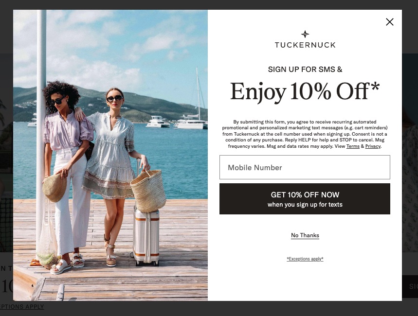
Clothing brand Tuckernuck combines attractive imagery with incentives to encourage users to sign up for SMS promotional messages.
Visitors can enjoy 10% off their purchase by simply registering with their mobile number.
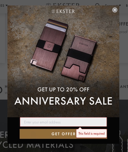
Ekster uses product images, large fonts, and a significant discount to grab attention. This CTA is an effective prompt for visitors to enter their email addresses and take advantage of the offer.
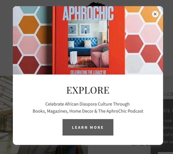
This website popup invites visitors to “celebrate African Diaspora culture,” tapping into the vibrant heritage that resonates with its audience. Promoting the brand’s various offerings, including books, magazines, and a podcast, allows visitors to engage with the content in their preferred format.
2. Exit-intent popup examples
An exit-intent website popup activates when it appears a visitor is about to leave a site, such as their cursor going towards the ‘close’ icon on a browser.
You can use this popup as a final call to incentivize users to take a desired action before they leave.
Let’s check out some examples of exit-intent website popups.
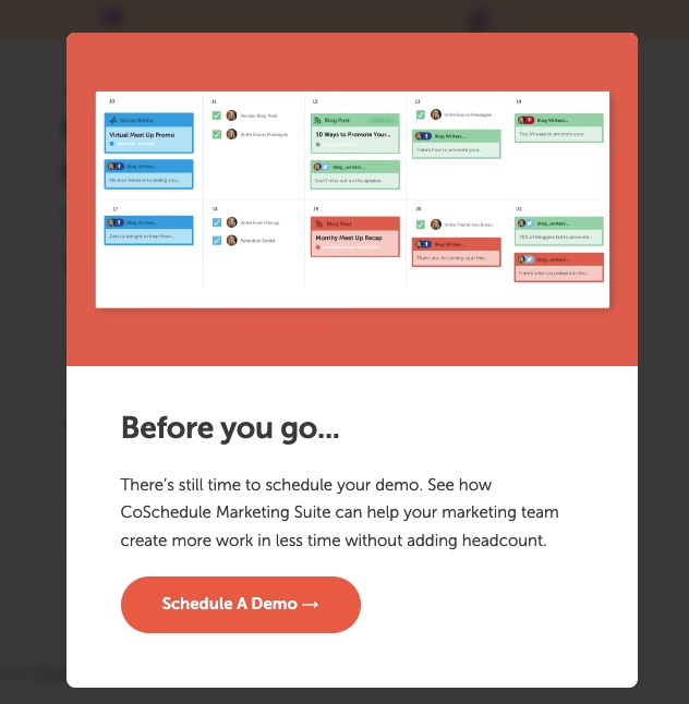
This is an excellent exit-intent popup example that uses a conversational tone and copy. The copy effectively highlights the benefits of the platform — more work done in less time for the same headcount. Then, the CTA stands out in a bright orange color to capture the visitor’s attention, urging them to schedule a demo without committing to signing up.
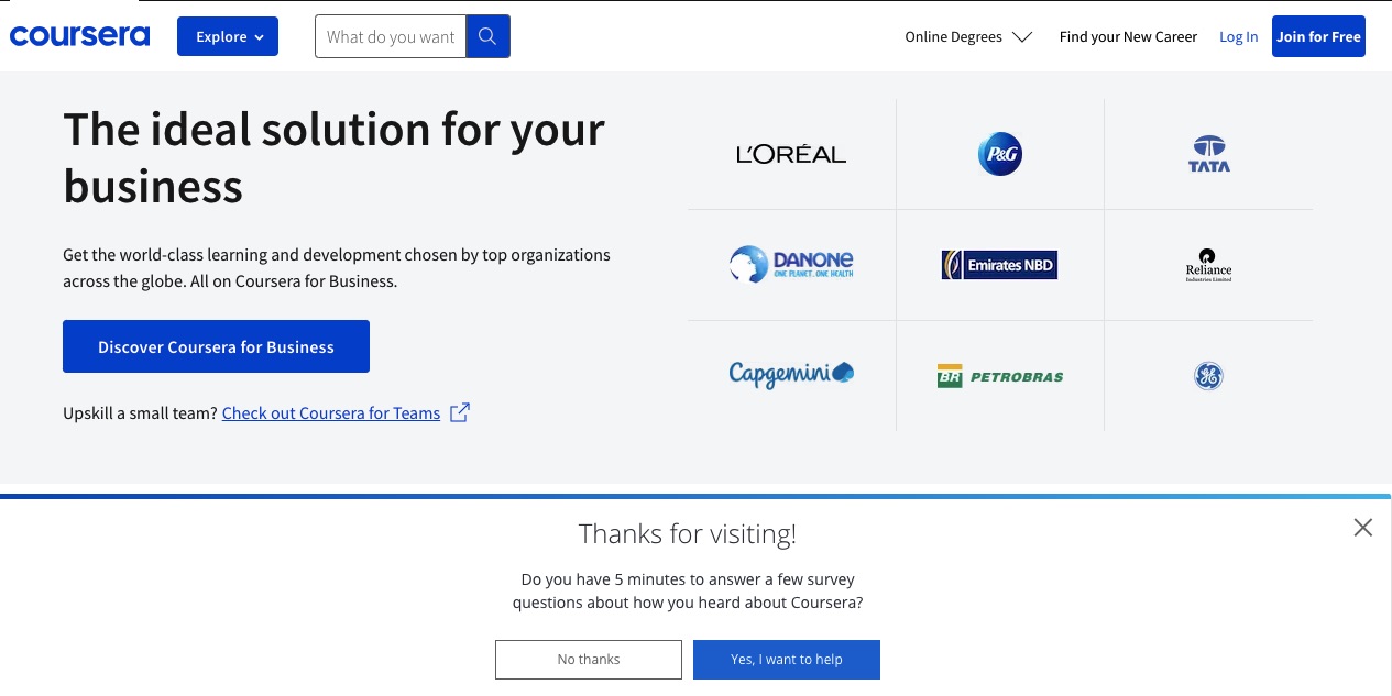
Coursera’s exit-intent message pops up at the bottom of the screen and politely asks visitors to complete a survey about how they heard about the brand.
Because of its friendly tone and non-intrusive structure, this is a good example of a website popup being used to gather feedback, instead of promoting products.
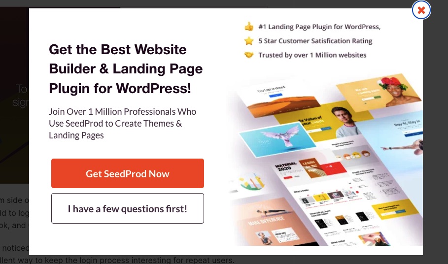
Instead of the usual yes or no choices, this website popup includes an option for visitors who still have unanswered questions and aren’t ready to sign up yet. The popup increases engagement by providing options that appeal to visitors at different stages of the sales funnel.
Whether they decide to buy the product or learn more about it, they’re engaged.
3. Timed popup examples
A timed website popup appears after a visitor spends a specific amount of time on your website. You can set the popup timing such that visitors have enough time to read your content before they see a popup with a relevant message.
Here are some examples of timed website popups.
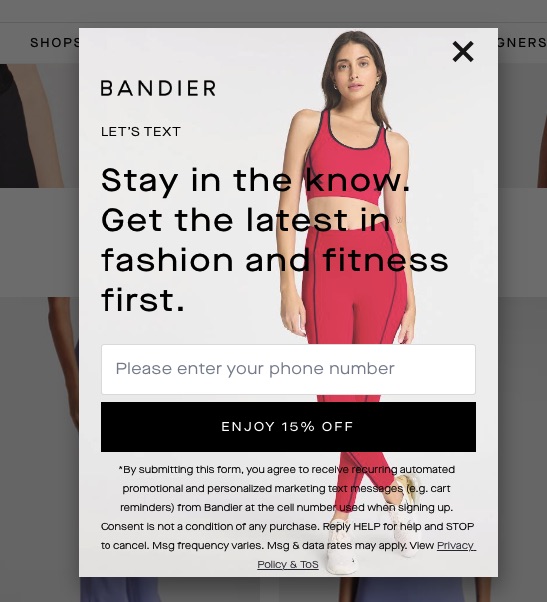
Fashion and fitness brand Bandier uses a timed popup on its website to offer a discount to site visitors in exchange for their phone numbers. The form discloses its privacy policy, which helps to build trust and make the popup more effective.
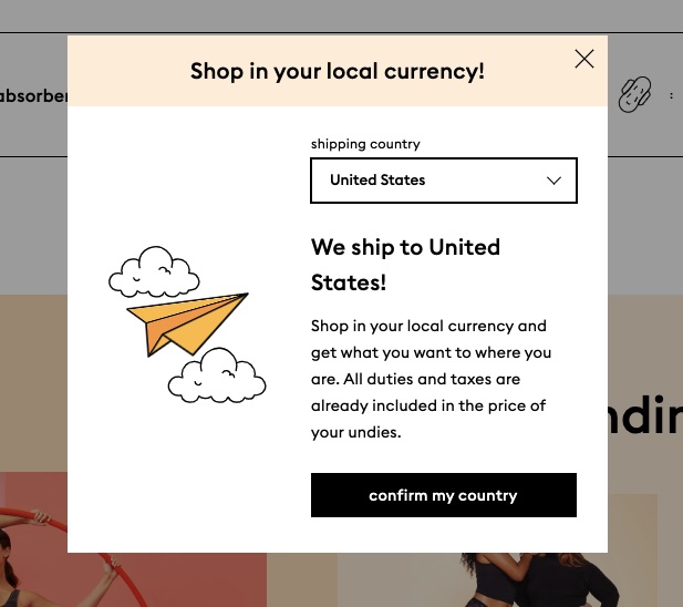
This website popup displays 10 seconds after the web page fully loads. It confirms a visitor’s location and informs them of the convenient shipping and pricing options the brand provides.
The promise of convenient shopping can encourage users to buy from the website.
4. Scroll-triggered website popup examples
This type of website popup displays when a visitor scrolls to a specific point on your web page. Like timed popups, it gives visitors adequate time to browse through your site before they see a request.
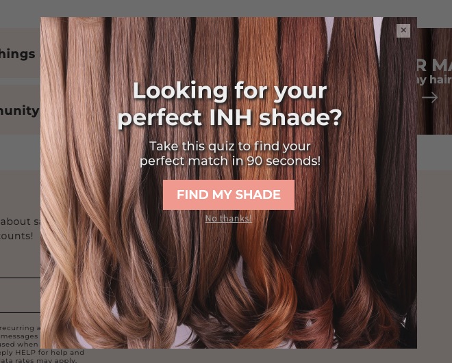
This popup is a quiz for visitors to find their perfect hair color shade, and it appears when they scroll to the bottom of the page. Anyone who takes the quiz gets personalized product recommendations, making their shopping experience more convenient.
By waiting until the visitor has reached the end of the page, INH Hair knows that they’re likely to be engaged. And mentioning that the quiz will only take 90 seconds lets people know that they won’t be spending a lot of time on it.
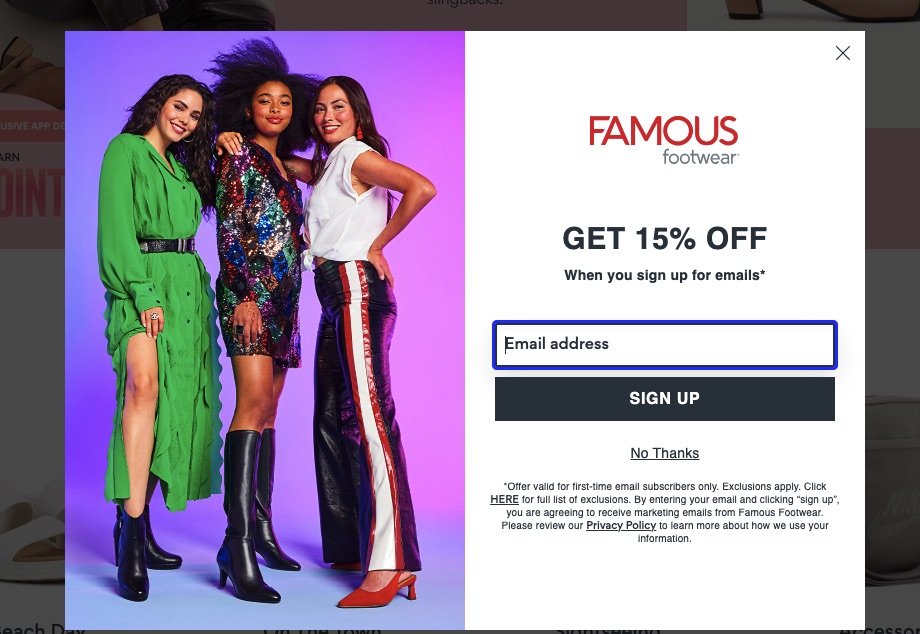
Famous Footwear’s scroll-triggered popup activates once a visitor has scrolled through three-quarters (or 75%) of the homepage. This gives users ample time to browse available products before offering a discount to encourage them to buy.
5. Click-triggered popup examples
This website popup is activated when a user clicks on an element on your web page, such as specific text, an image, or a button. A click-triggered popup for websites gives site visitors more information about the element selected.
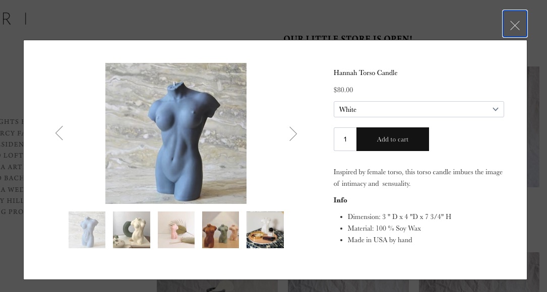
When visitors click on a product on Studio JARI’s web page, a popup appears with detailed product specifications.
A nice touch is that visitors can add the product to their cart directly from the popup, making the shopping experience smoother.
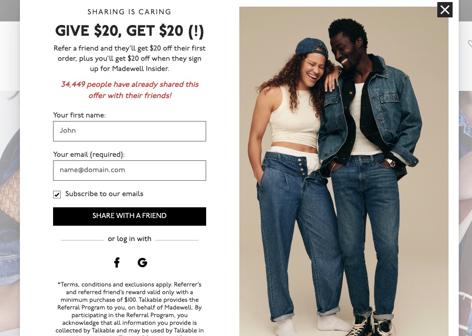
This popup activates when users click on “discount” on the homepage. It has a dual purpose: encouraging visitors to sign up for emails, and referring the brand to a friend to get a discount.
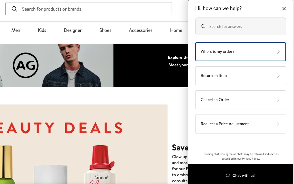
The “Chat with us!” button at the bottom of Nordstrom’s web page triggers a popup that provides customers with various options to manage their orders. This improves customer experience by providing an easy way to return or cancel orders or check order status.
6. Welcome mat/fullscreen popup examples
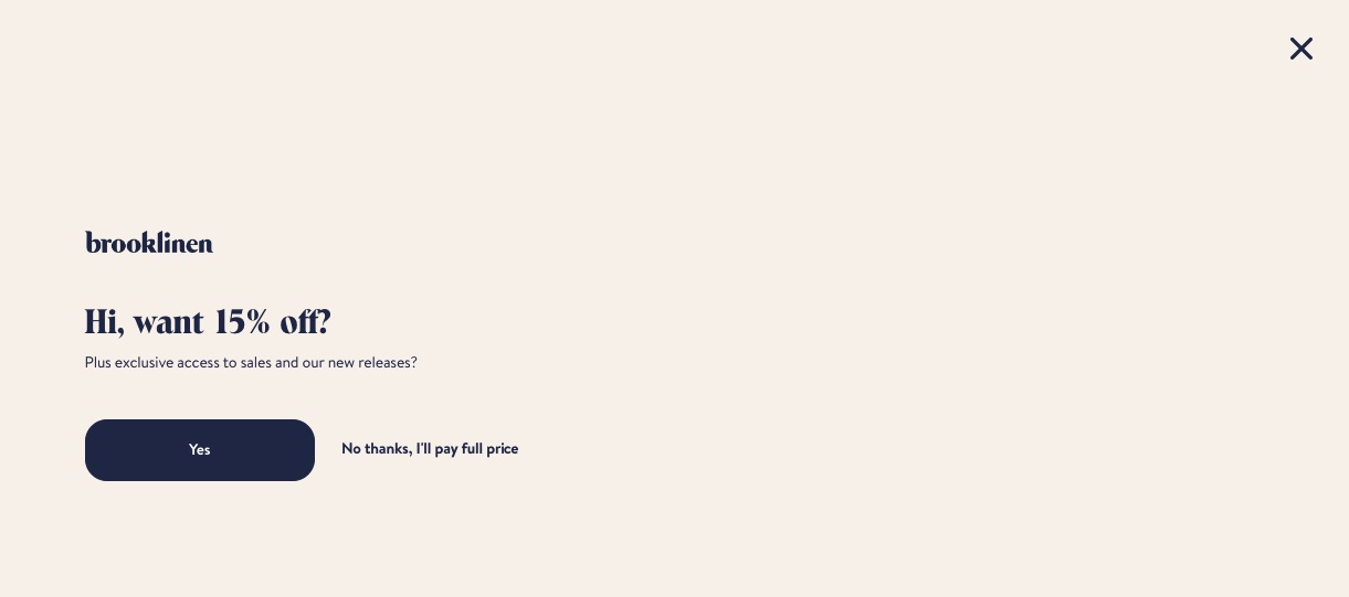
Unlike other popups on websites that cover only part of the screen, a welcome mat popup covers the entire page. When executed properly, it directs the visitor’s focus toward the CTA, preventing them from being distracted by other website elements.
Brooklinen’s website popup has a minimal design that focuses on two key elements: the discount and the CTA button. It’s simple yet effective. Anyone interested in buying will likely take the discount and those who aren’t can simply opt out.
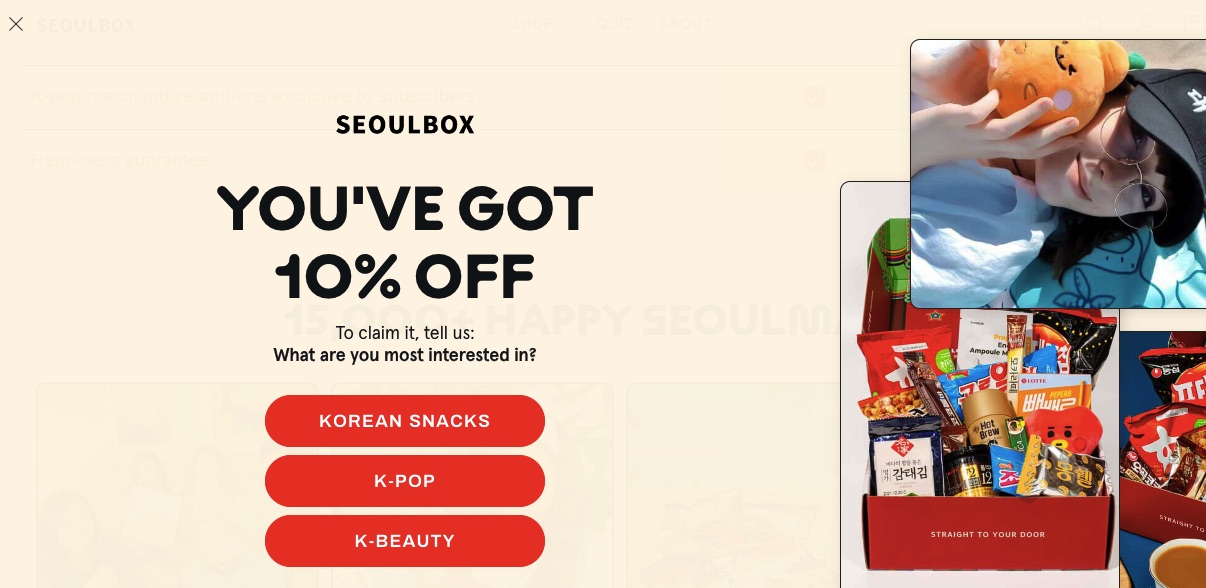
This is another example of how to use a simple design for your full-screen popup. It uses a plain background with images on the side to capture the visitor’s attention.
This welcome mat communicates the benefit quickly and clearly: the visitor has a 10% discount and can claim it by simply selecting which area they are most interested in.
7. Hello bar website popup examples
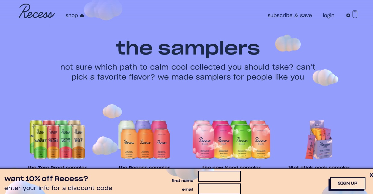
Unlike other types of popups, a hello bar website popup only appears at the top or bottom of the page. It doesn’t hinder your visitors from scrolling through your website, whether they interact with the popup or not.
This hello bar popup by the beverage brand Recess uses a subtle but effective approach. Its popup appears at the bottom of the page, ensuring a visitor’s navigation experience is not interrupted, and the message remains visible to visitors for as long as they browse the website.
The email popup design incorporates vibrant colors that contrast with the rest of the website. It instantly captures the visitor’s attention and drives engagement with a simple incentive: an email address in exchange for a discount.
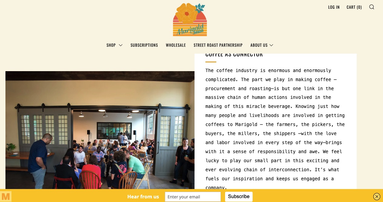
Marigold Coffee’s website popup is minimal and non-intrusive, with a friendly and conversational tone.
8. Informational alert popup examples
These are used to give visitors important information about your brand, products, or services, including policy changes, price changes, cookie consent, discounts, and more.
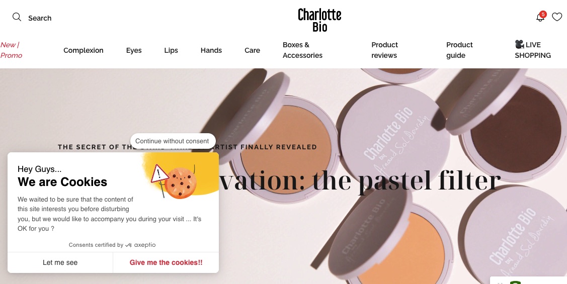
The makeup brand Charlotte Bio uses an informational alert website popup to display cookie consent information. It uses fun and catchy yet clear and concise copy to deliver its message.
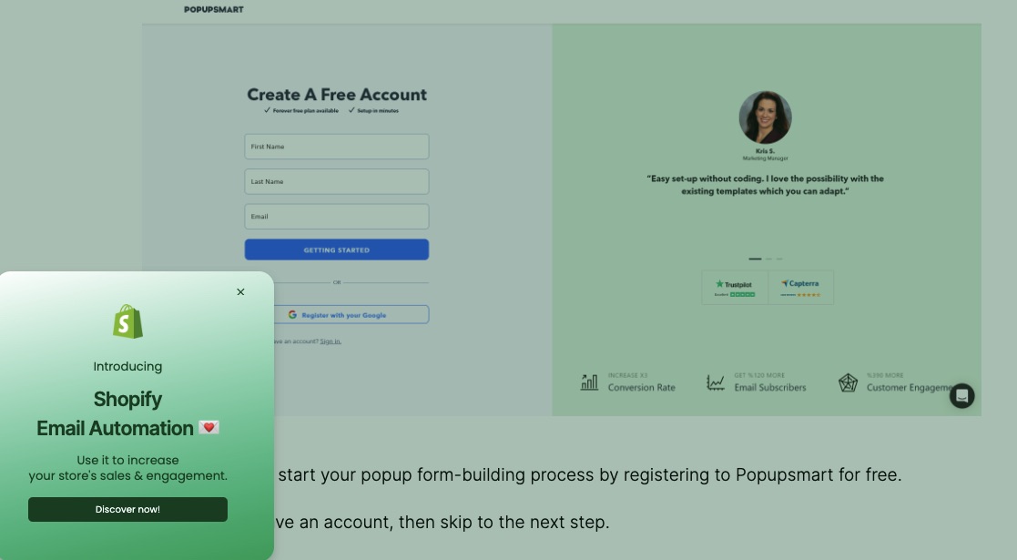
This informational alert popup tells visitors that Popupsmart now offers Shopify email automation.
The popup is positioned in the bottom-left corner of the screen and doesn’t disrupt a visitor’s navigation experience. It also uses colors similar to those on the rest of the page, creating a uniform and immersive experience.
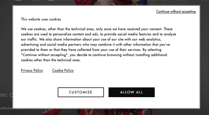
Aside from clearly explaining what cookies are used for, this popup’s design subconsciously directs the visitor’s attention to the “Allow All” CTA by highlighting it in black while the rest of the popup remains white.
9. Gamified popup examples
A gamified website popup uses fun, interactive, and engaging elements to capture a visitor’s attention.
Here are some examples.
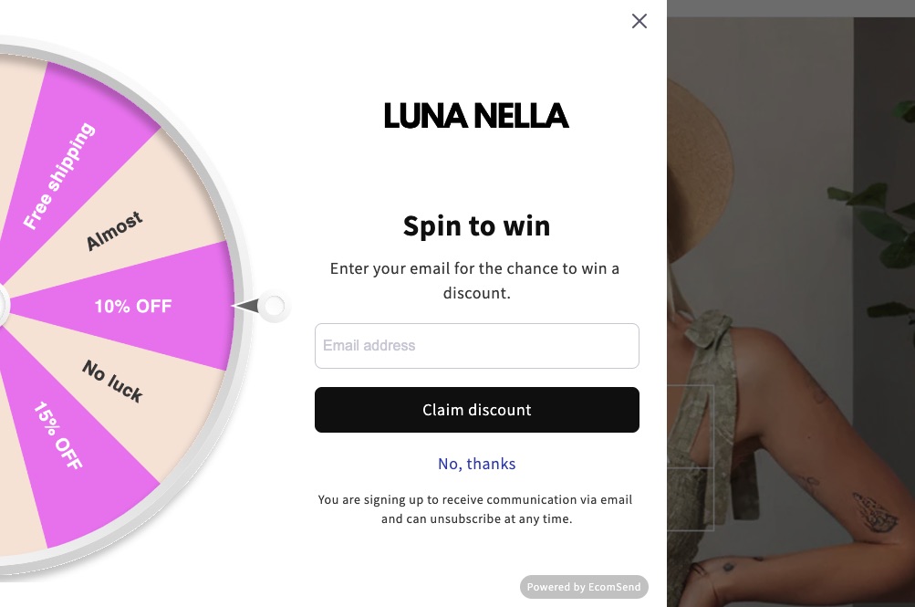
Luna Nella
Fashion brand Luna Nella uses a wheel of fortune to make its popup fun and interactive. Guests click to spin, with a 3-in-5 chance of winning something (either a discount or free shipping). The CTA is clear and simple — provide your email address to claim the discount.
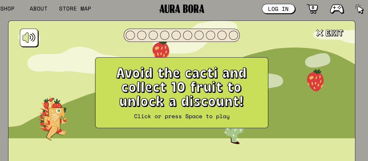
Sparkling water brand Aura Bora takes gamification to the next level by embedding an actual game within the popup. Even if someone isn’t sure if they want to buy, they might be tempted to play the game and get the maximum discount. Once they get it, they might then decide to use it.
That’s the beauty of this gamified popup: it has the potential to turn casual site visitors into customers.
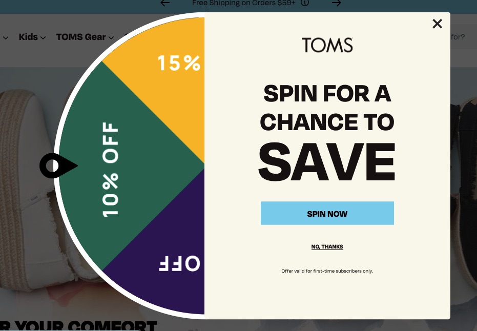
Toms, a shoe brand, also uses a wheel of fortune to capture leads. The website popup uses short, catchy copy to encourage visitors to spin the wheel and win a discount, thereby increasing engagement.
10. Page redirect popup examples
These website popups redirect visitors to specific pages that offer more relevant or valuable information. It’s an excellent strategy if you’re trying to drive more traffic and engagement to specific pages on your website.
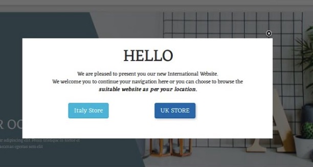
This popup from Prestashop informs visitors that they can view a location-specific website. This can increase engagement as it’s more relevant to the visitor, and offers a more personal experience.
The sustainable clothing brand Another Tomorrow uses a minimalist page redirect popup that allows users to view products or return to the homepage.

11. Ad-block workaround popup examples
Some visitors will have an ad blocker that prevents ads from appearing on their screen, thereby cutting down on your revenue. This type of popup prompts visitors to disable their ad blockers so they get full access to the content on your website.
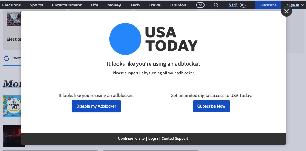
This popup by USA Today doesn’t just tell users to disable their ad blockers, it also explains why they should do it. It asks visitors to support the site by either paying for the content or disabling the ad blocker.
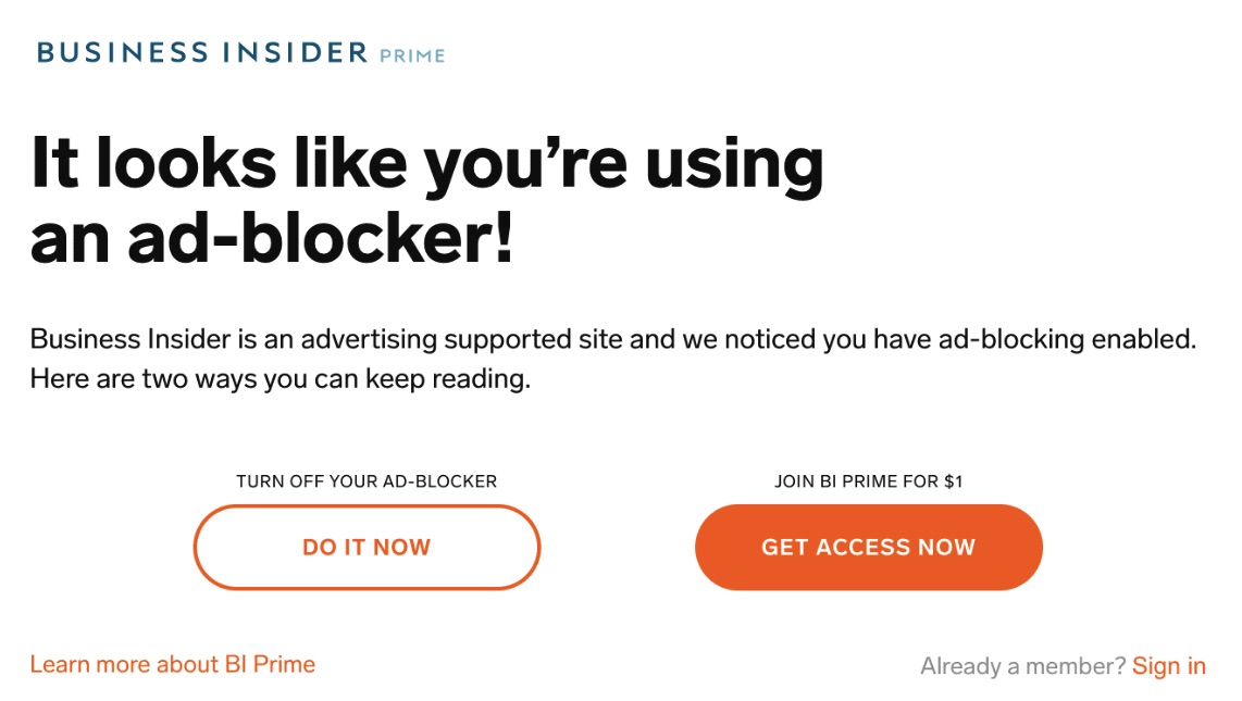
Business Insider’s ad-block workaround popup leverages big, bold text to catch a reader’s attention about using an ad blocker. It then offers the same options as USA Today — become a paid subscriber or remove the ad blocker.
12. User login popup examples
This type of website popup enables a visitor to create or log into their account without leaving the page. This can be especially useful for ecommerce brands as it allows them to provide a more personalized shopping experience to customers.
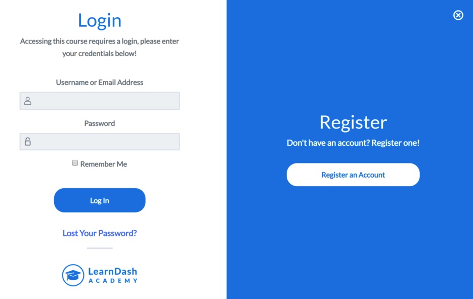
Instead of redirecting users to a different login page, LearnDash Academy uses a two-in-one login and registration popup. This creates a seamless experience for visitors, making it easy to log in or register as needed.
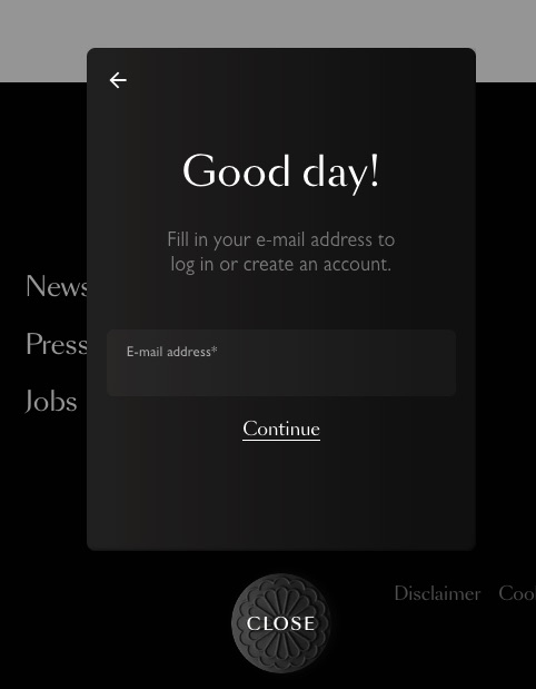
This login popup is simple and functional. It provides the option for users to sign in to their existing Moooi account, or easily create a new account if they don’t have one.
13. Survey website popup examples
This type of popup enables you to collect customer feedback and reviews directly from your website. You can use these in multiple ways, including collecting valuable insights to then design highly targeted marketing campaigns.
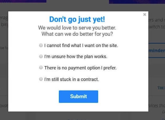
Circles.Life takes a unique approach by combining an exit-intent popup with a survey. It uses a popup to find out why they’re leaving the site.
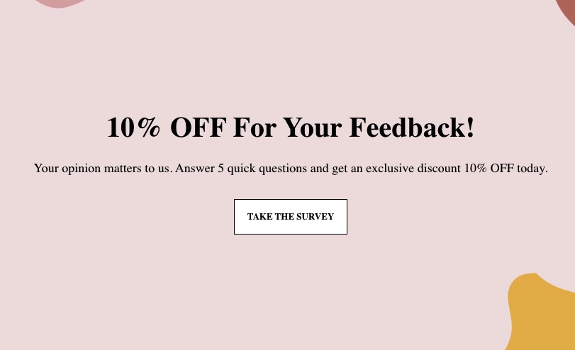
Kennedy Blue uses a multi-step popup form to gather information about the visitor’s experience on the site. This exit-intent popup provides a discount to encourage them to take the survey.
You can replicate this strategy using any type of incentive, such as gated content and exclusive offers, depending on your type of business.
14. Lead magnet popup examples
These popups provide valuable resources or incentives in exchange for contact information like email addresses or phone numbers. For example, you can offer a free ebook, an exclusive article, or a discount code.
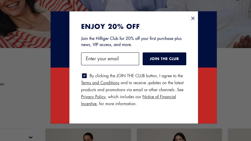
The fashion brand Tommy Hilfiger uses a lightbox design, highlighting the popup content by darkening the rest of the screen. The popup offers a clear incentive, a 20% discount, in exchange for joining the brand’s membership and providing email information.
The popup also mentions the membership terms and conditions to maintain transparency and build trust.
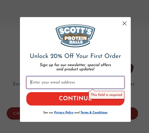
This website popup features a prominently placed logo to reinforce the company’s branding, with a prominent 20% discount offer for signing up. This, combined with the bright red CTA, attracts the visitor’s attention and encourages them to sign up.
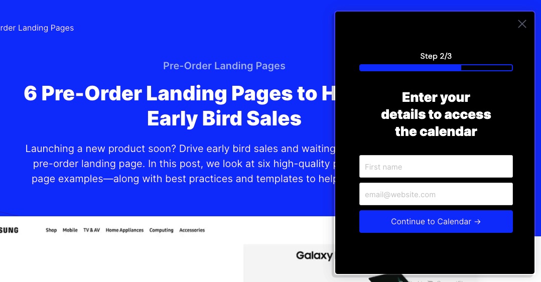
ConvertFlow uses a multi-step popup form to generate leads. The first step offers a free calendar that comes with recommended templates.
Once visitors click on the first popup’s CTA button, the second step appears to collect email addresses and names. Then, the visitor can access the calendar.
15. Registration popup examples
Similar to login popups, these popups enable the user to register or sign up for specific events like webinars or podcasts without leaving your website.
You can link it to a landing page, where you can collect email addresses to provide more information about the event that visitors are signing up for.
This website popup shows how shipping management company nShift directs users to easily sign up for its webinar. One side contains a registration form, while the other side lists the webinar’s key learning points. This strategy effectively highlights the benefits of the event, thereby increasing registrations.
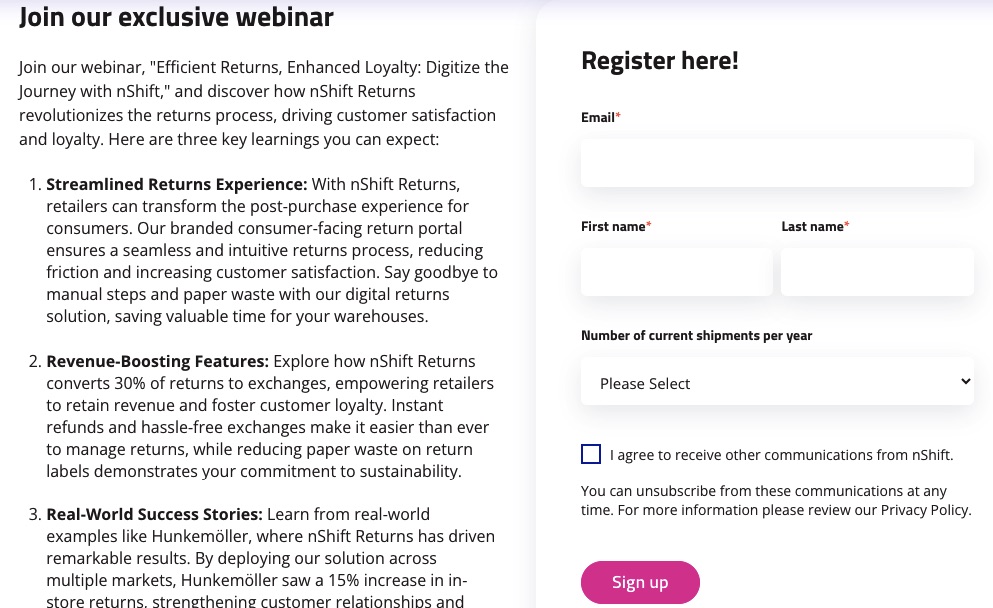
This website popup allows visitors to reserve a seat for a webinar ahead of time, with a headline that clearly communicates the benefits of attending.

16. Pre-order signup popup examples
These popups are used for collecting a list of potential customers before a product or service launch. It can direct the users to a landing page or prompt them to fill out a pre-order form.
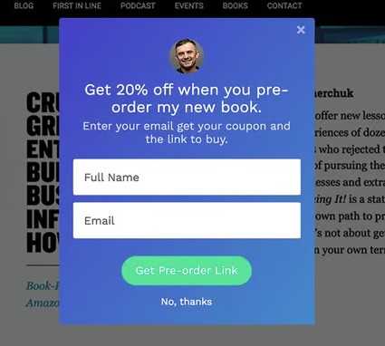
Serial entrepreneur Gary Vaynerchuck makes his offer clear in this website popup: get 20% off by pre-ordering his book and providing an email address.
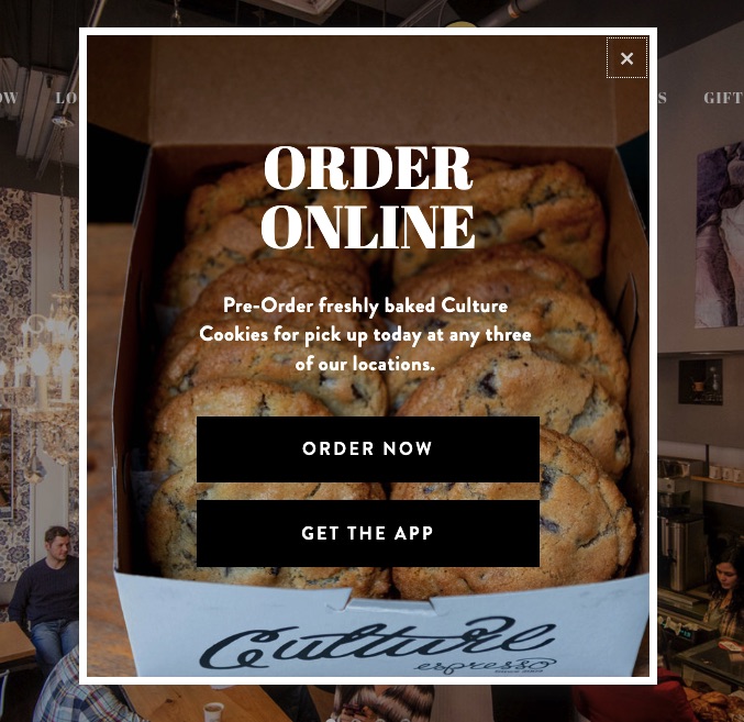
Culture Espresso’s popup allows visitors to pre-order cookies that they’ll then collect in person, and gives the choice of ordering via the website or the mobile app (also making this an effective way of increasing app downloads).
17. Coupon code popup examples
Coupon code popups work like lead magnets. They offer coupon codes for discounts in exchange for a visitor’s email address or contact information.
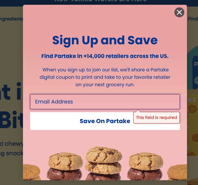
Partake Foods uses an enticing product image to encourage visitors to sign up and claim the coupon. It also mentions how many retailers sell this product, highlighting how easy it is to make a purchase.
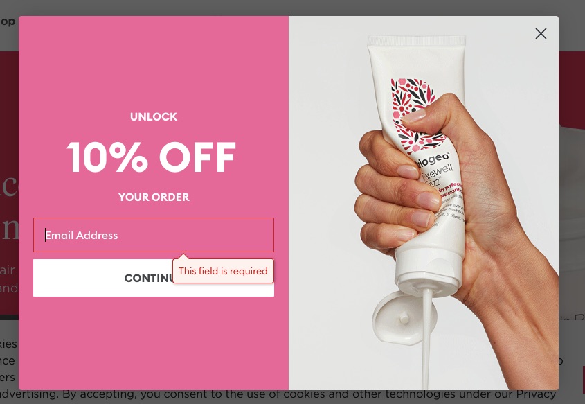
Briogeo Hair uses a website popup to offer 10% off in exchange for an email address.
The popup has a clear and simple design: showing the offer on one side and a product image on the other.
18. Email opt-in website popup examples
These types of website popups are designed to collect email addresses for marketing purposes. You can offer discounts and other types of incentives to generate leads with this popup.
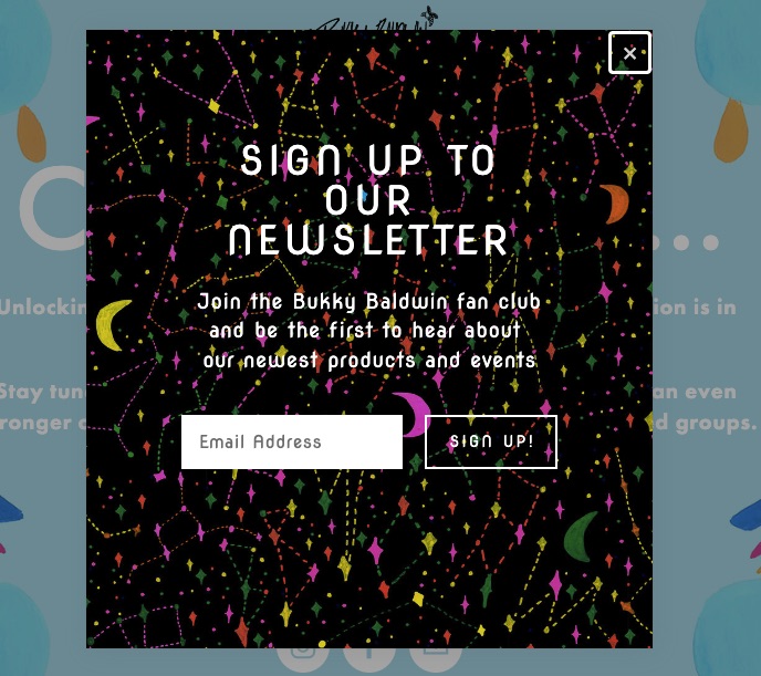
This email opt-in popup asks users to sign up for the company’s newsletter and highlights the key benefit of doing so. A single form field and a clear CTA make the process easier, encouraging more visitors to sign up.
Wheelchair lifestyle brand Push Living uses a simple text-focused website popup to collect email addresses for a mailing list. Even without images, the design is engaging, and the benefits are concisely communicated.

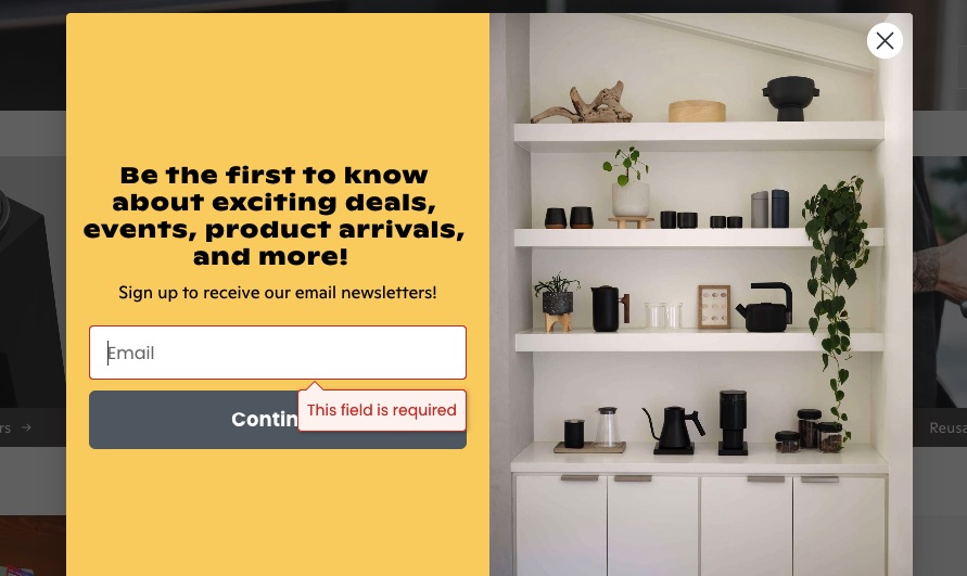
Coffee retail brand Eight Ounce Coffee uses this website popup to offer exclusive access to shopping deals and events to visitors who sign up for its newsletter. Listing the benefits helps convince site visitors that signing up will be worth it.
19. Phone number opt-in popup examples
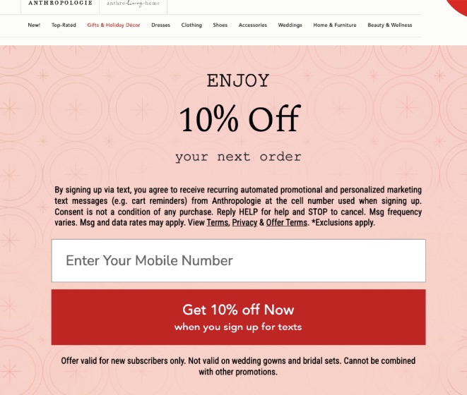
This type of website popup functions like an email popup. However, instead of collecting email addresses, it asks for phone numbers.
This website popup builds trust and transparency by detailing how your phone number will be used, how to unsubscribe, and how to contact support if you sign up. This, along with the 10% discount offer, encourages visitors to sign up.
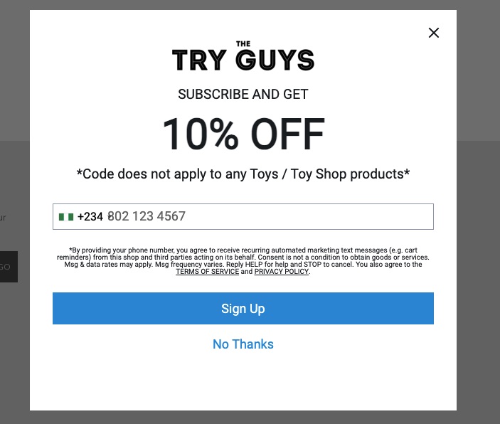
This opt-in website popup only uses text, there are no accompanying visuals. However, the clear and large fonts highlight the incentive for signing up, and the contrast between the CTA button and the white background draws a visitor’s attention.
Set up popups easily with Omnisend
Omnisend provides an easy way to create unique website popups with high-converting copy and creative designs. It offers built-in signup forms, templates, and other features that enable you to maximize your marketing efforts, including:
- Entertaining and interactive signup forms like the Wheel of Fortune
- Option to schedule a popup
- Signup boxes with high-converting CTAs and images
- Large selection of professionally designed templates for popups and emails
- Advanced integration capabilities that allow you to add a popup on Wix, Shopify, and other major ecommerce platforms
 | Organic Aromas is an aromatherapy company that teamed up with Omnisend to set up exit-intent popups, signup boxes, and other lead-generation tactics to grow its customer base. The end result was a 150% increase in newsletter signups. The company’s average signup rate of 3.24% jumped to 6.8% from a single Omnisend popup. Read the entire case study |
Wrap up
Digital marketers use website popups to capture leads, promote their sales and offers, and drive sales conversions.
You must select the appropriate type of website popup to attain your marketing goals. However, there are no set rules, and we recommend experimenting with different website popups to determine the most effective ones for your business.
Strike a balance between attaining marketing goals and providing a positive user experience. Keep them short and concise to further engage visitors and drive conversions.
If you’re looking for a comprehensive solution to create and implement various types of popups, try Omnisend.
TABLE OF CONTENTS
TABLE OF CONTENTS


No fluff, no spam, no corporate filler. Just a friendly letter, twice a month.

 OFFER
OFFER

