Drive sales on autopilot with ecommerce-focused features
See FeaturesEmail popups can convert over 3% of website visitors into subscribers, making them a crucial tool for capturing potential customers.
Effective popups incorporate nine essential elements, including clear headlines, strong CTAs, and visible close buttons to enhance user experience and drive conversions.
Gamified popups, such as spin-to-win wheels, significantly outperform standard popups, with conversion rates exceeding 10%.
Testing and optimizing popups through A/B testing can lead to substantial improvements in signup rates, often shifting conversions by several percentage points.
Email popups convert an average of 3.09% of website visitors into subscribers, according to an Omnisend report. That’s thousands of potential customers left behind if your site doesn’t use them effectively.
Most stores get popups wrong by copying the first example they see, without understanding what actually drives signups.
Popups can feel annoying when done poorly, but the data tells a different story. One Omnisend customer saw its signup rate jump from 3.24% to 6.8% with a single popup change.
This article breaks down 35+ real email popup examples organized by type. You’ll see what works across welcome popups, exit-intent designs, gamification formats, cart abandonment messages, multi-step forms, and mobile layouts.
Each example includes a practical critique of what makes it effective and what could be improved.
Quick sign up | No credit card required
What makes an email popup effective
To start with, what is a popup? An email popup is a website overlay that captures visitor contact information through a signup form in exchange for something valuable. That “something” could be a discount code, free shipping, exclusive content, or early access to sales.
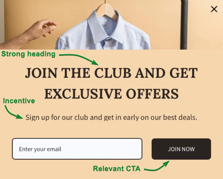
The value exchange is simple. Visitors provide their email address, and you offer an incentive in exchange. This Omnisend email subscription popup is a great example:
Common incentives include:
- 10-15% discount codes
- Free shipping on first orders
- Downloadable guides
- Entry into exclusive member groups
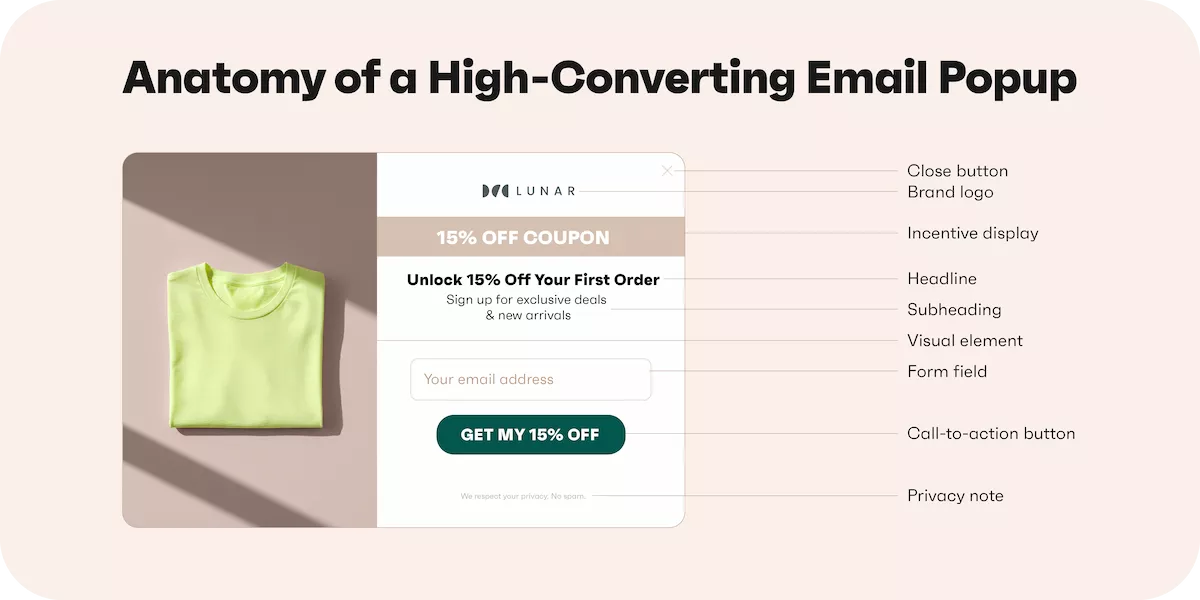
Effective email popups share nine essential elements that work together to drive conversions. When one element is weak, the entire popup underperforms. Here’s what makes each element work:
- Headline: State your offer in five to eight words maximum. “Get 15% off your first order” outperforms vague phrasing like “Get exclusive discount.”
- Subheading: Add context in one sentence. Explain what happens after signup or clarify terms, like the example above (“get in early on our best deals).
- Visual element: Use product images or lifestyle photos that match your brand. Avoid generic stock photos.
- Form field: Start with email only. You can always collect more information after the initial signup.
- Call to action button: Make it action-specific. “Claim my discount” beats “Submit” because it reinforces value.
- Close button: Always visible and clickable. Hidden close buttons frustrate visitors and hurt your brand.
- Brand logo: Include it for trust. First-time visitors need to know the email popup belongs to your store.
- Privacy note: A short line about how you’ll use their email builds trust. “We respect your privacy” works fine.
- Incentive display: Show the discount percentage prominently. Use larger fonts or contrasting colors.
Email popups in 2026: Are they still worth using?
The answer is yes, but only if you build them right. Done well, email popups generate a steady stream of qualified leads without disrupting the browsing experience. The key is matching your popup strategy to your audience and offer.
A brand working with Enflow Digital implemented popups that consistently convert between three and four percent of visitors, adding over 15,000 new subscribers each month:

 | Organic Aromas invested just one hour into Omnisend’s email capture features and increased newsletter signups by 150%. Its popup conversion rate jumped from 3.24% to 6.8% in just four weeks. “The time invested in this experiment — only 15 minutes for each form. This means that only 60 minutes were needed for the entire month to obtain such great results.” Read the full case study |
The format you choose directly impacts your results. Here’s how different email popup types perform:
- Exit-intent popups convert lower than immediate email popups, but capture visitors who would otherwise leave empty-handed
- Gamified popups often outperform static designs because they add an element of fun and surprise
- Mobile-optimized popups are essential since mobile users convert 38% higher than desktop users at 3.75% versus 2.67%
Your incentive affects conversion rates just as much. Consider these performance differences:
- Discount codes typically convert higher than no-incentive popups
- Free shipping offers work well for stores with higher average order values
- Lead magnets like downloadable guides appeal to audiences still in the research phase
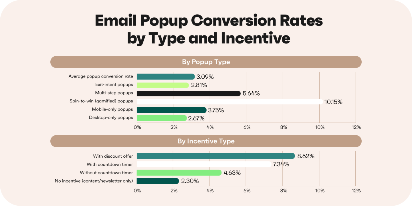
Testing makes the difference between average and exceptional results. Minor changes to your headline, CTA button text, or timing can shift your conversion rate by several percentage points.
Welcome popup examples
Welcome popups greet first-time visitors within the first 5-15 seconds of landing on your site. They’re the most common email popup type because they capture interest while it’s fresh.
These email signup popups work best when they follow popup best practices. This means they clearly communicate value, reduce friction, and align with the brand’s visual identity. Strong welcome popups balance an attractive incentive with a clean, distraction-free design.
1. KHY
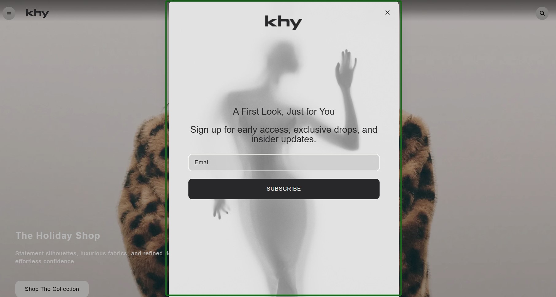
What works about this popup:
- The minimalist aesthetic with grayscale tones perfectly matches the fashion brand’s premium positioning
- A clear value proposition that explains precisely what subscribers get beyond just signing up
What could be better:
- Adding a concrete incentive (such as a first-order discount or early access) would likely increase conversions
Recreate with Omnisend: Browse minimalist email popup templates with clean typography in the template library.
2. TheCookingGuild
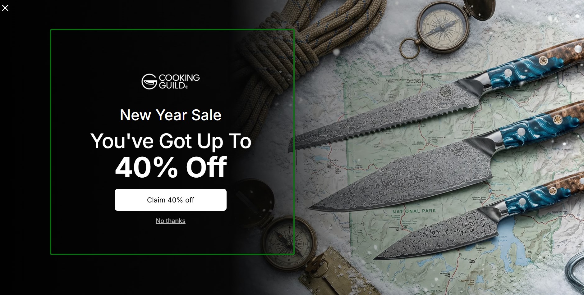
What works about this popup:
- High-quality product photography immediately showcases the craftsmanship of the knives
- The 40% off New Year Sale offer provides substantial value that’s hard to ignore
What could be better:
- The CTA “Claim 40% off” could be more specific about what happens next in the signup process
Recreate with Omnisend: Use image-focused email popup templates that let your product photography shine.
3. ZOA Energy
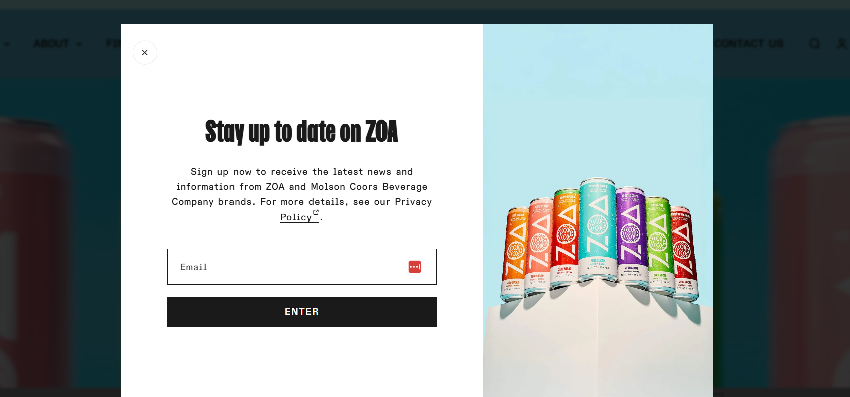
What works about this popup:
- Having the product array on the right side shows flavor variety without overwhelming the message
- A clean split-screen layout separates the form from visual elements effectively
- The privacy policy link builds trust by showing transparency about data usage
What could be better:
- Adding a benefit beyond discounts (such as early access to new flavors) would increase urgency
Recreate with Omnisend: Split-screen templates are effective for showcasing multiple products.
4. HerbsPro
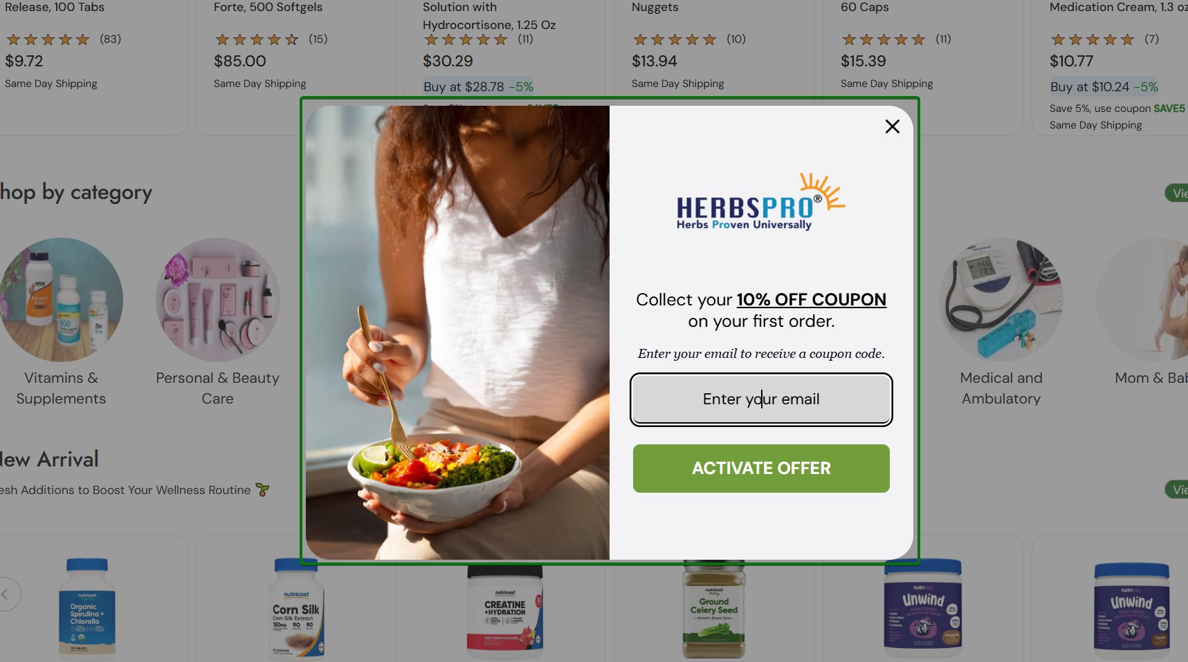
What works about this popup:
- Lifestyle imagery of healthy eating reinforces the wellness brand positioning immediately
- Dimmed background draws focus to the popup without overwhelming the page
- The 10% off coupon provides a clear monetary incentive for first-time buyers
What could be better:
- The popup could benefit from specifying whether the coupon applies to all products or has restrictions
Recreate with Omnisend: Lifestyle-focused email popup templates help create emotional connections with your brand values.
5. 100% Pure
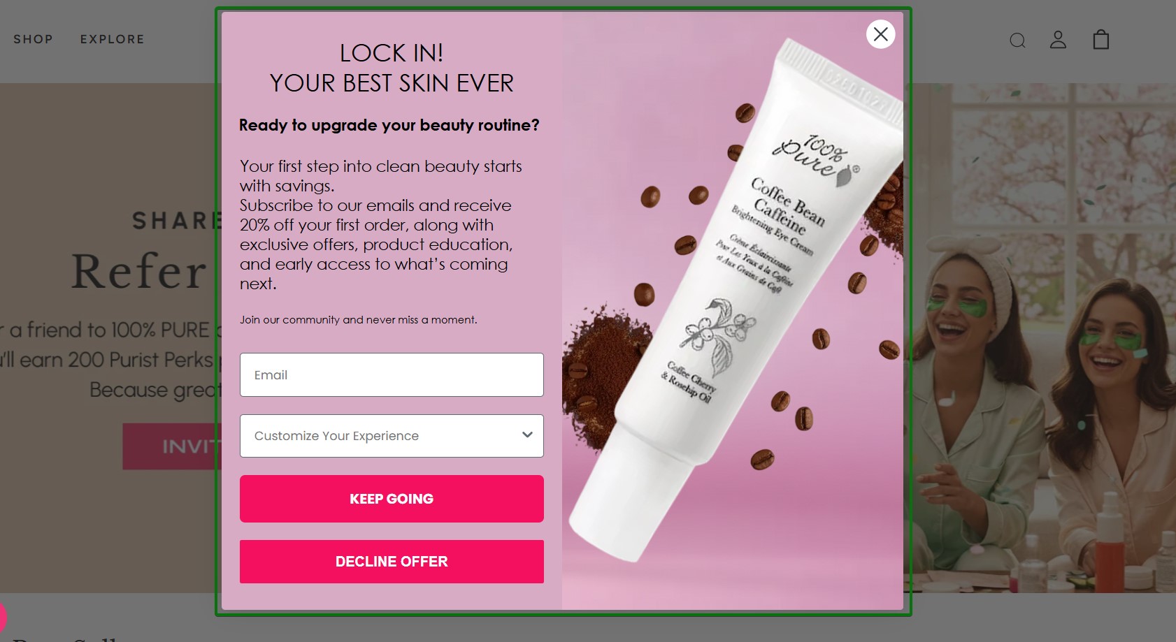
What works about this popup:
- A pink color palette with product photography creates strong brand recognition for the beauty company
- The 20% off first order incentive, alongside exclusive offers, provides clear value
- The dropdown menu for customization shows personalization options right from the start
What could be better:
- The copy is lengthy and could be shortened to make the offer more scannable
Recreate with Omnisend: Use color-blocking email popup templates that match your brand’s visual identity.
6. Codage
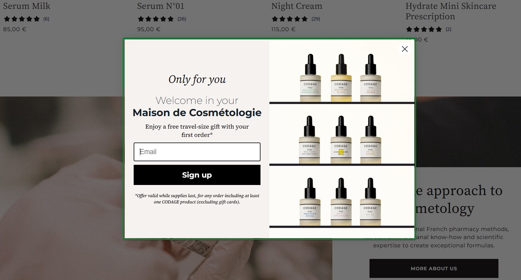
What works about this popup:
- The grid layout of serum bottles showcases the product range without cluttering the design
- The free travel-size gift incentive appeals to customers who want to try before committing
What could be better:
- Clarifying which product categories qualify for the gift would set clearer expectations
Recreate with Omnisend: Product grid email popup templates work well for brands with diverse product lines.
7. Silk & Willow
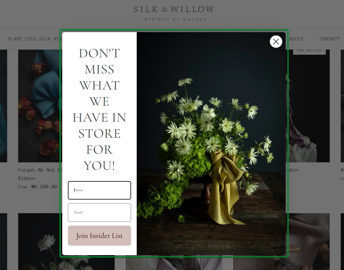
What works about this popup:
- Beautiful botanical photography immediately conveys the brand’s natural and artisanal positioning
- Split-screen design balances visual appeal with functional form elements
- Two form fields for name and email enable personalized follow-up communications
What could be better:
- Adding a specific discount percentage or dollar amount would make the incentive more concrete
Recreate with Omnisend: Choose nature-inspired email popup templates with elegant typography options.
8. Indestructible Shoes
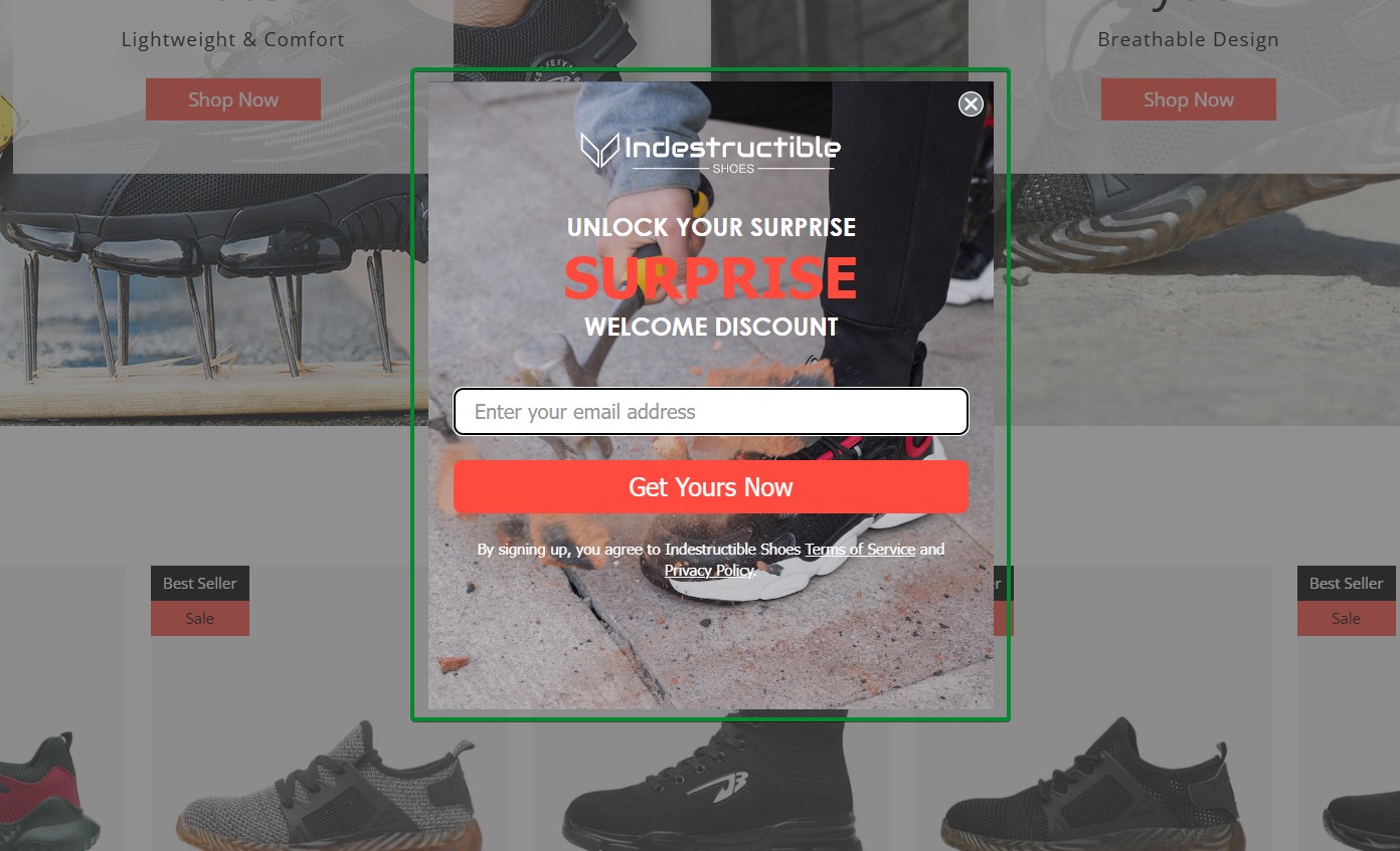
What works about this popup:
- The mystery discount concept creates curiosity around the signup experience
- Product photography in the background showcases the footwear without overwhelming the form
What could be better:
- Specifying the discount range would help visitors know what to expect before signing up
Recreate with Omnisend: Mystery discount email popups combine the simplicity of welcome forms with gamification elements.
9. Crown and Paw
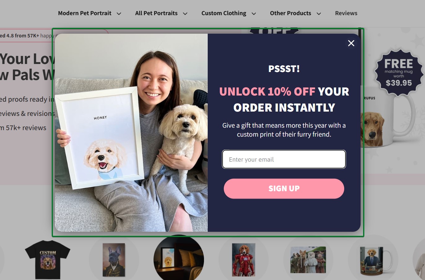
What works about this popup:
- The split design pairs a lifestyle image with the offer panel
- The headline “PSSST!” is casual and attention-grabbing without being pushy
What could be better:
- The CTA button could be more specific. “Get My Discount” or “Unlock My 10% Off” would be more actionable.
Recreate with Omnisend: Use a welcome popup template with an image-text split layout to showcase your products alongside your offer.
Exit-intent popup examples
Exit-intent popups appear when a visitor shows signs of leaving a site, such as moving their cursor toward the close button or browser tab. These email capture popups give you one last chance to convert visitors before they leave.
While exit-intent popups typically have lower conversion rates than welcome popups, they capture email addresses from visitors who would otherwise bounce without taking any action.
10. CoSchedule
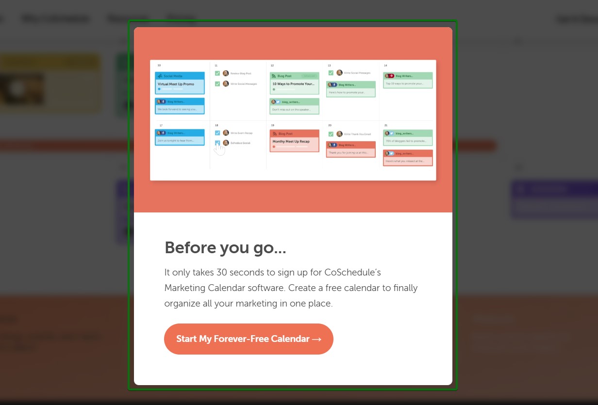
What works about this popup:
- The “Before you go…” headline directly acknowledges the exit behavior without feeling pushy
- The bright orange CTA button creates a strong contrast against the white background
What could be better:
- The CTA could be more specific about what happens after clicking, instead of just offering calendar creation
Recreate with Omnisend: Set up exit-intent triggers in Omnisend to display popups when visitors show cart abandonment signals.
11. OptinMonster
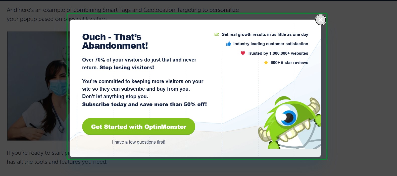
What works about this popup:
- The headline “Ouch – That’s Abandonment!” uses humor to soften the interruption
- The clear value proposition explains what subscribers get beyond just signing up
What could be better:
- The popup contains a lot of text that could be condensed for faster scanning
Recreate with Omnisend: Use social proof elements in your exit-intent popups to build trust at the critical moment.
12. Theoodie
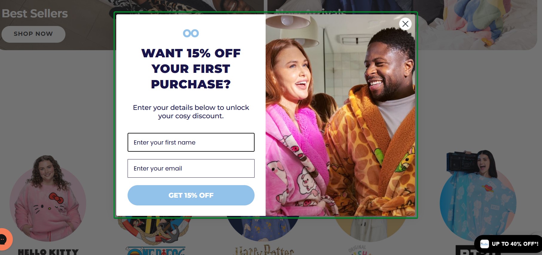
What works about this popup:
- Lifestyle photography showing happy customers wearing the product creates an emotional appeal
- The 15% discount provides substantial value to convince hesitant shoppers
- “Want”-based phrasing taps into desire rather than obligation
What could be better:
- Adding urgency language like “limited-time offer” would increase immediate conversions
Recreate with Omnisend: Combine lifestyle imagery with discount offers in exit-intent popups to address price objections.
13. Tiny Beast Designs
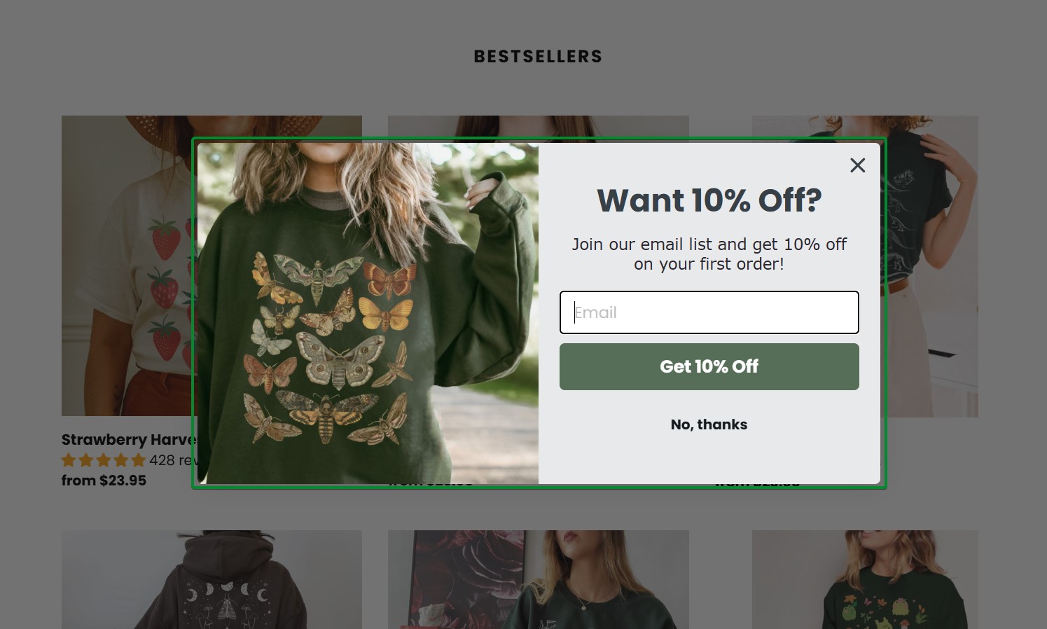
What works about this popup:
- The laid-back lifestyle photo instantly communicates the brand’s fun and colorful personality
- The 10% discount incentive is prominently displayed at the top of the email popup
What could be better:
- The popup could benefit from urgency messaging like “first-time visitors only”
Recreate with Omnisend: Match your exit-intent popup imagery to your brand’s personality and target audience.
14. Yes Please Health
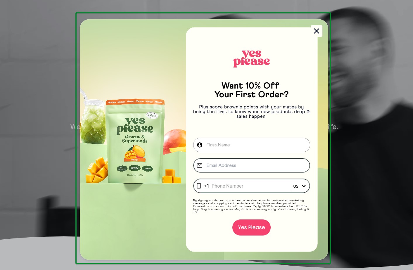
What works about this popup:
- Clean product photography on a green gradient background aligns with the wellness brand aesthetic
- The addition of a phone number field creates an avenue for multi-channel outreach
- Strong brand projection with “yes please” heading and CTA
What could be better:
- Adding a benefit statement about what subscribers receive would strengthen the value proposition
Recreate with Omnisend: Keep exit-intent popups simple with single-field forms to maximize last-chance conversions.
15. Winternational
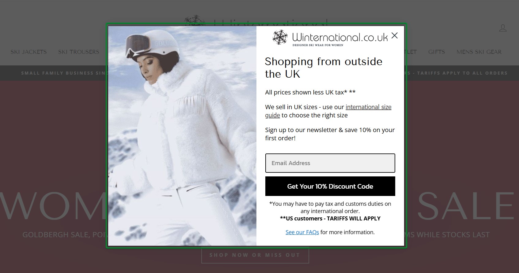
What works about this popup:
- The geographic targeting message addresses international shoppers specifically
- The 10% discount plus newsletter signup provides clear dual value
What could be better:
- The copy could emphasize what makes the newsletter valuable beyond just the discount code
Recreate with Omnisend: Use geographic targeting in exit-intent popups to personalize messaging for international visitors.
16. Death Wish Coffee
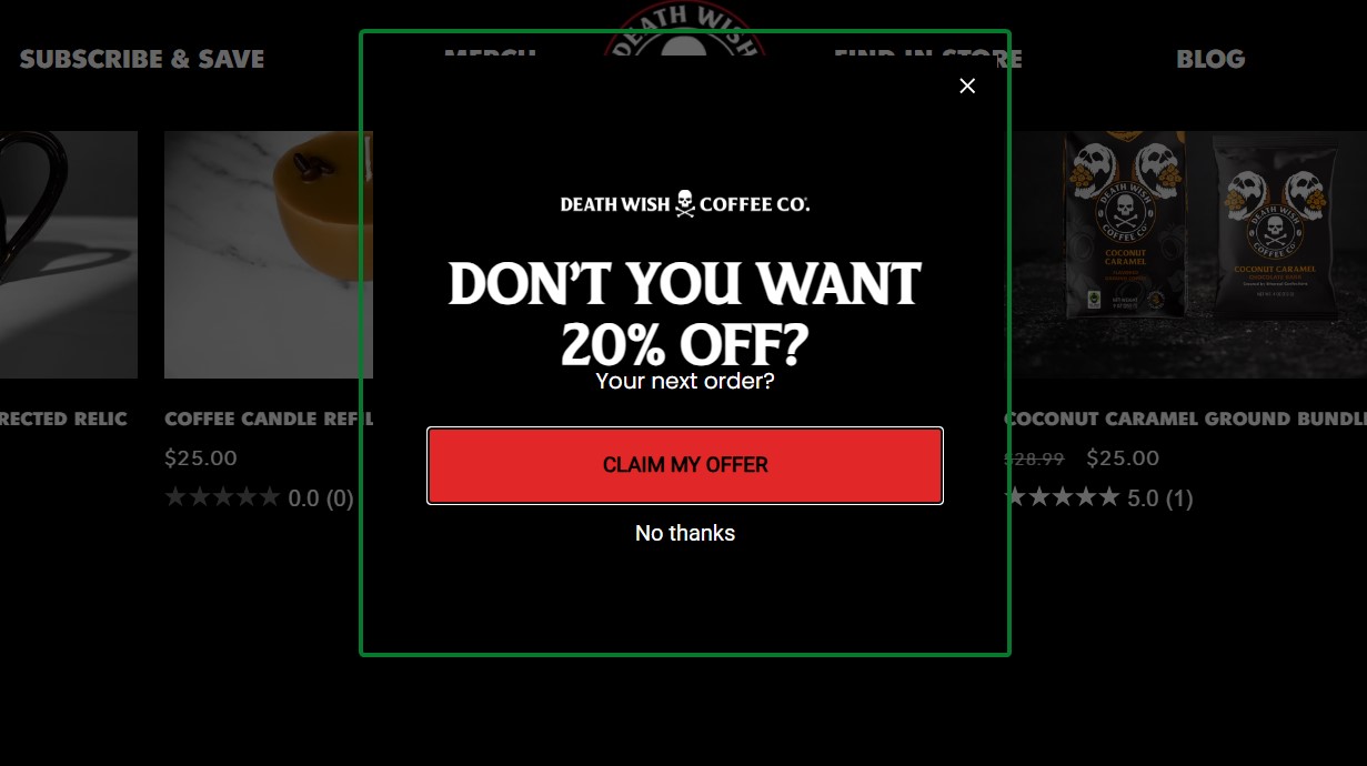
What works about this popup:
- The urgent headline “DON’T YOU WANT 20% OFF?” directly addresses the visitor’s hesitation
- The bold red CTA button creates a strong contrast against the dark background
What could be better:
- The popup could benefit from social proof or urgency elements like “Join 50,000+ coffee lovers” to strengthen the offer
Recreate with Omnisend: Set up an exit-intent trigger in Omnisend’s popup builder to capture abandoning visitors at the moment they’re about to leave.
Gamification popup examples
Gamification popups turn email signups into interactive experiences. These email popups use game mechanics like spin-to-win wheels, mystery discounts, and scratch cards to increase engagement.
When someone spins a wheel or clicks to reveal their discount, they’re already mentally committed to using it.
In fact, spin-the-wheel popups convert over 10% of website visitors on average, compared to 4.51% for standard popups.
Spin-to-win examples
17. Oddballs
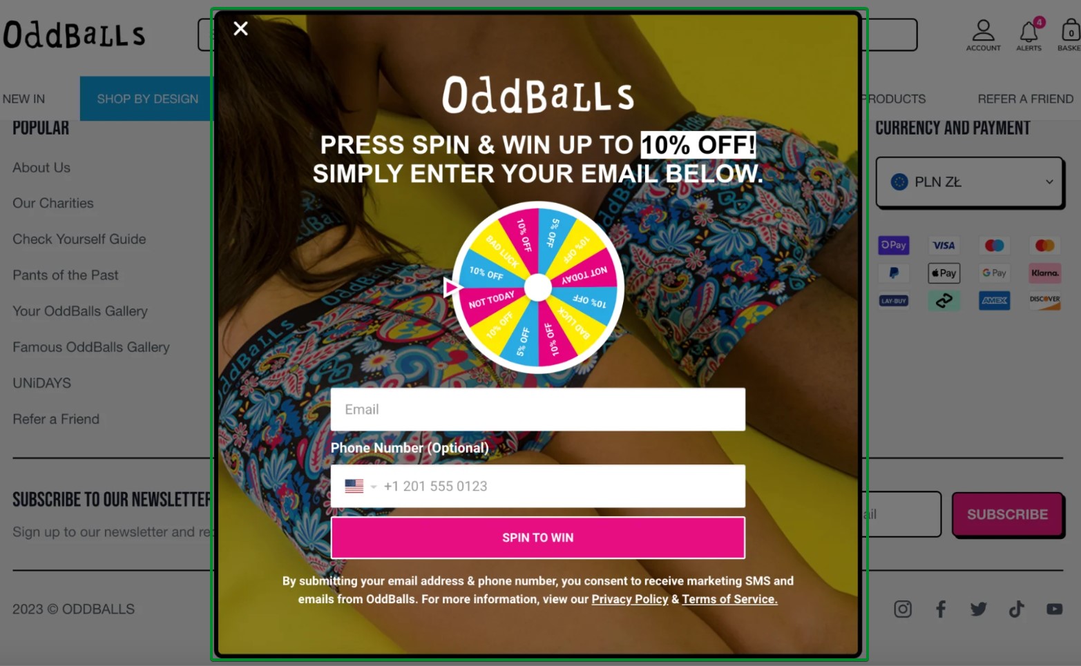
What works about this popup:
- A vibrant multi-colored wheel creates visual excitement and draws immediate attention
- The optional phone number field enables SMS marketing without creating friction
What could be better:
- The headline could emphasize the discount range to set clearer expectations before spinning
Recreate with Omnisend: Use Omnisend’s Wheel of Fortune feature to create customizable spin-to-win popups with your brand colors and prize tiers.
18. Bean Box
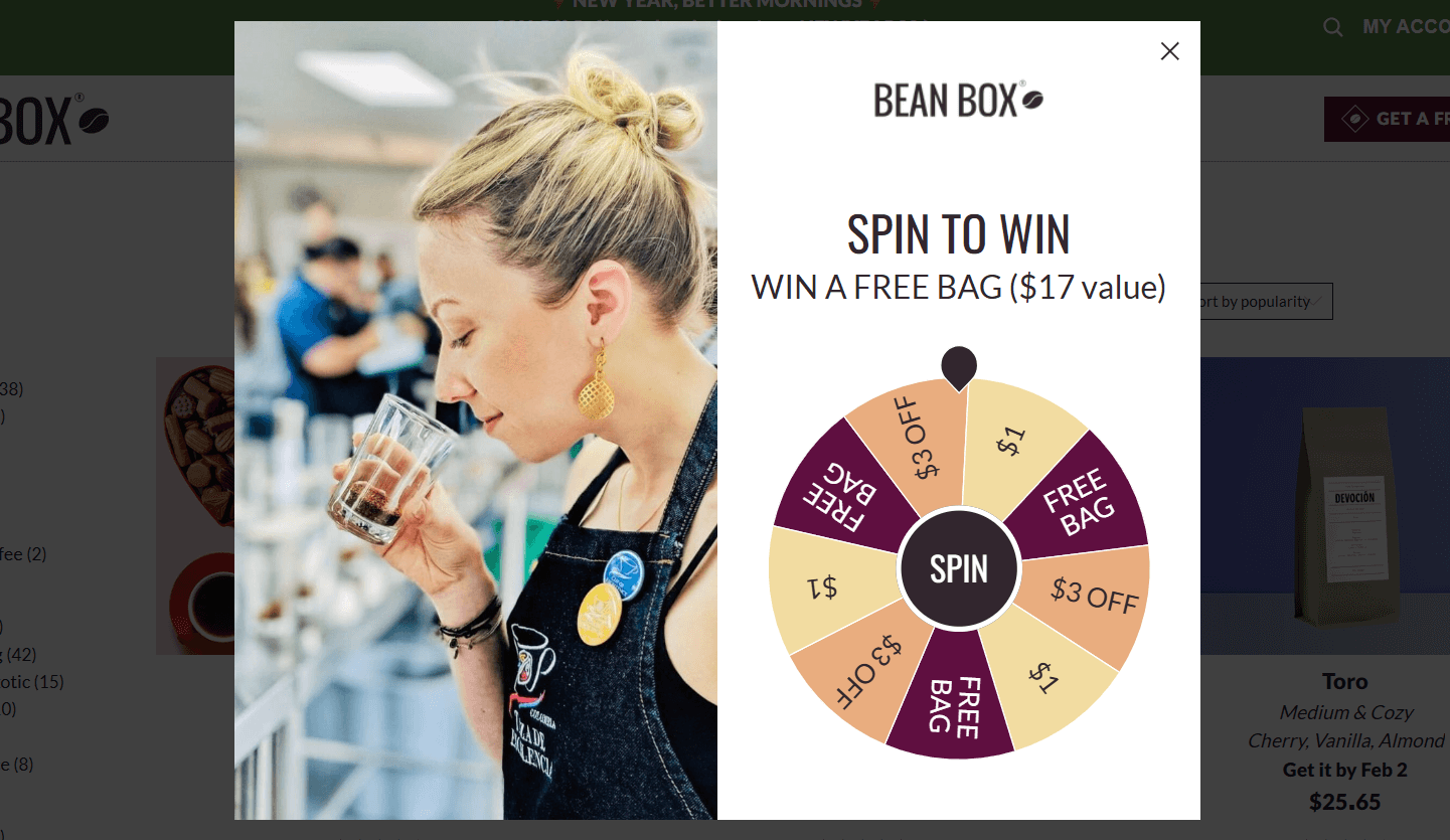
What works about this popup:
- The wheel shows multiple discount tiers, including “$1” options, which means no one goes empty-handed
- It gives a value of $17, so that customers know the amount they’ll get for the free bag for
What could be better:
- The popup could’ve asked for the email address to start spinning the wheel
Recreate with Omnisend: Build this exact email popup style using Omnisend’s native Wheel of Fortune templates with complete customization options.
19. Patch Panel
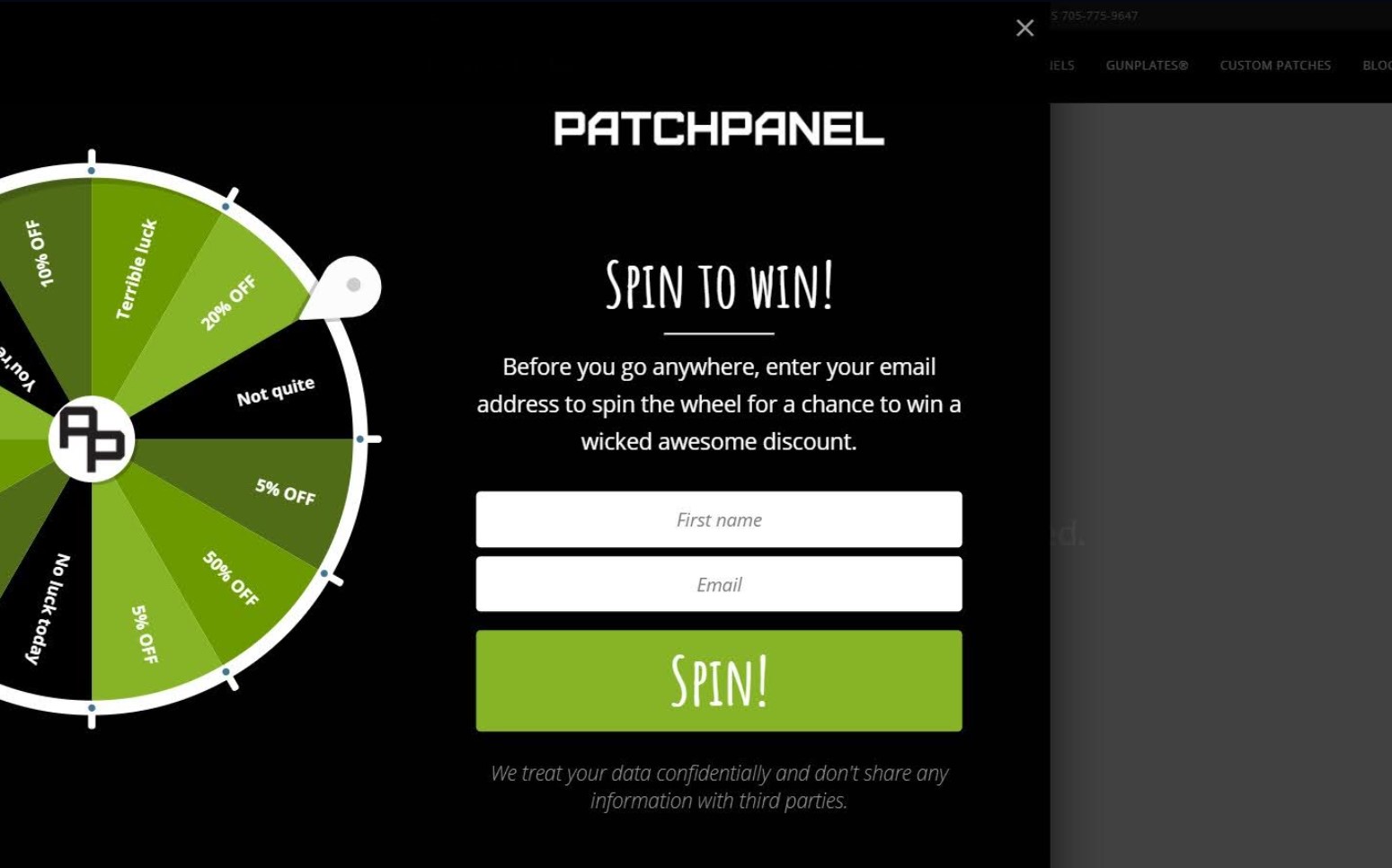
What works about this popup:
- The wheel graphic is eye-catching and clearly shows multiple discount tiers
- The privacy note at the bottom builds trust by addressing data concerns upfront
What could be better:
- The copy could emphasize exclusivity more strongly with language like “VIP discount” or “members-only offer”
Recreate with Omnisend: Use Omnisend’s Wheel of Fortune feature to create an interactive spin-to-win popup that increases engagement.
Mystery discount examples
20. Art of Play
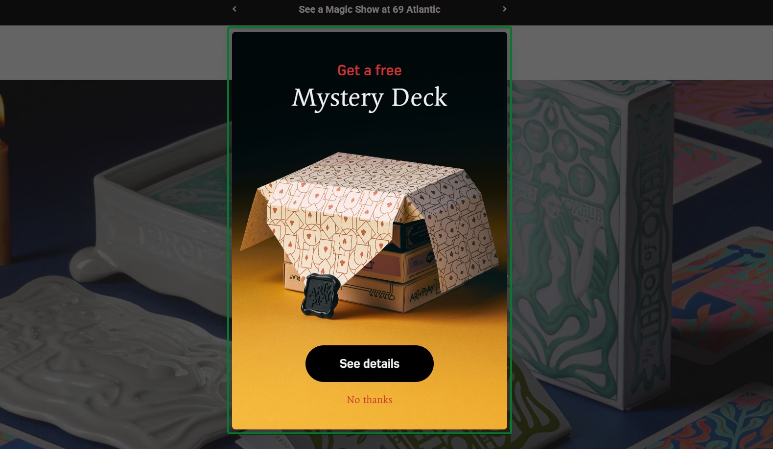
What works about this popup:
- “Get a free Mystery Deck” offer creates intrigue and perceived value beyond typical discounts
- The “See details” CTA invites exploration without requiring immediate commitment
What could be better:
- Adding an email capture field would enable follow-up even if visitors decline the initial offer
Recreate with Omnisend: Create mystery gift popups that offer free products or surprise bonuses to incentivize email sign-ups.
21. SnackNation
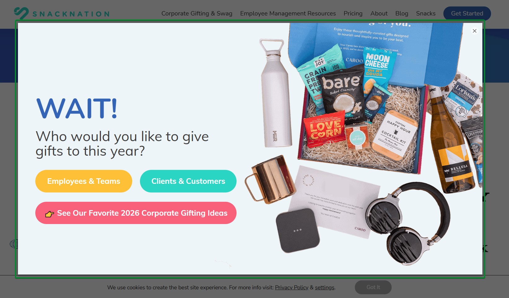
What works about this popup:
- The “WAIT!” headline creates urgency without feeling aggressive or salesy
- Colorful product photography shows the actual value of corporate gifting offerings
What could be better:
- The popup could benefit from a clear discount or incentive beyond just gift ideas
Recreate with Omnisend: Combine segmentation questions with exit-intent triggers to capture B2B leads before they leave.
Other gamification formats
22. Blume
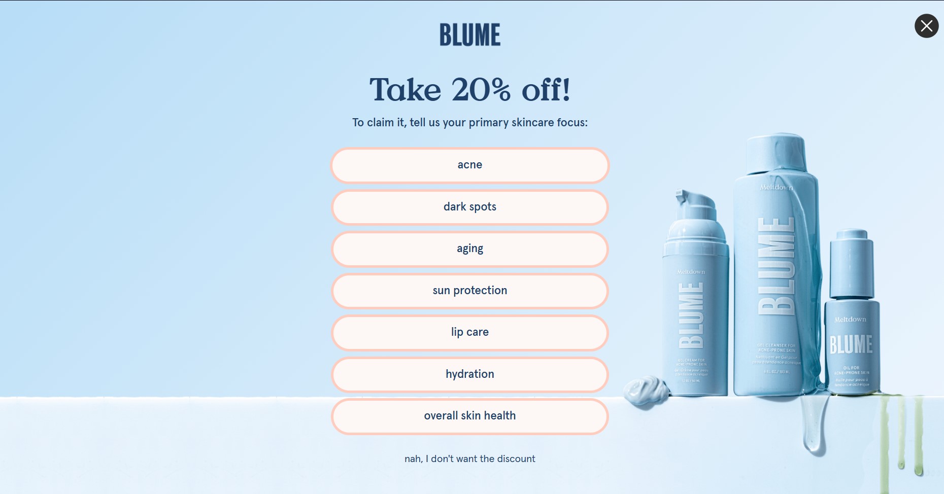
What works about this popup:
- The multi-button selection format gamifies the process without requiring actual spinning mechanics
- Seven specific skincare concerns give visitors multiple relevant entry points
What could be better:
- Adding a visual progress indicator would show visitors how close they are to getting their reward
Recreate with Omnisend: Use Omnisend’s form builder with custom buttons to create interactive selection-based popups.
23. Fly By Jing
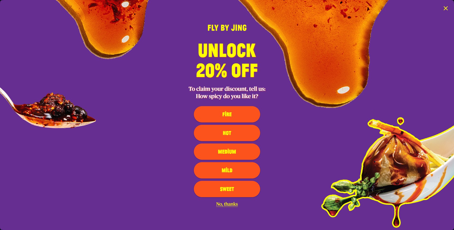
What works about this popup:
- The vibrant purple and orange color scheme creates a substantial visual impact and brand recognition
- Five spice-level buttons turn discount revelation into an interactive brand experience
What could be better:
- Explaining what each spice level means would help visitors make more confident selections
Recreate with Omnisend: Use multi-button quiz formats in Omnisend’s popup builder to engage visitors with product-related questions.
Cart abandonment popup examples
Cart abandonment popups trigger when visitors add products to their cart but show signs of leaving without completing their purchase. This happens for several reasons, including extra costs and slow delivery.
These email popups serve as the first line of defense in your abandonment recovery strategy. They capture contact information so you can follow up with email automation sequences.
24. Oddballs
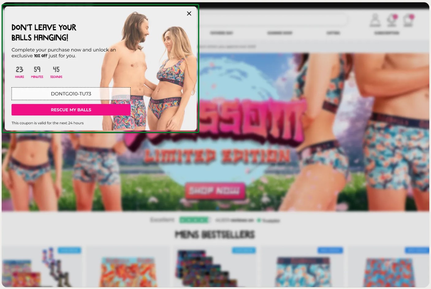
What works about this popup:
- A countdown timer with hours, minutes, and seconds creates specific urgency
- A visible discount code removes friction by showing the exact code upfront
What could be better:
- A shorter validity window (for example, two to four hours) would increase pressure to act
Recreate with Omnisend: Use cart abandonment triggers and countdown timers to create time-limited offers that drive visitors to checkout.
25. Mungo & Maud
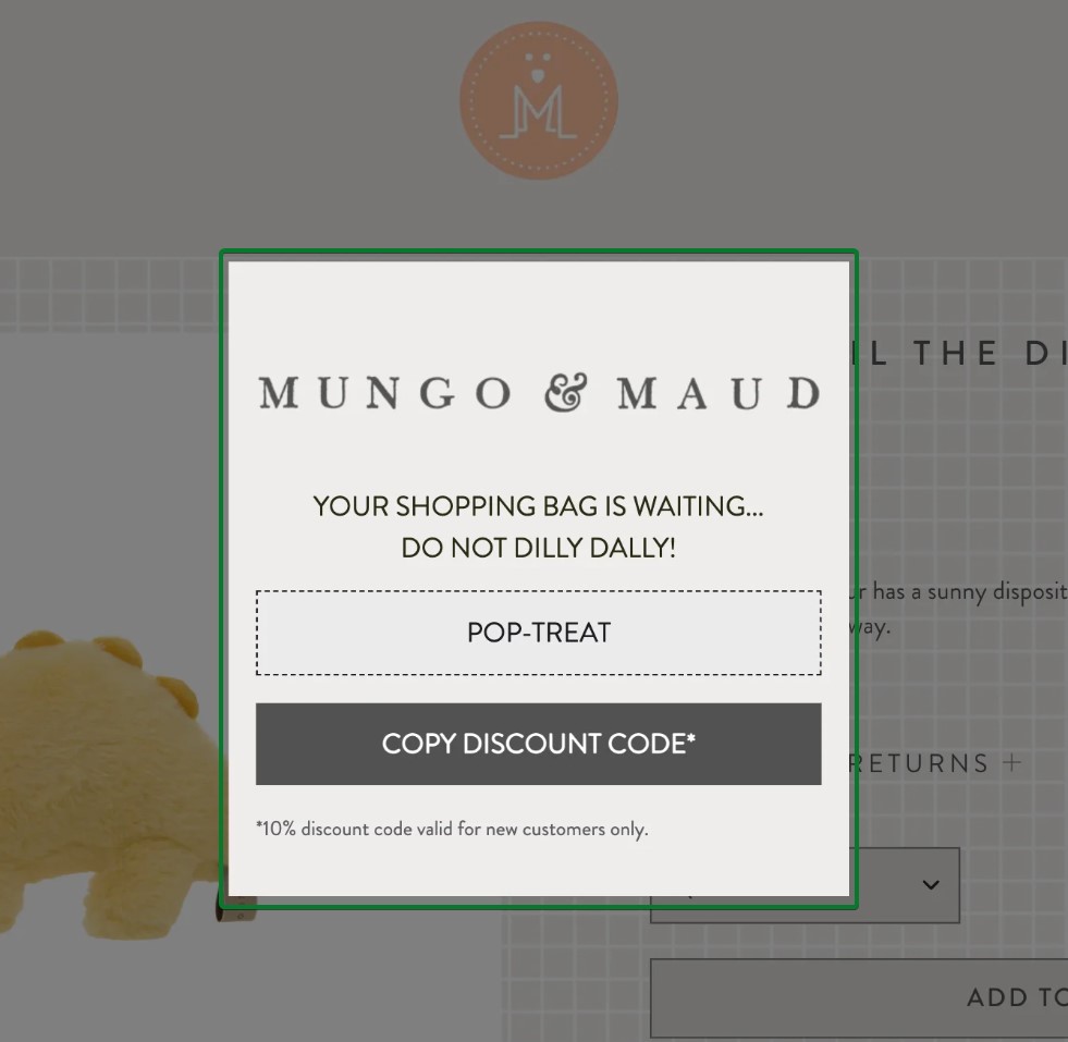
What works about this popup:
- “DO NOT DILLY DALLY!” creates urgency with a personality that matches the premium pet brand voice
- The “POP-TREAT” discount code name adds playful charm while being memorable
What could be better:
- Adding product imagery from the cart would remind visitors what they’re leaving behind
Recreate with Omnisend: Create branded discount codes that reflect your company’s personality and connect them to cart abandonment automations.
26. ShapeScale
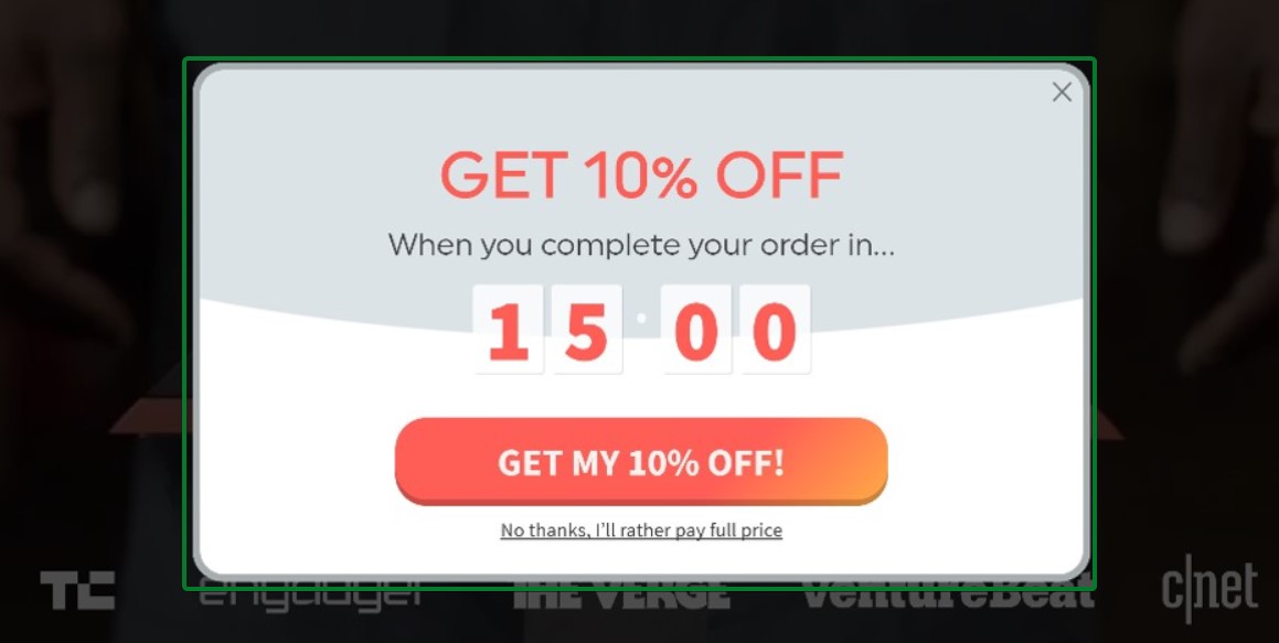
What works about this popup:
- A countdown timer with a 15-minute deadline creates immediate urgency to complete the purchase
- The clear 10% discount offer provides concrete value for finishing the order
What could be better:
- Adding product imagery from the cart would remind visitors of what they’re about to lose
Recreate with Omnisend: Use Omnisend’s cart abandonment triggers with countdown timers to create time-sensitive offers that push hesitant shoppers toward checkout.
27. Kate Spade
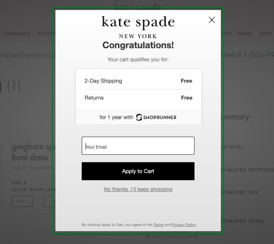
What works about this popup:
- The “Congratulations!” headline creates positive reinforcement for adding items to cart
- Free two-day shipping and free returns remove friction points that cause abandonment
What could be better:
- Adding social proof like “Join 50,000+ ShopRunner members” would strengthen the value proposition
Recreate with Omnisend: Connect cart-abandonment popups to your shipping-threshold automations to highlight free-shipping benefits.
28. Press
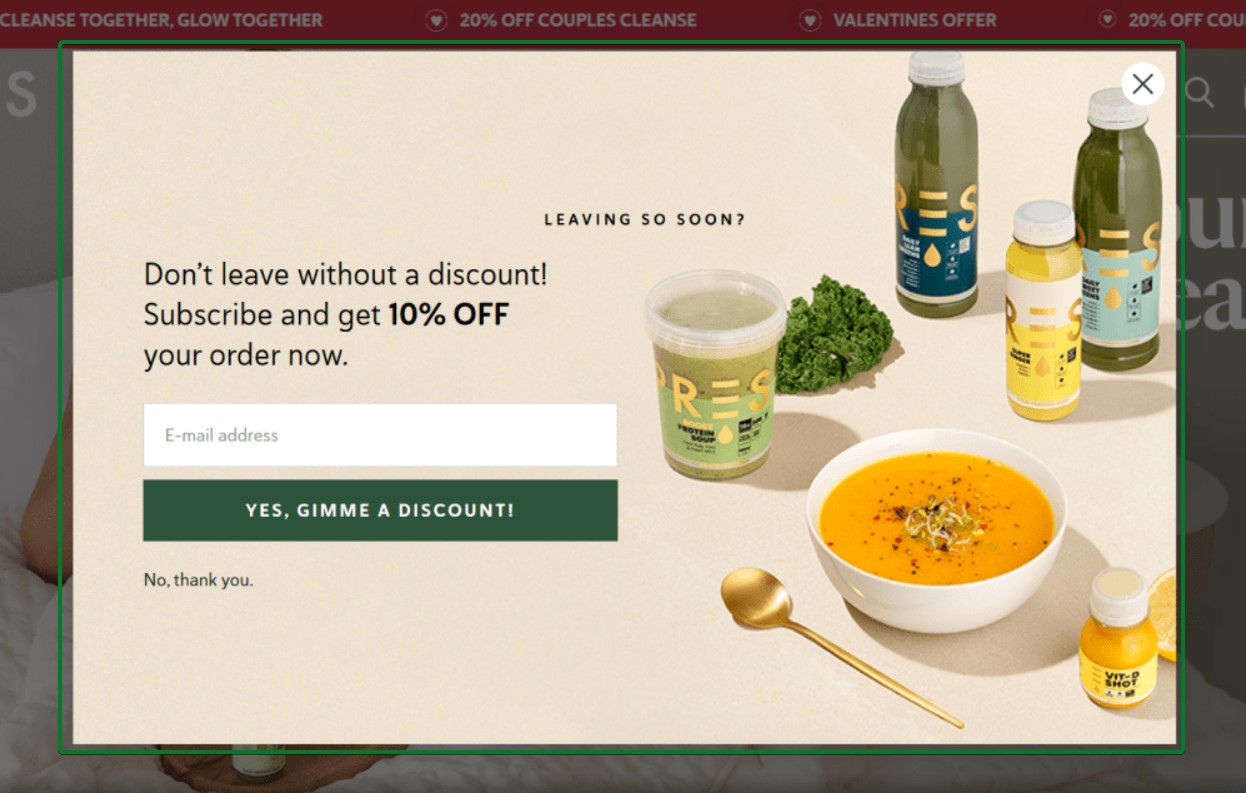
What works about this popup:
- The product imagery shows exactly what visitors are abandoning, creating visual reminders
- The 10% discount is clear and prominent in the copy
What could be better:
- Adding scarcity language like “Limited time offer” could increase conversion pressure
Recreate with Omnisend: Combine exit-intent triggers with cart abandonment automation to capture emails before visitors leave without completing a purchase.
Multi-step popup examples
Multi-step popups break the signup process into smaller, easier commitments. This approach leverages the “foot in the door” psychology principle. When visitors complete a simple first step, they’re more likely to finish the entire flow.
Multi-step popups also collect valuable zero-party data, such as preferences and interests, for email segmentation without overwhelming visitors with a long form upfront.
29. Welleco
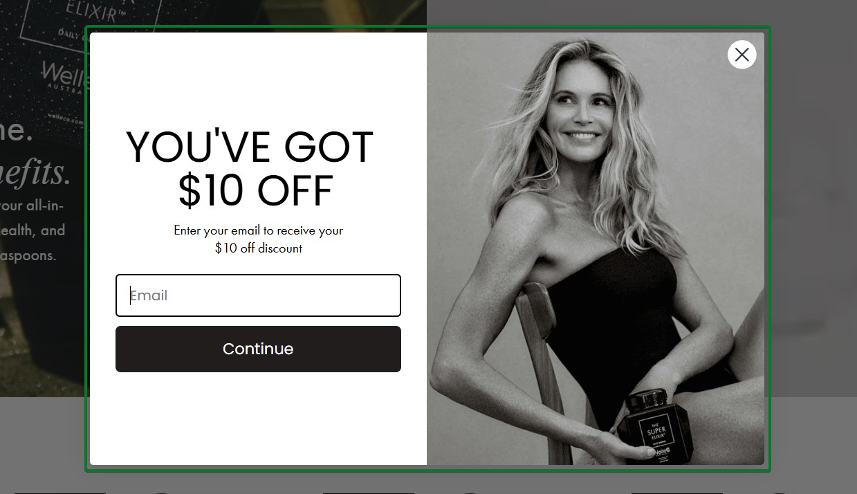
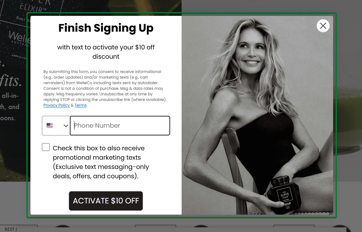
What works about this popup:
- Step one leads with the reward “YOU’VE GOT $10 OFF” to create immediate value perception
- Step two collects phone numbers for SMS marketing with a clear consent checkbox
What could be better:
- The dense legal text in step two could be shortened to reduce friction
Recreate with Omnisend: Build two-step forms that start with email collection and progress to SMS signup with clear opt-in language.
30. Mott & Bow
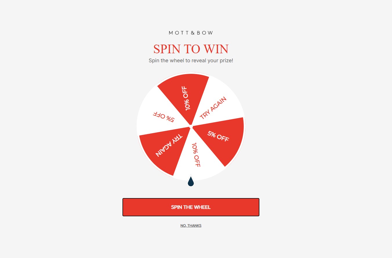
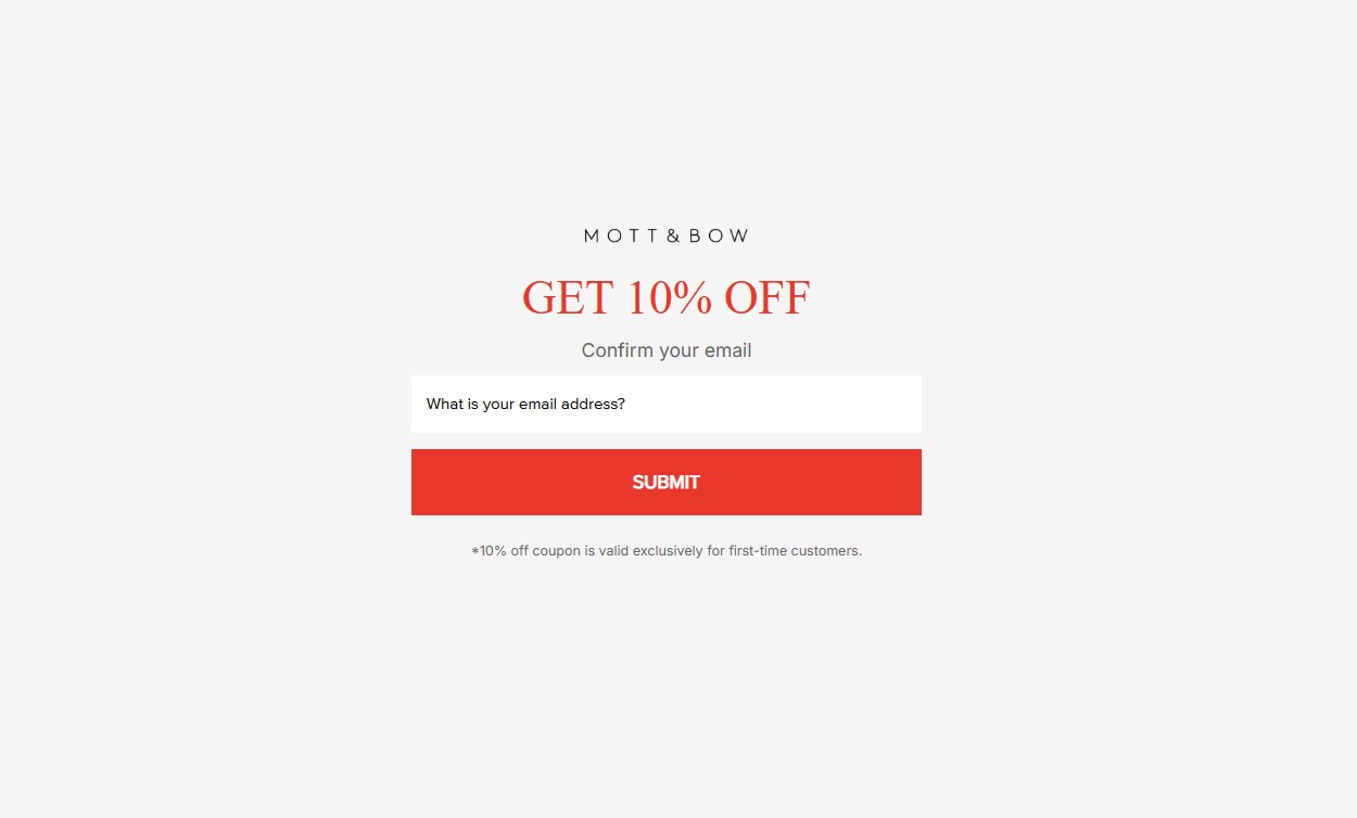
What works about this popup:
- Step one gamifies the process with a spin-to-win wheel showing discount tiers
- Step two confirms the discount earned and collects the email to deliver the reward
What could be better:
- Adding brand photography or product imagery would strengthen brand recognition
Recreate with Omnisend: Combine Omnisend’s Wheel of Fortune with multi-step signup forms to create interactive signup flows.
31. Pixie Wing
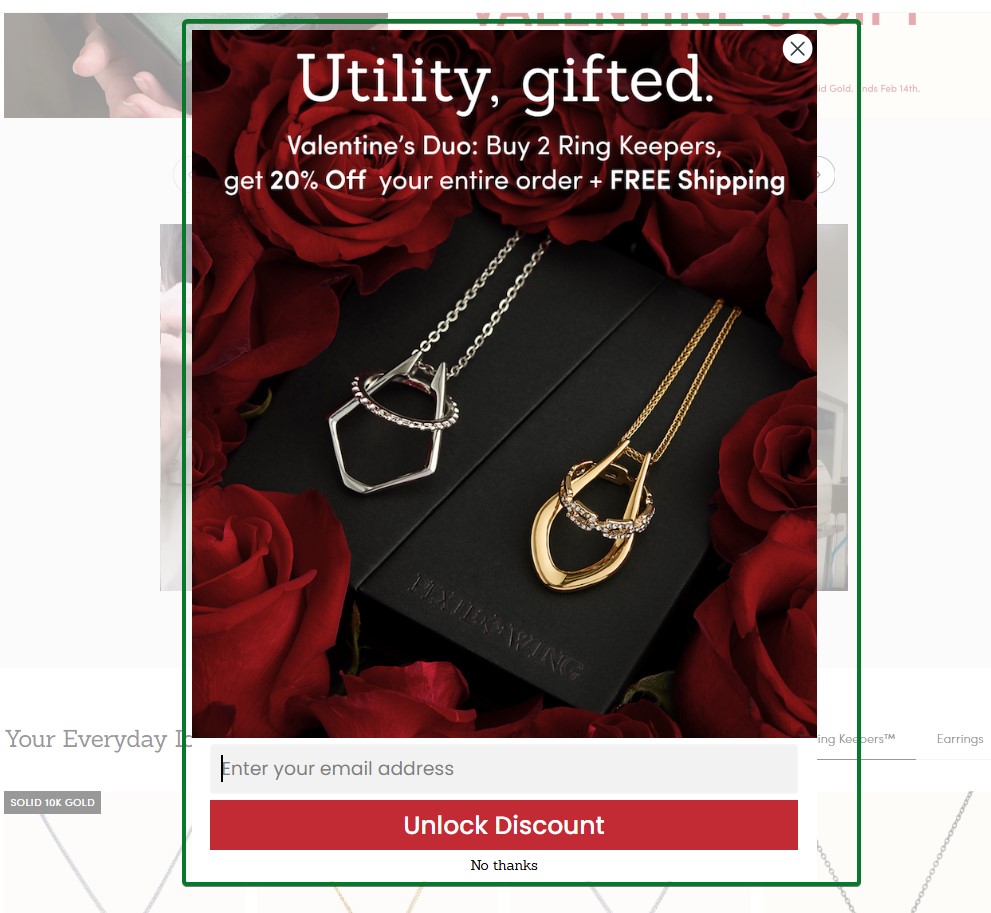
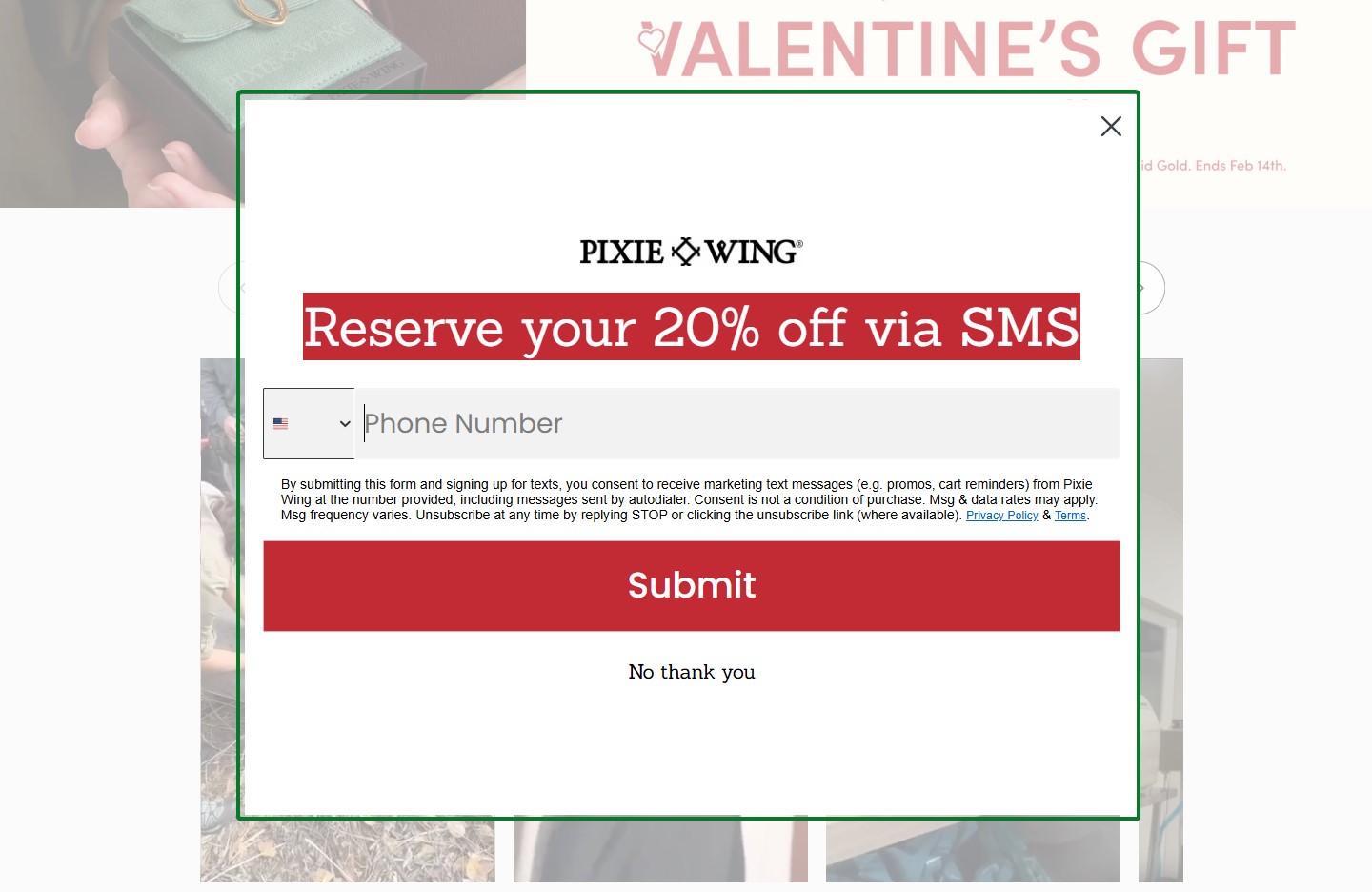
What works about this popup:
- Step one uses seasonal Valentine’s imagery with luxury jewelry photography
- Step two switches to the SMS channel with “Reserve your 20% off via SMS” framing
What could be better:
- The transition from email to SMS could explain the benefit of receiving offers via text
Recreate with Omnisend: Create holiday-themed multi-step campaigns that collect both email and SMS for omnichannel marketing.
32. Steve Madden
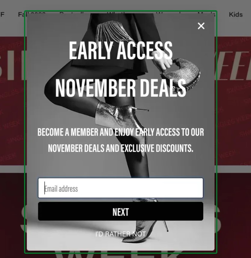
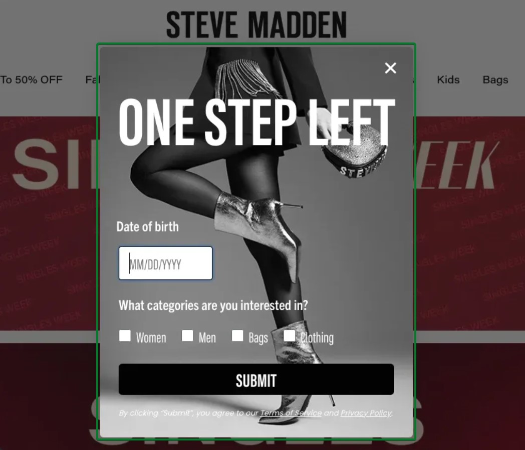
What works about this popup:
- Step one focuses solely on email with compelling benefits
- Step two collects birthday data for personalized campaigns and category interests for segmentation
What could be better:
- Adding a progress indicator would show visitors they’re on step two of two
Recreate with Omnisend: Use Omnisend’s multi-step form builder to create progressive data collection flows that segment subscribers based on preferences.
Mobile popup examples
Mobile commerce now accounts for over 60% of all ecommerce traffic. This means your email popups must work flawlessly on small screens.
Mobile-optimized email popups consider thumb zones for easy tapping, minimize screen coverage, and load quickly on slower connections. The best mobile email popups also comply with Google’s interstitial guidelines to avoid search ranking penalties.
33. Vegetology
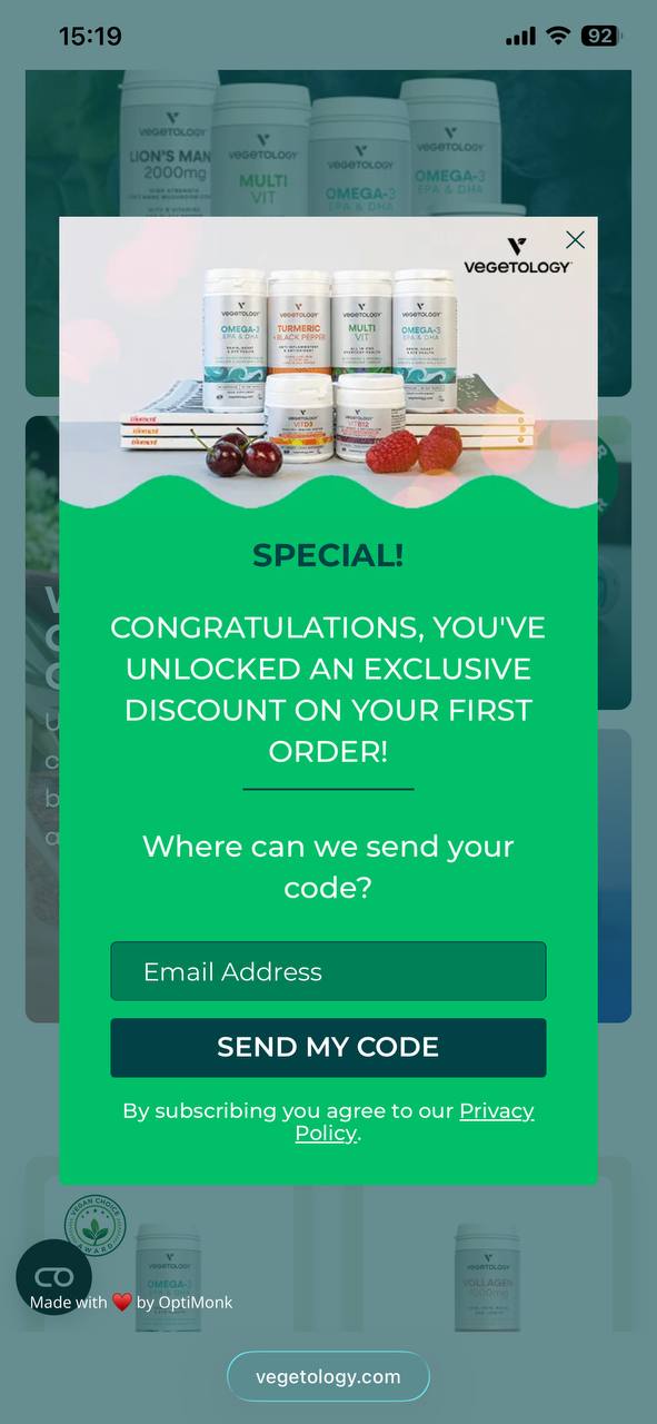
What works about this popup:
- Full-screen design maximizes impact on small mobile screens without feeling cramped
- “SEND MY CODE” CTA uses action-oriented language that promises immediate value
What could be better:
- The popup could appear after scroll engagement rather than immediately to reduce intrusion
Recreate with Omnisend: Omnisend automatically optimizes popups for mobile devices with responsive layouts that adapt to any screen size.
34. Victoria’s Secret
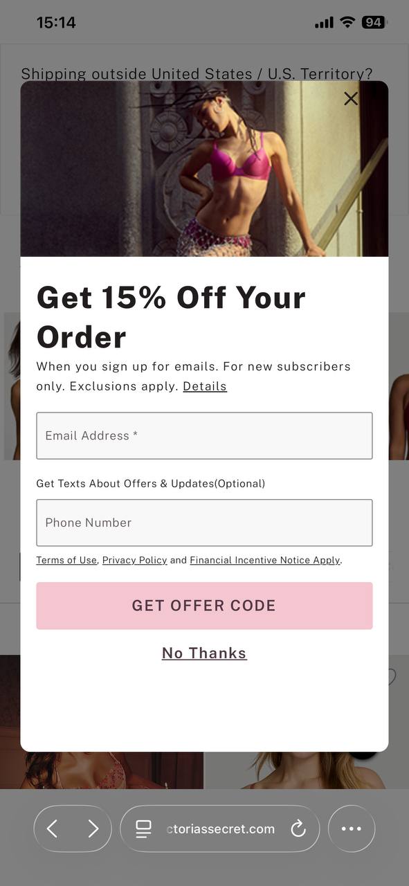
What works about this popup:
- The optional phone number field enables SMS collection without creating signup friction
- The pink CTA button matches brand colors while standing out against the white background
What could be better:
- The form could be shortened to just an email initially to reduce perceived commitment
Recreate with Omnisend: Create mobile popups with optional SMS collection fields that adapt based on device type.
35. Rebel Rabbit
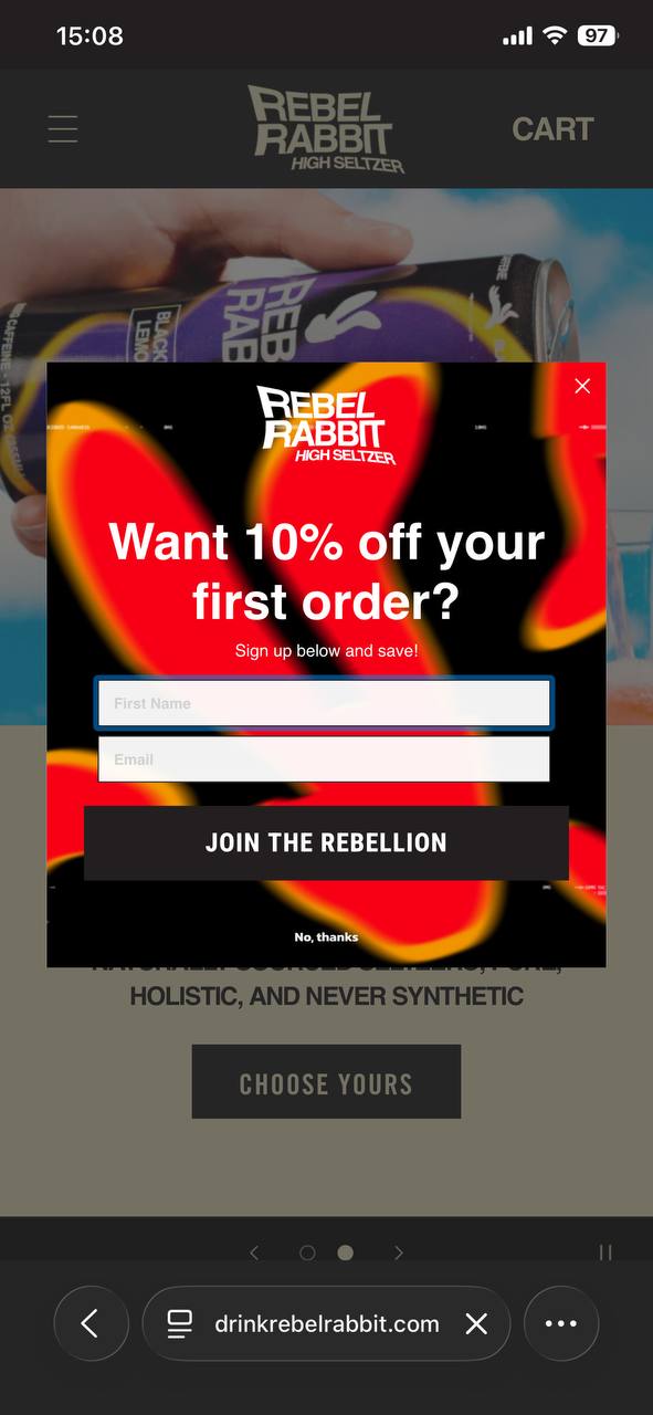
What works about this popup:
- The bold red and black color scheme creates high contrast and immediate visual impact
- “JOIN THE REBELLION” CTA matches the edgy brand personality perfectly
What could be better:
- The popup could use a progress indicator if this is part of a multi-step flow
Recreate with Omnisend: Design mobile-friendly popups with brand-aligned CTAs that reflect your company’s unique personality.
36. MVMT
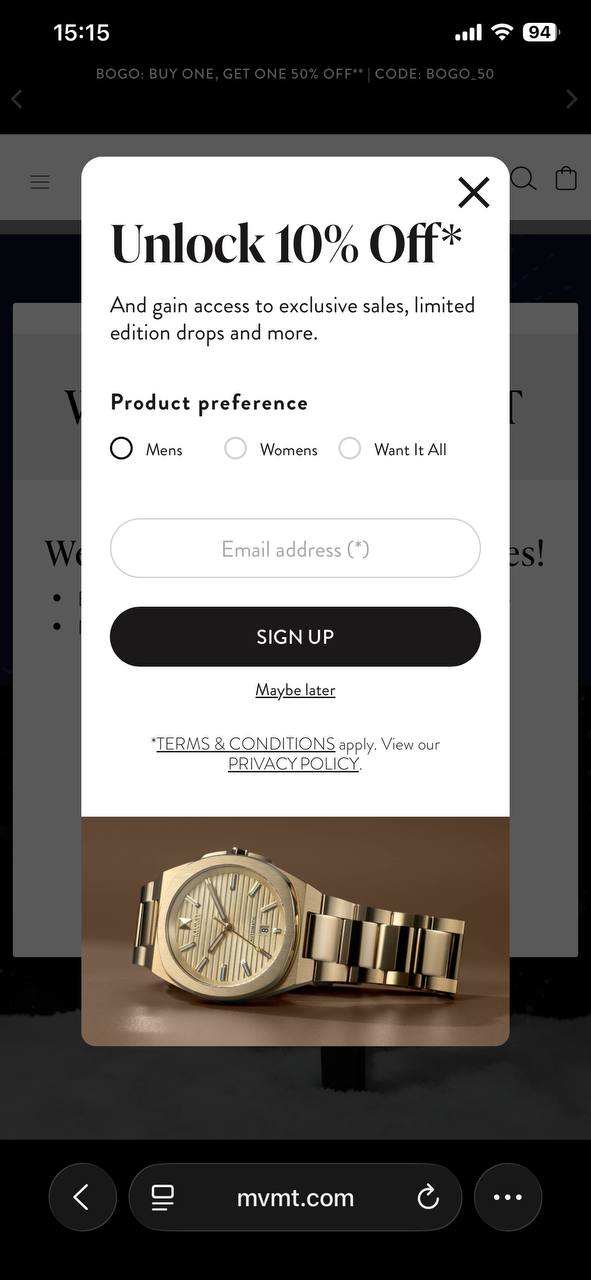
What works about this popup:
- Product preference radio buttons collect zero-party data for segmentation immediately
- The clean white design keeps focus on the offer and form fields
What could be better:
- Adding a small benefit statement for each category would help visitors make selections
Recreate with Omnisend: Build mobile popups with segmentation questions that collect preference data for personalized follow-up campaigns.
37. Only Natural Pet
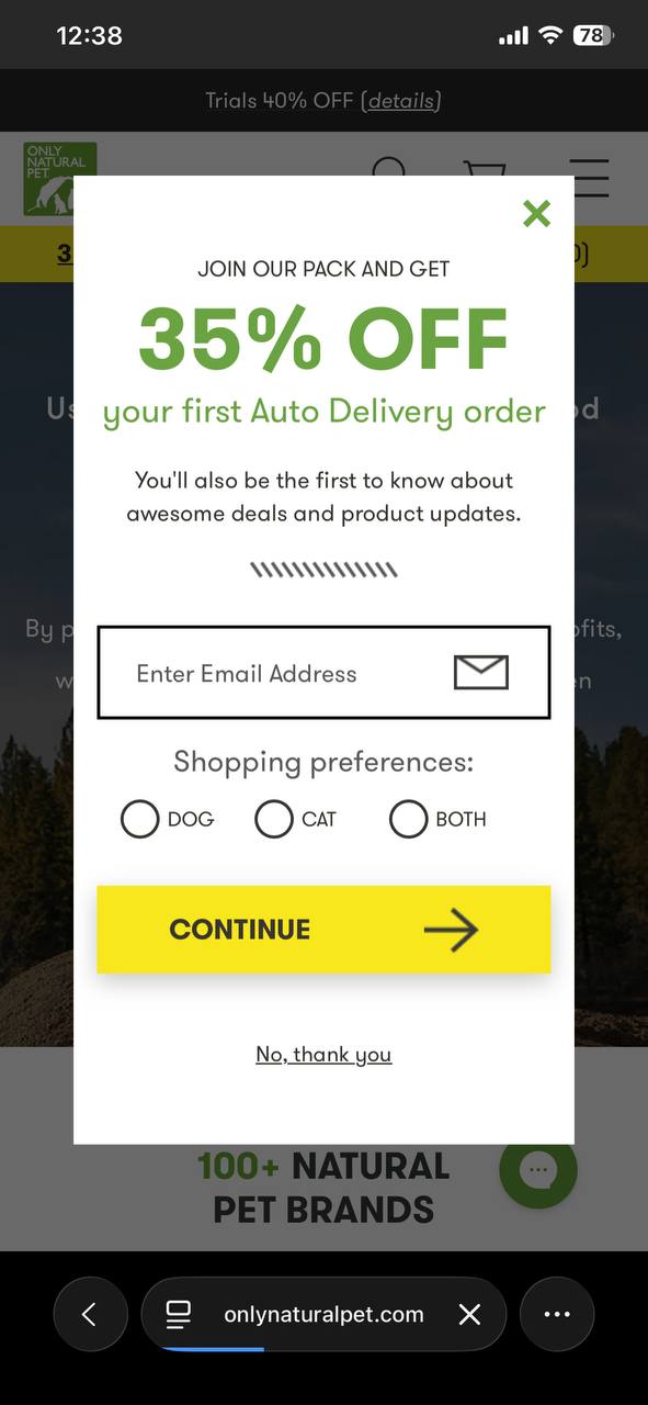
What works about this popup:
- The large, bold “35% OFF” text is immediately visible even on small mobile screens
- The shopping preferences toggle (Dog/Cat/Both) segments subscribers from the start, enabling more targeted follow-up emails
What could be better:
- The decorative divider line between the benefit copy and form fields adds visual clutter
Recreate with Omnisend: Design mobile-first popups in Omnisend that adapt to small screens while maintaining readability.
How to create an email popup — in just five steps
Creating an effective email popup doesn’t require technical expertise or design skills. Modern popup software and builders like Omnisend make the process simple with drag-and-drop editors and prebuilt templates.
Take a look at the layout of Omnisend’s signup form builder:
Follow these five steps to build a high-converting email popup in minutes.
1. Choose your goal
Start by defining what you want to achieve — determine everything from copy to design to timing. List building focuses on maximizing email signups with straightforward offers. Sales-focused popups promote specific products or time-sensitive deals.
2. Select a template
Browse Omnisend’s template library for professionally designed popups organized by type and industry. Choose a template that matches your goal and brand aesthetic. Templates include:
- Welcome popups
- Exit-intent designs
- Spin-to-win wheels
- Mobile-optimized layouts
- Multi-step popups
3. Customize design and trigger
Personalize the template with your brand colors, logo, and offer details. Write a compelling copy that clearly states the benefit. Set your trigger conditions like exit-intent detection, scroll percentage, or time delay.
4. Connect to a welcome automation
Link your email popup to an automated welcome email series that delivers the promised discount and introduces your brand. Most marketers skip this step and leave conversions unoptimized.
5. A/B test your popup
A/B test one element at a time to identify what drives conversions. Try different headlines, discount amounts, or CTA button colors. Run tests for at least two weeks to gather meaningful data.
In this video, Omnisend explains how email popup signup forms function as the foundation of successful email marketing campaigns:
Email popup best practices
The difference between an annoying popup and one that converts comes down to execution. The best email popups balance conversion goals with user experience.
Follow these email popup best practices to create forms that respect user experience while driving signups.
Offer and copy
- Keep form fields minimal: Ask for email addresses only initially, when possible. If you need more data, consider using a multi-step popup approach that collects basic information first.
- Write specific CTAs: CTAs like “Get 15% off” or “Send my discount” convert better than generic “Subscribe” buttons. Your CTA should clearly state the specific benefit visitors receive.
- Lead with value, not requests: Frame your email popup around what visitors gain, not what you want. Focus on benefits like early access, free shipping, or insider tips.
- Make offers irresistible: Free shipping, percentage discounts, or exclusive content give visitors a concrete reason to share their email. Vague promises like “special offers” don’t motivate action. Be specific about what they’ll receive.
Design and UX
- Always include a visible close button: Visitors need an easy exit option. Hidden or tiny “X” buttons create frustration and damage brand perception. Place the close button in the top-right corner where users expect it.
- Optimize for mobile screens: Over 60% of traffic comes from mobile devices. Test your popups on actual phones to verify they don’t block essential content. Mobile popups should occupy no more than 70% of the screen.
- Match your brand identity: Colors, fonts, typography, and imagery should align with your website design. Inconsistent popups feel disconnected and reduce trust.
- Add trust signals when collecting phone numbers: If requesting SMS opt-in, include privacy policy links and clear consent language to comply with TCPA regulations. Transparency builds trust and improves opt-in rates.
Targeting and timing
- Set appropriate delays: Give new visitors 20–50 seconds to browse before showing a popup. Immediate popups interrupt the browsing experience and increase bounce rates by up to five times.
- Use exit-intent for abandoning visitors: Trigger email popups when users move toward the back button or move to close the tab. This captures otherwise lost opportunities without disrupting active browsing sessions.
- Implement frequency caps: Don’t show the same popup to someone who already declined. Limit displays to once per visitor or once every 30 days. Repeated popups annoy users and hurt conversion rates.
- Run A/B tests for at least two weeks: A/B test signup form variables one at a time. Test the headline, discount amount, CTA copy, or design elements. Small changes create significant conversion differences.
Start building high-converting email popups today
Effective email popups balance user experience with conversion optimization. The 35+ examples in this guide demonstrate how different popup types serve specific goals, from welcome offers that capture first-time visitors to exit-intent strategies that recover abandoning traffic.
The key takeaway is to match your popup type to your objective. Use gamification for engagement, multi-step flows for data collection, and mobile-optimized designs for smartphone shoppers.
Apply the best practices around timing, design, and targeting to create popups that grow your list without annoying your audience.
If you want to recreate these popup styles without extra tools, Omnisend’s built-in popups give you a few high-impact options out of the box — standard popups, exit-intent popups (so you can catch visitors before they leave), and even a Wheel of Fortune form for gamified signups. You can also collect SMS signups via phone-number-only forms (or capture both email and phone), track form performance (including signup rate trends and device/location breakdowns), and keep things compliant with TCPA and GDPR consent features. And because the forms are mobile-optimized and Google mobile-friendly, you can apply the same best practices from this guide without sacrificing the mobile experience.
Ready to start building? Omnisend’s popup builder includes professionally designed templates, drag-and-drop customization, and built-in A/B testing to help you create high-converting email popups in minutes.
FAQs
Use a popup builder like Omnisend to create email popups without coding. Do these:
— Choose a template that matches your goal
— Customize the design with your branding
— Add your offer and copy
— Set trigger conditions like exit intent or scroll depth
— Connect the popup to your email automation sequence
An email popup is a website overlay that appears to visitors in exchange for their email address. It typically includes a headline, an incentive offer, an email form field, a CTA button, and a close option. Popups can be gamified wheels, lightbox overlays, or slide-in boxes.
Do the following to make your popups more engaging:
— Add gamification elements like spin-to-win wheels or mystery reveals
— Use multi-step forms
— Include personalization based on browsing behavior or traffic source
— Test interactive elements like quiz-style buttons that segment visitors based on their preferences
The optimal timing depends on your popup type. Welcome popups work best after the first five to fifteen seconds or 25% scroll depth. Exit-intent popups trigger when visitors move to close the tab. Cart abandonment popups appear when shoppers linger on checkout pages without completing purchases.
The average email popup conversion rate is 3.09% among visitors. Top-performing popups achieve five to eight percent conversion rates through strong incentives, mobile optimization, and proper timing.
Gamified popups typically convert 38% higher than standard forms. Test different elements to improve your rates over time.
TABLE OF CONTENTS
TABLE OF CONTENTS


No fluff, no spam, no corporate filler. Just a friendly letter, twice a month.

 OFFER
OFFER


