
 OFFER
OFFER


Drive sales on autopilot with ecommerce-focused features
See FeaturesA well-crafted popup message can turn casual browsers into loyal customers. But here’s what most marketers get wrong: they focus on the popup itself instead of the strategy behind it.
Omnisend data shows that while popups have an average signup rate of 3.77%, you can still achieve better results. Omnisend’s gamified popup formats on full pages like Wheel of Fortune achieve over 11% signup rates, thanks to smart strategies.
Just remember that strategic messaging, perfect timing, and user-focused design are the difference between annoying interruptions and conversions.
In this guide, we’ll break down what makes popups work, explore different popup types, and share real examples. You’ll also learn how to write better popup text, avoid common mistakes, and use Omnisend to build popups that convert.
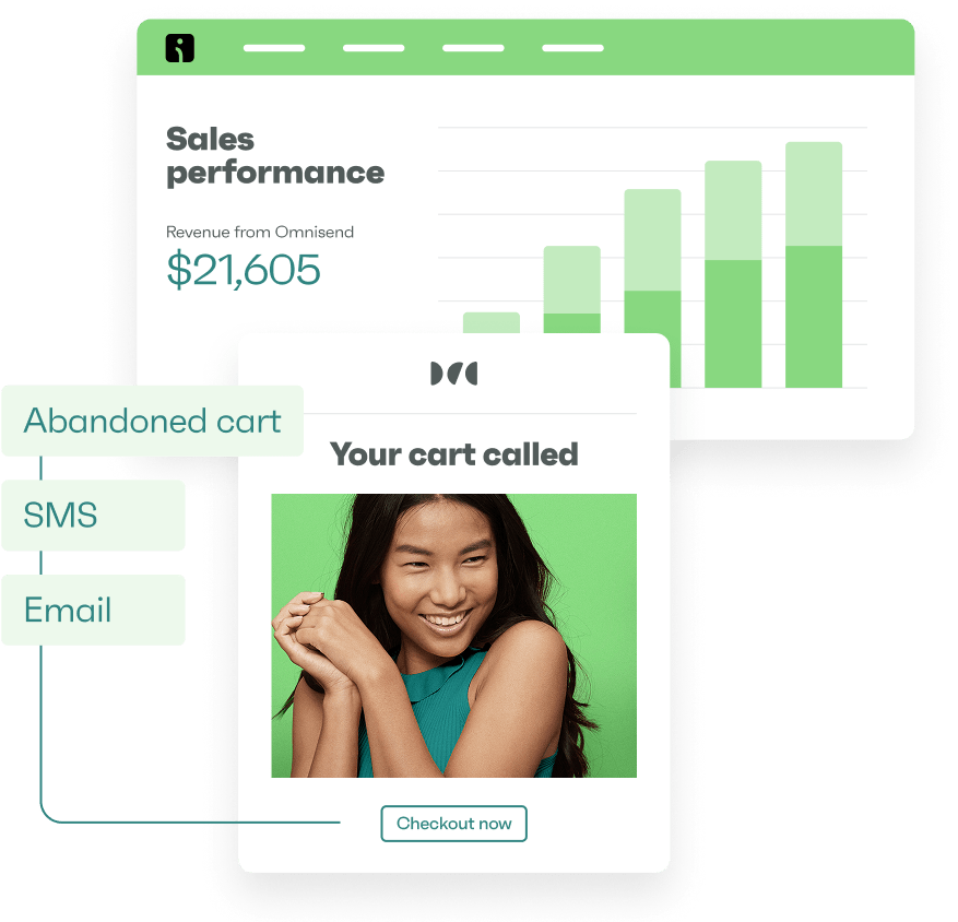
Create impressive and click-worthy popups to grow your list faster with Omnisend
Quick sign up | No credit card required
What is a popup?
A popup is a small window that appears on your main website’s page to grab attention and prompt user action. It’s a quick, focused way to deliver a message or offer, or request signups without taking users away from the page.
A basic popup may look something like this:
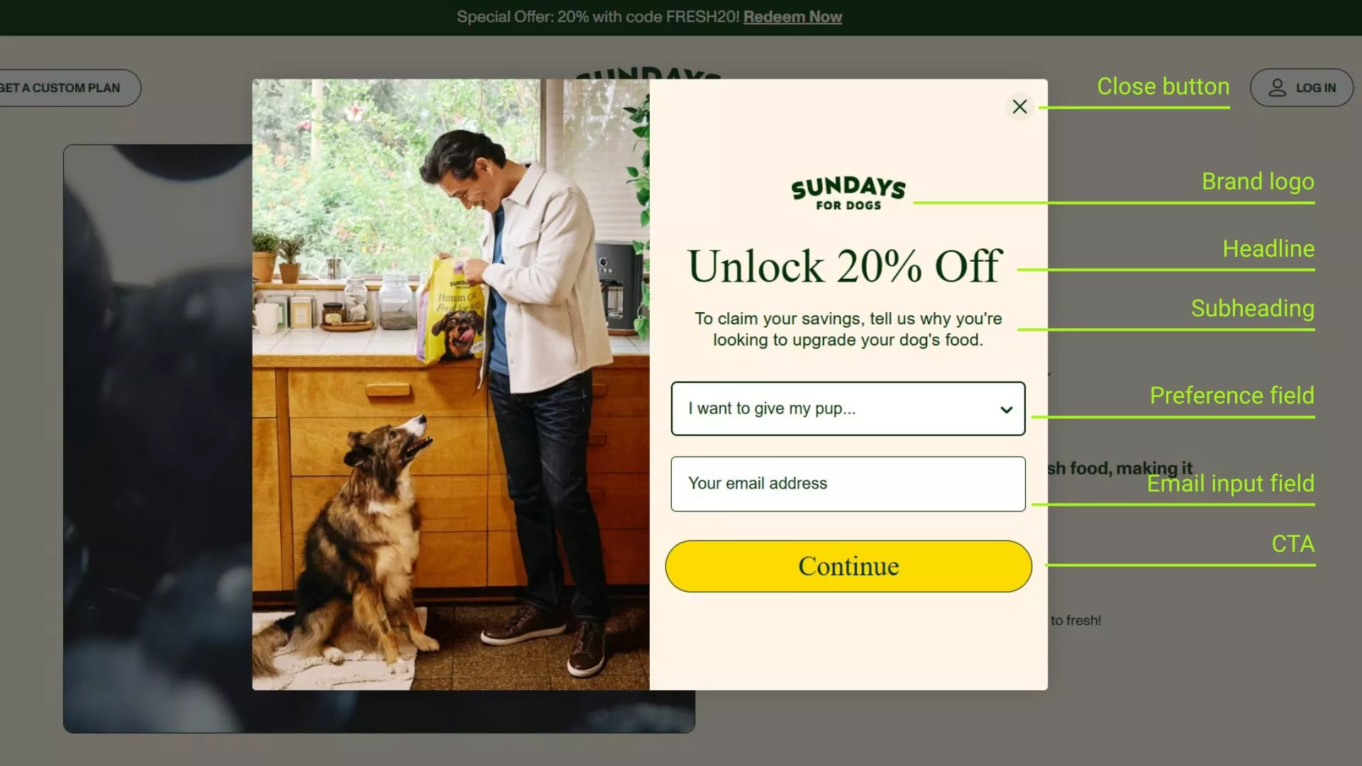
Popups can be customized in different forms and styles.
Some popups, like welcome popups, load right when you enter a page. Others appear after you scroll or try to leave.
No matter the form, popups usually trigger based on user behavior like page load, scroll percentage, exit-intent, or button clicks. You can add them with a short code snippet or through an ecommerce app, making setup fast and easy.
Typical email popup contents include:
- Flash sale alerts
- Free shipping offers
- Surveys or quick polls
- Countdown timers for urgency
- Spin-to-win gamified promotions
- Coupon codes or limited-time discounts
- Event or product announcements
- Newsletter or SMS signup forms
- Error or system notifications
- Cookie consent notices
Site popups help you deliver the message and get quicker signups — ideal for promoting a sale or building your email list. Now that you know what a popup notification is and how it works, let’s explore how they can increase your sales.
How popup messages impact your ecommerce success
Popup messages are the content inside your popups that drives visitor action. They directly communicate with customers at crucial moments in their shopping journey.
I’ve seen many ecommerce websites use popup messages to guide visitor behavior strategically, and honestly, I’ve been convinced at times, too!
These overlays appear when visitors are most engaged or about to leave. When used well, popup messages can help your store grow by:
- Capturing leads for future marketing campaigns
- Collecting feedback through quick surveys or rating prompts
- Reducing cart abandonment with exit-intent discounts or reminders
- Growing your newsletter list with clear email and SMS signup offers
- Increasing pageviews by directing visitors to trending or related products
- Highlighting seasonal promotions with a timely popup announcement
- Driving engagement with interactive gamification like mystery boxes
- Educating users about new products or upcoming events
The difference between successful and annoying popups lies in the message itself. Generic “Sign up now!” prompts get ignored or closed immediately. However, personalized, value-driven popup messages like “We have the best picks for you” create genuine connections with your audience.
Now, how can you create popup messages that actually convert? Let’s discuss the tactics.
How to craft high-converting popup messages
I’ve found that the most effective popup practice is to follow a simple formula: context × design × timing. Master these three pillars, and your conversion rates will soar without annoying your visitors.
Context
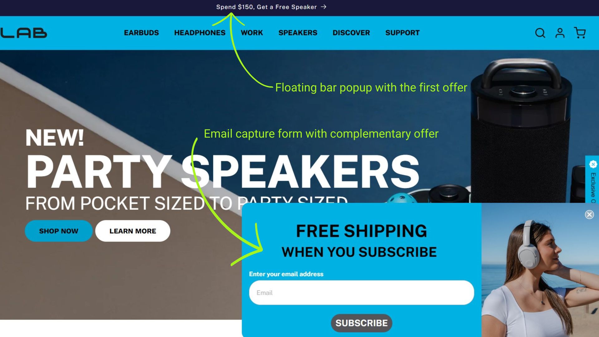
Your popup message should complement, not compete with, your page content. So, if the main page already pushes a discount, don’t repeat it. Instead, match your popup’s value to visitor intent by offering a complementary value.
This discount popup could include product recommendations, an alternate incentive, or an email capture form. Secondary offers feel less intrusive and more helpful while still keeping the user engaged.
Here’s an example of complementary offers from JLab:
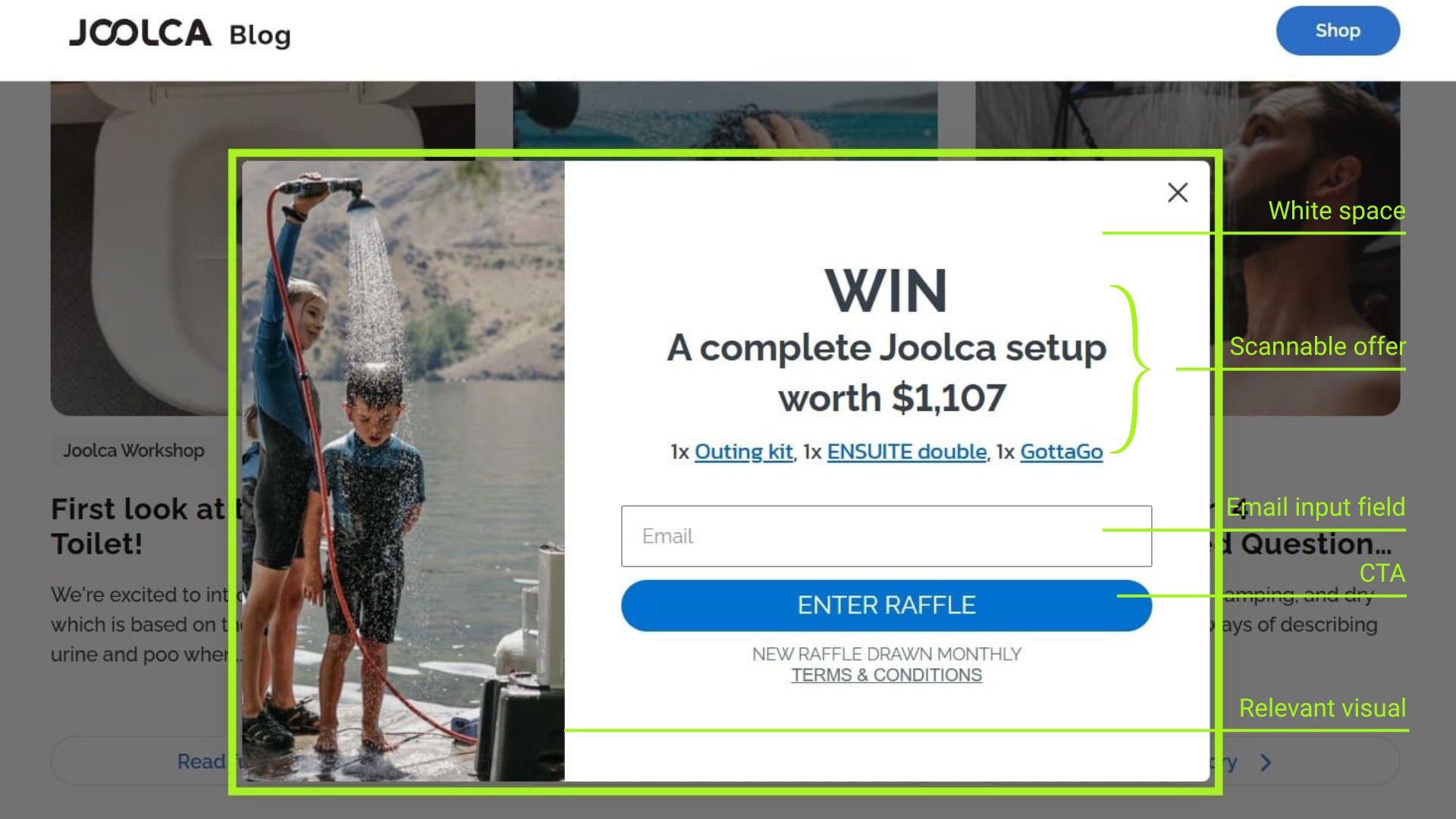
Design
Good design makes your popup easy to read and act on. Focus on having clean visuals that stick with your brand colors and typography with plenty of white space. Use clear hierarchy, bold and easily visible text, and a single call to action.
The copy should be short, with bold headlines and supportive subtext. Add strong, high-quality images if relevant, but don’t overload them. For accessibility, ensure proper contrast, readable font sizes, and focus states so users can engage easily.
Here’s an example of a clean popup design by Joolca:
Targeting and triggering
Even the best design can fail if presented at the wrong moment. Popups should appear for the right audience, at the right time. Here are common triggers and targeting rules:
- Exit-intent (mouse moves toward browser tab)
- Scroll depth (e.g., 50% or 75% down page)
- Time on page (e.g., after 30–60 seconds)
- Traffic source or campaign
- Button or link clicks
- Cart state
Target based on visitor location, device type, traffic source, or past interactions. Tools like Omnisend let you create precise targeting rules across all devices, so your popups feel timely, not random.
Once your popup is live, test it. Try different messages, designs, and triggers to see what works best. Use A/B testing, frequency capping, and suppression rules to avoid showing the same popup after someone converts.
Do popups still work?
Yes! Even though there are multiple touchpoints on a website, popups still work well.
Omnisend research shows that popups maintain an average signup rate of 3.77%, with some formats, such as back-in-stock alerts, achieving 3.63% conversion rates. That’s significantly higher than embedded forms at just 0.21%.
Popups use interruption marketing, where they break the browsing flow and shift attention to a clear call to action.
Unlike banner ads, which often fade into the background thanks to “banner blindness,” popups prompt action. Visitors must either engage or actively close them.
Compared to passive methods like sidebar forms or footer links, popups are a reliable tool to:
- Capture emails before users bounce
- Share product updates or restocks
- Promote time-sensitive offers
- Recover abandoned carts
Execute popups using popup best practices and ensure that they’re aligned with user behavior. The key to driving results is balance. Your popups must provide genuine value without frustrating users.
15 popup types with message examples you can create
We’ve covered the principles, so now it’s time to see them in action.
Below are 15 popup types you can use to gather signups, reduce cart abandonment, and grow sales. Each example shows the format, the offer, and why it works.
1. Glossier — Welcome lightbox popup
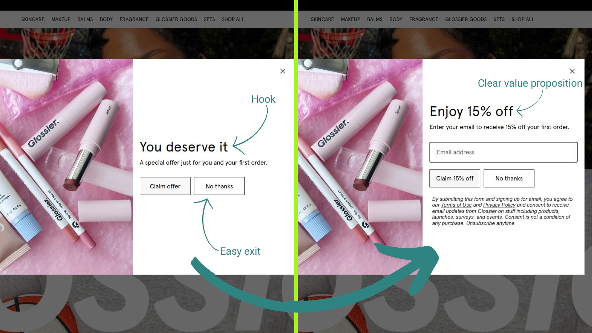
Glossier uses a multi-step welcome lightbox popup to turn new visitors into first-time buyers. The goal is to create a low-barrier entry point for conversions while capturing emails for future marketing.
- Trigger: Time delay on homepage visit for new visitors
- Offer: 15% off first order
- Why it works:
- Clear, immediate value
- Removes first-purchase hesitation
- Low-friction “Claim offer” CTA
- Relevant to all new visitors
- Steal this: Use a warm welcome and instant value to turn first visits into first conversions. Suppress after signup.
2. CRAFTD London — Fullscreen mystery discount popup
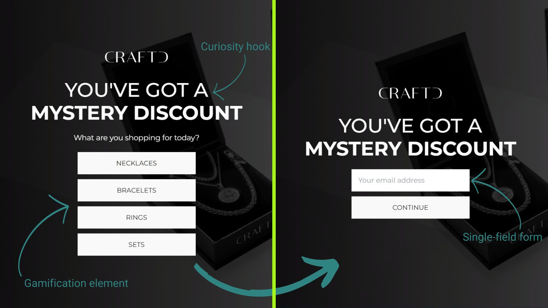
CRAFTD London uses a full-screen popup to spark curiosity and segment shoppers by product interest. The experience begins with a mystery offer and ends with email capture, blending gamification with personalization.
- Trigger: On-load for new visitors
- Offer: Mystery discount revealed after selecting the category and entering email
- Why it works:
- Curiosity-driven hook
- Product-based segmentation
- Powers email list growth
- Interactive flow
- Steal this: Use multi-step popups to guide users through a personalized funnel. Start with intrigue and end with conversion.
3. Allbirds — Cart value upsell popup
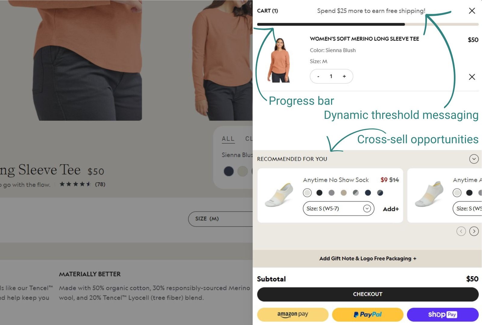
Shoppers who add items to their cart see how close they are to free shipping. Allbird’s popup displays the current cart value, with the amount needed to qualify, encouraging the addition of more items.
- Trigger: Add-to-cart action
- Offer: Free shipping on orders over $75
- Why it works:
- Shows cart progress
- Leverages loss aversion
- Solves common purchase objection
- Increases average order value
- Steal this: Set your threshold slightly above the average order value, and use exact amounts, such as “$12 away from free shipping.”
4. Magic Spoon — Subscription savings popup
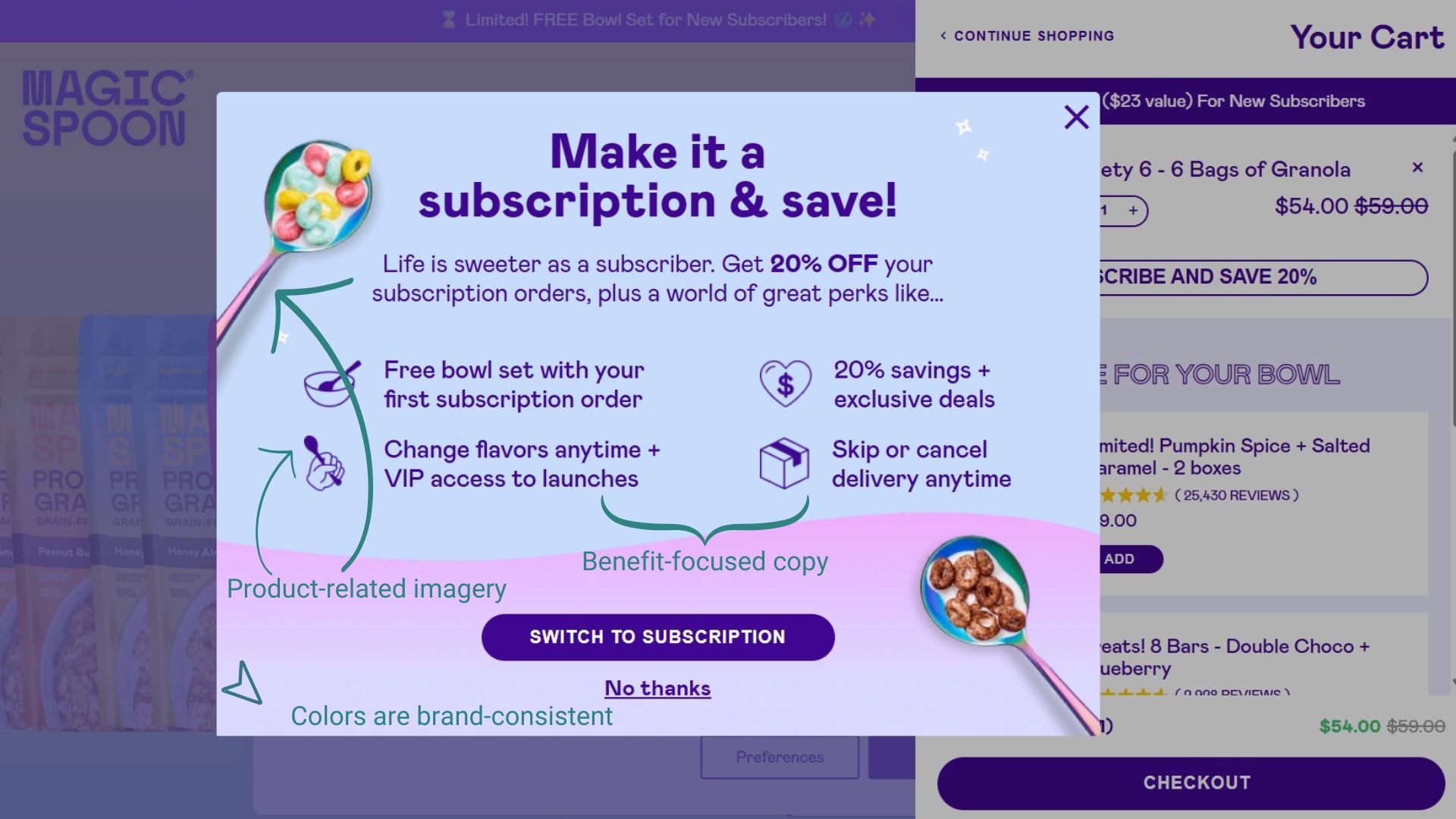
Magic Spoon encourages shoppers to switch from a one-time purchase to a recurring subscription with savings. By offering 20% savings and perks like VIP access, this offer is designed to increase recurring revenue.
- Trigger: On add-to-cart click
- Offer: Make it a subscription & save!
- Why it works:
- Captures high-intent moment
- Significant savings percentage
- Predictable revenue for the brand
- Increases customer lifetime value
- Steal this: Present subscription after cart add, not before. Ensure you highlight long-term value.
5. Brooklinen — On-click popup
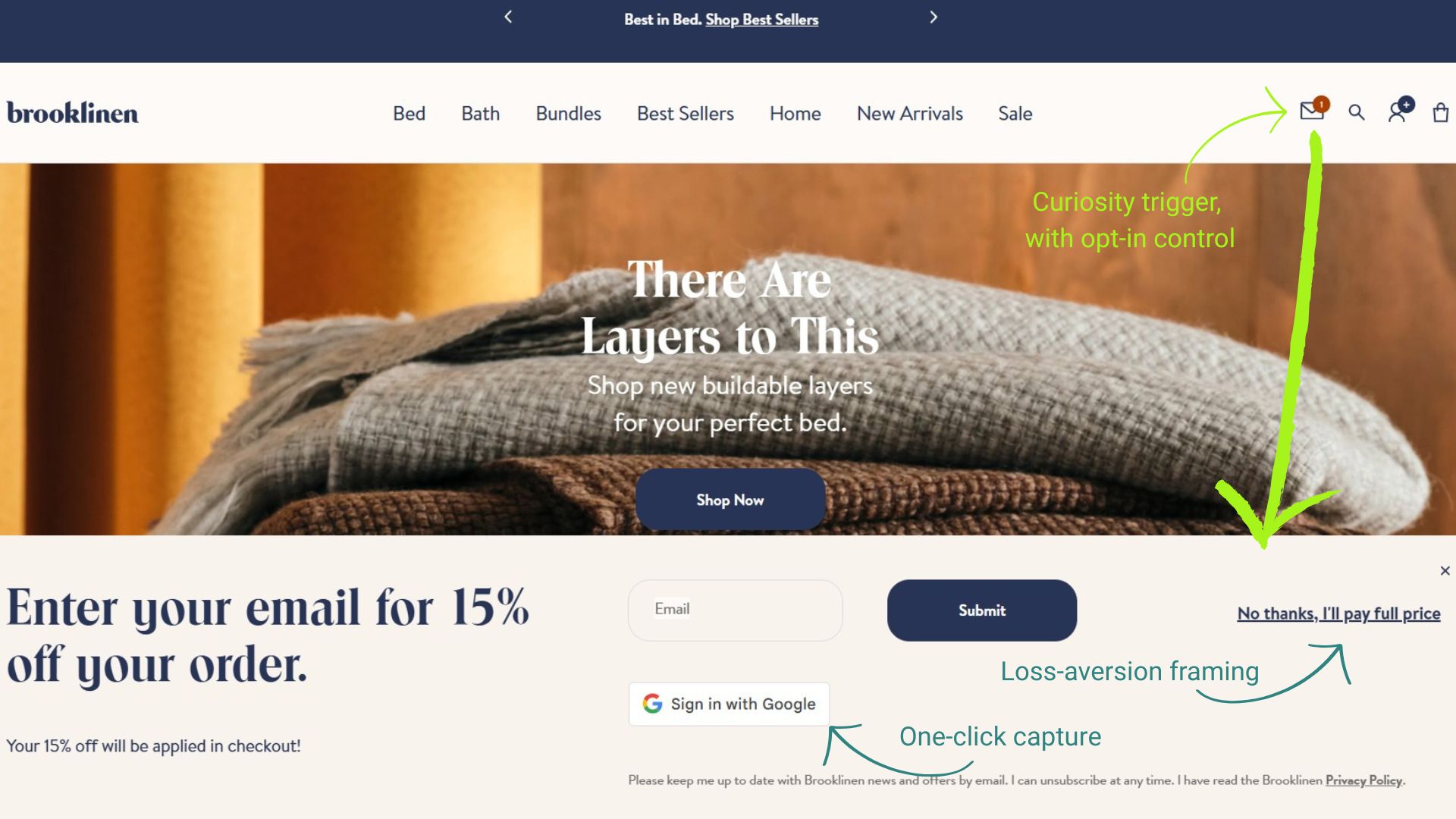
Brooklinen’s discount popup is tucked behind a subtle mailbox icon indicating a new message. This presentation invites curiosity and rewards clicks with 15% off, making it a clever blend of passive design and active engagement.
- Trigger: On-click via mailbox icon
- Offer: 15% off first order, auto-applied at checkout
- Why it works:
- Curiosity-driven, with on-demand information
- Icon blends into the site UI without disrupting the flow
- Empowers visitors to opt in, rather than forcing a popup
- Steal this: Use icon-triggered popups to create opt-in moments that feel like rewards, not interruptions.
6. Huckberry — Giveaway popup
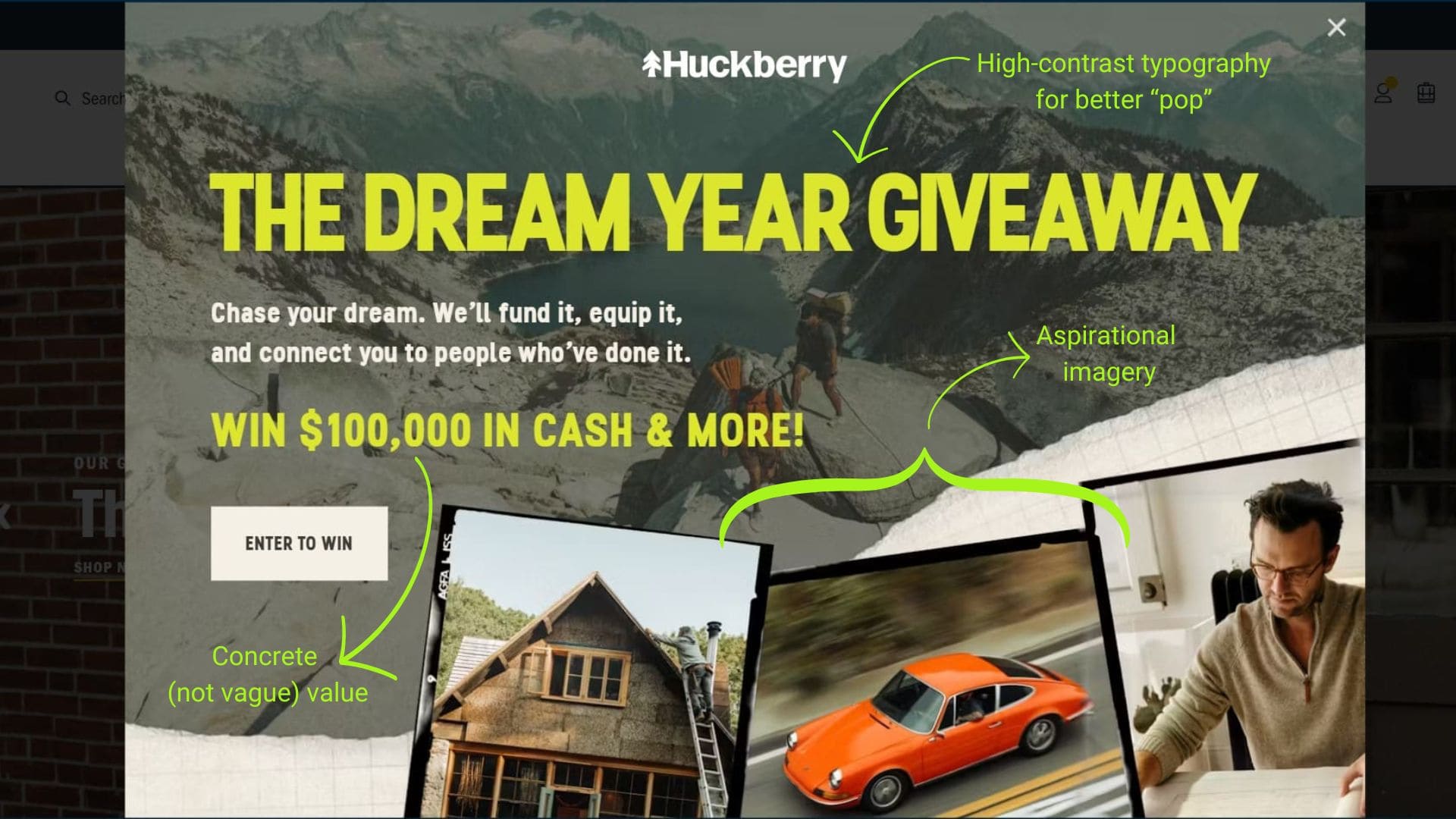
Huckberry’s “Dream Year Giveaway” popup is a bold, aspirational play, offering $100,000 in cash and gear to fund your ideal year. It’s designed to spark ambition and capture emails with high perceived value.
- Trigger: On-load popup for new visitors
- Offer: Enter to win
- Why it works:
- Low commitment, just needs an email
- Creates excitement with high-value fantasy
- Aspirational framing with “Chase your dream” copy
- Steal this: Use big-ticket giveaways to build your list fast, and pair them with social sharing options for extended reach.
7. Chubbies — On-scroll popup
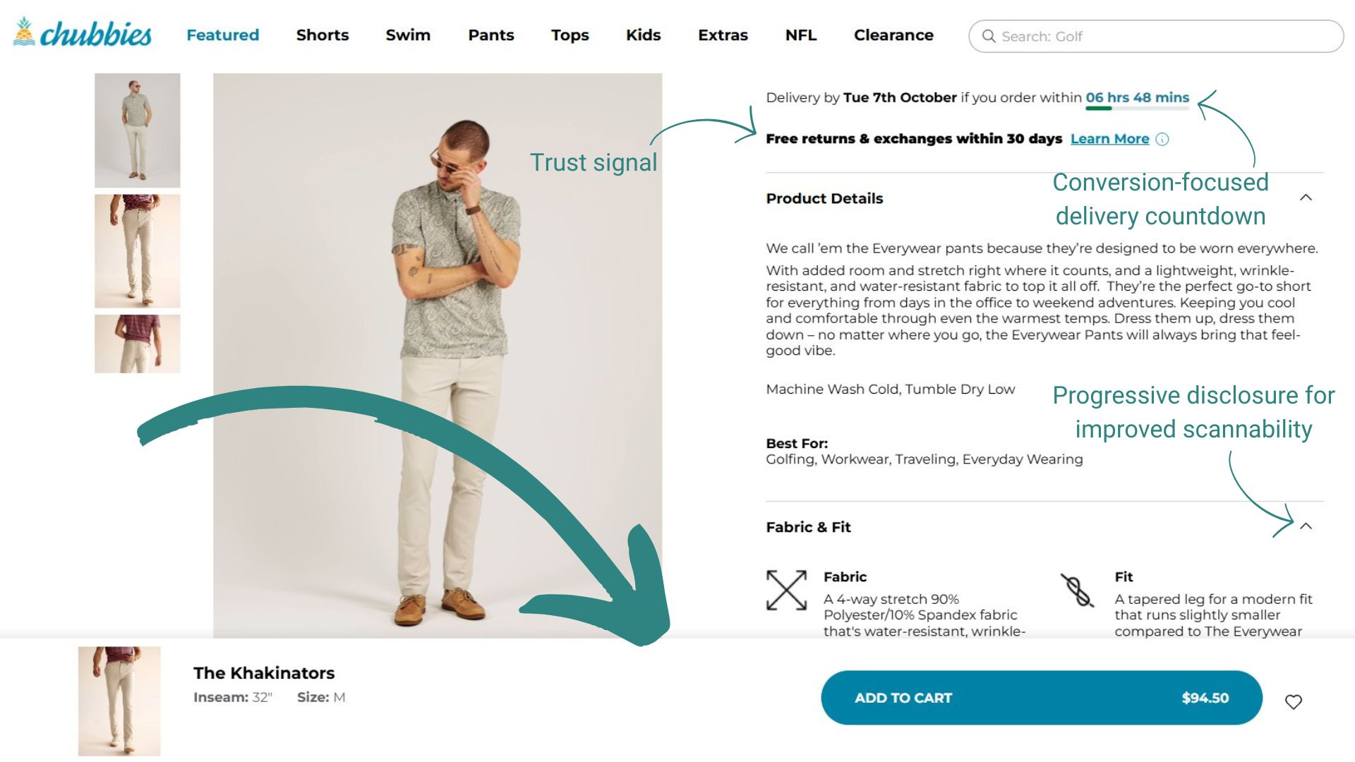
This on-scroll popup is a smart behavioral nudge, appearing just as the “Select Size” and “Add to Cart” buttons scroll out of view. It re-engages shoppers with a contextual prompt to complete their purchase.
- Trigger: Scroll-triggered when key CTAs disappear from view port
- Offer: Reminder to select size or add to cart (no discount)
- Why it works:
- Message adapts based on user action (size selected or not)
- Activates only when the user drifts from the purchase path
- Frictionless — no form or distraction, just a soft push toward conversion
- Steal this: Have scroll-based triggers re-surface key CTAs when users drift, especially on product pages with long-form content or reviews.
8. Blume — Segmented discount popup
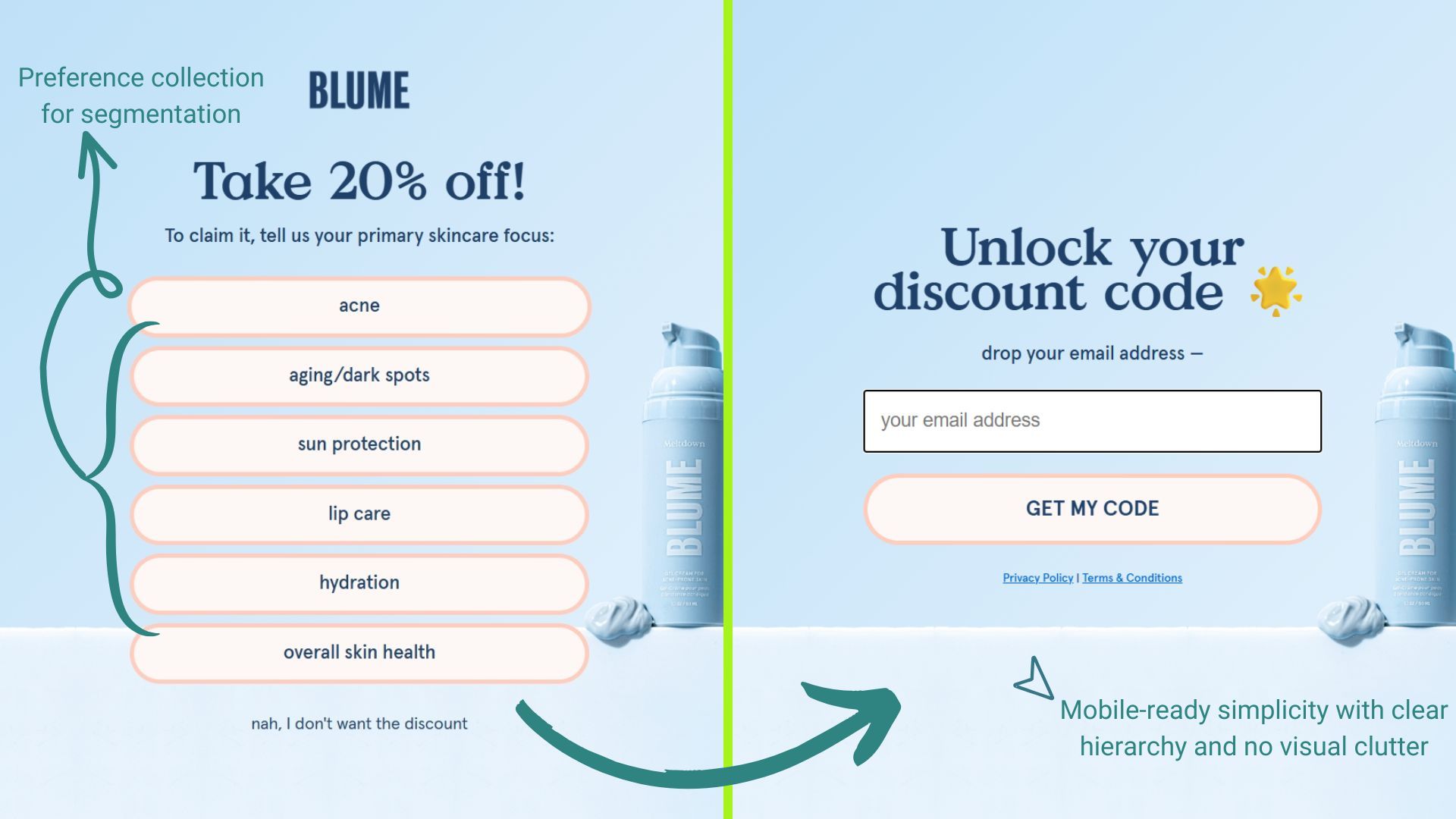
Blume’s full-page popup offers 20% off, after you self-identify your skincare focus. It’s a clever blend of personalization and conversion, using segmentation to tailor future messaging while delivering instant value.
- Trigger: On-load for new visitors
- Offer: 20% off when you select your skincare concern
- Why it works:
- Gathers user intent before email or purchase
- Tailored product recommendations and messaging
- Soft opt-out “Nah, I don’t want…” adds psychological contrast
- Steal this: Segmentation popups personalize the path to purchase. Use them to ask for preferences before emailing information.
9. CoSchedule — Exit-intent cart saver popup
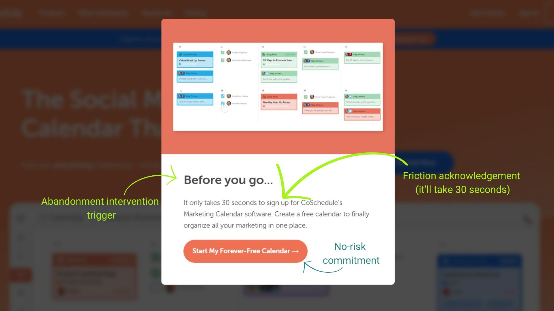
When visitors move to close the tab, CoSchedule’s exit-intent popup appears, assuring them it only takes 30 seconds to sign up for a forever-free calendar.
- Trigger: Exit-intent detection when the cursor moves towards the browser close button
- Offer: Start my forever-free calendar
- Why it works:
- Reduces cost barrier
- Appears at the decision point
- Prevents lost sales
- Feels supportive
- Steal this: Catch cart leavers with urgency and a clear incentive, and match exit-intent offers to actual abandonment reasons.
10. NEMO Equipment — Cookie consent popup
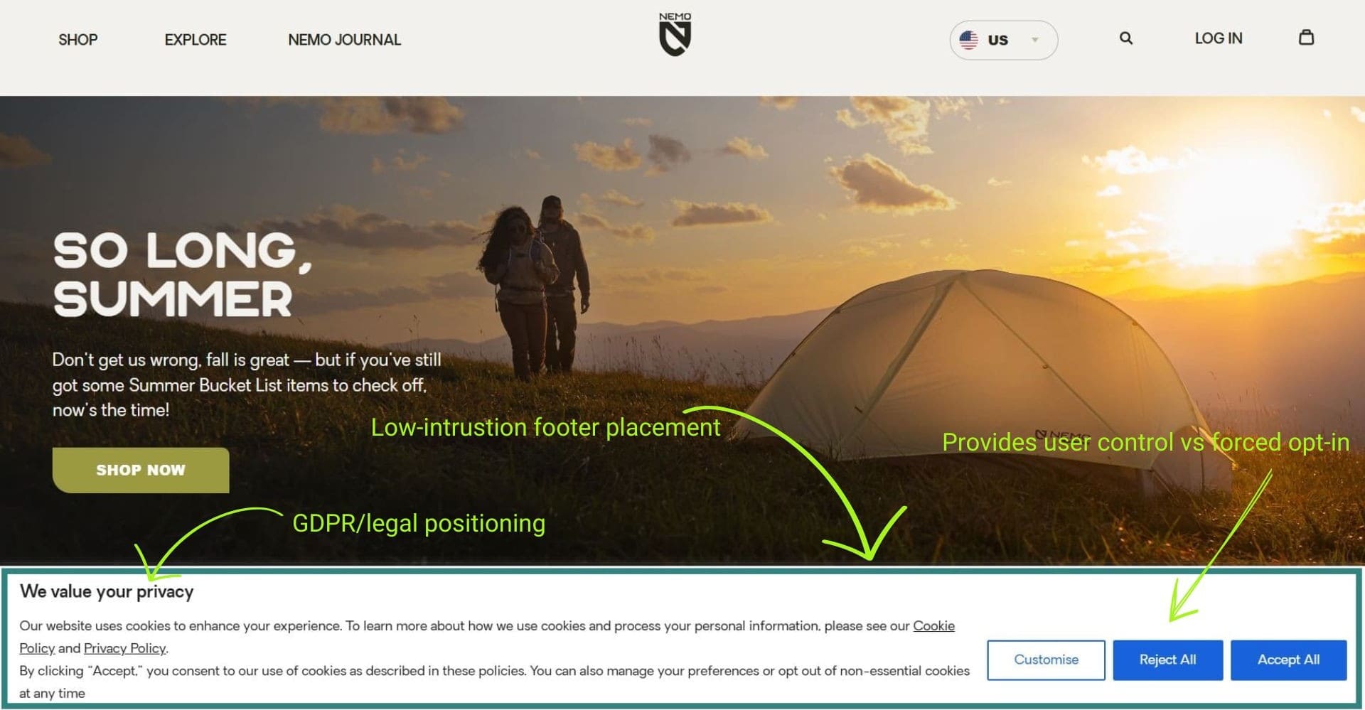
NEMO’s cookie popup is a standard privacy compliance tool, designed with clarity and user control in mind. It appears on page load and offers clear options for consent, customization, or rejection.
- Trigger: On-load for all visitors
- Offer: Consent to cookies for an elevated experience and the option to customize or reject
- Why it works:
- Full user control and autonomy
- Transparent and compliant with GDPR, privacy standards
- Informative without pressure or distraction
- Steal this: Multi-option cookie popups can help build trust. Offer clear choices, and link to policies for full transparency.
11. MotionGrey — Spin-to-win popup
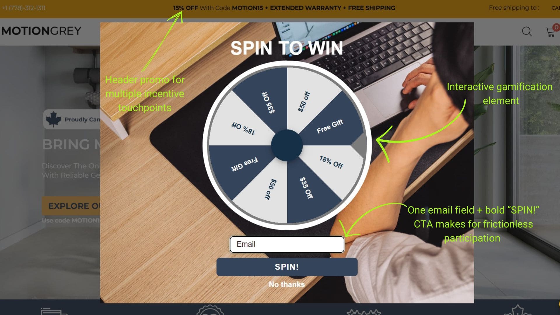
MotionGrey uses a gamified “Spin to Win” popup to engage visitors with instant rewards. It’s a playful, on-load experience that combines email capture with randomized incentives to maximize conversions and list growth.
- Trigger: On-load for first-time visitors
- Offer: Spin the wheel for a chance to win $50 off, 18% off, $35 off, or a gift
- Why it works:
- Immediate rewards after spinning
- Gamification adds fun and interactivity to signup flow
- Requires email entry before spinning, building your list
- Steal this: Spin-to-win popups gamify your discount strategy. Pair instant rewards with email capture to drive engagement and conversions.
12. MeUndies — On-click referral & signup popup
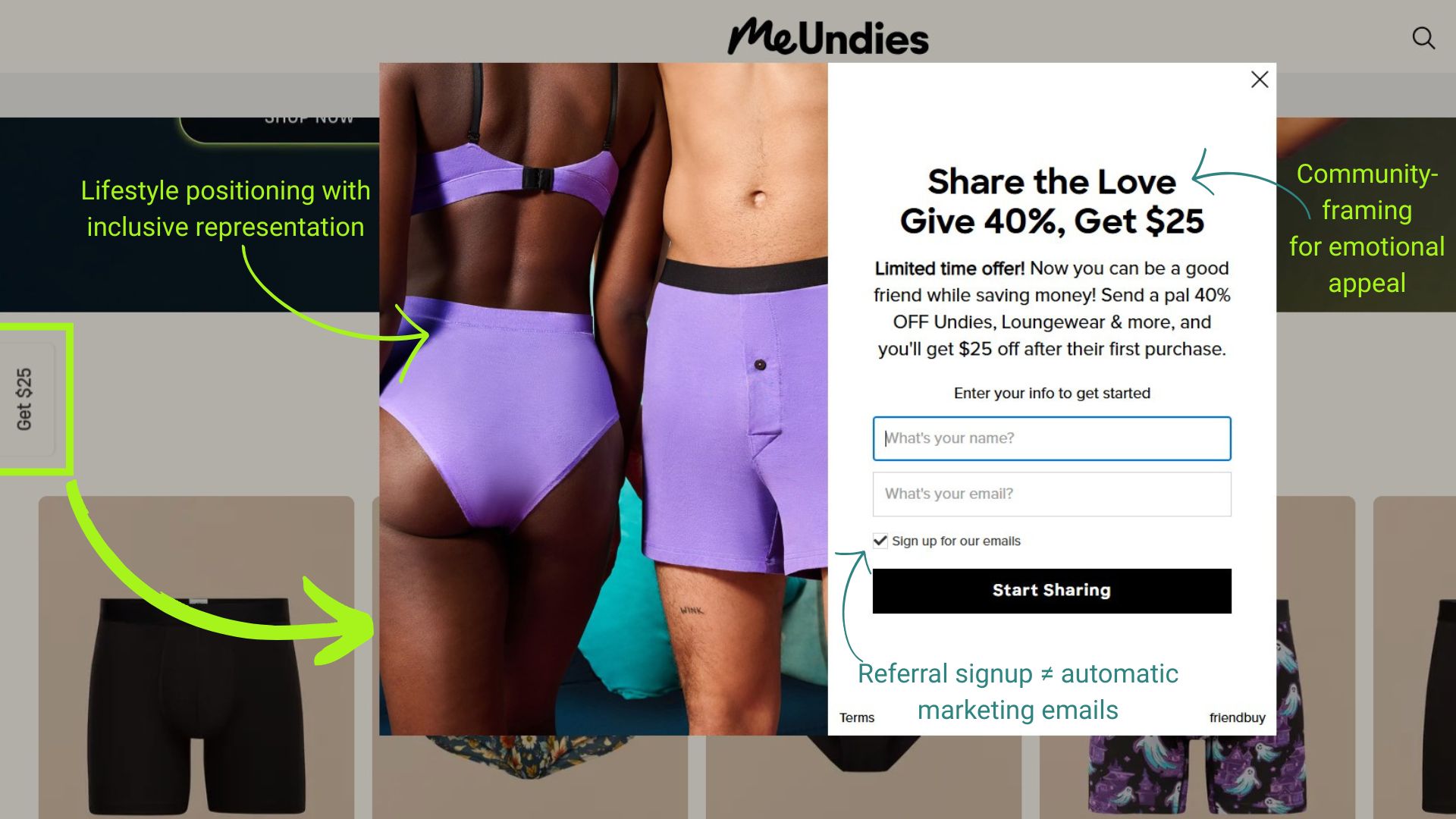
MeUndies uses a persistent “Get $25” tab to launch a referral-focused popup that blends email capture with viral sharing. It’s a limited-time offer that rewards users for spreading the word.
- Trigger: On-click via floating “Get $25” tab
- Offer: Give 40% off to a friend, get $25 off after their first purchase
- Why it works:
- The floating button keeps the offer visible without interrupting browsing
- Referral-first framing incentivizes sharing
- Built-in social buttons allow virality
- Steal this: Make sharing effortless and reward-driven by using a referral CTA to turn visitors into advocates.
13. Kayak — Age verification popup
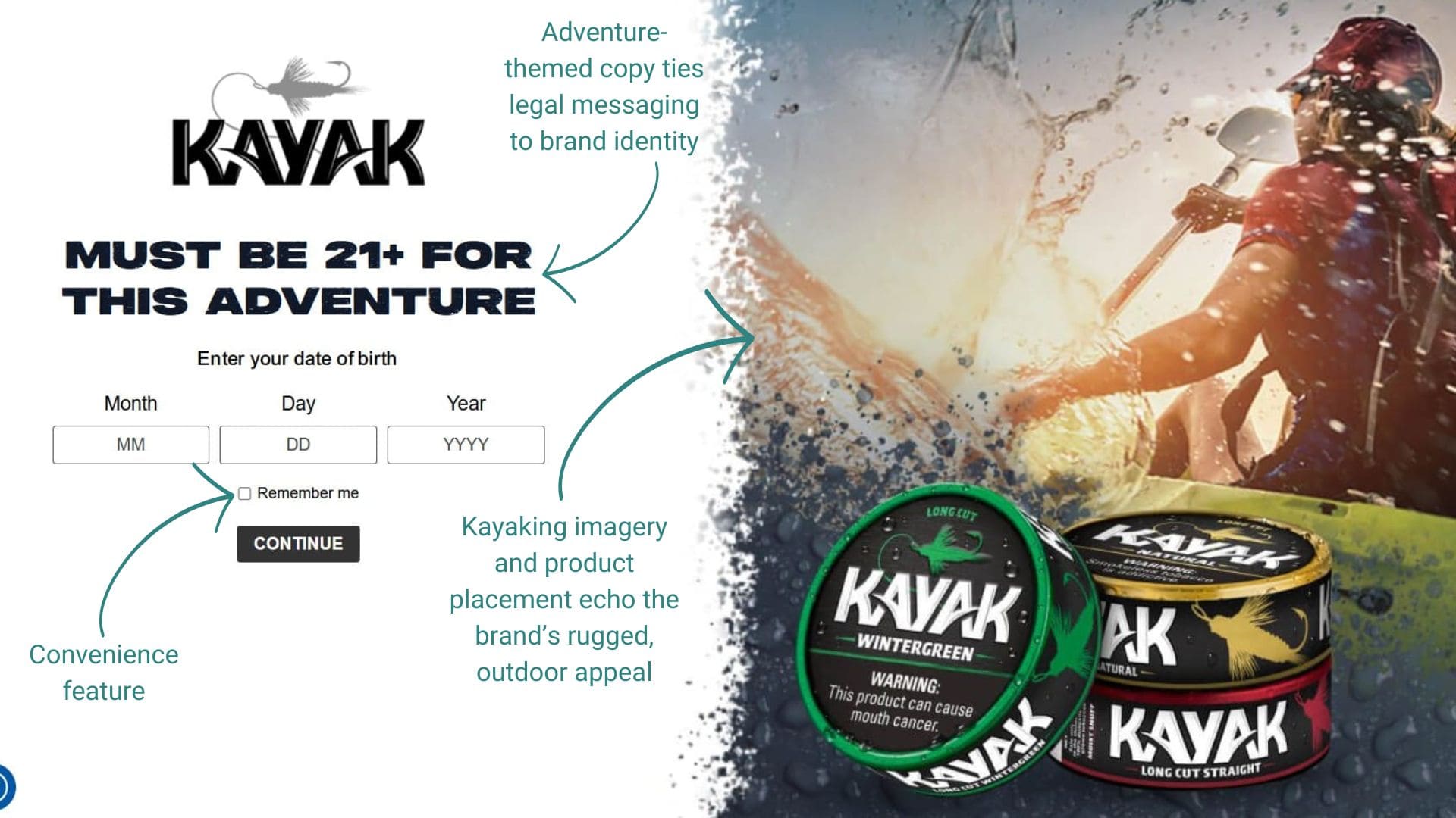
Before browsing Kayak’s tobacco products, visitors must confirm they’re 21+ by entering their birthdate. This compliance popup has no close button, ensuring every visitor confirms their age before browsing products.
- Trigger: Immediate page load for all first-timers before site access
- Offer: “Must be 21+ for this adventure” with DOB entry
- Why it works:
- Legal compliance requirement
- “Remember me” checkbox reduces friction on return visits
- Blocks underage access
- Steal this: Use conversational copy that fits your brand voice while meeting legal requirements. A “Remember me” option avoids annoying returning customers.
14. To’ak Chocolate — Newsletter signup popup
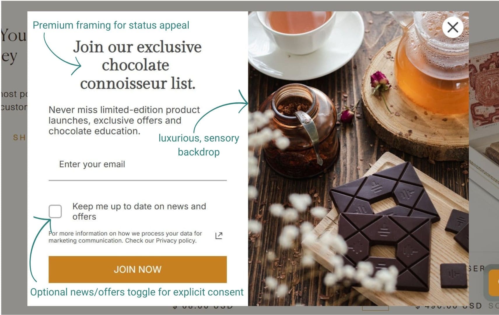
As visitors scroll, To’ak invites them to join a connoisseur list focused on exclusivity. It promises exclusive launches, education, and offers, positioning the email list as a premium membership.
- Trigger: Activates on scroll depth
- Offer: Early, exclusive access to limited-edition launches, and chocolate education
- Why it works:
- Copy emphasizes rarity
- Offers more than discounts
- Matches premium positioning
- Opt-in checkbox gives control
- Steal this: Frame your email list as exclusive access rather than just newsletters. Wait for scroll engagement to prove interest before showing.
15. BaccOff — Flash sale countdown popup
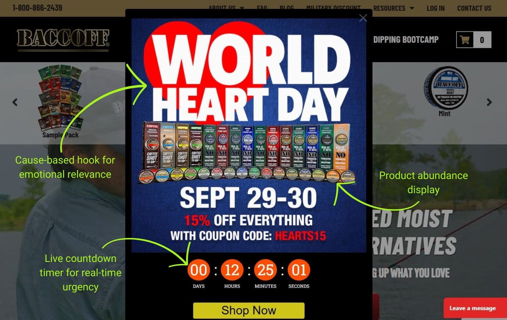
BaccOff promotes a time-limited sale with a live countdown popup tied to World Heart Day. The 15% discount code is displayed prominently with urgency messaging that the sale ends in hours.
- Trigger: Timed popup appearing seconds after page load
- Offer: 15% off sitewide with code HEARTS15
- Why it works:
- Event tie-in creates relevance
- Visible countdown builds urgency
- Bold framing grabs attention
- Steal this: Connect discounts to relevant events or holidays. Show countdown timers in hours and minutes when time is genuinely limited.
Here’s what these high-performing popups have in common:
- Clear value or incentive
- Smart timing and targeting
- One strong CTA per popup
- Suppression after conversion
- Personalization and interactivity
- Brand-aligned design
Common popup text mistakes to avoid
Here are the most common popup message mistakes that hurt conversions and how you can fix them:
- Showing popups too early: If a popup loads the second someone lands, it feels pushy. They haven’t even had time to understand your value yet.
Instead, use scroll or time-based triggers to give users a moment to engage first. Wait at least 30 seconds or until visitors scroll 25% down the page. - Weak or missing value propositions: Just writing “Sign up for updates” or “Subscribe to our newsletter” is too vague.
Lead with a clear benefit, like a discount, free shipping, or exclusive access. - Overusing or showing popups too often: Bombarding returning visitors with the same popup every page visit frustrates them. It also contributes to high bounce rates.
Set frequency caps and suppress popups for users who’ve already signed up or converted. - Poor design and visibility: When a popup appears on the screen, it should be distraction-free, as you’d want the customers to focus on it. One best practice is to ensure that your popup dims the background — otherwisescreen can look cluttered.
Consider using tools like Omnisend to personalize designs and make your popups stand out. Omnisend also helps you add content depending on location, device, cart state, traffic source, or past behavior. - Missing or hard-to-find close buttons: Visitors feel trapped when they can’t easily dismiss your popup. When that happens, most will readily bounce from your site.
Always include a visible, easy-to-tap “X” or close option in the top-right corner or allow background clicks to close. - Poor mobile experience: Popups that look fine on desktops sometimes break on small screens. Tiny text, hard-to-close buttons, and cluttered layouts drive mobile users away.
Always test mobile layouts for readability, spacing, and usability, such as easy tap targets.
How can Omnisend power popups?
Ready to create high-converting popups without coding or design headaches? With Omnisend, there’s no steep learning curve when it comes to building professional popup campaigns that actually drive results.
- Build quickly and stay on brand: Choose from ready-to-use templates for popups, flyouts, landing pages, or multi-step forms
- Smarter targeting and triggers: Use exit-intent, custom triggers, segmentation, and suppression rules to show the right popup window at the right time
- Engage and convert: Try gamified popups like Wheel of Fortune, capture emails and SMS natively, and optimize with A/B testing and reporting
Build your popup with Omnisend and start converting visitors today
Quick sign up | No credit card required
FAQs
1. What is the best popup message for email signups?
The best popup messages highlight a clear benefit. Instead of the generic “Sign up” request, try “Get 15% off your first order.” This shows value and encourages action. Keep copy short, benefit-driven, and easy to act on.
2. How do I create a popup message that isn’t annoying?
Non-annoying popups appear at the right time with genuine value. Wait until visitors show engagement (30+ seconds or 25% scroll) before displaying. Offer real benefits, include easy close options, and never show the same popup repeatedly to converted users or frequent visitors.
3. What popup message has the highest conversion rate?
Messages with strong incentives perform best. Personalized discounts, free shipping, or gamified offers convert higher than generic announcements. Gamified popups, such as spin-to-win, often perform best.
4. Should popup messages appear immediately or with a delay?
Popups should rarely appear immediately. Give visitors time to explore. A short delay, scroll trigger, or exit-intent approach works best.
5. How often should popup messages appear to users?
Avoid overwhelming visitors by using frequency caps and suppression rules. If someone converts, don’t reshow the same offer. Instead, rotate popup announcements or introduce new incentives.
TABLE OF CONTENTS
TABLE OF CONTENTS

Subscribe and don’t miss any updates!
No fluff, no spam, no corporate filler. Just a friendly letter, twice a month.