
 OFFER
OFFER


11 Amazing Welcome Email Examples (+ tips to write your own)
With over 130+ pre-built integrations and flexible APIs, you can easily centralize data from across your tech stack
Make the most out of your data and unlock powerful growth marketing possibilities with these other top marketing tools.
Build any custom integration with our open, flexible APIs that are simple to use and implement.
Check out apps that have been stealing all the spotlight.
Email and SMS marketing insights, ecommerce resources, and the latest Omnisend news
Expert-led sessions covering email, SMS, and ecommerce marketing strategies.
Educational video and live training to help you make the most out of Omnisend.
Drive sales on autopilot with ecommerce-focused features
See FeaturesMapping your email marketing funnel is essential for effectively targeting customers at different stages, ensuring you send the right content to the right audience.
Understanding behavioral signals like cart additions and email engagement allows you to tailor your marketing efforts and boost revenue.
Employing a structured marketing funnel enhances lead management, customer targeting, and sales consistency, ultimately fostering brand loyalty.
Continuously test and optimize your funnel strategies to adapt to customer needs and improve conversion rates over time.
An email marketing funnel is simply the path you build from first click to repeat purchase using the right message at the right time.
Instead of sending the same newsletter to everyone, you guide subscribers through clear stages: welcome, education, consideration, conversion, and retention.
A mapped funnel shows which stage each customer occupies, so you send awareness content to browsers and conversion offers to people ready to buy.
Behavioral signals such as adding to cart, product views, and email engagement help you understand where customers are and adjust your email and SMS to drive more revenue.
This article is a complete guide to mastering the stages of your marketing funnel, with additional insights into benefits, best practices, and examples from successful brands.
Quick sign up | No credit card required
A marketing funnel maps the journey customers take from discovering your brand to their first purchase. As your customers move through your funnel, you provide assets that nudge them along, such as emails, SMS, and ads.
Marketers use a marketing funnel to categorize each step of a buyer’s journey, from gaining awareness of a product to making a purchase. This can be streamlined into three critical steps:
Marketing funnels get their name from how the customer base narrows as you move further along the process. Initially, in the awareness stage, you’ll be drawing in a vast pool of people. However, once you start providing more and more information about your product, more people will drop off.
Funnel marketing is highly effective at reaching specific demographics, as once the funnel narrows, the strategy becomes laser-focused on the most promising leads.
Marketing funnels have been around for some time, but they still hold an important place in modern businesses. Here are a handful of reasons why:
You might assume they’re the same, however, a few key differences separate marketing and sales funnels.
Marketing funnels focus on attracting new customers by building awareness and driving interest, even among those unfamiliar with your business. In contrast, sales funnels aim to reinforce your value to existing customers, guiding them toward making a purchase or deepening their engagement.
Although the types of customers the two funnels approach differ, they share similar steps. In some cases, you can even integrate sales funnels into your marketing funnels.
Whether you’re looking to create a marketing or sales funnel, choosing the right software is vital. Omnisend streamlines funnel processes, from attracting high-quality leads to transforming them into loyal customers.
There are five key marketing funnel stages, each of which plays a major part in attracting customers to your business. Remember, a digital marketing funnel is crafted to attract customers who have never interacted with your business before. This is why the funnel starts at the very beginning of the buyer’s journey.
To remind you, the five stages are:
Image via Omnisend
Each individual stage requires different techniques to maximize your selling potential. As you progress, the stages become increasingly specific — and often more complex.
Below are a few tips on how to approach each stage:
The first step in any marketing funnel is generating awareness of your product, brand, or service. Your aim here is to make your business known to as broad an audience as possible. With Omnisend, you can run targeted email and SMS campaigns to build brand awareness.
While this seems relatively straightforward, you’ll have to take some steps to generate attention:
Once you have made people aware of your product, your next task will be to generate further interest by offering your newfound audience more information. Remember, people will be directly comparing you with others, so this information should include exactly why your product is worth buying.
The interest stage is pivotal, so here’s how you can maximize your chances:
So, you’ve generated a bit of interest around your product, and people’s eyebrows are raised. The next stage is all about turning their interest into something more substantial, genuine consideration for buying your product.
You now want to appeal to the emotional side of potential customers, not just explaining what your product does but why they need it. The type of content you’ll be required to push will also start to evolve, becoming more personal and persuasive.
Here’s what you should be doing:
The marketing funnel’s intent stage marks the point at which the customer first expresses an intention to buy the product. From here, the customer is likely to add the product to their cart or personally request more information from you.
Here’s what you should do when a customer gets to this stage:
The final (and best) part of the marketing funnel is the purchase stage, where customers take the plunge and buy your product. All your initial work leads up to this point, so if your conversion rates are good, your funnel must have been effective.
While you might be tempted to celebrate, hold off on popping that champagne just yet — there are still a few hurdles to clear before a purchase becomes official. Below are some things to iron out to ensure a smooth customer checkout:
Not all marketing funnels utilized by ecommerce businesses are the same. Some companies and marketers opt for simplified versions, such as the three funnel strategy.
The three funnel strategy simplifies a traditional five-step marketing funnel into just three steps. By streamlining the process, this approach becomes more accessible and easier to understand, making it a perfect entry point for marketing newcomers.
Here’s how it works:
Creating an email marketing funnel is a different discipline from a general marketing funnel, so it requires a couple of different techniques.
When creating your email marketing funnel, it is important to bear these things in mind:
When you’re building your own marketing funnel, it may well feel overwhelming, with so many aspects to think about. However, fear not. Here is a step-by-step guide to creating your marketing funnel and some best practices to consider:
“Connect your ecommerce store to Omnisend to import customer data, including their order history and cart activity. Create segments for cart abandoners, window shoppers, and one-time buyers to identify which stage loses the most customers. Each drop-off point reveals a problem your funnel needs to solve.”
— Marty Bauer, Director of Sales & Partnerships at Omnisend
There are plenty of things you can do right when creating a sales funnel. There are also plenty of pitfalls to try and avoid, including:
“Test different sending frequencies to find what works for your audience. Start with a baseline, then monitor open rates and unsubscribe spikes. Space automated workflows at least 24 to 48 hours apart to avoid message overlap, and adjust frequency by segment since engaged subscribers tolerate more emails than cold leads.”
— Karolina Petraškienė, Marketing Projects Lead, Omnisend
Additional reading:
A/B testing on Shopify: The complete 2026 guide for growth
No matter how well you have planned your marketing funnel, you’ll never truly know how it will work out until it goes live. That’s why it’s vital you keep tabs on how things are going. This allows you to assess what’s going well and what needs to be improved.
To generate success from your funnel, you have to be prepared to think on your feet. It’s rare for any business’s funnel to remain static — expect to make adjustments as you go.
If you see your funnel appealing to a certain demographic, be prepared to optimize your strategy to meet their demands. While the pivot may narrow your pool of customers, it will likely increase your conversion rates.
Below, we’ll run through some best practices to keep you on the right track when funnel building:
Creating a marketing funnel becomes significantly easier when you have a clear understanding of your target demographic. This insight allows you to tailor your marketing content to address their specific needs and motivations.
Knowing your audience helps you pinpoint where to engage with them, effectively guiding them into the awareness phase of the marketing funnel.
The customer journey should always be the foundation of your marketing funnel. By aligning your funnel with each stage of their journey, you’ll be able to precisely target potential buyers and provide them with the right content at the right time, guiding them closer to making a purchase. Ensure your funnel is always structured with the customer journey at its core.
If you really want to make your marketing funnel a success, you’ll need to supply your potential buyers with valuable, insightful content at every stage. If you don’t, you’ll find it difficult to progress them along to the next phase, reducing your conversions as a result.
This content shouldn’t all be in one format, either. For the best results, create blogs, videos, social media posts, infographics, and more.
“Use Omnisend’s Customer Breakdown to see your audience’s lifecycle stages. The map shows Champions, Loyalists, Recent customers, and At-risk segments based on purchase recency and order value. Your Champions already love you, so reward them. Recent customers need nurturing into repeat buyers. At-risk contacts need win-back campaigns before they’re gone. Behavioral patterns predict purchases better than age or location and help you create relevant content.”
— Andrius Šeršniovas, Conversion Specialist at Omnisend
Cross-channel marketing involves using multiple platforms to move buyers along your marketing funnel. These channels can include social media, blog sites, media advertising, and even print advertising.
By taking all these different routes, you’ll reach your customers at every step of their journey while broadening your outreach.
Since smartphones took over, ecommerce has been drifting away from desktops and moving toward mobile, so there’s no excuse for not optimizing for mobile. However, as most people will create their stores on a desktop device, this optimization is often strangely overlooked.
This can result in stores that look skewed on mobile, with pages that are difficult to navigate. As a result, customers will often look elsewhere for a similar product.
Automation makes everything smoother and more efficient. By leveraging automation tools in your marketing strategy, you can nurture leads seamlessly while lightening your workload, as the software handles the repetitive tasks for you.
Omnisend offers powerful email and SMS automation, with pre-built workflows sending out messages specific to the funnel stage the buyer is at.
“Automated emails generated 37% of sales from just 2% of email volume in 2024, and one in three people who clicked through from them made a purchase compared to one in 18 for scheduled campaigns. Set up abandoned cart, welcome series, and browse abandonment flows to cover revenue-generating moments in your funnel.”
— Evaldas Mockus, VP of Marketing, Omnisend
Segmenting your potential customers using data helps to improve the targeting of your marketing. It allows you to pinpoint segments of your audience most likely to convert, enabling you to tailor your content strategy accordingly.
When building an email marketing funnel, platforms like Omnisend provide advanced market segmentation and analytics to ensure your campaign will be highly effective.
No marketing funnel has ever been perfect, with room for improvement every step of the way. Continuously test strategies to maximize sales while implementing these changes as you go. Being adaptable is essential to achieving success from your marketing funnel.
Once again, adaptability is key to maximizing the success of your marketing funnel. By consistently tracking and analyzing its performance, you can identify what’s working and where improvements are needed.
This ongoing refinement will help you retain more customers as they move through the funnel, ultimately driving higher sales and increasing your business’s profitability.
Gaining the trust of your customers is the key to building a successful business. This will increase the chance of them purchasing your product and make them more likely to buy from you in the future.
You should always provide potential buyers with honest, accurate content at every step of the funnel.
Always pay close attention to your customers’ feedback at every stage of the marketing funnel. By addressing their concerns proactively and answering any questions they have, you can build trust and demonstrate that your product is exactly what they need.
While it’s great when customers reach the end of your funnel and purchase a product, it’s even better when they keep coming back for more. Encouraging customer loyalty with incentives and providing more high-quality products will help your business in the future.
Netflix’s 30-day free trial offer is perfect for getting customers acquainted with the service. It gives customers an entire month to explore and see if they like what’s on offer before parting with their money.
The offer’s simplicity also stands out. There’s limited writing, just the brand’s color scheme, and some information about what customers will receive. The company is not in danger of overwhelming new users.
The generous offer also helps attract a wide pool of potential new customers. Customers can cancel anytime, and everything will be available for the month. No rush, no hassle.
Once cosmetics company Rael does some digging and finds out its customers’ skin needs, it will drip-feed them information about related products. Now that the company knows what products its customers need, the content becomes more specific and detailed.
The brief yet valuable statistics it provides are enough to assure potential customers that the company knows what it’s talking about regarding skincare. This will help move customers toward the consideration phase of the funnel.
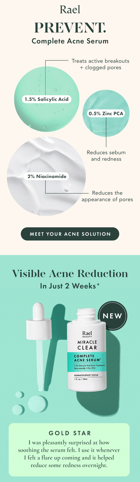
The aesthetics of the email are also likely to appeal to the company’s target audience. The whole vibe of the brand is clear to see, with the color scheme, relative minimalism, and clear images all working in tandem.
The consideration phase within your marketing funnel sees your customers researching products and other people’s experiences.
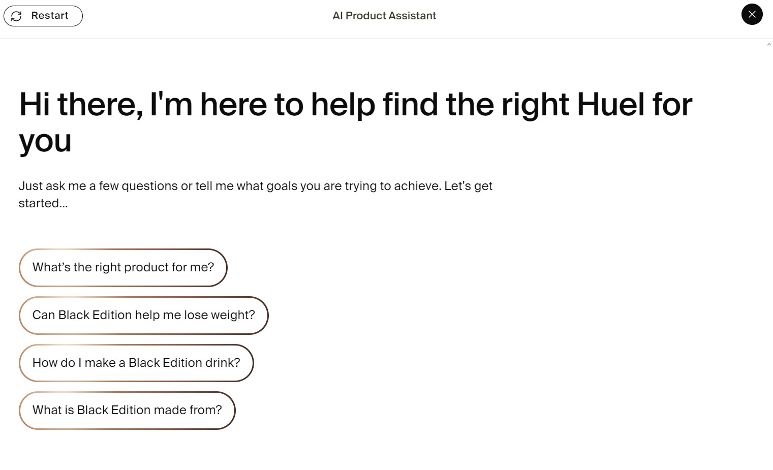
Nutrition retailer Huel uses knowledge of its funnel for onsite marketing, providing a sitewide AI chatbot that contextually answers product questions:
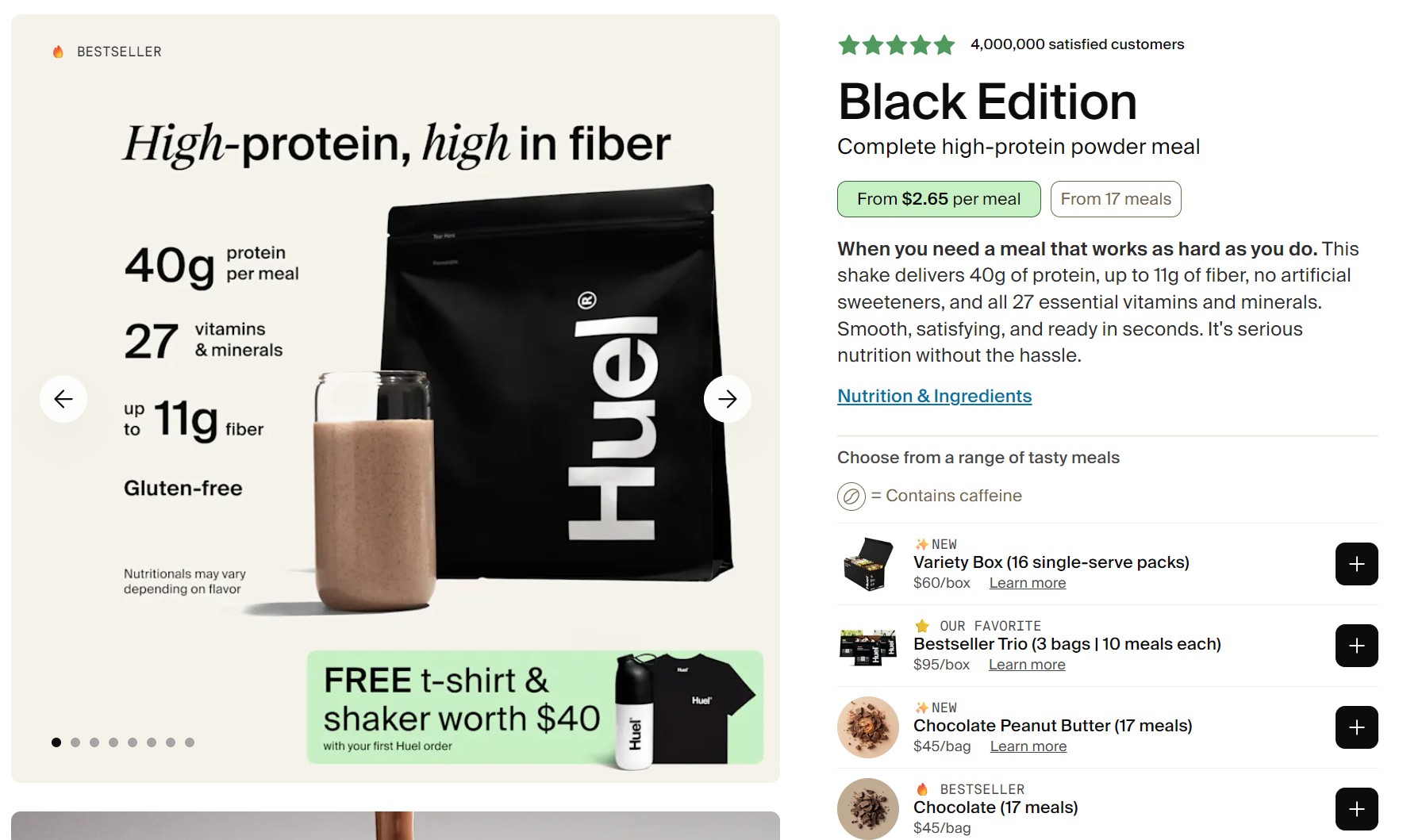
Additionally, Huel presents upsells and cross-sells across its product pages to help customers discover and consider multiple products:
At the intent stage, your customers have growing confidence that they want your product, but might hesitate due to price or commitment concerns.
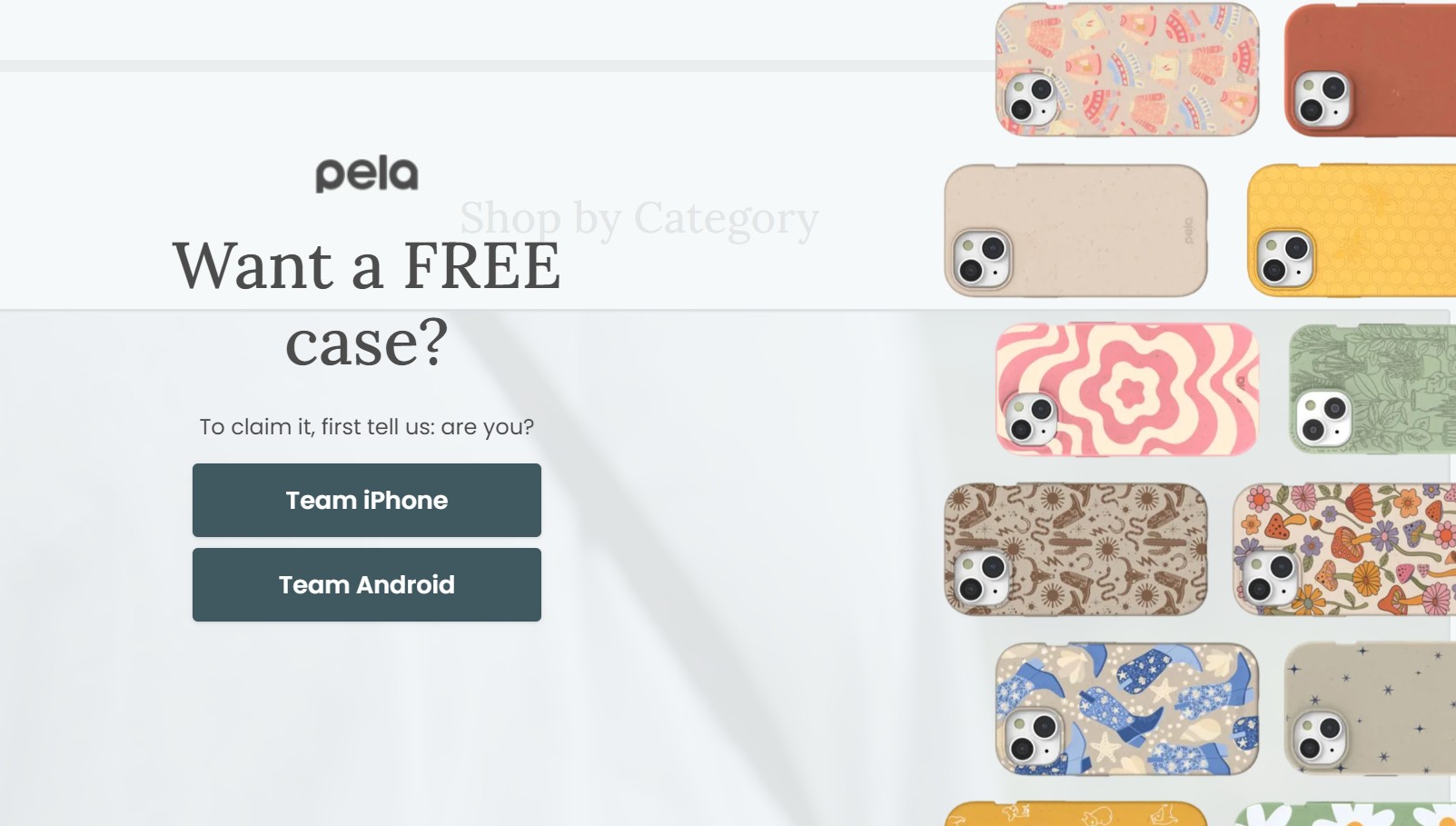
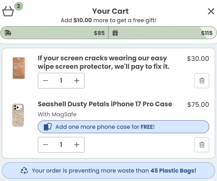
Smartphone accessories brand Pela captures these abandoning customers with an exit-intent popup quiz offering a free case:
Another tactic Pela uses to capture intent is cart optimization with free shipping thresholds, BOGO upsells, screen protection guarantees, and waste prevention messaging:
You don’t want to lose customers who are put off by a long, drawn-out checkout process. Instead, the aim is to make things as simple as possible for your customers.
One of the best ways to make things simple is by providing express payment options rather than asking your customers to input their personal information from scratch.
Beauty Bakerie’s checkout includes express checkout via Shopify Payments, accepting PayPal, Google Pay, Apple Pay, Amazon Pay, and Shop, in addition to credit cards. See the image below:
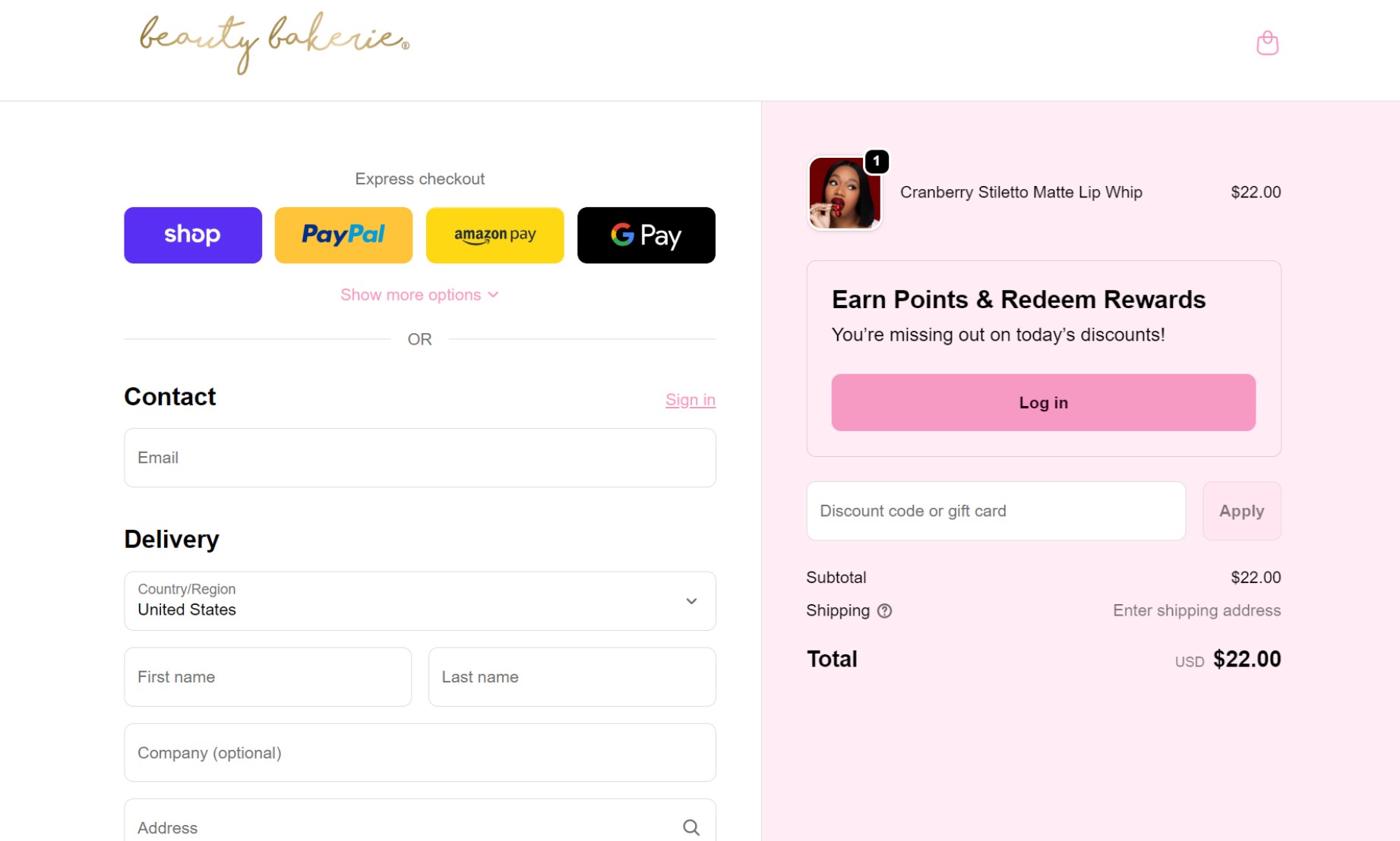
Letting your customers check out as guests is also crucial, with mandatory account creation causing 26% of shoppers to abandon their carts (PayPal). Beauty Bakerie allows guest checkout without requiring account creation or login.
Additional reading:
Shopify funnel builder tools for 2026 sales success
Targeting customers at every step of their buying journey will increase conversion rates. This is because you’ll be pushing them to take action methodically. You’ll start with a general approach to marketing a product and progress to offering detailed content with a focus on closing the sale.
Marketing funnels will help you understand the journey a customer takes before buying your product. They will also help you better understand your buyers’ needs and what makes them become paying customers. This knowledge will inform the marketing content that you produce going forward.
Marketing funnel automation will help to increase your ROI by saving you time on repetitive tasks like sending emails and following up on leads. Your automations will reach customers at appropriate moments in their journey and increase retention.
 | MDigital helped bike retailer 360cycles integrate online and offline customer data to trigger lifecycle automations across the customer journey. It achieved 70% open rates, reactivated 422 contacts before holidays, and generated €1,202 from a single upsell workflow in 14 days. Read the Omnisend customer story: MDigital. |
If you need a comprehensive solution for automating funnel processes, Omnisend is the ultimate tool.
Omnisend has all the features you need to automate the repetitive processes that come with marketing funnels. You can automate emails, segment your audience, and reach customers on their preferred channels.
Using our pre-built workflows that save you time and hassle, you can send out appropriate email and SMS messages to customers depending on where they are in their journey.
For instance, you could create a welcome series that introduces customers to your brand and encourages first-time purchases with a discount. The video below provides a primer on welcome email automations:
Each stage of the marketing funnel has a range of key performance indicators (KPIs) that measure the overall effectiveness of the funnel. These KPIs can help you find areas that need improving to further improve the effectiveness of your funnel.
| Stage | Metric | Description |
|---|---|---|
| Awareness | ||
| Website visits | How many people are visiting your website to look at the product | |
| Email opens | How many people open the emails that you send about the product | |
| Digital impressions | How many people have viewed and interacted with your posts about the product | |
| Interest | ||
| Leads | How many people have shown interest but not yet bought your product | |
| Consideration | ||
| CTA views to clicks | How many people see your calls to action vs. how many people click on them | |
| Landing page performance | How many people interact with your landing pages | |
| Intent | ||
| Bounce rate | The number of people who leave your site after viewing just the one page | |
| Return visits | How many times someone returned to your site | |
| Purchase | ||
| Conversions | The number of people who have bought the product | |
| Return on advertising spend | How much have you made in sales compared to the amount you spent on advertising | |
| Return purchases | How many people have returned and bought more products from your store |
With Omnisend, you can closely monitor your funnel’s metrics, including open rates, click-through rates, and conversions. This will give you actionable insight at every stage of your marketing funnel, helping you to maximize its potential.
There’s little wonder why marketing funnels have remained a much-used tool in marketing for so long. By crafting your marketing strategy around each step of your customer’s journey, you can harvest high-quality leads who won’t hesitate to hand over their cash.
Ultimately, the key to marketing funnels is their specificity, which means providing exact solutions to customers’ exact problems.
This helps increase conversions, customer loyalty, and, most importantly, profits. With tools like Omnisend at your disposal, you’re now empowered to set up your own highly effective marketing funnel that shows great results.
Quick sign up | No credit card required
The marketing funnel is a visual representation of a customer’s journey before buying a product, from initial awareness to eventual purchase. Marketing teams will then adapt their marketing strategy to where the potential customer is in this journey.
The five stages of a marketing funnel are:
— Awareness
— Interest
— Consideration
— Intent
— Purchase
A three-stage marketing funnel strategy is a simplified version of a traditional marketing funnel. It features three stages, including awareness (top of the funnel), consideration (middle of the funnel), and purchase (bottom of the funnel).
It’s called a marketing funnel because the number of customers that travel from the initial awareness stage to the purchase stage reduces at every step. Therefore, when visualized, it forms the shape of a funnel.
TABLE OF CONTENTS
TABLE OF CONTENTS
What’s next


No fluff, no spam, no corporate filler. Just a friendly letter, twice a month.