
 OFFER
OFFER


Drive sales on autopilot with ecommerce-focused features
See FeaturesYour emails need an appropriate font for headings and text to guarantee readability and create a consistent user experience. The best font for email will display consistently across all devices and reflect the nature of your message.
Different fonts have personality traits that can either strengthen or undermine your message’s impact. Serif fonts convey tradition and authority, while sans-serif fonts project a modern feel.
An email-safe font that works across all platforms is the easy pick for the best font for an email signature or marketing campaign. However, you can use custom fonts to strengthen your brand’s unique identity, provided your recipients’ email clients support them.
Read on to discover how to choose and implement the right fonts for maximum email impact.
Join Omnisend to create professional emails that convert
Quick sign up | No credit card required
Best font for email — key takeaways
- Your font choice impacts readability, brand perception, and user engagement across devices and email clients
- Sans-serif fonts like Arial and Helvetica reign supreme for digital communication, offering consistent readability on all screen sizes
- Email-safe fonts ensure your message looks consistent across Gmail, Outlook, Apple Mail, and other email clients
- Custom and branded fonts can enhance your email’s visual identity, but use them alongside email-safe fonts to maintain your message’s impact
- Use 14-16px for body text and 20-24px for headers, and ensure the text elements/blocks in your template have consistent sizing
- Choose email fonts that reflect your brand’s personality and match your website as closely as possible for a consistent user experience
What are email-safe or web-safe fonts?
Email-safe fonts are the typefaces email clients like Gmail, Outlook, and Apple Mail render without display issues. They are a subset of web-safe fonts chosen for their reliability across email platforms.
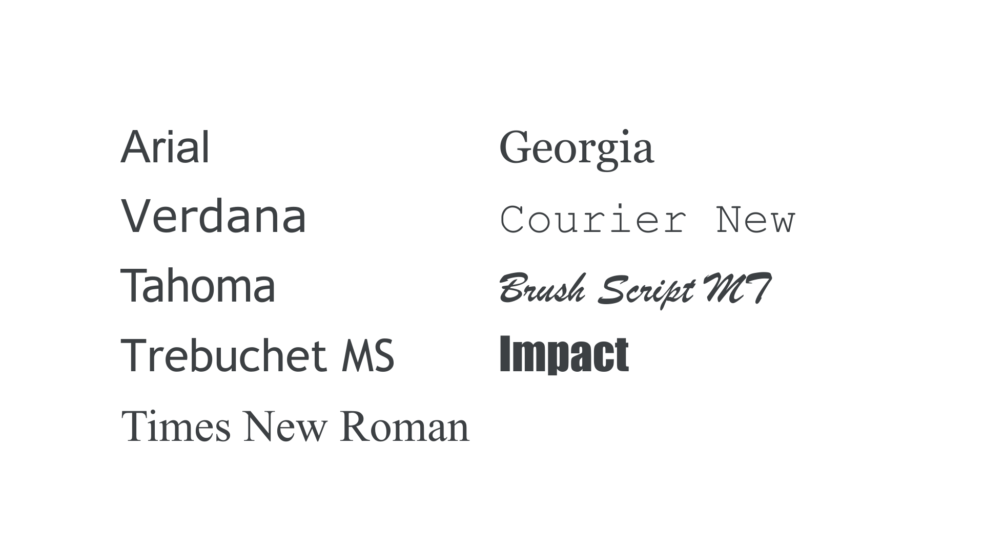
Web-safe fonts are the default typefaces pre-installed on most computers and devices, regardless of operating system. A few options include Arial, Times New Roman, Verdana, Georgia, Tahoma, and Trebuchet MS.
Each email client defaults to an email-safe font when it encounters display issues:
- Gmail uses Arial
- Apple Mail uses Helvetica
- Outlook uses Aptos
While choosing from the email-safe font collection ensures consistent display across all platforms and devices, it means working with a limited selection of fonts. If you want even more choice, you can use web fonts.
Web fonts, like Google Fonts, are custom typefaces loaded online. They offer more creative options, but most email clients block them and render default fonts instead.
Best fonts for professional emails and signatures
When choosing fonts for professional communication, you’ll encounter modern sans-serif fonts, traditional serif fonts, and decorative options for signatures.
You could use one serif or sans-serif font to create a consistent experience across all professional communications. Another option is combining serif and sans-serif fonts for your email body and headings to create visual interest.
Sans-serif fonts
Arial, Helvetica, Calibri, Aptos, and other sans-serif fonts are perfect for ecommerce stores and technology companies. These fonts lack decorative strokes at the ends of letters, creating a clean, modern appearance that’s easy to read on screens.
Popular options
- Arial: Clean lines and unmatched readability across all platforms
- Helvetica: Timeless modernism with perfect balance and clarity
- Calibri: Friendly yet professional, with excellent screen rendering
- Aptos: Microsoft’s Calibri replacement, perfect for digital-first brands
Pros
- Offers clarity across all screen sizes
- Ideal for footers and legal copy
- Suits most industries
- More choices across all email clients
Cons
- Appears less formal than serif fonts
- Lacks personality compared to serif typefaces
When to use them
Sans-serif fonts are neutral and work well in all communications. They should be your default choice for body text to ensure readability.
Serif fonts
Times New Roman, Georgia, Trebuchet MS, and other serif fonts are the traditional professional communication choices. These fonts have small decorative strokes (serifs) at the end of each letter, lending a classic, authoritative appearance to your messages.
Popular options
- Times New Roman: Traditional authority with excellent readability in long-form content
- Georgia: A characterful font with alternating thick and thin strokes
- Trebuchet MS: Sharp, open letterforms that enhance screen legibility
Pros
- Evokes authority and tradition
- Excellent for formal communications
- Creates natural eye flow in longer paragraphs
- Familiar to all recipients
Cons
- Looks outdated in some contexts
- Might be too formal for marketing purposes
When to use them
Serif fonts work well in formal company communications and for any businesses in the legal, financial, or services industries.
Cursive fonts for signatures
Signature fonts like Lucida Handwriting add a personal touch to your email closings. The best cursive fonts for email signatures create a distinctive look that helps your name and title stand out from the rest of your message.
Popular options
- Lucida Handwriting: A smooth, fun, and neat font
- Arizonia: A sign-painterly font with thick strokes
- Lobster: A clean and organized font with a free-flowing style
Pros
- Adds personality to your signature
- Creates a memorable brand impression
- Simulates handwritten authenticity
- Works well for creative industries
Cons
- Limited email client support
- Some fonts are incomprehensible at small sizes
When to use them
Use cursive fonts for personal or creative branding, such as signing your email signature in a font that looks handwritten.
Recommended font sizes
Your email’s font size should complement your template design, including its images, buttons, and calls to action. Always size up rather than down to ensure your message stays visible and readable.
For body text, 16px works well on desktop and mobile displays where content has room to breathe. Mobile layouts often compress content into a narrower space, making 14px suitable to maintain readability without excessive scrolling.
Different fonts behave differently at various sizes. Times New Roman maintains its elegance at smaller sizes but loses its crispness when scaled beyond 18px.
Keep your hierarchy clear with headers at 20-24px, and set signatures to 10-12px so they remain distinct without competing with your main content.
Best fonts for email marketing and newsletters
Your newsletters and automated messages can use web-safe fonts or branded typography to create more dynamic visual experiences.
Branded fonts look fantastic in email builders but can cause display issues for the reader. Many email clients default to standard fonts when encountering custom typography. Gmail renders in Arial, Apple Mail switches to Helvetica, and Outlook defaults to Aptos.
These fallback mechanisms ensure your message remains readable, but they can compromise your carefully designed visual aesthetic.
A compromise worth considering is combining email-safe fonts for the email body with custom fonts for headings. Ultimately, the best font for email marketing is the one that matches your brand strategy and displays correctly on most devices.
Fonts for engagement and readability
Sans-serif fonts are the easiest-to-read newsletter fonts because they lack decoration. Open Sans, Roboto, Lato, and Nunito are all great choices.
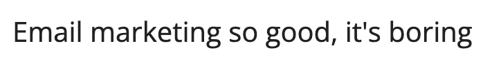
Here’s an example of Open Sans:
And now Nunito:
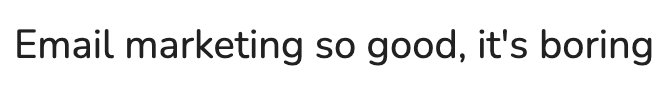
Notice the subtle differences? Open Sans is slightly wider and less decorative.
The absence of decorative strokes (serifs) at letter endings creates a clean, uncluttered visual experience that translates exceptionally well on screens.
Smaller text remains crisp and legible, reducing eye strain and improving scannability and information comprehension.
Serif fonts also have a place in newsletters, but their application needs finesse. Use them in headings to convey a sense of credibility, for visual interest in text-heavy newsletters, and to add a classic, refined aesthetic for brand purposes.
Fonts for branding in marketing emails
Unlike standard web-safe fonts, branded typography creates an immediate visual signature that separates you in crowded inboxes.
Fonts like Lexend, Gabarito, and Merriweather stand out against Arial, Tahoma, and other email-safe fonts. You can use them to give your email templates a more polished look and feel.
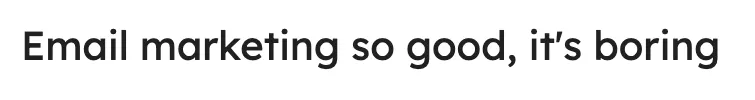
Here’s an example of Lexend:
And now Merriweather:
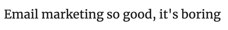
Lexend is a sans-serif font, while Merriweather is a serif font. A legal business might choose Merriweather because of its traditional feel.
The downside of custom fonts is that they are not “email-safe,” meaning your text elements may revert to the email client’s default font.
You can anticipate this issue and minimize layout shifts by sizing your custom fonts to complement the sizing of default email client fonts like Aptos, Helvetica, and Arial. For instance, check whether your custom font takes up the same vertical and horizontal space at 14 px.
Check out these email marketing examples to see how other brands use different fonts and layouts to create engaging emails.
Web-safe email fonts
Web-safe fonts are typefaces pre-installed on most computers and operating systems, ensuring baseline typographic consistency across different platforms and devices.
Popular options include:
You can use these universal fonts to ensure your emails render similarly regardless of the user’s device or email client. They offer reasonable confidence that most users will see the intended typeface or a similar alternative.
For example, if your email template uses Arial, users of different email clients, such as Gmail, Outlook, and Apple Mail, will probably see that font.
Why choosing the right font matters in emails
Font choice in emails dictates readability, brand perception, user engagement, and the overall effectiveness of your communication across different devices and email clients.
Here are three reasons why choosing the best font for email is critical to your success:
1. Readability and accessibility
Your emails should be accessible to everyone, and that starts with good font choices.
Sans-serif fonts like Arial and Helvetica provide clear, legible letterforms across devices. Body text is easily readable under 16px on desktop and mobile screens. Pairing these with serif fonts for headings creates a natural visual hierarchy that guides readers efficiently.
Fonts with distinct letterforms, letter spacing, and high contrast help screen readers interpret text accurately. Arial, Verdana, Tahoma, Calibri, Helvetica, and Georgia are accessible fonts for use across your emails.
2. Brand consistency
Typographic consistency across email, web, and print creates a unified brand identity. You can effectively reinforce brand recognition, making your communications instantly identifiable, whether received in a marketing email or internal memo.
Consider technology companies like Apple or Google, where consistent typography becomes a recognizable brand signature. The same font used in a product launch email mirrors their website and promotional materials, creating a cohesive visual language.
3. Email deliverability
Poorly rendered, illegible, or incorrectly sized fonts create friction in user experience, potentially driving subscribers to unsubscribe or add you to their spam folder.
Each unsubscribe and entry into spam negatively impacts your sender reputation and potential email deliverability rate.
High-quality, well-implemented fonts ensure smooth user interaction, reduce cognitive load, and make content easier to consume. These factors also make it likelier for your readers to click through, leading to higher conversion rates and more sales.
Tips for choosing the best fonts for your emails
Follow these tips to choose the best email fonts for business and marketing purposes:
1. Prioritize readability over style
Simple, clean fonts keep your message front and center. Decorative typography can create unnecessary noise, increasing cognitive load and risking reader disengagement.
Consider the primary goal of your email — communication. Custom fonts might seem attractive in design mockups, but they break down across different devices and email clients.
Email-safe and web-safe typefaces maintain integrity whether viewed on a desktop, tablet, or mobile phone. They support quick scanning, improve comprehension, and ensure your message renders correctly.
2. Use fonts that reflect your brand identity
Consider the fonts you already use on your website and print materials. If you mostly lean on sans-serif fonts, mirroring them in your emails makes sense.
You don’t need a perfect match, either. For instance, if you use Nunito on your website, you could use Verdana in your emails to ensure email client compatibility.
Fonts can also be strategic and context-sensitive. Don’t be afraid to break free from your branding and use different fonts when targeting specific segments (e.g., use a serif font when targeting law firms and other formal industries).
3. Test fonts before sending
What looks perfect in your email marketing software might appear completely different in Gmail, Outlook, or on a mobile email client.
Use the preview tool in your email builder to see how your message will appear on various devices, operating systems, and email clients. Send test emails to accounts on different email platforms, checking for font rendering, sizing, and overall layout integrity.
Pay attention to how fonts display on desktop, tablet, and mobile screens. Some fonts might look crisp on a large monitor but become unreadable on smaller devices.
4. Avoid overloading with too many fonts
Using one or two fonts for headings and body text is the best approach to keep your emails legible and clean.
Adding more than two fonts can create visual chaos that confuses readers, undermines your message’s clarity, and makes your email harder to read.
Remember that your font choices should enhance, not distract from, your content. A clean, focused design communicates professionalism and helps ensure your message cuts through the noise of a crowded inbox.
How Omnisend helps you choose the best fonts for emails
Omnisend helps you refine your font choices and ensure proper sizing and formatting across your campaigns with customizable templates, cross-platform tools, and performance insights.
- Customizable templates: Access a library of pre-designed email templates with customizable font styles, sizes, and weights to match your brand’s visual identity. Keep your templates for reuse in other campaigns to save time later.
- Cross-platform compatibility: Our templates automatically adapt to different devices and email clients. Use an email-safe font, and you won’t have any display issues.
- Personalization and segmentation: Use segmentation tools to create subscriber segments and craft unique emails with different font styles and sizes. This will increase engagement among other groups.
- A/B testing for typography: Split test two email versions to compare fonts. You can also automatically send the winning version to your list.
- Click Map insights: Omnisend’s Click Map feature visually highlights where recipients clicked within your email. Analyze the click distribution to identify which content, products, and design elements resonate most.
Conclusion
The best font for email depends on your message and intended recipient, but there are some golden rules to follow.
Start your search with email-safe fonts to ensure your text renders as intended. You can also match a web-safe or custom font closely to an email-safe font to ensure consistent rendering if the recipient’s email client defaults to an email-safe font.
Use a visual email builder, preview your email, and send test emails for review on multiple email clients to check everything looks as it should.
Monitor your click-through rates and use Omnisend’s Click Map feature to identify the areas of your newsletter that are most engaging. Use that data to refine your typography and other design elements for better email marketing results.
Join Omnisend to build emails that look perfect everywhere
Quick sign up | No credit card required
FAQ
What is the best font for professional emails?
Use sans-serif, email-safe fonts like Arial, Helvetica, and Calibri to give your content a modern feel. If your emails benefit from a personal touch, consider using a cursive font in your signature, such as Lucida Handwriting.
What font size is best for emails?
16px works best for body text, providing optimal readability on desktop and mobile devices. 20-24px is ideal for headings. Mobile layouts can use slightly smaller sizes, like 14px, to prevent excessive scrolling while maintaining clear, legible text across different screen sizes.
Is email font 11 or 12?
Some email clients use 11px or 12px font sizes as their defaults. However, both are too small for consistent readability. Use a font size of at least 14px for legibility, and reserve text smaller than that for your privacy disclaimer at the bottom.
What is the most accessible font for email?
Sans-serif fonts like Arial and Helvetica are the most accessible, as they have clear letterforms, consistent stroke weights, and excellent readability across devices. Georgia or Times New Roman work well if you need a serif font due to their clean, distinct letterforms.
TABLE OF CONTENTS
TABLE OF CONTENTS

Subscribe and don’t miss any updates!
No fluff, no spam, no corporate filler. Just a friendly letter, twice a month.