OFFER
OFFER


Emojis in email subject lines: best practices and examples
With over 130+ pre-built integrations and flexible APIs, you can easily centralize data from across your tech stack
Make the most out of your data and unlock powerful growth marketing possibilities with these other top marketing tools.
Build any custom integration with our open, flexible APIs that are simple to use and implement.
Check out apps that have been stealing all the spotlight.
Email and SMS marketing insights, ecommerce resources, and the latest Omnisend news
Expert-led sessions covering email, SMS, and ecommerce marketing strategies.
Educational video and live training to help you make the most out of Omnisend.
Drive sales on autopilot with ecommerce-focused features
See FeaturesEmail-safe fonts like Arial, Georgia, and Helvetica ensure consistent display across all major email clients, enhancing readability and user experience.
Custom fonts can elevate your brand's design but may not be supported by all email clients, leading to potential display issues; always include fallback options.
Testing your email across various platforms and devices is crucial to ensure that fonts render correctly and maintain your intended design and readability.
Prioritize accessibility by choosing fonts that are easy to read and ensuring sufficient contrast against backgrounds to cater to all users.
Email-safe fonts display correctly across all email clients, from Gmail to Outlook. Popular options include Arial, Times New Roman, and Helvetica.
Custom fonts, on the other hand, let you tailor your design to help your brand stand out. However, not all email clients support them. In such cases, the custom fonts in email will be replaced with a safer option, which may affect how your email looks.
In this post, we’ll explain the difference between email-safe fonts and custom fonts. You’ll also learn the best practices for using fonts in emails.
In this post:
Quick sign up | No credit card required
Email-safe fonts are pre-installed fonts, such as Arial, Georgia, and Helvetica. All major email clients support them and appear consistently across all devices. Because they’re easy to read, they provide a seamless user experience.
The standard email fonts are sans-serif fonts. Some popular examples include Arial, Calibri, Helvetica, and Verdana.
Here are more email-safe fonts you can use:
Font type: Sans-serif
Classification: Neo-grotesque
Designers: Robin Nicholas and Patricia Saunders
Date released: 1982
Arial is one of the most commonly used email-safe fonts. Since this sans-serif typeface offers a clean, modern look that enhances readability, it works well for various email types, from newsletters to promotional messages. Its neutral style makes it a versatile choice, appealing to a broad audience.
Font type: Serif
Classification: Transitional
Designer: Matthew Carter
Date released: 1993
Georgia brings a touch of elegance to your emails. This serif font stands out for its readability, even in smaller sizes. Its classic appearance adds a sense of professionalism, making it perfect for formal communications or content-heavy emails. Georgia is a perfect option if you want to convey authority without sacrificing style.
Font type: Sans-serif
Classification: Humanist
Designers: Charles Bigelow and Kris Holmes
Date released: 1985
Lucida is another solid choice among email-friendly fonts. Its design emphasizes clarity, making it easy for readers to digest your content. With its friendly vibe that can help foster a connection with your audience, Lucida works great for casual communications, such as updates or personalized messages.
Font type: Sans-serif
Classification: Humanist
Designer: Matthew Carter
Date released: 1994
Tahoma resembles Verdana but has sharper edges and higher contrast between thick and thin strokes. It’s a good choice if you want something that’s easier to read than Arial but still has a modern feel. If you’re sending tech-related content or anything that requires clarity, Tahoma fits the bill.
Font type: Serif
Classification: Transitional
Designers: Stanley Morison and Victor Lardent
Date released: 1931
Times, or Times New Roman, is a classic serif font that brings a sense of tradition to your emails. While it might not have the modern flair of some other fonts, its timeless design makes it suitable for formal communications. Use Times when you want to convey seriousness or authority in your messaging.
Font type: Sans-serif
Classification: Humanist
Designer: Vincent Connare
Date released: 1996
If you want to add a bit of fun and whimsy to your emails, Trebuchet MS is the font for the job. It’s an easy-to-read Sans Serif typeface with a wide range of weights and styles. Despite being a non-standard font, Trebuchet MS is widely supported by email clients, so you don’t have to worry about your emails looking strange on different devices.
Font type: Sans-serif
Classification: Humanist
Designer: Matthew Carter
Date released: 1996
Verdana is a favorite among email marketers, engineered for readability. Its wide spacing and clear letters make it easy to read, even on those smaller screens. This sans-serif font fits perfectly with any kind of email, whether you’re sending out newsletters or promotions. If you want to ensure your message gets across easily, definitely consider using Verdana.
There’s no single default email font. Each email client has its own default font. If you don’t specify a font in your email’s design layout, the client falls back to its default.
Even if you find the best font for your email, the email client will revert to the default if the font is unsupported. As a result, the email may appear differently, depending on whether it’s opened on Gmail, Outlook, or Apple Mail.
Here are some default fonts of major email clients and their fallback options:
| Client | Default font | Fallback font |
|---|---|---|
| Gmail | Roboto/Arial | Generic sans-serif |
| Outlook | Calibri/Aptos (for newer versions) | Times New Roman or serif |
| Apple Mail | SF Pro/Helvetica | Helvetica or sans-serif |
| Yahoo Mail | Helvetica | Arial or sans-serif |
Use a proper email format as it can affect readability, branding, and overall design. This is why marketers should always indicate a variety of fonts in their email code. This provides more options when your first-choice font isn’t available.
Email clients handle fonts differently. Some support custom web fonts using @font-face, while others ignore them and display a default font instead. The table below shows Gmail-supported fonts compared with those of other major clients, allowing you to design with clarity.
| Email client | Email-safe fonts | @font-face (web fonts) | Default fallback | Known quirks |
|---|---|---|---|---|
| Gmail (web/mobile) | Arial, Helvetica, Roboto, Verdana, Georgia, Times New Roman | No | Roboto/Arial | Strips web fonts entirely |
| Outlook (Windows 2003–2019) | Arial, Calibri, Times New Roman | Buggy | Calibri/Aptos | Uses Word rendering engine |
| Outlook for Mac (2011–2016) | Arial, Helvetica, Times New Roman | Yes | Aptos | Better CSS support than Windows |
| Outlook (Web/365) | Arial, Calibri, Verdana, Times New Roman, Lucida Sans Unicode | Limited | Aptos | Inconsistent rendering |
| Apple Mail (iOS/macOS) | Helvetica, Arial, Verdana, Georgia, Trebuchet MS | Yes | SF Pro/Helvetica | Full support for web fonts |
| Yahoo Mail | Arial, Helvetica, Georgia, Times New Roman, Verdana | No | Arial/Helvetica | Overrides some styles |
| Samsung Mail | Arial, Helvetica, Roboto, Verdana, Tahoma, Courier New | Yes | Roboto | May not work if the email is Microsoft-based |
In practice, only Apple Mail and Outlook for macOS reliably support custom web fonts. Apple Mail accounts for an estimated 52–58% of email opens. This means about half your audience may see your chosen font, while the rest will see a fallback.
Having a well-planned font stack is one of the essential email design best practices. It ensures the fallback font resembles your brand font.
Outlook (Windows)
Outlook on Windows uses the Microsoft Word engine to render emails, which severely limits support for custom fonts. It can override spacing, line height, and even fallback fonts. As such, your design may look professional elsewhere but appear broken on Outlook.
Stick to email-safe fonts like Arial, and test every email before sending. Use conditional code where needed. The transition between the classic and “new Outlook” continues to create inconsistencies between versions. The new Outlook is still developing and lacks advanced support for font customization.
Gmail
Gmail doesn’t support @font-face, meaning any custom font you include will be removed. It also rewrites some inline styles, changing the font size, weight, and overall layout. These changes happen when the email is sent, so you may not see them in preview tools.
To stay safe, use specific email-safe fonts for Gmail. This ensures you send a responsive email to subscribers.
Apple Mail
Apple Mail offers the best support for custom fonts, making it ideal for brand consistency. However, relying heavily on this can create uneven experiences across your audience.
Use custom fonts strategically, but ensure your fallback fonts preserve readability and hierarchy.
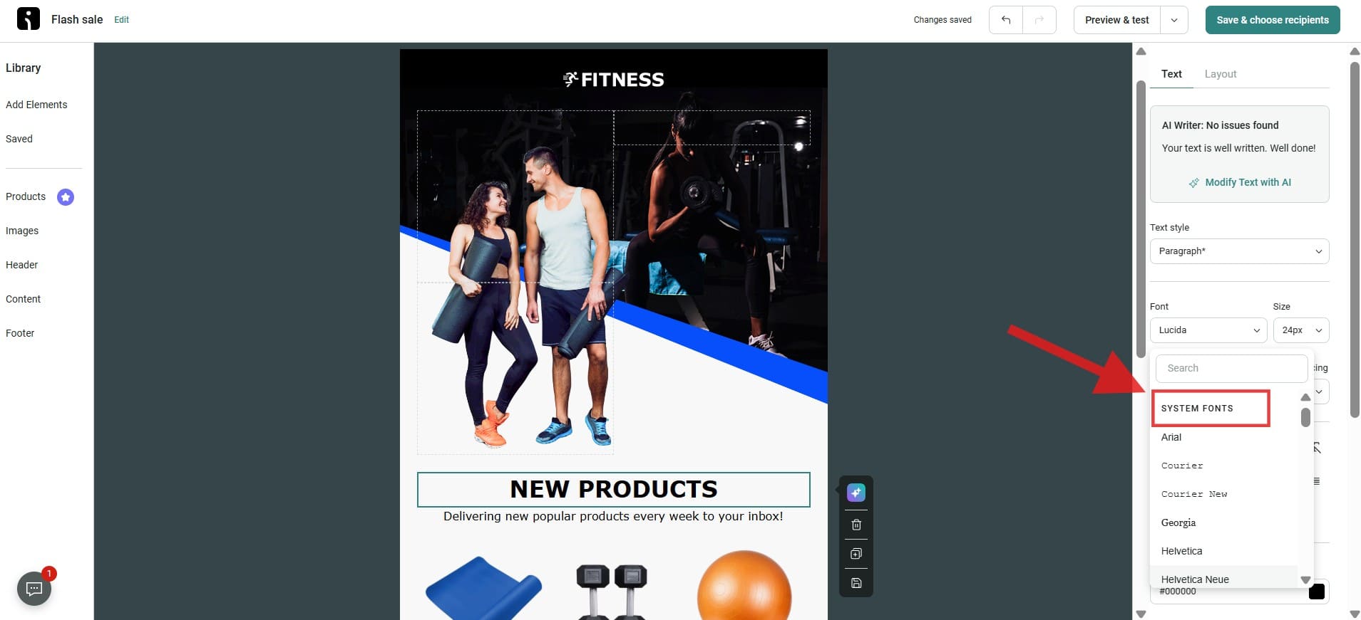
Incorporating email-safe fonts into your emails is simple. Most email marketing platforms, including Omnisend, offer options for selecting standard fonts. Here’s how to do it:
Email marketing apps offer several email-safe font options for your message. When selecting a font, keep readability and brand consistency in mind. For headings, you can go with something a bit more eye-catching, like Georgia or Tahoma.
Look for the font dropdown menu on your email marketing app, usually located in the text editing section. This menu will display a variety of fonts.
On Omnisend, for example, the email-safe fonts are labeled “system fonts” in the font selection menu, as shown in the image below.
Once you have selected your font, you can adjust its size and style as needed. You also need to consider how your readers will read your text. This brings up the point that, above all, your text’s readability needs to be considered. You can also use styles such as bold or italic to emphasize your points in your email. Just be careful not to overdo it, as it could make your email look messy.
After selecting your font, use it in your content. You can use your selected font throughout your email, including headings and other text. It is recommended to avoid using more than one font in a single email. You can use one or two fonts to make your email clean and professional.
It is good practice to preview your emails before sending them. This is to ensure you can view your emails, including their design, content, and layout, exactly as the recipient sees them. It is necessary to preview your emails because it gives you a sneak peek, and this is very important.
After you’re done with your initial preview, it’s vital to check your email on different platforms, such as desktop and mobile devices. This will help you identify any issues that may arise when you send your email. This is super important since people access emails from a variety of devices.
Before you send your email, test it on a device of your choice. This will provide you with valuable insight into what your recipient’s inbox will look like. You may send a test email to your phone, tablet, or another computer.
Testing on different devices ensures the formatting, images, and links function correctly, ultimately allowing you to address any last-minute issues before the email reaches your audience.
If the font you have selected is not supported by the email client your recipient uses, it is always best to set up fallback fonts. Fallback fonts are used when your original font is not supported. For example, if your original font is Helvetica, then your fallback fonts would be Helvetica Neue and Arial.
Below is a list of the fonts supported by Omnisend and their fallback variants. However, keep in mind that this is just a portion of the fonts supported by the platform:
| Font name | Fallback 1 | Fallback 2 | Fallback 3 | Fallback 4 |
|---|---|---|---|---|
| Arial | Sans Serif | |||
| Courier | Courier New | Monospace | ||
| Courier new | Courier | Monospace | ||
| Georgia | Serif | |||
| Helvetica | Helvetica Neue | Arial | Verdana | Sans Serif |
| Helvetica Neue | Helvetica | Arial | Verdana | Sans Serif |
| Lucida | Lucida Sans Unicode | Lucida Grande | Sans Serif | |
| Tahoma | Sans Serif | |||
| Times | Times New Roman | Serif | ||
| Times New Roman | Times | Serif | ||
| Trebuchet MS | Sans Serif | |||
| Verdana | Sans Serif |
If you notice any issues or areas for improvement during your previews or test emails, make the necessary adjustments. Perhaps the font size is too small, or certain elements are misaligned. Once you’ve made those changes, run another test to confirm that everything appears as intended.
The image below shows how an email in Arial would look on a mobile phone screen:

Need inspiration for your next email campaigns? Check out our collection of free newsletter templates and examples.
Custom fonts can give a unique touch to your email marketing campaigns and help you stand out from the crowd. There are various custom fonts available on platforms like Google Fonts that you can explore to find the perfect font for your brand identity.
Some popular custom fonts for giving your email marketing campaigns a unique look include Roboto, Open Sans, Lora, Montserrat, and Poppins.
Using custom fonts in emails comes with considerations to ensure your message renders properly across various devices and email clients:
The most reliable way to load a custom font in email is to use the @font-face rule. You must assign a name for the custom font, then enter the URL of the font file inside the src descriptor. Here’s the standard implementation:
<html>
<head>
<style>
@font-face {
font-family: myFont;
src: url(sansation_light.woff);
}
* {
font-family: myFont;
}
</style>
</head>
<body>
<h1>The @font-face Rule</h1>
<p>Websites can use other fonts than the pre-selected “web-safe” fonts.</p>
</body>
</html>
Based on the email client support matrix, only Apple Mail and Outlook for Mac fully support custom fonts. Gmail only supports Roboto and Google Sans as web fonts.
To maximize the effectiveness of custom fonts in your email campaigns, adhere to these best practices:
Here’s a list of custom fonts you can consider for emails:
Web-safe fonts come pre-installed on most users’ devices, ensuring that they display correctly across most platforms. These fonts aren’t the same as email-safe fonts, which have been specifically tested and verified to work across major email clients. Most email-safe fonts are also web-safe, but not every web-safe font behaves predictably inside every email client.
Here, we’ve listed the most popular web-safe fonts for email:

Arial and Arial Black are widely supported across different browsers and devices, making them versatile choices for various design needs. The primary difference between the two is in their weight: Arial Black is a much bolder version of Arial. Arial’s clean and readable design makes it ideal for body text, while Arial Black’s thicker, more striking appearance is perfect for headings and adding emphasis.
Calibri is a modern sans-serif font designed in 2004. It’s the default font in Microsoft Office and favored by many for its professional yet casual tone.
Cambria is a great all-purpose font for emails, offering sharp, modern styling that’s easy to read on screens of any size. Its versatility makes it a reliable choice for clear and polished communication.
Helvetica is a versatile sans-serif font widely used in corporate branding and advertisements. Its simple and clean look creates an impression of professionalism, so it’s perfect for emails where you want to convey a sense of trustworthiness.
Segoe UI, a modern sans-serif font, is well-known for its elegant curves and legible letterforms. Its popularity stems from its unique ability to maintain sharpness and readability across devices, making it an excellent choice for email newsletters and digital projects.
Your brand’s unique identity is essential for effective communication with your audience, and typography plays a vital role in this process. Fonts can evoke emotions and establish visual consistency, which enhances brand recognition.
However, many brands face challenges with email-safe fonts widely supported by email clients. If your brand’s font is not compatible, here are some strategies to effectively convey your brand’s essence in emails:
Here are some examples of brands that use fancy typefaces to express their brand identity:
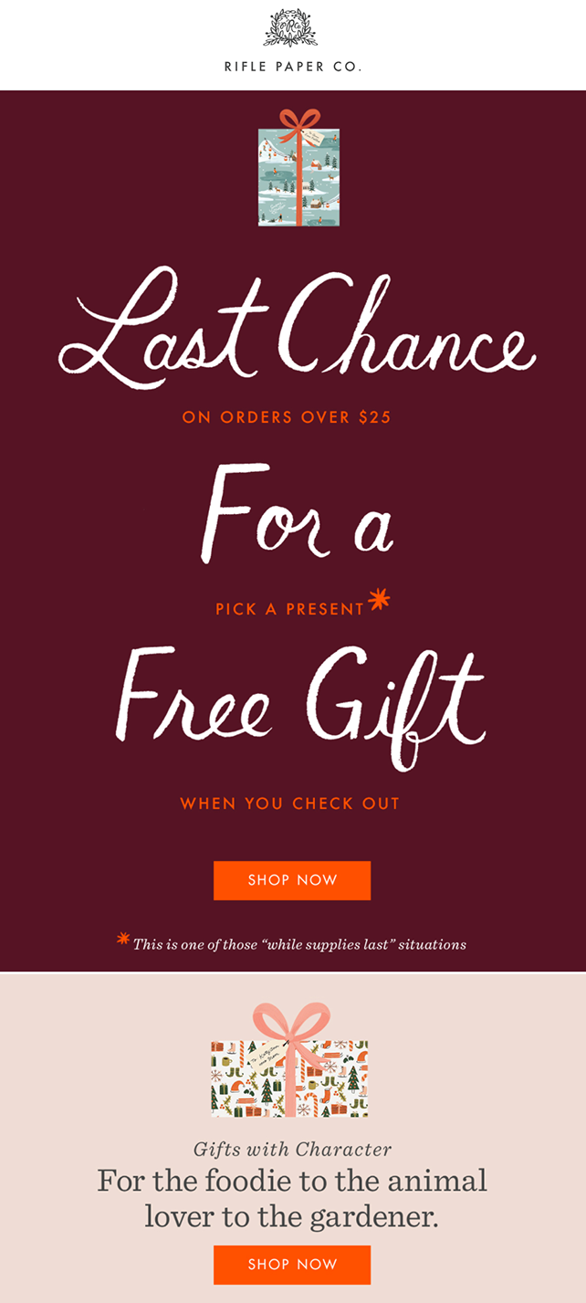
Rifle Paper Co., a stationery brand, mixes fonts like Futura, Average Mono, Rifle Open Narrow, and other email font families to show off its artistic characteristics.
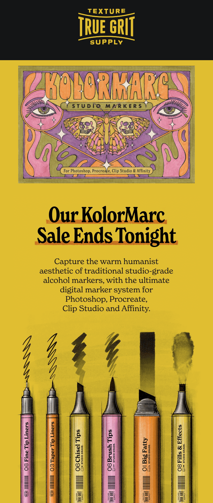
True Grit Texture Supply really knows how to make their emails pop with amazing visuals and typography. It uses eye-catching images that highlight the brand’s fonts and creative elements, all while keeping everything else easy to read and understand.
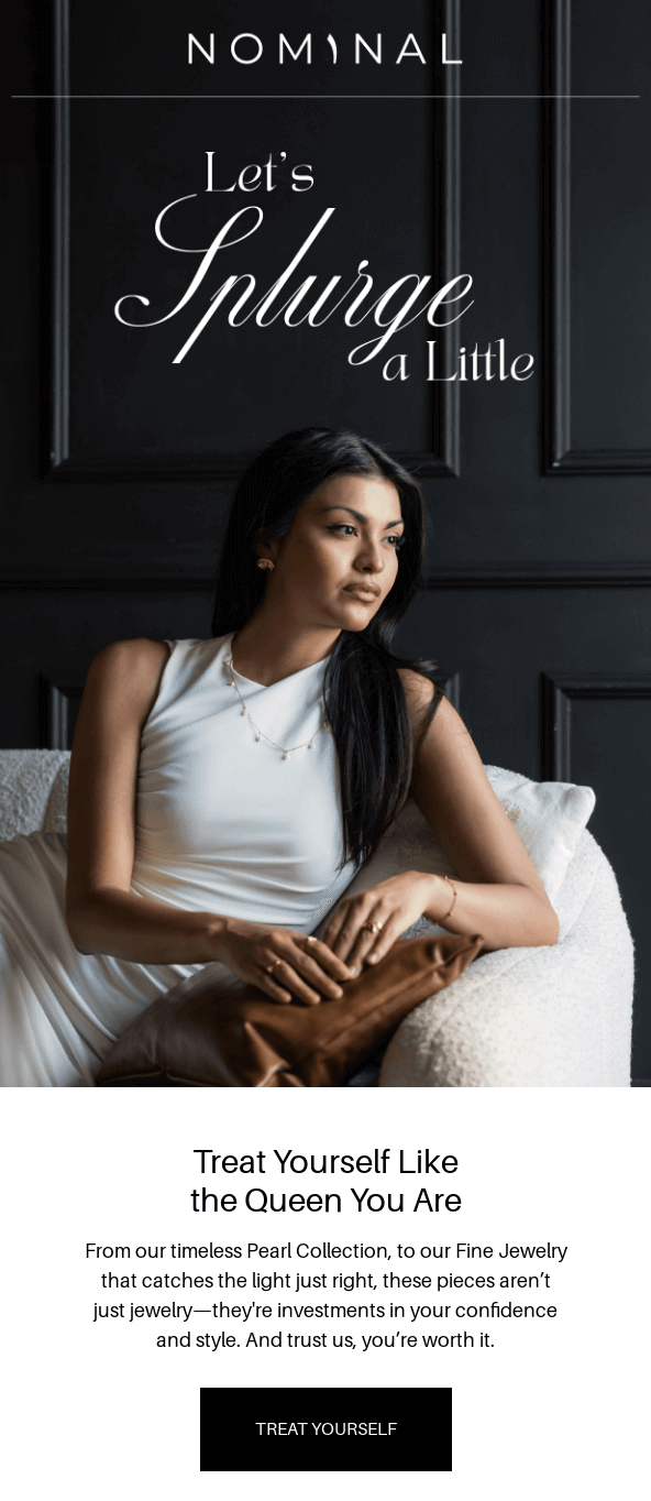
This Nominal newsletter stands out due to its elegant and sophisticated design, which perfectly reflects the brand’s identity as a purveyor of meaningful, Arabic-inspired jewelry. Fancy typefaces, such as sleek serif fonts for headings and stylish script fonts for special announcements, add a touch of luxury and exclusivity.
So far, you’ve seen that custom fonts are great for brands, but not all email clients support them. The best way to ensure your emails look good wherever they appear is to use email-safe fonts.
Whether you choose email-safe fonts or custom fonts, test a few email sends before launching campaigns. Always aim for readability and mobile-responsiveness.
While you can technically use any font, sticking to email-safe fonts ensures compatibility across different emails. Using non-standard fonts can lead to rendering issues that may distort your email’s layout and undermine your message’s professionalism and readability.
Georgia is a great alternative to Times New Roman. Both are serif fonts, but Georgia flaunts a more modern design and enhanced legibility, especially on digital screens. This combination of traditional and contemporary aesthetics makes Georgia an excellent choice for a range of professional and casual documents.
If a font isn’t supported, the email client uses a fallback font from your font stack. If you didn’t specify one in the code, it defaults to its system font. This can change spacing, layout, and overall design.
You can use Google Fonts in email, but support is limited. Only clients like Apple Mail reliably display Google Fonts using @font-face. Gmail and most Outlook versions ignore them and show fallback fonts instead.
Gmail supports a variety of email-safe fonts, including Arial, Georgia, Times New Roman, Tahoma, and Verdana. Using these Gmail-supported fonts ensures your emails look consistent and professional across devices and email clients.
Outlook supports a range of email-safe fonts, including Arial, Tahoma, Verdana, and Georgia. Using these fonts prevents rendering issues, so your emails appear consistent across Outlook versions and devices.
Quick sign up | No credit card required
TABLE OF CONTENTS
TABLE OF CONTENTS
What’s next


No fluff, no spam, no corporate filler. Just a friendly letter, twice a month.