
 OFFER
OFFER


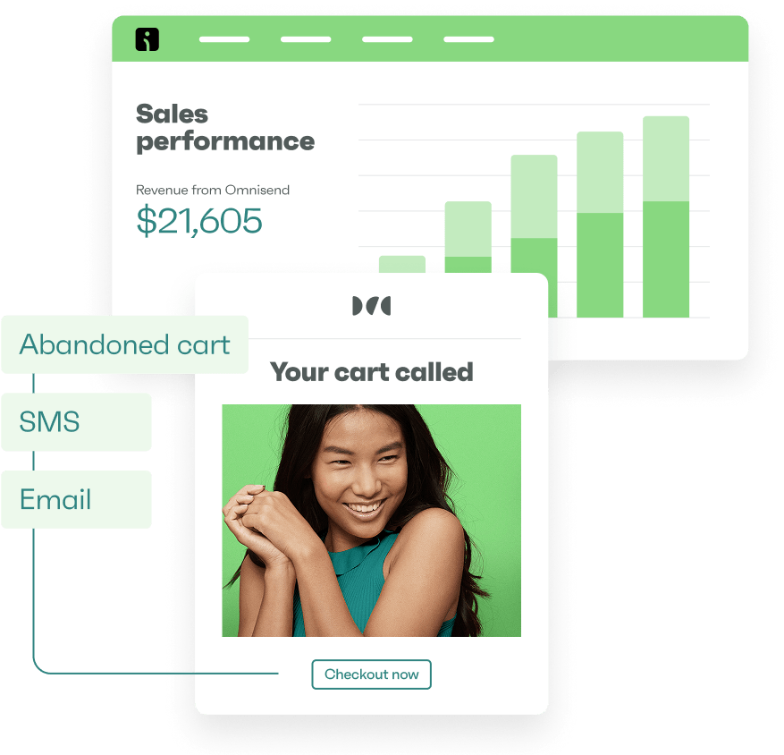
Drive sales on autopilot with ecommerce-focused features
See FeaturesKey takeaways
Effective email design goes beyond aesthetics; it must convey a clear message and guide readers towards a single call-to-action (CTA) to boost conversions.
Prioritize mobile-first layouts, as 41% of customers open emails on their phones, making readability and fast loading essential for engagement.
Incorporate user-generated content and personalization to enhance trust and relevance, ultimately driving higher engagement and conversions.
A/B testing is crucial for optimizing email designs, allowing you to refine elements like subject lines and CTAs based on actual performance data.
Reveal key takeaways
When we think of email design, we often think of beautiful colors, striking images, and stylish fonts. Many marketers assume that just having beautiful emails will add to the sales, but what if the reader can’t understand the email’s message in the first place? It’s simple — they won’t stick around.
One brand that understands this perfectly is Pasignia. This growing ecommerce brand improved conversions and revenue by refining its email design. Jean Pascal puts it perfectly: “Good design is more than just looking pretty. With it, you want to tell the brand’s story while driving action.”
Email design best practices require structure, clarity, readability, and intent. Great email design guides your reader’s eye, helps them understand the message, and tells them what to do next. The idea is to allow subscribers transition smoothly from the subject line to the CTA.
After years of designing, reviewing, and helping brands craft better ecommerce emails, I’ve learned what actually works. In this guide, I’ll walk you through proven email design best practices I rely on. With these tips, you can craft layouts that drive clicks, sales, and long-term revenue.
Use Omnisend’s intuitive email builder to design layouts that capture attention and increase conversions
Quick sign up | No credit card required
Why email design matters more than ever
Visual storytelling is one of the most effective ways to capture attention online. It’s rapidly overtaking text-heavy content, especially among Millennials and Gen Z, who value aesthetics and visual excellence.
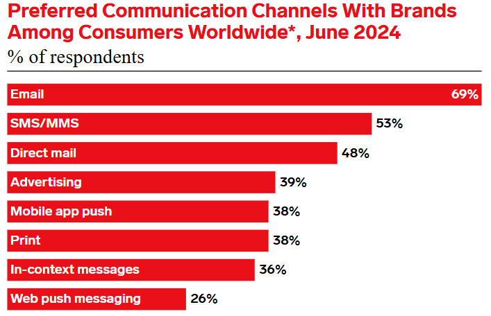
One of the best ways to present your brand and deliver your message visually is through email marketing. In fact, a recent report found that seven in 10 consumers prefer communicating with brands via email:
However, your subscribers’ inboxes are flooded with emails from competing brands. To stand out, you’ll need excellent email design.
As Rens Robroek, founder of La Machine Cycling Club, puts it:
“You’ve got to keep your emails beautiful — design really matters. When a campaign looks great, people trust it more, and they’re more likely to click.”
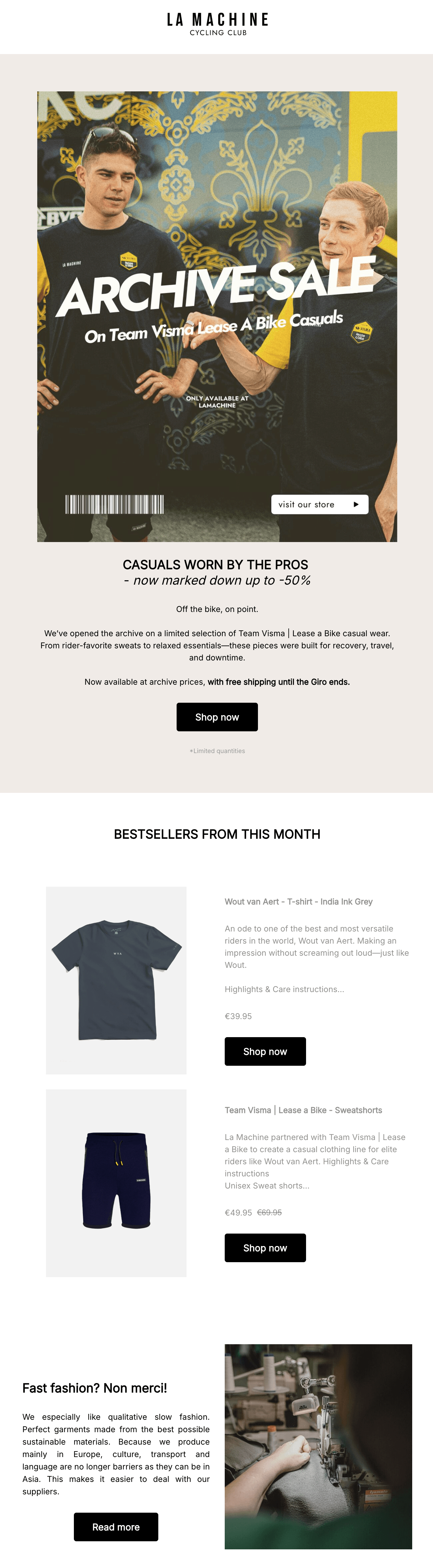
La Machine, a premium cycling brand, proves this point perfectly. Rather than adding plain product photos to its email, the brand sent its product collection to a photographer in Barcelona to capture golden-hour images.
Its team then designed an email around the emotions behind that imagery. The result was a unique, standout design that resonated with its audience.
As Rens says, “Every cyclist dreams of riding under the Spanish sun. Our imagery taps into that emotion.”
See how the actual email complements La Machine’s photos with a clean layout, warm color tones, and a clear CTA:
Now that we’ve covered why it’s crucial to learn how to design emails, let’s look at the specific email design best practices you can follow to build successful campaigns.
17 essential email design best practices
I’ve seen compelling offers fail simply because of small design choices. A cluttered layout or misplaced button can negatively affect your campaign’s performance. The best way to create layouts that increase engagement and conversions is to follow the email design best practices below.
1. Build an email design system
I no longer design emails from scratch, and neither should you. Creating reusable email blocks saves you time, keeps your emails consistent, and builds brand recognition. With a bit of tweaking, you can repurpose these elements to fit each email campaign.
Here are some essential elements to include in your email design layout:
- Header blocks with logo
- Hero blocks for headlines or offers
- Product blocks with image, price, and CTA
- Text blocks for short explanations
- Review or testimonial blocks for social proof
You can save layouts and content blocks with Omnisend’s intuitive drag-and-drop editor. Here’s a quick look at how Omnisend’s email builder works:
If you’d rather see how a design system comes together, this walkthrough shows how to build reusable email blocks, keep layouts consistent, and make quick edits without starting from scratch. It’s a practical demo you can follow alongside the tips in this guide:
2. Make your emails mobile-first
According to a recent study, 41% of customers open emails on their phones. If the emails are hard to read or load slowly, they’ll ignore or even delete them.
One of the best email design practices to avoid this is to create mobile-first layouts. This means designing emails that don’t just look good but also load quickly on smaller screens.
A mobile-friendly email design usually includes:
- Single-column layouts
- Large, tappable buttons
- Light email images that load fast
- Short subject lines and copy
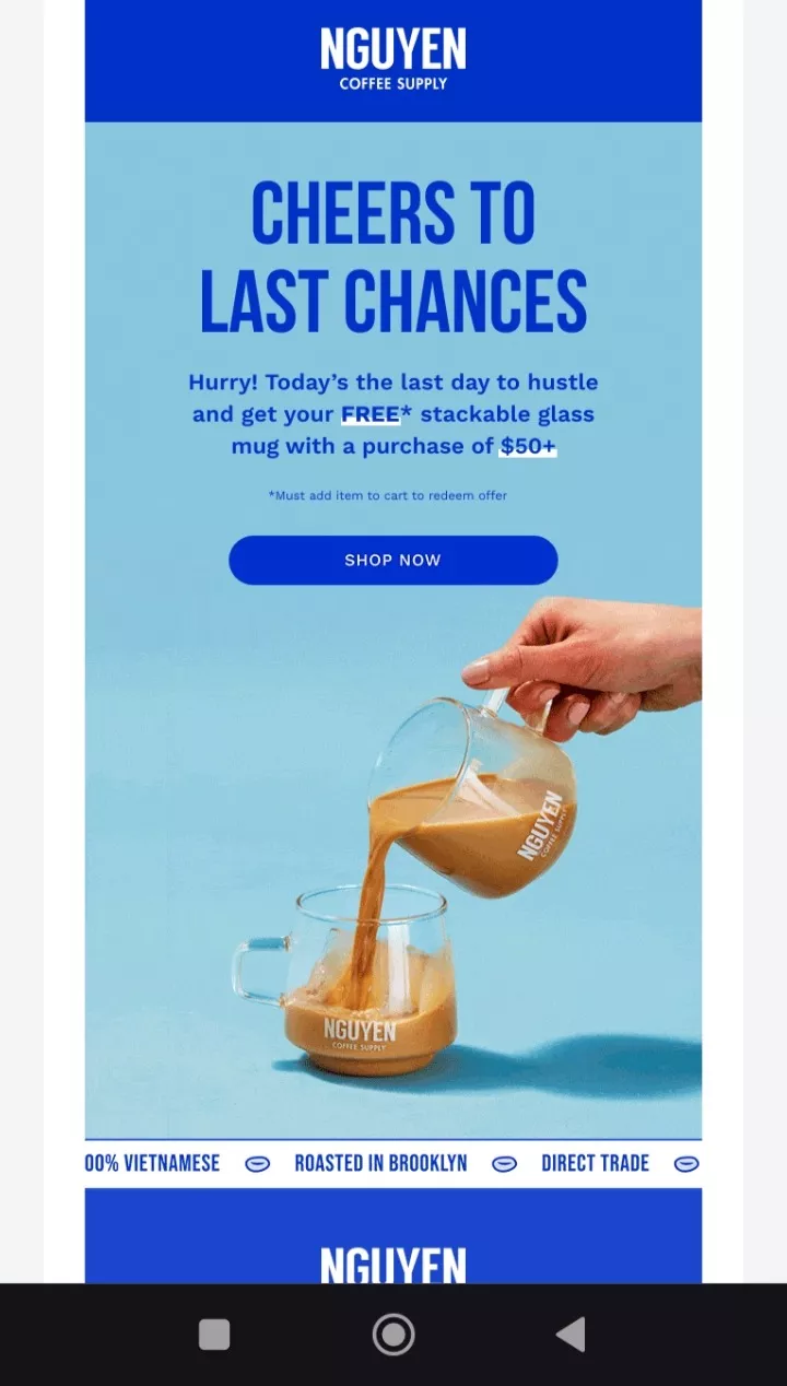
This email from Nguyen Coffee Supply is an excellent example of a mobile-first design:
Mobile-first isn’t just a nice-to-have — it’s the difference between an email that gets read and one that gets deleted. This short video shows the fastest mobile checks to run before you send, so your layout, text, and CTAs stay friction-free on smaller screens:
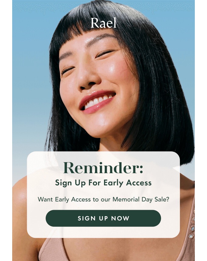
3. Use one clear CTA
I see many brands cluttering their emails with multiple CTA buttons. When you give customers five different choices, they end up choosing none because they feel confused.
To drive clicks and conversions, you should use a single CTA that tells your customers exactly what step to take. Use a large, bright, and visible button with clear copy, such as “Get Early Access” or “Shop the Drop.”
This email from Rael does precisely that. I love how it gives readers one clear path to follow with a single, prominent “Sign up Now” CTA:
4. Build every email around one primary goal
Before designing anything, I ask myself: “What do I want my readers to do after reading this email?” The answer becomes the goal of my design.
When your email has a single clear goal, your design becomes more focused and more likely to convert.
Here are some email design tips to build goal-driven campaigns:
- Write compelling copy that aligns with your objective
- Support your goal with clear visuals
- Remove anything that distracts from the main message
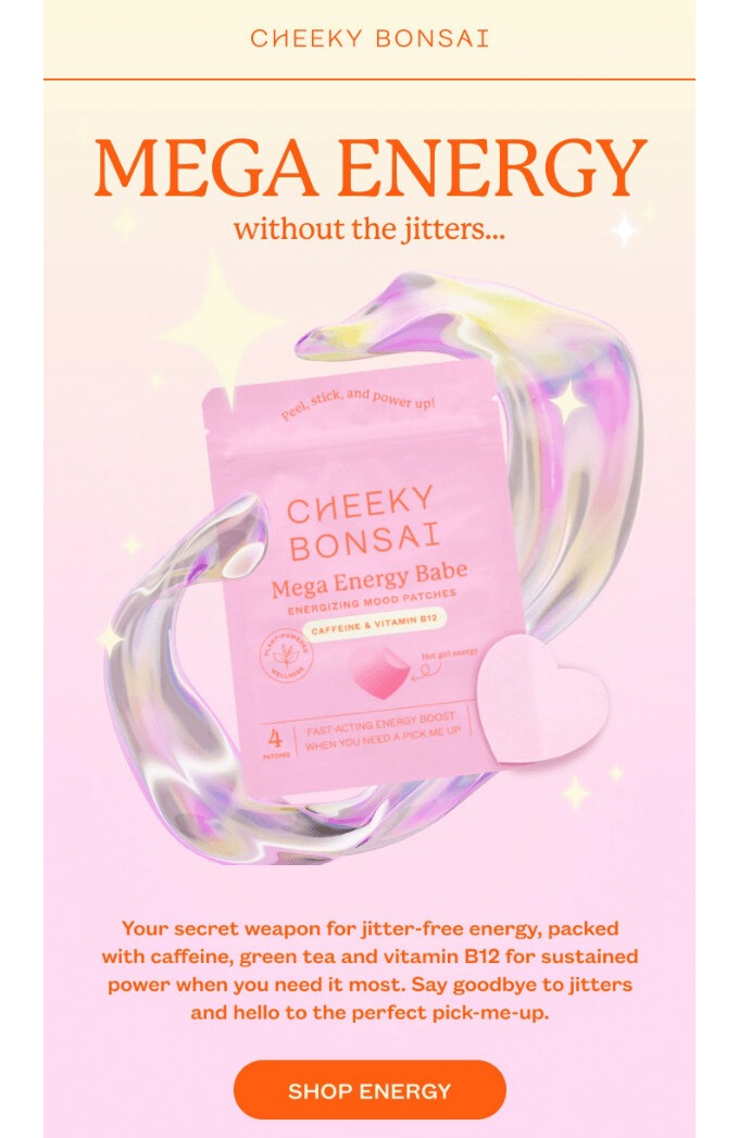
5. Keep your email header simple
Your email header sets the tone for the entire design. If it’s oversized or cluttered, it might distract your customers from the main message.
In my experience, simple headers work best, and this approach is consistent with all email design best practices I’ve encountered. You want your header to grab attention and set expectations without overwhelming the reader.
A great example is this header from Cheeky Bonsai. It only includes the brand’s logo and a simple heading:
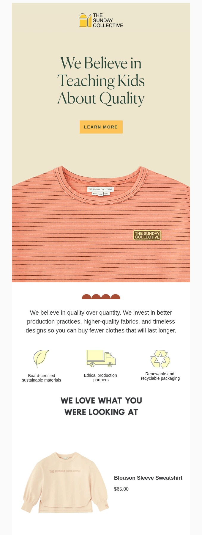
6. Use white space to guide attention
When you overcrowd your email design, it becomes difficult for readers to scan your email or understand your message.
One of the email design best practices I follow to avoid this is using white space strategically. White space draws your customer’s attention to the main message, making it easier to read, especially on small screens.
The Sunday Collective uses white space effectively in its email. It guides the reader’s eye and achieves a clean, polished layout:
7. Create a clear visual hierarchy
When a customer opens your email, they should know where to look first without having to search. That’s why building a clear visual hierarchy is one of the most effective email design best practices you should follow.
A clear hierarchy guides the reader’s eye through the email and helps them understand your message. The key is to use size, color, and placement to distinguish headlines, body text, and buttons.
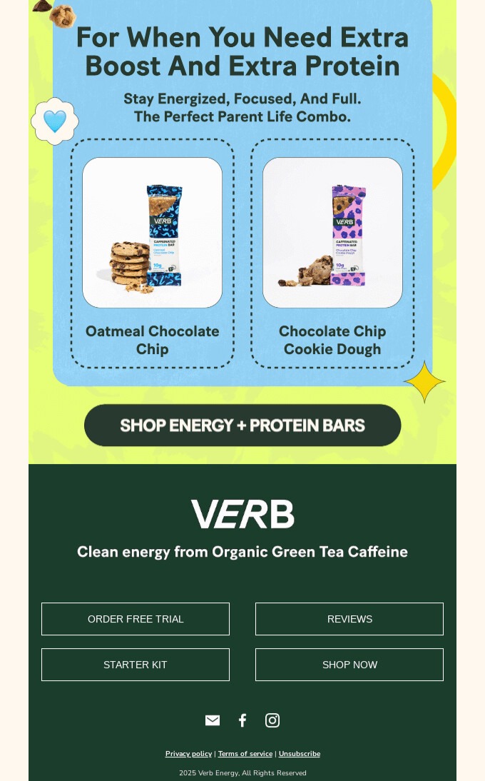
I love how this email from Verb uses bold typography, contrasting colors, and a logical flow to guide its readers:

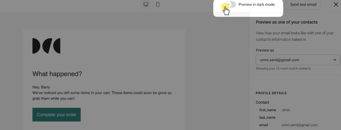
8. Optimize for Dark Mode
Dark Mode flips white backgrounds to black to reduce eye strain. If you don’t design for it, your visuals and text may become difficult to see or read on a dark background.
Optimizing for Dark Mode is one of the most crucial email design best practices you should remember. This involves using transparent logos and images, checking text for contrast, and avoiding purely black backgrounds.
You can use Omnisend’s email builder to preview and optimize your emails for Dark Mode before sending:
9. Always keep accessibility in mind
Accessibility is one of the email design best practices I never skip because it helps drive conversions and engagement. Everyone, including people with visual or motor challenges, should be able to read your email easily.
Here are some of the best email design practices for improving accessibility:
- Use clear, readable email fonts
- Leverage intense, contrasting colors
- Write short sentences and paragraphs
- Add alt text to images
- Use clear, descriptive links and buttons
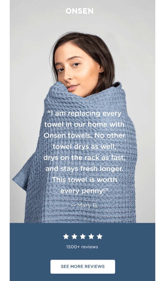
10. Incorporate user-generated content
Nothing builds confidence quicker than authentic reviews, photos, and quotes from real customers who’ve tried your product. This is one of those email design best practices that helps reduce buyer hesitation, enhance trust, and maximize conversions with proof.
For the best results, position user-generated content strategically so it stands out. Tie it to what the reader should do next, such as claiming an offer or learning more.
I like this email example from Onsen because it doesn’t oversell. It lets authentic customer voices do the talking. It also includes a clear CTA:
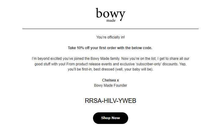
11. Personalize where possible
One of the best email design practices that consistently improves performance is email personalization. When you speak directly to your customers’ needs, they feel valued and pay attention.
Even small personal touches, such as using customers’ names in subject lines or email copy, can leave a good impression. To go further, you can tailor content to your subscribers’ behavior, such as past purchases or browsing history.
Bowy Made uses Omnisend to run regular A/B tests on subject lines, discounts, and timing. The results prove that personalization is effective. As Dallas from Bowy Made shared, a subject line like “Jessica, you left something behind” converted 5-10% better than a generic one.
Here’s an example of a personalized welcome email I got from Bowy, sent immediately after signing up:
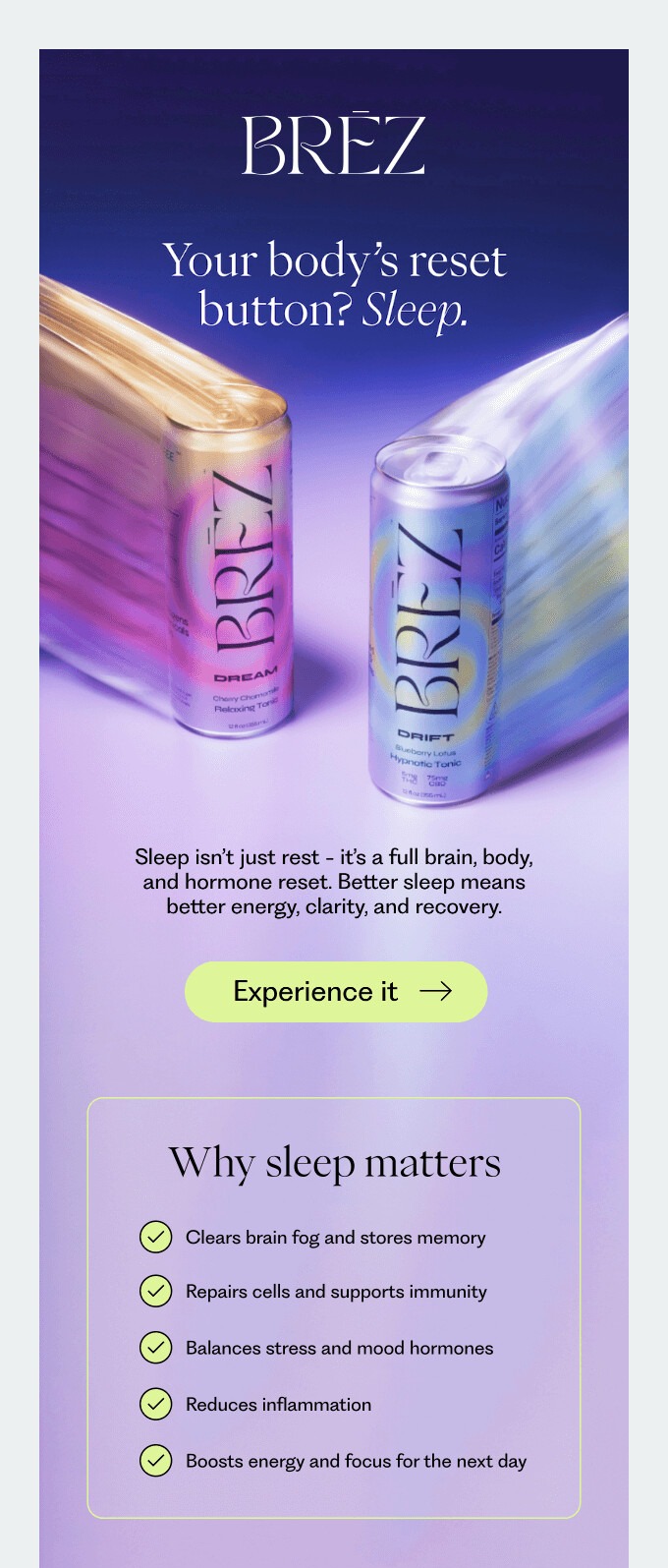
12. Design for skimming
Most customers won’t read your emails word for word. That’s why creating a skimmable email is among the crucial email design best practices I never skip.
It helps readers scan for keywords, bold headlines, images, and buttons to understand your message quickly. This results in more clicks, conversions, and email marketing ROI.
I love how this email from Brez uses clear headlines, high-quality visuals, and bullet points to improve scannability:
13. Use web-safe fonts
You may be tempted to use stylish custom fonts, but if your customer’s email app doesn’t support them, your design will break. If your emails are difficult to read, customers will ignore them, resulting in lower engagement and conversions.
That’s why I stick to email-safe fonts that load fast, display correctly across devices and email apps, and improve readability. Examples of email-safe fonts include:
- Arial
- Helvetica
- Georgia
- Verdana
- Times New Roman
- Trebuchet MS
- Courier New
- Tahoma
14. Add movement with GIFs
A bit of motion can grab attention quicker than a static image. This is why I include GIFs in my email design best practices.
When used right, GIFs guide the eye, highlight key elements, and add personality to your design without overwhelming the reader.
Here’s how to add GIFs to your emails correctly:
- Keep them short and smooth
- Ensure they support your key message
- Use small file sizes to ensure fast loading
I love how this Great Jones email uses a simple GIF to highlight the product without distracting customers from the message:
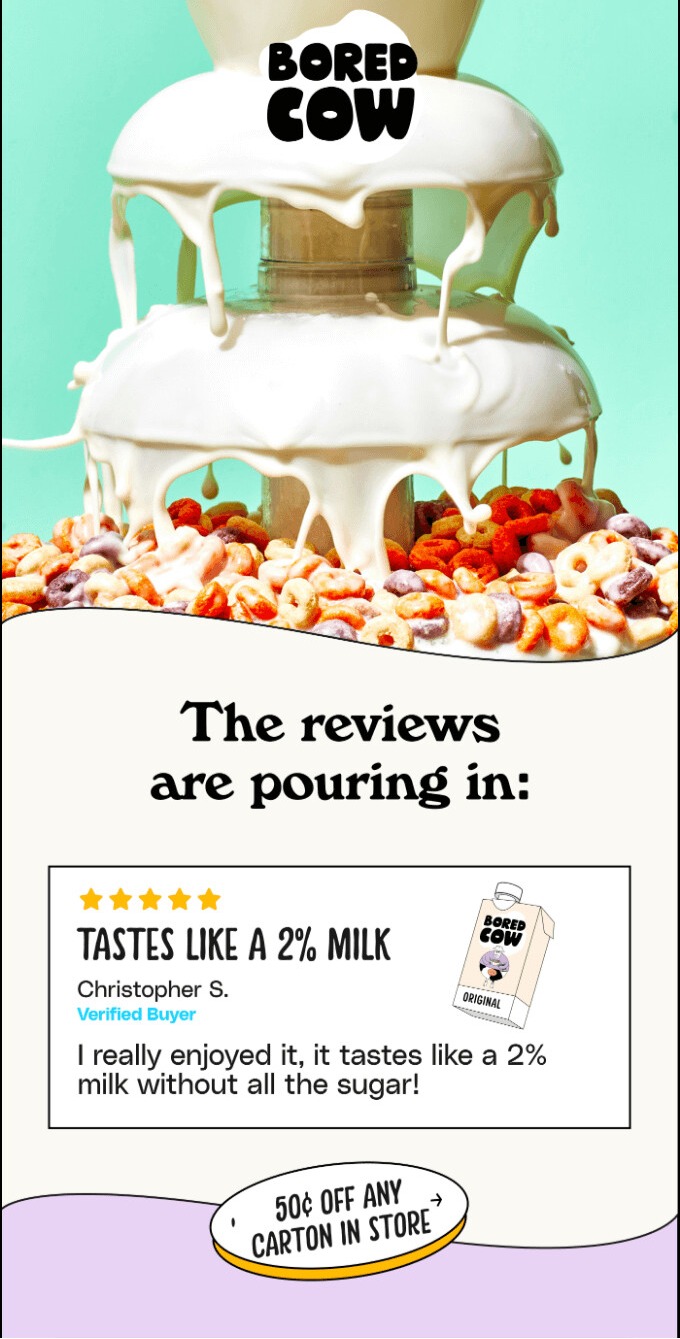
15. Be bold with your visuals
In my experience, subtle design doesn’t always grab attention in crowded inboxes. To stop customers from scrolling, you need bold visuals that stand out instantly.
This helps you create an experience that goes beyond words. You can use bold visuals for product launches or special announcements to evoke a specific emotion.
See how Bored Cow uses a vibrant, enticing image to communicate its product’s taste even before you read a single word:
16. Don’t forget your footer
Adding an email footer is a vital part of email design best practices because it enhances trust and guides your readers’ next steps. I think of it as the final place to catch a reader’s interest before they close my email.
When adding a footer, here are some best practices for email design to follow:
- Add clear navigation links and social media icons
- Include brand details and contact options
- Always add an unsubscribe link and your privacy policy
This email footer from Verb includes the essential information above. However, what I love most is the clear buttons that urge the reader to explore the brand more:
17. A/B test for best results
I’ve learned that even the most beautiful designs can fail if you’re writing emails based solely on guesswork. A/B testing is one of the most powerful email marketing best practices to reveal your readers’ preferences.
You just sent out two versions of an email design to a small group. Then, see which one gets more opens, clicks, and conversions. Some design elements you can test include:
- Subject lines
- CTAs
- Layouts
- Images
A great example of successful A/B testing is from CA Design. The brand constantly tests and refines messaging styles to increase open and click-through rates.
“We constantly tweak our messaging based on open rates, click-through rates, and unsubscribe rates. If something works, we double down on it,” Harry explains.
Through testing, the team discovered that text links drove over five percent clicks, compared to 1.5% from button-heavy emails.
Why the best email design feels effortless
The best email design should be easy to read and understand. This puts the reader in a better position to make decisions. Everything from your message and visuals to your CTA guides the customer’s attention and helps them take action easily.
By following the proven email design best practices above, you make it easy for readers to see your brand’s value. Moreover, the key to better engagement, clicks, and conversions is to test and refine your designs consistently.
Start by applying as many best practices as possible and watch your results improve!
Design professional, high-performing ecommerce emails with Omnisend’s pre-built templates
Quick sign up | No credit card required
And just a small addendum for your convenience, when creating your unique emails, don’t forget to save custom email design templates as well. You never know, when you come to need them.
If you want a deeper, step-by-step watch all the way through, this webinar pulls the key principles together — layout, hierarchy, CTAs, and testing — and shows how to apply them in real ecommerce email design workflows. It’s a great companion if you’re building a repeatable design process for campaigns and automations.
Email design best practices FAQ
How do I design my emails for dark mode?
To optimize for dark mode, follow these best practices for email marketing design:
— Use transparent images and logos
— Avoid pure black backgrounds
— Leverage high-contrast colors
— Preview your emails with Omnisend before sending
What is the ideal text-to-image ratio for ecommerce emails?
The common standard for ecommerce emails is a 60:40 text-to-image ratio. Maintaining this balance prevents your emails from being flagged as spam, as image-only emails can trigger spam filters.
How many CTA buttons should I include in my emails?
Using a single prominent, high-contrast CTA in every email is ideal. It prevents confusion and guides the reader toward a single action.
What are the best font sizes for email readability?
To ensure your email is readable across devices, keep the body text at 14px to 16px. Headlines should be larger, typically between 20px and 24px, to create a clear visual hierarchy.
TABLE OF CONTENTS
TABLE OF CONTENTS

Subscribe and don’t miss any updates!
No fluff, no spam, no corporate filler. Just a friendly letter, twice a month.