
 OFFER
OFFER


Ecommerce marketing guide: Tips, strategies & plan
With over 130+ pre-built integrations and flexible APIs, you can easily centralize data from across your tech stack
Make the most out of your data and unlock powerful growth marketing possibilities with these other top marketing tools.
Build any custom integration with our open, flexible APIs that are simple to use and implement.
Check out apps that have been stealing all the spotlight.
Email and SMS marketing insights, ecommerce resources, and the latest Omnisend news
Expert-led sessions covering email, SMS, and ecommerce marketing strategies.
Educational video and live training to help you make the most out of Omnisend.
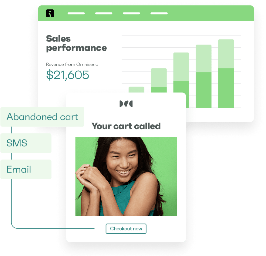
Drive sales on autopilot with ecommerce-focused features
See FeaturesIf you could sum up the term “ecommerce customer journey,” how would you answer it?
Maybe it’s a series of steps customers take to purchase online. Or, maybe, it’s the process that businesses use to create an effective customer experience.
The truth is, it’s both of these things—and more. The e-commerce customer journey consists of all the touchpoints in your relationship with customers: from when they first become aware of your business to when they make a purchase and beyond.
Either way, it’s definitely worth dipping your toes into. In this article, we’ll cover all the ins and outs of the e-commerce customer journey. We’ll look at creating an effective process where customers can easily find what they’re looking for and complete their purchase.
Let’s dive in.
Get started:
The ecommerce customer journey is a series of steps a potential customer takes before eventually purchasing. It starts with becoming aware of the product or service, considering whether it meets their needs, and then buying it.
This journey can be broken down into five stages: Awareness, Consideration, Acquisition (Purchase), Retention, and Advocacy. Each of these steps is necessary to create an effective ecommerce customer journey, as they help you understand the needs and wants of your potential customers.
Increase customer engagement and sales by implementing an omnichannel marketing strategy at each step of your customer journey.
Get my copy
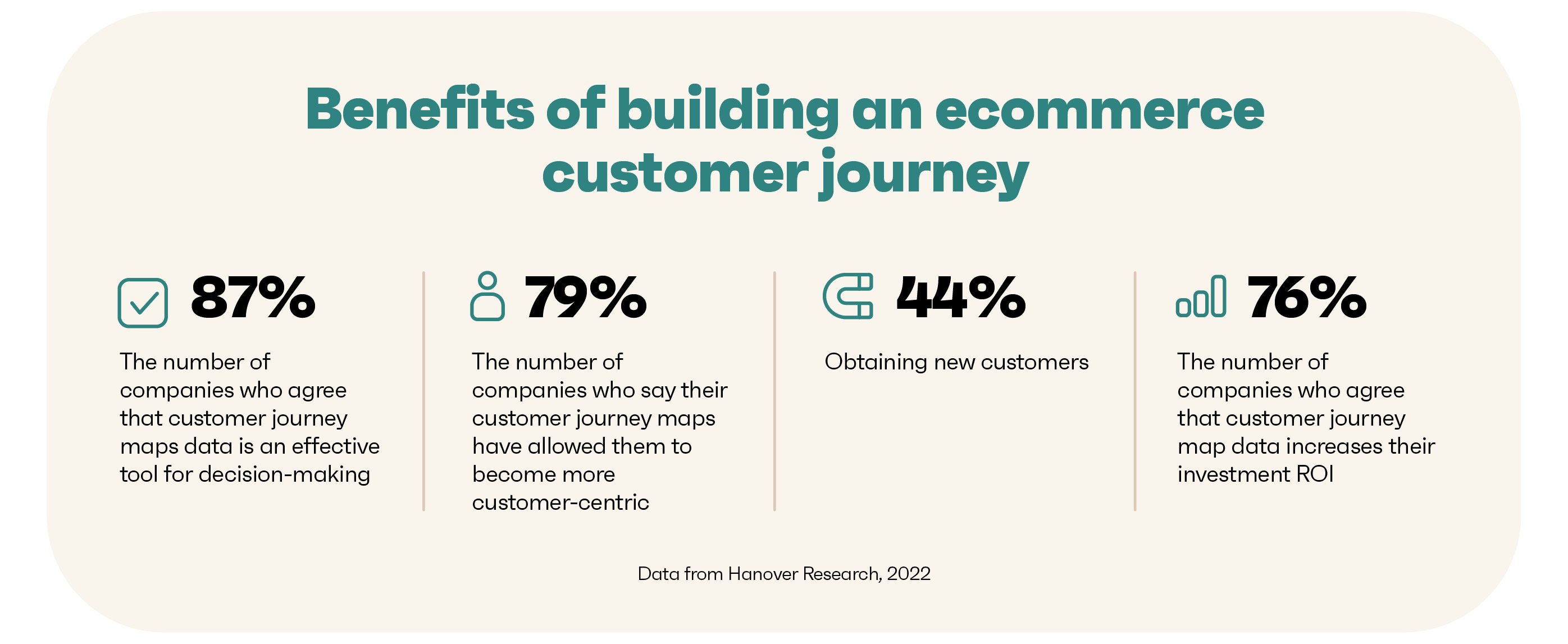
The experience a customer has with your website can shape their opinion of your business, regardless of whether they purchase or not. By visualizing each stage of their journey, you can understand their needs, motivations, and frustrations at different touchpoints. This allows you to identify where you can improve to make the customer experience more enjoyable.
Here’s a snapshot of how building an ecommerce customer journey can help your brand:
By mapping out each stage of your customer’s buying process, you can create a personalized customer experience that makes them want to come back. Plus, it helps you identify areas where you can improve the customer journey to increase sales and loyalty.
Each stage is important and valuable in providing a compelling ecommerce customer journey. Focusing on one stage and ignoring the rest can affect the customer experience, leading to lower sales. To ensure your online store’s successful customer journey, it’s essential to consider every step.
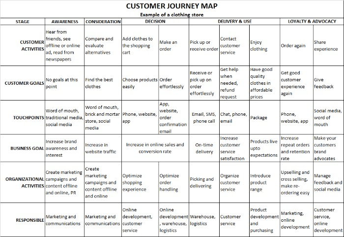
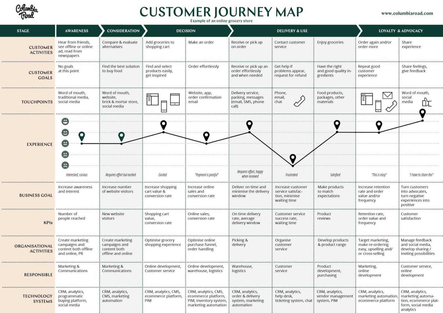
Let’s look at the customer journey map below to understand each stage of the ecommerce customer journey.
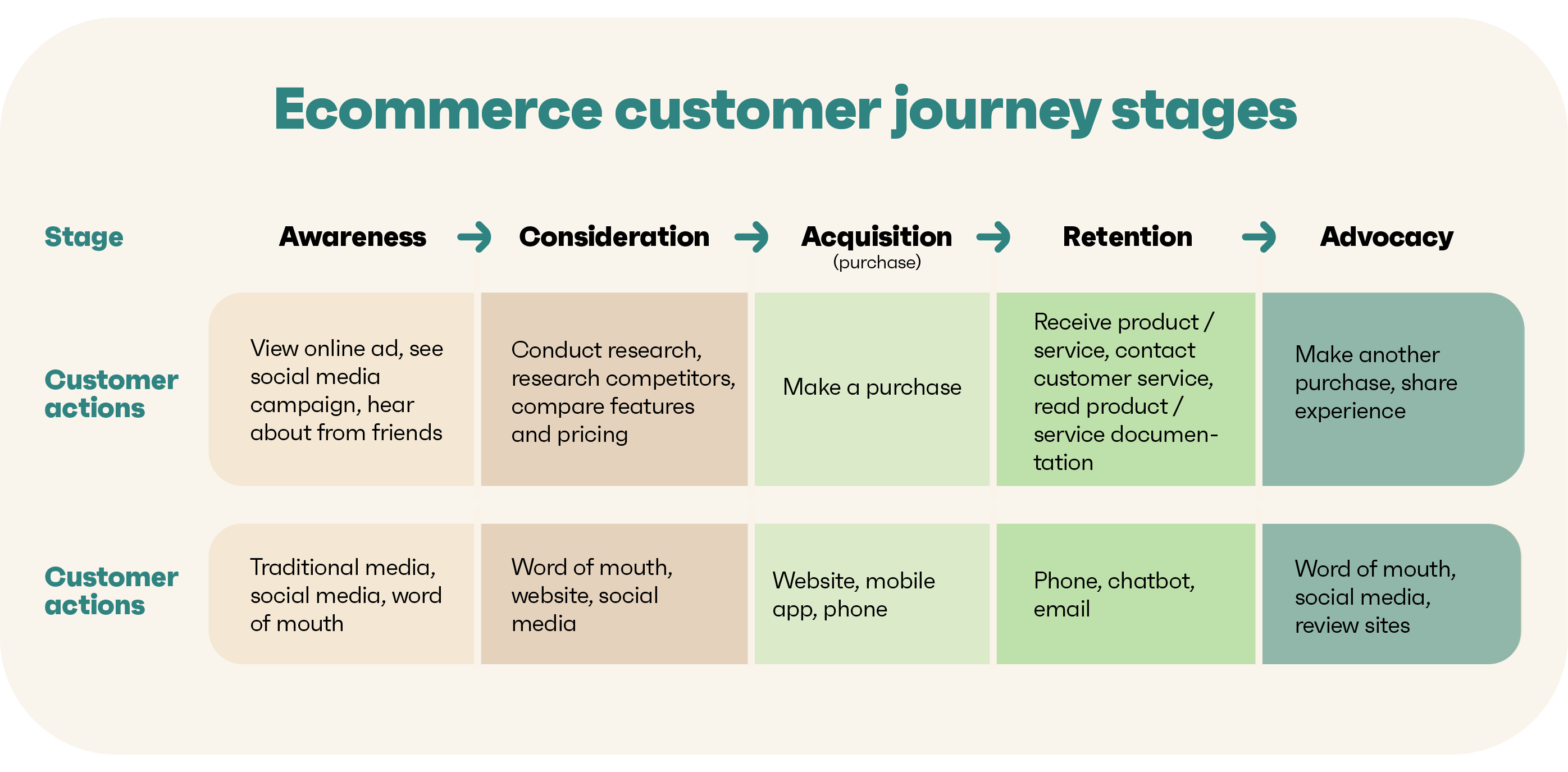
Awareness is when potential customers find your website and generate traffic. This can be through different channels, such as social media, traditional media, or referrals from friends and family.
At this stage, ecommerce store owners can discover how customers discover their websites, what products or services they’re interested in, and how they find out about them. This helps you to understand their needs and preferences better so that you can optimize the customer experience.
What success looks like at the awareness stage:
The consideration stage is when potential customers learn more about your business and evaluate whether it meets their needs and wants. At this stage, they research products, prices, delivery times, and more to compare competitors’ offers and make an informed decision.
Ecommerce store owners can use this stage to showcase their unique selling points and show customers why they should choose them. They can also display customer reviews, ratings, and product photos to help customers decide.
What success looks like at the consideration stage:
At the acquisition stage, customers have decided and are ready to purchase a product or service from your online store. This is the culmination of the customer journey, and they’ll likely come back to make more purchases if they have a positive experience.
Ecommerce businesses should provide easy payment and delivery options to ensure the purchase is successful. They should also ensure that their website is secure and safe to use, as customers are more likely to purchase if they feel their personal and financial details are secure.
What success looks like at the acquisition stage:
Retention is all about keeping customers engaged and coming back for more. It involves staying in touch with customers after they’ve completed a purchase through personalized emails, loyalty programs, and special offers.
At this stage, ecommerce store owners should focus on providing good customer service, responding to customer queries and feedback, and introducing loyalty programs or rewards. They can also set up customer surveys to get feedback on their products, services, and overall customer experience.
What success looks like at the retention stage:
The advocacy stage is when customers become brand advocates and actively recommend your products or services to others. This is the most powerful form of marketing, as it’s based on word-of-mouth and referral traffic.
At this stage, store owners should incentivize customers to leave reviews and share their experiences with others. This could include offering rewards such as discounts or free products for customers who write reviews or share their purchases on social media. They can also create content that customers can share to spread the word about their e-commerce store.
What success looks like at the advocacy stage:
Helpful resources from our blog:
To map out your customer journey, having an in-depth understanding of who your customers are and what they want is essential. To define your ideal customer, ask yourself questions such as:
Don’t create a generic customer persona. Take the extra time for e-commerce customer journey mapping to build a highly detailed customer profile.
For example, an ecommerce store selling cosmetics might have the following ideal customer:
Jessica is a 30-year-old female professional in New York City and is passionate about fashion and beauty. She values quality and always looks for new trends, but doesn’t want to spend too much. She tends to do her research and looks for reviews from other customers before making a purchase.
If you’re finding it hard to define your ideal customer, here are some tips:
Use surveys and interviews to collect feedback from customers
The next step is to identify why your customers come to you in the first place. What are they looking for in your online store? What is the frequency of their visits? Do they come back to make repeat purchases? What are their expectations and desired outcomes from their interactions with you?
To answer these questions, you need to collect data on the actions and behaviors of your customers.
Ways to collect info:
A touchpoint is an interaction between a customer and your business. Identifying these touchpoints is vital for understanding how customers interact with your online store at different stages.
Examples of touchpoints include:
Quick sign up | No credit card required
To manage customer touchpoints effectively, online store owners need to decide which channels to use, how to personalize each touchpoint, and how to measure the effectiveness of each. Business owners can choose the touchpoints that will best help them reach their target customers based on their resources and goals.
To optimize touchpoints for maximum engagement, online store owners should measure customer response to each touchpoint. This means tracking how customers interact with each touchpoint and measuring the success of campaigns and promotions.
For example, if you’re running an email campaign, track how many people open the emails and click through to purchase.
The listing stage helps you improve micro-engagements and create a seamless, personalized customer experience.
As ecommerce customer journey mapping is a continuous process, it’s crucial to consider customers’ steps to explore, engage, and convert. You can streamline each stage by identifying customers’ key tasks and reducing the clicks needed to complete those tasks. For example, if customers struggle to find specific products on your website, you could create product filters to make it easier to find what they’re looking for.
Here are some tips on how to make the most of each journey stage:
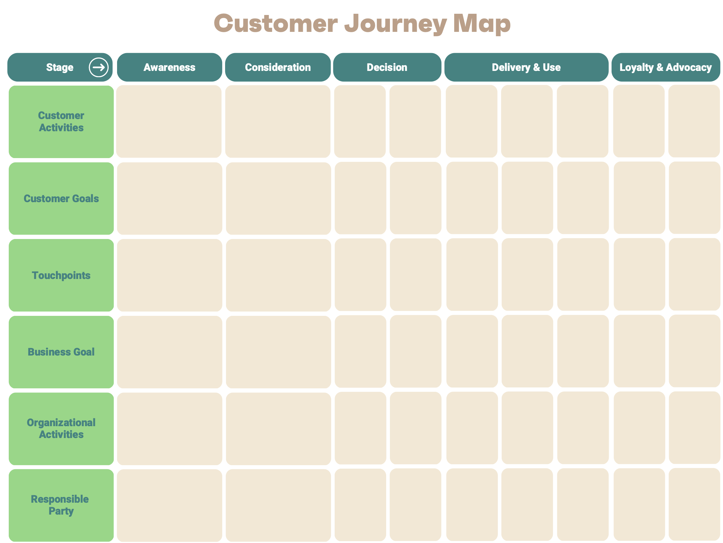
Once you’ve identified the customer journey and all the touchpoints, it’s time to create a journey map. A journey map helps you visualize the customer journey and better understand how customers interact with your online store.
Here’s an example map for a clothing store:
Ecommerce customer journey mapping is a continuous process. Make sure to evaluate your journey map regularly. As customers’ needs and habits constantly change, keeping up with the latest trends and updating the map when needed is important.
☝️ Expert tip: Treat your journeymap as a living document. Refresh, improve, and monitor it regularly to see if there are any changes to be made.
Once you have a clear picture of the customer map, you can start planning resources to help customers complete their journey. Tailor campaigns and messages to each touchpoint so customers have a seamless experience.
You can use the following tips to plan resources:
Contact customer support and inquire about any information that can verify the relevance of the map.
A customer journey map template can tailor your marketing efforts and campaigns to each stage of the customer journey. To help you create a journey map for your online store, use the following template:
As the name suggests, an ecommerce customer journey is the lifecycle of a customer from discovery to loyalty.
Whether your business is at the start of its journey or well established, understanding your customer’s journey is essential to success. Not only does it help customers to confidently navigate through the buying process, but it also assists ecommerce businesses in understanding their consumer’s wants and needs better.
Ecommerce customer journey mapping tools like Omnisend can manage the whole customer journey process. From acquiring users to optimizing touchpoints and creating personalized campaigns, Omnisend helps ecommerce businesses stay ahead of the competition.
Quick sign up | No credit card required
TABLE OF CONTENTS
TABLE OF CONTENTS
What’s next


No fluff, no spam, no corporate filler. Just a friendly letter, twice a month.