 Omnisend AI

 OFFER
OFFER


Newsletter design examples, expert tips, and templates
With over 130+ pre-built integrations and flexible APIs, you can easily centralize data from across your tech stack
Make the most out of your data and unlock powerful growth marketing possibilities with these other top marketing tools.
Build any custom integration with our open, flexible APIs that are simple to use and implement.
Check out apps that have been stealing all the spotlight.
Email and SMS marketing insights, ecommerce resources, and the latest Omnisend news
Expert-led sessions covering email, SMS, and ecommerce marketing strategies.
Educational video and live training to help you make the most out of Omnisend.
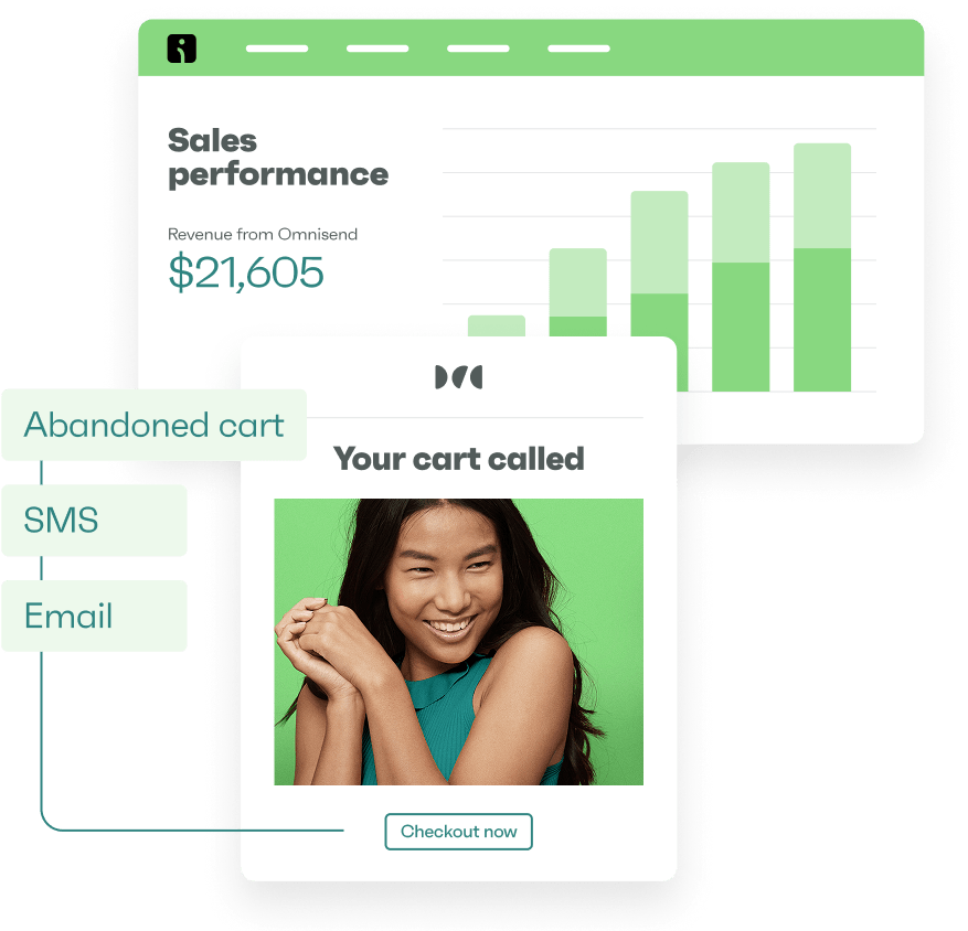
Drive sales on autopilot with ecommerce-focused features
See FeaturesAs mobile devices dominate the digital landscape, creating responsive emails that adapt to various screen sizes has become essential. By crafting emails that look great on any device, you can effectively deliver your message to your audience.
In this post, we’ll explore responsive email design, best practices, and a step-by-step guide on creating responsive emails to optimize and get the most out of your email marketing strategies.
In this post:
Quick sign up | No credit card required
A responsive email automatically adapts the layout and design to fit the screen size of your subscribers’ devices. Responsive designs ensure optimal readability and provide a better user experience across desktop and mobile devices.
With around 60% of email campaigns read on mobile devices, there’s a greater need for responsive designs than ever before. Planning for mobile users has become a vital part of effective email marketing.

Let’s examine some inspiring examples of responsive email designs from various industries.
To’ak Chocolate’s new product email demonstrates how you can adapt a clean, simple design effectively for mobile devices. By using responsive design techniques, To’ak Chocolate saw a conversion rate increase of 394% over their promotional email.
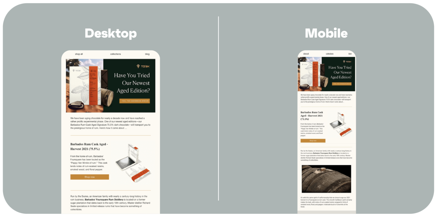
 | Case study Learn how To’ak Chocolate increased email-generated revenue by 460% Get more details |
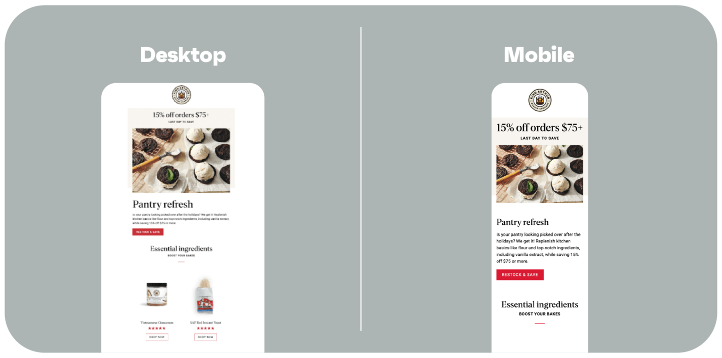
King Arthur Bakery’s promotional email is an excellent example of how you can use mobile stacking to create a user-friendly experience on smaller screens. By rearranging content sections to appear one below the other, the email maintains its readability and visual appeal on mobile devices.
Kerrits’ marketing newsletter demonstrates how a well-structured, responsive design can effectively convey a brand’s message and products across different devices. The use of clear headings, concise text, and visually appealing images makes for an engaging reading experience on both desktop and mobile.
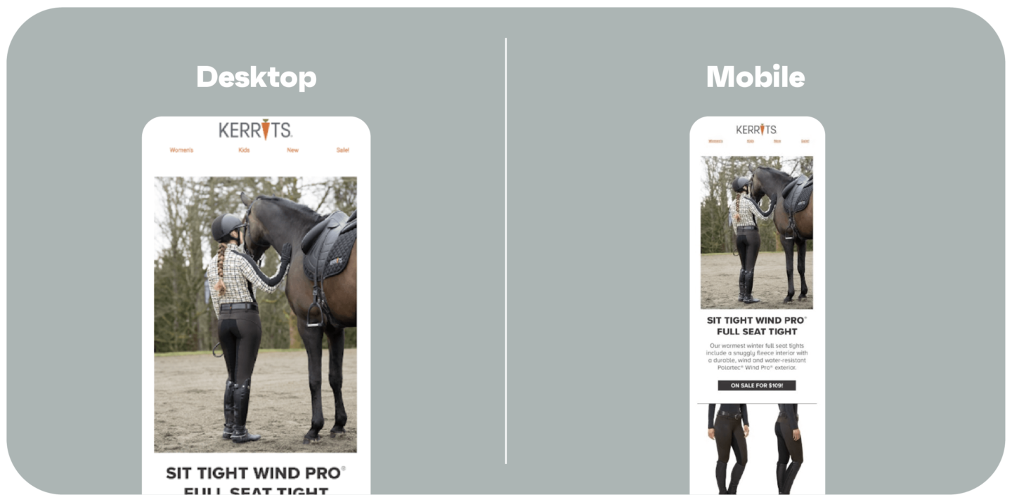
Read how Kerrits increased revenue-per-email by 50%.
Amundsen Sports’ cart recovery email is a prime example of how companies can use responsive design to create effective, high-converting emails. With a conversion rate of 57%, this mobile-responsive email showcases the power of a well-crafted, mobile-friendly design in driving sales.
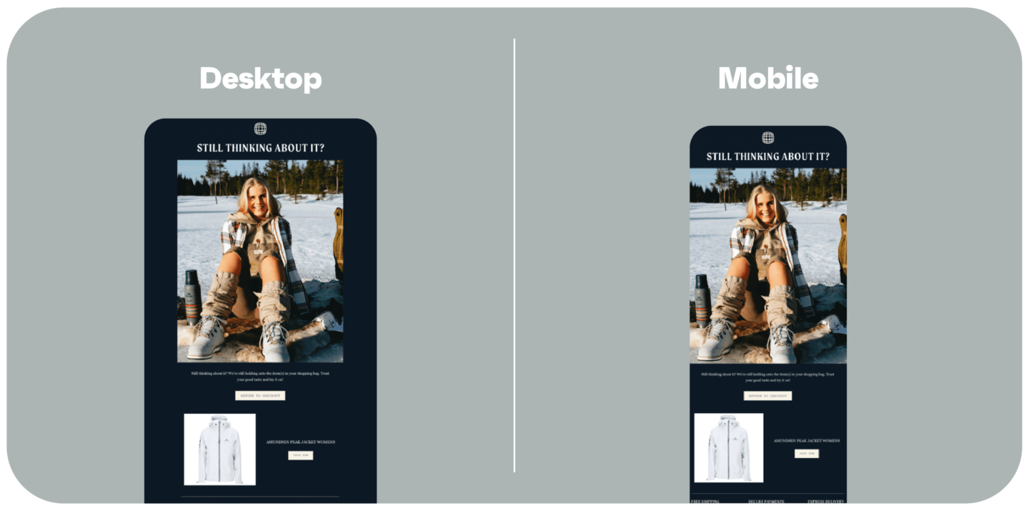
Check out the Amundsen Sports case study.
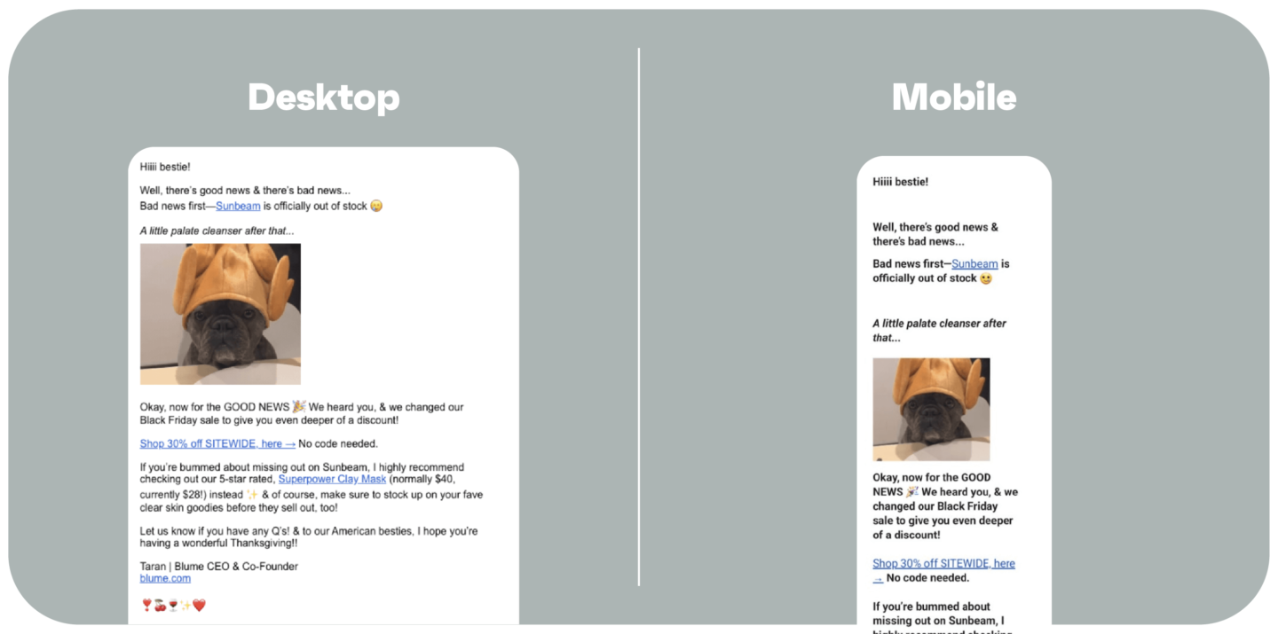
Blume’s limited-time sale email is another great example of a responsive design that effectively adapts to different screen sizes. The use of a single-column layout, a clear call-to-action, and concise text ensures that Blume’s message is conveyed effectively on both desktop and mobile devices.
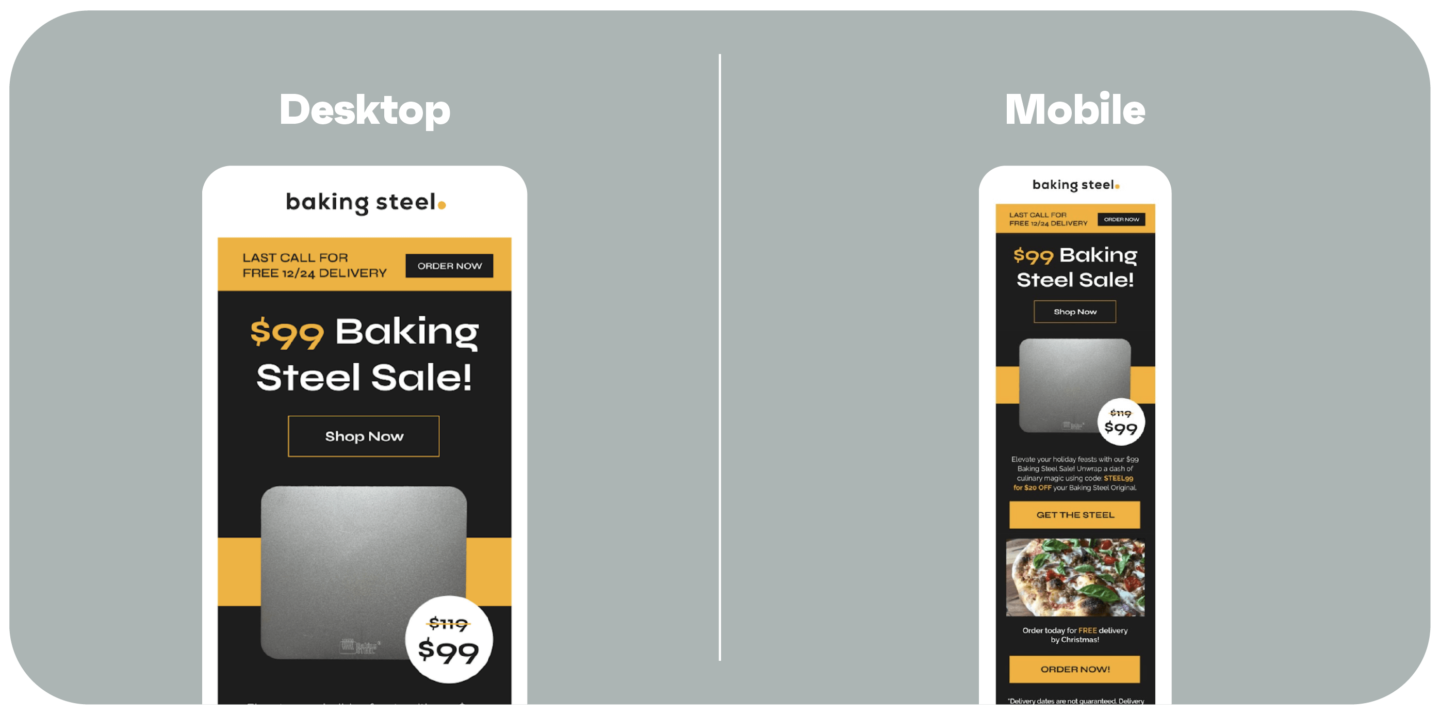
This sale email from Baking Steel shows how a good responsive layout can display products and promotions well on both desktop and mobile. Baking Steel used designs like these in post-purchase email sequences, and saw revenue-per-email up to 217% higher than their promotional campaigns.
Quick sign up | No credit card required
Creating messages that look great on any device is fundamental to boosting engagement. Here are some email responsive design best practices to follow as you develop your campaign.
Ensure text remains legible using relative font sizes that adjust to screen dimensions. This prevents your text from becoming too small or too large on different devices.
Another good rule of thumb is to stick with one or two main fonts for consistency.
Section stacking helps create mobile-friendly emails by rearranging content sections to appear one below the other on smaller screens. This ensures your email’s content remains easily readable and accessible on mobile devices.
Prioritize single-column layouts for better mobile compatibility. This ensures the email content flows smoothly on smaller screens and is easy to read and interact with.
Too much content in the mobile version will shrink into one narrow column, making an otherwise engaging email an endless wall of text. Keep your emails concise and break text into smaller paragraphs for better readability and easy scanning on mobile devices.
Always test your emails on different devices and email clients to ensure consistent responsiveness. Testing will help you identify and fix any issues before sending your message.
Creating a responsive email design without coding is easy with the right tools. Here’s a step-by-step guide to crafting your responsive emails:
For this tutorial, we’ll use Omnisend (rated 4.8 stars on Shopify, and offers 500 free monthly emails), where you can create a free account to get started.
Go to Campaigns > New Campaign > Email. Fill out the window that opens. Once you’re done, click the button to proceed.
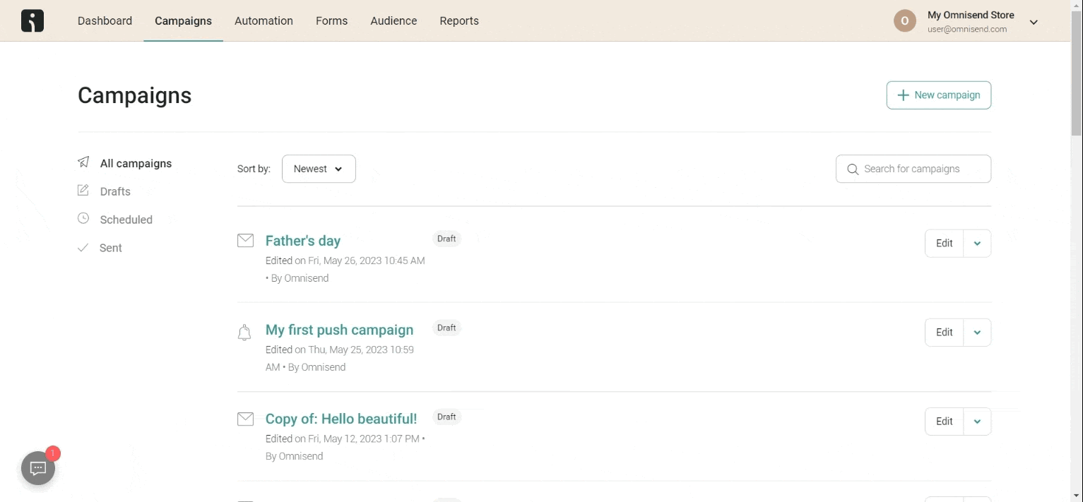
Make sure to use the built-in subject line generator to create compelling subject lines quickly.
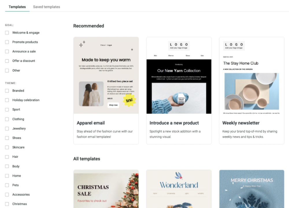
Choose a template that fits the goal of the campaign. All Omnisend templates are responsive by default, so you can be sure your email will look great on any device.
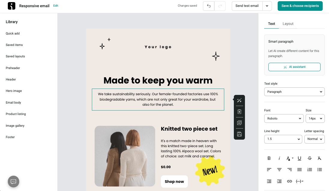
Use the drag-and-drop editor to customize your template. Add your text, images, and branding elements to create a unique email that aligns with your brand.
For more information on working with the Omnisend email builder, check out this helpful resource.
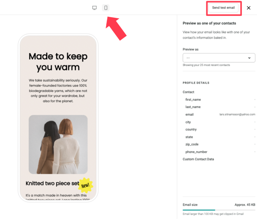
Go to Send test email > Preview.
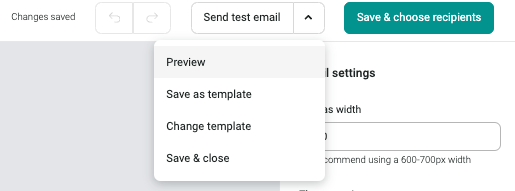
Switch between the desktop and the mobile view to see how the email will render on different devices. Send a test email to make sure that the campaign looks perfect.
Once you’re done, click Save and choose recipients to continue. In the next window, choose Save and close in the bottom right corner.
Congratulations, your responsive email design is done!
Responsive email design is crucial for creating emails that look great and perform well on any device. By following best practices, such as adjusting font sizes, using section stacking, choosing single-column layouts, limiting content, and testing your emails, you can deliver your message to your audience effectively.
Creating responsive emails is easy with the right tools. Omnisend offers a user-friendly drag-and-drop editor, responsive templates, and built-in testing features.
By incorporating responsive email design into your email marketing strategy, you can improve engagement, conversions, and overall customer experience.
Quick sign up | No credit card required
TABLE OF CONTENTS
TABLE OF CONTENTS
What’s next


No fluff, no spam, no corporate filler. Just a friendly letter, twice a month.