
 OFFER
OFFER


Drive sales on autopilot with ecommerce-focused features
See FeaturesKey takeaways
The best ecommerce homepages don’t explain the product — they show who it’s for
Navigation built around customer intent converts better than catalog‑style menus
Email and popup prompts work best when contextual, appearing at moments of genuine interest
High-converting ecommerce websites use product pages to remove specific buying doubts
Guided selling tools, quizzes, and AI assistants help reduce decision fatigue
Subscription offers work best when they feel flexible and clearly valuable
Trust signals work harder when placed at the decision point
Reveal key takeaways
Drawing inspiration from the best ecommerce website examples can help you turn your store into a memorable digital experience.
Good design attracts visitors and makes browsing effortless. It helps visitors understand the product, trust the brand, and buy with less friction.
In this guide, we explore 15 ecommerce website examples that show what great design looks like. You’ll see what works and why.
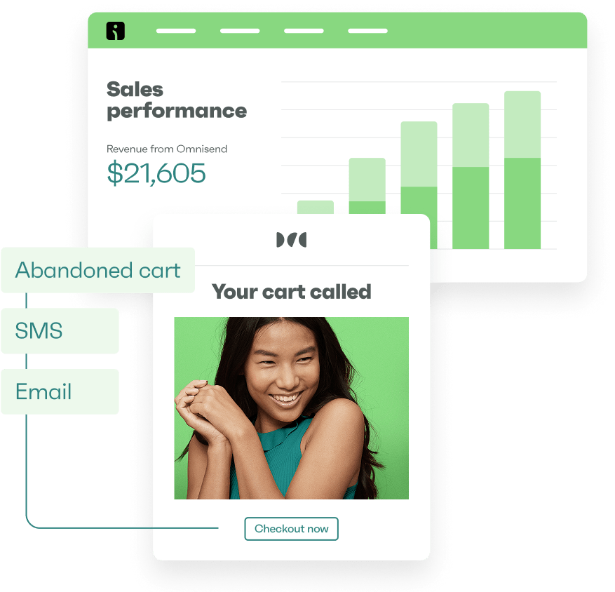
Ready to improve your ecommerce store’s sales with tailored email + SMS marketing automation?
Quick sign up | No credit card required
More examples of ecommerce stores by platform:
Stunning Wix stores examples for your inspiration
The best Shopify stores crushing it (examples)
Stunning WooCommerce store examples
What makes a great ecommerce website?
A great ecommerce website blends clarity, trust, and usability. It makes shopping feel simple. This way, visitors can understand the product, trust the brand, and quickly find what they need. Here are five things our top 15 ecommerce websites get right:
- Instant clarity on the homepage: A high-converting ecommerce homepage should explain what’s being sold and who it’s for within seconds. Strong visuals, headlines, and navigation labels do this better together than paragraphs of explanation.
- Navigation built around customer intent: The best UX ecommerce websites organize products by activity, need, or outcome. That means “Running”, “Gifts under $50”, or “For oily skin” convert better than organizing by internal catalog names.
- Product pages that remove doubt: Every category has one key objection. That could be “Will it fit?” or “Will it work for me?” High-converting product pages reduce hesitation by addressing this question directly. They use reviews, close-ups, guides, or clear sizing details.
- Email capture that feels natural: The best capture prompts don’t interrupt; they appear at a moment of intent. Popups triggered after a second product view or on exit must be relevant. They must also align with what the visitor was already considering.
- Consistent brand experience across devices: The best ecommerce websites keep design, tone, and performance seamless from desktop to mobile. They also make menus, product pages, and checkout flows easy to use on smaller screens.
Ecommerce website examples
Below is our ecommerce website list: 15 stores selected for design quality, clarity, and conversion thinking.
- To’ak Chocolate
- Amundsen Sports
- Daily Spoon
- Recess
- Memo Paris
- Antler
- Taylor Stitch
- Allbirds
- WP Standard
- Patagonia
- Italic
- Rhode
- Huel
- Meow Meow Tweet
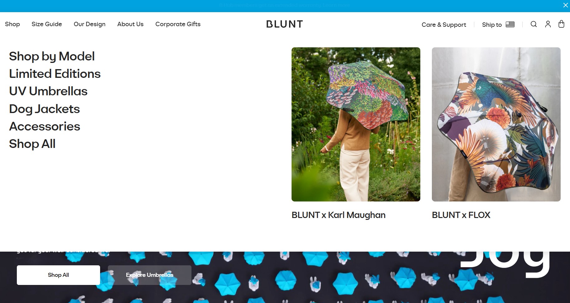
- Blunt Umbrellas
Let’s break down what makes these ecommerce website examples excel.
1. To’ak Chocolate
Made with: Shopify
Homepage
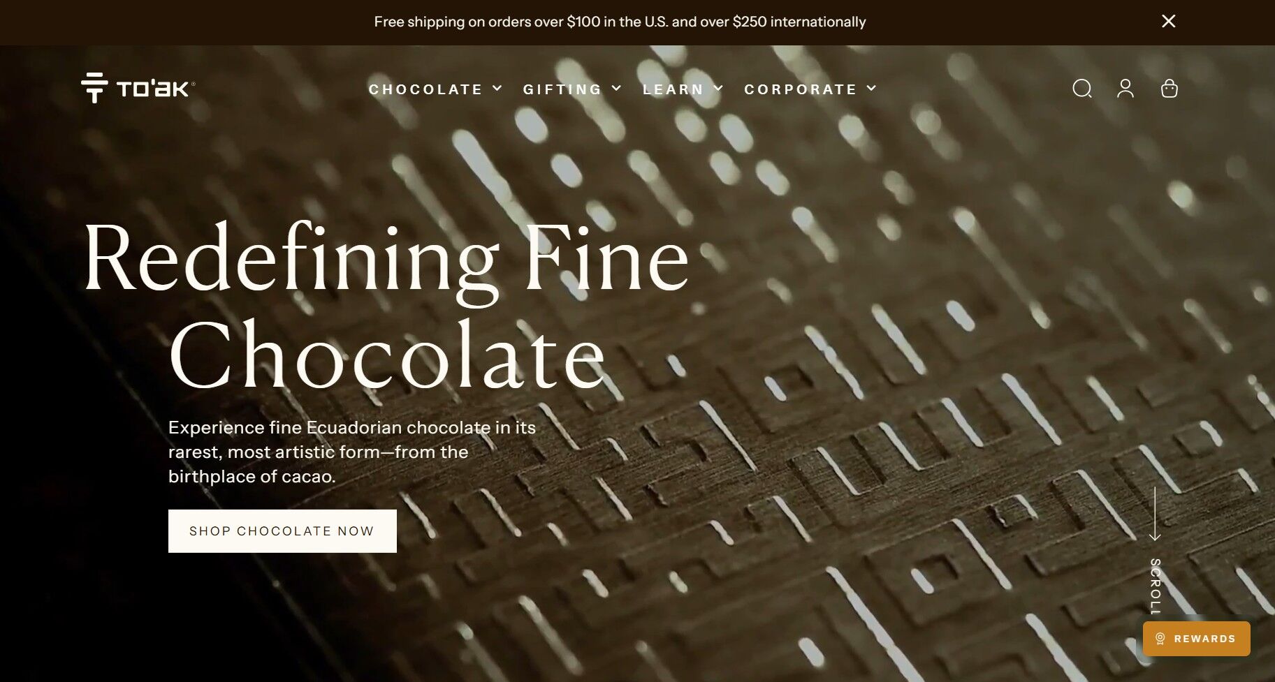
To’ak Chocolate positions the brand as a luxury collectible, not an everyday snack. The site opens to a cinematic full-screen hero background video. The looping video highlights the cacao harvesting and grinding process, from raw to refined product. It’s paired with a minimalist headline: “Redefining Fine Chocolate.”
- The visual hierarchy draws the eye from motion to message, then to the Shop Chocolate Now CTA below
- The hero section emphasizes rarity and craftsmanship instead of promotions, with a subtle invitation to become a VIP
- Trust signals appear subtly, with press mentions and brand promises further down the page, validating the premium positioning
Navigation
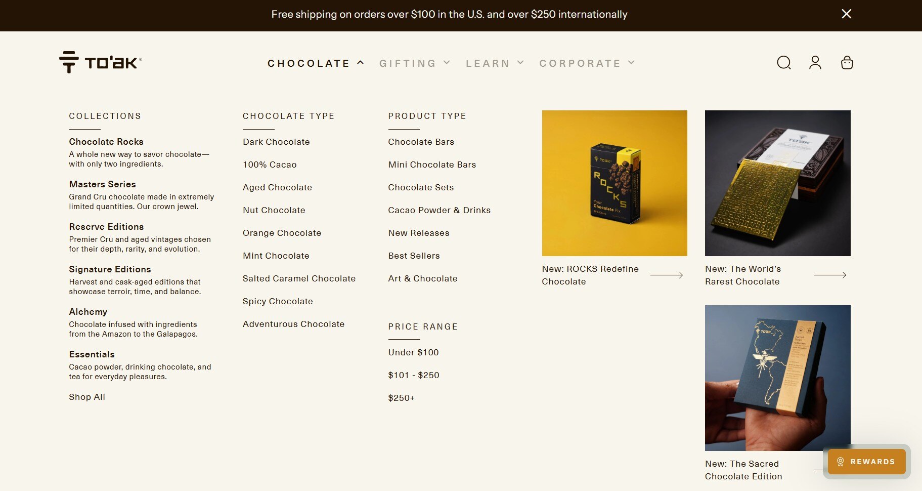
The navigation is concise, with four main categories: Chocolate, Gifting, Learn, and Corporate.
The Chocolate category is further grouped by Chocolate Type, Product Type, and Price Range. Collections include Masters Series and Reserve Editions.
For customers thinking about gifting by recipient, occasion, or in corporate settings, the Gifting category is elegant and frictionless.
Product pages
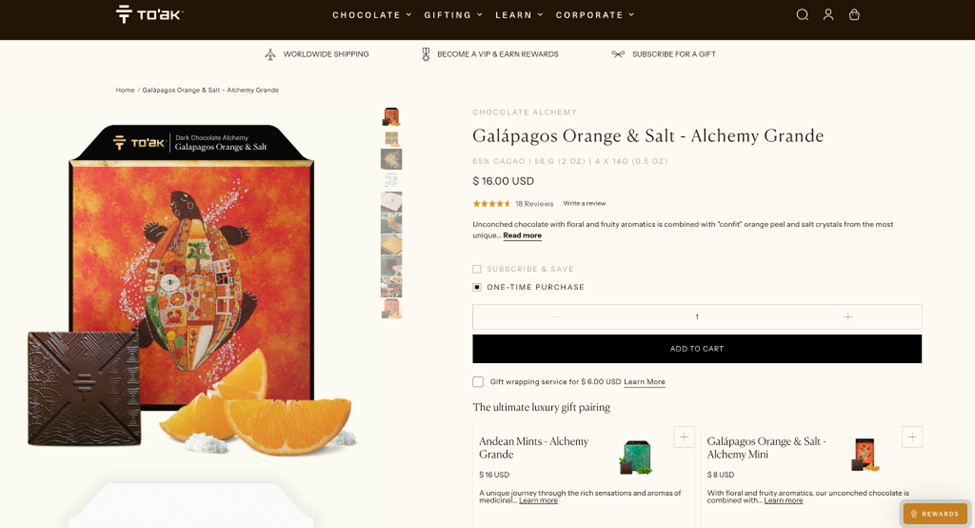
Product pages rely heavily on presentation and storytelling. Several UX details stand out:
- Descriptions focus on tasting notes and origin details
- Bundles and tasting sets encourage higher-value purchases
- Large close-up images highlight packaging and craftsmanship
- Subscribe & Save, One-Time Purchase, and gift wrapping options available
To’ak Chocolate combines luxury storytelling with thoughtful ecommerce UX to support its premium positioning and increase customer engagement.
Read the case study
2. Amundsen Sports
Made with: WooCommerce
Homepage
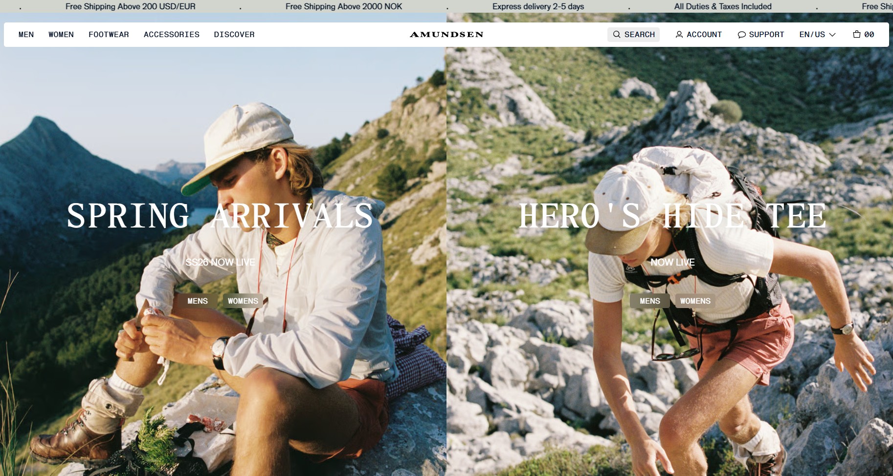
Amundsen Sports uses adventure photography to instantly establish its brand identity. The hero section shows real explorers wearing the gear outdoors. This instantly answers the question of who it’s for. A few homepage patterns stand out:
- Seasonal collections like Spring Arrivals receive strong placement near the top
- Product cards below the fold use both lifestyle photography and studio shots to reinforce authenticity
- Capsule drops featured in the hero section each have CTA buttons linking to the men’s and women’s product pages
Navigation
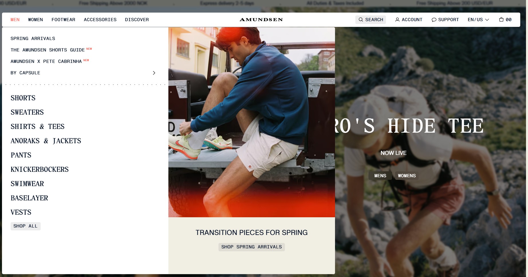
The main navigation is organized around five items: Men, Women, Footwear, Accessories, and Discover. The first four are further grouped by type, such as shorts, sweaters, pants, and belts.
Discover houses the Amundsen Journal, help center, and product guides. This editorial content keeps visitors on-site. It also pre-sells higher-priced items through education, rather than urgency.
Product pages
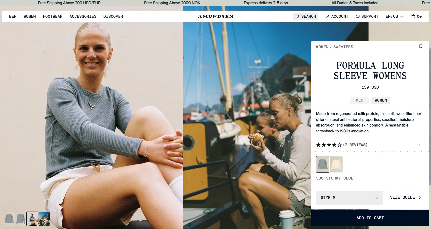
The product pages effectively combine technical detail with lifestyle merchandising. Key conversion elements include:
- Product galleries mix close-up fabric shots with outdoor photography
- Copy highlights product materials, craftsmanship, features, and performance benefits
- Color and size selection, along with the size and fit guide, are visible near the Add to Cart CTA
- Subtle cross-sells below the fold (You Might Also Like) encourage multi-item purchases without distraction
Amundsen offers a sharp on-site experience and tight email automation. It drives nearly one in three clicks on order confirmation emails to a second purchase.
Read the case study
3. Daily Spoon
Made with: WooCommerce
Homepage
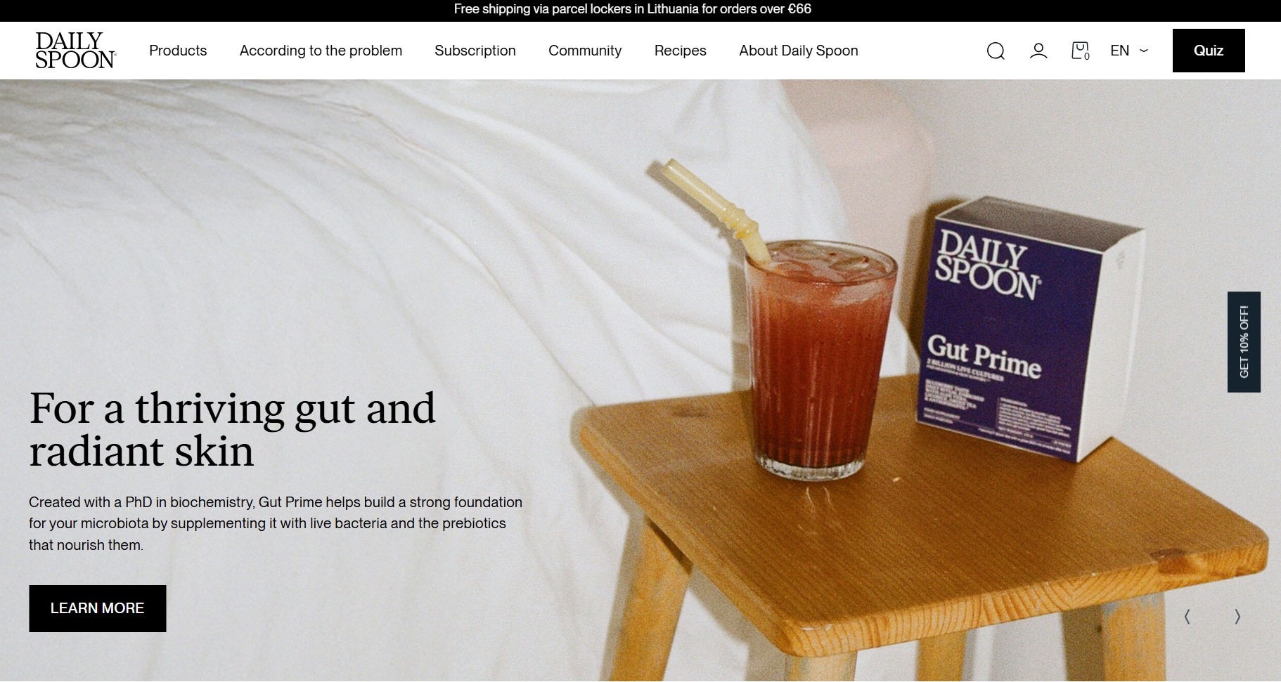
Daily Spoon’s homepage leads with outcome, not ingredient. The hero slides name the problem being solved before naming any product. For example, “For a thriving gut and radiant skin” and “When ‘just don’t worry’ doesn’t work.”
- The homepage gallery uses arrow-based navigation to control pacing and reduce visual overload
- A floating teaser offering 10% off stays visible while scrolling, keeping email capture accessible without interrupting browsing
- Customer videos below the fold add authenticity and demonstrate product use naturally
- A Quiz button is prominently displayed, signaling personalization from the start
Navigation
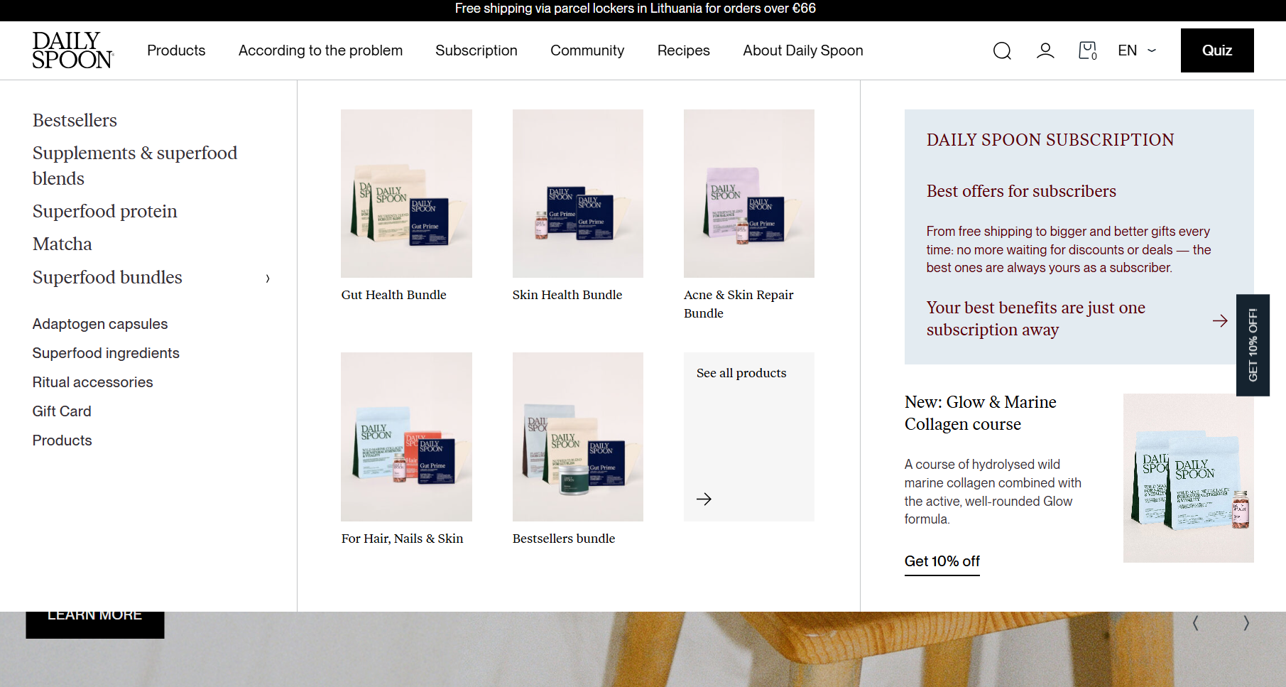
The navigation splits products into two ways. First, by type (supplements, proteins, Matcha, bundles) and second, by problem (gut nourishment, skin, hair, hormonal balance, energy).
Subscription and Community also sit at the top level. They signal that repeat purchase and belonging are core to the brand.
Product pages
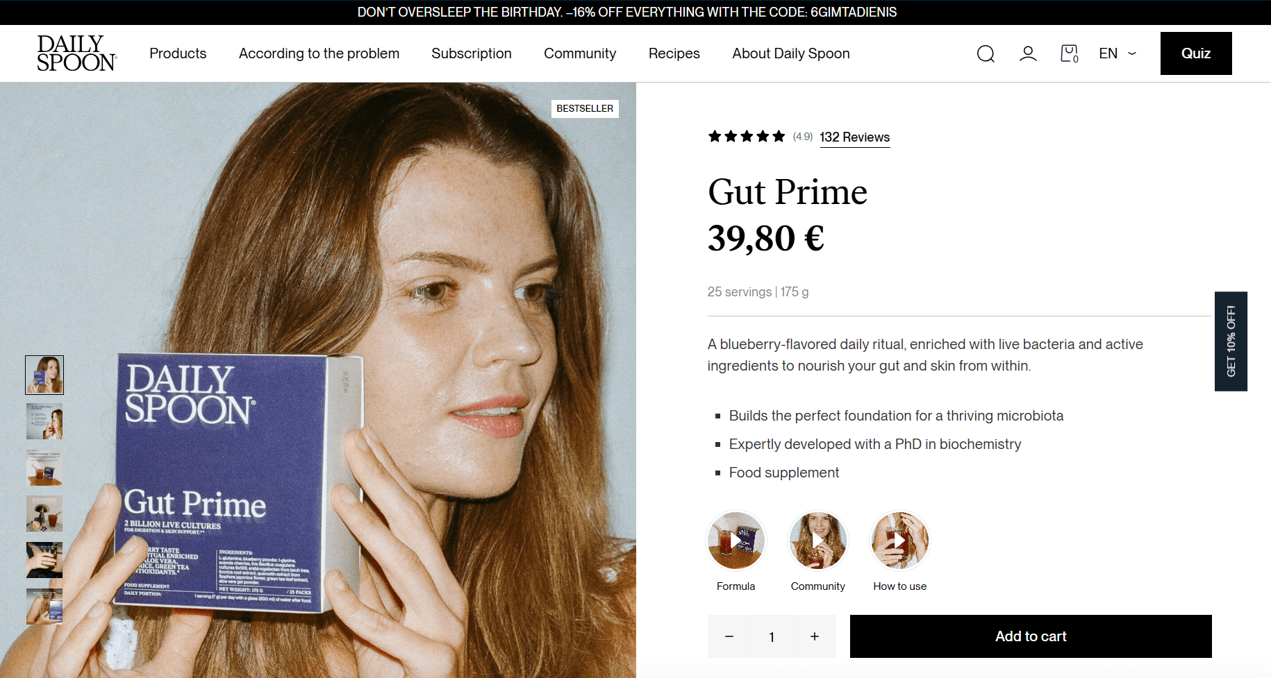
Daily Spoon’s product pages focus on clarity and routine-building “rituals.” A few reasons why it works especially well:
- Prominently displayed review counts (Gut Prime shows 132 reviews)
- UGC from community members, linking their photos to specific products and outcomes
- Subscriber-only perks, including free shipping, bigger gifts, and exclusive rewards, are highlighted prominently
With smarter segmentation and automation, Daily Spoon achieved a 51.5% email open rate. It also reduced total sends by over 351k messages.
Read the case study
4. Recess
Made with: Shopify Plus
Homepage
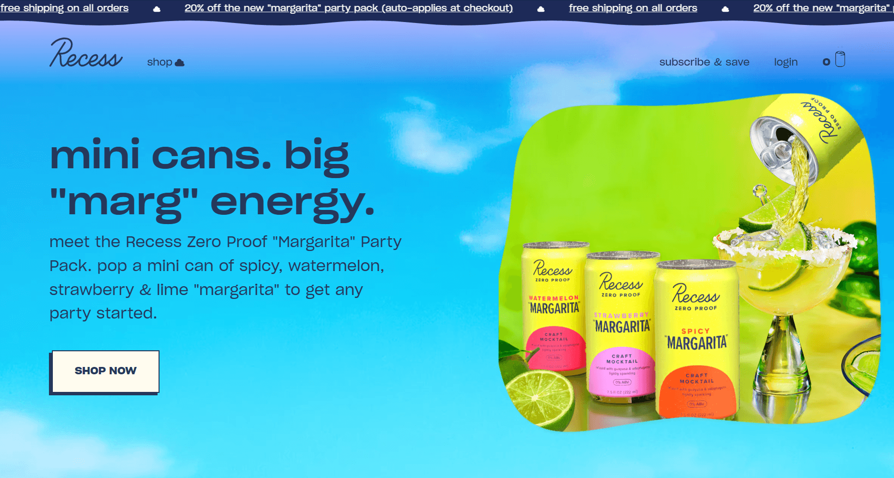
Recess has one of the most distinctive visual identities in the beverage space. It features pastel gradients and soft cloud animations. This playful design sets it apart from clinical wellness brands. A few design choices stand out:
- Bright product colors create strong visual separation between categories and flavors
- Above the fold, Subscribe & Save, and Login buttons guide users toward recurring purchases
- Samplers that lower first-purchase risk are featured prominently mid-page — a smart conversion move as Recess has many products
Navigation
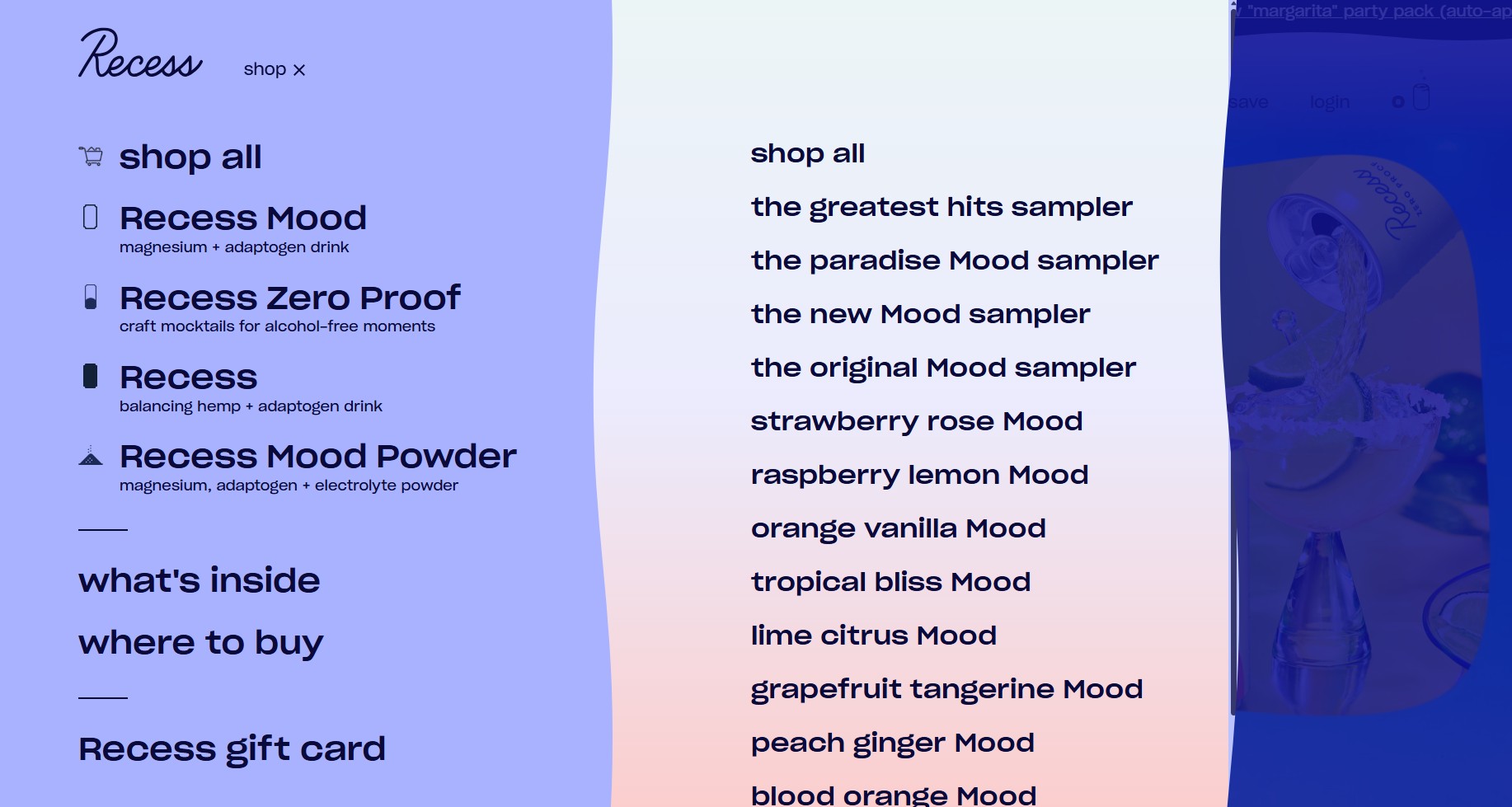
Clicking Shop opens a two-level sliding menu. Product lines appear at the first level (Recess, Recess Mood, Zero Proof, Powders). Then specific products appear on hover.
Fruit-related icons appear next to select flavor names. This adds visual recognition, so scanning the product lists is more intuitive.
Product pages
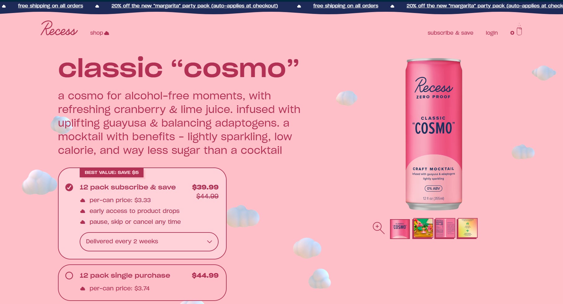
Recess product pages combine strong merchandising with ingredient storytelling. Several elements improve conversion:
- Each product carries its own color theme, making flavor variants visually distinct for quick identification
- Ingredient storytelling (magnesium, adaptogens, electrolytes) is brief, with well-explained functional benefits
- Subscription options are framed as the best value, with delivery every two, four, or eight weeks, compared to one-time purchases
- There’s no hard sell, with the tone staying consistent with the brand’s relaxed voice
5. Memo Paris
Made with: Shopify
Homepage
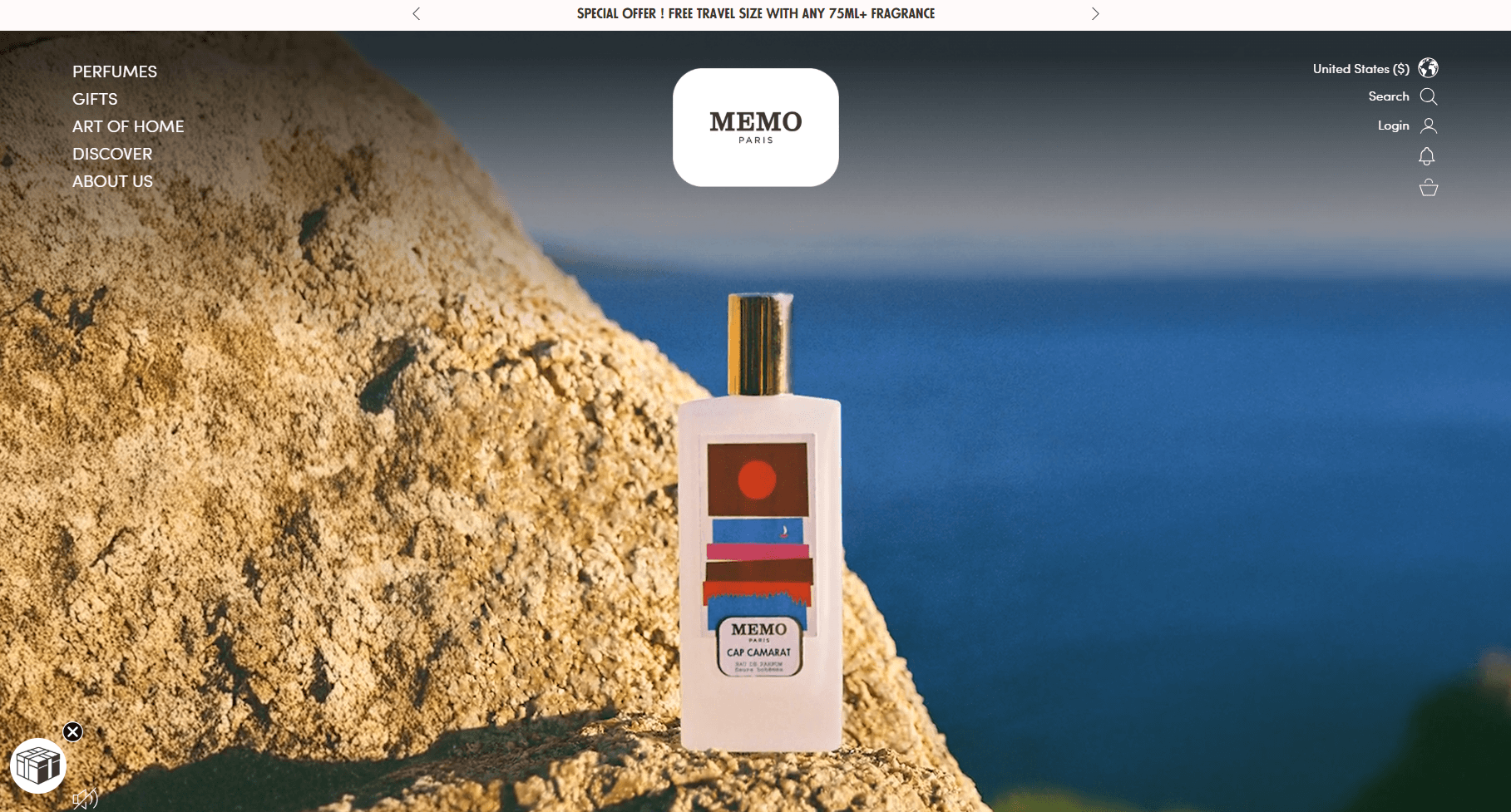
Memo Paris uses cinematic storytelling to create an emotional first impression. The brand’s looping hero video feels more like a luxury fashion campaign than a fragrance homepage. Here’s how its design emphasizes storytelling and exclusivity:
- The hero communicates the brand’s travel-inspired positioning without a single word of copy about fragrance
- A floating gift icon triggers a 20% email signup offer, keeping lead capture subtle but accessible and effective
- Navigation labels appear in a vertical stack, producing an editorial, magazine‑like layout
Navigation
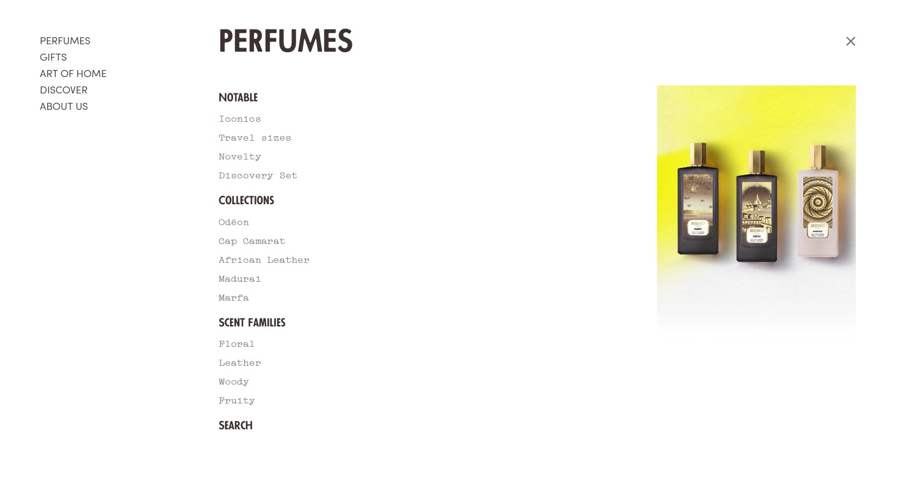
The navigation is structured around discovery instead of simple catalog browsing. It’s designed to reward browsing customers, particularly those who don’t yet know what they want.
One can explore perfumes by scent families, collections, or notable releases. This helps shoppers browse according to preference.
Gift categories and discovery sets also receive strong placement. This supports both gifting and first-time sampling.
Product pages
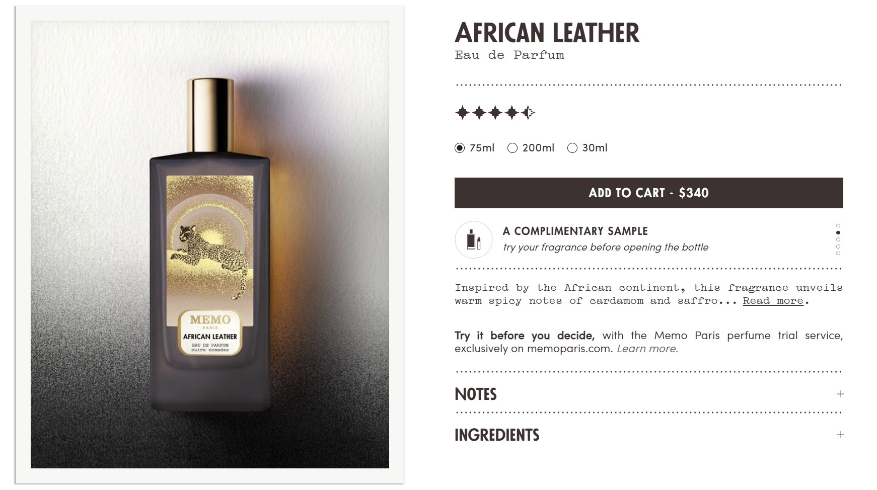
Memo Paris product pages focus on sensory detail and guided exploration. These elements work especially well:
- An exclusive perfume trial service, Try it before you decide, is available at Memo Paris
- Notes are grouped by top, heart, and base, with intensity ratings shown visually
- Products in the same collection appear below the fold alongside customer reviews, supporting cross-sell
6. Antler
Made with: Shopify Plus
Homepage
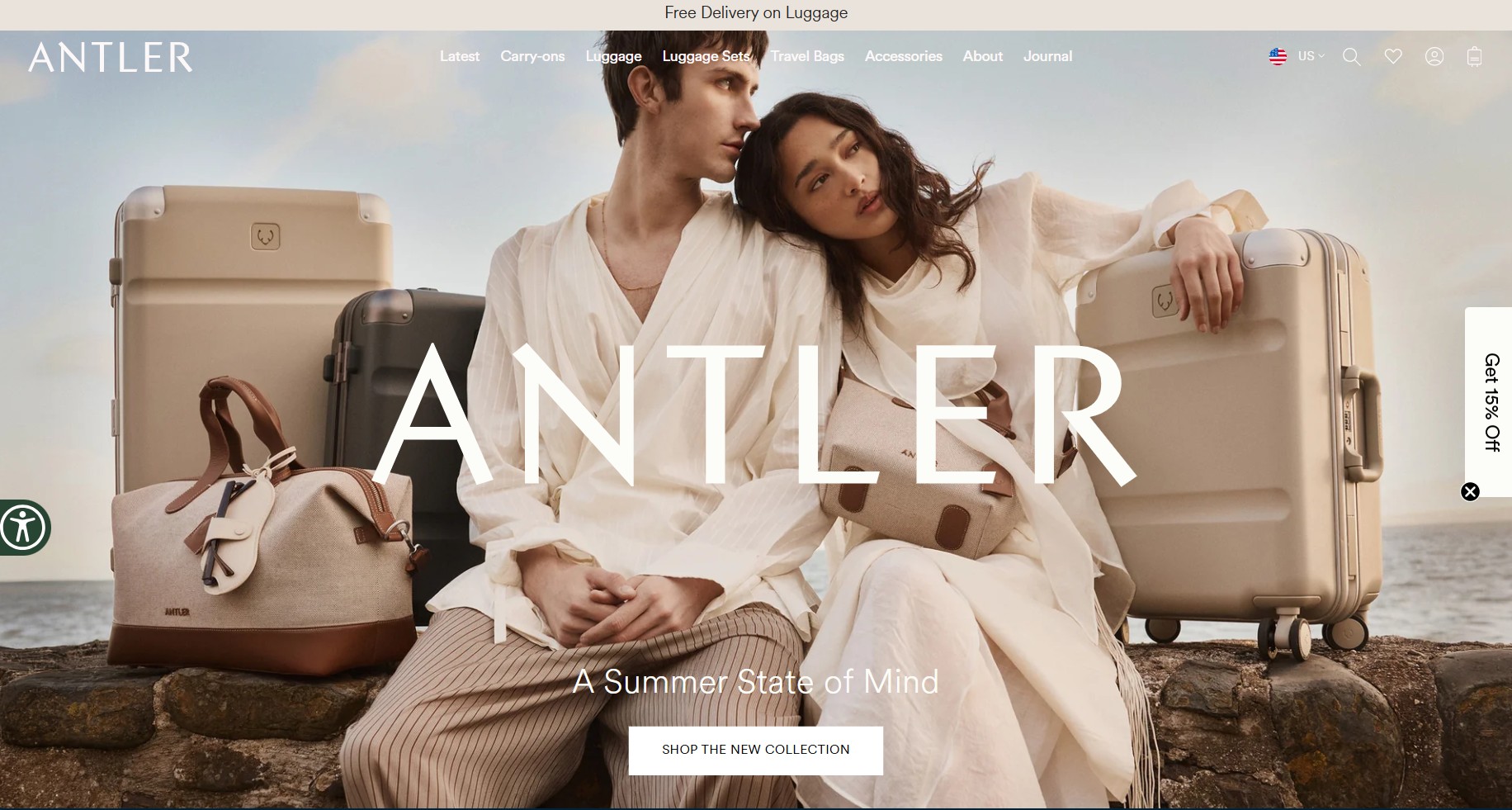
Image via Antler
Antler’s homepage opens to a hero with lifestyle imagery and a seasonal collection CTA. Meanwhile, the trust bar directly above mentions a lifetime warranty, 110+ years of expertise, and free delivery on luggage. Additionally:
- The Antler logo fades while scrolling, keeping attention on the collection imagery
- The tagline “A summer state of mind” paired with the Shop the new collection CTA sets a seasonal mood
- Accessibility controls are unusually comprehensive, including font and spacing adjustments
Navigation
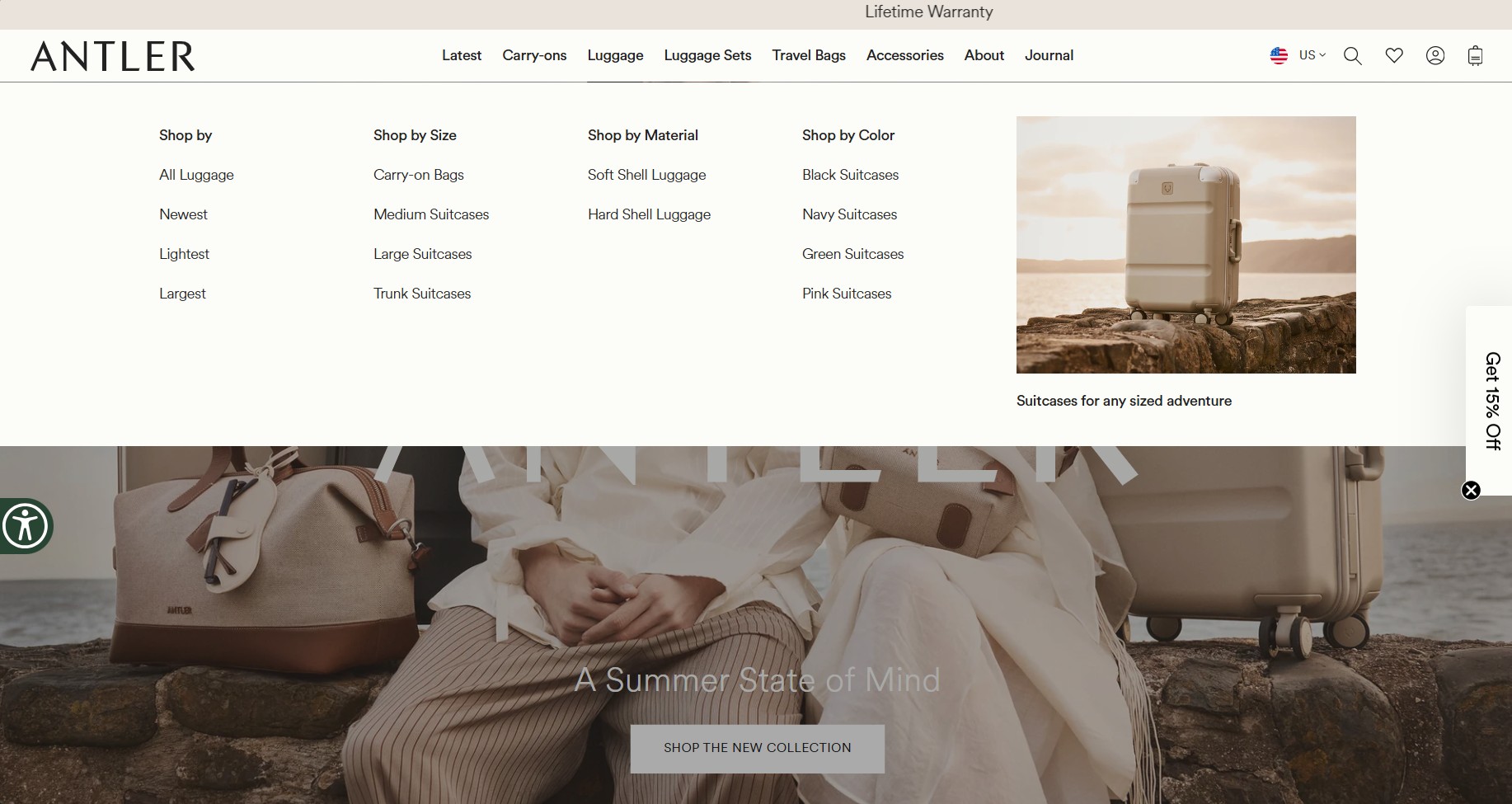
The navigation categories cover luggage types, travel accessories, editorial content, and bundles. These are further organized by product type, material, and color.
Each dropdown also includes editorial image panels linking to collections. The color-led buyer and the material-led buyer can both navigate without friction.
Product pages
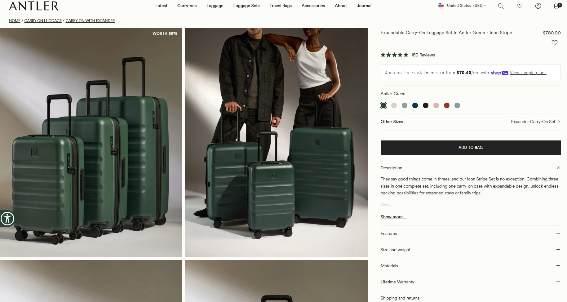
Antler’s product pages are built around the dominant luggage objection: Will it actually fit, and will it last? Here’s why it works:
- Features are grouped into internal and external categories for easier scanning and comparison
- Dimensions come with front and side diagrams, plus max volume and actual packing capacity
- Review count and star ratings appear above the fold, while installment payments via Shop Pay reduce purchase friction
- Below, professional product videos demonstrate durability, as This goes well with cross‑sells, encouraging bundle buying
7. Taylor Stitch
Made with: Shopify Plus
Homepage
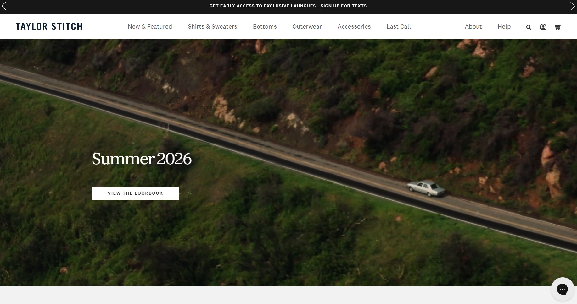
Taylor Stitch uses cinematic visuals and clean layouts to balance lifestyle branding with product discovery. The looping hero video immediately establishes the seasonal aesthetic without relying on heavy copy. A few homepage details stand out:
- The headline, Summer 2026, keeps the message concise and fashion-focused
- The View the lookbook CTA prioritizes browsing or brand engagement over immediate conversion
- Sustainability messaging appears prominently through the responsibility section below the fold
Navigation
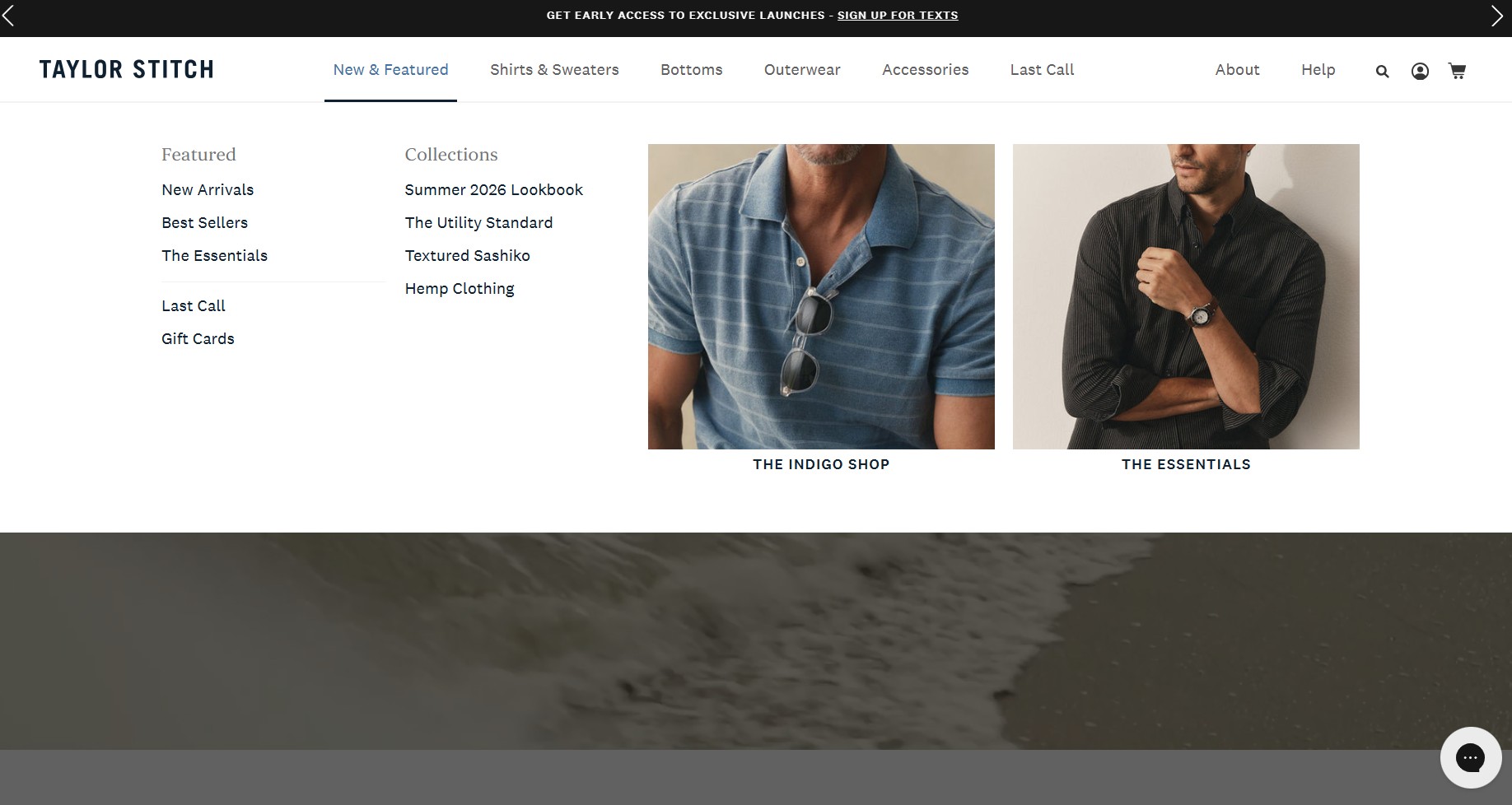
Navigation is organized by garment type, then by fit within each category. For instance, Slim, Straight, and similar options appear as sub-filters.
Last Call sits as a top-level nav item alongside the main categories, creating a separate destination for discounted products. It captures price-sensitive visitors by adding urgency through limited availability.
Product pages
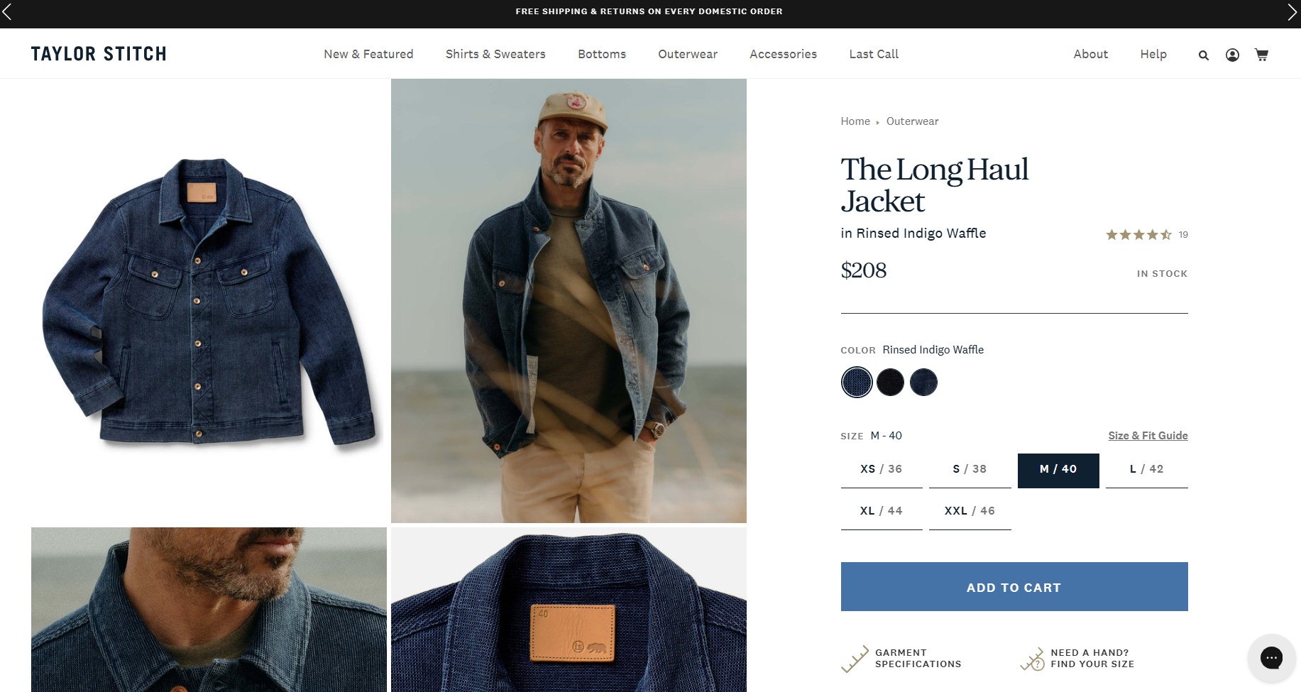
Taylor Stitch product pages balance technical garment details with reassurance messaging. The dominant apparel objection is fit, and the page answers it directly:
- Color, size, and fit are selectable together above the fold, with real availability indicated (items can show as limited)
- Shipping and returns information opens as inline info popups instead of redirecting visitors to a separate page
- A Repair or Replace guarantee below the fold reinforces the durability positioning
8. Allbirds
Made with: Shopify Plus
Homepage
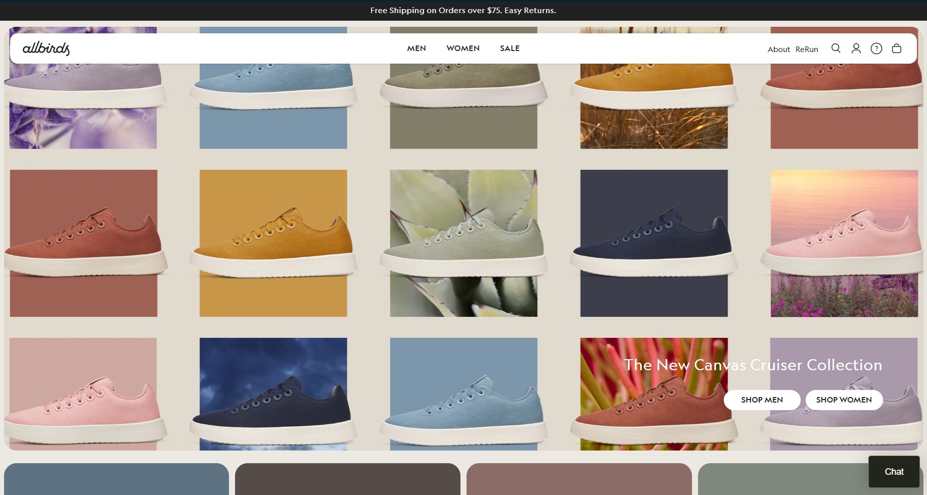
Allbirds uses a mosaic of sneaker colorways above the fold. The sneaker grid creates visual consistency while quickly highlighting collection variety. This homepage works because it’s optimized for returning visitors who are picking a new colorway. Additionally:
- Dual CTAs for men and women reduce browsing friction immediately
- The layout is clean and minimalist, matching the brand’s comfort-focused positioning
- The icon grid just below the fold (New Arrivals, Mens, Womens, Best Sellers) speeds up navigation
Navigation
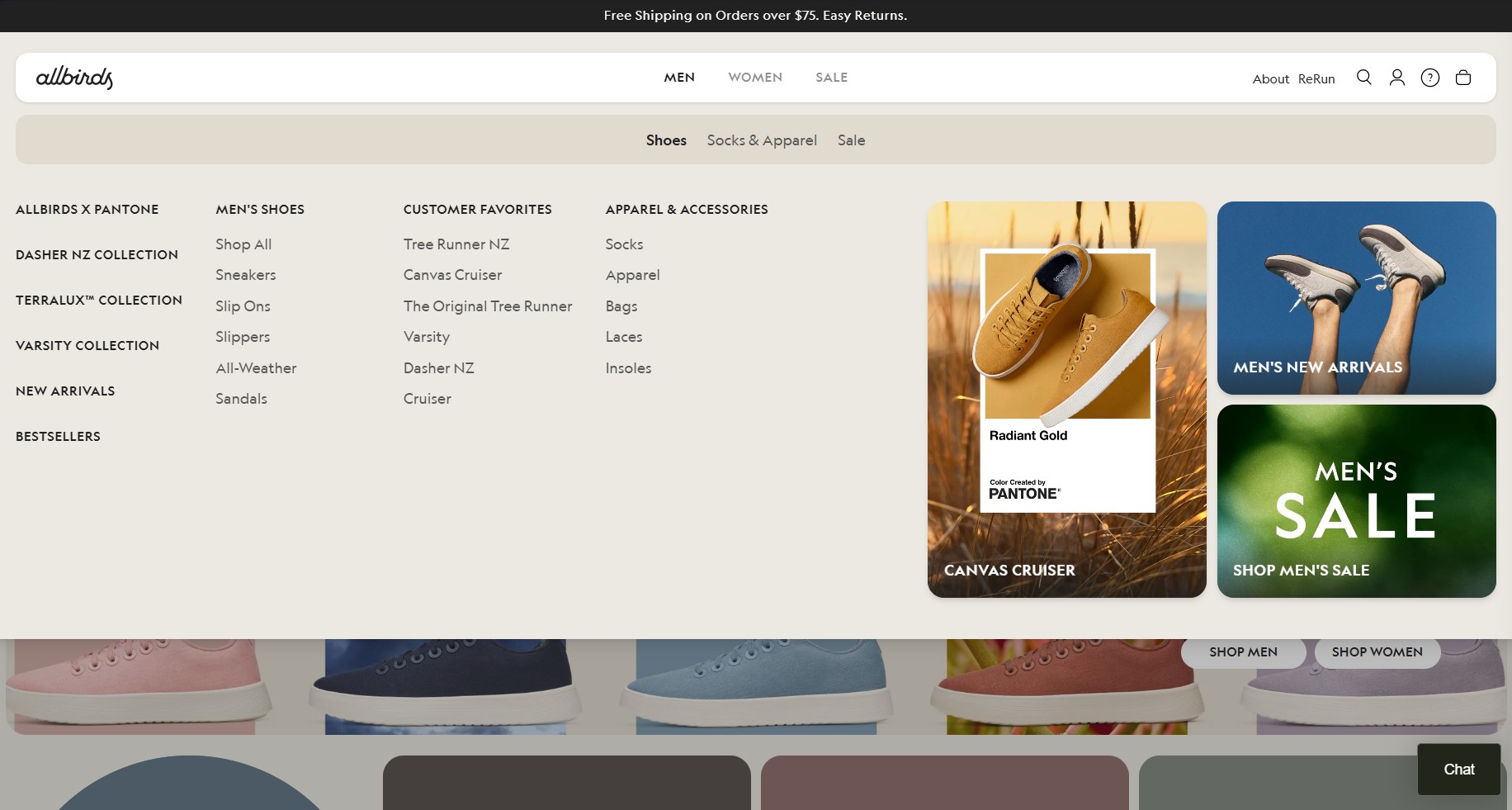
Three top-level items — Men, Women, Sale — keep the structure exceptionally clean.
Each gender dropdown is organized by footwear collections first, then shoe type, customer favorites, and finally apparel. Collections and customer favorites are also highlighted.
The Sale top-level item treats clearance as a destination rather than hiding it.
Product pages
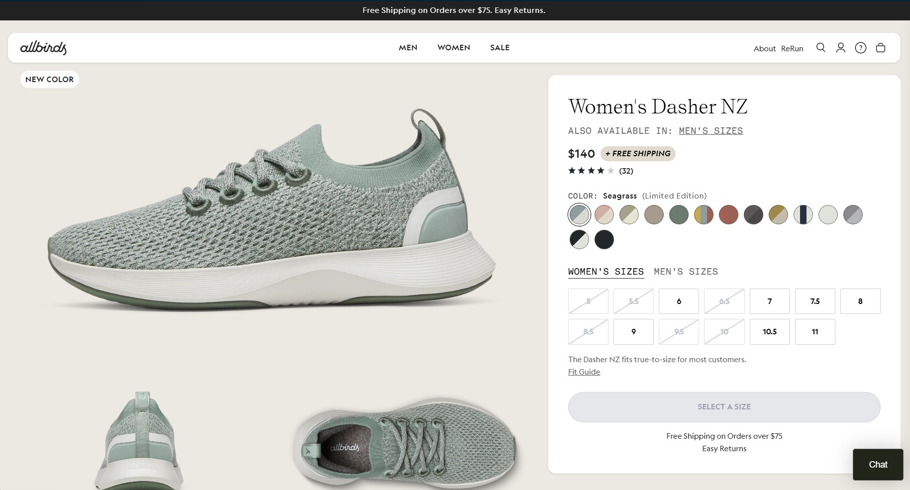
Allbirds’ product pages have some of the best ecommerce designs in 2026. They set a clear benchmark for sustainability storytelling integrated into UX. Here’s how they answer why you should care about a specific shoe:
- Best for tags (everyday, walks, vacation), help buyers self-qualify without reading a description
- The section, Why we made this, explains the design rationale and use cases plainly
- Fit guides pop out inline with USA/UK/cm conversions, reducing sizing uncertainty
- Sustainability and care instructions add transparency, strengthening brand trust
9. WP Standard
Made with: Shopify Plus
Homepage
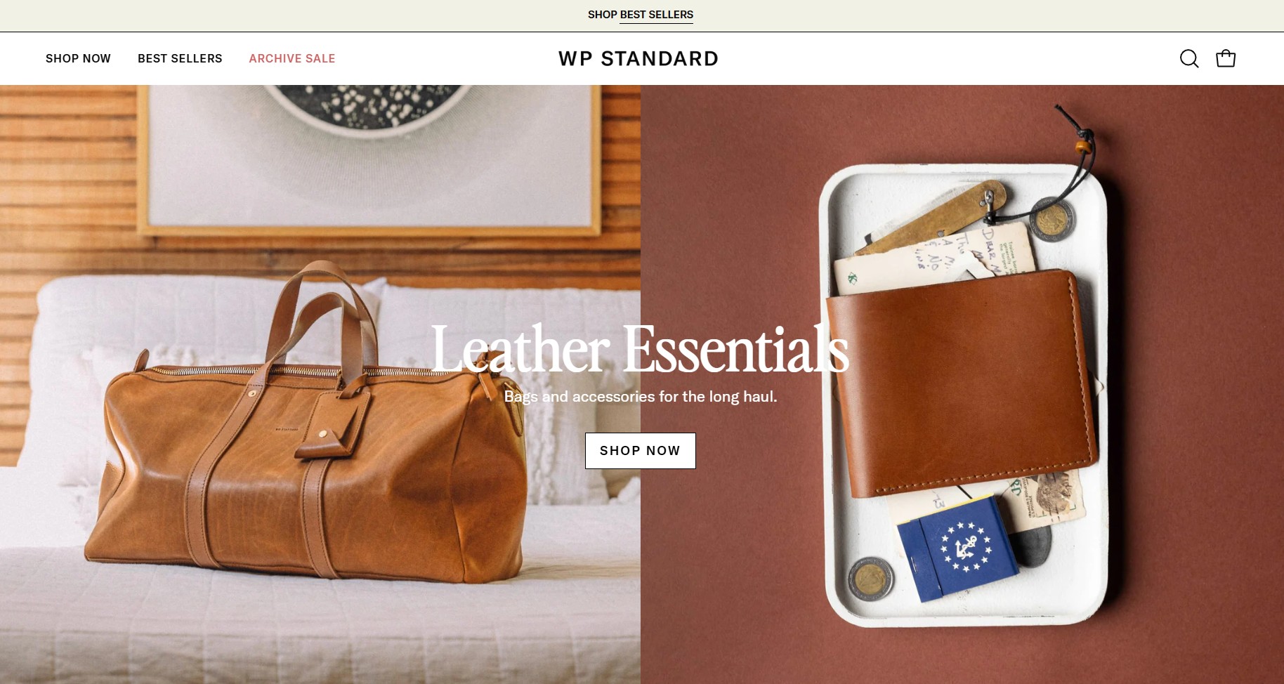
WP Standard opens with two side‑by‑side product images, a duffel bag and a wallet. These split-screen hero images sit under Leather Essentials in bold, which immediately communicates the product focus. Several homepage choices stand out:
- The duffel bag and wallet imagery create balance while showcasing the product range
- Generous white space that’s paired well with photography to make products feel premium
- The three-item navigation (Shop Now, Best Sellers, Archive Sale) deliberately signals that the catalog is curated
Navigation
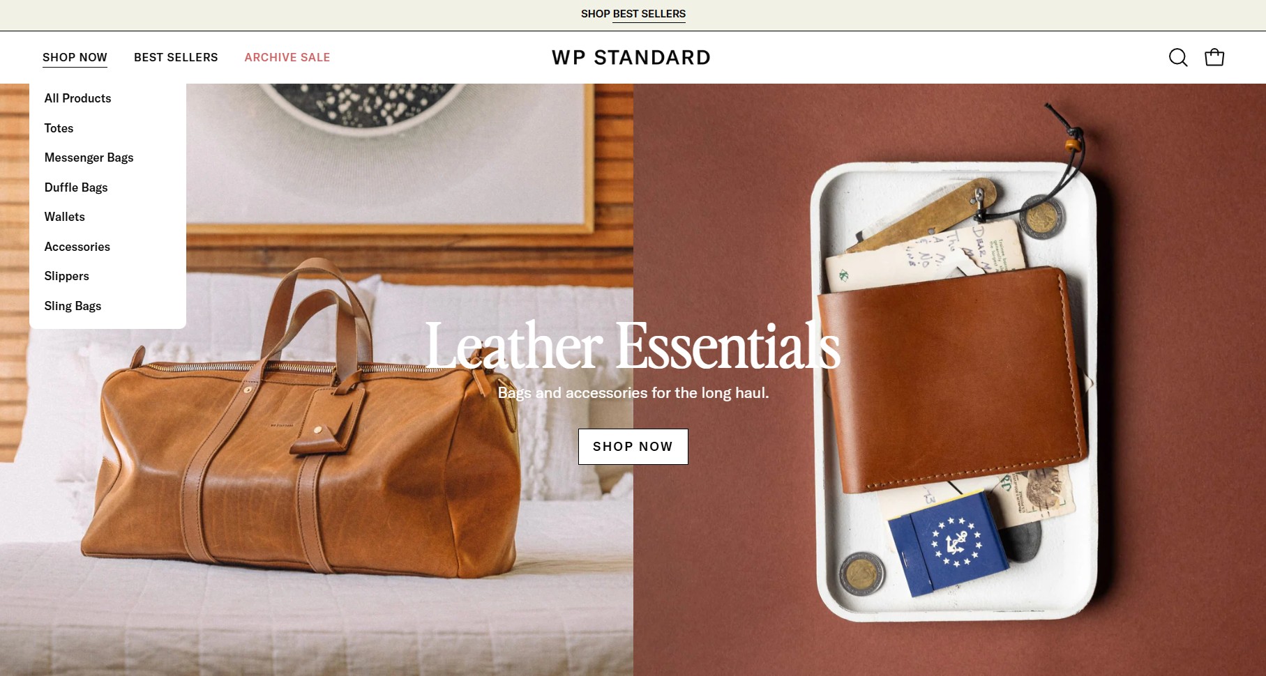
The navigation is intentionally minimal. Only Shop Now expands into a dropdown, and the menu remains compact.
Categories focus on core product types, making browsing fast and predictable. Also, Archive Sale frames discounted inventory as a destination with character rather than a clearance rack.
Product pages
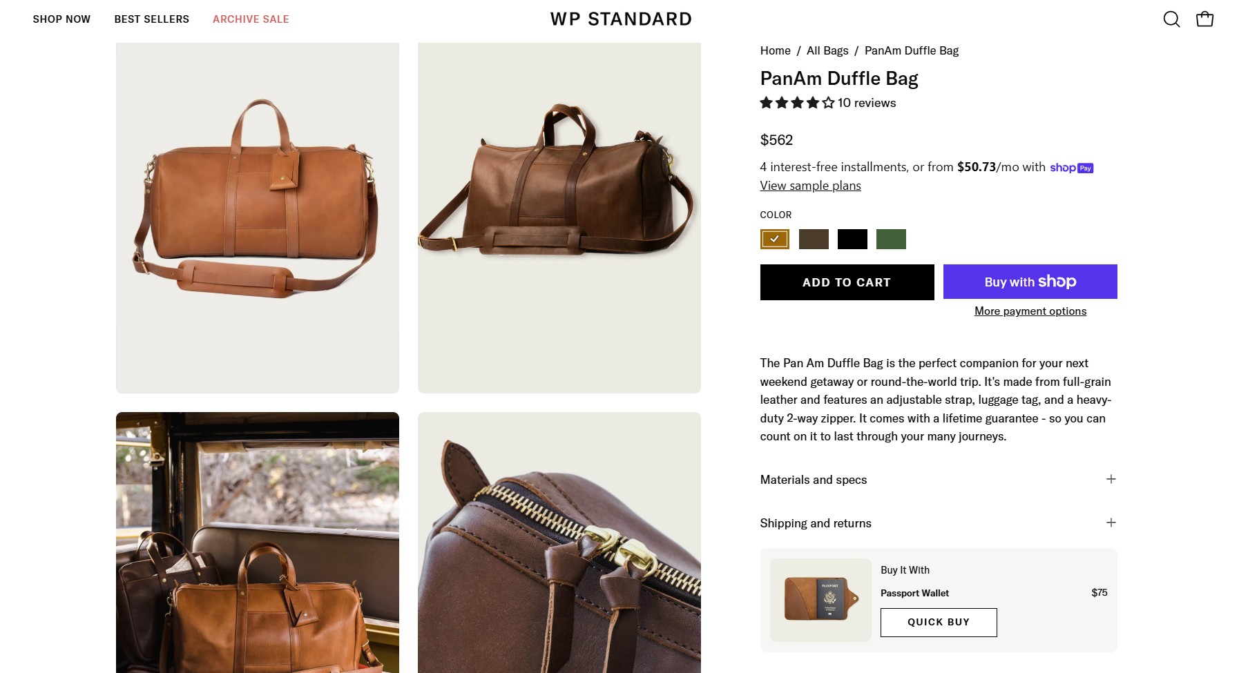
Product pages rely on high‑resolution photography, including close‑ups that highlight grain and stitching. Plus:
- Star rating and review count appear above the fold alongside color options, placing social proof before the price decision
- You May Also Like and Recently Viewed tabs support browsing momentum, followed by detailed customer reviews
- A sticky add-to-cart bar with product details appears when the CTA scrolls out of view
- A Buy It With quick‑add module encourages natural or practical add-on purchases
10. Patagonia
Made with: Salesforce Commerce Cloud
Homepage
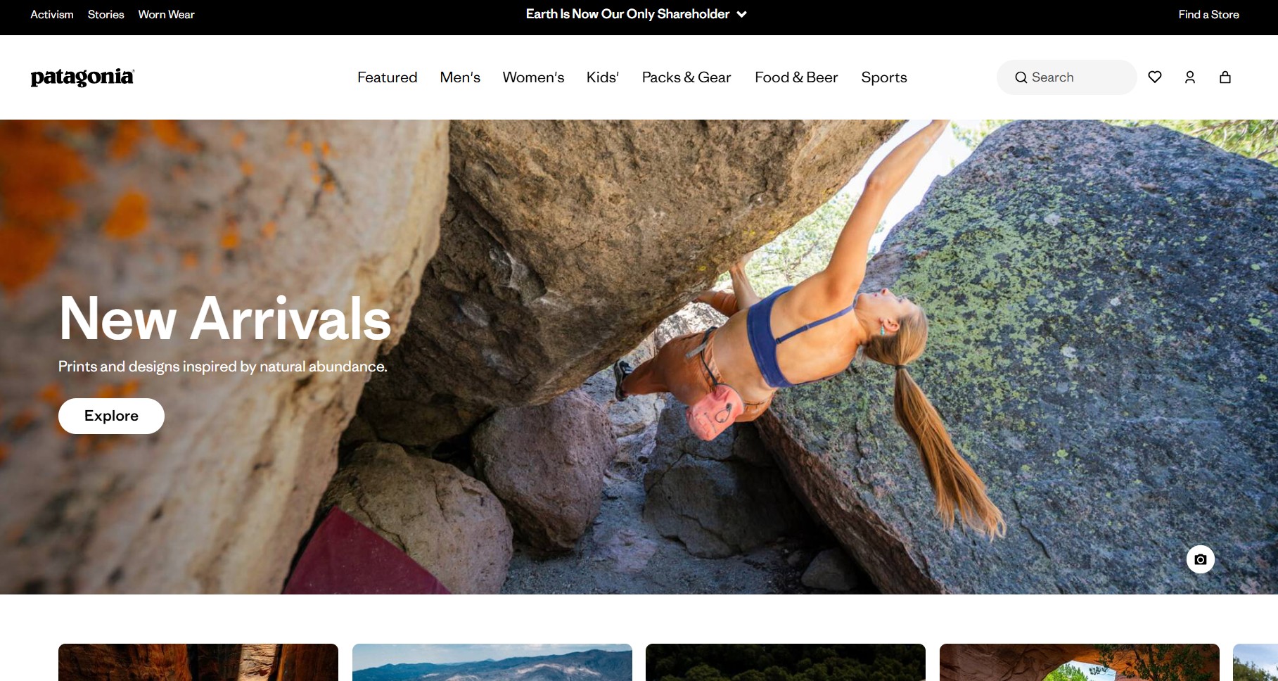
Patagonia’s homepage uses rugged, worn-in visuals to reinforce its durability claims authentically. The brand is deliberate in showing products with visible wear and real-world use. Additionally:
- Editorial sections balance activism, storytelling, and commerce
- Patagonia publishes its own films and podcasts on the homepage
- Five trust/mission icons appear near the footer, including Ironclad Guarantee, environmental footprint, activism support, and Worn Wear
Navigation
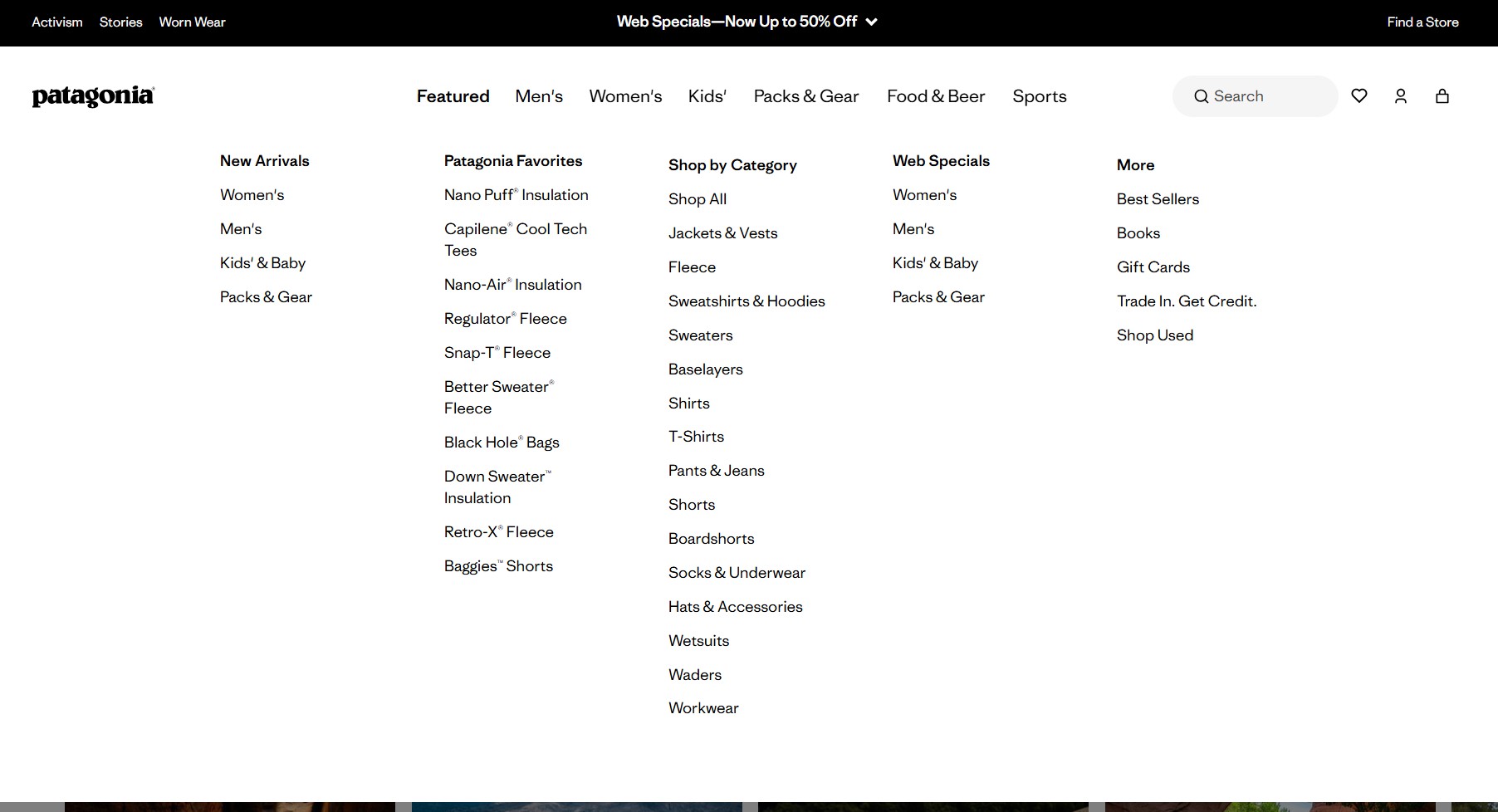
Visitors can shop by category, sport, or featured collections depending on how they think. Activities like climbing, surfing, and trail running receive dedicated paths.
Meanwhile, tools like Jacket Finder help customers narrow choices quickly, reducing decision fatigue.
A Shop Used link for worn wear appears inside the Men’s, Women’s, and Packs & Gear dropdowns. This reinforces the durability message effectively.
Product pages
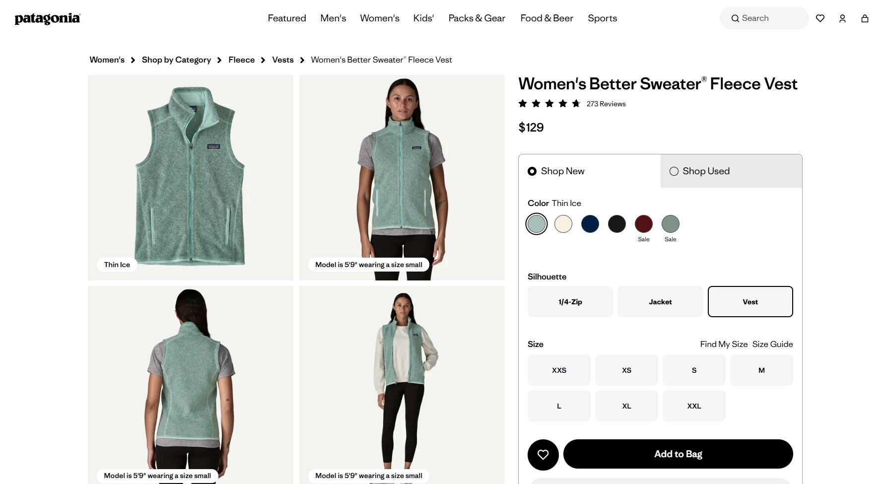
Patagonia product pages focus heavily on utility and confidence in fit. The idea is to provide evidence of durability. Standout features include:
- Find My Size and Size Guide popups include measurement instructions
- Silhouette feature showing how an item looks layered with others, like vests or jackets
- Shop New and Shop Used tabs provide choice, with the latter offering a trade-in facility for credit
- True-to-size percentage ratings from verified buyers, plus activity tags (hiking, trail running, everyday), appear below the fold
11. Italic
Made with: Shopify Plus
Homepage
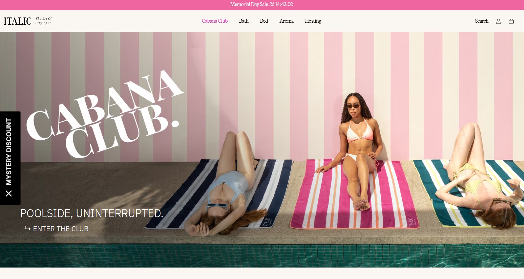
Italic’s homepage is built around a single collection at a time. Currently, that’s Cabana Club, presented as full‑width lifestyle imagery featuring models on beach towels against a pastel-striped backdrop. This creates a relaxed luxury feel. Additionally:
- New visitors see a full‑page Mystery Discount popup that doubles as a preference survey
- Lifestyle photography helps products feel aspirational, while tags like New color added let shoppers quickly understand value
- UGC from tagged Instagram posts, with real customer photography, adds social proof
Navigation
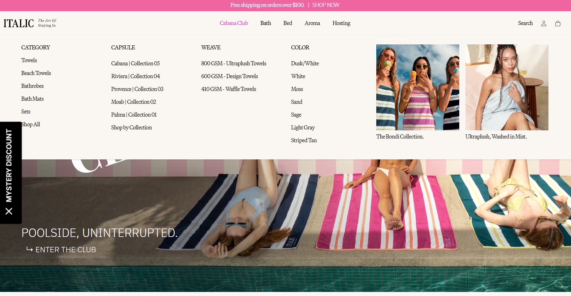
The navigation organizes products by category, capsule, and color. The Capsule filter is worth noting, as collections are named geographically (Riviera, Provence, Cabana) rather than descriptively.
This positioning choice favors brand storytelling over strict clarity. It creates a premium, editorial feel, but may require exploration or extra interpretation for first-time visitors.
Product pages
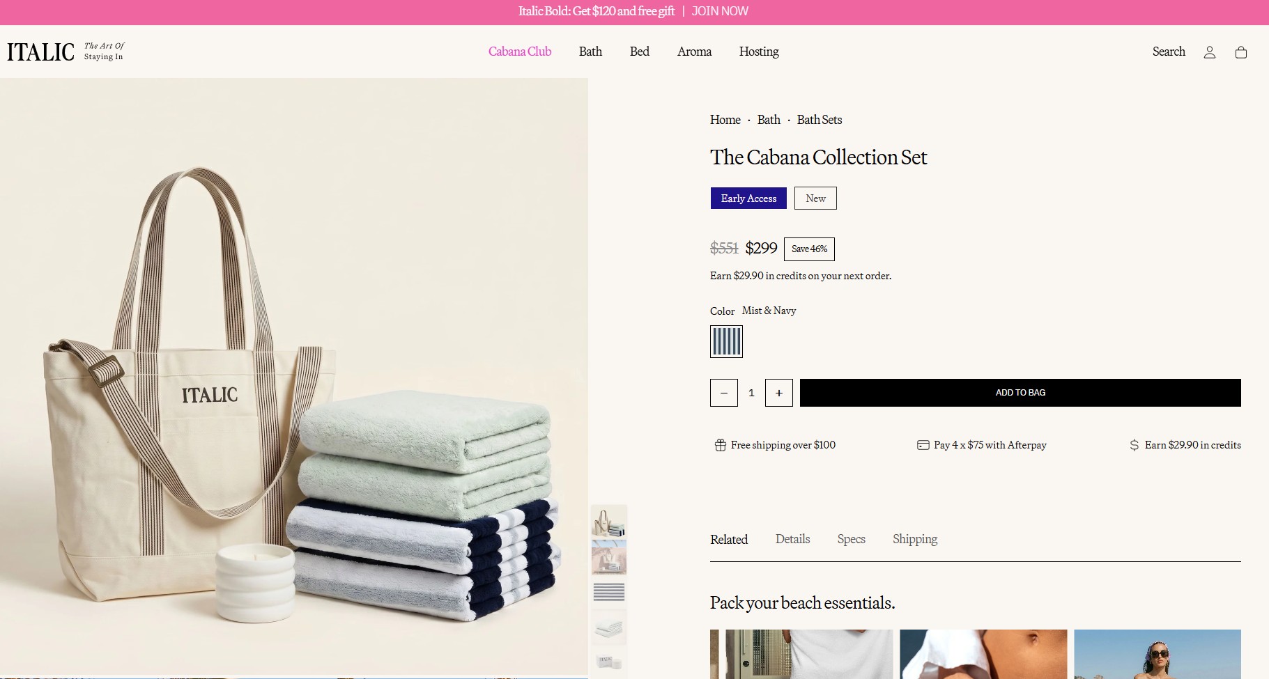
Italic’s product pages run a clear persuasion sequence. From the image stack to status signals and savings framing, key structural choices include:
- Sticky tabs for details, specs, and shipping improve long-page usability
- Tags like Early Access and New create product momentum immediately
- Savings are shown as both a canceled original price and a percentage saved, doubling the perceived value
- Product notes like Set of 2 simplify comparison while browsing
12. Rhode
Made with: Shopify Plus
Homepage
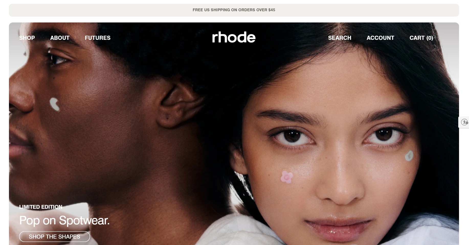
Rhode’s homepage is built around a product launch moment. The hero is a still editorial image featuring models wearing the Limited Edition Spotwear (Hydrocolloid patches). Other noteworthy homepage details:
- The hero focuses on skin texture and the product in use, not an aspirational lifestyle removed from the product itself
- A persistent accessibility button allows visitors to enter or exit accessibility mode at will
- The product-specific Shop the Shapes CTA reinforces the playful framing
Navigation
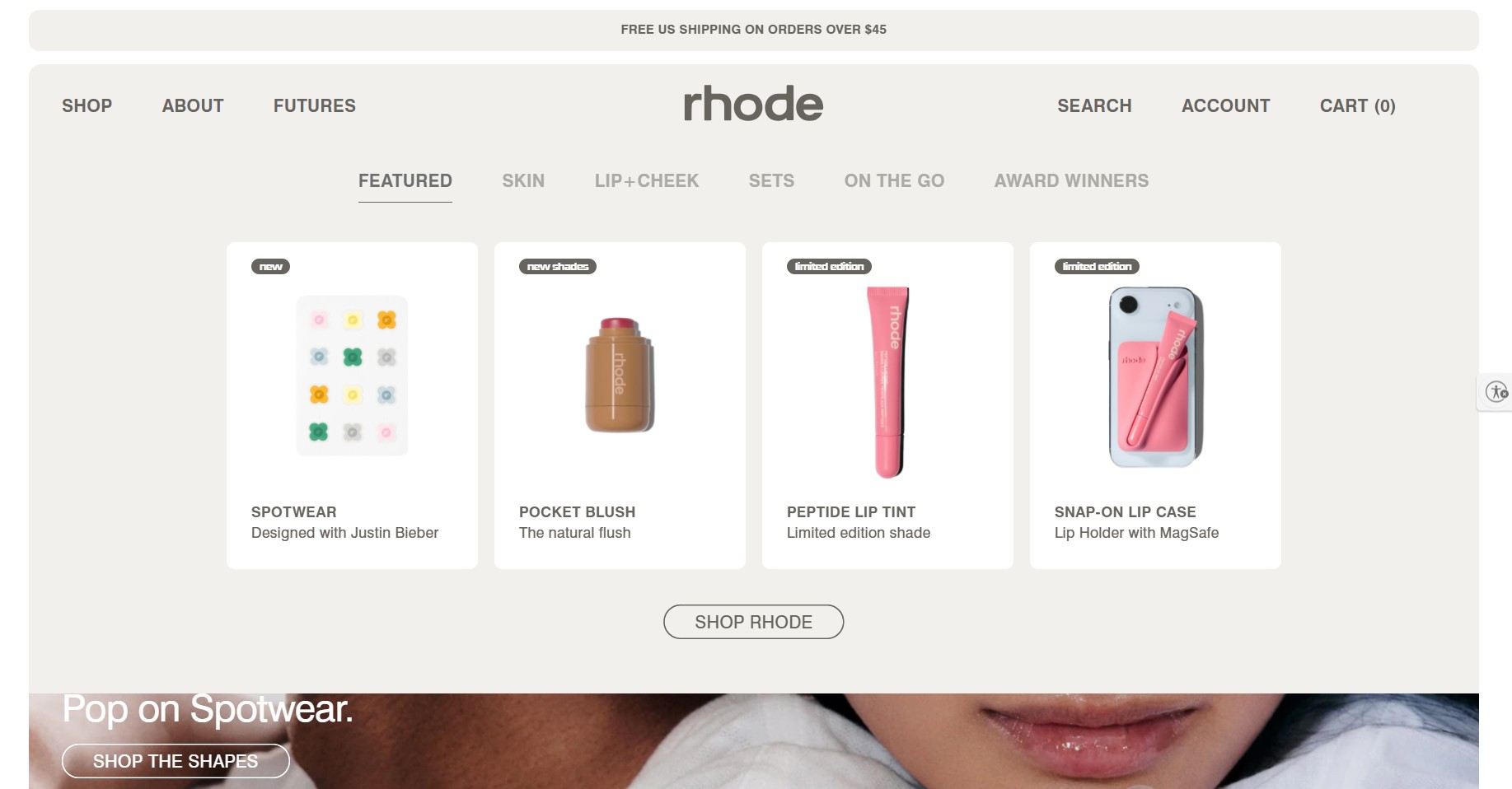
Navigation includes Shop, About, and Futures. Shop expands into a visual menu. Each category, Skin, Lip + Cheek, Sets, and so on, displays product thumbnails with labels like new or limited edition.
This visual-first approach reduces friction and helps shoppers quickly identify what’s trending or exclusive.
Product pages
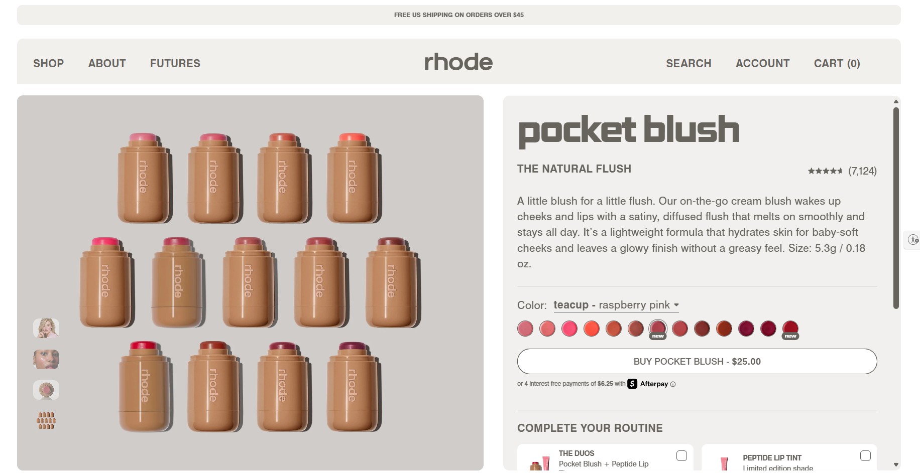
Rhode’s product pages answer two dominant skincare objections: What does this do, and what’s in it? Here’s how they do it:
- Benefits, application instructions, Rhode Tricks (finish variations), and full ingredient lists each live in their own expandable section
- Product pages use a dropdown for shades, and a Complete Your Routine module for upsells
- A Recycling 101 section explains how to dispose of packaging, a subtle but effective trust builder for sustainability‑minded shoppers
- Clinical study results and consumer testing data strengthen credibility
13. Huel
Made with: Shopify Plus
Homepage
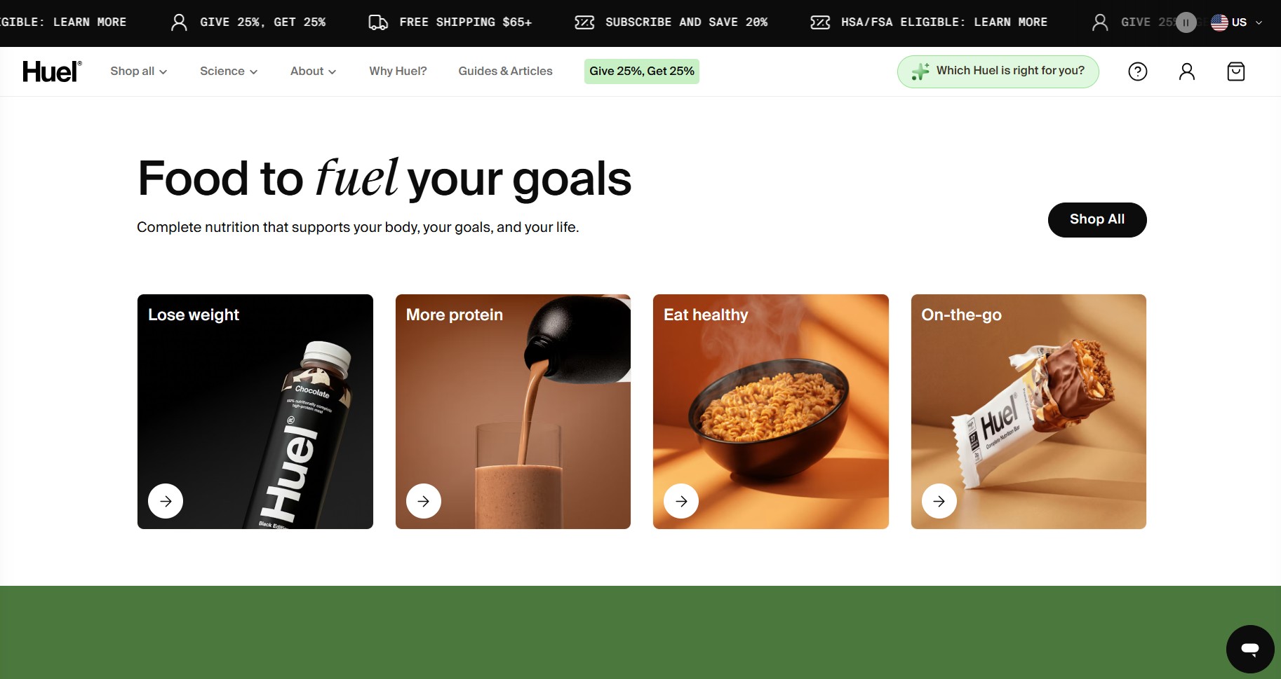
Huel’s homepage organizes products around customer goals. The four above-the-fold options are: Lose Weight, More Protein, Eat Healthy, and On-the-Go. A visitor doesn’t need to know what a powdered meal is. They just need to recognize their goal. Several patterns stand out:
- The scrolling top bar rotates four value propositions: Free shipping threshold, subscribe-and-save offer, HSA/FSA eligibility, and referral program
- A Give 25%, Get 25% referral button sits in the menu bar, remaining visible without dominating the layout
- Below the fold, expert endorsements and athlete recommendations strengthen credibility
Navigation
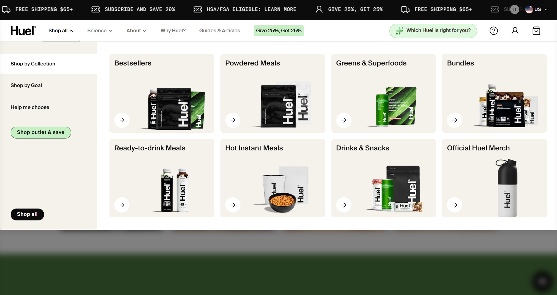
The navigation supports both education and product discovery well. Shop All organizes products by collection, goal, and Help me choose for guided AI recommendations. Meanwhile, Science focuses on nutritional categories rather than merchandising.
Product pages
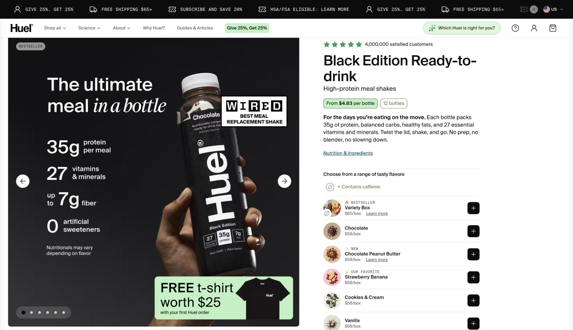
Huel product pages focus heavily on nutritional transparency. Here’s why they work:
- Subscription options (2–8 weeks) are framed as the best value, with a one‑time purchase available
- Health benefits are listed with specific nutrient attribution (for example, “Rich in iron, which contributes to the reduction of tiredness and fatigue”)
- A Nutrition & Ingredients link opens a detailed popup with expandable sections for Science & Testing and full nutritional breakdowns
- Below the fold, health benefits, ingredient explanations, and an FAQ help reduce objections
14. Meow Meow Tweet
Made with: Shopfiy
Homepage
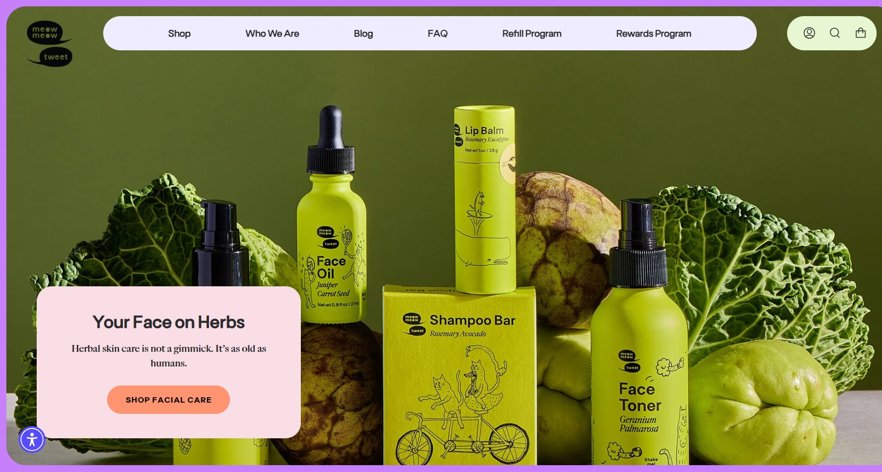
Meow Meow Tweet positions herbal skincare as timeless rather than trendy. The homepage immediately communicates this through earthy visuals and direct messaging. Several homepage choices stand out:
- The hero image’s dark green background creates a natural, botanical positioning
- Below the fold, a Shop by Skin Type grid helps visitors self‑select by oily, dry, combination, or sensitive types
- A Read Our Latest section highlights educational blog content, reinforcing the brand’s expertise
Navigation
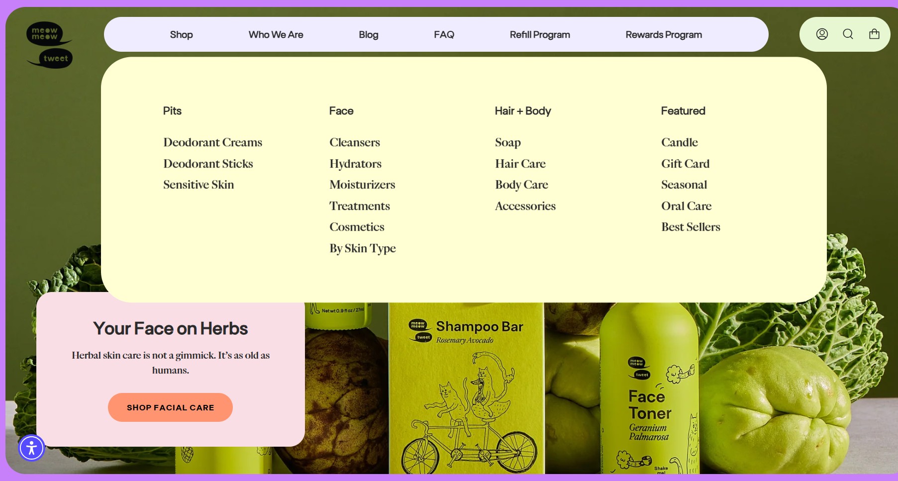
Navigation includes Shop, Who We Are, Blog, FAQ, Refill Program, and Rewards Program. The Shop menu appears in a pill‑shaped container with subcategories like Pits, Face, Hair + Body, and Featured.
These subcategories organize products by concern and skin type. The refill and rewards programs also receive dedicated placement. This reinforces long-term customer retention strategies.
Product pages
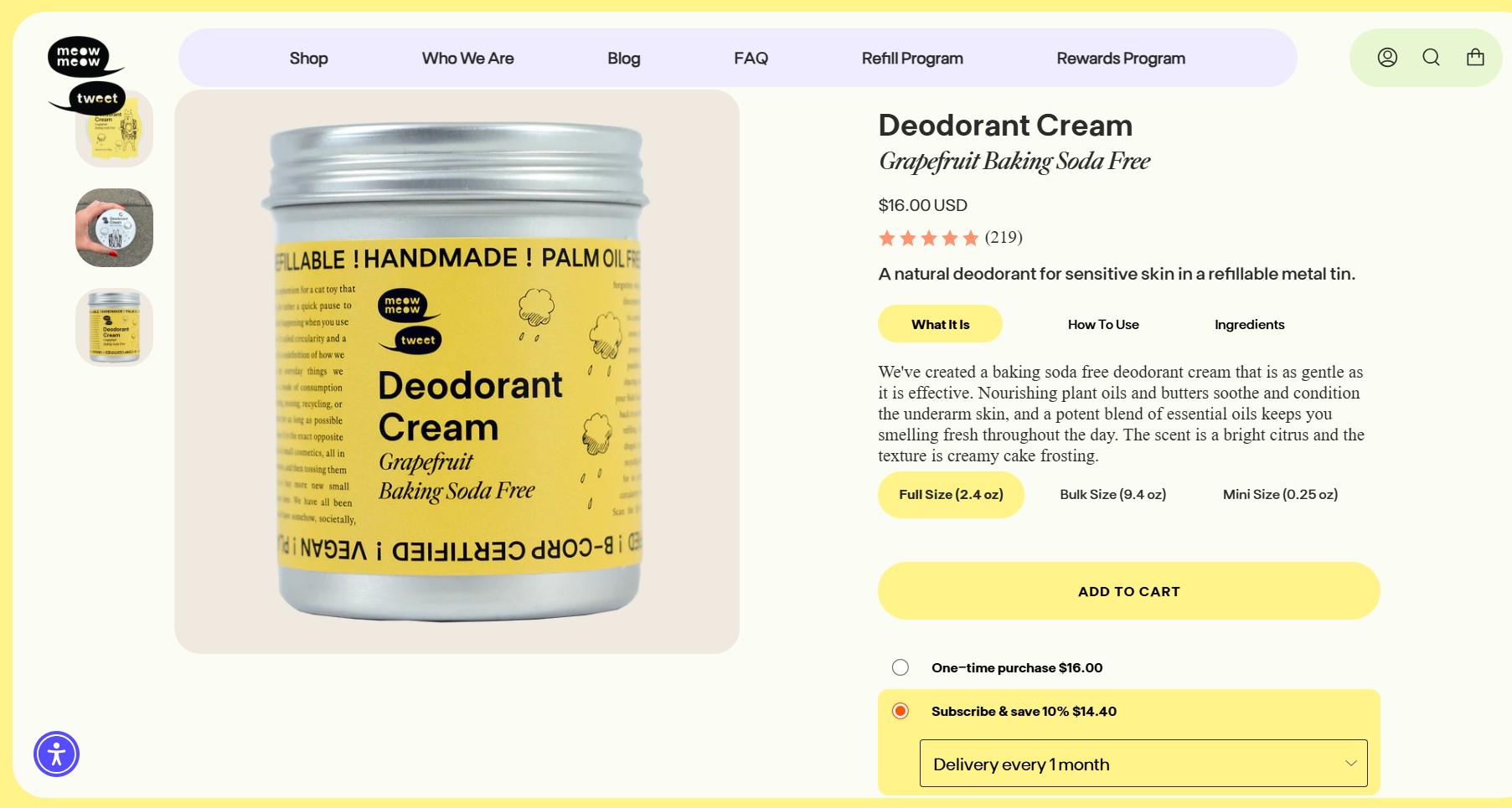
Meow Meow Tweet product pages are lean by design. They match the brand’s no-gimmick positioning with a no-clutter layout. Key structural choices include:
- Three tabs — What It Is, How to Use, and Ingredients — organize product info without long scrolling descriptions
- Multiple size options support sampling before larger purchases
- Subscription intervals provide flexible replenishment timing
- Reviews appear below the fold, offering social proof
15. BLUNT Umbrellas
Made with: Shopify Plus
Homepage
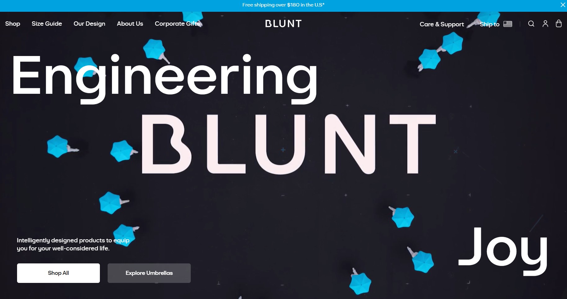
BLUNT Umbrellas’ homepage immediately communicates movement and engineering. The looping aerial video of umbrellas opening and closing creates a memorable first impression. It also visually reinforces the product’s core function. What’s more:
- The hero animation keeps attention without overwhelming the interface
- Dual CTAs support both direct shopping and product exploration
- Below the fold, sliding tiles showcase limited editions and collaborations
Navigation
The navigation effectively balances commerce with post-purchase support. Product categories include models, UV umbrellas, accessories, and collaborations, while care resources receive equal visibility.
Warranty registration, repairs, and support links help reinforce the long-term durability positioning. Collaboration collections also create freshness without cluttering the main navigation.
Product pages
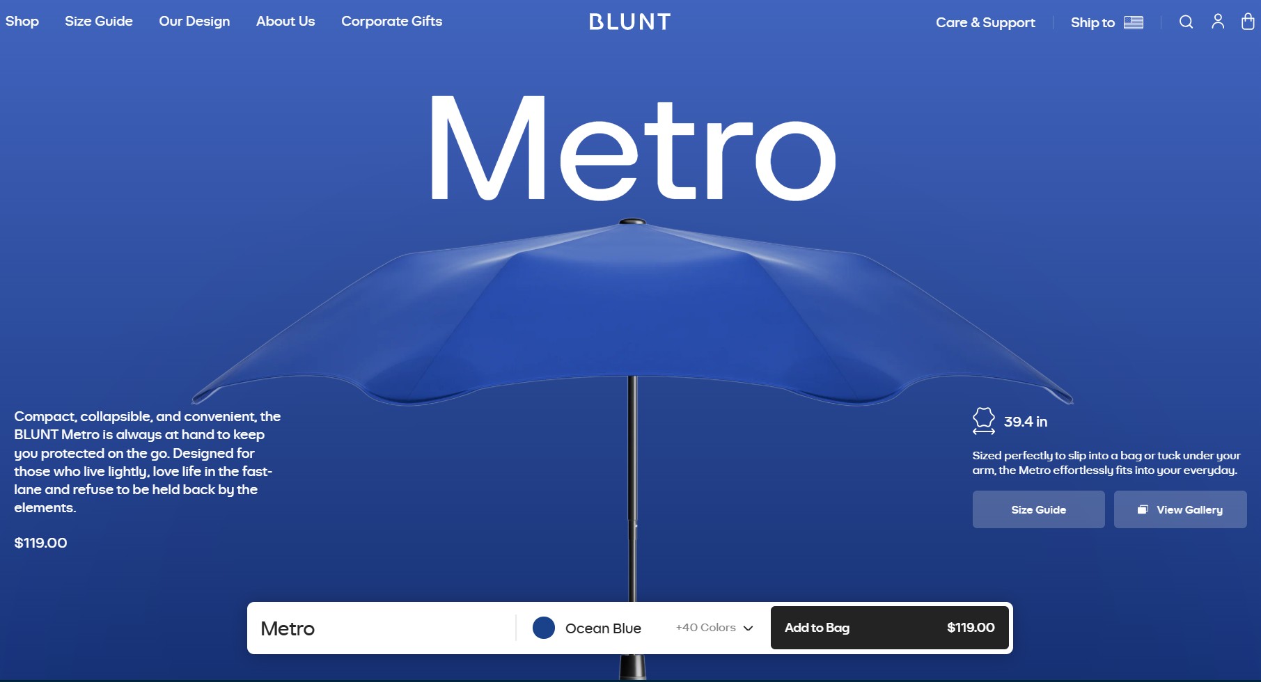
BLUNT product pages focus heavily on technical transparency. Several UX details improve the buying experience:
- Currency and measurements (cm/inches) adjust automatically based on shipping destination
- The size guide popup includes open and closed diameters, weight, and a “wind tested to” specification
- Shoppers can view galleries, select colors, and explore detailed graphics explaining component engineering
- A repair-first philosophy is embedded in the page structure, with warranty and repair info provided as part of the product story
How we chose these top ecommerce sites
We chose every ecommerce website example on this list for a standout design choice. This was on the homepage, in navigation, or on product pages.
We prioritized variety in price points, categories, and platforms to give you a broad set of ideas to study. Our focus was on repeatable UX patterns, not solely the platforms with the highest traffic or revenue.
Conclusion
From budget-conscious fashion to globally renowned luxury brands, we’ve explored some of the best ecommerce websites in the world.
The takeaway for marketers and business owners is clear: prioritize user experience, embrace design excellence, and ensure exceptional customer service.
By adopting these strategies, you can transform your ecommerce website into a thriving online destination. This is how you captivate your target audience and drive sustainable growth.
Unlock the power of email automation and elevate your marketing game with Omnisend
Quick sign up | No credit card required
TABLE OF CONTENTS
TABLE OF CONTENTS

Subscribe and don’t miss any updates!
No fluff, no spam, no corporate filler. Just a friendly letter, twice a month.