
 OFFER
OFFER


Cart Abandonment Incentives: The Pros, Cons, and How to Make Them Effective
With over 130+ pre-built integrations and flexible APIs, you can easily centralize data from across your tech stack
Make the most out of your data and unlock powerful growth marketing possibilities with these other top marketing tools.
Build any custom integration with our open, flexible APIs that are simple to use and implement.
Check out apps that have been stealing all the spotlight.
Email and SMS marketing insights, ecommerce resources, and the latest Omnisend news
Expert-led sessions covering email, SMS, and ecommerce marketing strategies.
Educational video and live training to help you make the most out of Omnisend.
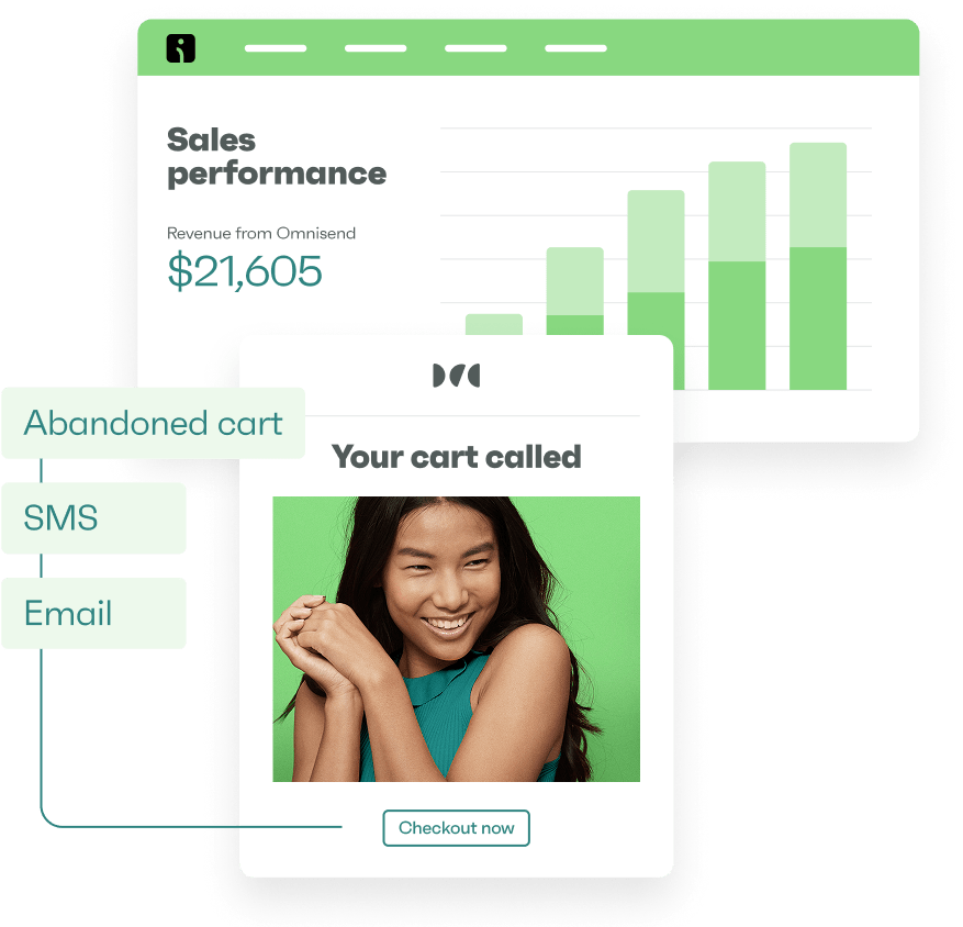
Drive sales on autopilot with ecommerce-focused features
See FeaturesBrowsers are passive shoppers, abandoning your store without adding products to carts or otherwise showing low purchase intent. But if you have their email address, you can entice them back and recover revenue with a browse abandonment email.
It’s possible to recover a significant portion of browse abandonment sales with a well-timed, personalized email. Your email tool, such as Omnisend, will trigger the automation on abandonment, and according to the segment activity conditions you set.
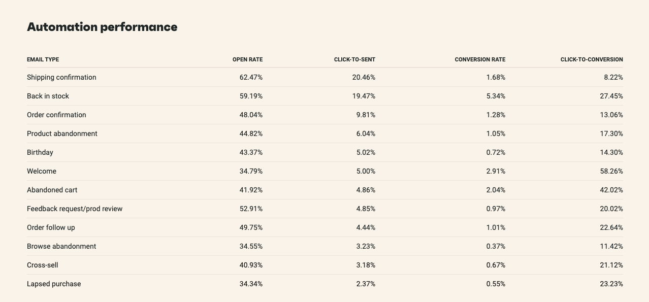
With a 34.55% open rate and an 11.42% click-to-conversion rate, browse abandonment emails are getting popular.
Omnisend report, 2025
A segmented list, combined with automation, lets you send unique offers to those who were browsing expensive versus low-cost products, bundles versus subscriptions, and so on, which will significantly increase your ROI.
This article provides 10+ browse abandonment email examples, subject lines you can steal, best practices, and a comparison of different abandonment flows.
Rather watch a video? No problem:
Quick sign up | No credit card required
Browse abandonment emails are automated messages sent to email subscribers who were viewing products on your website but never placed an item in their shopping cart.
Sending these automated emails is an opportunity to recover lost revenue, personalize your customer experience, and significantly increase your marketing ROI.
Your browse abandonment emails will trigger to engage customers in the middle of their shopping journey — and they work.
Imagine a simple email message saying, “Hey! Do a double-take. This iconic apparel won’t stick around forever!” That one message could bring your customer back and save on paid retargeting costs.
In general, browse abandonment emails are some of the most profitable messages sent from email marketing programs. They achieve a 0.37% open rate in 2025 and 3.23% click-to-sent, which is higher than cross-sell emails.
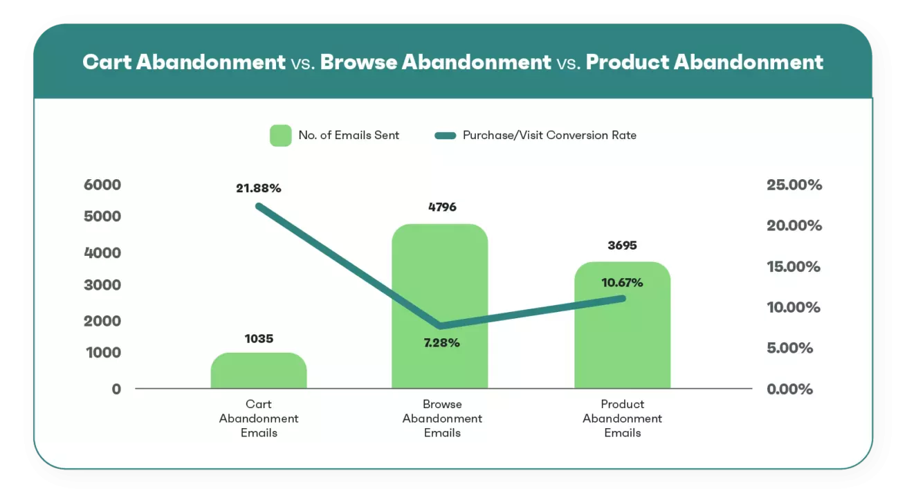
Here’s how they compare to other automations:
Although these three messages sound similar, they each work a bit differently. Let’s take a closer look at each and figure out how they differ:
Your email marketing tool will trigger browse, cart, and product abandonment emails at different moments in your customer journey.
Each abandonment email represents deeper buying intent. Browsing happens before product interest, and product interest occurs before cart activity.
Browse abandonment emails trigger when visitors explore any pages and then leave. Product abandonment targets those who viewed items but didn’t add them to the cart. Cart emails wait until products sit abandoned in carts.
The image below shows how the conversion rates for these abandonment flows compare:
A well-timed email with the right messaging can turn casual browsers into loyal buyers.
Let’s explore some real-world browse abandonment email examples from top brands and discuss the elements that make them engaging. These examples showcase how you can get creative and turn a shopper’s browsing session into a buying one:
As one of the best browse abandonment email examples, Sometimes Always makes the recipient feel special. The headline, “You’ve Got GREAT TASTE,” is flattering and builds excitement, while the following subheading creates urgency.
The opening line, “We noticed you checking out…” makes the customer feel seen. The email’s friendly tone also feels like a personal suggestion and isn’t pushy:

The elegance and persuasion in Alyaka’s browse abandonment email is noteworthy. The friendly yet compelling headline, “See anything you liked?” makes the reader rethink their browsing history.
This browse abandonment email example creates urgency by stating that the item is “going fast.” This triggers FOMO and drives immediate customer action.
It features a clean, minimalistic design that keeps the focus on the product:

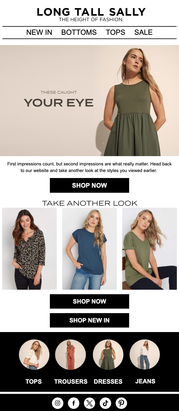
When it comes to re-engaging shoppers, Long Tall Sally’s browse abandonment email does a great job of encouraging them to review the collection they were interested in.
The bold headline, “TAKE ANOTHER LOOK,” reminds visitors of the items they viewed. The “THESE CAUGHT YOUR EYE” section adds personalization to the email:
KOIO’s browse abandonment email opens with urgency (“TAKE ANOTHER LOOK AT THESE”) paired with aspirational copy (“Endlessly Versatile Picks”). A bright green “SHOP WITH FREE SHIPPING” button pops against white space, turning a potential objection into an incentive.
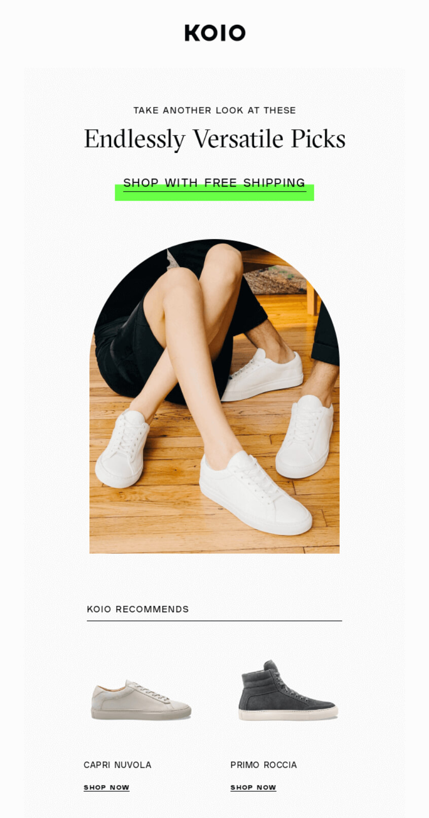
Product images show four shoe styles with prices, giving browsers multiple reasons to return. Lifestyle photography places the shoes in context, and “SHOP WOMEN” and “SHOP MEN” buttons help segment traffic.
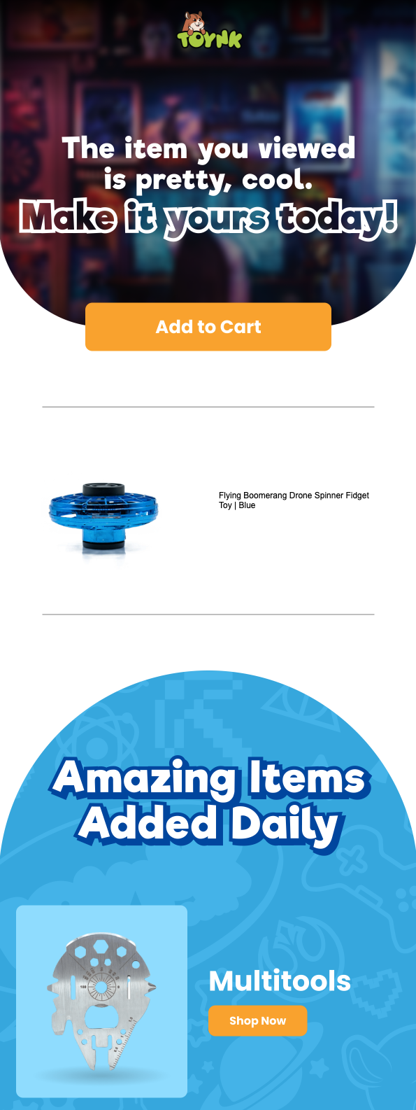
Toynk creates one of the most colorful and engaging browse abandonment email examples. The subject line, “The item you viewed is pretty cool,” sparks curiosity and excitement.
The bold phrase that follows, “Make it yours today,” compels the customer to want to buy the product and pushes them to a decision.
The colorful design and fun visuals create an inviting shopping experience:
Danbury Mint takes a personalized approach to product abandonment emails with the line: “WE SEE YOU HAVE GREAT TASTE.” This email acknowledges the reader’s interest and reinforces a sense of exclusivity by curating top products just for them.
Greeting the customers with “Your favorites are selling fast” induces urgency, while including multiple product recommendations increases the chances of conversion:

ASOS has one of the best browse abandonment email examples with a more conversational approach and attractive visuals. The headline, “Oh hello again…” feels cheerful and inviting, which makes this a friendly reminder rather than a sales push.
A list of popular brands below offers a chance to check out something different that might interest consumers, increasing the chances of purchase:

Gigantic!’s browse abandonment email opens with “WINDOW SHOPPING?” in bold black text on a yellow background. Its casual copy and eye emoji in the subject line (“You might wanna look again 👀”) match the brand’s playful personality.
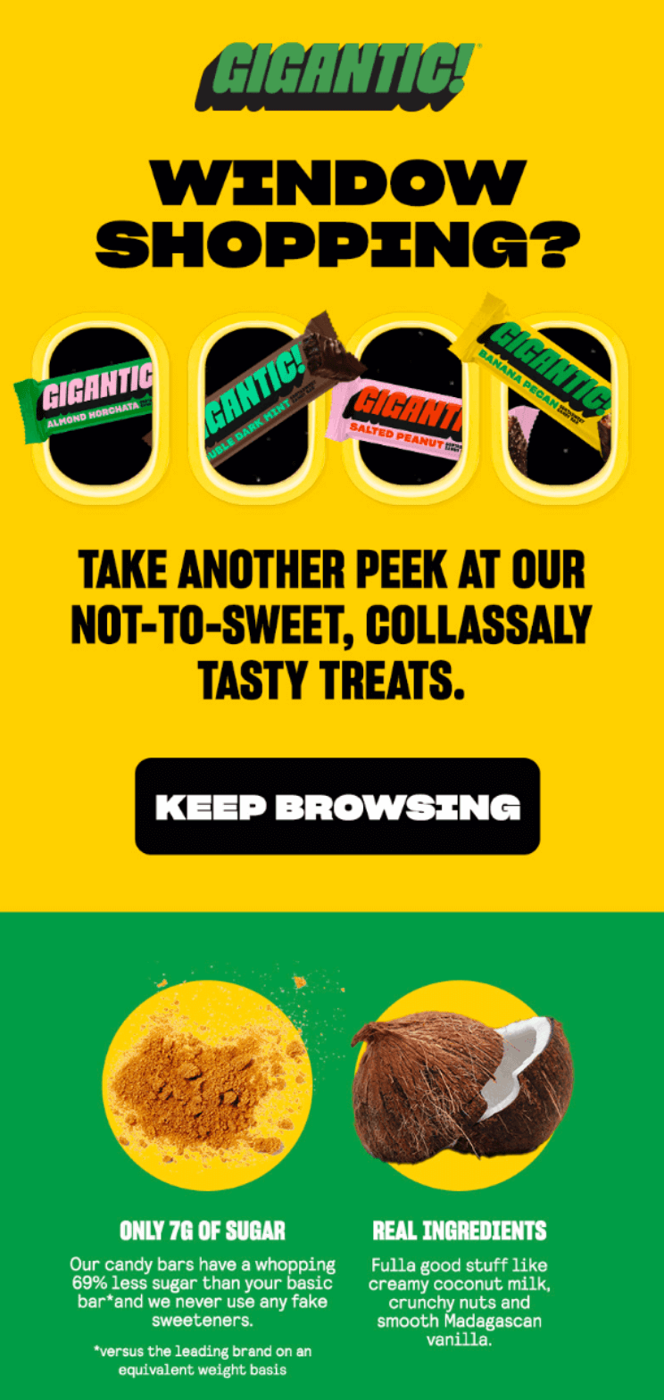
The header showcases four candy bar varieties, and the copy reads “TAKE ANOTHER PEEK AT OUR NOT-TO-SWEET, COLLASSALY TASTY TREATS.”
The circles below feature ingredients and sustainability points — 7g of sugar compared to standard bars, coconut milk, and Madagascar vanilla, as well as fair trade sourcing and plant-based recipes, which appeal to Gigantic!’s audience.
Chewy’s browse abandonment email uses emotional appeal with a French Bulldog hero image and playful copy (“Make it yours, er…theirs”). The subject line “Your browsed items are order-ready” creates urgency by suggesting products are waiting for purchase.
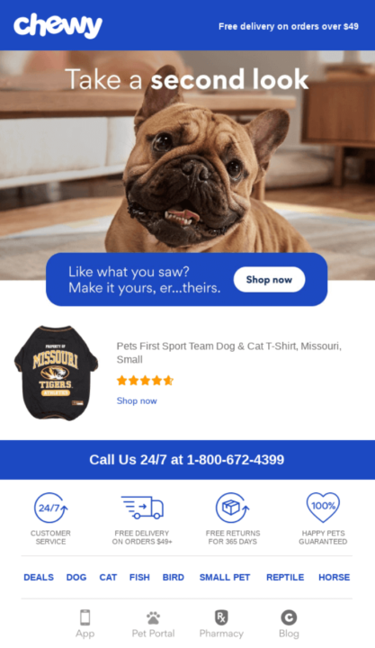
Below the hero image sits the Missouri Tigers pet shirt, with a five-star rating alongside. Footer content builds trust with 24/7 phone support, a free shipping threshold, and a happiness guarantee.
Category links (DOG, CAT, FISH, BIRD) invite exploration beyond the abandoned item. Multiple touchpoints appear throughout — app download, pet portal access, pharmacy services — giving customers various ways to engage.
Omnisend success story
Dukier’s browse abandonment automation contributed to its 525% revenue growth from email marketing. The pet accessory brand localized cart recovery messages across five languages, achieving a 48.4% open rate and 2.8% conversion rate.
Read the case study
Haoma’s browse abandonment email has a striking silhouette against a sunset backdrop. Its subject line, “Any questions?” positions the brand as helpful rather than pushy.
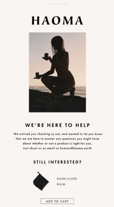
“WE’RE HERE TO HELP” appears in bold, followed by conversational content about answering product questions. It then provides a direct contact (humans@) for personalized assistance.
Below is its abandoned washcloth at $18. Customer favorites showcase three alternatives — earth soap ($15), cleansing balm ($85), and night cream ($110), giving browsers options across price ranges.
Rael’s email leads with the catchy heading, “We Saw You Checking Us Out 😉” paired with a winking emoji that matches the subject line’s playful tone. Free shipping on orders $50+ appears prominently at the top.
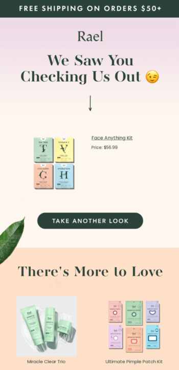
The abandoned Face Anything Kit ($58.99) showcases four colorful sheet masks in mint, yellow, coral, and blue packaging. A dark green “TAKE ANOTHER LOOK” button sits below.
“There’s More to Love” introduces alternative products, including Miracle Clear Trio, Ultimate Pimple Patch Kit, Miracle Clear Soothing Spot Gel, and Miracle Patch 3-Step Pore Melting Pack. Each product photo shows clean, minimalist packaging in Rael’s signature pastels.
Here are 20 browse abandonment-specific subject lines that caught our eye and might be worth testing with your audience:
Regardless of whether it’s these or other browse abandonment subject lines you choose, don’t forget to make them short and compelling. This way, recipients will be intrigued to open and check out what’s inside.
Want to see how your browse abandonment email subject lines perform? Try our free email subject line tester here.
While browse abandonment emails can help you turn those “almost” shoppers into actual customers, it’s imperative to implement them properly for optimal results.
Use the following browse abandonment email best practices to craft emails that feel personal, engaging, and compelling:
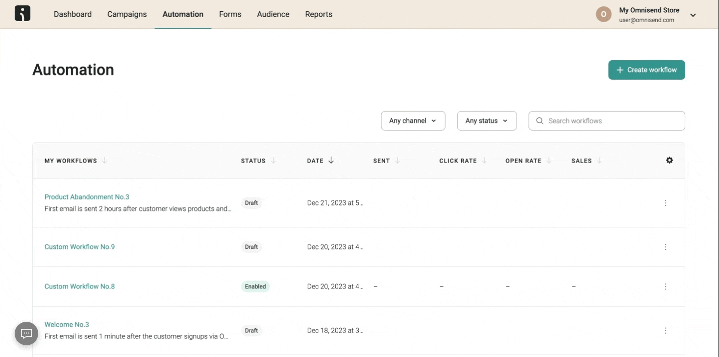
With a pre-built automation workflow, Omnisend lets you create detailed browse abandonment emails without a steep learning curve. The intuitive automation helps you save hours on creating workflows by letting you select the workflow you need and begin customizing:
Omnisend success story
Bowy Made’s luxury baby brand generates 70% of its revenue from email automations. Pre-purchase flows, including browse abandonment, product abandonment, and cart recovery, together produce five figures monthly.
Read the case study.
Armed with the abandoned browse email examples and best practices we’ve outlined here, you’re one step closer to re-engaging shoppers.
The site abandonment email examples we’ve provided that contain simple reminders or an offer-packed message both prove that a little nudge can go a long way toward turning window shoppers into buyers.
So, if you’re looking for inspiration, check out browse abandonment emails from top brands to figure out what works best for your brand.
Ready to win back those hesitant shoppers? Take cues from these winning email examples and turn those “maybe’s” into “yeses!”
Quick sign up | No credit card required
A browse abandonment email is a friendly nudge rather than a sales pitch, reminding you about a product you checked out but didn’t add to your cart. The best browse abandonment emails make it easy to pick up where you left off — sometimes with a little extra incentive.
Typically, one to three emails over a few days work best for a browse abandonment flow. Start with a friendly reminder, follow up with some urgency, and end with a final prompt — add an incentive, if needed.
Too many emails can feel spammy or overwhelming, so keep it simple and strategic.
The best browse abandonment email subject lines feel personal, spark curiosity, and make you want to open the email. Something like “Hey Alex, still thinking about this?” or “Did you forget something?” works well. Consider adding a product to make it even more effective.
First, set up a browse abandonment trigger to track when shoppers leave without buying. Then, use tools like email marketing platforms to automate the flow, and include personalized product reminders, clear CTAs, and incentives. Remember to test and tweak to see what works best for your audience.
The browse abandonment trigger kicks in when you check out a product but leave before adding it to your cart. It lets brands send you a quick reminder, similar to the abandoned browse email examples that feel helpful, not pushy. It’s a smart way to bring you back without being annoying.
TABLE OF CONTENTS
TABLE OF CONTENTS
What’s next


No fluff, no spam, no corporate filler. Just a friendly letter, twice a month.