OFFER
OFFER


Email capture: Best practices + software you need [2026]
With over 130+ pre-built integrations and flexible APIs, you can easily centralize data from across your tech stack
Make the most out of your data and unlock powerful growth marketing possibilities with these other top marketing tools.
Build any custom integration with our open, flexible APIs that are simple to use and implement.
Check out apps that have been stealing all the spotlight.
Email and SMS marketing insights, ecommerce resources, and the latest Omnisend news
Expert-led sessions covering email, SMS, and ecommerce marketing strategies.
Educational video and live training to help you make the most out of Omnisend.
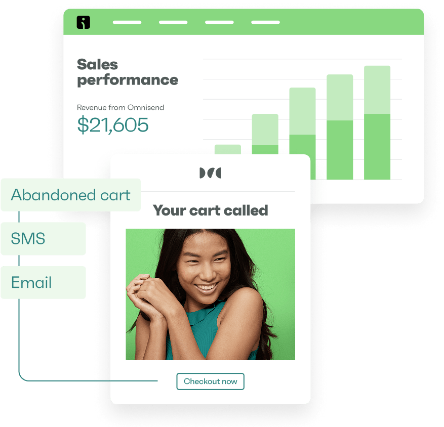
Drive sales on autopilot with ecommerce-focused features
See FeaturesEmail marketing campaigns are the most effective way to directly engage customers and boost sales, as they bypass social media algorithms and paid ads.
The success of email campaigns hinges on strategic messaging, targeting the right audience at the right time, and utilizing segmentation to enhance relevance.
Different types of campaigns, such as promotional, re-engagement, and seasonal, serve distinct goals and require tailored approaches to maximize effectiveness.
Consistent monitoring of key metrics like open rates, click rates, and revenue per message sent is essential to refine strategies and improve future campaigns.
Years of ecommerce have taught me that there’s no better way to nurture customers and increase sales than an email marketing campaign. Unlike social media algorithms or paid ads, email puts you in direct contact with people who asked to hear from you.
The difference between profit and spam comes down to strategy. Send the right message at the right moment, and subscribers buy. Blast everyone with everything, and they unsubscribe.
In this guide, I’ll walk you through different types of email marketing campaigns that convert. You’ll get real-world ideas from seasonal promotions to price drop emails, plus strategies for timing and personalization.
Quick sign up | No credit card required
An email marketing campaign is a one-time or scheduled send to your subscribers. You might send one promotional email or multiple messages over the course of weeks. Each campaign has a clear goal, such as generating sales, building relationships, or sharing information.
With an email campaign, you create an email, assign a list or segment to it, and then send it immediately or schedule it to go out on a date and time of your choosing. Your email tool sends the message and collects data for open rates, clicks, and so on.
Email campaigns help you:
Email campaigns versus automations
Campaigns and automations are types of email marketing, but they operate through different mechanisms and play different roles in your customer journey.
Read my complete guide to email automations to find out more, including how they generated 30% of all revenue from 2% of sends in 2025.
Campaigns reach your customers according to the schedule you set. Control over timing and delivery means you can target customers with emails based on the engagement data you hold, such as most people opening them between 9 AM and 11 AM.
Another reason behind campaign success is segmentation, if you use it, which you most certainly should. It lets you target different customers with unique campaigns, improving their relevance through contextual information for VIPs, for example.
Omnisend’s Ecommerce Marketing Report shows that scheduled email campaigns earned $0.18/send in 2025 and played crucial roles in reach and awareness. Using them alongside your automations makes sense to cover all points in your customer journey.
A sales campaign is clearly a revenue-generating tactic, but launches and newsletters can be slower-burners that nurture your customers.
I’ve found that a contextual campaign sent to a targeted segment, rather than everyone all at once, makes the difference between ignored messages and instant sales. Choose the right type for each situation to maximize your results:
A promotional campaign includes emails that cover your exclusive content, sales, and discounts, such as the Fender email. The purpose is to move your customer closer to a purchase, either through direct action or, more subtly, through nurturing tactics.
These are for your product and service launches, or you can blur the lines between launch and promotional campaigns with sales launches. The Google Fitbit email in our examples section is a good one. Again, you’re moving customers closer to purchase with these.
You’ll eventually have a customer segment containing people who purchased X months ago but haven’t since. These customers are ripe for a re-engagement email. A product-recommendation email, such as the one sent by Asics, works well.
A non-promotional email series delivered on a schedule that your subscribers anticipate, such as once a week or monthly. It’s a space to cover your company news and opinions. The Ordinary has an eye-catching newsletter you can take ideas from.
A one-off or email series for the likes of BFCM, Thanksgiving, and Valentine’s Day. Check out the Kizik email below. Sales are primary to the campaign, which is why we see so many heavy discounts from retailers during events. Best sent to window shoppers and existing customers.
You can set up your email marketing tool, such as Omnisend, to segment customers who purchased but didn’t leave any feedback via an automated request. Those customers can then receive a campaign email after a few months, such as the one Tripadvisor sends.
Save a price-drop template in your email tool and pull in relevant products whenever you lower prices. You can then send that campaign to your most engaged segments. Also suitable as an automation if you link your ecommerce store. The Uniqlo email below works very well.
Follow these steps to build your first professional email campaign:
You’ll eventually have a few email campaigns running, but let’s pick a promotional campaign as our starting point. The instructions below are applicable to all campaign types anyway.
Your campaign can reach all your contacts or a segment. I always recommend a segment so that your least engaged subscribers don’t waste your send quota.
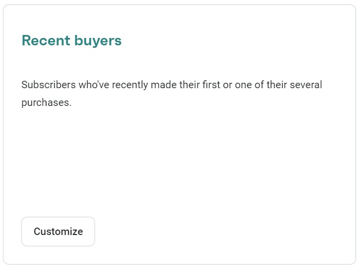
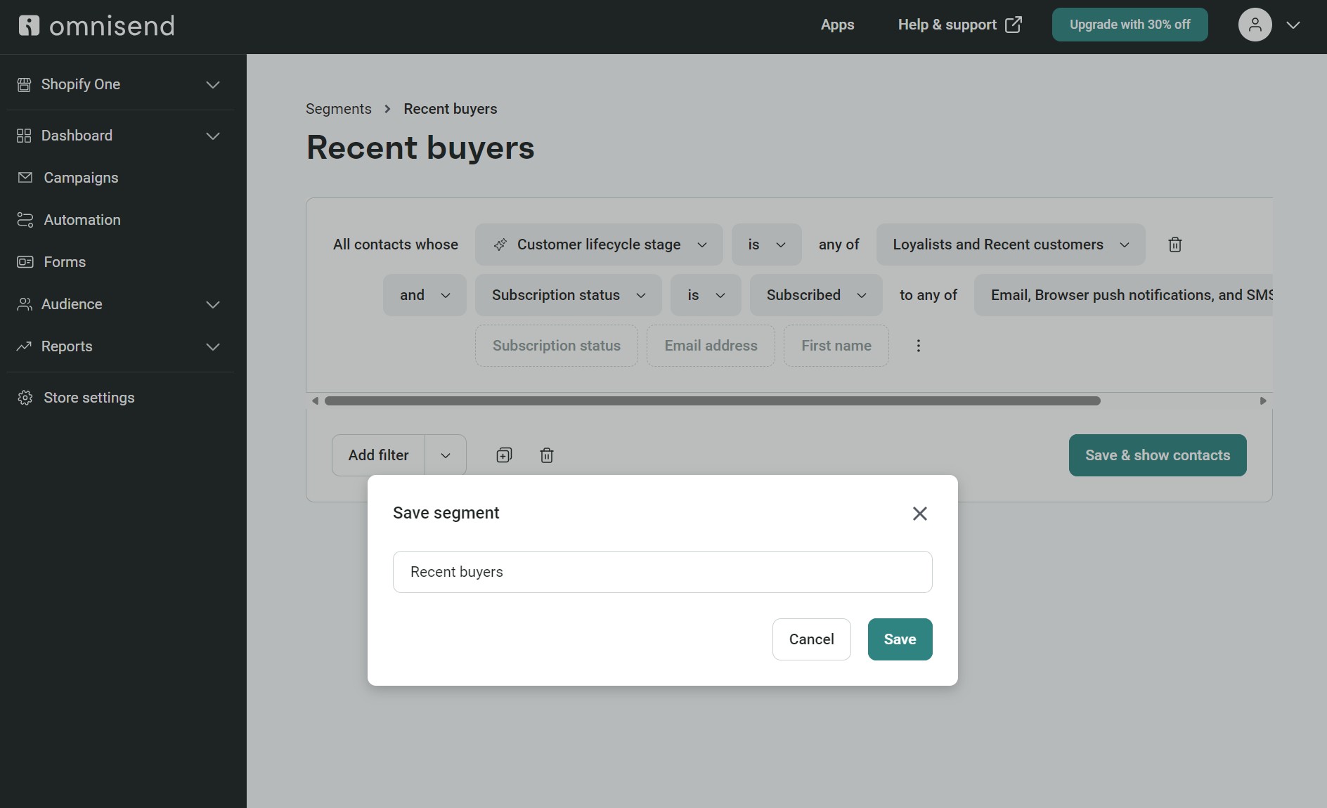
If you have your ecommerce store synced into Omnisend or another email tool, then you’ll be able to create a segment for subscribers who have purchased at least once, or recent buyers. Create that recent buyers segment in Omnisend with these steps:
4. Click Save & show contacts, and any relevant ones will sync automatically:
We’ll assign this segment to your campaign in step four.
Create a campaign
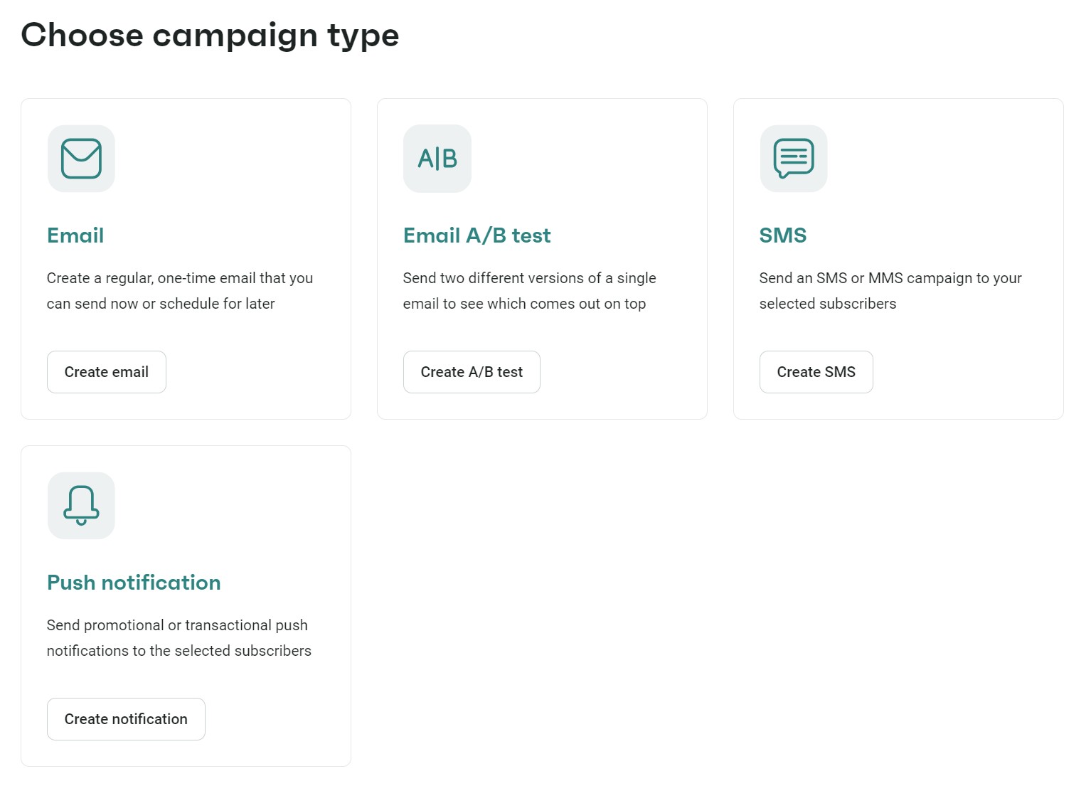
Follow these steps to create your campaign in Omnisend:
4. Enter these details:
5. Click Choose email template to proceed to designing your email
Now that you have a segment for your promotional campaign and an initial campaign configuration with a subject line and preheader, you can build your email template (or, as I like to call it, the really fun part).
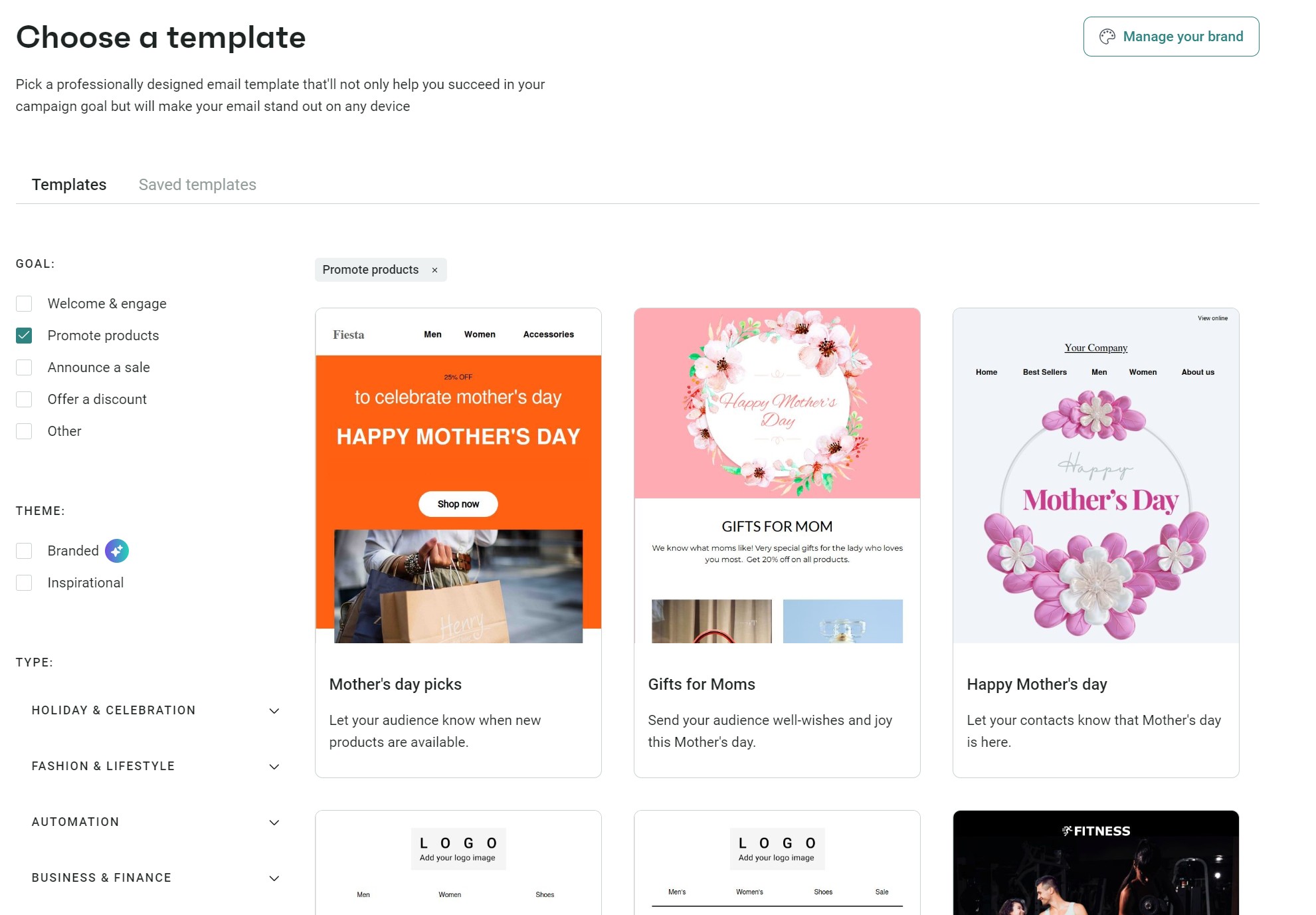
Omnisend has 250+ pre-built email templates to choose from. Select the Promote products filter to load a few seasonal and general-use ones, or you can scroll through all the templates. Hover over any and click Use template to start editing:
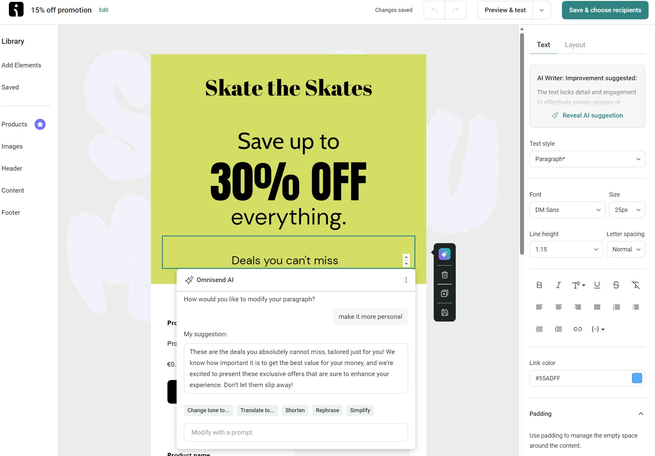
Once you’re in the email editor, follow these steps:
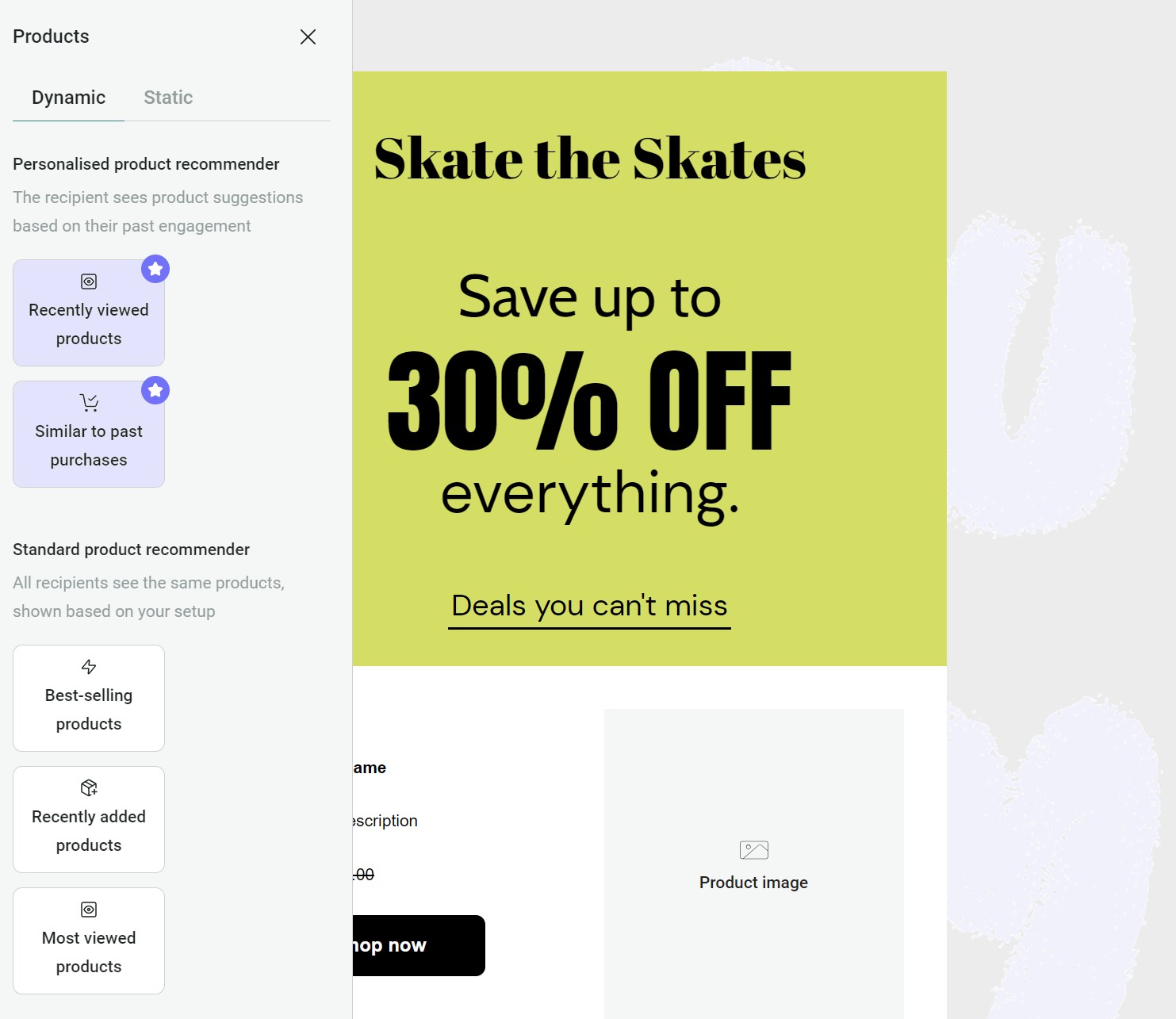
2. Assign a product element to your email. All Omnisend plans let you add best-selling, recently added, and most-viewed products. If you have the Pro plan, you can add recently viewed products and products similar to past purchases, which use browsing and purchase activity to personalize recommendations:
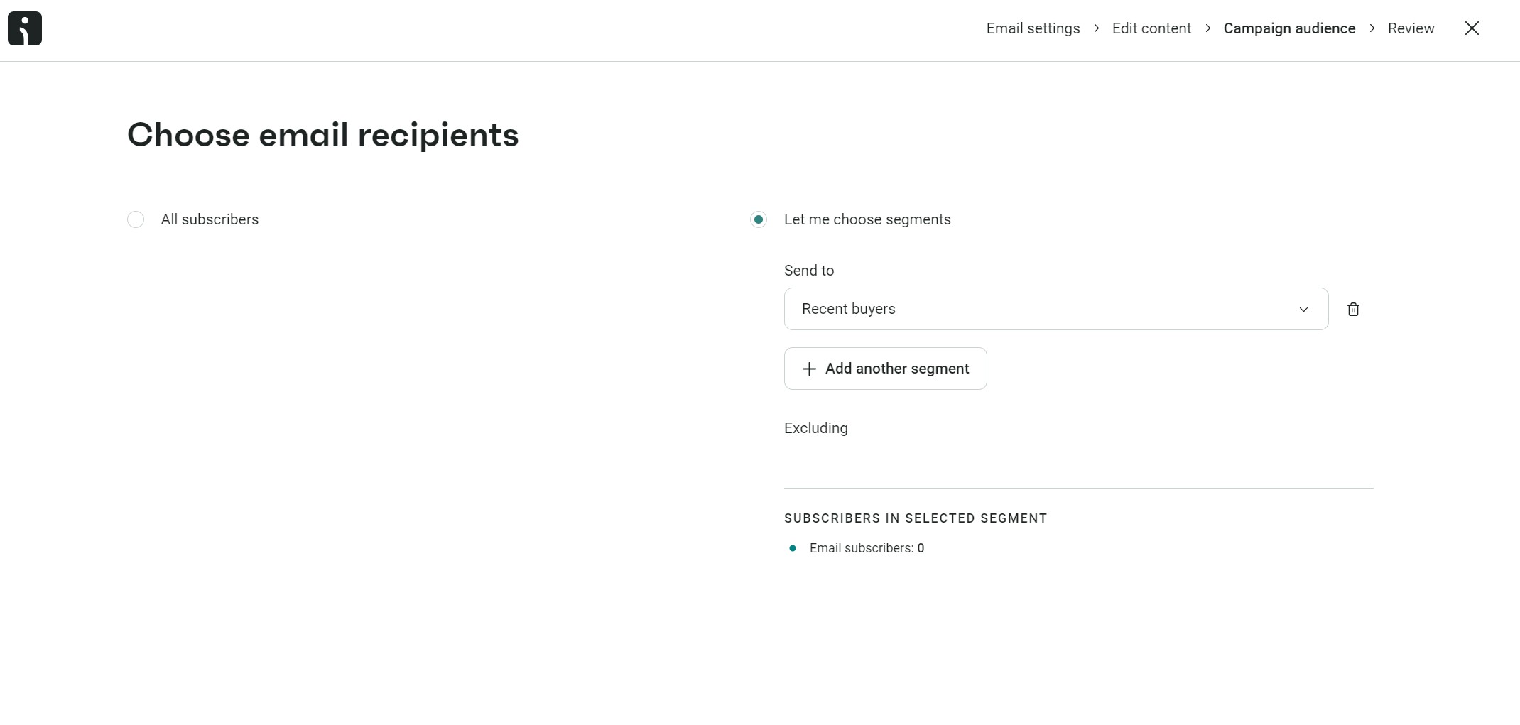
3. Assign your campaign to a segment. Click the Save and choose recipients button and then select Let me choose segments. A dropdown will then load > select the Recent buyers segment we created earlier:
4. Click Review campaign and amend these settings:
5. To test your email, click the send test email button, and then add an email address to receive a test email. I recommend sending it to a Gmail and Outlook address to ensure the email formats properly in these popular email clients.
6. Click the Schedule campaign button to set it in motion.
Head to the Reports tab in Omnisend and click Campaigns:
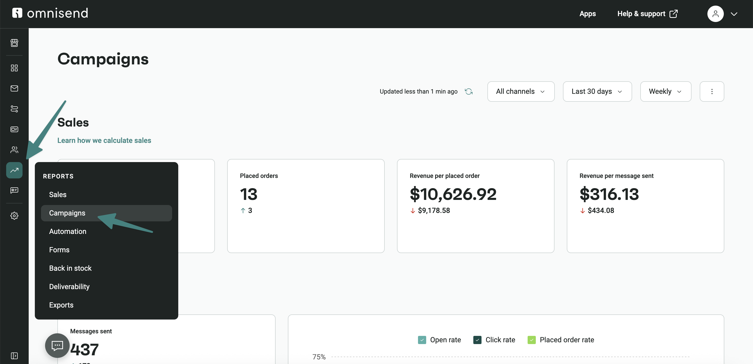
You’ll see these metrics at the top:
Note that the above metrics are the total, across all campaigns. If you scroll down to Campaign performance, you can then see the following information per campaign:
Monitor these metrics one week after the initial send date to give your customers a good chance to open your email, and compare them like-for-like with other campaigns once you have a few under your belt.
These five email marketing tools let you create and send professional campaigns:
Omnisend is my best pick for ecommerce because it lets you build unlimited email campaigns, unlimited segments, and it tracks opens, clicks, sales, and attributes revenue to your efforts.
Schedule them for any date and time or publish them immediately; it’s your call. Additionally, all plans let you build standalone SMS and web push notification campaigns, and you can combine these channels in automations.
Quick sign up | No credit card required
Sender’s pitch is its enormous monthly send limits. These make it perfect for sending mass campaigns and bulk emails. In fact, the free plan is probably all you need if you only intend to upload a list and send an email to everyone.
Where Sender doesn’t do as well as Omnisend, in my opinion, is in campaign optimization and multichannel targeting. Its auto-resend-to-non-openers feature and SMS campaigns, for instance, are only available on the standard plan, whereas Omnisend lets you use them for free.
MailerLite is an alternative to Sender with almost as generous send limits and more seller features, such as a website builder and the ability to sell digital products and take bookings. Its paid plans also let you send paid newsletters.
If you want an extremely short learning curve and to send your email campaigns within five minutes, I can’t knock MailerLite. It works well enough for campaigns and provides free access to its basic automations.
Pricing
I recommend Brevo if you’re sending email marketing campaigns to both consumers and businesses. It has a built-in CRM for contacts, lists, segments, companies, and deals, and your campaigns can target these different elements.
Its pre-built email templates, drag-and-drop editor, and AI content generator are available on all plans. However, many ecommerce-critical features, such as A/B testing and email frequency management, are restricted to higher-priced plans.
Mailchimp is my top email marketing campaign tool pick if you’re a small business planning to integrate multiple tools into your stack. 300+ integrations cover most Shopify apps, and you get all the tools you need to send basic campaigns for free.
I rate Mailchimp’s intuitive dashboard and drag-and-drop email builder. Something to be wary of, though, is that you only get limited access to templates for free. Additionally, the free plan doesn’t let you schedule emails, a feature that Omnisend, Sender, MailerLite, and Brevo support.
The 20 email marketing campaigns I’ve listed below will inspire your efforts:
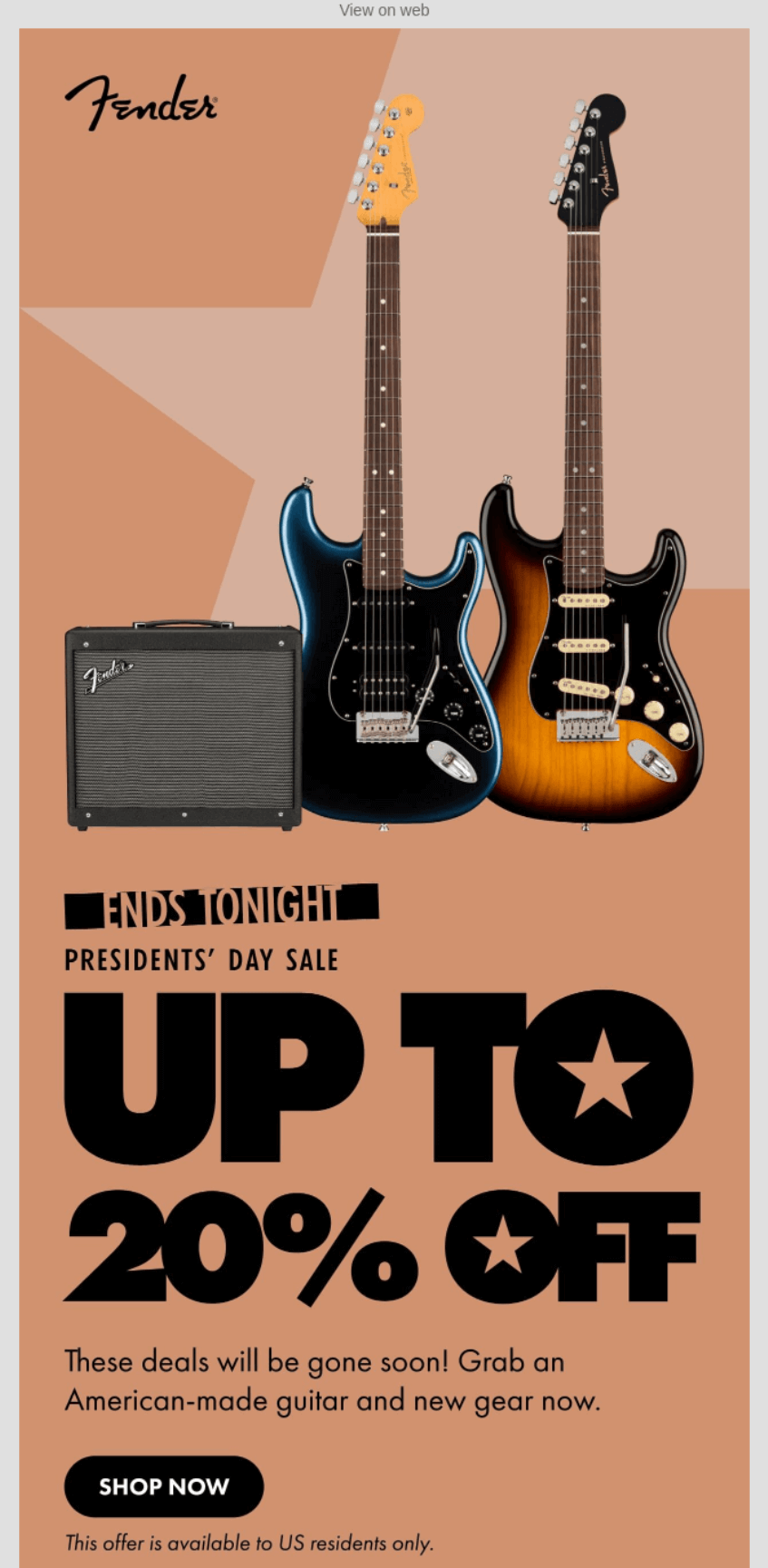
Fender uses bold typography with “UP TO 20% OFF” filling the screen alongside iconic guitars and amps.
Geometric backgrounds in warm tones create visual interest without distracting from its products. The “ENDS TONIGHT” header and “gone soon” messaging push immediate action for its Presidents’ Day sale.
What stood out to me
Stars in the “UP TO” design cleverly reference the American flag for Presidents’ Day without being obvious. At the same time, additional language about American-made products hooks customers who value products from their country.
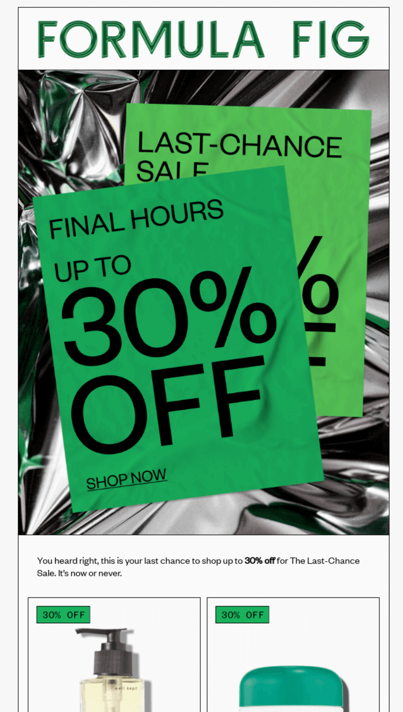
Formula Fig creates urgency with “FINAL HOURS” messaging for its Last-Chance Sale offering up to 30% off.
Its product grid showcases six best-sellers with discount percentages, making it easy to spot deals. Each item shows both original and sale prices, removing mental math for shoppers racing against the clock.
What stood out to me
Product blocks with individual discount percentages (10% OFF, 20% OFF) let shoppers quickly scan for their preferred savings level, plus the template includes both luxury items (Wonder Valley at higher prices) and accessible options, capturing different budget levels during the sale.
The “Give a fig about your skin” tagline at the bottom adds personality to the promotional email without distracting from the urgency.
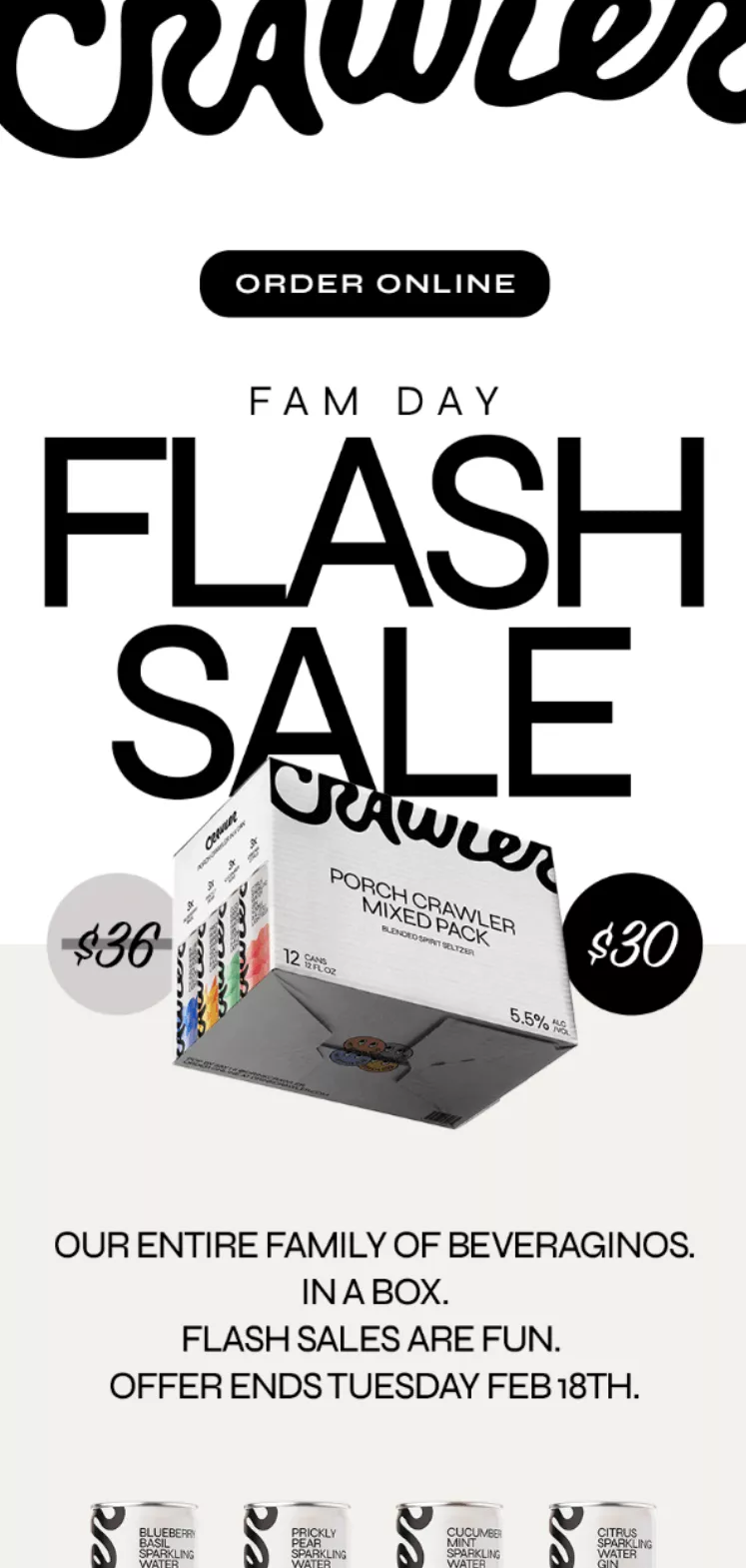
Crawler strips its flash-sale email to essentials — bold typography dominates, with “FLASH SALE” taking center stage, and the minimal design lets the $30 price point and product shot do the selling.
The Tuesday deadline appears multiple times, creating urgency without cluttering the clean layout or distracting from the product image.
What stood out to me
Its black and white design with selective color makes the product packaging pop against stark backgrounds. I love how “FLASH SALES ARE FUN” breaks corporate speak — it feels like a friend texting about a deal.
Repeating “ORDER ONLINE” buttons at the top and bottom catches both quick scanners and those who read everything.
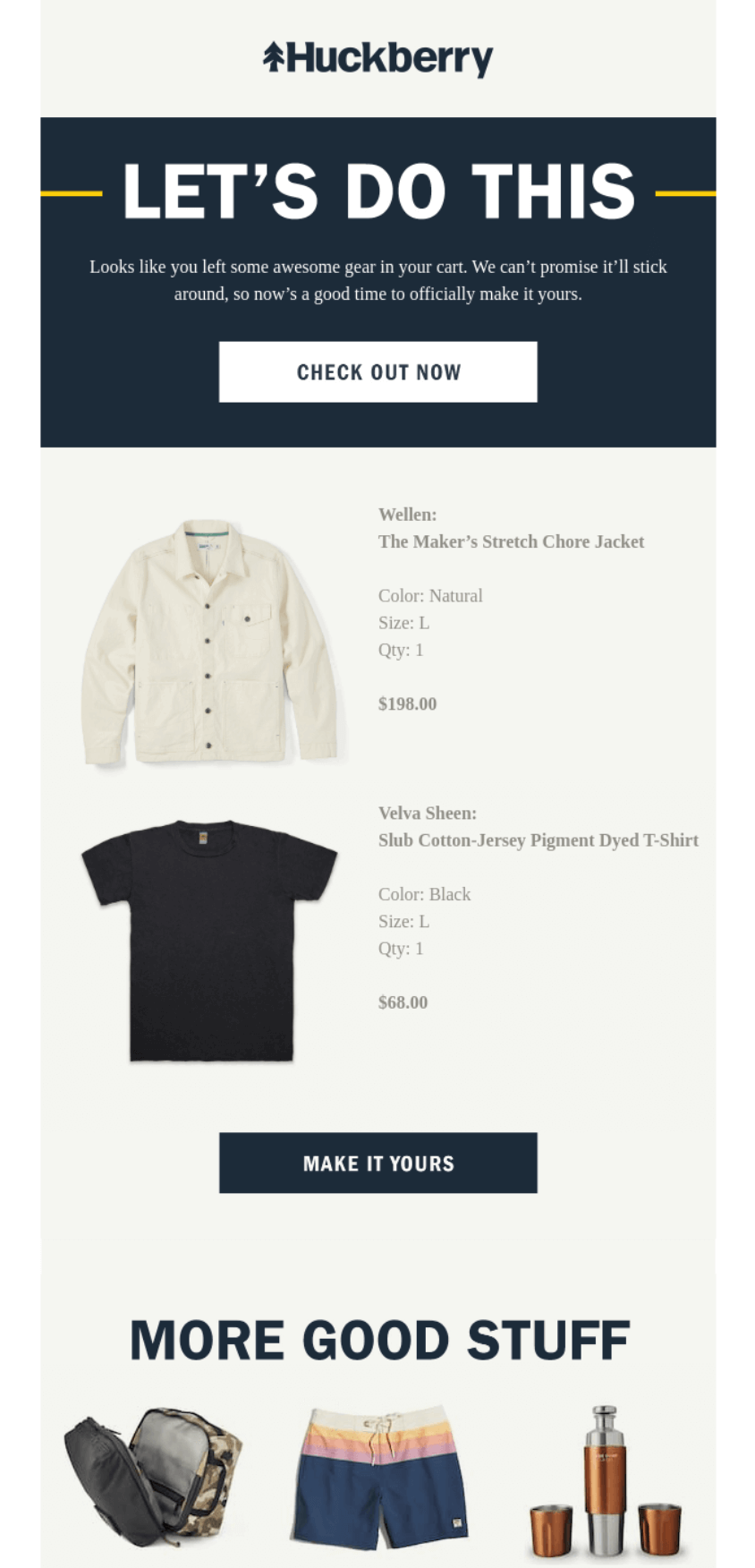
Huckberry saves its customers’ carts and sends emails that show abandoned cart items, including details like color, size, and quantity, to jog customers’ memories.
The “LET’S DO THIS” messaging creates momentum, and “We can’t promise it’ll stick around” creates urgency, encouraging customers to start shopping again. The “MORE GOOD STUFF” section below provides alternatives if original items sell out.
What stood out to me
“Looks like you left some awesome gear in your cart” feels like a friend reminding you about forgotten plans. Showing items with all details (Natural, Size L, Qty: 1) removes guesswork and builds trust.
The grid of alternative products at the bottom turns potential disappointment into discovery when cart items are out of stock.
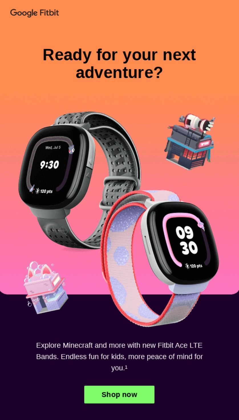
Google announces its new Fitbit products in email campaigns. The campaign above, for its Minecraft bands, is intended for parents and gift buyers. I love how it lets the product images do the talking and how it frames the launch as an adventure.
Further down the email, Google promotes Fitbit features and how they correlate to kids. For instance, it says “Call, chat, locate and more with Ace Pass,” appealing to parents who want to know where their kids are.
What stood out to me
The top gradient background is striking and immediately grabs the eye with a youthful feel. The product images look fantastic against it.
The language in the email, particularly the word “adventure,” subtly prompts customers to find out more. Overall, there’s clear energy here. The email aims to encourage customers to shop and discover the new bands without being pushy.
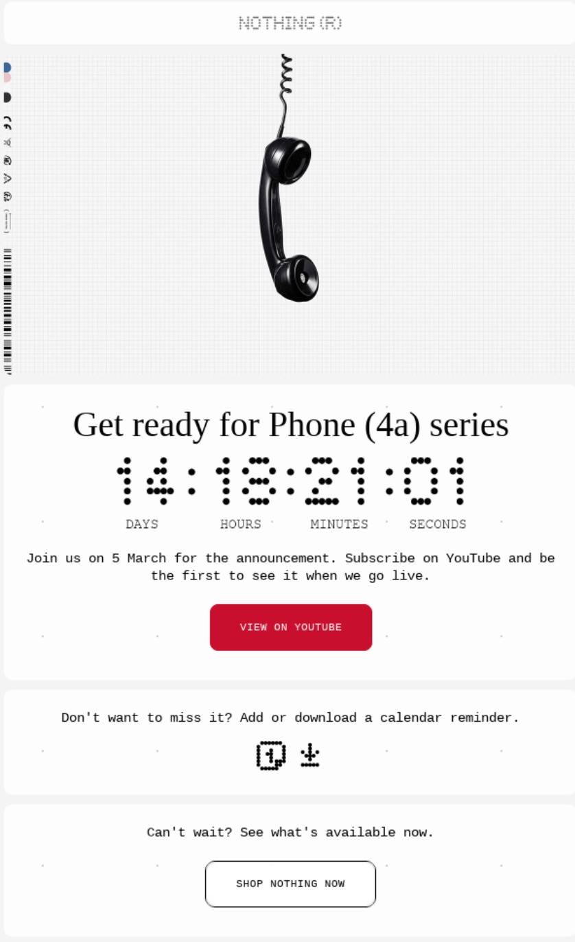
Smartphone retailer Nothing Phone builds stripped-down, transparent smartphones with decent specs for the price. It knows the value of a teaser and sends pre-launch anticipation emails to its most engaged customers to build interest.
The email above uses a countdown timer for the launch and asks customers to join them on 5 March for the announcement. It also asks them to subscribe to its YouTube channel, a modest cross-channel push you can replicate to grow your audience.
What stood out to me
Nothing Phone’s technology-first branding is evident throughout its email, with barcode-like fonts and a grid-patterned hero image. The image of a corded phone hanging from the top encourages the reader to listen to (or take note of) the email.
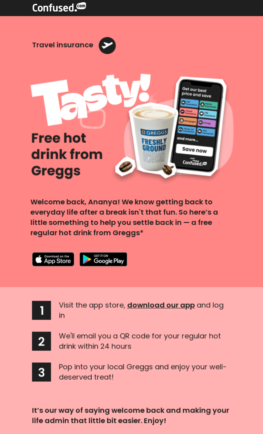
Confused.com wins back dormant customers by offering a free hot drink from Greggs. Partnering with a popular brand creates immediate value for subscribers while encouraging app downloads and account reactivation.
Clear numbered steps make redemption simple, turning a freebie into genuine re-engagement with the travel insurance platform.
What stood out to me
“Welcome back! Here’s a treat just for you ☕” perfectly balances friendliness with incentive. I love how Confused.com acknowledges post-holiday blues before presenting the solution — it shows understanding of the customer mindset.
Bold numbered steps eliminate confusion about how to claim the offer, which is crucial when you want returning customers to follow through rather than abandon halfway.
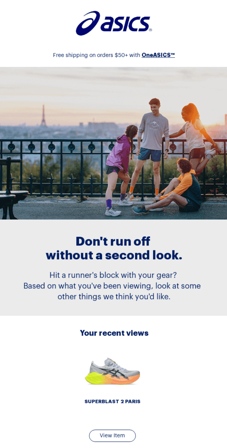
ASICS targets shoppers who browsed but didn’t buy with personalized product recommendations. Showing recently viewed items alongside similar gear creates multiple chances for conversion.
Free shipping on orders over $50 sweetens the deal, while OneASICS membership benefits remind customers why staying engaged pays off.
What stood out to me
“Don’t run off without a second look” cleverly plays on ASICS’s running heritage while addressing cart abandonment. I appreciate how it shows the shoe that was viewed as well as related options — providing choice without overwhelming.
Multiple CTAs at different price points ($50+, $100+, clearance) meet customers wherever their budget falls, maximizing the chances of re-engagement.
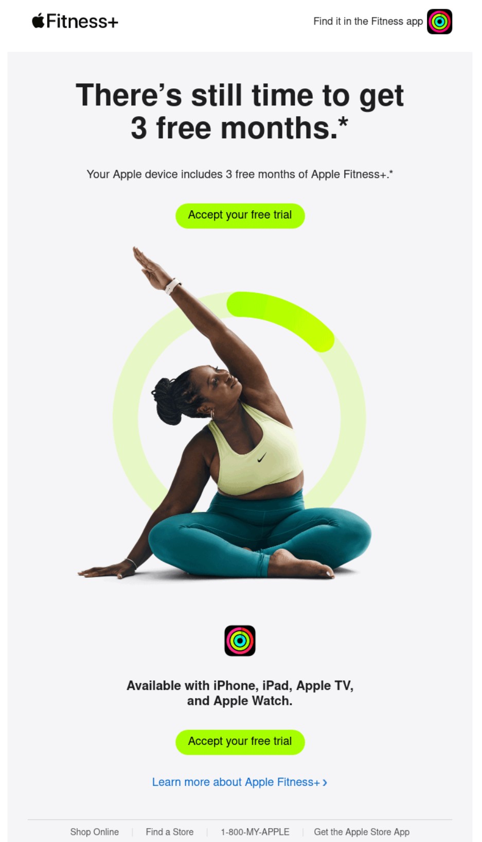
Apple sends out re-engagement emails to customers who signed up for email marketing but didn’t complete their free trial of Apple Fitness+.
The subject line leads with what they will miss, and the heading says that there’s still time, reducing pressure on the customer’s next action. I rate those tactics. Customers will open the email out of panic and then feel comfortable taking the next step.
What stood out to me
The lime green CTA button stands out and makes the next step clear. The image of a person sitting on the floor, exercising with a circular progress bar around them, makes the email feel alive.
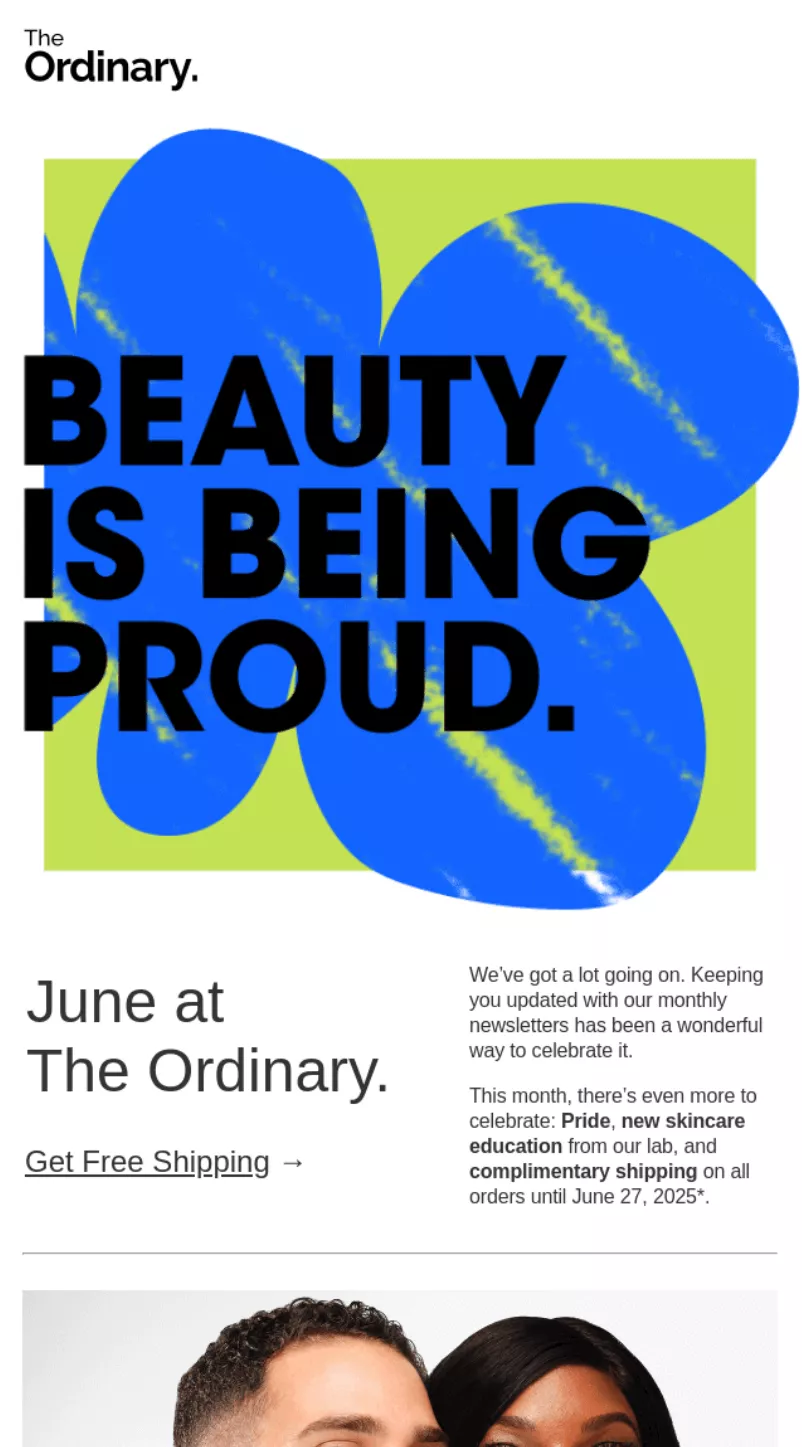
The Ordinary celebrates Pride month with “BEAUTY IS BEING PROUD” messaging while highlighting skincare education and product benefits.
Content mixes celebration with science, explaining pycnogenol benefits and glass-skin techniques. Free shipping promotion runs throughout June, making it easy for readers to try featured products.
What stood out to me
The Leading with Pride celebration feels authentic, not performative, especially with mentions of donations to The Center for Anti-Violence Education and GLAAD.
Product education takes center stage — explaining what pycnogenol does and how to achieve glass skin — rather than just listing items. The mix of advocacy, education, and commerce makes for a newsletter worth reading beyond just discount hunting.
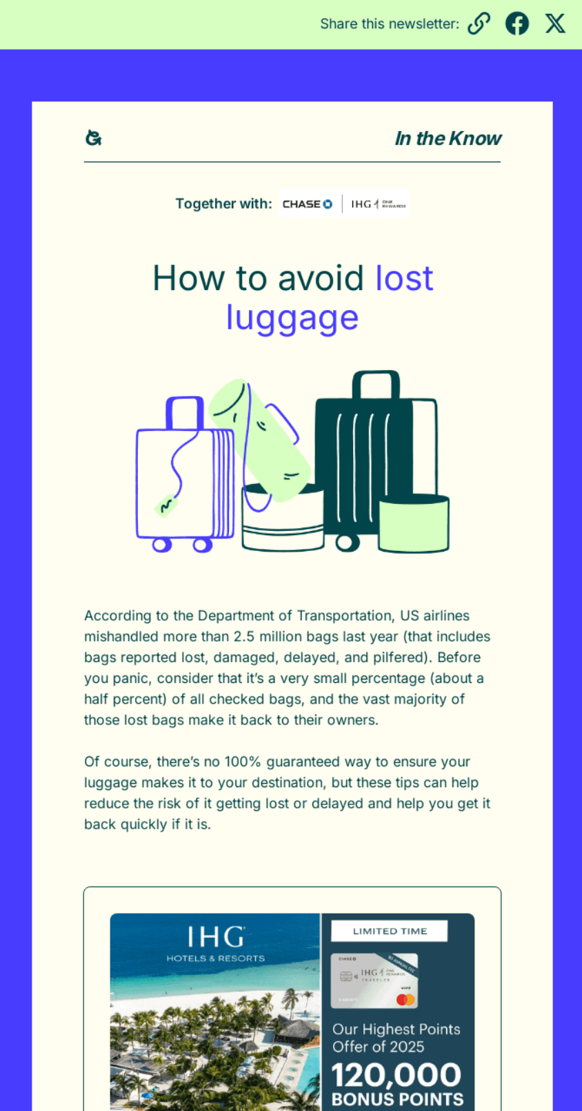
Going provides practical travel advice with nine luggage protection tips, from choosing direct flights to using AirTags.
Content educates without selling, establishing Going as a travel resource beyond just flight deals. The $20,000 IHG sweepstakes adds value and encourages engagement beyond just reading tips.
What stood out to me
Going uses its travel expertise to help subscribers avoid common headaches — lost luggage anxiety resonates with every traveler.
Tips range from basic (direct flights) to tech-savvy (AirTag placement), appealing to different experience levels. Publishing helpful content between deal alerts keeps it top of mind as a trusted travel companion, not just a deals newsletter.
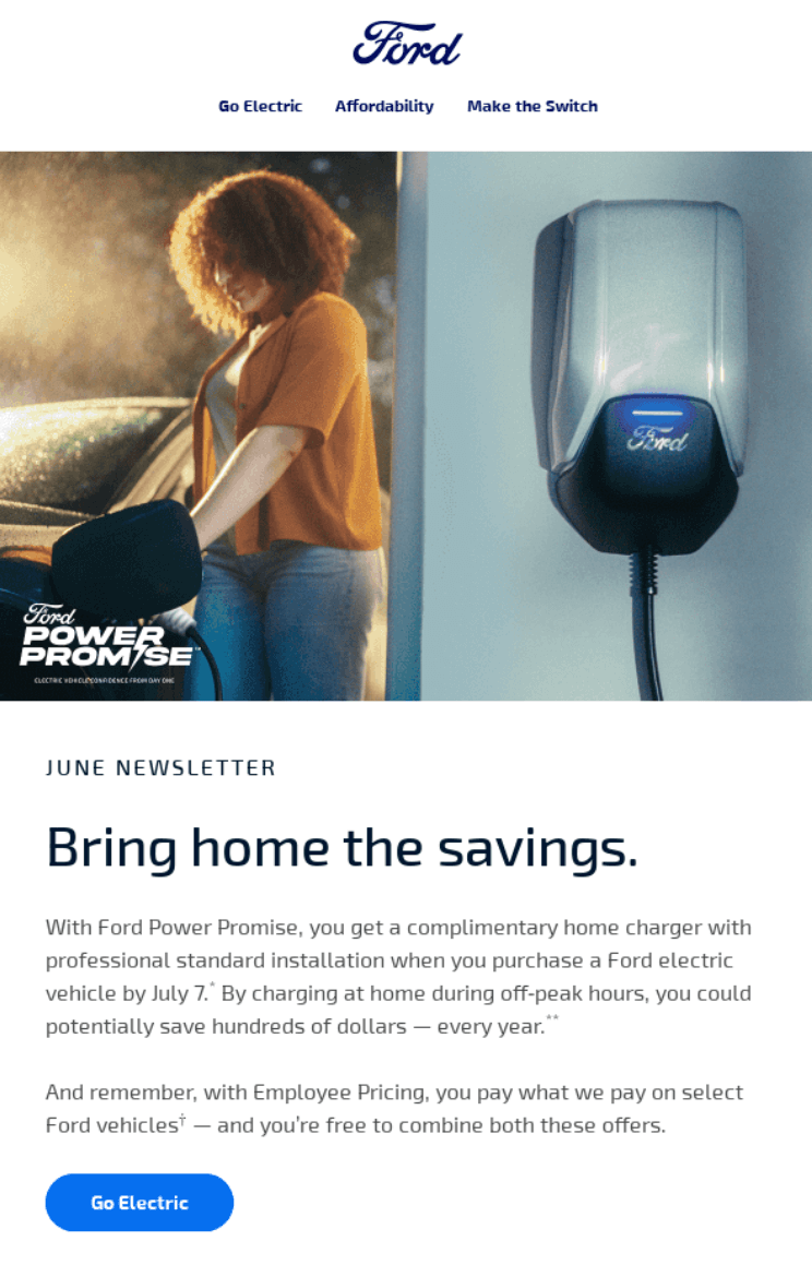
Ford’s monthly newsletter covers home charging education, Mustang Mach-E features, and employee spotlights.
Its content balances product information with human stories — explaining EV charging alongside team member profiles. Multiple CTAs guide readers to specific interests without overwhelming them with sales pitches.
What stood out to me
Opening with “Making Power Moves in EV” educates nervous EV prospects about home charging logistics before they even shop. I appreciate Ford humanizing the brand through employee stories — seeing the actual people behind the products builds connection.
The Mustang Mach-E color options displayed visually let readers imagine ownership without pushy sales language.
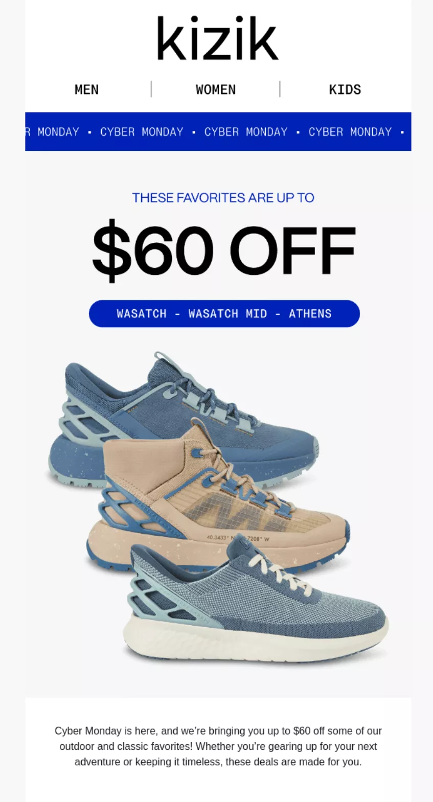
Kizik showcases hands-free shoes with up to $60 off for Cyber Monday shoppers. Multiple styles (Wasatch, Wasatch Mid, Athens) at different price points give options for every budget.
Its product grid layout makes browsing easy while “SEE DEALS” buttons create obvious paths to purchase.
What stood out to me
Starting deals before actual Cyber Monday captures eager shoppers who hate waiting. I like how Kizik displays original prices with sale prices — seeing “$80 off” or “$60 off” tags makes the value apparent.
The question “Know someone who struggles with their hiking shoes?” at the bottom cleverly positions these as gift options, doubling its market.
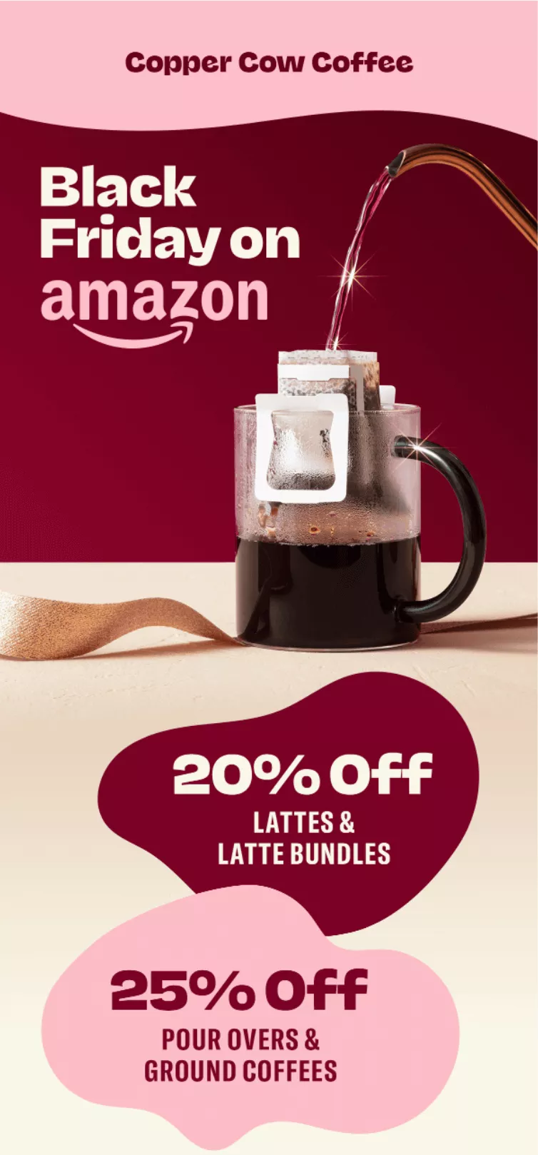
Copper Cow Coffee extends Black Friday deals to Amazon, acknowledging different shopping preferences.
Visual hierarchy with bold percentages (20% off lattes, 25% off pour-overs) makes savings clear instantly. The conversational copy admits its website sale ended, but offers Amazon as an alternative for procrastinators.
What stood out to me
“Our best deal of the year is over on our website rn, but if you need coffee like…now” reads like a text from a friend who gets it.
The “AMAZON IS LIFE” button leans into how people feel about Prime delivery during holidays, acknowledging that some customers prefer Amazon’s checkout and shipping.
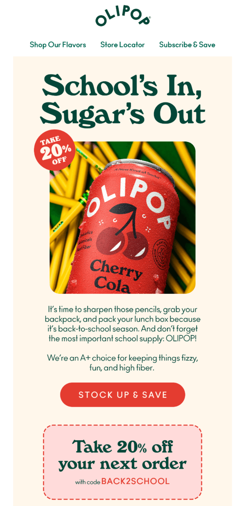
OLIPOP positions low-sugar soda as a back-to-school essential for parents packing healthier lunches.
Cherry Cola imagery with pencils creates the school connection, while 20% off with code BACK2SCHOOL drives immediate purchases. Its copy cleverly calls OLIPOP “the most important school supply” to justify the purchase.
What stood out to me
Calling OLIPOP “the most important school supply” made me laugh — it’s bold positioning that parents will either love or eye-roll at.
The code BACK2SCHOOL feels more memorable than generic discounts and ties directly to the season. I also noticed it chose Cherry Cola for the hero image, likely because it’s the most kid-friendly flavor for lunchbox appeal.
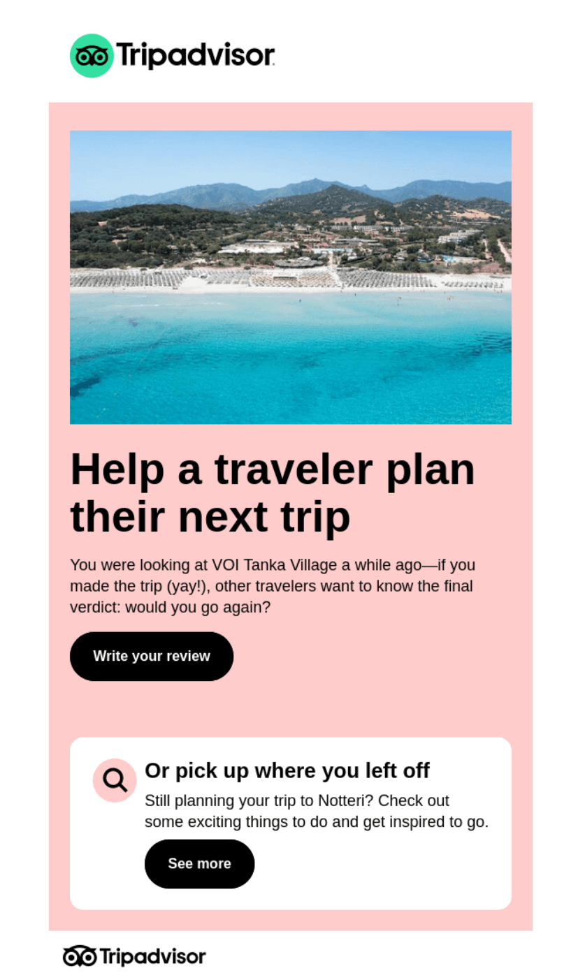
TripAdvisor provides one of my favorite email campaign ideas. It asks past viewers to review VOI Tanka Village, using browsing history to request relevant feedback. Its timing catches travelers after their trip when memories remain fresh.
Offering an alternative (“Or pick up where you left off”) respects that plans sometimes change, keeping non-travelers engaged with destination content.
What stood out to me
“Help a traveler plan their next trip” frames the review request as helping others, not just doing Tripadvisor a favor. Mentioning when they viewed the property (“a while ago”) and asking “would you go again?” feels conversational rather than transactional.
The backup option to explore Notteri attractions keeps the email valuable even for those who have never visited.
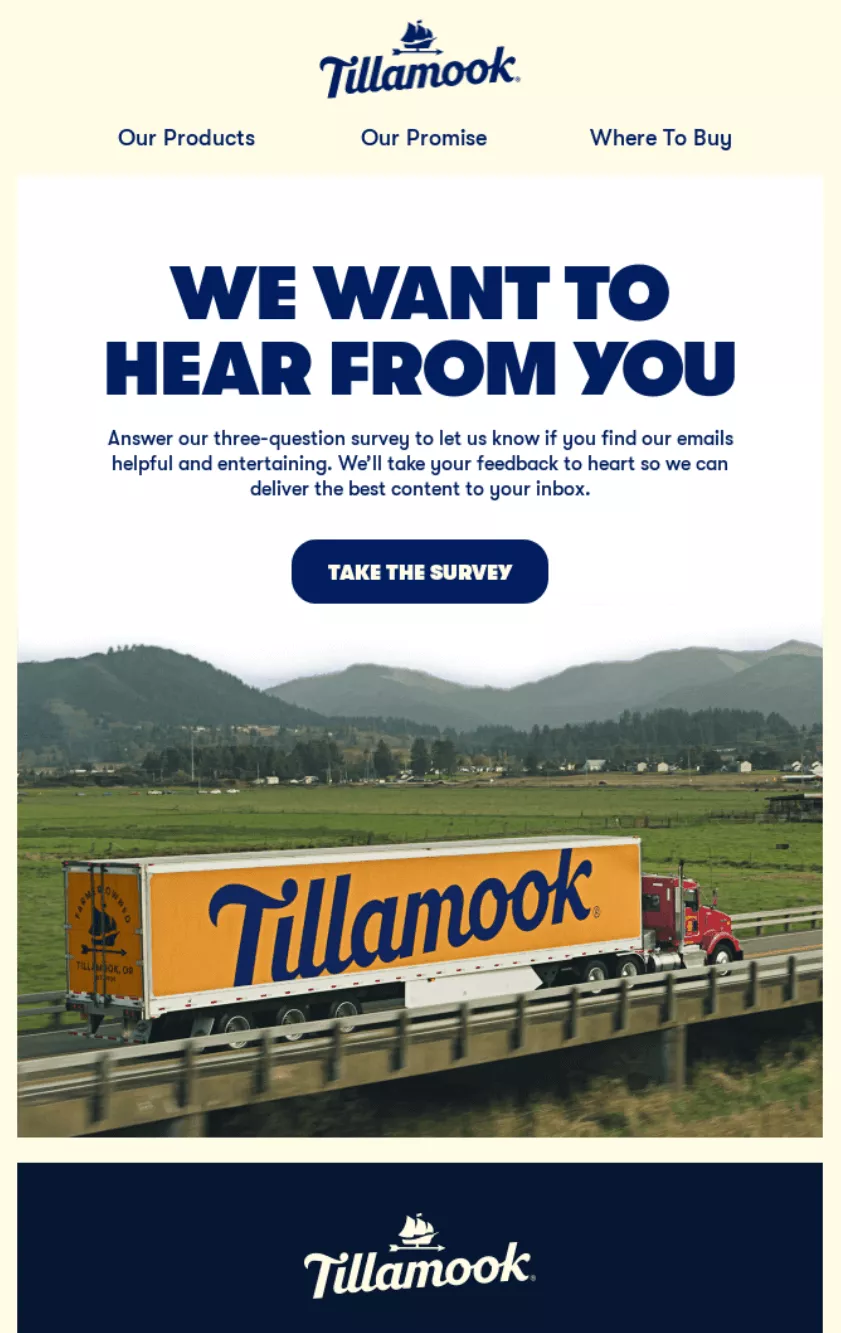
Tillamook keeps its survey request direct with just three questions. Promising to “take your feedback to heart” shows subscribers their opinions matter for future content.
The scenic farm imagery reminds customers of Tillamook’s authentic roots, while the clear CTA button makes participation easy.
What stood out to me
“WE WANT TO HEAR FROM YOU” in bold caps grabs attention without feeling aggressive. I appreciate how Tillamook frames the survey as helping subscribers get better content, not just collecting data.
Mentioning it’s only three questions respects people’s time — a crucial detail that likely increases completion rates compared to vague “quick survey” promises.
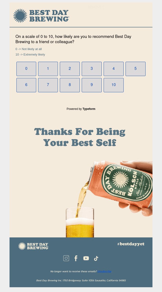
Best Day Brewing uses a Net Promoter Score (NPS) survey to measure customer loyalty with a straightforward question.
The 0–10 scale makes responding quick, while “Thanks For Being Your Best Self” reinforces brand messaging. A clean design with numbered buttons reduces friction, encouraging higher response rates than traditional survey formats.
What stood out to me
Starting with the actual survey question immediately respects subscribers’ time — no lengthy introductions or explanations needed. The playful closing “Thanks For Being Your Best Self” ties back to Best Day’s alcohol-free positioning, making even a survey feel on-brand.
Using large, clickable number buttons instead of radio buttons or dropdowns makes mobile responses effortless.
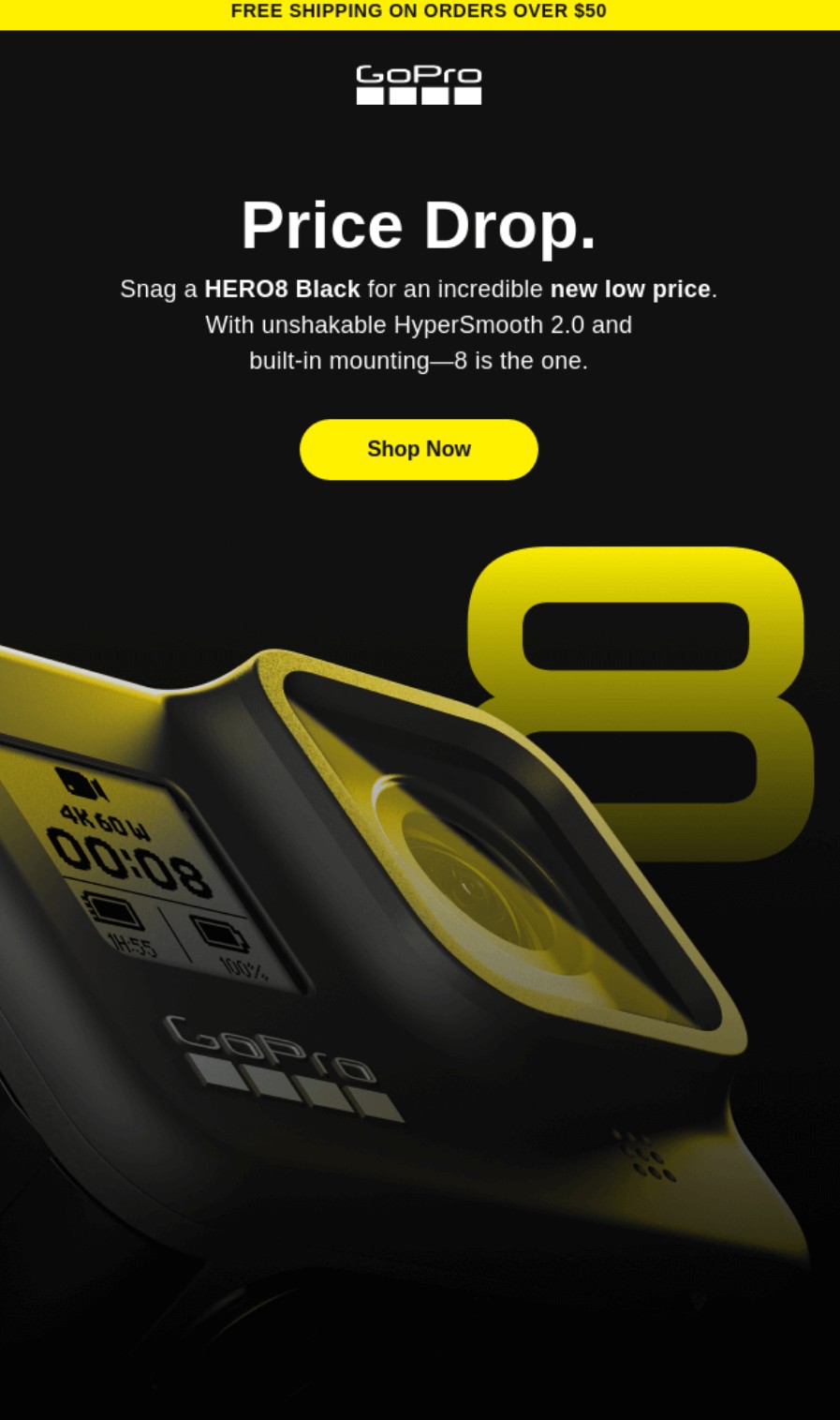
Action camera retailer GoPro sends price-drop emails to previous buyers and window shoppers (those who’ve shown intent through opens and clicks but haven’t purchased yet). The email above alerts them to a new low price for the HERO8 Black.
I love the yellow and black color scheme in this email. The black background, yellow CTA button, and yellow number eight look extremely professional. Additionally, the product image blends into the content above the fold. There’s no text to clutter it.
What stood out to me
The subject line literally says price drop and the heading uses those words only so that customers can be in no doubt about the email’s purpose and intent. The footer is grey, ensuring the reader focuses their attention on the bright yellow elements.
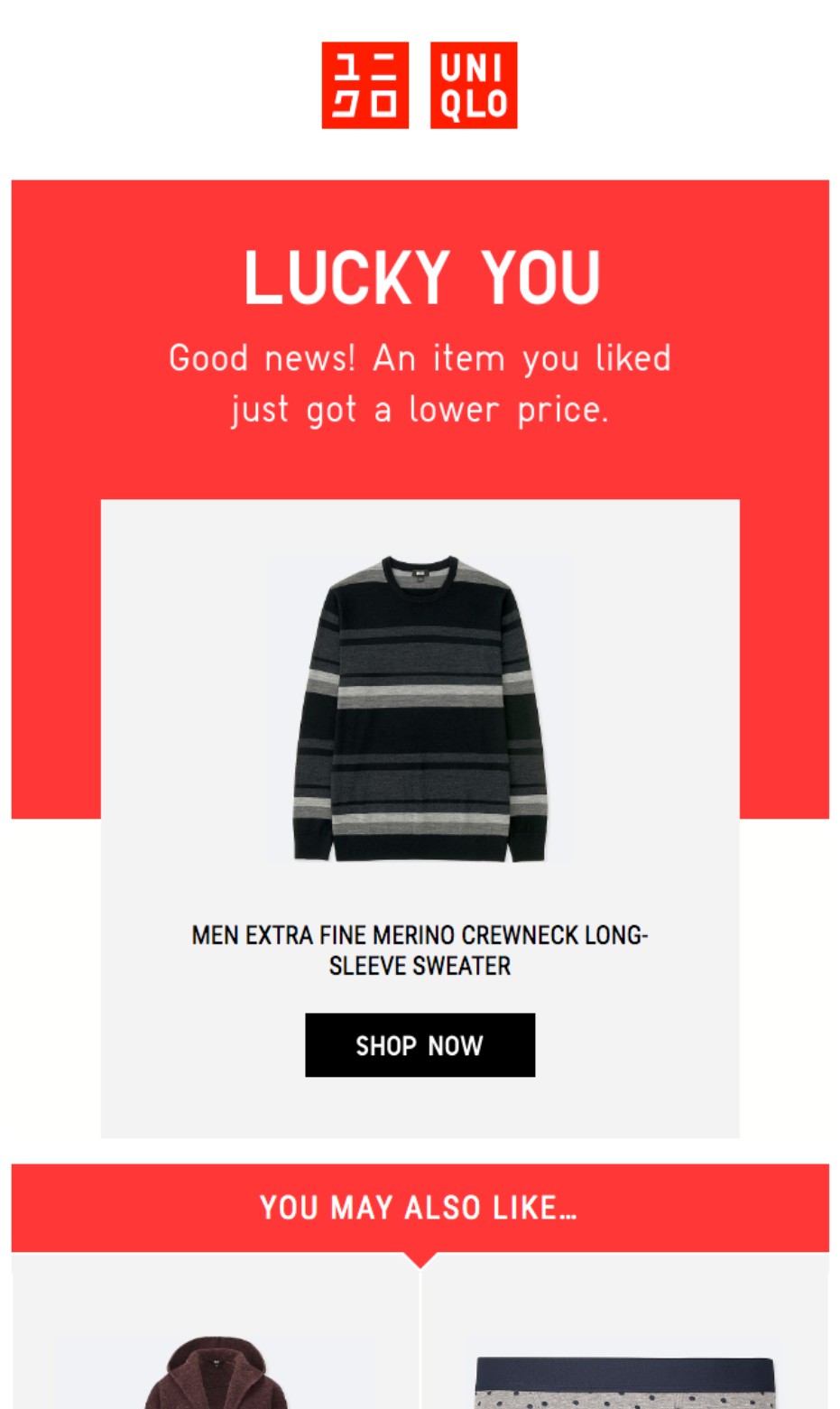
Fashion retailer Uniqlo sends out price drop alerts with a touch of personalization. Its email uses the heading “LUCKY YOU” to make customers feel special, and it pulls products based on the customer’s activity (such as adding an item to their wish list).
Uniqlo’s standout red and white branding carries from the logo through to the email body, with no pricing within product boxes to let the images do the talking.
What stood out to me
I appreciate Uniqlo’s personalization here. The email references past engagement and recommends additional products the customer viewed. Another bonus point goes to the subject line, which encourages action with an outcome (open to see the new price).
Email campaigns that convert have clear messaging, targeted content, and reader-focused design. Master these fundamentals to build campaigns that work:
There are a few basics to cover:
Expert tip
Sending too frequently, too soon, and to too many contacts can get your account frozen or banned by some email marketing tools. Follow the tool’s advice for deliverability and never take risks that could jeopardize your sender reputation.
Pick one goal per campaign and stick to it. Mixed messages about sales, feedback, and brand awareness can confuse subscribers.
Success looks different for each campaign type. Product launches might target 500 sales, whereas feedback emails might aim for a 20% response rate benchmark.
Share your goal with everyone involved in the campaign. Designers, writers, and analysts all make better decisions when they know the target.
Document everything — from success metrics to failure points. Next quarter’s campaign improves faster when you learn from data, not fuzzy memories.
Expert tip
Some campaigns double their conversion rates simply by removing competing goals. When everyone focuses on one outcome, magic happens — from subject lines to design choices.
Under the European GDPR, which can apply to global customers, you generally need to obtain explicit opt-in consent to send marketing emails.
Omnisend provides form templates with opt-in checkboxes, including:
Double opt-in is an additional feature you can enable to collect explicit consent. After filling out your form, customers are required to confirm their email address via a link in an email.
Additionally, your ecommerce platform, such as Shopify, will attempt to collect opt-ins during checkout. If your customers tick the box, you can send them campaigns, in addition to the cart recovery emails your email tool might trigger.
Only customers who tick the box should receive your marketing emails. Note that I said, “who tick”. As in, they tick it themselves. Pre-ticked boxes are not valid consent.
Actively manage your list; don’t just let it accumulate inactive contacts. Most email tools, including Omnisend, charge by the total number of contacts in your list, so you’ll save money with a clean list that reflects engagement.
We’ll touch on segmentation in more detail below, but one of the first things I do with any email setup is create a segment for inactive contacts. These are the ones who don’t open, click, buy, or do anything. I then remove them from my list after one month.
Expert tip
Don’t stop at inactive contacts. Remove any contacts from your list who have invalid data (such as partial addresses), are duplicates, or have unsubscribed.
Create segments for active and inactive customers, recent buyers, and window shoppers. These all require different messaging in your email marketing campaigns.
I love using Omnisend’s segmentation tools to group contacts automatically by behavior, location, or purchase patterns. For instance, if you have a sporting goods store, you can separate yoga enthusiasts from weightlifters in seconds.
Fresh subscribers want different content from five-year customers. One group needs product education, the other craves insider perks and early access.
Start with three segments — new subscribers, active buyers, and quiet contacts. Add complexity only after these foundational groups perform well.
Expert tip
The biggest mistake is over-segmenting too early. Master three segments first, and you’ll catch more opportunities without the headache of complexity.
Subscribers delete emails that only talk about you and your offers. Solve their problems first, sell your solution second.
Mix content formats to discover what your audience reads. Quick tips work for busy parents, and detailed guides appeal to hobbyists learning new skills.
Follow a 3:1 rule — three helpful emails for every sales pitch. Readers stay subscribed when they get value beyond discount codes.
Expert tip
The highest-performing sites treat email like a magazine, not a megaphone. They educate, entertain, then sell — in that order. Sales naturally follow value.
“Click here” tells readers nothing about what to do next. “Get your 20% discount” or “Download the guide” sets clear expectations.
Mobile readers need thumb-friendly buttons above the fold. Desktop users who scroll can find secondary CTAs lower in your message.
Size matters for mobile tapping. WCAG’s widely adopted Level AA standard sets 24 x 24 px as the minimum touch target, but you should aim higher. Its Level AAA standard, which is better for accessibility, recommends 44 x 44 px.
Button colors should pop against your background without clashing with brand guidelines, so test different contrast levels to maximize visibility and clicks.
Expert tip
CTAs with outcome-based language, such as “Save $50 on sneakers,” generate more clicks than vague ones.
The data from my email marketing campaigns shows that six in 10 emails are opened on phones, making mobile optimization mandatory. Single columns work everywhere, but some multi-column layouts break on small screens and ruin email designs.
Omnisend’s templates start mobile-ready and stay that way. Swap colors and fonts to match your brand in minutes, not hours.
Heavy images kill load times and engagement. The maximum file size you can upload to Omnisend is 5 MB. However, images should be as small as possible. A smaller file size means faster load times on the email client side.
Gmail displays differently from Outlook, which differs from Apple Mail. Test everywhere your subscribers read to catch formatting issues before sending.
Expert tip
The best thing you can do for your email templates is make them as similar to your website as possible. That familiarity helps improve trust and click-through rates.
First names in subject lines barely scratch personalization’s surface. Product recommendations based on purchase history convert browsers into buyers.
Dynamic content automatically serves different products to different segments. Runners see shoes, swimmers see goggles, all from one campaign.
Location-based subject lines grab attention instantly. “Seattle shoppers: rain gear restocked” beats “New arrivals in store” every time.
Insufficient data ruins personalization faster than no personalization does. Regular list cleaning keeps your recommendations relevant and your reputation intact.
Omnisend has a product recommender Item in its email builder that uses order and browsing history to pull products. Additionally, you can use Liquid syntax in subject lines and email bodies to mention your customers by name (plus more).
Expert tip
Don’t skip browsing history data when personalizing your campaigns. Customers who see their viewed products in their emails are more likely to click and shop again.
Monitor these email marketing metrics to gauge your campaign’s effectiveness:
Engagement
Deliverability
Sales
Expert tip
Opens and clicks are vanity metrics when your email campaigns don’t generate sales, but they directly influence them. If you can get more people to open and click, your chances of making sales increase. It’s a numbers game.
Email campaigns build loyalty and increase sales when executed properly. I’ve watched marketers repeat the same errors that tank their results. These are the ones you should avoid:
Those “URGENT!!!” and “Act NOW!!!!” subject lines? Subscribers spot them instantly and hit delete, or report you as spam, and reduce your deliverability.
Clarity wins over wordplay in my experience. “20% off your next purchase this week only” beats “Don’t miss this crazy deal!” because readers know what they’re getting.
I use Omnisend’s free subject line tester to score my headlines from zero to 100. It analyzes length and word choice to help me write subject lines that get opened.
Responsive templates save hours of formatting work. One design adapts to phones, tablets, and computers, keeping your message readable everywhere.
Mobile readers skim, so put value up front. Short paragraphs, clear headlines, and bullets help people find what matters.
Mass emails feel like junk mail in any format. Subscribers expect recognition as individuals with unique needs and interests. Names create a connection where generic greetings fail. “Hi Sarah!” works better than “Dear Customer” every time.
Segmentation multiplies results without multiplying work. I group subscribers by behavior — runners see shoes, yogis see mats, everyone gets relevant content.
Email frequency was challenging for me to determine when I first started marketing.
I’ve found weekly works for product updates, and monthly sends suit newsletters. Your ideal frequency depends on content type and what subscribers want.
Metrics reveal frequency problems before subscribers complain. Unsubscribe spikes and falling opens mean you’ve crossed from helpful to annoying.
Email campaigns could be a significant revenue generator for your store. Look no further than Dukier for inspiration. 45% of its email revenue comes from campaigns, with the other 55% from automations. You can also use both to maximize your results.
Crucial to Dukier’s success was segmentation. After segmenting by customer type and language, campaign revenue grew by 532%.
The takeaway is that campaigns are most effective when they have appropriate targeting and are complementary touchpoints alongside your email automations.
Omnisend provides the campaign, automation, and segmentation tools you need to create the best experiences for customers, just as Dukier does.
Quick sign up | No credit card required
You need a contact list, an email marketing tool, a plan for that tool that supports your list and sending requirements, and a little patience to warm up your domain.
Once your domain is warm, inbox providers trust you, and you know your way around your email tool, you can start creating revenue-generating campaigns and newsletters.
They are perfectly legal, and in most cases, your customers will appreciate them; in fact, many will have subscribed to your marketing emails or newsletters. However, you still need to respect opt-outs and collect explicit consent for marketing messages.
To instantly communicate with multiple customers in your entire list, or a segment that contains a list. Your campaigns can be promotional, informational, or both, and you can measure their success via open rates, click rates, and attributed sales.
Any campaign that lets you add personalized product recommendations, ideally based on customer behavior/preferences, or on your store data, such as best-sellers. The more contextual your recommendations, the higher the likelihood of purchase.
A descriptive subject line and preheader for open rates, and a catchy headline and CTA button in large sizes and bold colors to link your initial purpose with an action. Your customer should be able to do what you want them to with minimal steps.
TABLE OF CONTENTS
TABLE OF CONTENTS
What’s next


No fluff, no spam, no corporate filler. Just a friendly letter, twice a month.