OFFER
OFFER


Order confirmation automation: Best tools compared in 2026
With over 130+ pre-built integrations and flexible APIs, you can easily centralize data from across your tech stack
Make the most out of your data and unlock powerful growth marketing possibilities with these other top marketing tools.
Build any custom integration with our open, flexible APIs that are simple to use and implement.
Check out apps that have been stealing all the spotlight.
Email and SMS marketing insights, ecommerce resources, and the latest Omnisend news
Expert-led sessions covering email, SMS, and ecommerce marketing strategies.
Educational video and live training to help you make the most out of Omnisend.
Most brands treat order confirmation emails like a receipt. But with Omnisend, they can be so much more. Turn every purchase into an opportunity to bring customers back, boost sales, and build loyalty – without any extra effort.
Drive sales on autopilot with ecommerce-focused features
See FeaturesAn order confirmation email is the message a customer gets right after buying something. It confirms the order went through and shows exactly what they bought.
Omnisend’s 2026 Ecommerce Marketing Report puts the average open rate for order confirmation emails at 53.99%. That’s higher than almost any other email type.
But this email does more than confirm an order. It documents the transaction, calms any worry your customer has about their order, and starts the relationship that brings them back.
Most brands treat it like a basic receipt and stop there. But there’s a lot more value you can get from it than that.
This guide covers five order confirmation email templates, real brand examples, and clear writing and design tips. All of it is practical and ready to use right away.
An order confirmation email is the transactional message a customer receives immediately after completing a purchase. It confirms that the order went through and details what the customer bought.
An order confirmation email is one of the few emails your customer actually wants to see. They’re looking for proof that their money went to the right place.
That’s what makes it a trust signal. A well-structured order confirmation email tells your customer that your store is professional and organized. It hands their experience over to you so they can get on with their day.
It’s also worth knowing where order confirmation emails sit legally. They’re classified as transactional emails. That means they’re exempt from standard opt-in rules under CAN-SPAM and GDPR.
That said, any promotional content you add must follow the 80/20 rule. Keep it at least 80% transactional and no more than 20% promotional.
Most ecommerce platforms send a basic order confirmation automatically. If you’re using a dedicated email tool, it gives you more control over design and content. It also makes it easier to fit the confirmation into your broader post-purchase email strategy.
These three email types are easy to mix up. Here’s how they differ:
Order confirmation: It is sent right after the purchase. It records that the order was placed and covers order details, shipping info, and next steps.
Receipt: Sent after payment is processed. It’s a financial record of the transaction.
Invoice: Sent before payment. It’s a bill requesting payment, which makes it the only pre-purchase document of the three.
Only the order confirmation and receipt are post-purchase. Some stores send both after a sale. But a single order confirmation email that covers the transaction details and payment record is usually enough.
Your customers open their order confirmation email with the goal of verifying that everything looks right. Here’s what to include to answer that and present your store as trustworthy and professional:
Beyond these seven, there are a few optional add-ons worth considering:
Just remember the 80/20 rule — keep your order confirmation email at least 80% transactional and 20% promotional at most.
These five templates cover the most common ecommerce voices, namely:
Use the comparison table below to find the one that fits your store, then copy the template and swap in your details.
You can also browse more designs in Omnisend’s library of order confirmation email templates.
| Template | Voice | Best for | Audience |
|---|---|---|---|
| Clean and direct | Minimalist | Stores where the product speaks for itself | Fashion, lifestyle |
| Personality-first | Warm and conversational | Brands with a recognizable tone | DTC, skincare, snacks |
| VIP and luxury | Elevated and restrained | High-AOV stores and premium segments | Luxury, high spenders |
| Professional and B2B | Formal and structured | Business purchases and bulk orders | B2B, corporate buyers |
| Subscription confirmation | Warm and informative | Recurring billing and subscription products | Subscription boxes, meal kits |
This template works best when your brand voice stays out of the way and lets the order details do the talking. It suits fashion, lifestyle, and any store that values clarity over personality.
The screenshot below shows how this template looks when rendered in Omnisend’s email builder:
Subject line: We’ve got your order
Preheader: [[ order.order_number ]] is under prep for shipping as you read this.
Hi [[ contact.first_name ]],
Good news — we’re getting things shipped fast, so your order will go out before our shipping cut-off today.
Here’s what you purchased:
[[ order.line_items ]]
Subtotal: [[ order.subtotal_price ]]
Shipping: [[ order.shipping_price ]]
Total paid: [[ order.total_price ]]
Shipping to:
[[ order.shipping_address.address1 ]], [[ order.shipping_address.city ]], [[ order.shipping_address.state ]] [[ order.shipping_address.zip ]]
Tracking details will hit your inbox once it’s on the way.
Thank you,
[[ account.name ]]
This confirmation email template works for DTC brands that want every touchpoint to feel on-brand. It’s warm, direct, and leaves the customer feeling good about their purchase.
Subject line: We’re prepping something good for you
Preheader: Order confirmed, soon to be shipped (stay tuned for that one)
Hi [[ contact.first_name ]],
Your order just came through, and honestly? Great picks — they’re some of our bestsellers.
Here’s what you’re getting:
[[ order.line_items ]]
Total paid: [[ order.total_price ]]
We’ve verified your address and will ship it here:
[[ order.shipping_address.address1 ]], [[ order.shipping_address.city ]], [[ order.shipping_address.state ]] [[ order.shipping_address.zip ]]
The next email we send will be a shipping update. We always ship via DHL, and we’ll provide tracking details then.
Anything else, reach out,
[[ account.name ]]
P.S. Do you know someone who’d love this? Share your experience and give them a reason to check us out.
This order confirmation email template suits luxury stores, high-AOV purchases, and any brand that wants to signal quality from the very first post-purchase touchpoint. No exclamation marks, no emoji, no fuss.
Subject line: Order #[[ order.order_number ]] confirmed
Preheader: Your order details are below, [[ contact.first_name ]].
Dear [[ contact.first_name ]],
Thank you for your order. Please find your order details below.
Items ordered:
[[ order.line_items ]]
Order total: [[ order.total_price ]]
Delivering to:
[[ order.shipping_address.address1 ]], [[ order.shipping_address.city ]], [[ order.shipping_address.state ]] [[ order.shipping_address.zip ]]
Billing address:
[[ order.billing_address.address1 ]], [[ order.billing_address.city ]], [[ order.billing_address.state ]] [[ order.billing_address.zip ]]
For high-value orders, a dedicated contact will be in touch shortly to assist you personally.
For any other queries, our details are in the footer below.
[[ account.name ]]
This professional order confirmation email template is built for business purchases. It leads with the PO number, covers payment terms, and gives the buyer a clear point of contact for any queries. It targets the needs of corporate buyers and bulk order situations.
Subject line: PO #[[ order.order_number ]] confirmed
Preheader: Your purchase order confirmation and details are below.
Dear [[ contact.first_name ]],
This email confirms receipt of your purchase order. Please find the details below for your records.
Items ordered:
[[ order.line_items ]]
Order total: [[ order.total_price ]]
Payment terms: Net 30
Delivering to:
[[ order.shipping_address.address1 ]], [[ order.shipping_address.city ]], [[ order.shipping_address.state ]] [[ order.shipping_address.zip ]]
Expected delivery: Within five to seven business days of dispatch.
For any queries regarding this purchase order confirmation, please contact us directly. Our details are in the footer.
[[ account.name ]]
This confirmation email template is built for subscription-based ecommerce stores. It welcomes the customer, confirms their plan and billing cycle, and sets clear expectations for what comes next. Check out how it looks with a brand example from IPSY in the next section.
Subject line: Your subscription is confirmed, [[ contact.first_name ]]
Preheader: Here’s everything you need to know about your plan.
Hi [[ contact.first_name ]],
Welcome! Your subscription is now active. Here’s a summary of your plan.
Plan: [[ subscription.plan_name ]]
Billing cycle: [[ subscription.billing_cycle ]]
Next billing date: [[ subscription.next_bill_date ]]
You can update your preferences or manage your subscription at any time using the link below.
[Manage your subscription]
Questions about your plan? Our support team is here to help. Find our contact details in the footer.
[[ account.name ]]
Quick sign up | No credit card required
The best order confirmation emails get to the point fast and look exactly like the brand’s website. Here are eight order confirmation email examples from real brands you can emulate.
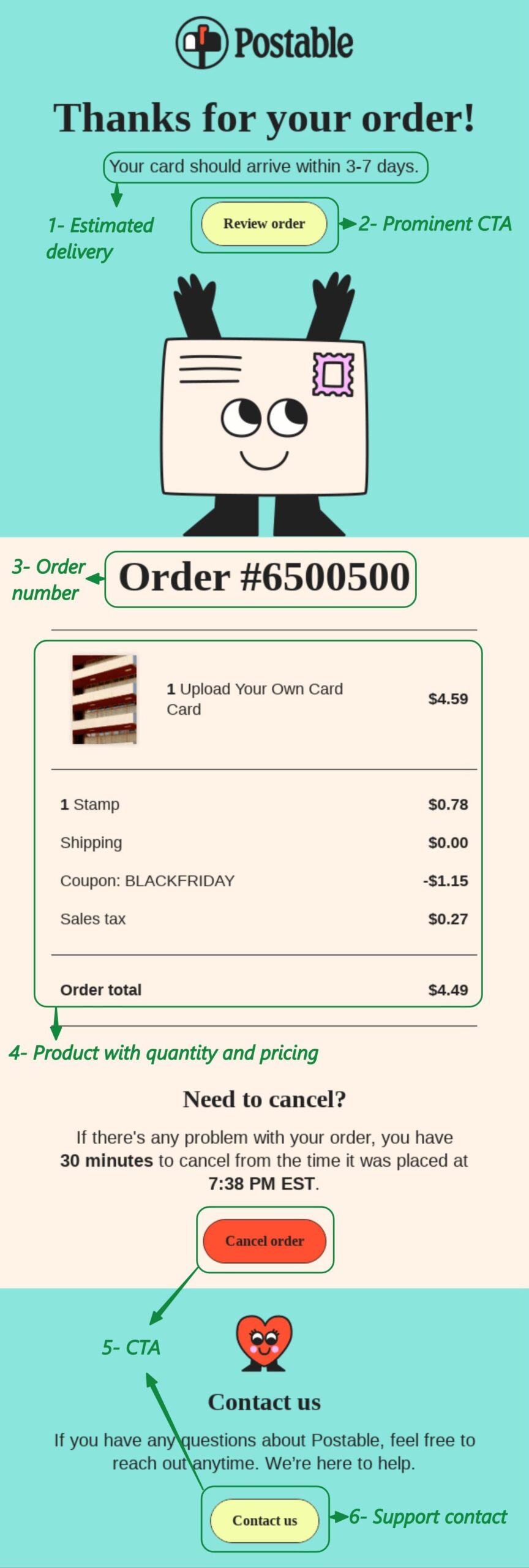
Postable is a gift card retailer that posts unique cards to customers. Its order confirmation email leads with a warm thank-you and a clear delivery timeline right at the top.
The order number is just below a smiling card, which keeps it light.
What works in Postable’s confirmation
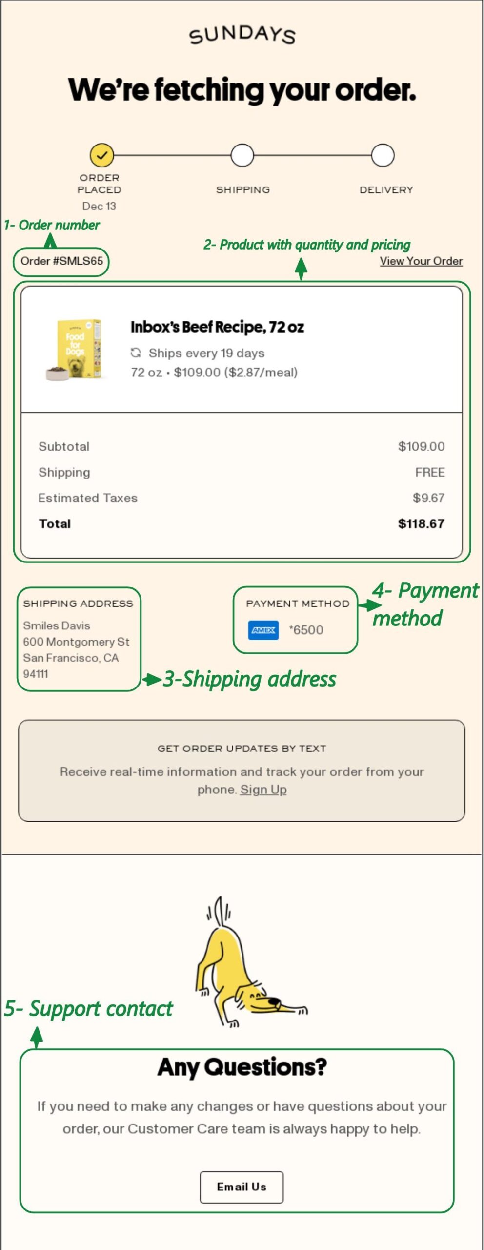
Sundays is an air-dried dog food brand with a strong DTC voice. Its order confirmation email opens with a clever heading and a progress bar that sets up what comes next.
The white order summary box stands out against the email background, so key details are easy to scan.
What works in Sundays’ confirmation
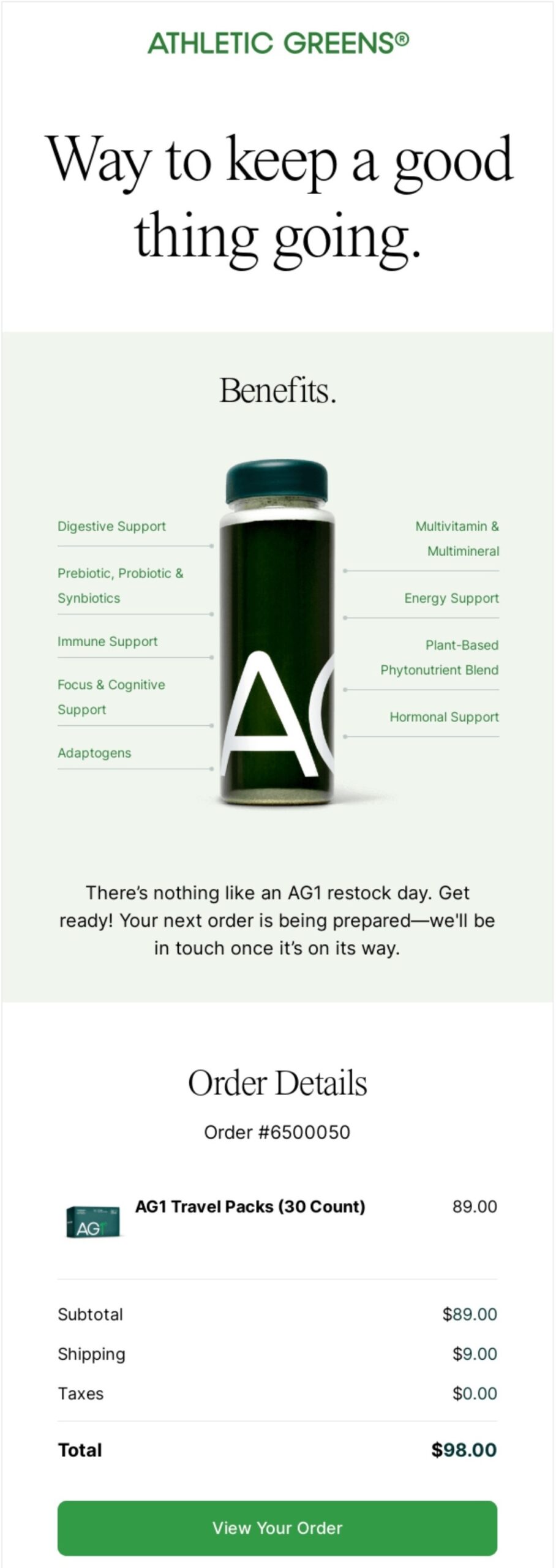
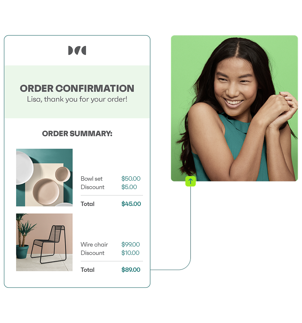
AG1 is a daily nutrition supplement brand that sells on subscription. Its order confirmation email leads with product benefits rather than a standard thank-you. The heading, “Way to keep a good thing going,” and benefit copy reinforces this approach.
Since these order confirmation emails go to existing customers, they skip any upsell and focus on reinforcing the purchase decision.
What works in AG1’s confirmation
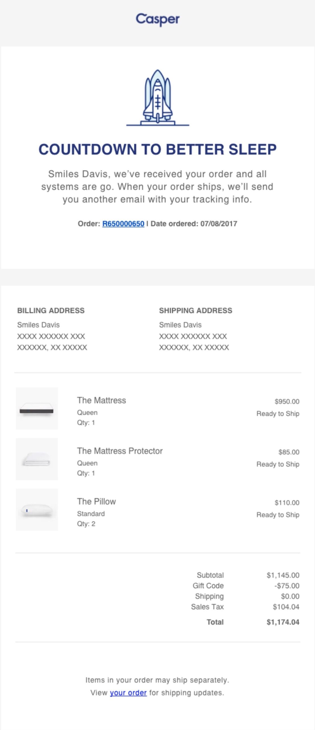
Casper is a mattress and sleep products brand. Its order confirmation email uses the heading “Countdown to better sleep” to confirm the order while building excitement.
The layout puts the shipping address first in the order summary, which makes sense for a brand where delivery timelines matter most to customers.
What works in Casper’s confirmation

Crocs is a global footwear brand known for its distinctive clog design.
Its order confirmation email places the order number, date, billing information, and shipping address side-by-side rather than stacking them in a list. This lets the customer check all key details at a glance without scrolling.
What works in Crocs’ confirmation
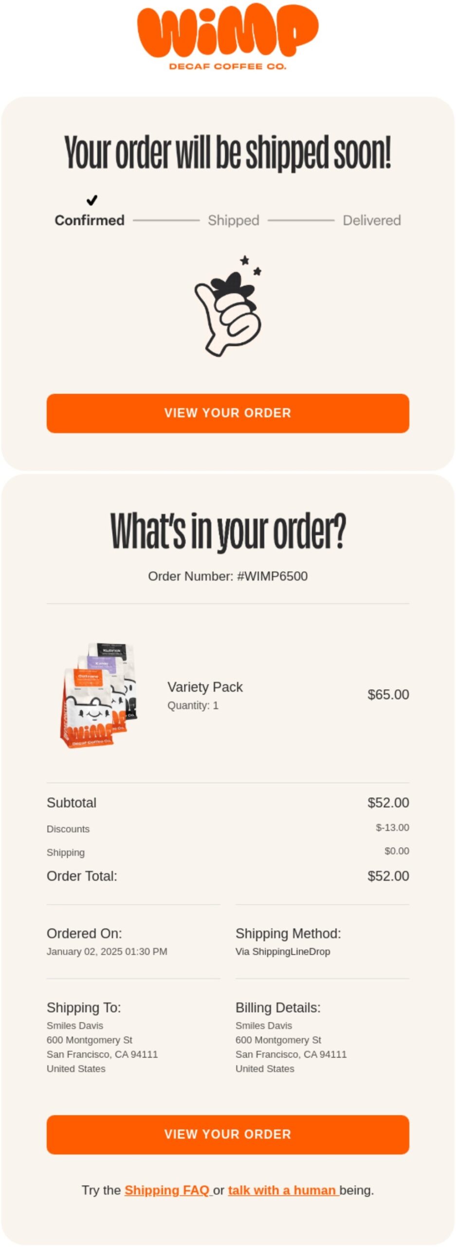
Wimp is a decaf coffee brand with a bold visual identity. Rather than leading with a standard confirmed heading, the email opens with “Your order will be shipped soon!” This moves the customer’s focus forward to delivery right away.
Good order confirmation email design works this way — it answers the next question before the customer thinks to ask it.
What works in Wimp’s confirmation
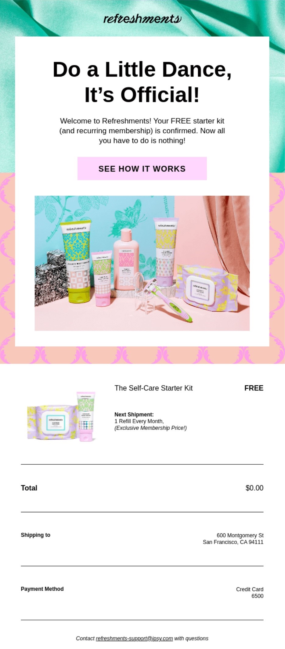
IPSY is a beauty subscription brand that sells curated monthly boxes. Its order confirmation email doubles as a subscription welcome, opening with the heading “Do a Little Dance, It’s Official!”
It then walks the customer through how the subscription works, which helps cut down on confusion around recurring billing. A review request email sent a few days after delivery is a natural next step for a brand like this.
What works in IPSY’s confirmation
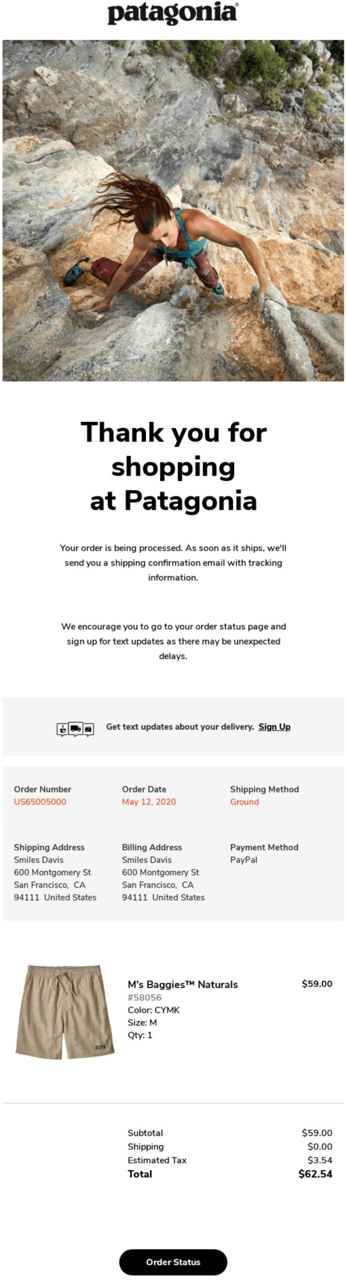
Patagonia is an outdoor apparel brand with a strong sustainability focus. Its order confirmation email gets straight to the point with a clean layout and a seasonal hero image.
The email follows a clean, easy-to-scan layout, with key information highlighted at the top and order details organized further down. It also encourages customers to sign up for text delivery updates, making it easier to track their package without having to keep checking their email.
What works in Patagonia’s confirmation
For a deeper look at structuring these emails visually, the guide on email design covers the core principles. A review request email is a natural follow-up once the order has been delivered.
Knowing how to write order confirmation emails that get the job done comes down to seven steps:
Let’s look at these steps in detail.
Your subject line has one job — to tell the customer their order is confirmed. Customers open order confirmation emails because they need to verify their order, not because of a clever subject line.
Add a personal touch and be direct to build trust.
Here are 15 subject line options across six styles:
Functional and direct
Excitement-driven
Reassurance
Playful
For high-value orders
Personalized
Keep subject lines under 50 characters so they display properly on mobile devices. Use Omnisend’s subject line tester to check yours before sending.
The preheader is the preview text that appears next to your subject line in the inbox. Most brands leave it blank or let it pull random text from the email. Use it to tell the customer what’s happening with their order instead.
Format: Your order is being prepared and will ship within 24 hours.
Your email heading should reference the order number or confirm the order straight away for the customer’s convenience.
Format: Order #189178 confirmed — thank you, [[ contact.first_name ]]
The description should appear directly under your heading. Use it to tell the customer what happens next and when to expect their shipping notification. Keep it to two or three sentences. Avoid anything promotional.
Format: We’ve received your order and are getting it ready. You’ll get a shipping notification from us within 24 hours.
This is the core of your order confirmation email. Pull in the order details dynamically using Liquid placeholders so each email reflects the exact purchase. Include the product name, quantity, price, any discounts, subtotal, shipping cost, and order total.
Format: [[ order.line_items ]] / Subtotal: [[ order.subtotal_price ]] / Shipping: [[ order.shipping_price ]] / Total: [[ order.total_price ]]
A few well-placed links at the bottom of your order confirmation email can cut down on the number of customers who contact you unnecessarily. Keep it to the most useful ones and avoid anything that pulls attention away from the order details.
Useful links to include are:
Format: [Track your order] [Visit our FAQ] [Create an account]
Send test emails to both a Gmail and an Outlook address before activating your order confirmation emails. Check that images load, links work, and the layout holds on mobile.
Also, make sure to turn off your ecommerce platform’s default order confirmation so customers don’t receive two emails for the same order. This applies whether you’re on a Shopify order confirmation email setup or using WooCommerce order confirmation emails.
Format: Send test → check Gmail → check Outlook → check mobile → disable platform default → go live
Good order confirmation email design comes down to four things:
Let’s start with the most important one.
Mobile-first formatting
Most customers open order confirmation emails on their phones. A layout that looks clean on desktop but breaks on mobile is failing the majority of your audience.
Keep your layout to a single column, set your body text to at least 14px, and make sure every button is at least 44px tall so it’s easy to tap. Set spacing between elements to 20px maximum to keep things from feeling cramped.
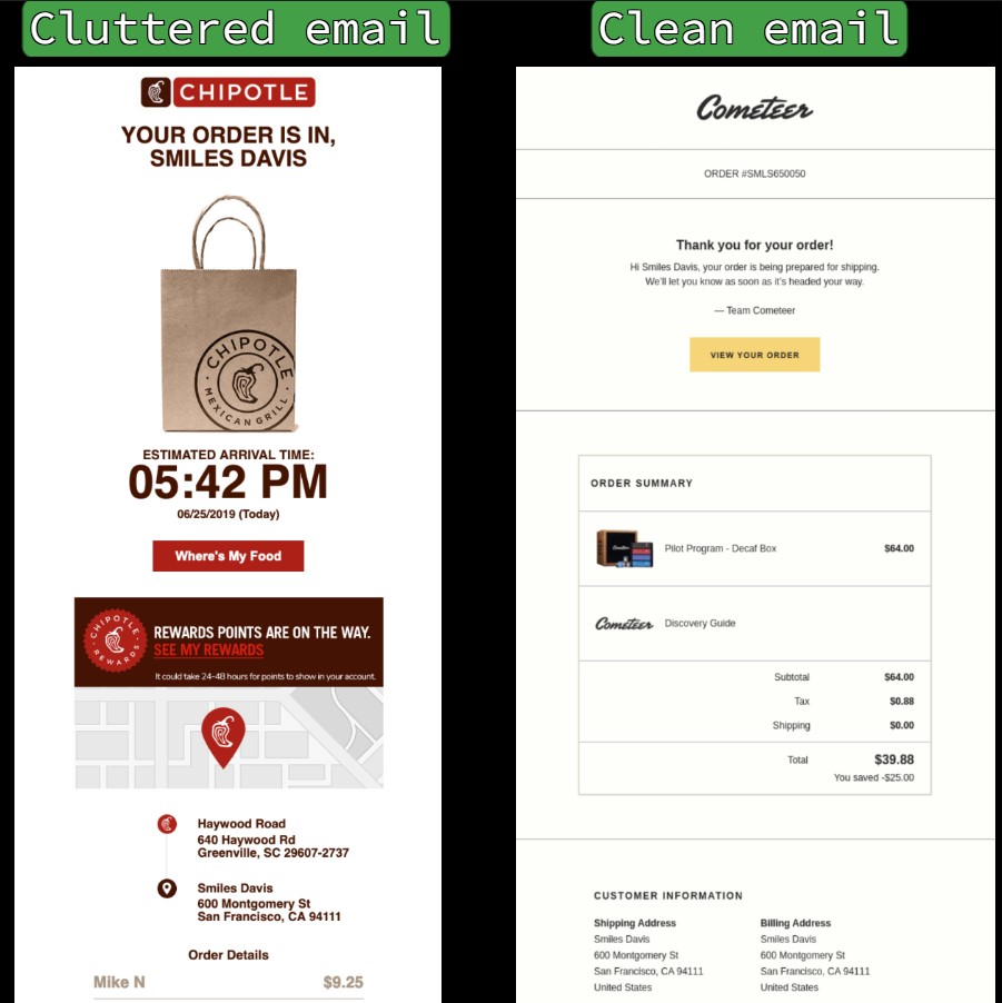
The difference between a cluttered and a clean layout is immediately obvious when you see both side by side:
Accessibility
Not every customer reads your email the same way. Some use screen readers, which read out the alt text on your images and work through your content from top to bottom.
Add descriptive alt text to every image so screen reader users get the same information as everyone else. Use descriptive language on your CTA buttons, too. “View return policy” tells a screen reader user exactly what to expect. “Click here” tells them nothing.
Also, always include a plain-text version of your email as a fallback for email clients that don’t render HTML.
Brand consistency
Your order confirmation email should look like an extension of your store. Use your logo, match your brand colors, and stick to the same font family you use on your website.
A confirmation email is often one of the first post-purchase interactions a customer has with your brand. If it feels generic or doesn’t match the look and tone of your business, it can leave customers feeling uncertain about their order.
Keeping an eye on email marketing metrics like open rate and click-to-conversion will tell you whether your design changes are making a difference.
Here’s a quick reference for the most common order confirmation email design decisions:
Do/Don’t table
| Do | Don't |
|---|---|
| Design mobile-first with a single-column layout | Use multi-column layouts that break on mobile |
| Match your store's logo, colors, and fonts | Send generic, unbranded templates |
| Put the order number near the top | Bury the order number in the footer |
| Include product images in the order summary | Use text-only lists |
| Add alt text to all images | Assume images will always display |
| Use descriptive link text like "View return policy" | Write vague links like "click here" |
| Give one primary call to action button | Add multiple competing buttons |
| Space elements 20px apart maximum | Cram content with no breathing room |
| Use 14px+ text and 44px+ button height | Make links too small to tap on mobile |
| Include shipping and payment info | Add cross-sells or promotional content |
Order confirmation emails are the best-performing automation type in ecommerce.
According to Omnisend’s 2026 ecommerce marketing report, they averaged a 53.99% open rate in 2025. That’s higher than any other automation type, including welcome emails, abandoned cart emails, and back-in-stock notifications.
Their click-to-conversion rate came in at 14.25%, which means roughly one in seven customers who clicked went on to complete another action. The average order confirmation email generated $1.60 per send.
These numbers highlight that customers are highly engaged at the moment your order confirmation email lands. They’ve just spent money, and they want to know everything went through correctly. That’s a window you can use well or waste.
Here’s how order confirmation email benchmarks compare across key email marketing metrics:
| Metric | 2026 benchmark | What it means |
|---|---|---|
| Open rate | 53.99% | Customers actively look for this email after purchase |
| Click-to-sent rate | 7.71% | The share of sent emails that generated a click |
| Conversion rate | 1.10% | The share of sent emails that led to a purchase |
| Click-to-conversion rate | 14.25% | Roughly one in seven clicks leads to a follow-up action |
| Revenue per email | $1.60 | Average value generated per confirmation sent |
Omnisend’s analytics dashboard tracks all of these metrics in one place. The order confirmation feature lets you track open rates, clicks, and conversions against these benchmarks directly.
A good order confirmation email doesn’t need to be complicated. The five order confirmation email templates in this guide cover the most common store voices, so there’s a solid starting point regardless of your brand’s tone.
Just get your writing and design right. Small details like starting with the order number, setting delivery expectations early, and keeping the layout clean on mobile all add up over time.
The next step is automation. Sending your order confirmation email automatically at the right moment is what turns a one-time purchase into the start of a longer relationship.
For a full breakdown of the tools that make this possible, see the guide on the best tools for order confirmation automation.
An order confirmation email is the transactional message a customer receives immediately after completing a purchase. It confirms the order went through, details what they bought, the total paid, and where it’s being shipped.
You can start with a subject line that includes the order number. Open with a heading that confirms the order, then list the order details, shipping address, and payment method. Close with one call to action, such as a “track your order” button.
Not exactly. An order confirmation records that the order was placed, while a receipt is the financial record of the transaction.
An order confirmation is sent right after a purchase to record that the order was placed. A receipt is sent after payment is fully processed and serves as the official financial record of the transaction. A confirmation says the order is in. A receipt says the payment is done.
You can send a direct email with the order details and a clear call to action asking them to verify. Make sure your email includes the order number, itemized products, and a reply or confirmation button so they can respond quickly
A genuine order confirmation email is usually sent from the brand’s official email domain, which should match the store’s website. This helps verify that the message is coming from the retailer you purchased from. It includes a real order number and specific product details.
Order confirmation emails go to spam when the sender domain isn’t authenticated properly. Make sure your domain has SPF, DKIM, and DMARC records set up. Always send from a branded domain rather than a generic address.
A purchase order confirmation email confirms that a seller has received and accepted a buyer’s purchase order. It includes the PO number, itemized products, pricing, payment terms, and expected delivery date. Template 4 in this guide is a ready-to-use purchase order confirmation email template for exactly this scenario.
A purchase confirmation email should go out as soon as the order is placed and payment is received. For B2B purchases, include the PO number, itemized order details, payment terms, and an expected delivery window.
Ready to compare automation tools?
See the best tools for order confirmation automation
TABLE OF CONTENTS
TABLE OF CONTENTS
What’s next


No fluff, no spam, no corporate filler. Just a friendly letter, twice a month.