
 OFFER
OFFER


Drive sales on autopilot with ecommerce-focused features
See FeaturesHighest-impact ecommerce A/B tests include checkout simplification, product page information hierarchy, mobile sticky CTAs, shipping threshold messaging, and email/SMS automation flows.
Product page optimization lifts conversions 12-28%, while mobile checkout simplification reduces cart abandonment 24-31%. Prioritize tests using the ICE framework (Impact, Confidence, Ease) and start with the pages closest to the transaction.
Properly implementing ecommerce A/B testing requires precise knowledge and understanding of statistics. That’s exactly what we’ll teach you in our guide, all the way from why you should implement A/B tests to how you should evaluate data.
What is ecommerce A/B testing, and why does it matter?
Ecommerce A/B testing is the practice of creating and comparing two versions of a page, asset, or feature (for example, shipping cost) to determine which version performs better, typically in terms of revenue. Partial improvements include measuring conversion rate, cart abandonment rate, click-through rate, and other metrics.
Your goal with A/B testing is simple — create different versions, find out which visitors prefer, and implement the winning version. Then repeat the process. It’s also platform-independent, as you can run A/B testing on Shopify, WooCommerce, or your own custom solution.
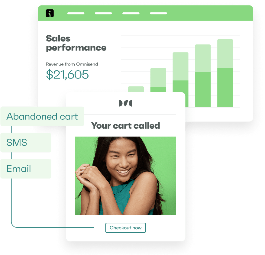
While ecommerce A/B testing has primarily been performed directly on the website, there are plenty of multi-channel opportunities. Email automation, SMS marketing, and post-purchase messaging can be A/B tested to improve revenue – platforms like Omnisend combine these channels and bring testing tools to your disposal.
We’re sure the value of converting more visitors into customers is clear. But with ecommerce sales being forecasted to reach $6.88 trillion and account for 21.1% retail sales in 2026, there’s no better time to turn the ever-increasing traffic into buyers.
Cart abandonment is another area where you can and should implement A/B testing. Over 70% of carts are abandoned, costing USA retailers an estimated $705 billion annually – that’s money on the table you could be picking up.
But remember that ecommerce A/B testing is a long-term process. A good test generates 5-15% improvement over previous metrics. Cumulative improvements of up 40% annually are achievable if you are systematic and consistent.
How to prioritize your ecommerce A/B tests
Start with landing page optimization, as these pages drive the most traffic and are most impactful for revenue. These are your most popular product pages or, in some cases, category pages that bring in a lot of non-branded traffic.
But remember that visitors arrive at your pages from several sources: a newsletter, automated text messages, or paid ads. Some of your A/B testing ideas and findings will overlap across channels, so reuse them wherever applicable.
If changing the featured image of a product on a landing page improves conversions, you’ll likely get the same results by changing images in the newsletter.
You’ll usually want to pick high-impact areas to test: checkout steps and friction, call to action buttons, email subject lines, and featured images. It’ll also make collecting and analyzing data easier – larger differences between A and B versions make it more likely it’s not a statistical artifact.
The ICE framework for test prioritization
Even if you settle on something simpler, such as product page optimization, there are still dozens of A/B tests you can run. Prioritize with the ICE (Impact, Confidence, Ease) framework:
- Impact: The potential positive effect your change will bring. Make a reasonable estimate without overthinking.
- Confidence: How sure you are that the change will bring the desired results.
- Ease: How much time, effort, or resources will be required to implement the change.
Don’t get stuck in long debates about what precise number is the most accurate. Rate each 1-10 and average them to get a final result. Tests with the highest score go first.
Here’s how an ICE framework looks in practice:
| Test idea | Impact | Confidence | Ease | Total |
|---|---|---|---|---|
| Change newsletter subject lines | 7 | 9 | 10 | 8.7 |
| Change product image format (lifestyle vs. studio) | 8 | 6 | 5 | 6.3 |
| Add guest checkout | 9 | 9 | 5 | 7.7 |
| Product descriptions as bullet points | 6 | 9 | 10 | 8.3 |
Your product page optimization starts by testing variations in which product descriptions are presented as regular text or bullet points. It’s often best to run a single test on a single page at a time.
But you can always A/B test your email campaigns and product descriptions at the same time – just make sure you don’t run two simultaneous tests on the same page.
Product page A/B testing ideas
Product page optimization is the bread and butter of A/B testing in ecommerce. That’s where the purchase happens. And you want it to happen as often as possible.
Product image formats
Start by testing lifestyle photos (product in real-world use) against studio shots (for example, product on a white background).
Other classic high-impact ecommerce A/B testing runs for product images involve changing the total number of images, adding or removing 360-degree views, and including or removing product videos.
Images are a core part of the product information hierarchy because they’re the first thing your users notice when they visit a page. While procuring images can be costly, experimenting with information hierarchy is impactful – up to a 28% increase in conversion rates when executed properly.
On-site test results will overlap with other channels. You can reuse the findings in your email campaigns, SMS marketing initiatives, and much more. If users are buying more when you add lifestyle photos on product pages, it’ll work in your newsletter as well.
Product description length and structure
Test short-form, factual descriptions (bullet points or key specifications) against long-form, narrative-driven product stories. Another A/B test you can try is a feature-first versus benefits-first description.
There’s no universally better option. But there are trends – lifestyle brands and complex products will often benefit more from narratives. You want to highlight the cool factor on the product page to encourage purchases.
Simple commodity products will benefit from simpler descriptions. Even if you can make the description of bread cool, few people buy pastries because they think they’re cool.
You’d do well to take only the facts from the manufacturer’s copy. It’s optimized for specifications, not people – add some personality and answer potential questions ahead of time.
Social proof placement
Reviews and case studies build trust and drive purchases, so their placement on the page directly impacts ecommerce conversion rates. You don’t have to get too creative – run A/B tests by placing reviews, stars, and other proof higher or lower on the page.
A high-impact A/B test is placing reviews, stars, or testimonials close to the product title. Review position changes show up in roughly 45% of product page experiments. Well-placed reviews increase conversion rates by an average of 18%.
You can experiment with the amount of information shown as well, such as showing star distribution, displaying individual reviews, or even larger snippets.
Carry over the results of these ecommerce CRO tests to your email campaigns. If they worked on your product pages, they’ll work in your emails as well.
CTA button copy and design
Test out different colorings for the call to action button and variations of “Add to Cart”, “Buy Now”, “Shop Now”, “Continue”, and anything else you can think of.
These changes may seem minuscule, but a simple change from “Sign up for free” to “Trial for free” led to a 104% increase in signups for Going. Other companies often test sticky “Add to Cart” buttons – these are tested in 73% of mobile optimization projects.
CTA button tests also perform well in checkout optimization projects. But since most tests overlap, you can lift the results from landing page optimization projects directly to checkout pages.
Urgency and scarcity messaging
As your A/B test, try adding countdown timers, successful purchase popups, limited-time badges, and low stock alerts. Play around with your copy as well by being more or less aggressive with the messaging.
Your copy may be as important as, if not more important than, the format of the message itself. Being too aggressive will push away some users, so iterating over your copy should be a major part of the process.
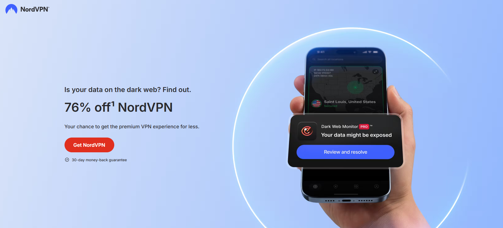
There’s also room for creativity. Your message may only be indirectly nudging the user towards a sense of urgency, as in NordVPN’s example below.
Homepage and navigation A/B testing ideas
You’ll get many users visiting your home page. Make the right first impression by implementing ecommerce A/B testing to make sure they don’t leave without making a purchase.
Hero section content
Run a test comparing a static image with a video. You can also test a single value proposition against a carousel and either include or exclude seasonal messaging.
Your results will vary depending on the ecommerce niche you’re in. Brands with a narrow, focused product range do better with a single value proposition. But if you have a wide product range, a carousel might be a better bet.
While you can follow the guidelines above, testing will always be the better option.
Navigation menu structure
Homepage optimization tests include making the navigation menu as accessible and understandable as possible. Try comparing a mega menu with many elements to a simplified dropdown.
Adjusting the number of categories and subcategories is another homepage optimization test you can do. Or you can add additional “Sale” categories to your menu, change their positioning – these are all valid options.
A good rule of thumb is to adjust based on your user base and products. An easily visible “Sale” category for luxury and premium products will be less effective than the same category for a website selling everyday goods.
Search bar prominence
Amazon has an oversized search bar for a reason. Test a larger, center-stage bar against a smaller, magnifying glass icon tucked somewhere in the header.
You should also verify whether variations of auto-suggest bring better conversion rates. Adding or removing autocomplete and product suggestions, or changing other search features, is another part of your A/B testing arsenal.
Site-wide benefits bar
Free shipping is a benefit that helps many visitors make the final purchase decision – you can add that right to the top of your website. Experiment with other benefits as well: good return policies, customer service availability, and money-back guarantees.
Think of using the site-wide benefits as a way to reduce shopping anxiety right from the get-go. You’ll address some of your visitors’ doubts without them ever having to ask.
Shopping cart A/B testing ideas
Shopping cart abandonment is the plague of ecommerce. Current rates sit at around 70%. If you don’t perform shopping cart optimization, you’ll be losing at least that much. And these are users who were that close to buying a product.
Free shipping thresholds
Assess what the lowest shipping threshold you can offer is and experiment with different levels (for example, $50 vs. $75). You want to give good value to your customers without cutting too much into your bottom line.
How you communicate shipping thresholds is important as well. There’s a difference between “Free shipping from $75” and “You’re $12 away from free shipping!” Dynamic shipping thresholds usually win, but you’re always better off A/B testing.
You can even add notifications to nudge the visitor further. In some studies, shipping threshold notifications reduce cart abandonment by up to 23%
Cart page upsells and cross-sells
Try adding suggested or “Frequently bought together” products to your shopping cart optimization efforts. Any one-click additions to the shopping cart page are a worthwhile test.
Let users stay on the same page while adding products; it’ll make it easier to collect data. Even if some ecommerce A/B testing projects do include multiple page tests, you’re often better off starting simpler, getting the hang of things, and moving towards more complicated implementations.
Cart abandonment interventions
A frequently used test for cart abandonment interventions is an exit-intent pop-up. You’ve likely seen these popups – “Complete your purchase for an extra 10% off”, “Your cart is reserved for 15 minutes”, and many others.
In fact, those are two different versions of cart intervention. One offers a discount, another displays urgency. Try these two tests to see which one works better.
Cart abandonment interventions truly shine once you include multiple channels. On-page optimization is just a small part of what you can do. Include automated emails and SMS messages to help recover additional revenue.
Automated emails make up just 2% of all emails sent, but generate 30% of total email-driven revenue. And abandoned cart emails generate an average of $2.54 per email. With our abandoned cart workflows and presets, you can start generating those returns in minutes.
Post-purchase messaging is also worth considering. While not strictly just for abandoned carts, post-purchase practices add another revenue-generating layer.
Checkout optimization A/B testing ideas
Even the smallest change in the checkout page can have a large impact on revenue. It’s also the closest you’ll get to direct influence on the bottom line – every friction removed is a dollar added.
Guest checkout vs. account creation
Account creation is a friction that many users don’t want to go through, especially in ecommerce. Forcing users to create an account may increase abandonment by up to 19%, so try implementing guest checkout.
But there’s a cost to be paid since there’s less data to create profiles and develop personalized offers. A common strategy is to set guest checkout as the default while nudging account creation post-purchase.
You can also test different guest checkout versions – one-click, mandatory post-purchase account creation, no guest checkout at all, or a hybrid where account creation is optional. What works best will depend on your users, products, and industry.
Form field reduction
Here’s your rule of thumb – fewer mandatory fields are better. So, experiment with reducing the amount of information users are forced to input. Another checkout optimization option is to experiment with a single-page versus a multi-step checkout.
You’ll usually find that fewer steps and mandatory fields work better for ecommerce conversion optimization. PayU, for example, removed a mandatory email field, keeping only a mobile phone number, and improved conversion rates by 5.8%
Payment option display
Test out showcasing all payment options in one place, adding return policies, or even buy-now-pay-later buttons. Alternatively, payment options can be revealed progressively.
Industry best practices recommend showcasing all of them at once, since clearly visible payment options increase checkout completion rates by up to 19%.
You can also experiment with selection timing (earlier at the checkout process vs. later), a dropdown selection, or showcasing added fees (if applicable). All of these may influence buying decisions.
Even if it doesn’t improve conversions per se, it may lead users to choose better payment options for you. Implementing BNPL is also a great option since the providers (Klarna, Afterpay, Affirm) handle the entire process.
Trust signals and security badges
Reassurance before purchase reduces dropoff, so test out adding SSL badges, money-back guarantees, and return policy summaries near your payment form. Not a lot of creativity here, but you can experiment with some of the copy and placement options.
Your goal is to find the optimal balance between visibility and credibility without going overboard and creating distrust by trying to force too much trust.
Progress indicators
Sometimes you’ll see how many pages are left, sometimes you’ll be in the dark. And it’s a huge progress bar or a small numerical indicator. No one knows which is better right off the bat – test it out on your traffic by running a few ecommerce A/B tests.
You’d want to make sure the differences across the versions of progress indicators are prominent and visible.
| Test idea | What to test | Expected impact | Ease | Metric |
|---|---|---|---|---|
| Guest checkout vs. account creation | Default checkout flow | High | Medium | Cart abandonment, checkout completion rate |
| Form field reduction | Number of fields | High | Easy | Conversion rate |
| Payment option display | Visibility, order of payment methods | High | Medium | Checkout completion rate |
| Trust signals and security badges | Placement and type of trust indicators | Medium | Easy | Checkout completion rate |
| Progress indicators | Progress bar style and type | Low | Easy | Drop-off per step |
Remember that checkout optimization is just a single layer of your overall ecommerce CRO strategy. Follow up with a well-timed email or SMS message to extend the optimization. You can implement these using our post-purchase presets and workflows without overthinking.
Email A/B testing ideas for ecommerce
Most ecommerce A/B testing practices stop at on-site optimization. That’s a mistake we don’t want you to make.
Email automation is where cross-channel ecommerce conversion rate optimization shines. Nearly one in three automated emails results in a purchase. Setting these up properly can bring even better results.
Email subject lines
Tweaking subject lines is the most popular email marketing A/B test. You can try personalized versus generic subject lines, play around with length (stick to 7 words as a ballpark), and elicit different emotions – from scarcity and urgency to curiosity.
Use our email subject line tester to create a few winning combinations before running the test, so you’re comparing potential winners rather than trying to get data from a black box.
Sender name and address
You may get an email from “Omnisend” or from “Ona from Omnisend”. These two have different open rates and lead to different results. You’d also sometimes see emails coming from different inboxes.
All of these are good A/B tests for email marketing. But you don’t have to set these up manually. We’ve prepared a dedicated A/B testing feature that’s available on all Omnisend plans.
Running the A/B test is as simple as having a few subject lines and sender names. You’ll be able to input these in our A/B test campaign setup wizard, which will guide you through the entire process.
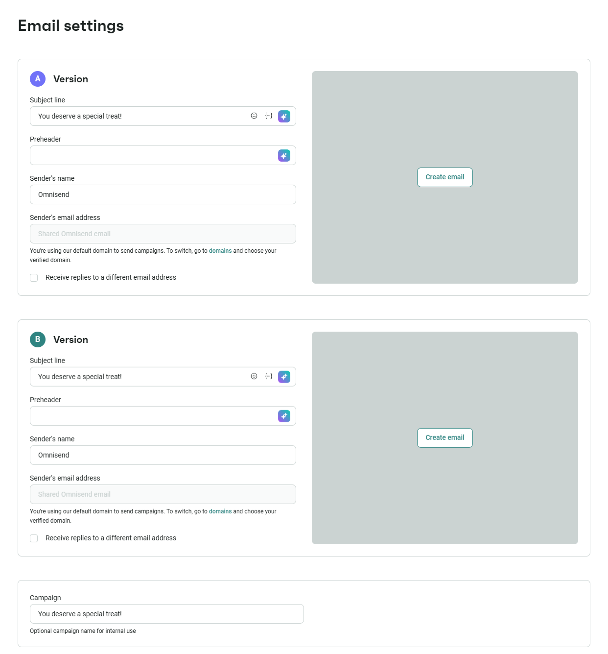
You don’t even need to analyze the results yourself. We first send to a small sample of users, find the winner, then email that version to the recipients – all done automatically.
Email content and design
Test different layouts, image counts, numbers of CTAs, product recommendations, and their styles. There’s a lot you can do, as content and design for emails is one of the areas where you get to be creative.
You can use templates on the Omnisend dashboard to set up different variations and use the email A/B testing campaign feature to find the winning version. Since the changes are much larger, you’ll want to review the results yourself.
Always test and iterate until you get a good foundation of what works and what doesn’t.
Send times and frequency
Test out different frequencies and sending times – morning vs. evening, weekday vs. weekend, and once, twice, or three times per week. Each of these can work, depending on your audience.
We have tested all of these ourselves. Here are our email timing research findings:
- Tuesdays and Fridays are your optimal days for sending emails.
- Send your emails at 2 PM, 5 PM, or 8 PM to maximize engagement
- For conversion rates, target the 1st and 30th days of the month. For clickthrough, hit inboxes on the 2nd and 26th. For open rates, send emails on the 10th and 24th.
These are what we found works. Your audience may be different, so we recommend using these as a starting point and A/B testing campaigns on your own.
Automation flow structure
We’ve shown you that email automation matters. But the format matters as well – you can send 3 onboarding emails or 5. You can test out emails only or combine them with SMS marketing, particularly for cart abandonment.
All of these work. We recommend always combining email automation with SMS messages.
One more thing to test: upsells with combined email and SMS automation. These increase your repeat purchases. It may all sound a little complicated, but we’ve built our features and interface to be as intuitive as possible.
If you’re not convinced yet, our internal data show that Omnisend customers earn $68 for every dollar spent on email. Proper testing lets you reach that goal faster.
Start testing your email campaigns for free with Omnisend
Quick sign up | No credit card required
SMS A/B testing ideas for ecommerce
Supplementing your ecommerce CRO strategy with SMS marketing will bring out even more revenue. Most of your competitors are ignoring SMS, giving you ample opportunity to pull ahead. Couple that with the fact that SMS open rates and response rates are higher, and you have a winner.
SMS vs. MMS
SMS can include images (those are called MMS). Test text-only vs. image-based variations – MMs lets you include product images to draw more attention to the effort.
But there’s a drawback: MMS costs more per send. Keeping a close eye on the conversion rate versus the costs will be key to your success.
Images will add value if you’re a lifestyle brand, launching a new product, or need to showcase something. For discount-driven messages, SMS will do a better job by reducing costs.
SMS content and offers
Test different offer variations – discount percentages vs. precise dollar amounts, add urgency, and personalize the offer by including first names.
Keep a few of our SMS marketing best practices in mind: respect local time zones (no one likes to get pinged in the middle of the night), front-load the important information, and focus on automation rather than mass SMS.
One more thing we think you should do: always make it easy to opt out of automated text messages. SMS is highly responsive, and some users may just want to unsubscribe. Let them.
SMS send times
Respecting time zones is just one of the best practices – you still have ample time to experiment with send times. Try weekends vs. weekdays, earlier vs. later in the day, and other variations.
Usually, you’ll want to stick to 8 AM to 9 PM times for your audience. These are the best times to send SMS, but you can experiment to narrow them down for better results.
Luckily, Omnisend SMS marketing features support global outreach. You don’t have to limit yourself to just your USA audience. With our tools, you’ll be able to find the best times for each country.
Email vs. SMS sequencing in flows
Make use of our cross-channel support and integrate both SMS and email automation in one go. Test whether emailing first, then SMS, or vice versa, works better.
Our experience shows that email works better for lower intent, while SMS works better for higher intent. Your mileage may vary – every audience is different.
Another way to run your A/B tests is to set time delays. Send an email first, wait 24 hours, then send an SMS. For other sequences (for example, abandoned cart), try lower delays.
Once you get the hang of it, results will come. For one of our customers, Headbanger Sports, combining email, SMS, and A/B testing resulted in 55% year-over-year growth in annual revenue.
Signup form and pop-up A/B testing ideas
You want to implement signup forms and popups – they can work as both an ecommerce CRO tactic and as a growth engine for your email and SMS marketing list.
Form incentive offers
Discount codes and freebies are often the big winners in form incentives. But you can test the messaging: “10% off your first order” vs.. “free shipping for your first order”. Or you can also nudge people to subscribe to emails with “Exclusive access to new arrivals”.
Which incentive is correct for your audience depends on your products and brand. But a good reason is closer to “Get $5 off your first order”, not “Sign up to our newsletter”.
You can use our A/B testing for forms to find what works best for your audience. One key thing to remember is that results may vary depending on your goal.
Form display timing and triggers
Trigger form display on scroll, on exit-intent, or right as the page loads. All of these are viable options that can improve your conversion rates.
Instant popups can be a little annoying, but they get the most eyes on them. Exit-intent popups reach the fewest users but have higher conversion rates because they catch people at an opportune moment.
Your form’s display settings will also impact the audience’s reaction. A/B test your signup forms, display settings, and frequency to make sure you’re not scaring away your users.
Form design and field count
Add or remove fields, test email-only vs. first name and email. Try collecting phone numbers as well to get your SMS marketing efforts going.
But remember our previous discussion on forms – more steps mean more friction. You don’t want your users to groan when they see the pop-up. You want them to fill it out.
So experiment carefully. Try both single-step and multi-step forms. Sometimes you’re better off getting fewer signups with more data. Sometimes it’s the other way around.
Gamified forms vs. standard forms
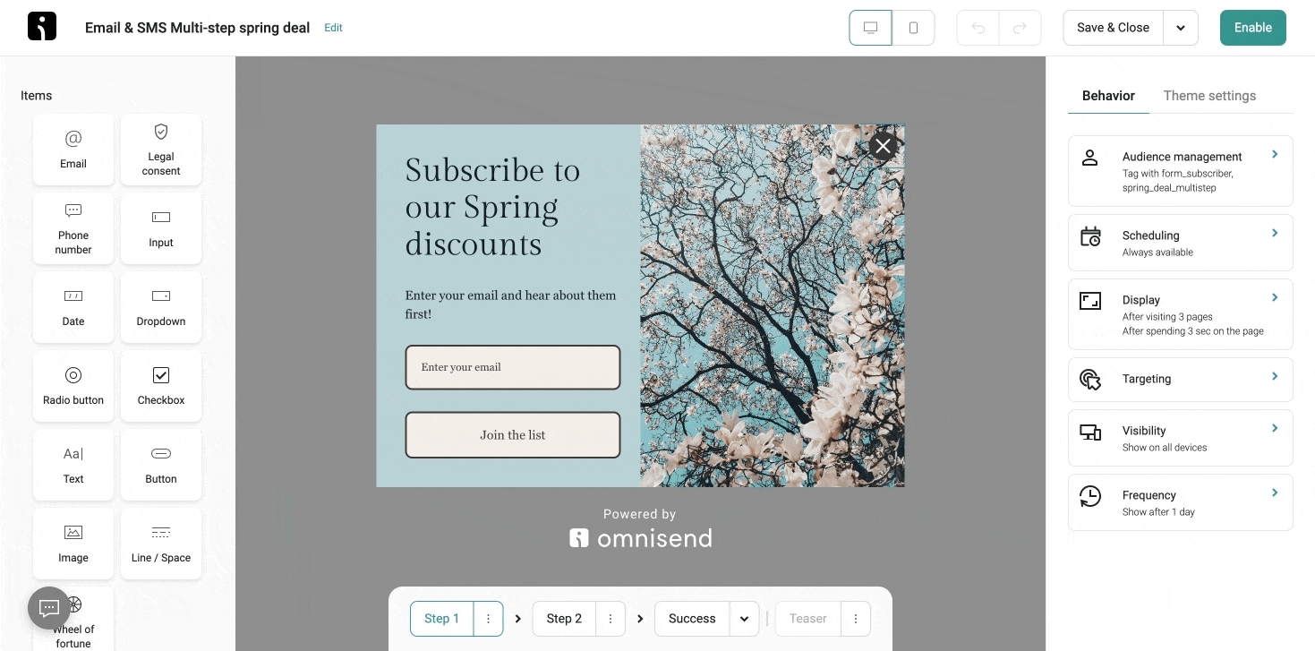
You can use our pop-up building feature not only to create multi-step forms but also to include gamified versions, such as the Wheel of Fortune. They may increase the time a user spends with the form, but if it yields better results, the friction is worth it.
Our form A/B testing workflow makes the entire process straightforward. You can create two versions of any pop-up, split traffic, and track which one drives more subscribers. Experiment with copy, visuals, display triggers, and incentive offers – all from the form builder.
Your goal is to capture attention and build your email and SMS list. If you need to brush up on the basics of building an email list, we have you covered.
Start A/B testing your signup forms with Omnisend—free plan available
Quick sign up | No credit card required
Mobile-specific A/B testing ideas
Mobile commerce accounted for 59% of total ecommerce sales in 2025. And it’s trending upward each year. You can run ecommerce conversion rate optimization on those devices specifically to attract more buyers.
Sticky add-to-cart buttons
Add a sticky “Add to Cart” button that follows the user when they scroll. Place it at the bottom or the top of the screen. Experiment with sizing and colors.
Sticky buttons are one of the most widely tested mobile elements in ecommerce and it almost always works. After all, you remove the need to scroll around to start buying.
Simplified mobile navigation
Every pixel matters when your screen is (comparatively) tiny. Test out smaller navigation elements, hamburger menus against tab bars, and fewer elements in general.
These will also help with cross-channel optimization. Push notifications and SMS messages also take up screen size – maybe it’s better if they still see product information if such a thing arrives.
Mobile-optimized checkout
On a desktop, auto-fill feels like a security issue. On mobile, it’s a great timesaver – try adding these to your checkouts.
Also, experiment with Apple Pay and Google Pay as the default mobile payment options. It’ll remove the need for visitors to enter card details manually, which is a pain for most.
Another way to optimize mobile checkouts is to implement a multi-step process. Compare it to a single-page checkout – multi-step usually fits on the screen better.
Finally, remember that mobile optimization extends to your email and SMS, too. SMS is inherently a mobile channel, and with Omnisend’s email templates being mobile-responsive by default, you have the perfect opportunity to mix all channels in one.
Ecommerce A/B testing best practices
Running tests is easy. But you want to run valid tests, which is easy to do if you use Omnisend. But there are still a few things you should keep in mind.
Test one variable at a time
Testing multiple variables simultaneously is definitely possible – that’s called multivariate analysis. But that complicates things significantly without always yielding better results.
Start with a single variable. It’s almost always clearer, more precise, and actionable.
If done incorrectly, testing multiple variables at once will just confuse. A winning version where the copy, CTA button color, and placement changed, you won’t know what drove the increase.
Ensure statistical significance
Statistics is prone to variance, artifacts, and accidental results. If you run a test with 100 visitors per version and a 49-51% split, the winner is not clear. Just two more users in either direction will change the result.
Statisticians use statistical significance for nearly any study or analysis. Put simply, it’s a line in the sand from which you can at least somewhat confidently say that if the test were repeated multiple times, you’d get the same result.
Most tools recommend more than 10,000 visitors per month to reach statistical significance within a reasonable timeframe. Aim for at least 100 conversions per variation before concluding.
Additionally, you’ll want to account for seasonal and day-of-week variation. Run your tests for at least one to two full business cycles (typically two to four weeks).
That’s a lot to remember, but we’re here to make things easier for you – use our free A/B testing calculator to get everything in one place.
Document and iterate
A/B testing is a long-term process. Your results may change over time, even if you run identical tests. User behaviors and preferences evolve, and keeping logs helps you track them all.
But you don’t have to break out a pen and paper. If you run A/B tests on Omnisend, you’ll get all of the data for free, forever. We even automatically pick the winning variations for you.
If you have many users, segmenting by demographic or behavioral features will work even better. But that also means more A/B tests — and more potential revenue, so it’s worth it.
Ready to start testing? Omnisend gives you built-in A/B testing for emails, SMS, and forms—all on the free plan
Quick sign up | No credit card required
FAQs
What is A/B testing in ecommerce?
A/B testing in ecommerce is the practice of comparing two versions of a webpage element, email, SMS message, or sign-up form to see which drives better results. You split your audience randomly between the two variations, measure performance, and implement the winner.
What should I test first on my ecommerce store?
Start with the pages closest to the transaction. Checkout optimization, cart page tests, and cart abandonment improvement have the largest dollar impact since these are users who have already demonstrated buying intent.
How long should an ecommerce A/B test run?
Most tests need at least two to four weeks to reach statistical significance. True duration is highly dependent on traffic volume. Aim to accumulate at least 100 conversions for each version.
Can I A/B test emails and SMS for my online store?
Yes, and you should. SMS and emails can drive significant revenue. They are also highly testable with different subject lines, send times, designs, and much more. Omnisend brings every tool and feature you need to do so in one dashboard.
How many visitors do I need to run A/B tests?
Most tools recommend at least 10,000 on-site tests per month to achieve statistical significance within a reasonable timeframe. If your traffic is lower, test only high-traffic pages or shift to email and SMS marketing tests.
What is the ICE framework for A/B testing?
ICE stands for Impact, Confidence, and Ease. Each proposed test is rated across these 3 dimensions from 0 to 10. The scores are then averaged, and the test with the highest rating is implemented first.
TABLE OF CONTENTS
TABLE OF CONTENTS

Subscribe and don’t miss any updates!
No fluff, no spam, no corporate filler. Just a friendly letter, twice a month.