Drive sales on autopilot with ecommerce-focused features
See FeaturesA successful newsletter signup form combines clear value propositions, minimal friction, and strong trust signals to enhance conversion rates and compliance.
Compliance with regulations like GDPR and CAN-SPAM is crucial; non-compliant forms can damage deliverability and erode subscriber trust.
Gamified and interactive signup forms can significantly boost engagement and conversions by making the signup experience enjoyable and personalized.
Utilizing Omnisend's form builder allows for easy creation of compliant and high-converting signup forms, optimizing for both user experience and deliverability.
Newsletter signup examples are useful for one reason: they show what actually convinces someone to hand over their email address in the real world. The best forms don’t just say “Subscribe” — they make the value obvious (what you’ll get), reduce friction (short form, smart timing), and add trust (social proof, privacy reassurance).
Below, you’ll find high-performing newsletter signup examples you can model — plus the specific takeaways to apply to your own popups, embedded forms, and landing pages.
Over the past two years, Gmail, Yahoo, and regulators worldwide have tightened the rules around consent. That means forms built only to “convert” can quietly hurt deliverability or create compliance risks you don’t notice until it’s too late.
In this guide, we’ll explore 25 newsletter signup examples and explain why they work. You’ll learn how to design forms that convert, avoid common GDPR and CAN-SPAM mistakes, and implement them with Omnisend.
Quick sign up | No credit card required
What makes a newsletter signup convert?
A high-performing newsletter signup template leverages psychology, usability, and compliance. Design matters, but only when paired with clarity, trust signals, and the right offers and messaging.
To understand why some signup form examples outperform others, we must look at the core elements of conversion:
- Clear value proposition: People subscribe when they instantly understand the benefit of your newsletters. State what they’ll receive, how often they’ll receive it, and why your content is worth taking up space in their inbox.
- Minimal friction: Ask only for the information you need so users can finish the form quickly. If you need more information, use multistep forms. They reduce friction by breaking requests into smaller steps.
- Strong trust signals: Privacy policy links, transparency, and recognizable branding can reduce hesitation. Social proof, such as subscriber counts or testimonials, helps build trust on high-intent pages.
- Mobile-first optimization: Since most signups occur on mobile devices, forms should be optimized for these platforms to ensure a seamless user experience. They should load quickly and be easy to navigate. Buttons must be easy to tap, and text must be legible.
- Reliable deliverability setup: Signup forms can only lead to conversion if new subscribers actually receive your emails. Implement authentication (DKIM, SPF, DMARC), easy unsubscribe paths, and clean data handling to protect inbox placement.
Apart from these core conversion elements, newsletter signup forms must also be legally compliant. It’s part of what makes a signup form high-converting. Non-compliant forms can trigger complaints, lower deliverability, and undermine trust.
Here are two major laws to comply with:
- CAN-SPAM (US): You must identify yourself, avoid misleading language, make unsubscribing easy, and send messages only to users who opted in. Explicit checkboxes are recommended with promotional copy. Omnisend’s form builder offers templates for easier compliance and increased conversion.
- GDPR (European Union and UK): You must obtain freely given, specific, informed consent. Visitors should know what they’re agreeing to and how to withdraw consent, which is why pre-checked boxes aren’t allowed. To understand the full requirements, check out Omnisend’s detailed GDPR compliance guide that explains how to design compliant signup forms.
How do different types of forms compare?
Recent Omnisend signup form data highlights how different formats perform. The table below compares signup rates, best use cases, and mobile behavior across popular form types.
| Newsletter signup form type | Average signup rate | Best use cases | Mobile performance |
|---|---|---|---|
| Embedded | 1.28% | Blog, always-on footer collection | Excellent |
| Popup | 3.77% | High-intent moments and offers | Needs optimization |
| Exit-intent (desktop) | 2–4% | Reducing site abandonment | Limited |
| Landing page | 6.47% | Paid traffic, focused campaigns, events | Excellent |
| Gamified landing page | 11.02% | Engagement campaigns | Good |
| Multistep landing pages | 9.11% | Guided lead qualification flows | Good |
| Flyout/slide-in | 3.24% | Non-intrusive always-on capture | Good |
| Discount‑based popups/flyouts | 2.07–2.36% | Retail, offer-driven, or incentive campaigns | Good |
Here are some strategic takeaways from the data:
- Gamified formats work well when paired with full-page layouts
- Landing page forms are best for focused intent
- Discount offers must be paired with strong design and messaging
- Urgency‑based formats like back‑in‑stock alerts excel in popup or flyout placements
- Embedded forms provide consistent signups but rarely drive spikes
- Multistep forms break the signup into digestible screens and reduce friction
Great examples of embedded newsletter signup forms
Embedded signup forms blend naturally into web pages, often with “Join our email list” messaging. They are perceived as trustworthy and encourage steady subscriber growth.
1. theSkimm
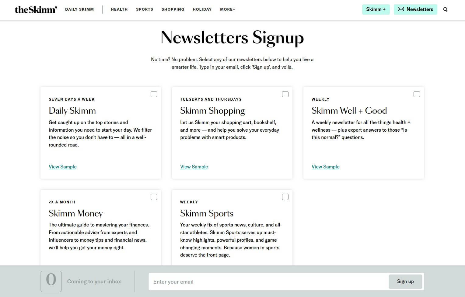
theSkimm’s newsletter signup page is an excellent example of a high-converting email signup form. It allows users to choose multiple newsletters at once, effectively catering to various interests like news, shopping, wellness, and finance.
Why is it good?
- Has a personalized feel as users can select newsletters that match their interests
- Each newsletter highlights a clear benefit, showing users exactly what they’ll get
- The simple checkbox format creates a straightforward signup process
Compliance note: Consent is explicit, with clear checkboxes and newsletter descriptions that support informed opt-in requirements.
Strategic takeaway: The ability to select multiple newsletters works best when your brand publishes completely different topics that resonate with your audience.
Build this with Omnisend: Create a multi-step or multi-interest embedded form using Omnisend’s form templates.
2. The Bagel Co

Located in the page footer, The Bagel Co’s newsletter signup is two-in-one and combines the contact form. Its clean design aligns with the brand’s aesthetics. With its short and straightforward approach, users can easily subscribe through a checkbox.
Why is it good?
- A single contact form reduces the number of steps in forms
- Short and easy-to-fill form enhances user experience
- The contact form doubles up as a signup form, and users only have to click the checkbox
Compliance note: An explicit checkbox is provided below the form to avoid confusion.
Strategic takeaway: The footer placement ensures visibility without interrupting browsing, making it ideal for continuous subscriber growth.
Build this with Omnisend: Browse the embedded form template gallery for simple, brand‑aligned signup form examples.
3. Allbirds
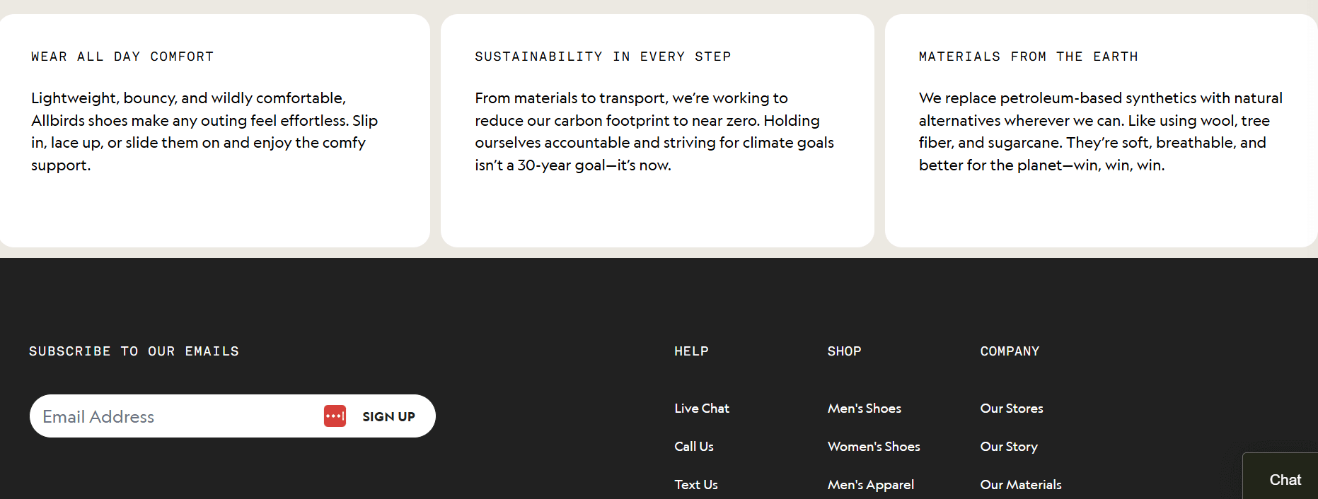
Allbirds’ newsletter signup form uses simplicity and clarity to encourage action with its CTA copy, “Subscribe to our emails.” You can also use “Subscribe to our newsletter.” Users can easily sign up with only an email address. This approach effectively increases opt-in email conversions.
Why is it good?
- The company clearly states what it’ll do with its emails to reduce confusion
- Minimal, distraction-free design keeps focus entirely on signup
- Placing this in the footer minimizes disturbance to the page layout
Compliance note: The form offers informed consent and enhances compliance by simply asking the customers to subscribe to its emails.
Strategic takeaway: Exclusivity messaging works best for product-focused brands where early access to launches or promotions drives subscriber value.
Build this with Omnisend: Start with pre-designed embedded form templates that include mobile optimization and consent tracking by default.
4. Marketer Milk
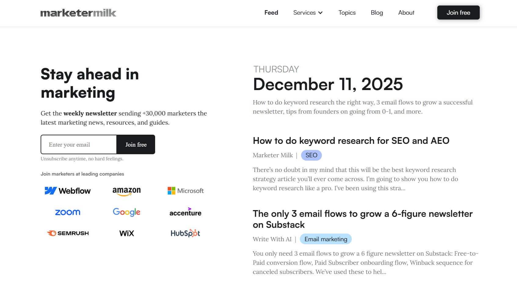
This newsletter signup form performs well because it’s simple, persuasive, and builds trust with potential subscribers. It shows a clear value proposition and social proof. By showcasing leading companies that subscribe, it shows credibility. This makes the newsletter appealing to professionals.
Why is it good?
- Promises the latest marketing news, resources, and guides
- Highlights 30,000+ subscribers, including Amazon, Google, and Microsoft
- Requires only the user’s email address to simplify the signup process
Compliance note: This form is only partially compliant. It lacks a visible privacy notice and an explicit consent checkbox. However, it excels at collecting only minimal data.
Strategic takeaway: Social proof boosts credibility, especially when targeting professionals.
Build this with Omnisend: Manually type testimonials for your signup form using the text box, or upload an image using the image block.
5. The New Yorker
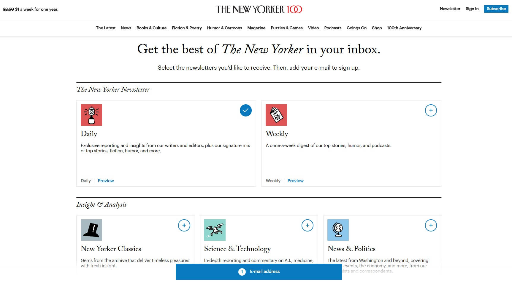
The New Yorker’s signup form is designed with simplicity and choice in mind. It features a dual newsletter option, allowing readers to select between “Daily” for regular updates and “Weekly” for weekly content.
Why is it good?
- Offers two newsletter choices for tailored content
- Minimalist design keeps the focus on the selection
- Content descriptions reduce uncertainty
Compliance note: The separate checkboxes for each newsletter demonstrate granular consent, as required by the GDPR when offering multiple subscription options.
Strategic takeaway: Offer options for sending frequency and cater to varied user preferences.
Build this with Omnisend: Set up a multistep signup form and categorize subscribers into segmented lists based on their preferences and chosen frequency.
6. Morning Brew
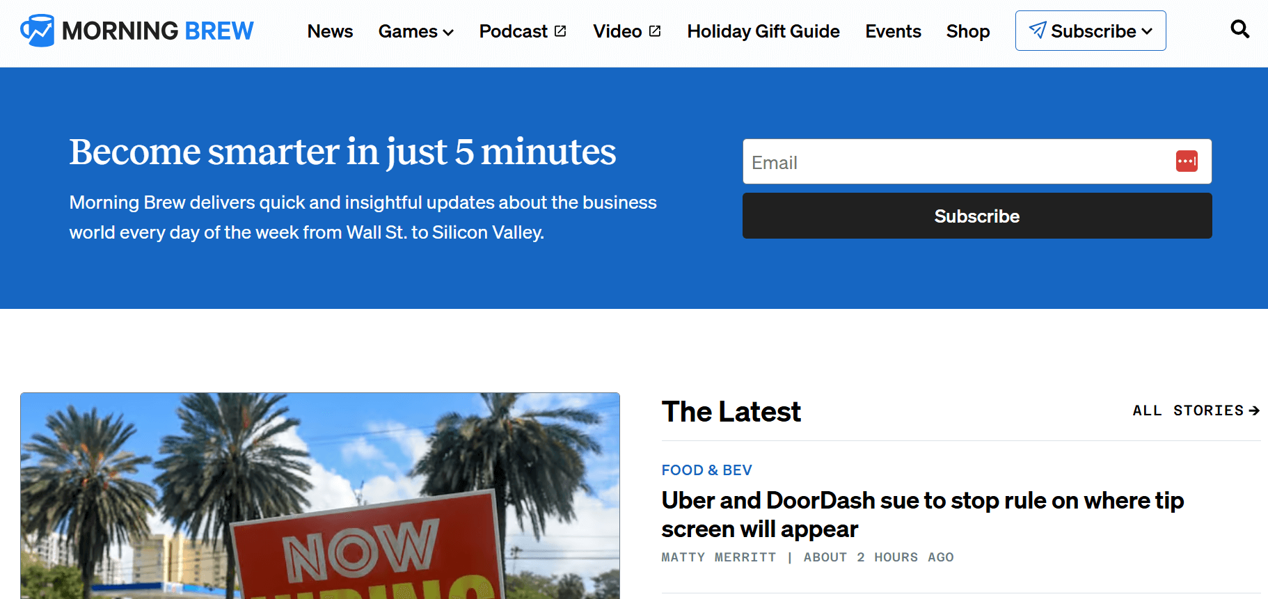
This newsletter signup template is straightforward and inviting. It promises readers that they can become smarter in just 5 minutes. The text highlights its value upfront, so readers understand exactly what they’ll receive.
Why is it good?
- The benefit statement is short, bold, and specific
- The conversational tone creates an engaging experience
- Its single-field form supports frictionless onboarding
Compliance note: Including expected send frequency (“every day”) enhances transparency.
Strategic takeaway: Daily newsletters need obvious value propositions because you’re asking for significant inbox commitment.
Build this with Omnisend: Default welcome automations trigger automatically for embedded form signups. You don’t need to set up separate welcome workflows.
7. The Publish Press
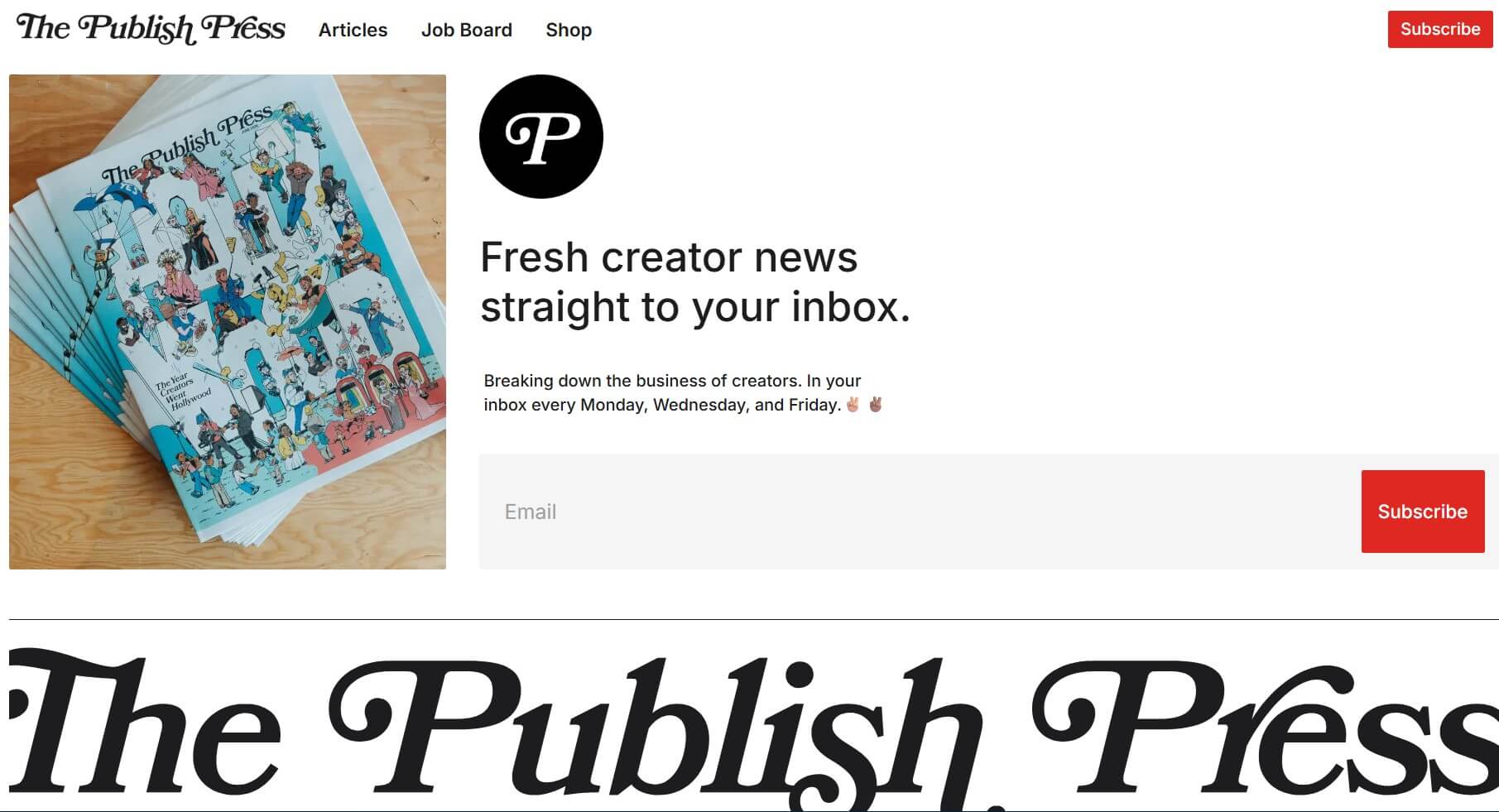
The Publish Press showcases one of the best newsletter signup examples, which is both short and engaging. Compelling copy draws readers in, while the design ensures visitors can subscribe in seconds with minimal effort.
Why is it good?
- Simple, engaging copy speaks directly to the audience
- Minimal fields allow quick signup
- Offers a strong value proposition and clearly states newsletter frequency
Compliance note: The signup form describes what subscribers will receive and states the frequency. However, it doesn’t have an explicit consent checkbox.
Strategic takeaway: Content creators benefit from the publishing schedule transparency because subscribers prefer this predictability.
Build this with Omnisend: Leverage landing page forms for dedicated signup pages that reduce navigation distractions and focus entirely on conversion.
8. Mad Fientist
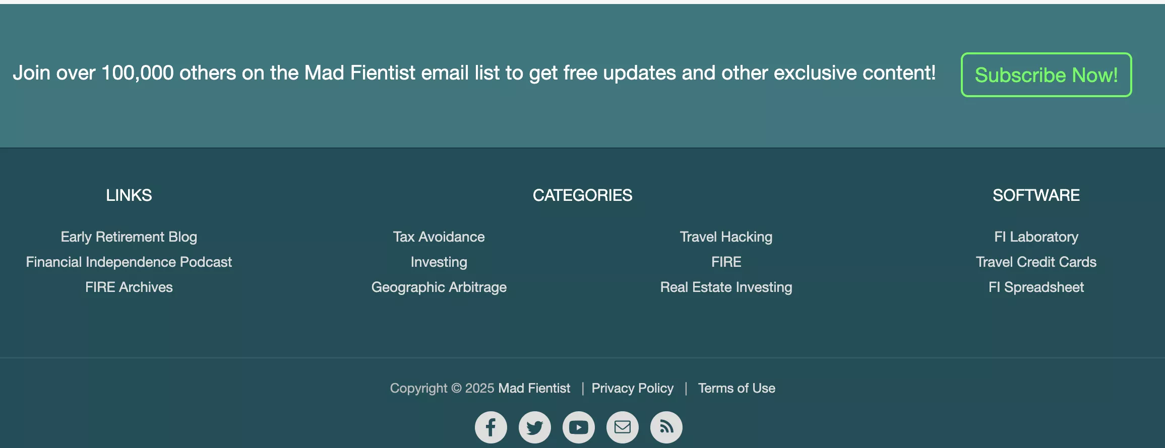
Mad Fientist uses a straightforward text-based signup form. It removes all distractions and focuses purely on email collection. This subscribe-to-newsletter example leverages social proof and offers exclusive value.
Why is it good?
- Highlights 100,000+ subscribers for credibility
- Promises free updates and exclusive content
- Bright green “Subscribe Now!” button effectively draws attention
Compliance note: While it’s simple and low friction, this form is missing links to terms or privacy notices and explicit consent elements.
Strategic takeaway: Social proof and exclusivity create urgency, value, and trust.
Build this with Omnisend: Enhance your distraction-free forms by adding double opt-in and privacy links for compliance.
9. J.Crew
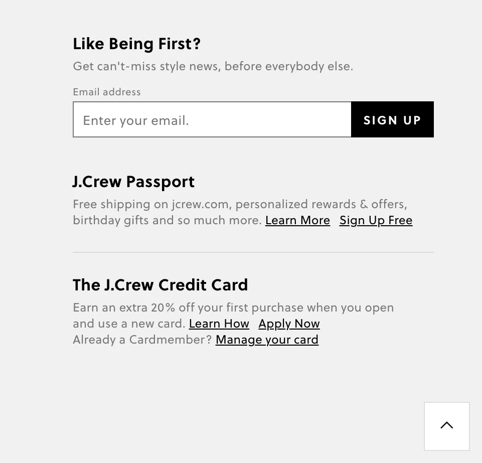
J.Crew’s newsletter signup form uses a bold, attention-grabbing headline to encourage users to get exclusive style-related news. It also promotes additional rewards through the J.Crew Passport and Credit Card. This provides additional value for subscribers joining the mailing list.
Why is it good?
- Uses a compelling headline to grab attention
- Creates urgency by emphasizing early access to style-related news
- Maintains a clean and straightforward design to minimize distractions
Compliance note: When offering rewards and cross-promotions, include clear consent language and processing details to satisfy GDPR’s specific requirements.
Strategic takeaway: Newsletter signup forms for retail brands convert better when paired with tangible benefits like early sale access rather than generic content.
Build this with Omnisend: Build tiered signup experiences using multi-step forms that capture email first. Then, offer additional program enrollment on subsequent screens.
10. Vox
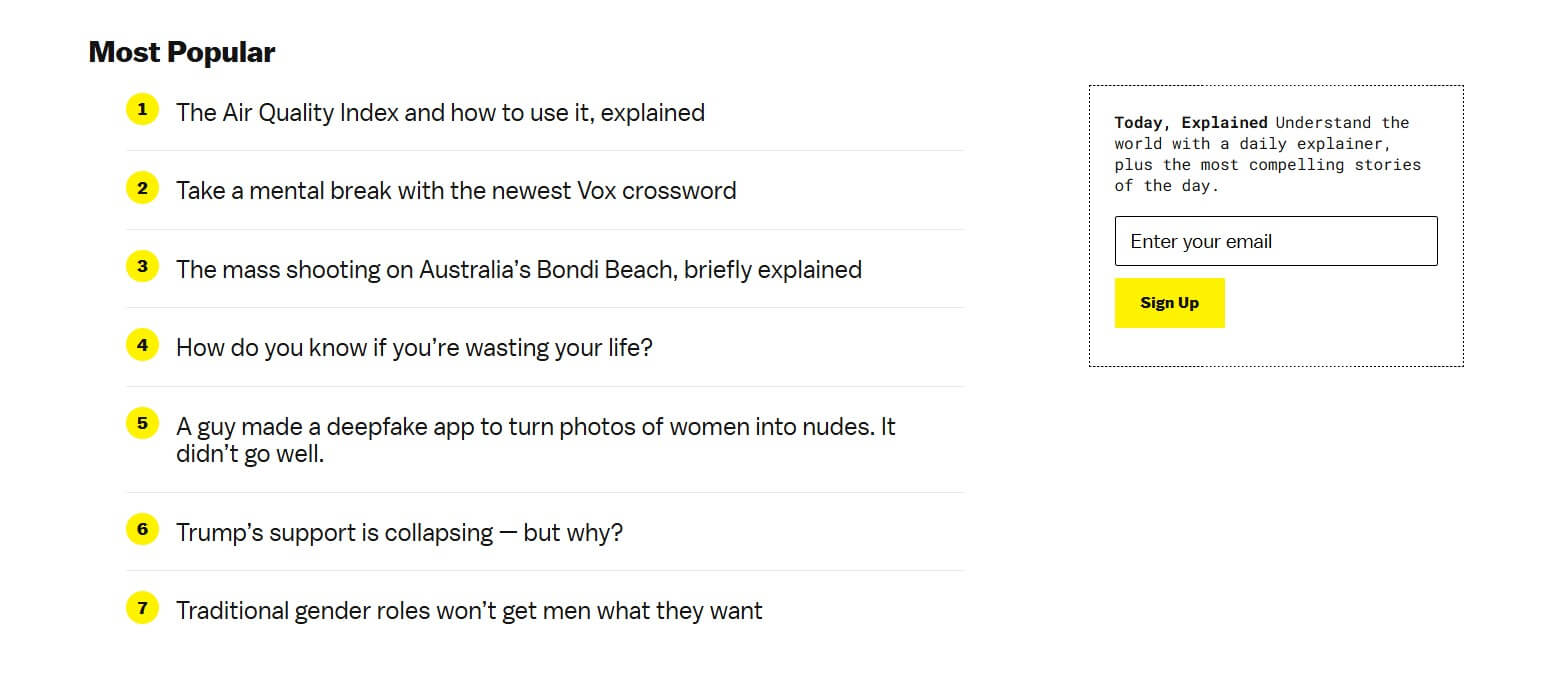
Vox’s signup form is modern and objective, focusing on delivering value-driven content straight to subscribers. With just an email field, this template offers a simple, low-friction signup.
Why is it good?
- The messaging matches Vox’s informative, straightforward, and trustworthy voice
- Features a clear and straightforward design that eliminates unnecessary friction
- Emphasizes high-quality content delivery
Compliance note: Content-focused signups should avoid discount language that triggers commercial message rules under CAN-SPAM.
Strategic takeaway: Lead with content value when your audience prioritizes insight over discounts.
Build this with Omnisend: Use embedded templates specifically for newsletter signup forms, with dropdowns for interests or frequency preferences.
11. Qatar Airways
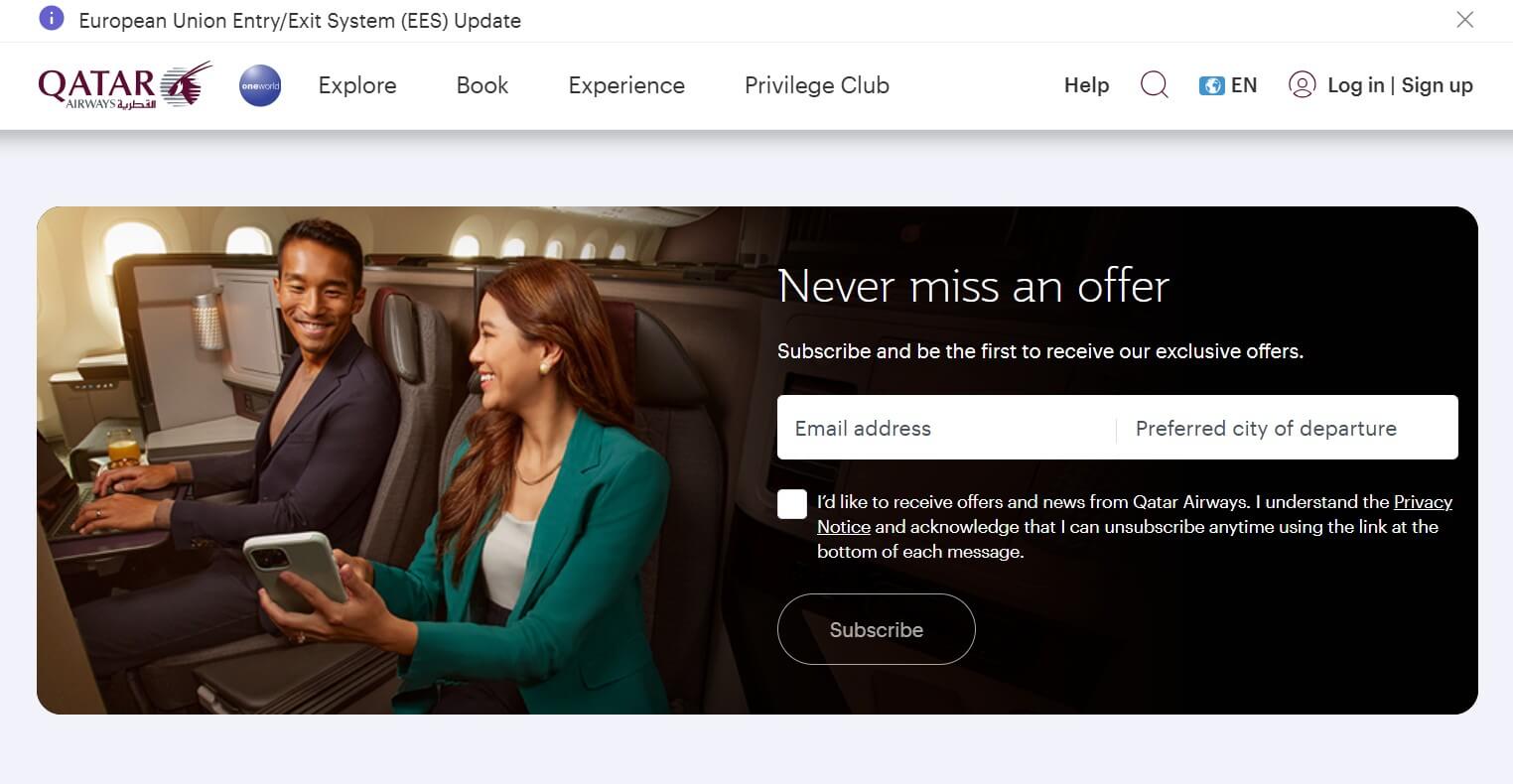
The Qatar Airways newsletter signup example leverages exclusivity to engage potential subscribers and offer personalized deals. Its compelling headline immediately grabs attention. It showcases urgency as no one wants to miss out on exclusive flight offers.
Why is it good?
- The headline “Never miss an offer” triggers FOMO (fear of missing out)
- Users can enter their preferred departure city for relevant deals
- Clean, distraction-free layout for quick and intuitive signups
Compliance note: With the informed consent checkbox and easy unsubscribe option, this signup form strongly complies with GDPR.
Strategic takeaway: Location-based personalization increases relevance for travel and event businesses where geography fundamentally determines offer value.
Build this with Omnisend: Add custom fields to newsletter signup forms to capture location preferences. This also enables segment creation for geo-targeted campaigns.
12. Urban Outfitters

Urban Outfitters uses its newsletter signup form to invite users to get updates. Subscribers receive news on new arrivals, sales, exclusive content, and events. The form doesn’t just simply say, “Sign up for our newsletter.” It also comes with a clear email field and a bold CTA button.
Why is it good?
- The “first dibs” wording creates exclusivity by positioning subscribers ahead of others
- Mentions exclusive content and events to add value beyond standard promotions
- Simple, clutter-free design ensures seamless signup
Compliance note: Listing multiple content types (sales, events, and more) shows adherence to the transparent purpose notification required by GDPR.
Strategic takeaway: Lifestyle brands convert younger audiences by emphasizing access to events and content aside from traditional product promotions.
Build this with Omnisend: Use profile data like sex or preferences to set up dynamic content blocks. This allows emails to adapt to what recipients want.
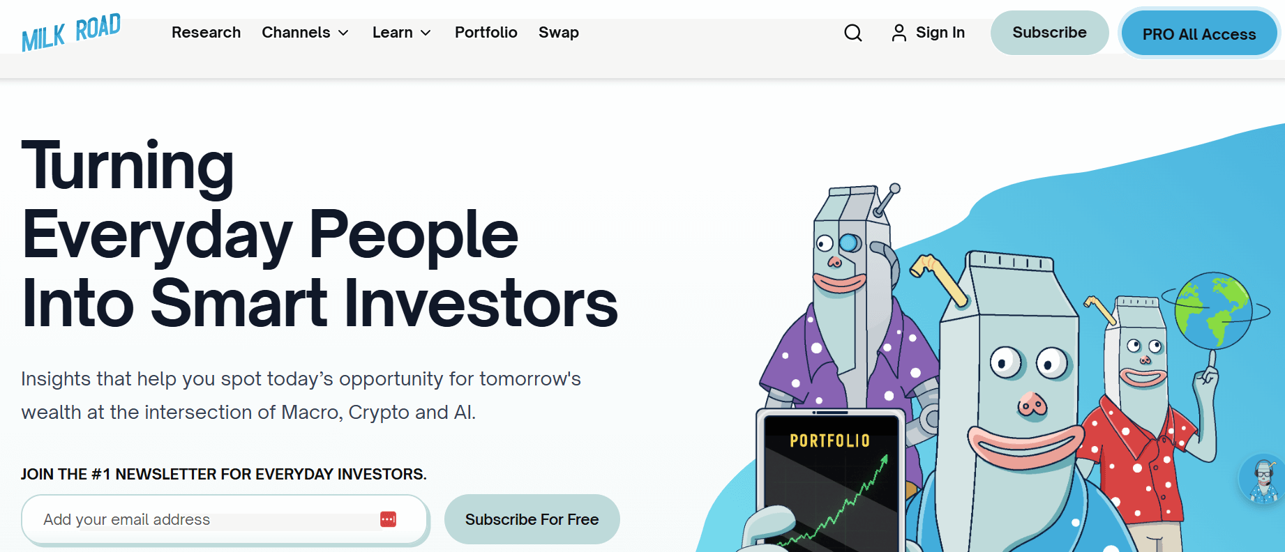
13. Milk Road
Milk Road’s signup form stands out with its playful design that aligns with its brand personality. It uses social proof and engaging visuals to build trust and capture attention.
Why is it good?
- Establishes credibility by showcasing that it’s the number one newsletter for everyday investors
- Features an eye-catching design with playful and memorable illustrations
- Shows a clear value proposition by emphasizing Macro, Crypto, and AI topics
Compliance note: When you cite social proof, you’re making a marketing claim, so accuracy is essential to avoid FTC violations.
Strategic takeaway: Pair playful design with forms to maximize conversions without hurting user experience.
Build this with Omnisend: Use popup form templates with custom image uploads to showcase brand illustrations while setting scroll-based triggers to avoid Google penalties.
14. The GIST
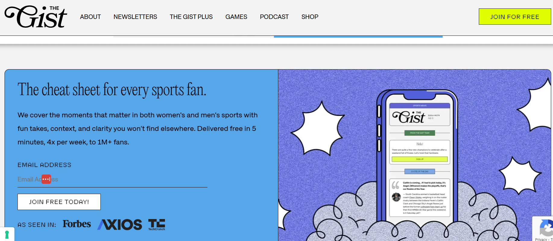
The GIST’s newsletter signup form looks fun and energetic while being tailored to its sport-focused audience. It reflects the brand’s personality while ensuring an easy signup process.
Why is it good?
- Showcases playful, engaging copy that matches the enthusiasm and energy of sports fans
- Shows sending frequency to maintain transparency
- Builds trust by mentioning its one million fans and media features
Compliance note: By writing “five minutes, four times per week, to 1M+ fans…” the newsletter establishes credibility. This is strengthened by the simple CTA, “Join free today.”
Strategic takeaway: Add social proof, mention explicit numbers, and keep the signup simple to capture both passive and high-intent visitors.
Build this with Omnisend: Use simple forms to allow readers to sign up quickly and avoid friction.
 | “Omnisend has proven to be an ideal solution for the types of ecommerce brands we work with — especially those in the early to mid-growth stage. It offers the right balance of powerful automation features, user-friendly design, and accessible pricing. If your flows aren’t set up properly, you’re paying to acquire customers you’re not keeping.” Omar Juman, Co-Founder of Blue Drop Studio Using signup forms and automated flows, Blue Drop Studio achieved a 435% increase in client email revenue in 30 days. Read the full case study. |
Effective popup newsletter signup form examples
These popup newsletter signup examples pair strong offers with precise timing to increase conversion. When designed and triggered correctly, popups capture intent without violating Google’s intrusive interstitial guidelines.
15. Lenny’s Newsletter
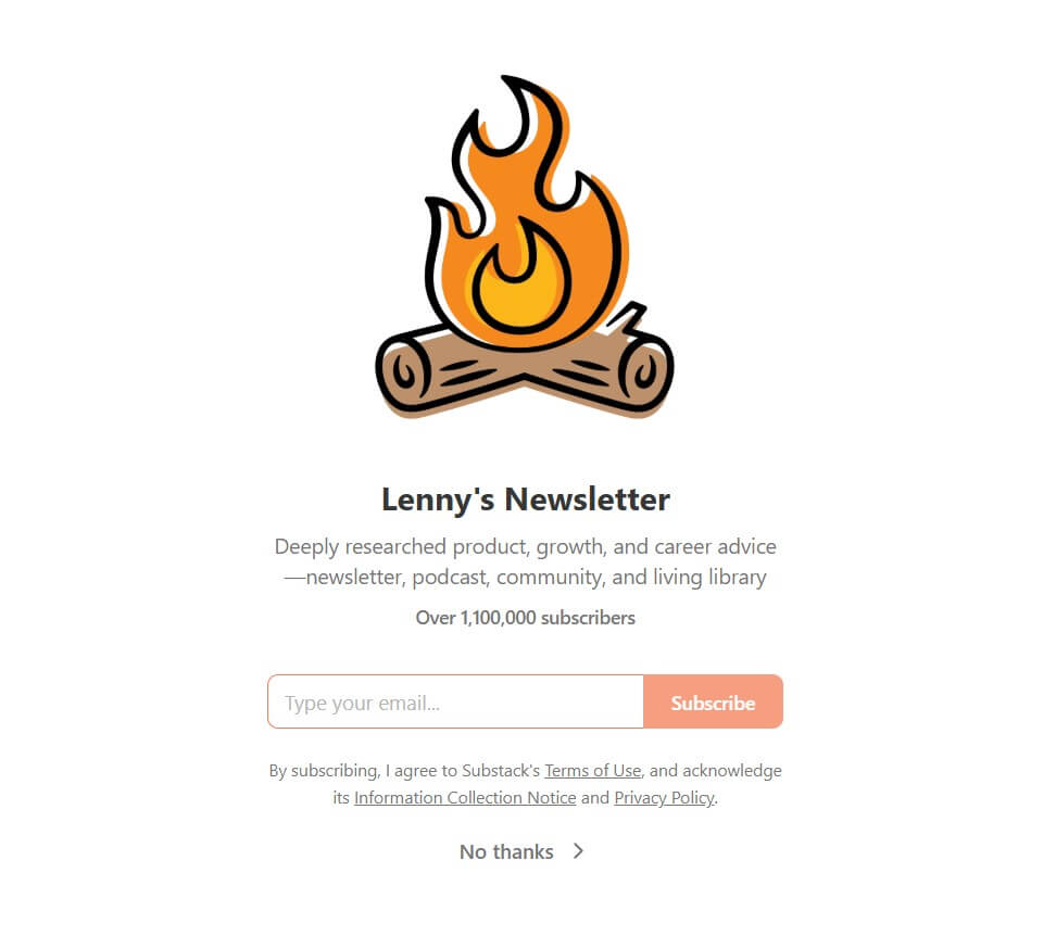
Lenny’s popup embraces a conversational approach. The form builds credibility through social proof and uses a clean, visually appealing design. With its concise copy, visitors can easily understand its subscription value.
Why is it good?
- Showcases a massive subscriber count of over 1.1 million to establish trust and authority quickly
- Simple, distraction-free layout helps users focus on signing up
- Clear benefits match professional reader needs and goals
Compliance note: Including clear purpose language and an opt-out option supports GDPR’s informed consent requirements.
Strategic takeaway: Convert skeptical professionals by showing subscriber count to demonstrate peer validation rather than relying solely on content promises.
Build this with Omnisend: Use a full-page popup with a clear value statement to capture attention immediately. Then, limit frequency to avoid repeated exposure.
16. Sleeknote
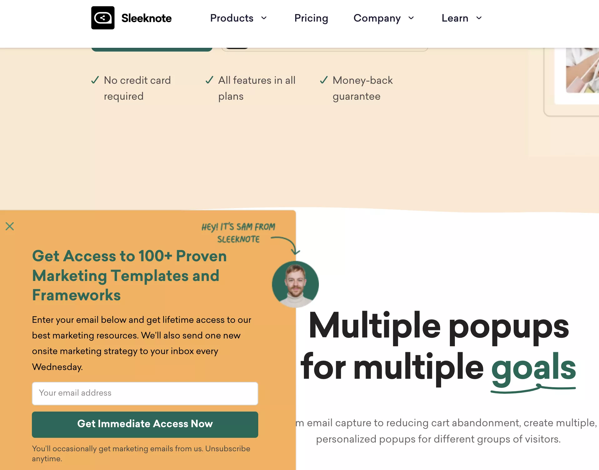
Sleeknote’s signup form is optimized for conversions by using exit-intent popups and personalization. This excellent newsletter marketing strategy ensures visitors get the most relevant offers at the right time.
Why is it good?
- Includes dynamic and personalized signup options
- Offers lifetime access to its best marketing resources to boost perceived value
- “Get Immediate Access Now” CTA creates urgency
Compliance note: Exit-intent popups avoid Google’s mobile popup penalty since they trigger on abandonment. They don’t interrupt active engagement with page content.
Strategic takeaway: Use exit-intent popups for value-heavy offers that capture consideration-stage visitors before they leave.
Build this with Omnisend: Set up exit-intent popup triggers with page-specific targeting rules that show different lead magnets based on which product categories the visitor has browsed.
17. MAC Cosmetics
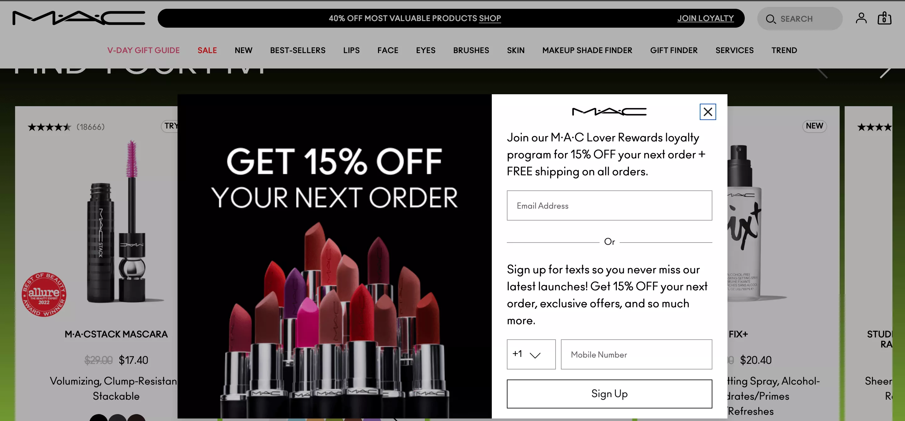
MAC Cosmetics’ signup form leverages a loyalty rewards program, offering 15% off and free shipping to incentivize signups. Unlike other forms that just say, “Join our newsletter,” this one increases conversion by effectively emphasizing why users should join.
It also offers both email and SMS signup options, providing multiple ways for users to access exclusive discounts and updates.
Why is it good?
- Features an elegant and brand-consistent design
- Highlights exclusive perks for members
- Ensures a quick and easy signup process
Compliance note: Offering SMS requires separate opt-in language under TCPA regulations, as text message consent can’t be bundled with email.
Strategic takeaway: Layer discounts with multi-channel capture to increase conversions and retention.
Build this with Omnisend: Enable SMS collection with separate consent checkboxes that automatically segment subscribers into email-only and omnichannel lists.
18. Bose
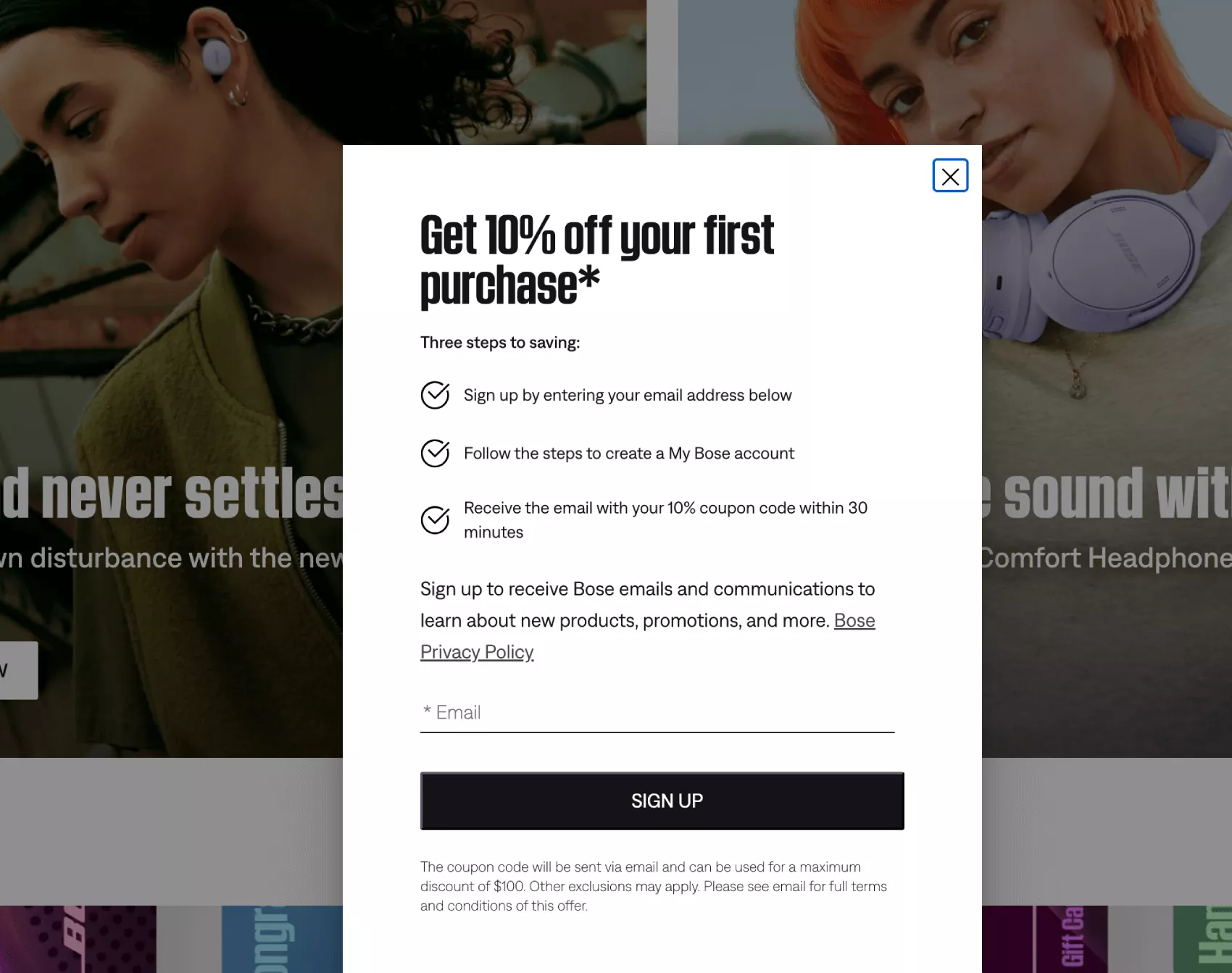
This popup signup form is effective because it offers a strong incentive and outlines the simplicity of the signup process. The clear, structured steps reduce friction and make the process easy to follow.
Why is it good?
- Attractive 10% discount encourages immediate action
- Provides step-by-step outline to simplify the signup process
- Minimalist design keeps users focused on subscribing
Compliance note: Disclose promotional intent clearly in your incentive-based popups, and apply advertised discounts correctly to avoid violating consumer protection laws.
Strategic takeaway: Step-by-step previews that show the simple path to savings work for premium products where hesitation is high due to pricing.
Build this with Omnisend: Create popup campaigns that generate a unique discount code for each subscriber, preventing sharing and making it easy to track redemptions accurately.
19. SHEIN
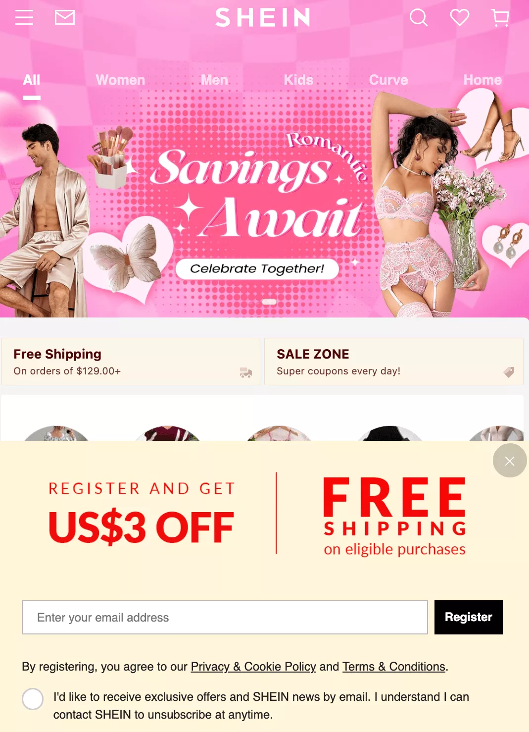
SHEIN’s signup form is visually compelling, featuring discounts and incentives that encourage immediate action. It also capitalizes on people’s fear of missing out by offering limited-time promotions.
Why is it good?
- The immediate $3 discount offer encourages signups
- Offers free shipping for extra motivation to complete the signup process
- Minimalistic form reduces distractions and maintains focus on the conversion goal
Compliance note: Combining multiple incentives (discount + free shipping) requires clear disclosure of terms, which SHEIN links out to.
Strategic takeaway: Stacking incentives works for impulse-buy categories, where removing multiple friction points (price + shipping cost) encourages hesitant shoppers to convert.
Build this with Omnisend: Use popups with countdown timers and expiring discount codes to create real urgency and encourage immediate signups.
20. AliExpress

The popup on AliExpress asks users to subscribe to notifications for order updates, discounts, and coupons. It features a clear CTA with clear “Allow” and “Don’t allow” buttons.
Why is it good?
- Provides value by offering order updates, discounts, and shopping tips
- Uses clear and concise messaging that immediately grabs attention
- Features contrasting buttons that simplify decision-making
Compliance note: Browser push notifications require a separate explicit opt-in under GDPR’s purpose limitation principle.
Strategic takeaway: Use permission-style popups when asking for ongoing notifications or updates.
Build this with Omnisend: Separate email collection from push requests. You can achieve this using multi-step popups that capture email first, then offer push notifications as an option.
| Related:10+ newsletter introduction examples [+ takeaways and tips]How to monetize a newsletter: 10 essential ways |
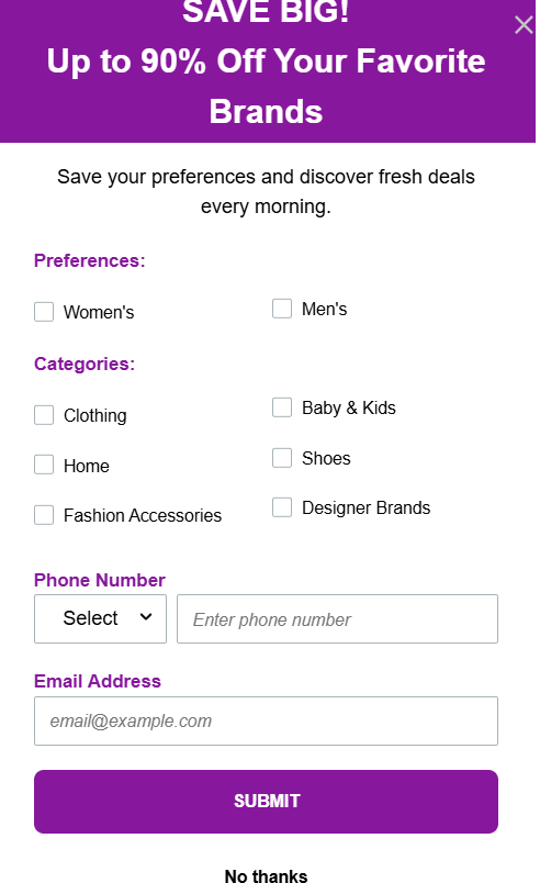
21. Zulily
This popup leads with a strong value hook, “Save Big! Up to 90% Off Your Favorite Brands,” while capturing email and phone details for tailored deals. The checkbox-based layout makes selection quick, and the single, prominent CTA clearly guides users toward the next step.
Why is it good?
- It’s benefit-first and personalization-focused
- Allows subscribers to choose preferences and categories
- The visual hierarchy is clean and easy to scan
Compliance note: CAN-SPAM requires actual email frequency and content type to match the promises made during signup. It also includes a polite “opt-out” option.
Strategic takeaway: Flash sale positioning works for deal-driven audiences who check their emails multiple times in a day.
Build this with Omnisend: Use teaser forms tied to deal-focused automations to highlight flash sales and daily deals.
22. Fashion Nova
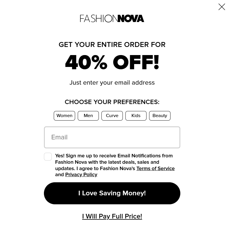
Fashion Nova’s popup offers a 40% discount in exchange for a newsletter subscription. It allows users to customize their shopping preferences and uses an engaging CTA to encourage signups. This makes the opt-in process more appealing to customers.
Why is it good?
- Incentivizes signups with an exclusive 40% discount
- Offers personalization by letting users select their shopping preferences
- Engages users emotionally with a compelling CTA, “I Love Saving Money!”
Compliance note: When collecting preferences, you need a clear explanation to meet GDPR consent rules, which is handled here with an opt-in checkbox.
Strategic takeaway: Collecting shopping preferences at signup and using the data for segmentation reduces irrelevant sends, which ultimately improves long-term engagement.
Build this with Omnisend: Add preference dropdowns in signup forms to auto‑segment subscribers by their shopping interests.
23. The New York Pass
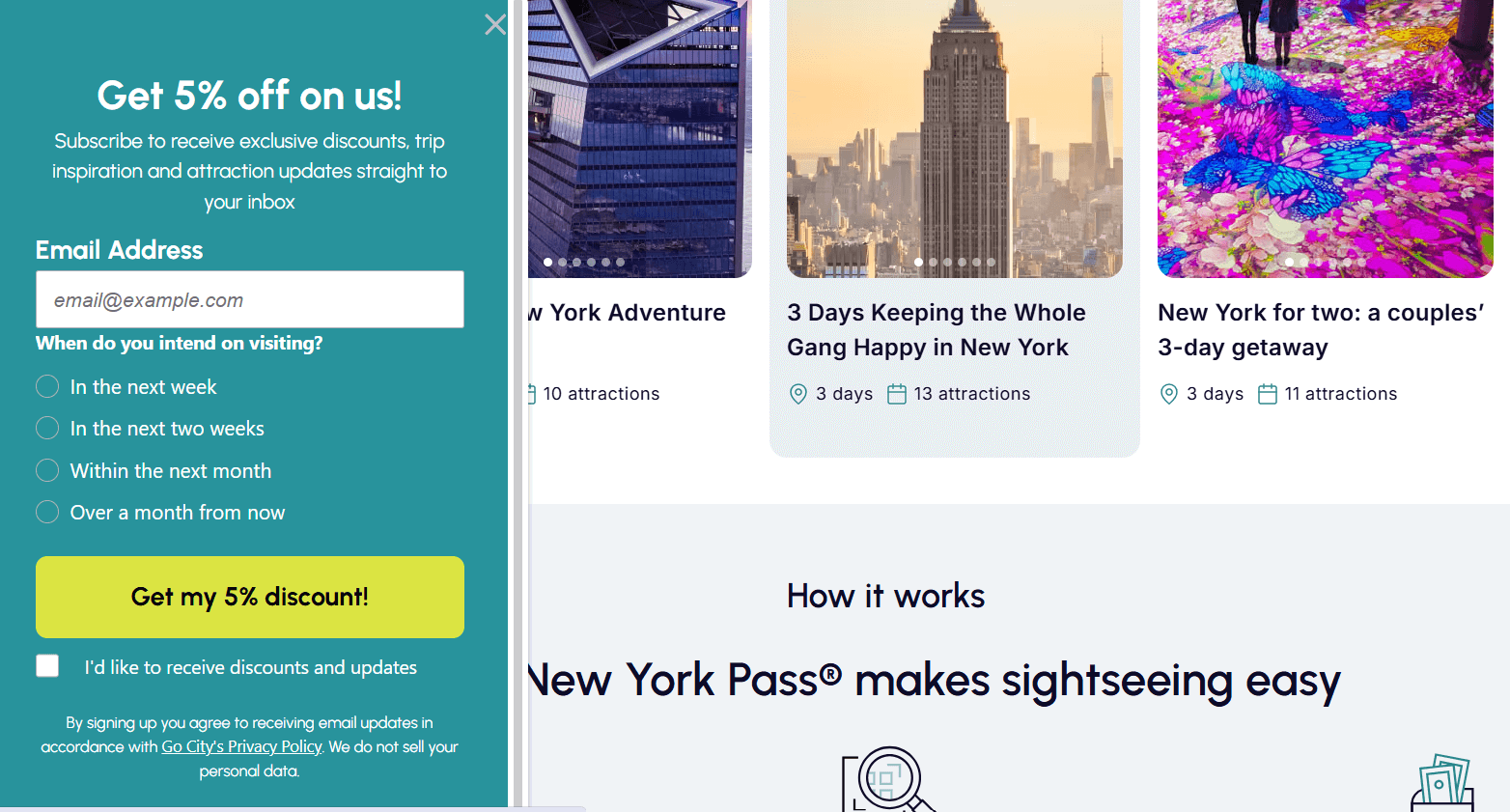
The signup form by The New York Pass encourages subscriptions with an extra 5% discount, travel ideas, and updates on top attractions. What’s more, it requires only an email to sign up.
Why is it good?
- Asks the customer’s travel preferences
- Uses persuasive language like “On us!” to encourage action
- Maintains user trust with a clear privacy disclaimer about data security
Compliance note: Privacy disclaimers shown at signup meet GDPR transparency rules when they link to a full privacy policy, as shown here.
Strategic takeaway: Pair discounts with helpful content like trip planning ideas when selling experience-based products.
Build this with Omnisend: Link your audience to a subscriber preference center to manage data transparency and subscription status effortlessly.
Gamified signup forms that boost newsletter conversions
These newsletter signup form examples use interactive elements to create engaging experiences. These elements, including spin-to-win wheels, quizzes, and progress bars, make the process feel rewarding rather than transactional.
Here are a couple of examples:
24. Woof
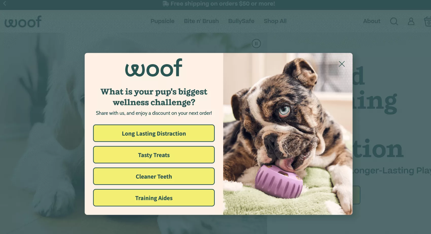
Woof’s form engages users by asking about their pup’s wellness challenge and offering a discount based on their choice. This email signup template makes subscribing interactive while collecting valuable customer data.
Why is it good?
- Engages users with an interactive experience for fun and effortless signup
- Personalizes offers based on user choices to increase relevance and conversions
- Creates a seamless path to discounts, effectively encouraging immediate action
Compliance note: Ensure the “quiz” interaction doesn’t force a subscription, as consent to receive marketing must be freely given.
Strategic takeaway: Using gamified signup forms to collect preference data enables smarter segmentation than relying on demographics alone.
Build this with Omnisend: Create conditional multi-step forms where quiz answers reveal the right discount and automatically tag subscribers for targeted campaigns.
25. Perifit

Perifit’s gamified signup form goes beyond just saying, “Join our email list.” It makes the process exciting by offering users a chance to win prizes. The spin-to-win feature offers free Perifit Care or discounts of up to 25% off first orders.
Why is it good?
- Engages users with an interactive spinning wheel that creates anticipation
- Exciting giveaways make signing up feel more like winning a reward than completing a task
- Asks for the subscriber’s main goal to gain valuable insights for product recommendations
Compliance note: This form has an active opt-in, where subscribers can tick the checkbox to receive marketing or promotional communications.
Strategic takeaway: Gamified rewards are ideal for first-touch engagement and list growth campaigns.
Build this with Omnisend: Use Wheel of Fortune forms with minimum prizes and weighted odds to offer bigger discounts while protecting margins and maintaining excitement.
How to create a newsletter signup form with Omnisend
Creating a high-converting newsletter signup form is simple with Omnisend’s email marketing platform. With customization, automation, integrations, and compliance tools, Omnisend has everything you need to grow your email list.
Follow these steps to set up an effective newsletter signup form with Omnisend:
Step 1: Access the form builder
Start by logging into your Omnisend account and opening the form builder.
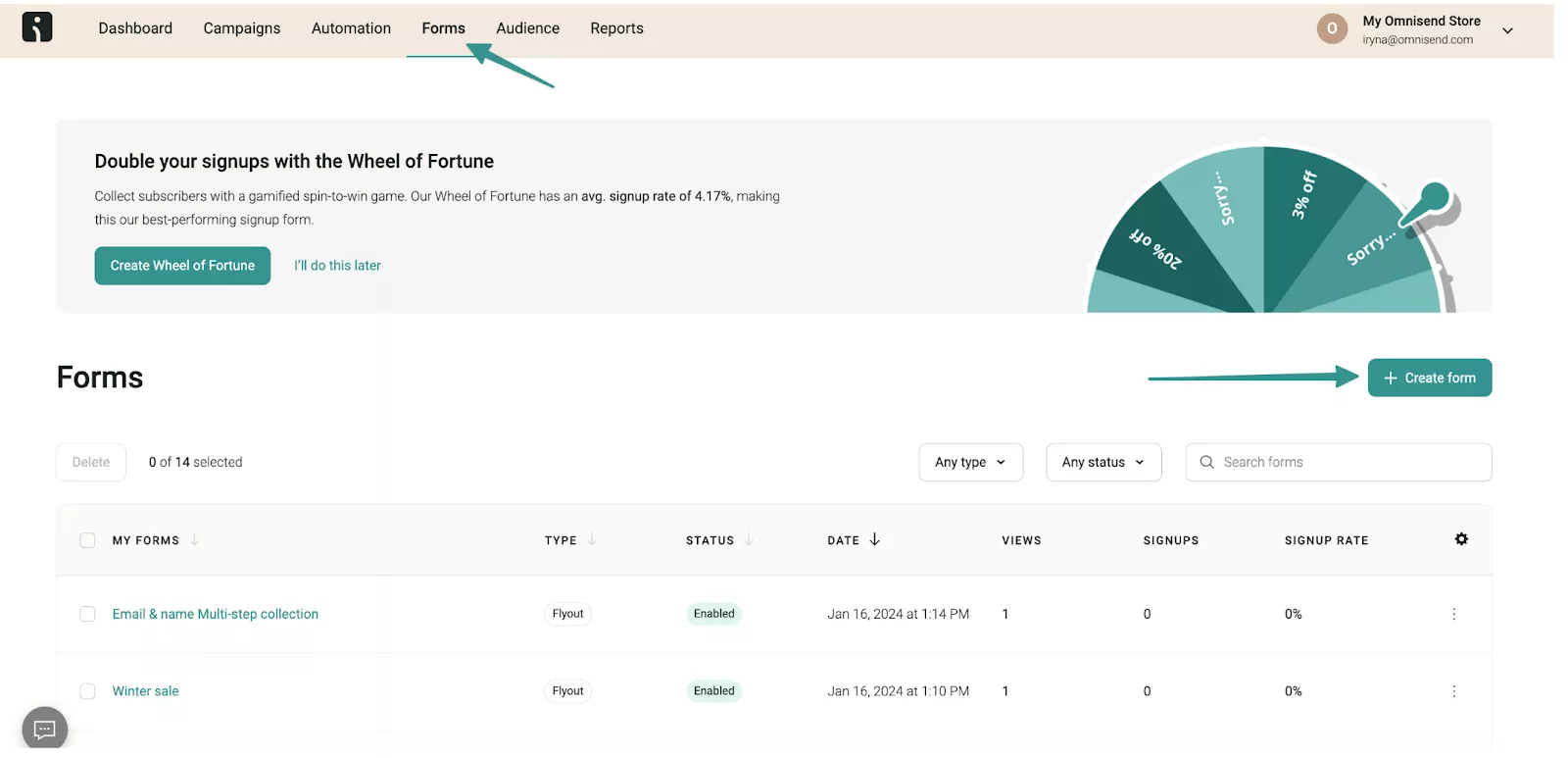
- Sign in to your Omnisend dashboard
- Navigate to Forms in the left-hand menu
- Click Create Form to start building a new signup form
This takes you into Omnisend’s visual form editor, where you can design embedded forms, popups, and interactive signup experiences.
All types of forms use the same core builder. This keeps the setup consistent regardless of your chosen format.
Step 2: Choose your form type
Next, select the signup form type that aligns with your goals.
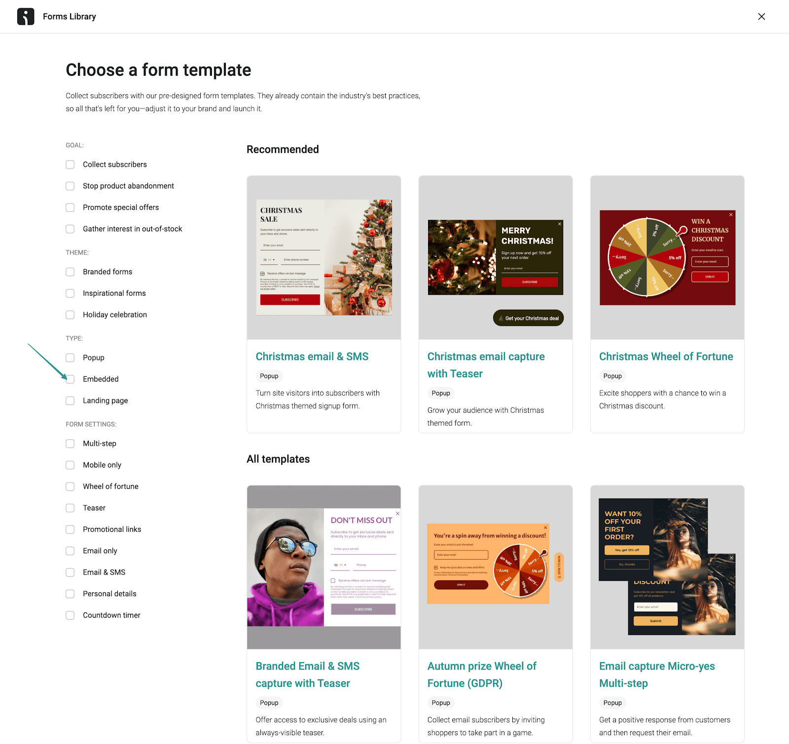
Omnisend offers several options in its Forms Library:
- Popups: Best for high-intent moments or grabbing attention quickly. Use timed, scroll-based, or exit-intent popups when you want to convert visitors before they leave.
- Embedded forms: Ideal for steady, always-on low-friction list growth. These work well on homepage sections, blog posts, or landing pages where visitors expect to see a signup option.
- Gamified forms: Designed for engagement-focused campaigns. Spin-to-win wheels and interactive formats work especially well for promotions, younger audiences, and discount-driven signups.
Choose the form type that aligns with your conversion goals and website design. You can also create multiple forms for different pages or audience segments.
Step 3: Customize for conversions
Once you’ve chosen a form type, it’s time to optimize it for conversions using Omnisend’s Theme and Behavior settings.
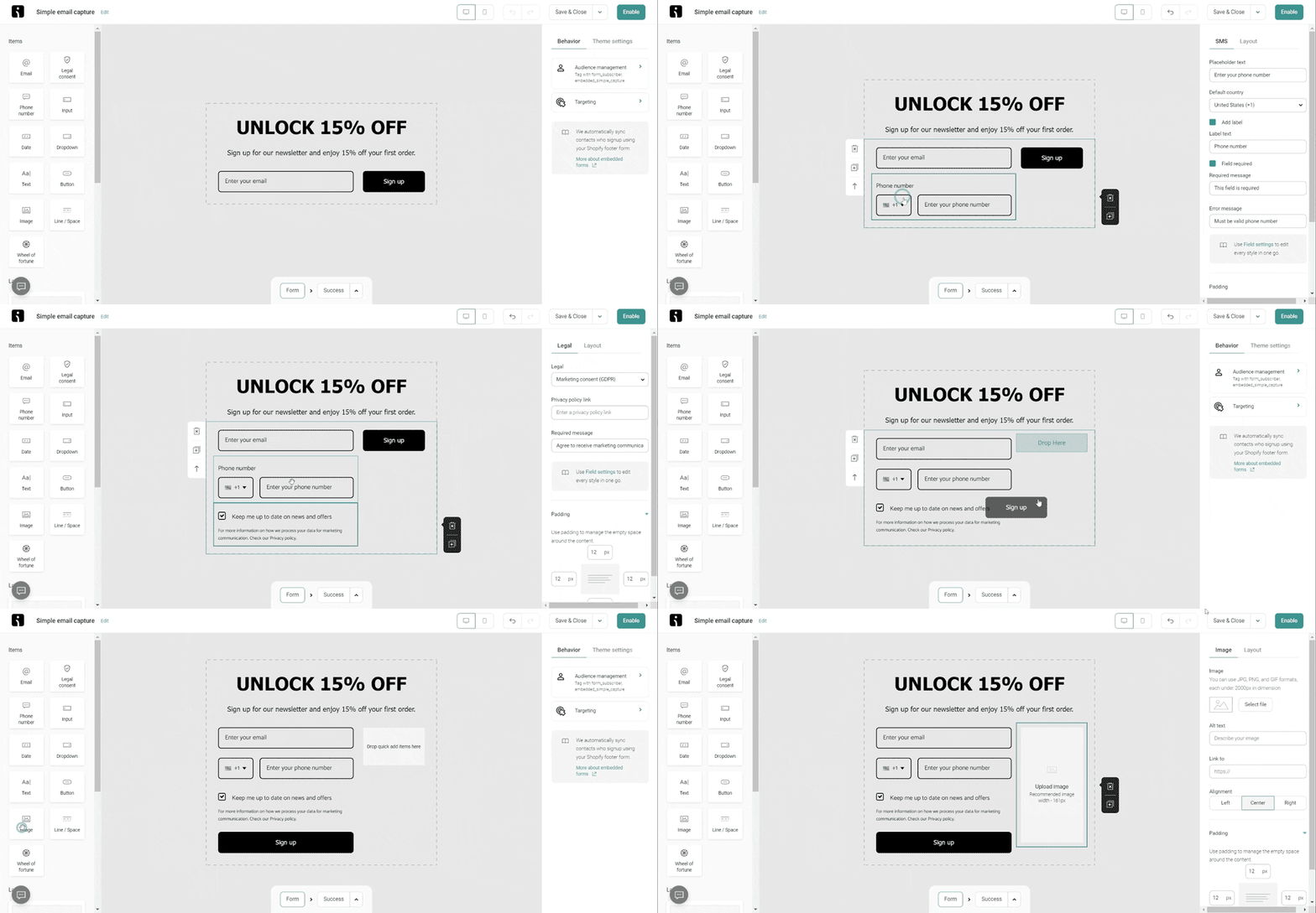
- Start with a clear headline that highlights the value that subscribers get
- Write compelling copy that lists the benefits of joining your newsletter
- Keep the form short — an email address and name are usually enough
- Add an engaging CTA button like “Get exclusive updates” or “Claim my discount”
- Use colors, fonts, and imagery that align with your brand for consistency
Behavior settings let you control when and how the form appears. You can trigger forms after a delay, on scroll, or based on exit intent.
This timing is especially critical for popup newsletter signup forms. That’s because poorly timed popups can hurt user experience and violate Google’s intrusive interstitial guidelines on mobile.
Show popups after engagement signals, not immediately on page load, unless you’re using a full-page takeover intentionally.
Step 4: Set up compliance features
Compliance is where many signup forms fall short. Omnisend makes it easier to collect consent while staying aligned with GDPR, CAN-SPAM, and other data protection requirements.
Before you hit publish, here’s how to ensure your form meets compliance standards:
- Enable consent logging: Omnisend automatically records consent data for every subscriber. This includes opt-in timestamps, IP addresses, and the exact content they saw on the form upon signup. This audit trail helps prove compliance if you’re ever audited by regulatory authorities.
- Add a privacy policy link: Include a clear, clickable link to your privacy policy on every email newsletter signup form. This transparency is required under GDPR and builds trust with potential subscribers. Place it near the signup button or in the consent checkbox text.
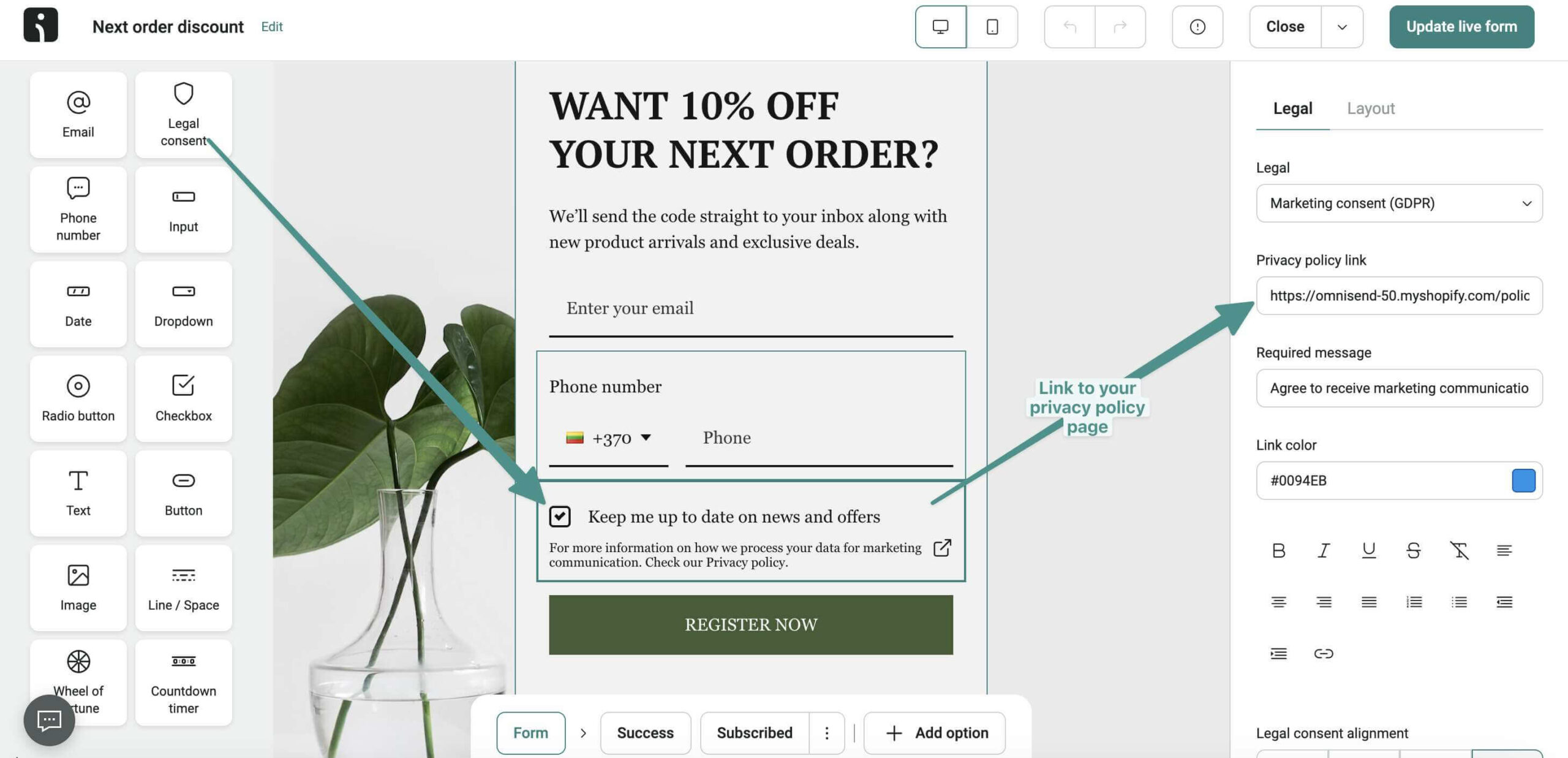
- Ensure checkboxes are unticked by default: Pre-checked consent boxes violate GDPR requirements. Omnisend’s forms follow best practices by leaving consent checkboxes unticked, requiring subscribers to actively opt-in. Aside from compliance, this also ensures you’re building a list of genuinely interested contacts.
- Review consent language for clarity: Use plain, straightforward language that explains exactly what subscribers are agreeing to. Your opt-in text should state the type of emails subscribers will receive and how often. Avoid legal jargon or confusing terms. Let users know that they can unsubscribe at any time.
- Add double opt-in for maximum compliance: Enable double opt-in in your form settings so subscribers will receive a confirmation email before they can be added to your list. While this adds an extra step, it significantly improves list quality and provides additional proof of consent.
Step 5: Enable welcome automation
After ensuring that your newsletter signup form is compliant, connect it directly to a welcome automation. This ensures new subscribers receive immediate value. It also sets the foundation for long-term engagement. Here’s how:
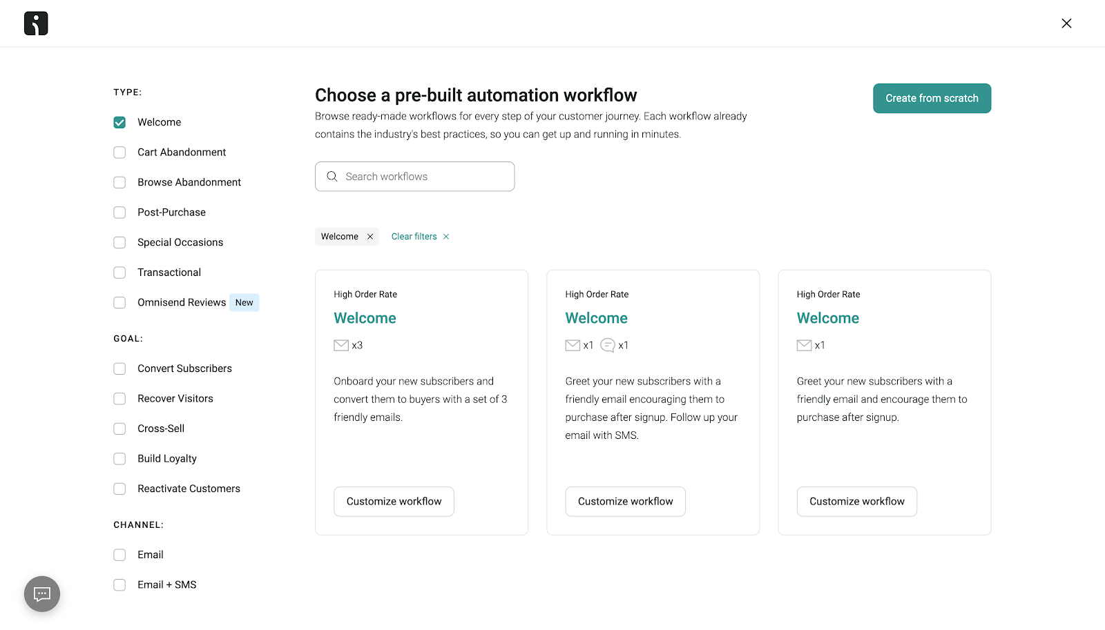
- Set up an automated welcome email: Create a warm, friendly welcome message that thanks subscribers for joining. Make sure to deliver on any promises you made in your signup form. If you offered a discount code, include it in this welcome email.
- Create a welcome series: Go beyond a single email by building a multi-message email automation sequence. A typical welcome series typically includes three to five emails introducing your brand story. It showcases popular products or content, and encourages first purchase or engagement.
Here are several welcome email workflows by Omnisend:
- Use segmentation for personalization: Leverage Omnisend’s segmentation features to tailor the welcome flow based on collected subscriber preferences. For example, someone whose interest was tasty treats for their puppy might receive different content than someone interested in dog supplements.
- Integrate with your website: Embed your form on high-traffic pages like your homepage, About page, and popular blog articles. For popups, configure exit-intent triggers to capture visitors before they leave. You can also set time-based triggers that display after visitors have engaged with your content for some time.
- Optimize form placement and timing: Test different form placements to see what works best for your audience. A/B test various trigger settings, including different time delays, scroll percentages, or page-specific targeting. This allows you to maximize conversions without annoying visitors.
Check out this quick tutorial to see these steps in action:
Step 6: Configure authentication and deliverability
Even the best signup form fails if emails land in spam folders. Before driving traffic to your signup form, make sure your sending domain is authenticated.
Omnisend supports authentication protocols like SPF, DKIM, and DMARC. These verify sender identity, protect brand reputation, and improve inbox placement.
- SPF: Confirms emails are sent from authorized servers
- DKIM: Adds a digital signature to prove authenticity
- DMARC: Aligns SPF and DKIM to prevent spoofing
This step matters because simply collecting compliant consent doesn’t guarantee deliverability. Authentication ensures your welcome emails actually reach new subscribers.
Step 7: Track performance and optimize for growth
After your form is live, use Omnisend’s dashboard overview to monitor your audience growth and signup form performance.

Monitoring performance helps you refine your strategy by:
- Testing different headlines, CTAs, and form styles
- Adjusting targeting settings to reach the right audience
- Reviewing compliance logs to ensure that consent records are complete
Regular testing ensures your signup forms remain effective and compliant.
Summary
Your newsletter signup form is often the first actual interaction visitors have with your brand, so make it count.
The newsletter signup examples listed in this guide demonstrate how strategic design, clear value propositions, and minimal friction drive conversions.
As regulations tighten, compliance will no longer be optional by 2026. Instead, it’s a competitive advantage that builds trust from the first click.
Whether visitors choose to sign up to your newsletter through popups, embedded forms, or gamified experiences, transparency matters.
To simplify the creation of newsletter signup forms, Omnisend combines form design, consent management, automation, authentication, and deliverability tools in one platform.
With Omnisend, you can create a compliant and high-converting newsletter signup form that responsibly grows your list. It helps you build a high-quality audience to position your brand for long-term engagement and revenue growth.
Email newsletter signup examples FAQ
The best newsletter signup form examples show that less is more. Typically, an email address is enough. However, adding a first name can help personalize welcome emails. You can also collect names or preferences later through follow-up emails or preference centers. Keeping your newsletter signup simple reduces friction and boosts conversions.
Double opt-in isn’t legally required, but it’s a best practice for list quality and compliance. It confirms consent, reduces fake signups and spam complaints, and improves deliverability. Many brands use double opt-in for GDPR-affected regions or high-value newsletters.
Start with a welcome email immediately after signup. Follow with a brief series that introduces your brand and its value. After that, send consistent updates. Weekly or biweekly works for most audiences. Be sure to match your sending frequency to the promise you made in your newsletter signup form to maintain trust and engagement.
Quick sign up | No credit card required
TABLE OF CONTENTS
TABLE OF CONTENTS


No fluff, no spam, no corporate filler. Just a friendly letter, twice a month.
 OFFER
OFFER
