
 OFFER
OFFER


Drive sales on autopilot with ecommerce-focused features
See FeaturesAs an ecommerce store owner, it can be disappointing to see the shoppers leave at the last step of checkout, possibly because the shopping cart designs weren’t appealing enough to make them complete the purchase.
There are chances that the customers were looking for more than just the products while checking out — a transparent shipping rate, extra deals, or a clear refund policy.
One common reason people leave early is the design of the checkout. By implementing a simple and user-friendly cart page design, you can significantly reduce the abandonment rate and enhance the overall shopping experience for your customers.
In this guide, we’ll discuss practical tips and shopping cart examples to inspire you to create intuitive designs for your cart.
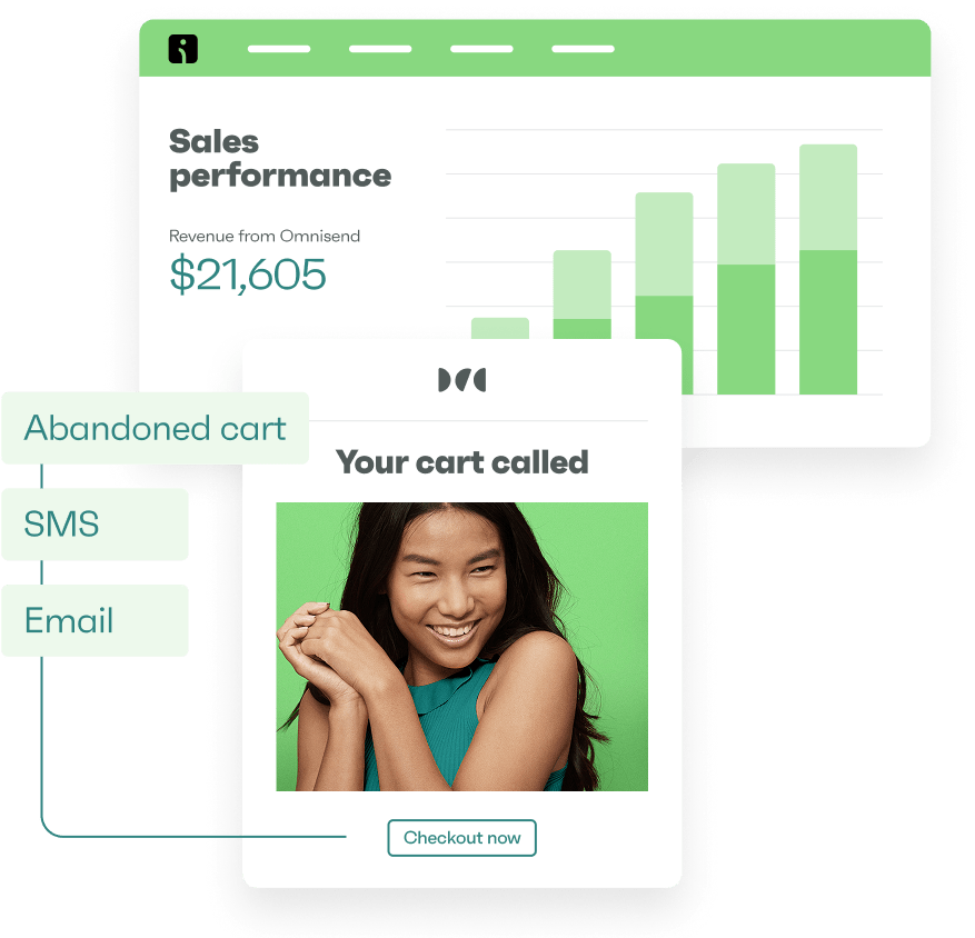
Try Omnisend today and create high-converting shopping cart designs faster
Quick sign up | No credit card required
Want to win back customers who abandoned their shopping carts? Take a look at 13 shopping cart abandonment strategies to maximize revenue.
Choosing the right shopping cart design format
Your shopping cart designs determine how customers interact with the checkout process. It can either simplify or complicate the shopping experience.
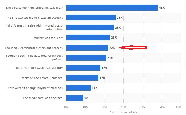
According to a recent Statista survey, 22% of consumers abandoned their carts due to a complex checkout process.
To avoid this, use a design format that makes it easy for customers to add items to their shopping cart, view them on the same page, and finalize their orders through hassle-free payments.
Here are the two main formats of shopping cart designs to consider to facilitate easy checkouts:
A dedicated cart page
As the name suggests, a dedicated cart page is a separate page that displays the items a customer has added to their cart in a separate page. It provides a detailed overview of the products, along with options to update quantities, remove items, and payment methods.
A cart preview
Also known as a mini cart, a cart preview is a small window overlay that appears when customers hover over or click the shopping cart icon. Unlike the detailed dedicated cart page, it provides a quick view of the items in the cart without redirecting them to a new page.
Dedicated cart page vs cart preview: pros and cons
Each ecommerce cart design format has advantages and drawbacks, as shown below:
| Feature | Dedicated cart page | Cart preview (sidebar cart) |
| Pros | ||
| Detailed review | Customers can see the product details, quantities, prices, and shipping options in one place | Customers can quickly review and edit without leaving the current page |
| Focused attention | It guides customers to checkout, reducing distractions | Immediate access and visibility of changes in the cart from any page |
| Advanced functionality | Supports complex interactions and displays detailed product information | Reduced friction, fewer navigational steps to checkout |
| Mobile-friendly | Easier to optimize for mobile device screen layouts | Interactive and intuitive design with real-time updates |
| Better navigation | Supports additional navigational features like saving carts or applying discounts | Minimal risk of cart abandonment due to additional navigation steps |
| Cons | ||
| Additional navigation | Users must leave the current page to access the cart | Less room for detailed product information |
| Cart abandonment risk | Extra steps might lead to higher cart abandonment rates | Customers might overlook the small cart size |
Shopping cart website design examples
To inspire you to create shopping cart designs that pique the customers’ interest, we’ve compiled compelling real-life shopping cart examples you can include in your store. Let’s look at 16 shopping cart designs and what makes them effective.
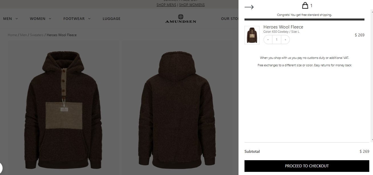
1. Amundsen Sports — Design a simple, user-friendly interface
Our first shopping cart design example is from Amundsen, a company that sells outdoor apparel. The website is simple and easy to navigate, with a clean, minimalist design.
Best features of this shopping cart design
- Consistent design: The cart page design maintains a consistent black-and-white color scheme that matches the rest of the website, reinforcing the brand’s identity from start to finish
- Customer reassurance: Notifying customers of free exchanges and easy returns reduces purchase hesitation
- Prominent call to action: The call to action button is large and eye-catching, with its bold black color contrasted with the lighter background, making it easy to identify
- Use of white space: The design incorporates white space to create a clean, uncluttered look, where customers can easily view their orders, make adjustments, and checkout
- Clear and concise product information: Each item has relevant product details, and you can conveniently adjust quantities directly in the cart without cluttering the page
 | Case study Learn how Amundsen has increased its revenue by focusing on automation in marketing: Amundsen Sports case study |
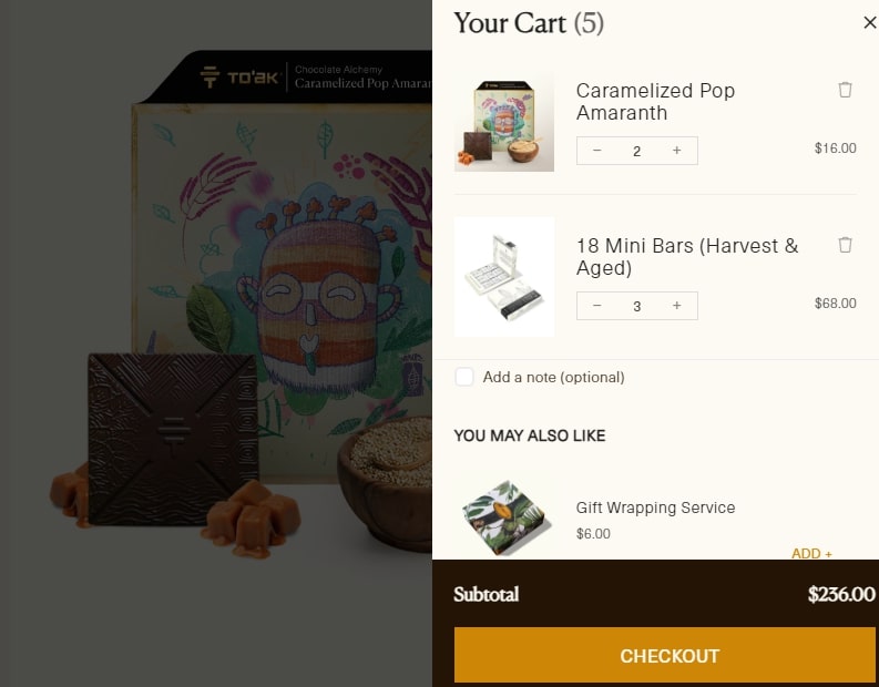
2. To’ak Chocolate — Add related products
To’ak Chocolate is an ecommerce store that sells high-end, luxury chocolate bars. Its shopping cart page design features a minimalist aesthetic and high-quality product images.
Best features of this shopping cart design
- Lightbox effect: The cart opens as a lightbox, allowing customers to view their selected items without leaving the product page. This encourages them to continue browsing uninterrupted.
- “You may also like” section: The cart includes suggestions for additional products, such as gift-wrapping services or complementary items. This feature promotes upselling and increases the average order value by offering relevant add-ons.
- Option to add a note: Customers can include a personalized note. This simple step allows them to transform their purchase into a thoughtful gift.
- Free gift incentive: To’ak Chocolate clearly communicates the free gift offer at a certain purchase threshold. It motivates customers to want to spend more to qualify.
- Clear and organized layout: The cart displays product images, prices, and quantities. The layout allows customers to review and adjust their orders easily before checking out.
| The design of the welcome email you send after customers have bought from you for the first time can be just as important for sales as the shopping cart design. To’ak’s welcome email has a 47% open rate and 18% conversion rate. Read the full case study here. |
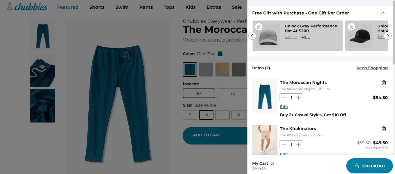
3. Chubbies — Let shoppers choose gifts
Here is another excellent shopping cart design example from Chubbies. This brand sells casual men’s clothing and is particularly known for its shorts. The playful and youthful website design features high-quality product imagery and is easy to navigate.
Best features of this shopping cart design
- Free gift promotion: The shopping cart page highlights a promotion where customers can unlock a free gift when they purchase. This motivates them to complete their purchases.
- Upselling opportunities: The “Buy 2+ Casual Styles, Get $10 Off” discount encourages customers to purchase additional items. It easily creates smooth upselling opportunities.
- Smooth checkout process: The shopping cart user interface includes a clear checkout call to action button. This progress indicator guides customers.
- Informative product details: The design displays detailed product descriptions, size, and color guides. They help customers make accurate purchase decisions.
- Quantity and size adjustments: The shopping cart web design allows customers to adjust the quantity and size of their items without leaving the cart page. This enhances the user experience and streamlines checkout.
Chubbies is one of the top Shopify Plus stores.
See more: The 25 top Shopify Plus stores to learn from in 2024
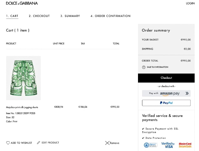
4. Dolce & Gabbana — Add trust signals
We loved this shopping cart example from Dolce & Gabbana. The fashion brand sells high-end clothing, accessories, and footwear. Its website’s minimalist black-and-white design reflects sophistication and elegance.
Best features of this shopping cart design
- Trust signals: The ecommerce shopping cart design displays security certifications and verified payment badges, such as Verified by Visa. These badges reassure customers about the safety of their transactions.
- Detailed order summary: The order summary provides customers with a clear breakdown of their total costs, including taxes. This improves transparency and builds trust.
- Clear navigation steps: The cart outlines the checkout process with labeled steps (Cart, Checkout, Summary, Order Confirmation). The simplified navigation guides customers through the purchase journey.
- Multiple payment options: Customers can conveniently use various payment methods, including PayPal and Amazon Pay. Having more payment options lets customers checkout without much hassle.
- Wishlist option: This shopping cart template includes a “Wishlist” feature, allowing customers to save products for future consideration. It enhances the shopping experience for those who may want to purchase later.
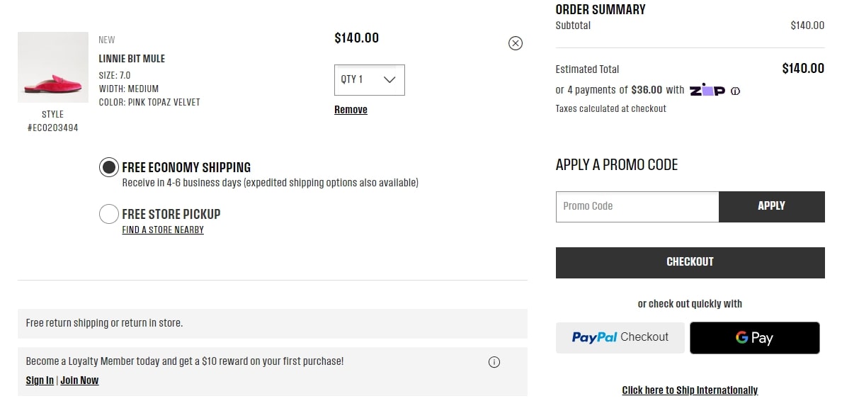
5. Sam Edelman — Give shipping options
Sam Edelman is a brand that sells stylish footwear, apparel, and accessories. Its shopping cart web design is simple, user-friendly, and maintains a consistent theme.
Best features of this shopping cart design
- Flexible shipping options: Customers can choose between free economy shipping and free store pickup based on their preference. This flexibility encourages them to complete their orders, resulting in fewer bounce rates.
- Clear product summary: The cart page displays the product name, size, width, color, and style number. This makes it easy for customers to verify their selections.
- Promo code field: The shopping cart design offers a promo code option. This encourages customers to take advantage of discounts during checkout.
- Customer loyalty program: The cart design features a $10 reward for new members who join the loyalty program. It can facilitate repeat purchases and customer retention.
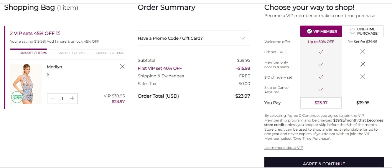
6. Adore Me — Encourage shoppers to sign up for the loyalty program
The cart design of Adore Me is sleek and feminine, which speaks for the brand specializing in lingerie, sleepwear, and activewear. Its user-friendly layout emphasizes product visuals and offers a smooth shopping experience.
Best features of this shopping cart design
- Membership benefits: The cart actively encourages customers to join the VIP membership program to enjoy discounts and free shipping. These benefits promote brand loyalty.
- Flexible purchase options: Adore Me’s cart design offers flexible purchasing options. Customers can choose between a one-time purchase or a subscription-based VIP membership.
- Clear call to action: The brand prominently displays the “Agree & continue” button to guide customers through checkout. A clear call to action eliminates confusion and allows for quick checkout.
- Detailed order summary: The cart provides a transparent breakdown of the order total, including applied discounts, shipping costs, and taxes. This eliminates added costs at checkout.
- Promo code integration: It provides a clear field for applying promo codes. With a clear space to add coupons, customers can get easy access to discounts.
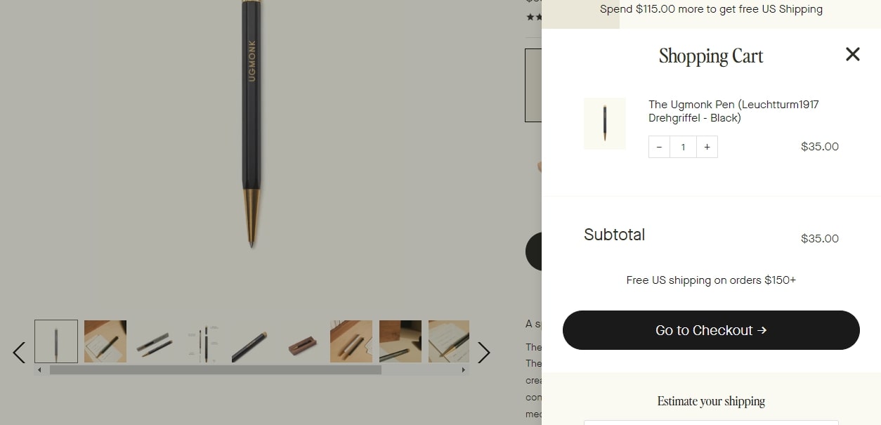
7. Ugmonk — Give shipping estimates
Ugmonk is a lifestyle brand that sells minimalistic apparel, accessories, and workspace products. Its cart preview features clean, simple, and minimalistic product descriptions, quantities, and pricing information.
Best features of this shopping cart design
- Shipping estimates: The cart includes estimated delivery times to inform customers when to expect their orders
- Free shipping: The cart highlights free shipping for orders over $150, which adds value to customers’ purchases and encourages them to buy more to reach the threshold
- Minimalist aesthetic: The shopping cart has a sleek, minimalist design with plenty of white space
- Seamless user experience: The cart is designed with the user in mind: its intuitive navigation makes adjusting quantities, removing items, or returning to shopping hassle-free
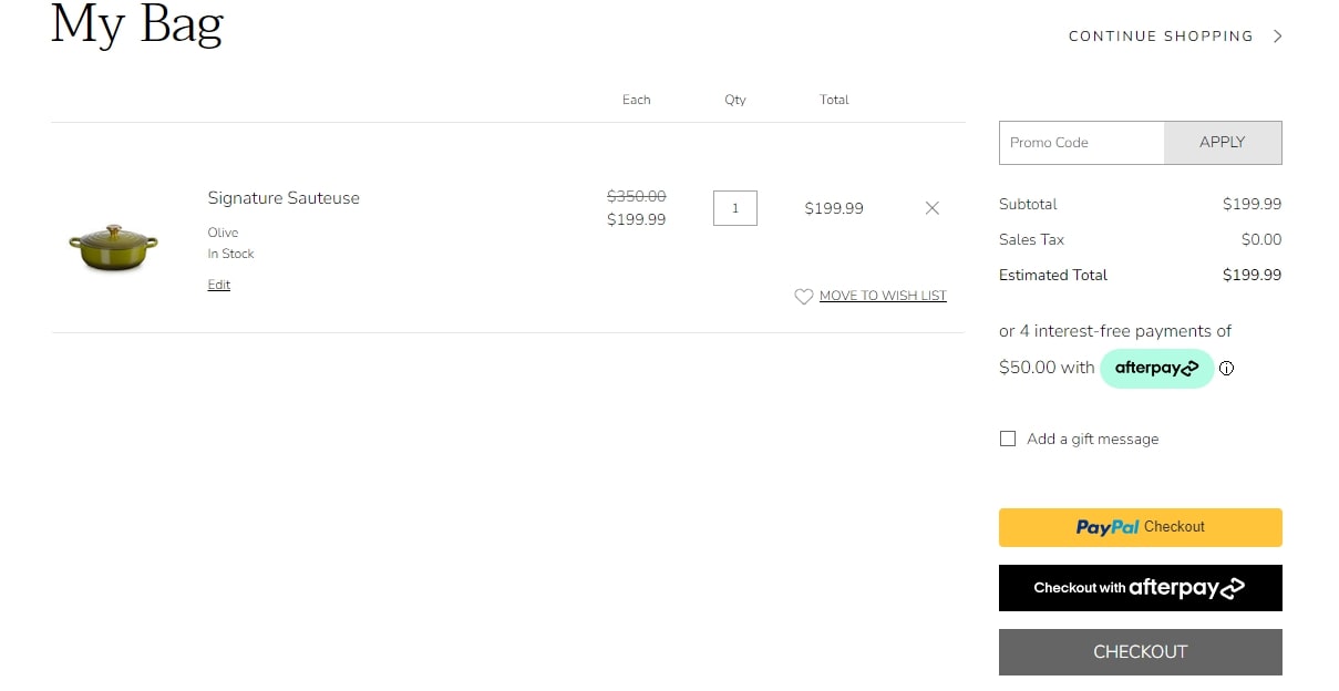
8. Le Creuset — Add a discount code box
Le Creuset is a premium cookware brand known for its colorful, enameled cast iron pots, pans, and kitchen accessories. Its elegant and vibrant website design features high-quality images and a color palette that reflects the brand’s iconic cookware.
Best features of this shopping cart design
- Discount code box: The cart includes a clearly visible discount code box, allowing customers to apply promotional codes during checkout. This feature enhances the shopping experience and aims to increase conversions and repeat business.
- Elegant visuals: The cart features high-resolution images of each product. This lets customers assess and appreciate the design and color options before purchasing.
- Gift messaging: Customers can add a personalized message to their order. This significantly enhances their gifting experience.
- Wishlist feature: Customers can save items to a wishlist directly from the cart. This makes it easy to keep track of products they’re interested in for future purchases.
- Order summary: The cart design includes a clear and detailed order summary. It informs customers of the cost of items in their cart before proceeding to payment.
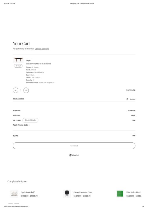
9. Design Within Reach — Add relevant product recommendations
When it comes to the best shopping cart designs, the brand Design Within Reach doesn’t disappoint. This company specializes in high-end, modern furniture and home decor. Its clean and user-friendly website design reflects the elegance of its offerings.
Best features of this shopping cart design
- Product recommendations: Its “Complete the Space” section suggests additional products that complement the customer’s current selection. This prompts the customer to consider adding more to their basket.
- Clear pricing and discount display: The cart clearly shows the original price, applied discounts, and the final price. This transparency makes it easy for customers to see the value of their savings, helps build trust, and reduces cart abandonment rates.
- Promo codes and tax calculation: The cart includes a field for applying promo codes and displays tax information. This feature helps customers understand their final cost before checking out.
- Easy quantity adjustment: Customers can adjust the quantity of items in their carts. This enhances user convenience and improves the overall shopping experience.
- Wishlist option: The cart includes a wishlist option. It allows the customers to save items for later consideration.
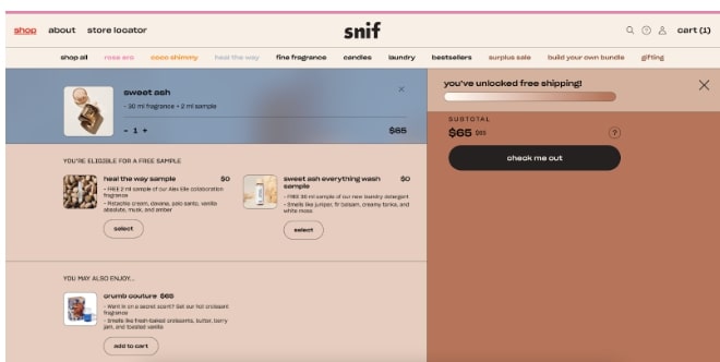
10. Snif — Add free samples
This Snif shopping cart example stands out for its distinct design. The brand sells fragrances, candles, and other scented products, and its website design features a playful and inviting color scheme that complements the brand’s focus on sensory experiences.
Best features of this shopping cart design
- Free samples offering: The “Free Samples” section provides customers with an extra incentive to complete their purchase. It also promotes customer loyalty as customers will be able to experience more of your products.
- Personalized product suggestions: The ecommerce shopping cart design includes personalized product recommendations. This not only shows customers you care, resulting in customer loyalty, but also catches customers with products they want at a time they’re likely to commit to buying.
- Progress bar for free shipping: A progress bar informs customers when they’ve unlocked free shipping. This can be a motivator for them to add more items to reach the threshold.
- Consistent design aesthetics: The color palette and design elements are consistent throughout the cart. This creates a visually appealing experience aligning with the brand identity.
- Simple and intuitive layout: The cart’s design is straightforward and user-friendly. Customers can easily review their selections and make adjustments.
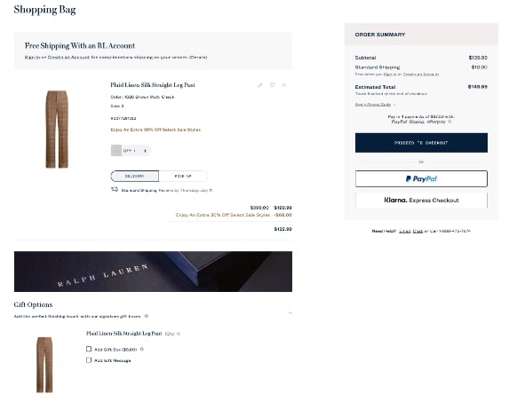
11. Ralph Lauren — Show gift options
Ralph Lauren is a luxury fashion brand popular for its high-end apparel, accessories, and home goods. Its website design is classic and reflects the brand’s image, with consistent typography, a clean layout, and high-resolution images.
Best features of this shopping cart design
- Gift options: The cart design integrates gift options, allowing customers to add a gift box or a personalized message to their order. This enhances the customers’ shopping experience and reduces the likelihood of cart abandonment.
- Shipping information: The cart displays clear shipping details, including standard or expedited shipping options. This transparency helps customers make informed decisions about delivery times and costs.
- Discount integration: The shopping cart design clearly shows applicable discounts, such as percentage-off promotions. It showcases what customers save when they complete their purchase.
- Payment options: It offers multiple payment options, including PayPal and Klarna, for making the payment. Multiple payment options make the checkout process convenient.
- Clear CTA buttons: The cart features a clearly displayed “Proceed to checkout” button. This easily guides customers to the final steps of the shopping process.
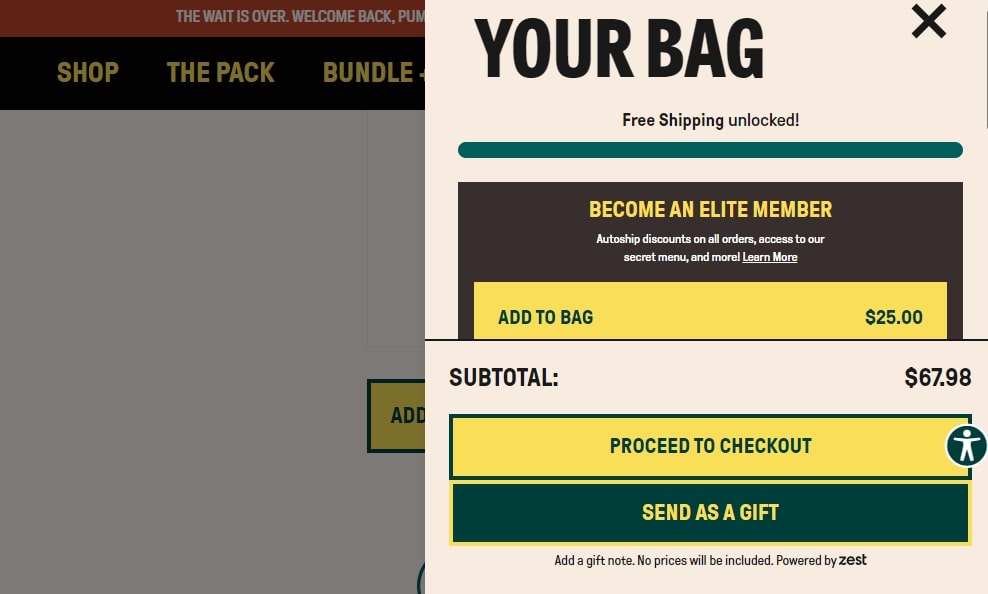
12. Wandering Bear Coffee — Offer a membership
Wandering Bear Coffee sells coffee beans and other coffee products. The ecommerce store’s website design is bold and to the point, reflecting the brand’s professional product approach.
Best features of this shopping cart design
- Membership offers: The cart promotes the brand’s Elite Member program. It prominently displays the membership program to encourage customers to join for benefits like access to a secret menu.
- Free shipping threshold: A progress bar shows how close the customer is to unlocking free shipping. This shopping cart design incentivizes them to add more items to their cart.
- Bold call to action: The cart features prominent, easy-to-find call to action buttons like “Proceed To Checkout”. They guide customers through the checkout process without confusion.
- Gift option: Customers can personalize their purchases and send items as gifts. This gifting option adds an emotional and customized touch to the purchase and saves the customer time since they know they won’t have to wrap it themself.
- User-friendly design: The cart layout features a simple color palette that makes important elements stand out. It also eliminates clutter and distractions that could lead the customer away from the checkout page.
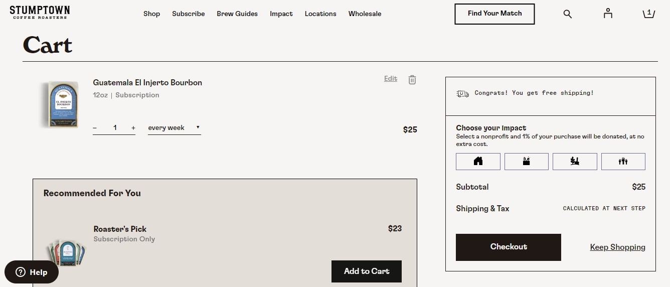
13. Stumptown Coffee Roasters — Allow to donate at no extra cost
Stumptown Coffee Roasters, a coffee company that sells coffee beans and unique blends, integrates social responsibility into its shopping cart design templates. The firm’s website features a clean and visually appealing aesthetic.
Best features of this shopping cart design
- Donation option: The cart includes a feature that allows customers to select a nonprofit organization to donate a portion of their purchases at no additional cost
- Free shipping: The cart design displays a congratulatory message to customers on qualifying for free shipping that nudges the customers to complete their order
- Subscription options: Customers can easily manage their subscription preferences directly in the cart, enhancing convenience and streamlining their shopping experience
- Product recommendations: The cart page suggests additional products that may interest the customer, such as the “Roaster’s Pick,” encouraging further purchases
- Keep shopping link: The cart features a “Keep Shopping” button, allowing customers to return to browsing the store without losing their cart items
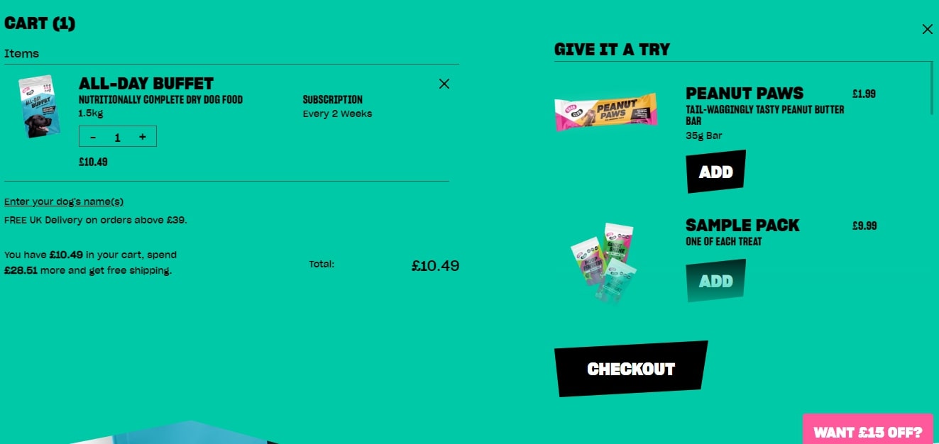
14. Grub Club — Complement the creative design of the website
Grub Club, a company that sells dry dog food and treats, is an excellent shopping cart design example. Its website features a vibrant and playful aesthetic that aligns with the brand’s energetic and fun personality.
Best features of this shopping cart design
- Consistent branding: The shopping cart design maintains the same vibrant color scheme and playful typography as the rest of the website. This consistency strengthens brand recognition and creates a cohesive user experience.
- Personalized touch: Customers can personalize their order to include their dog’s name. This enhances the shopping experience while giving an emotional touch to the product.
- Free shipping offer: The promotion for free shipping on orders over £39 nudges customers to complete their orders. It also prompts them to spend more to qualify.
- Complementary product recommendation: The “Give It a Try” section suggests complementary products that customers can add to their carts. It’s an effective way to improve sales.
- Bold and eye-catching checkout button: The prominent “Checkout” button nudges the customer to complete their order. This leaves no room for confusion or second thoughts before checking out.
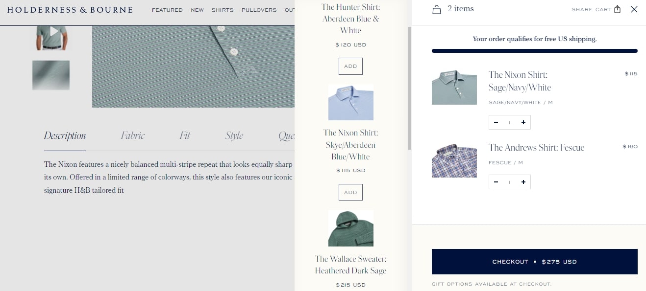
15. Holderness and Bourne — Show related products in a separate column
Holderness and Bourne is another great source of inspiration for shopping cart designs. It specializes in golf apparel and accessories, and its sleek and intuitive website design reflects the brand’s image.
Best features of this shopping cart design
- Product recommendations: The “You May Also Like” section suggests complementary products to customers in a separate column. This makes it easy to browse and add items without leaving the cart page.
- Gift options: The cart allows customers to select gift packaging or add a personalized message. The feature adds a personal touch and encourages repeat purchases.
- Free shipping incentive: A progress bar shows when a customer qualifies for free shipping. It’s an effective strategy for increasing sales.
- Clear call to action: The checkout button is distinct and easy to locate. This lets the customers complete their purchases without hitches.
- Cohesive design: The shopping cart maintains consistent fonts, colors, and layout elements. This simple method reinforces brand identity.
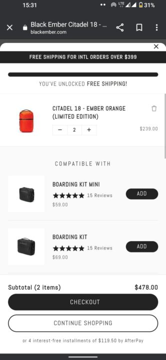
16. Black Ember — Make sure your mobile cart page is responsive
Black Ember prioritizes mobile-friendliness along with other website design shopping cart features. The ecommerce company sells backpacks and accessories. Its website features dark tones and high-quality product images.
Best features of this shopping cart design
- Mobile-responsive design: The shopping cart is responsive and functions smoothly, even on mobile devices. This adaptability improves the shopping experience for customers who browse and make purchases on their smartphones or tablets.
- Quick page loading speed: The cart page loads quickly on both desktop and mobile devices. This reduces frustration and prevents cart abandonment.
- Relatable products: The cart page includes suggestions for related products that align with the customer’s interests. This increases the likelihood of additional sales.
- Free shipping offer: There’s a banner promoting free shipping for orders over $399. It encourages customers to spend more to qualify.
- Continue shopping button: The cart page features a well-placed “Continue Shopping” button. It helps customers easily return to browsing without losing the items in their cart.
Summary
We’ve explored 16 shopping cart design examples, each offering unique features that enhance the shopping experience. We analyzed examples with clear call to action buttons, personalized product recommendations, and flexible payment options to inspire you.
Whether you choose a dedicated cart page or a cart preview format, prioritize customer preferences and needs when designing your cart page to enable a smooth transition from browsing to checkout.
Create shopping cart designs that drive results. Optimize shopping cart pages with Omnisend
Quick sign up | No credit card required
TABLE OF CONTENTS
TABLE OF CONTENTS

Subscribe and don’t miss any updates!
No fluff, no spam, no corporate filler. Just a friendly letter, twice a month.