Omnisend AI


 OFFER
OFFER








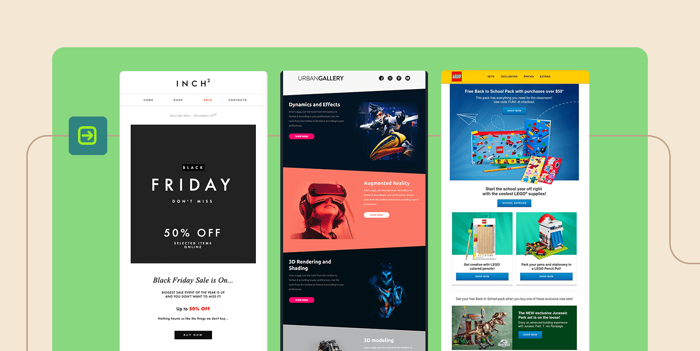

Email newsletter design isn’t about aesthetics— it’s about making your message effortless to scan, tap, and act on (especially on mobile). The best newsletters use a clear hierarchy, generous spacing, and a single, obvious next step. This ensures that readers don’t get lost in a wall of text or too many buttons.
That’s why it’s important to master the essential newsletter design secrets. It can, after all, help your brand get noticed and keep your audience engaged.
In this guide, we’ll break down practical email newsletter design principles you can apply immediately. You’ll also get examples and templates that help turn opens into clicks.
Quick sign up | No credit card required
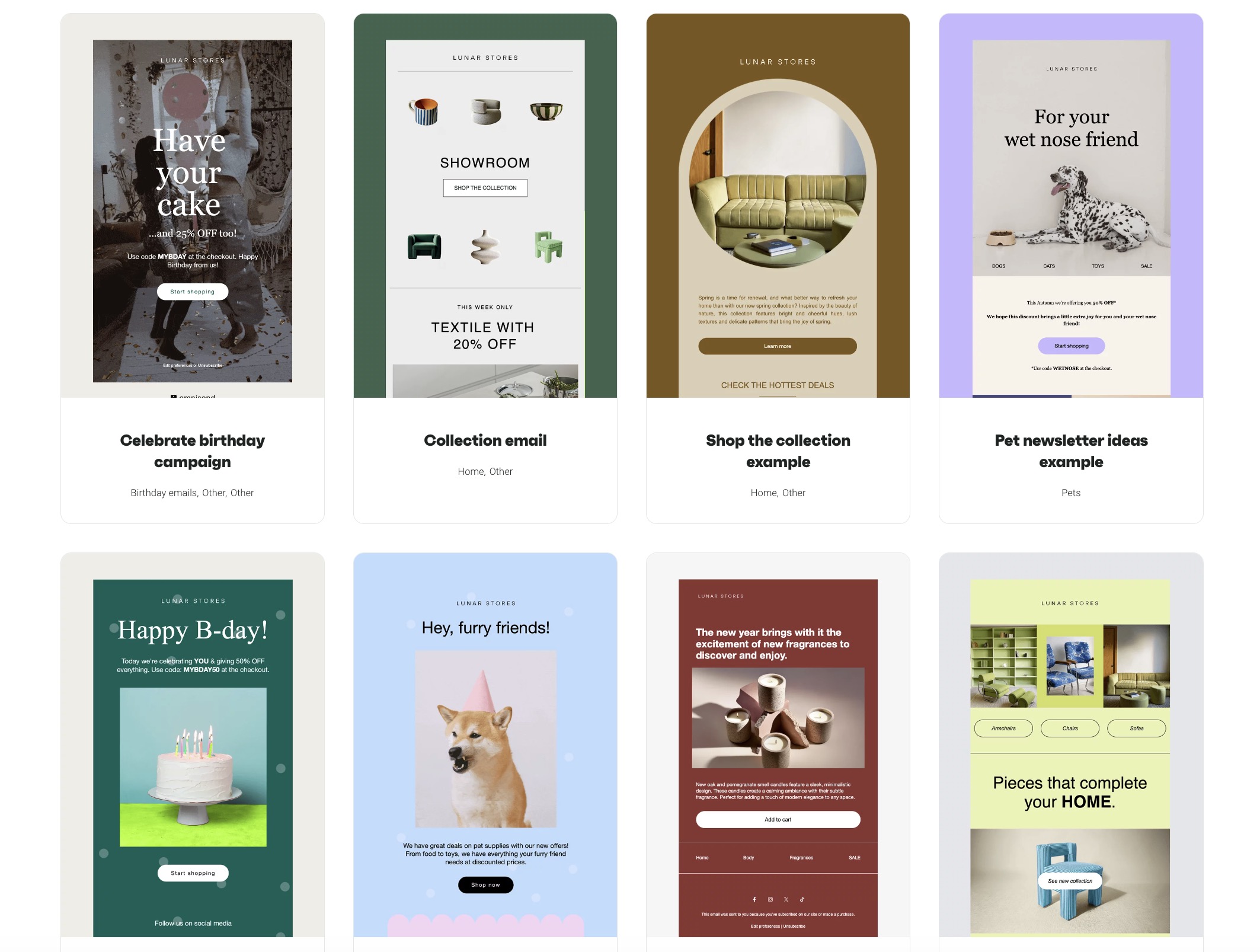
Free email newsletter design templates
Instead of starting with a blank page, use a template built for the type of campaign you want to send. Omnisend’s free newsletter templates are easy to customize and designed to help you create professional emails faster.
Newsletter design essentials
Email newsletter design is the process of shaping an email so it is easy to read, visually clear, and built to drive one action. Good design should guide the reader through the message without making them work for it.
Here are some newsletter design essentials:
- Stick to one column: Single-column emails are usually easier to scroll through. Multi-column layouts can start to feel crowded when the screen gets smaller.
- Focus on one action: Every email should have one main thing you want readers to do. Too many buttons or links can make the message feel scattered.
- Give sections some breathing room: Spacing helps break up the content and makes the email less tiring to read. It also helps important sections stand out more naturally.
- Make the design feel familiar: Using the same fonts, colors, and logo style across campaigns helps readers recognize your brand right away.
- Pair the subject and preheader: These two lines should work together. The preheader should support the subject, not repeat it.
- Keep the brand visible at the top: Your header should make the sender clear at a glance. A simple logo and clean headline are usually enough.
- Preview on various devices: Test how the email renders before sending it. Mobile and desktop can show very different results.
- Don’t ignore the footer: Add the essential details readers expect at the bottom. Contact info, social links, and an unsubscribe link should all be there.
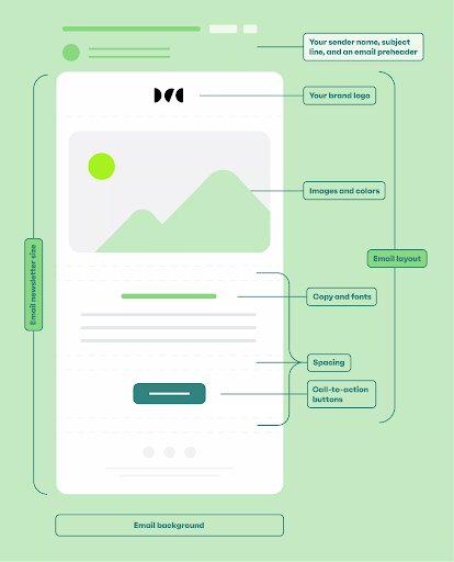
Here are the key components of an email newsletter design:
Email newsletter design examples
Looking for creative ways to design your next newsletter? Here are some email newsletter design inspiration ideas to spark creativity, along with top tips on how to make your emails get noticed.
To’ak Chocolate: Minimalist newsletter design
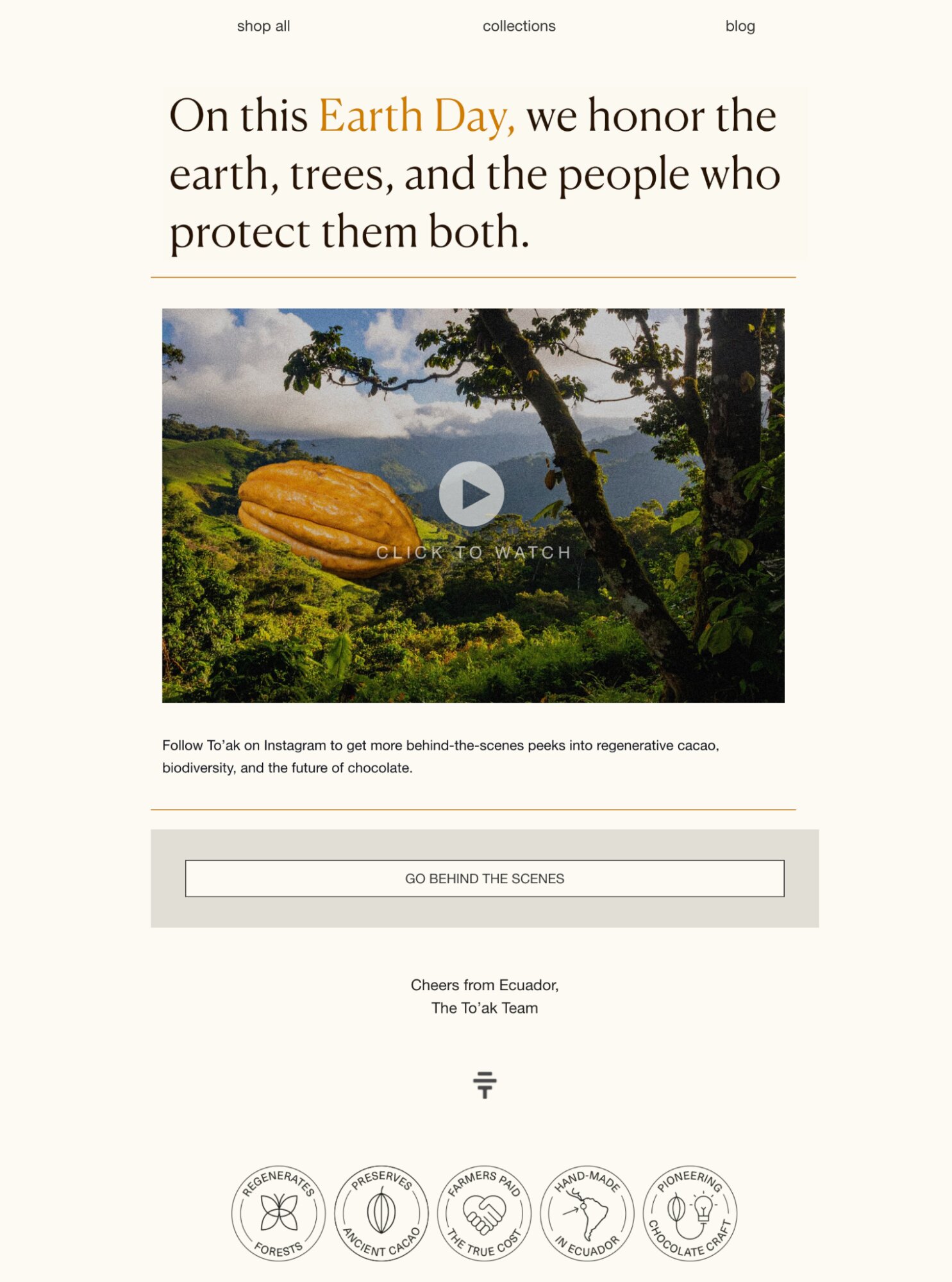
Purpose: Create a brand story around a meaningful topic to connect with your audience
Design tips:
- Use a large hero image to grab attention as soon as the email opens
- Add a video thumbnail with a play button, even if the video can’t be played natively
- Utilize the footer to build trust by adding icons, badges, or certifications
Ideal for: Sustainable ecommerce brands and companies focused on brand loyalty rather than hard selling
To’ak Chocolate’s minimalist approach to email — one message, one CTA, rare discounts — helped grow email-generated revenue by 460%.
Read the case study →
Amundsen Sports: Narrative newsletter design
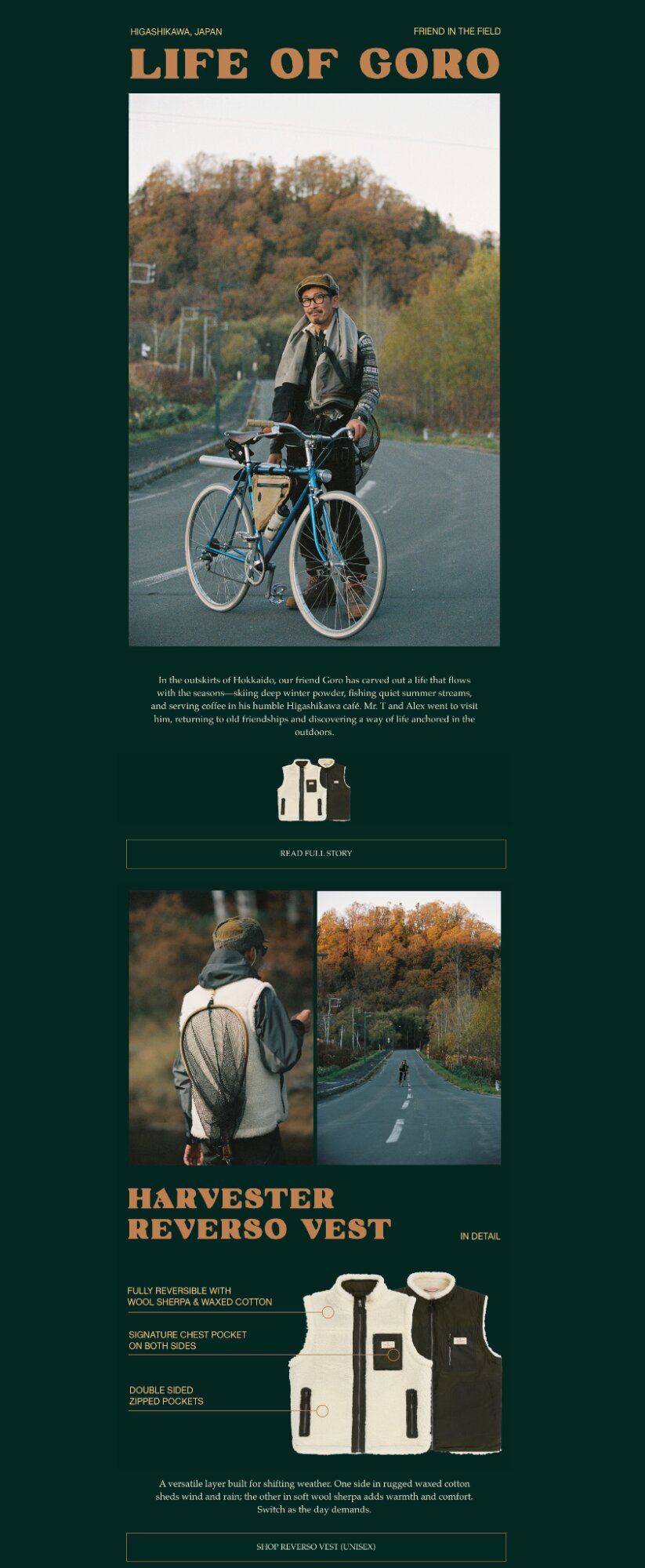
Purpose: Showcase a product collection using visual storytelling
Design tips:
- Use oversized headlines to add personality to the layout
- Add product visuals with feature callouts instead of dense copy blocks
- Use whitespace and dark backgrounds to create contrast and guide attention through the layout
Ideal for: Lifestyle and fashion brands that lean heavily on visuals and storytelling
Amundsen Sports adopted Omnisend to simplify email creation while keeping every campaign aligned with their visual style. See how they did it:
Read the case study →
Minimalist Baker: content-led newsletter design
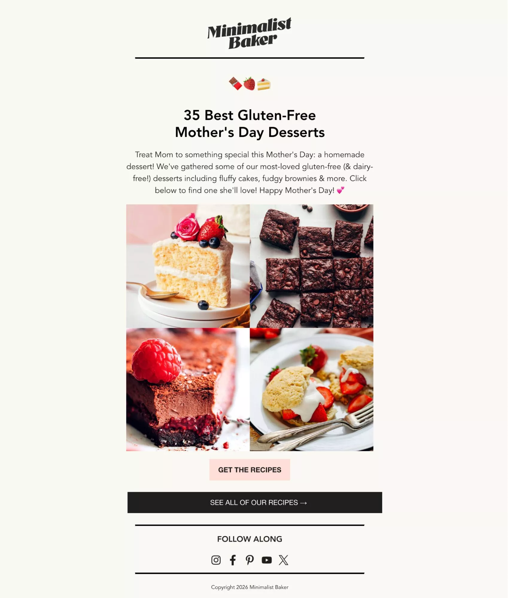
Purpose: Share a content compilation to drive traffic to various pages
Design tips:
- Keep the focus on images, and use minimal text to support them
- Keep a single CTA button, but complement it with a CTA link within the email text
- Use a background with a contrasting color to make the images pop
Ideal for: Food and lifestyle brands that have a blog and want to drive traffic to a specific post or collection
Charity Water: Emotional storytelling newsletter design

Purpose: Tell meaningful stories that help customers relate to your brand
- Design tips:
- Write a title that makes your main message stand out
- Use images that make the story feel more real and emotional
- Close with clear CTA that supports the goal of the campaign
- Ideal for: Nonprofits and brands that support social causes and want to build a community around that
Pretzels.com: Promotional newsletter design
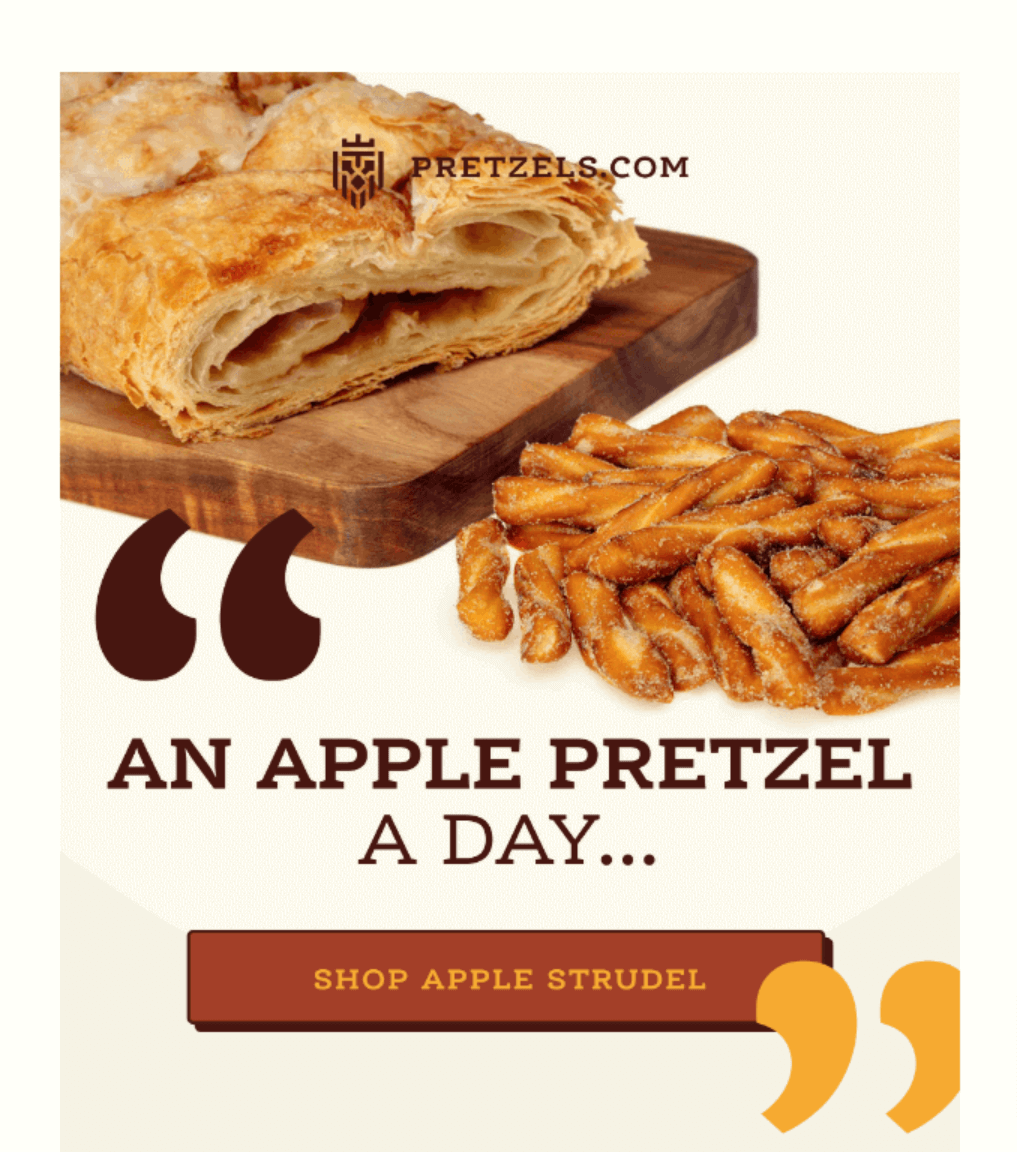
Purpose: Drive sales or highlight a special offer.
- Design tips:
- Use a single-column layout with bold visuals of the featured product or service
- Incorporate urgency with time-sensitive headlines like “Limited time offer”
- Place the CTA button (“Shop now” or “Get the deal”) prominently above the fold
- Ideal for: Ecommerce brands looking to drive conversions and email marketing ROI
Today: Event invitation newsletter design
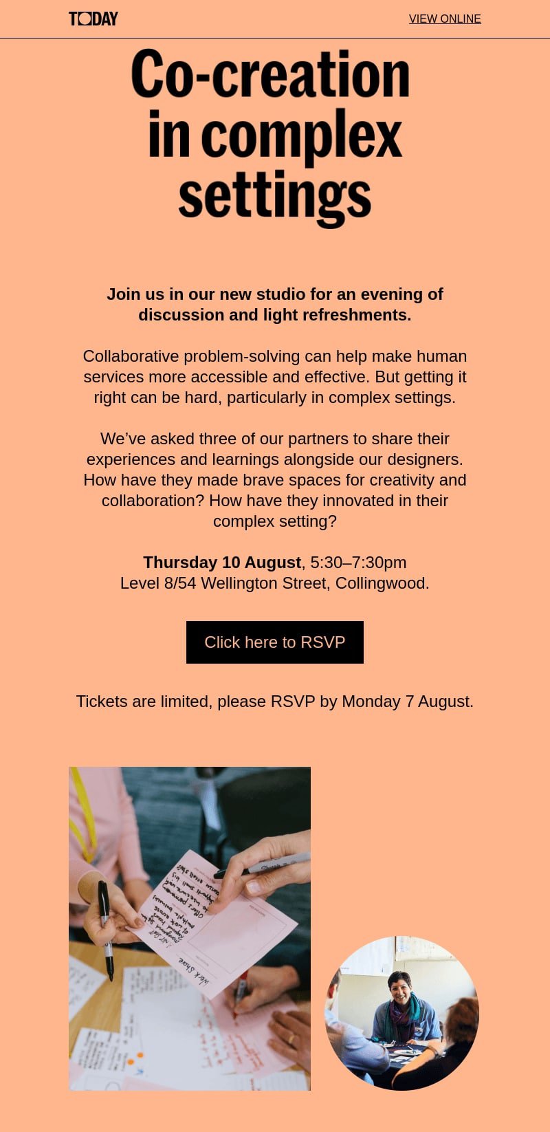
Purpose: Invite readers to attend a discussion or event and nudge them to RSVP.
- Design tips:
- Use a warm background color and a clean layout with concise event details (date, time, location)
- Add a CTA like “Click here to RSVP” at the bottom of the design
- Add a friendly reminder about the RSVP deadline to prompt quick action
- Ideal for: Workshops, panel discussions, corporate events, or webinars
University of Chicago: Educational newsletter design
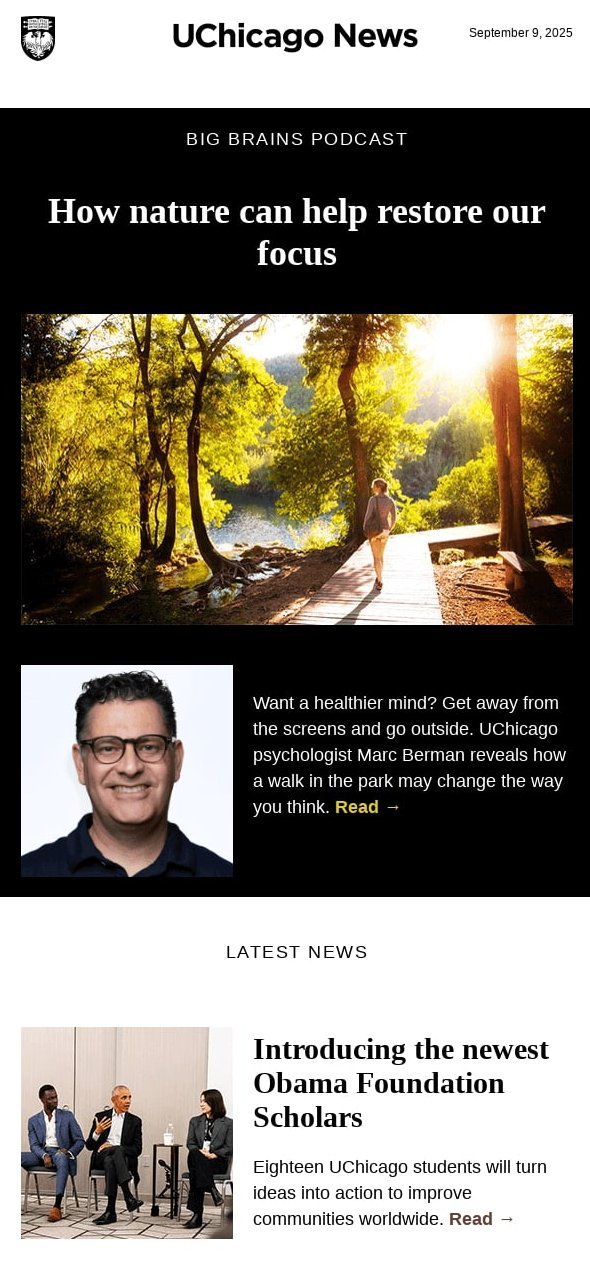
Purpose: Draw readers in with useful and informative content
- Design tips:
- Use images that support the points and headings that stand out
- Give readers a quick look at the main points before linking to in-depth content resources
- Use contrasting backgrounds (light and dark) to guide the reader’s flow
- Ideal for: Universities, research institutions, foundations, or blogs with educational content
ARMRA: Product showcase newsletter design
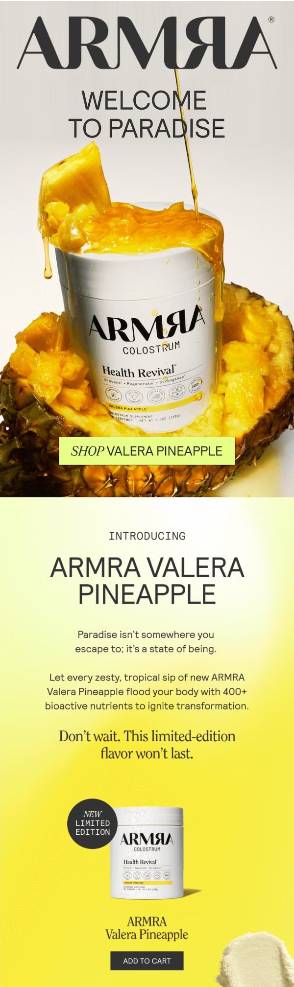
Purpose: Create excitement around a new or limited-edition product and drive sales.
- Design tips:
- Use a bold image to emphasize the product’s color, texture, or flavor
- Keep the copy short and highlight scarcity or urgency with phrases like “Limited edition” and “Don’t wait”
- Include a prominent CTA button, such as “Add to cart” or “Shop now,” under the product image
- Ideal for: Retail brands, ecommerce stores, or seasonal limited-edition product launches
Methodical Coffee: Holiday-themed newsletter design
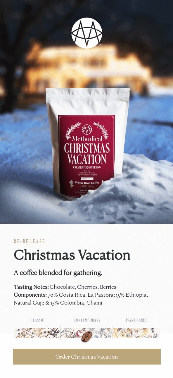
Purpose: Spread festive cheer while promoting special holiday products or offers.
- Design tips:
- Use festive colors, visuals, and fonts to evoke the holiday spirit
- Incorporate copy that ties the product to togetherness, warmth, and celebration
- Detail the product specifications and add a seasonal CTA, such as “Try Our Holiday Favorite”
- Ideal for: Holiday promotions, seasonal releases, or festive gift guides
Rainbo: Community-focused newsletter design
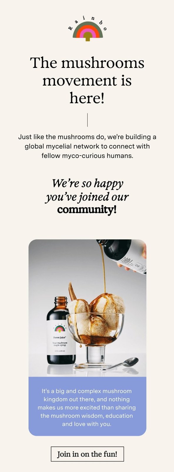
Purpose: Create a sense of belonging and build a connection with your audience.
- Design tips:
- Use warm, friendly language to make readers feel like part of something bigger
- Include eye-catching images and compelling copy that emphasizes shared curiosity or passion
- Add an inclusive CTA like “Join in on the fun,” or “Grow with our community”
- Ideal for: Wellness brands, nonprofits, or community-centered initiatives
You can tailor these email newsletter design ideas to suit your brand’s style and goals. With the right visuals, layouts, and CTAs, you can create emails that inspire, inform, and convert your audience.
How to design a newsletter: Step-by-step guide
Designing a newsletter from scratch can often seem a daunting task, but it doesn’t need to be.
In the next section of this article, we’ll take a look at the five steps that will put you on the path to success.
It begins with defining your audience and ends with testing and optimizing your email newsletter design. Here’s a breakdown of everything we’ll cover:
- Defining your audience and goal
- Choosing a newsletter platform
- Picking or customizing a template
- Adding engaging content and visuals
- Testing and optimizing before sending
Want a quick preview before getting into the details of how to design an email newsletter? This video tutorial is packed with expert email newsletter design tips that perfectly complement the steps we’ll explore next.
Step 1: Define your audience and goal
You could spend hours creating a beautifully designed newsletter, but for it to succeed, you first need a clear understanding of your audience and purpose.
Before working on your email newsletter design, ensure you know who you’re trying to reach. Conduct research to identify the demographics, preferences, and needs of the people you want to receive your newsletter.
Your intended audience could be busy professionals, students, or customers who’ve been supporting your brand for years. Whichever it is, they’re likely to have very different needs and preferences — and trying to target your newsletter to all of them will likely fail.
Instead, think about what they value and the type of content that will resonate with them. By doing so, you’ll be able to send messages that feel more personal and relevant.
Next, you must set a clear goal. What do you want your newsletter to achieve? It could be one of the following:
- Increasing sales
- Generating more clicks through to your website
- Promoting a new product you’ve just launched
- Sharing news or updates about your brand
Just as it was essential to determine your audience, so is setting your goal. This will guide every email newsletter design and content decision you make.
For example, if you’re promoting a product from your WooCommerce store using an email newsletter, focus on bold visuals and clear calls to action.
After you’ve done the groundwork for your email newsletter design, you’re ready to move on to the next stage: choosing the right platform.
Step 2: Choose a newsletter platform
With numerous different newsletter platforms available today, finding the right match for your brand can be challenging.
Ultimately, it will come down to personal preference and which you find easiest to use. But before settling on one option, it’s worth comparing a few platforms and reading reviews to understand better what each offers.
A good newsletter platform will make it easy for you to design, personalize, and send emails while providing detailed analytics showing how your campaigns are performing.
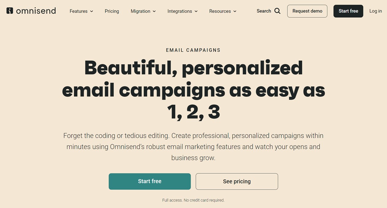
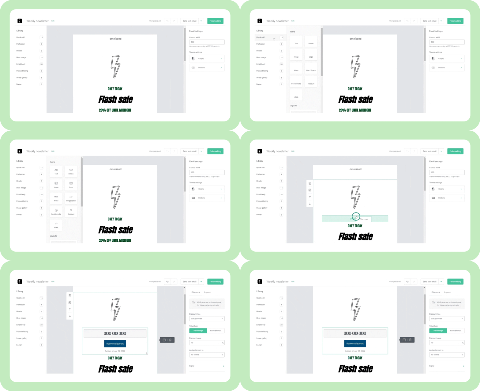
Omnisend’s powerful yet intuitive email builder saves you hours by letting you customize templates to your exact specifications. You don’t need any technical skills, so it’s perfect if it’s your first time creating an email newsletter design.
But that’s not all — Omnisend also offers advanced features, including segmentation, email automation, and detailed performance analytics, to help you send the right message to the right audience.
Blue Drop Studio’s Revenue Strategy
Initially, SUIHE Jewelry’s email strategy was limited to a basic welcome email with no segmentation or personalized flows. After partnering with Blue Drop Studio to implement Omnisend’s full suite of automated lifecycle flows, the brand saw a remarkable improvement in deliverability and conversion rates. Its email revenue skyrocketed by 435% in just 30 days, with the new welcome flow alone generating $6.4K in sales.
Read the full Blue Drop Studio case study to understand the framework it used to improve conversion and retention rates.
Step 3: Pick or customize a template
Now you’ve defined your audience and chosen a platform, it’s time to find the template that best works for your email newsletter design.
Templates are a great time-saving solution that guarantees your email newsletter design looks polished and professional.
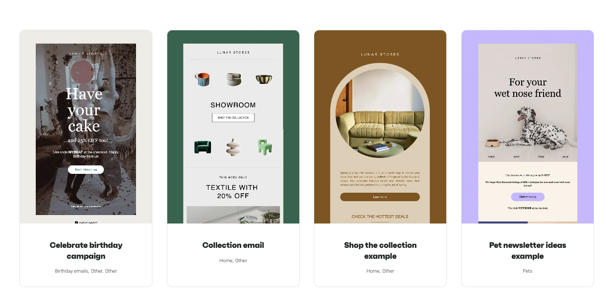
Once you’ve found a template you love, it’s time to make it your own. Remember to use branding that your audience will recognize, including your own colors, fonts, and logo.
You can also change the layout to highlight your message. For example, you could use stronger visuals for promotions and keep things simple for informative content.
A few custom touches can turn a basic template into a newsletter design that feels more engaging and professional.
Step 4: Add engaging content and visuals
Now comes the part where your newsletter starts to take shape. Add visuals that catch attention and content that gives readers a reason to keep reading
Make sure the content stays focused on the goal. Readers should immediately understand whether it’s a promotional message, an announcement, or any other type of content.
You should also keep the layout clean by using short sections, simple headings, and bullet points. This will make your content easy to read and keep people engaged from start to finish.
Visual elements are essential to grabbing your audience’s attention. There’s plenty of email newsletter design inspiration out there for campaigns that do this well. But we particularly love this email marketing campaign example from Lonely Planet’s travel diaries, promoting a stay in Costa Rica:
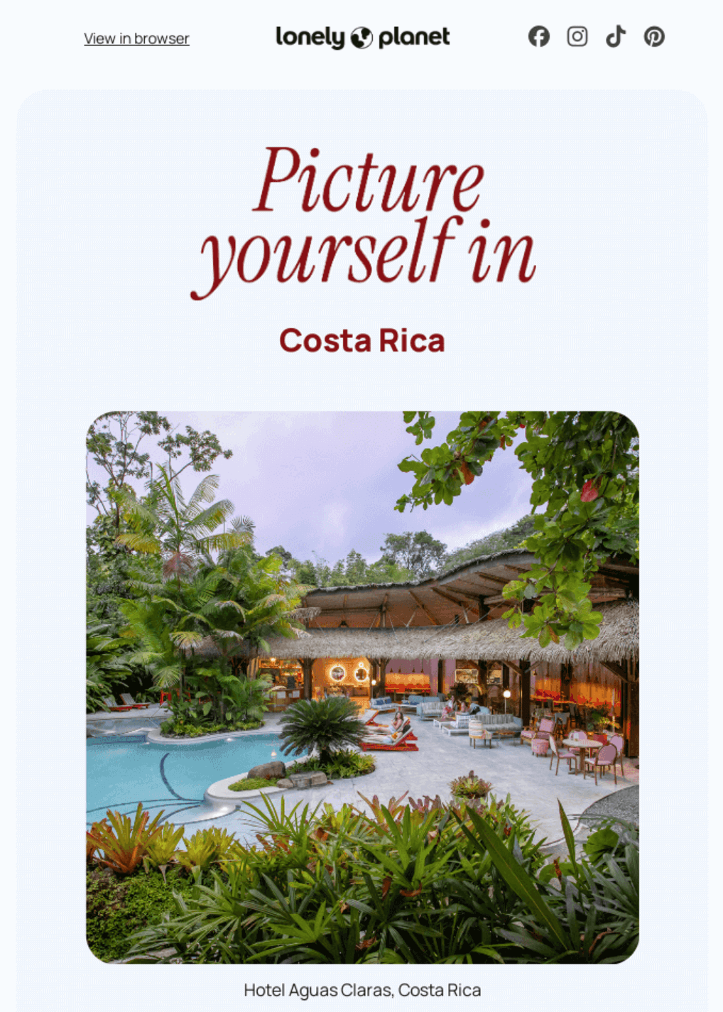
High-quality images, icons, and graphics help convey your message quickly and make your content more appealing. Remember to place visuals strategically to highlight important sections — for instance, featured products or calls to action.
Personalization is another vital part of any professional newsletter design. You should aim to address your recipients by their name and, where possible, tailor content to preferences or behavior. Examples include product recommendations based on past purchases or content that matches their interests.
Step 5: Test and optimize before sending
You’ve finished customizing your email newsletter design, and everything looks great. You’re excited to send your new, gleaming newsletter out into the world! But wait. Before you press that Send button, there are a few last things you need to take care of.
A crucial email newsletter design best practice is to test and optimize your newsletter so you know it looks perfect and performs well on every device. Taking extra time to do this can help you run more successful email campaigns.
Your audience will likely view your newsletter on a range of different devices. It’s no good making it look great on a laptop if it’s unreadable on a smartphone — particularly when a growing number of emails are opened on these devices.
Before sending the email, test the design on different devices. The text, images, and CTAs should be clear on every device.
You should also proofread your content. After all, typos and silly errors can make your emails look unprofessional. Check for wrong details, broken links, and spacing issues that can confuse the readers.
A strong subject line can help your email reach more inboxes. Keep it clear and relevant, and avoid overusing symbols, all caps, or promotional language, as these things can trigger spam filters.
It is also a good idea to test different elements to see which one works the best. You can try various subject lines, layouts, and CTAs to find the combination that works for your audience.
Use a tool like Omnisend, which offers built-in A/B testing. So, you can easily run A/B tests and find the winners, without much manual effort.
Thoroughly test and optimize your email newsletter design to improve the chance of it reaching your audience.
Requirements for newsletter format
Think of your newsletter’s format as the building blocks for how your design is presented. A well-thought-out format lets you create a smart and modern newsletter design that’s visually appealing, easy to navigate, and delivers your message.
Getting the format right is an important part of the process, as it will mean your completed newsletter looks professional and engages readers.
Let’s take a look at some of the key elements of a newsletter format:
Header
This is the first thing your readers see, making it crucial for branding and capturing attention. It typically includes:
- Your logo for brand recognition
- A clear and engaging headline to set the tone
- Optional navigation links for quick access to key areas of your website
Body
This is the main chunk of your email newsletter design where you deliver your content. It should include:
- Text blocks for information or storytelling
- Images, GIFs, or videos for visual interest
- Consistent formatting to improve readability and flow
Footer
The footer wraps up your email newsletter design clearly and neatly. It often includes:
- Contact information (email, contact number, or your business address)
- Social media links to encourage further engagement
- An unsubscribe link to comply with email regulations
| Element | Recommended spec |
|---|---|
| Newsletter width | 600px (works across most email clients) |
| Heading font size | 22–28px |
| Body text font size | 14–16px |
| CTA button size | 44x44px minimum |
| Content-to-image ratio | 60:40 text-to-visuals |
| White space | Enough space between sections for a clean, scannable layout |
Tips for responsive design
- Mobile optimization: Many people read emails on their phone, so ensure you design emails for that and then adjust for the desktop version
- Scalable images: Ensure that images adjust to the screen size and look sharp on every device
- Simple fonts: Avoid decorative fonts and use clean ones with big enough sizes to be visible on mobile devices
Improve readability with visual aids
Nobody wants to read a huge block of text — particularly when viewing it on a smaller screen. Excessive scrolling can reduce the likelihood that someone will read your message in full.
Use images, icons, and dividers to make your content easy to scan. These elements break down the monotony of text-heavy sections and improve readability and flow of your email.
Newsletter layout
Choosing the right email newsletter layout depends on your goals, content, and audience preferences. Here are the best newsletter layouts and examples of where they work well:
1. Single-column layout for simplicity
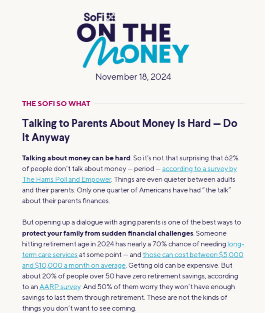
This layout is ideal for mobile-first designs and readability.
- Best for: Announcements, storytelling, or when focusing on one primary message or CTA
- Why it works: Ensures a smooth reading experience on all devices by eliminating distractions
2. Multi-column layout for detailed content
Perfect for newsletters with multiple sections, such as news updates, promotions, or blog highlights.
- Best for: News updates, product catalogs, or email digests
- Why it works: Organizes content neatly, using two- or three-column sections for clarity
- Pro tip: As one of the best newsletter layout best practices, maintain proper spacing and alignment to prevent a cluttered appearance
3. Z-pattern and F-pattern layouts
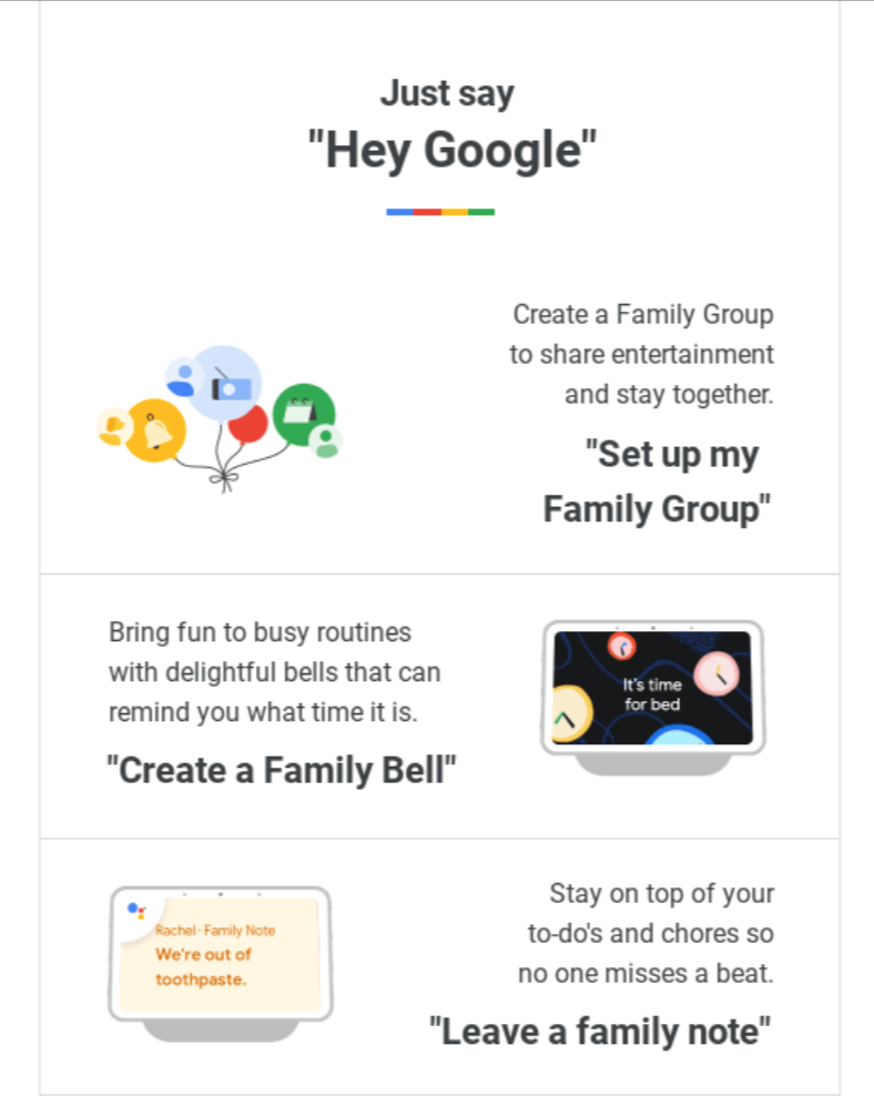
These layouts guide readers’ eyes naturally through the email.
- Best for: Highlighting key elements like headlines, CTAs, and visuals
- Why it works: The Z-pattern suits visual-heavy designs, while the F-pattern works well for text-rich content
4. Grid-based layouts for structure
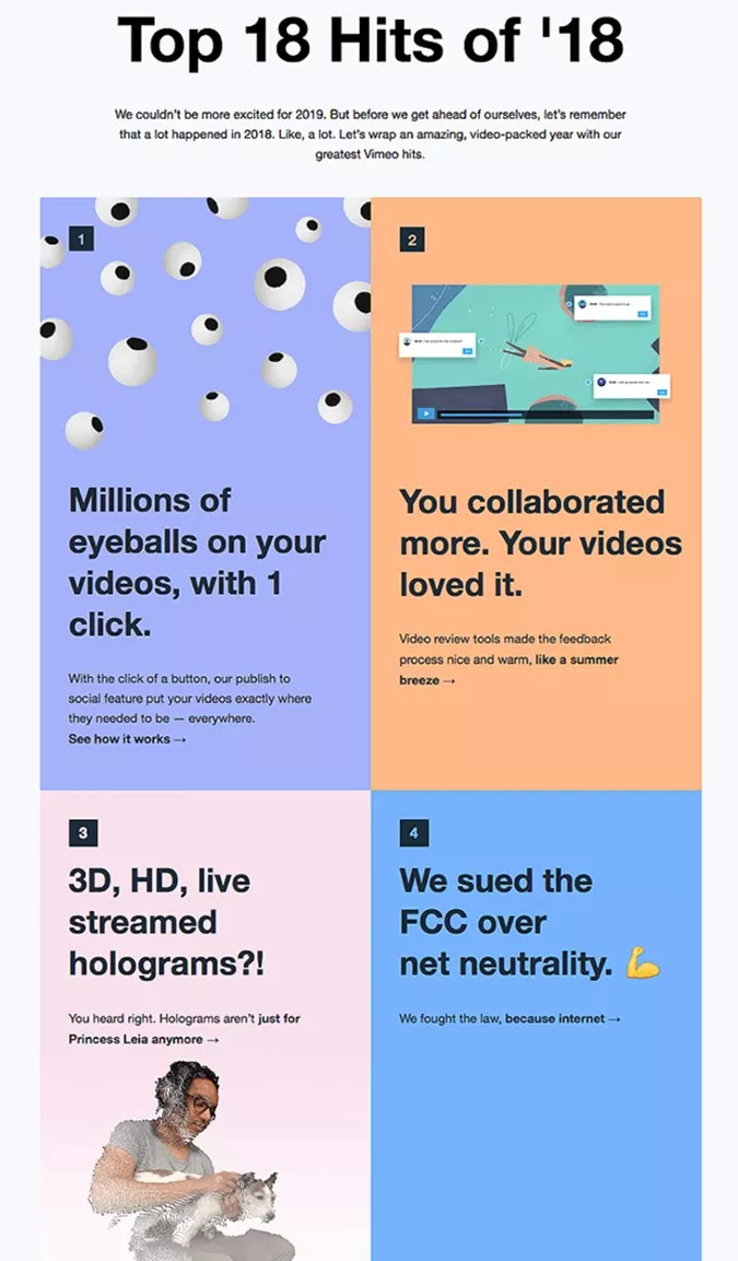
A grid-based email newsletter design provides a balanced, professional look.
- Best for: Showcasing products, event details, or multiple highlights
- Why it works: Grids help maintain symmetry and structure, making information easy to process
5. Hybrid layouts for flexibility
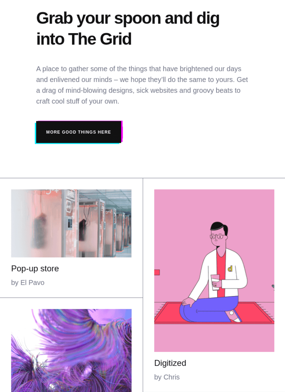
Combine single-column and multi-column sections for a dynamic design.
- Best for: Newsletters with diverse content like articles, promotions, and social media links
- Why it works: Allows for creative freedom while maintaining organization
6. Minimalist layouts for impact
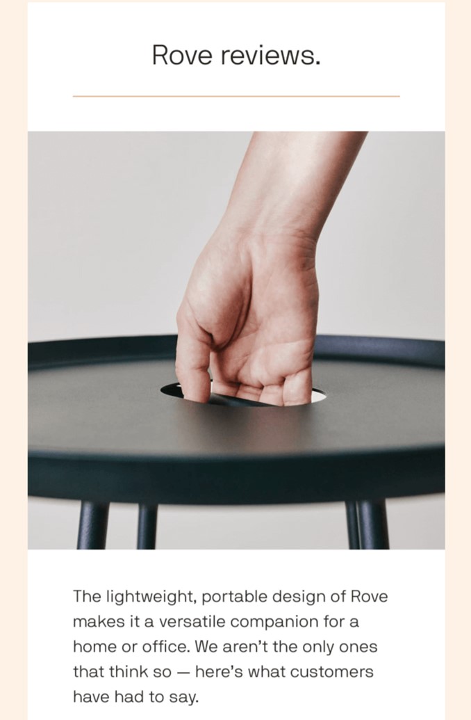
Some of the best newsletter designs focus on essential content and emphasize simplicity.
- Best for: Bold announcements, artistic newsletters, or brand campaigns
- Why it works: Clean layouts with plenty of white space draw attention to key elements
7. Visual-first layouts
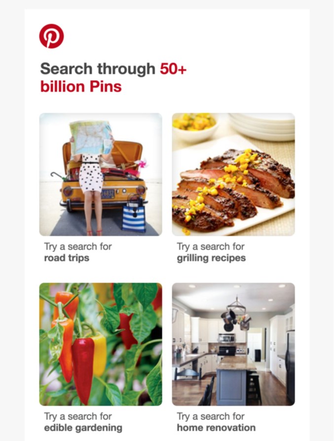
These layouts rely heavily on imagery to convey the message.
- Best for: Displaying products, events, or photography portfolios
- Why it works: Appeals to visual learners and adds aesthetic appeal
You should aim to select an email newsletter design that highlights your message and achieves your email marketing goals.
By combining creativity with functionality, you can create an effective newsletter design that truly stands out. However, you should avoid choosing a layout that’s inappropriate for your brand or one that risks confusing your audience.
Conclusion
Email newsletter design is at the heart of successful email marketing. A well-designed newsletter captures attention, keeps readers engaged, and inspires them to take action — from clicking a link to making a purchase or simply staying connected with your brand.
Remember, the key to great email newsletter design is balancing creativity with functionality. Play around with layouts, visuals, and CTAs until you find the mix that resonates with your audience.
Quick sign up | No credit card required
FAQ
What is the best format for an email newsletter?
The best format for an email newsletter depends on your audience and goals. A promotional newsletter might prioritize bold visuals and CTAs to drive sales, while an informational newsletter could focus on clear text sections and relevant links. No matter what your newsletter is for, a 600px width, mobile-responsive layout with a clean and readable design will help you reach a broad audience effectively.
How to structure an email newsletter?
What is an example of an email newsletter?
What size is an email newsletter format?